Imagine nearing completion on your house renovation, with carpenters, electricians, and plumbers still at busy at work, and suddenly the painters, wallpaper hangers, and your decorator show up to do finish work and set up the furnishings. Oh, and there’s a TV crew filming, and a class of 9-year-olds have arrived for a school field trip.
That pretty much summed up the scene at the Carlisle house at one point. Tom Silva and his crew were completing construction in the barn—trimming out the windows, finishing the floor, putting appliances in the wet bar, and installing hardware. Meanwhile tile contractor Joe Ferrante was patiently tiling the entry hall as workers around him replaced a broken glass door and install a security system, and the This Old House TV crew was setting up to shoot. Designer Kathy Marshall’s decorative painters created a Venetian-plaster finish on the kitchen walls and ceiling, and decorator Frank Roop’s paperhanger carefully applied squares of hand-cut wallpaper to the master bedroom walls. “Right now it’s a three-, no, make that a 10-ring circus”,says TOH producer Deborah Hood. “But the amount of goodwill—because this is a TOH project—is overwhelming. Everyone is managing to dance around each other to get the work done.” That was still the case even after a school bus pulled up to the barn and unloaded a class of Carlisle Elementary School kids whom This Old House Master Carpenter Norm Abram decides to entertain with a series of carpentry-related math problems.
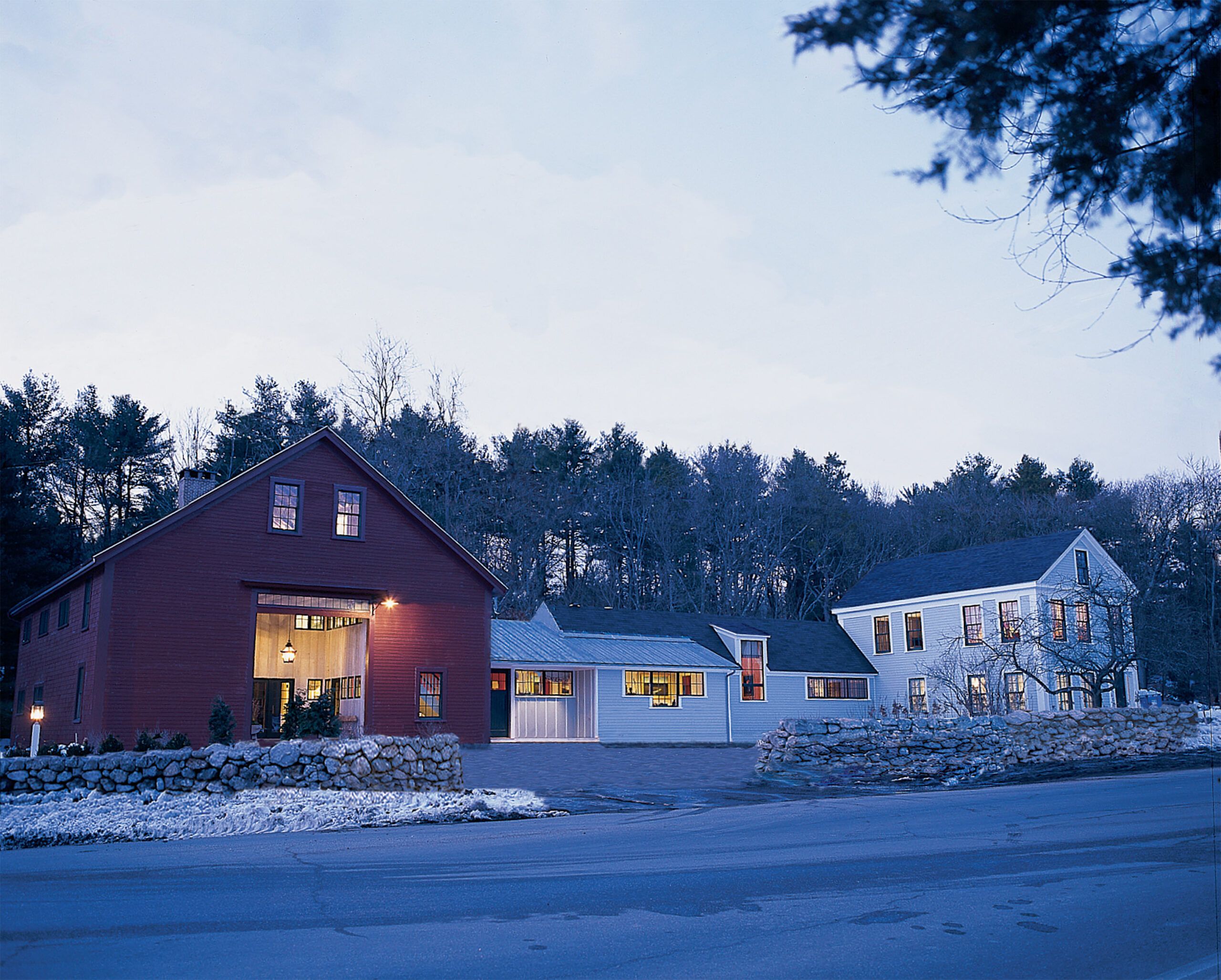
In all, 22 separate teams worked simultaneously to get the house ready for the taping of the final TV show. This Old House Senior design consultant Alexa Hampton collaborated with architect Jeremiah Eck and the TOH team to select the architectural details and design elements that unify the house’s three structures—Greek Revival main house, the timber frame barn, and the connecting one-story ell between them—into a coherent whole. “We chose things that are modern but have a classical foundation,” Alexa says.
We were able to go behind the scenes to see how three of the designers put their personal stamp on the show house’s three largest rooms—the living hall, master suite, and dining room. Take a look.
Barn Again
Designer Eric Cohler let the informal nature of the living hall—the 760-square-foot central portion of the barn’s nearly 2,000-square-foot first floor—guide his family-friendly design. “Since there are exposed beams and posts—you can even see where the animal stalls were—I wanted it to be comfortable and keep its rustic feel. But that doesn’t mean I went country!” He allowed the hall’s three bays, with their varying ceiling heights, to dictate the way he divided the space: The area to the left of the entry, with its 7-foot ceilings, is a media area; the center, with its massive Rumford fireplace and 14-foot ceilings, has seating and a card table; and the area to the right of the entry, with 16-foot ceilings, offers lots of informal seating.
Cohler used bisque-colored Madagascar grass cloth on the walls for its sophisticated informality, and sheer citrus curtains on the double-height windows. For the media area, furnishings include an overstuffed sofa and chairs in browns and creams, a 5-foot-long green ribbed-cotton bench, and a pickled-wood coffee table. All of the upholstered pieces use indoor/outdoor fabrics that are stain-resistant and child- and pet-friendly. The piece de resistance in this space will be a media cabinet designed by Cohler and his associate Matthew Hartzog and built by master carpenter Norm Abram. The seven-foot unit, based on a mid-nineteenth century New England design, will house a 50-inch plasma TV.
In the central fireplace area, Cohler’s plan called for a rhubarb-colored chair and brown leather ottoman, an antique chair, and a glass table on a chrome pedestal with four cherry chairs with striped seat cushions.
For the area to the right of the entry, the seating arrangement includes a tobacco-brown wicker sofa with overstuffed cream-colored cushions flanked by two lacquer-topped side tables; two brown-and-white-striped club chairs, a green armchair, and a yellow-brown side chair. Here, too, all of the fabrics are stain-resistant so “the kids can drink cocoa and eat peanut butter without parents worrying if they spill or drop anything,” says Cohler.
Modern Master Suite
When coming up with his design scheme for the 670-square-foot master suite interior, decorator Frank Roop says he played off of the room’s beautiful architecture: a 15-foot cathedral ceiling; corner windows; and a full-height, dormered bump-out. Besides taking advantage of the tremendous backyard views, Roop experimented with color, using crisp, cool shades with punches of saturated hues. “I want to evoke the feeling of summertime in the Mediterranean,” he says. Toward that end, he covered the walls in a pale blue-gray paper with a shimmery finish that was hand cut into squares and applied in a grid pattern to approximate the look of stone. The sleeping area includes a four-poster bed wrapped in suede with nail-head detailing on all its surfaces. On either side of the bed are simple, cube-shaped walnut nightstands, each with 1940s silver mercury-glass lamps topped with square periwinkle shades. A citrus-yellow bench sits at the foot of the bed.
The suite’s seating area is furnished with a chocolate brown, two-way chaise longue with olive flannel cushions; a pale lavender club chair, and a TV cabinet veneered in abalone shell. The Brazilian cherry floor is covered with a 13-by-8-foot chartreuse pony-skin rug. The drapery panels are two shades of brown linen cut and stitched together with a silk kelly-green hem. A navy blue, fabric-covered pendant hangs over the seating area. “I try and customize everything I do,” says Roop. “Nothing looks ready-to-wear; everything’s couture.”
Down-to-Earth Dining
In addition to her duties as senior design consultant, Alexa took on the decorating for the dining room—a bit of a design challenge, she admits. “I think everybody would love a proper dining room,” she says. “The trick is to do it right: just elegant enough to feel special, but not so formal as to be stiff and forbidding.”
The bare room is tall and somewhat angular, capped by the asymmetrical cathedral ceiling. Alexa uses shiny linen damask on the walls to soften the tone of the room. It’s framed with battens painted to match the wood trim to give “a sense of cohesion to the eccentrically shaped space,” Alexa says. Although dining room damasks are traditionally red (thought to be a good color to stimulate the appetite), Alexa went with a terra-cotta color for a modern twist. She chose a mahogany dining table with an X-frame because it’s reminiscent of the barn’s timbers. The camelback dining chairs are upholstered in a velvet to match the walls. The silk curtains are a terra-cotta-and-off-white vertical stripe, and the wool rug is terra-cotta and sand. “I wanted the room to be sophisticated yet fun,” Alexa says. That’s the spirit that is evident in so many of the rooms and in the attitudes of the dozens of professionals that are working long hours to complete the house.
Where to Find It:
Alexa Hampton
Mark Hampton Inc.
654 Madison Avenue
New York, NY 10021
212-753-4110
Eric Cohler
Eric Cohler Design, Incorporated
New York, New York
212-737-8600
Frank Roop Design Interiors
Boston, Massachusetts
617-267-0818

