Past Meets Present
Stroll downtown Charleston, South Carolina, past the carefully preserved facades of its early-19th-century houses, and it’s not hard to conjure the top-hatted gents and hoop-skirted ladies who traveled its streets by horse-drawn carriage. And nowhere is that imagined pre–Civil War era more vivid than in the Ansonborough neighborhood, located on the east side of the city’s peninsula, and home to This Old House TV’s most recent project house.
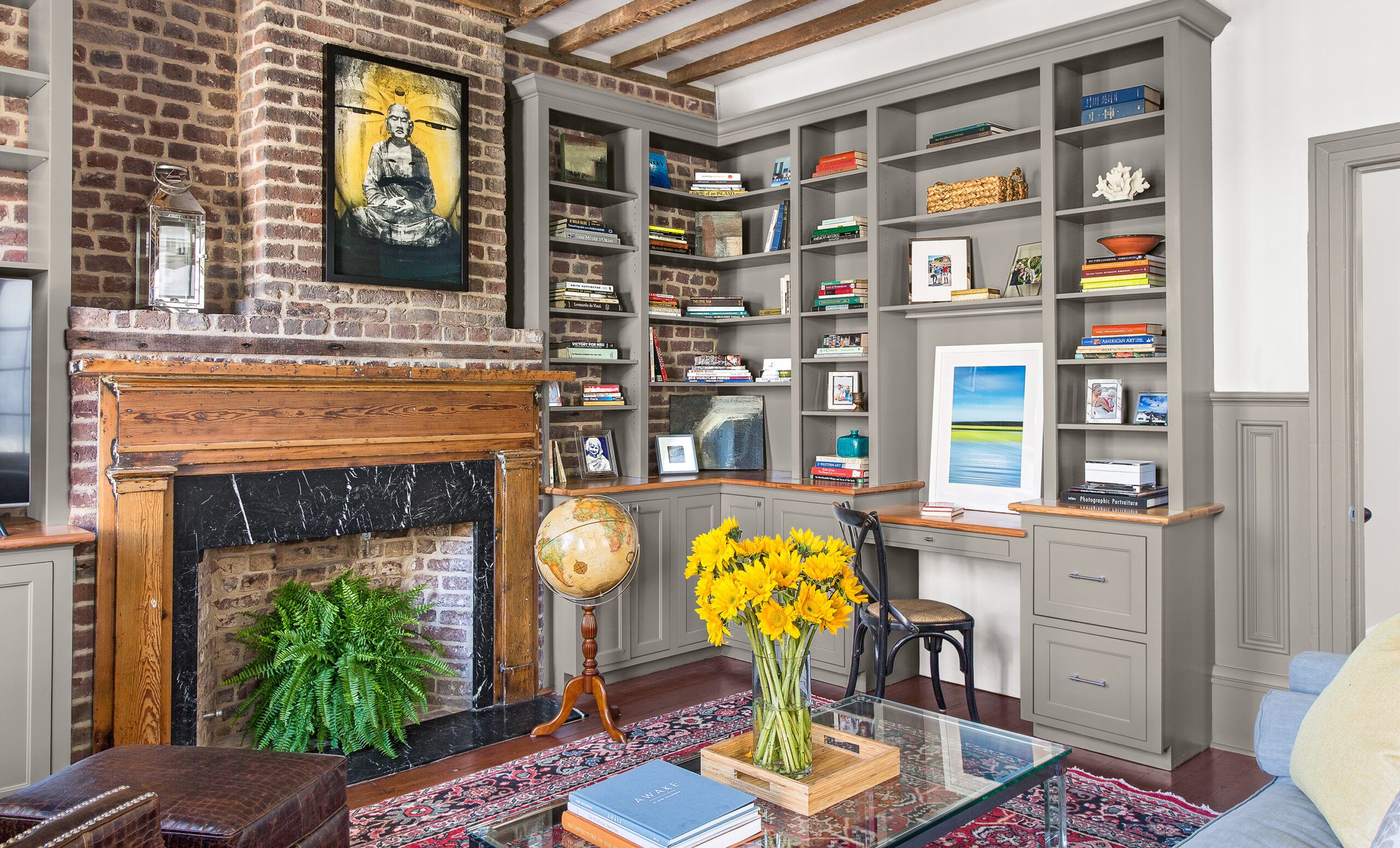
Shown: What had been a second-floor front sitting room is now a library and home office. Interior storm inserts preserve the original street-facing windows and help muffle street noise. Smooth new cabinetry plays off the rustic floor joists overhead and original 1840s brick walls.
Paint (built-ins): Benjamin Moore’s Platinum Gray
Coffee Table and ottoman: Hayneedle
Fireplace mantel restoration: Ziacraft LLC
Artwork above mantel: John Duckworth
Edwardses
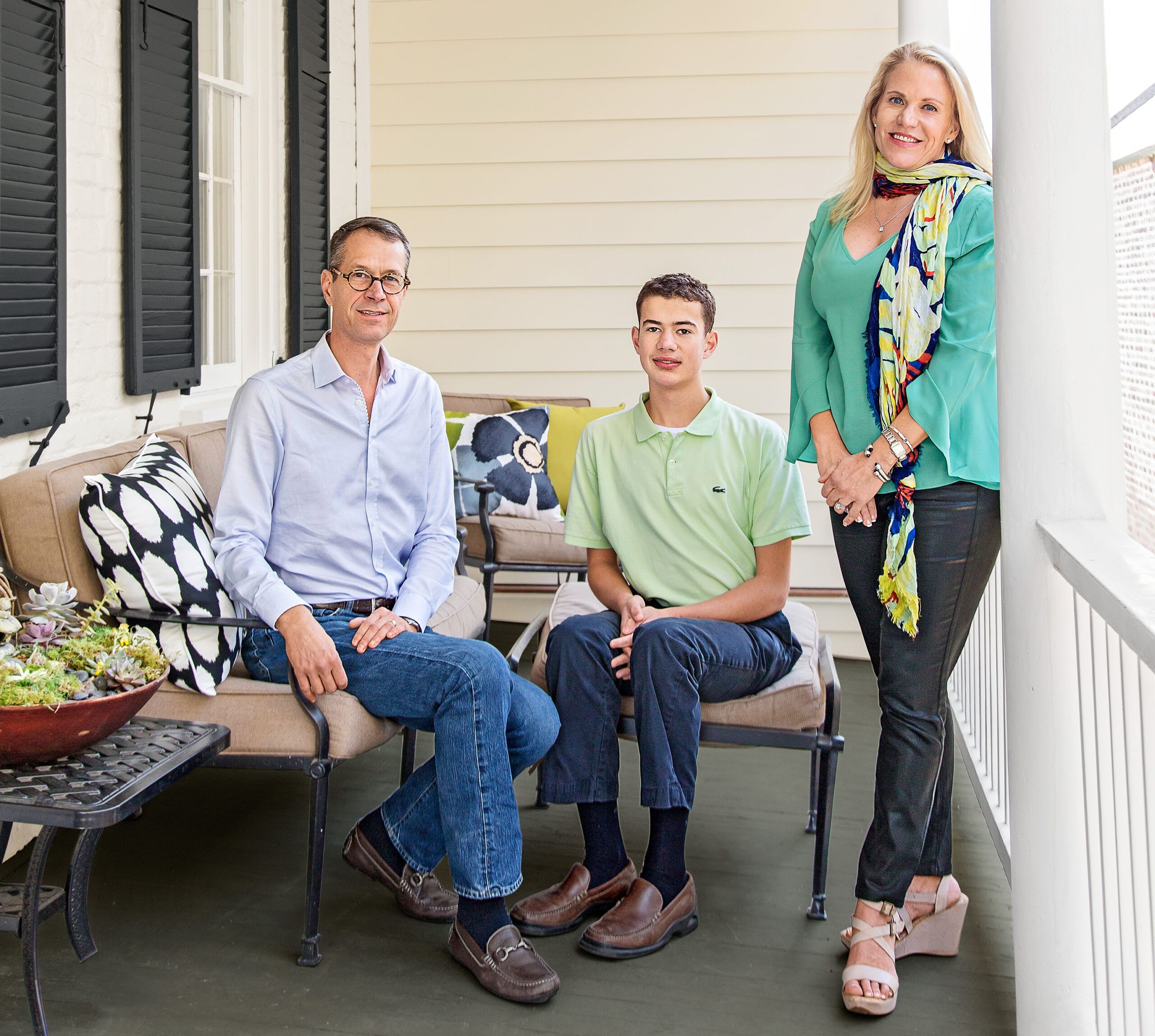
Homeowners Kathleen and Scott Edwards searched for more than a year to find the perfect house for their family: affordable, just the right size, and not too formal. Many of Charleston’s period homes have lavish moldings and details—as much a nod to the fashion of the times as a way to shout out the owner’s affluence. The house the Edwardses finally settled on is a relatively simple, one-room-wide “single house” built on spec in the 1840s after a fire ravaged the city and municipal funds were made available to builders of fireproof brick homes.
Shown: Homeowners Scott and Kathleen Edwards and their teenage son, Tradd, on the second-floor piazza.
Decorative Pillows in Floral, Ikat, Square: Hayneedle
Front View
The couple’s goal for renovating the house was akin to that of most old-house aficionados: retain the charm of the original building while making it comfortable for today with modern amenities.
But more than just an update—adding bathrooms, upgrading the kitchen—the Edwardses wanted a contemporary look for their old house’s interior, with sleek surfaces juxtaposed against the hand-wrought 19th-century building materials, which they would highlight.
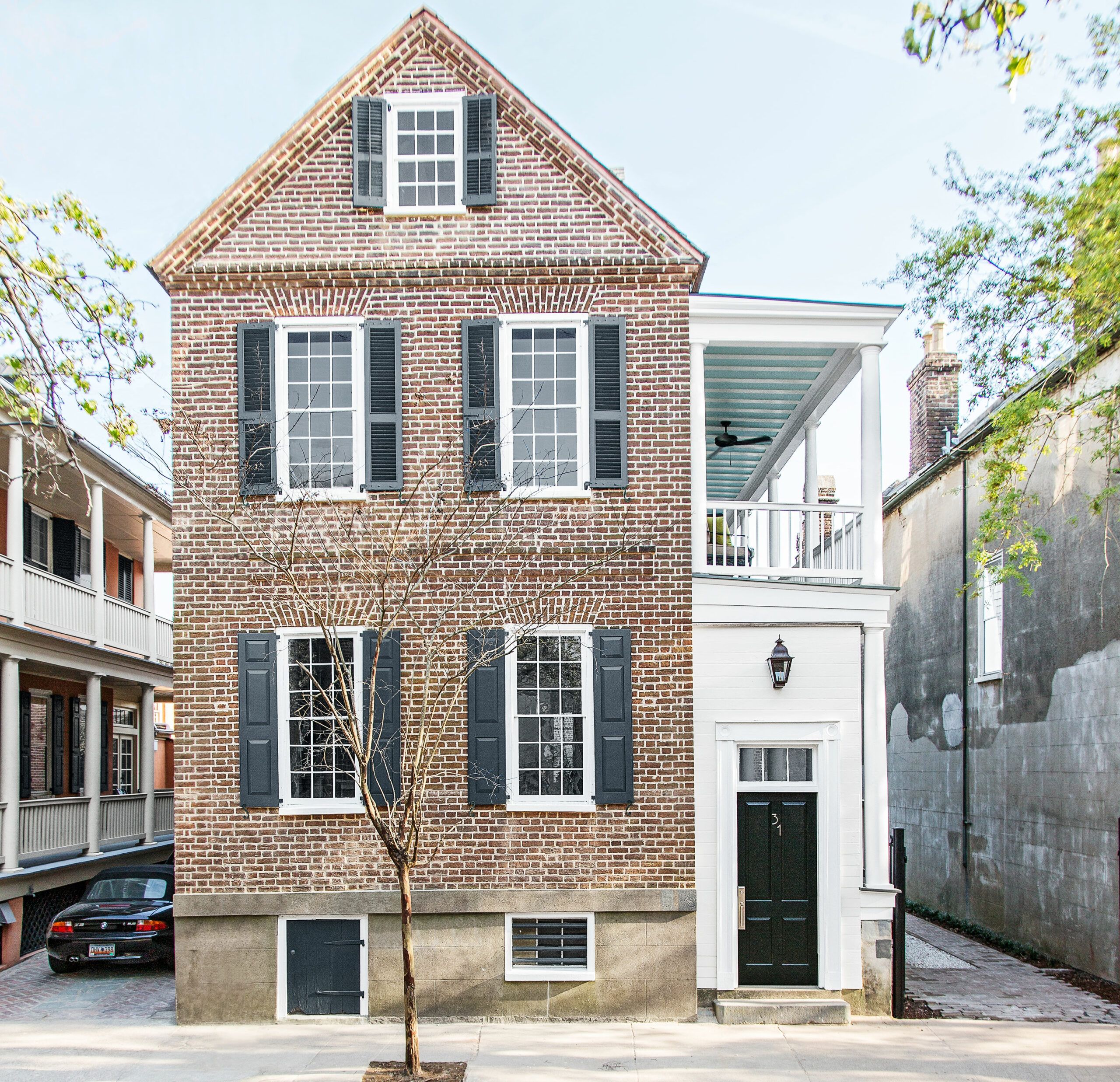
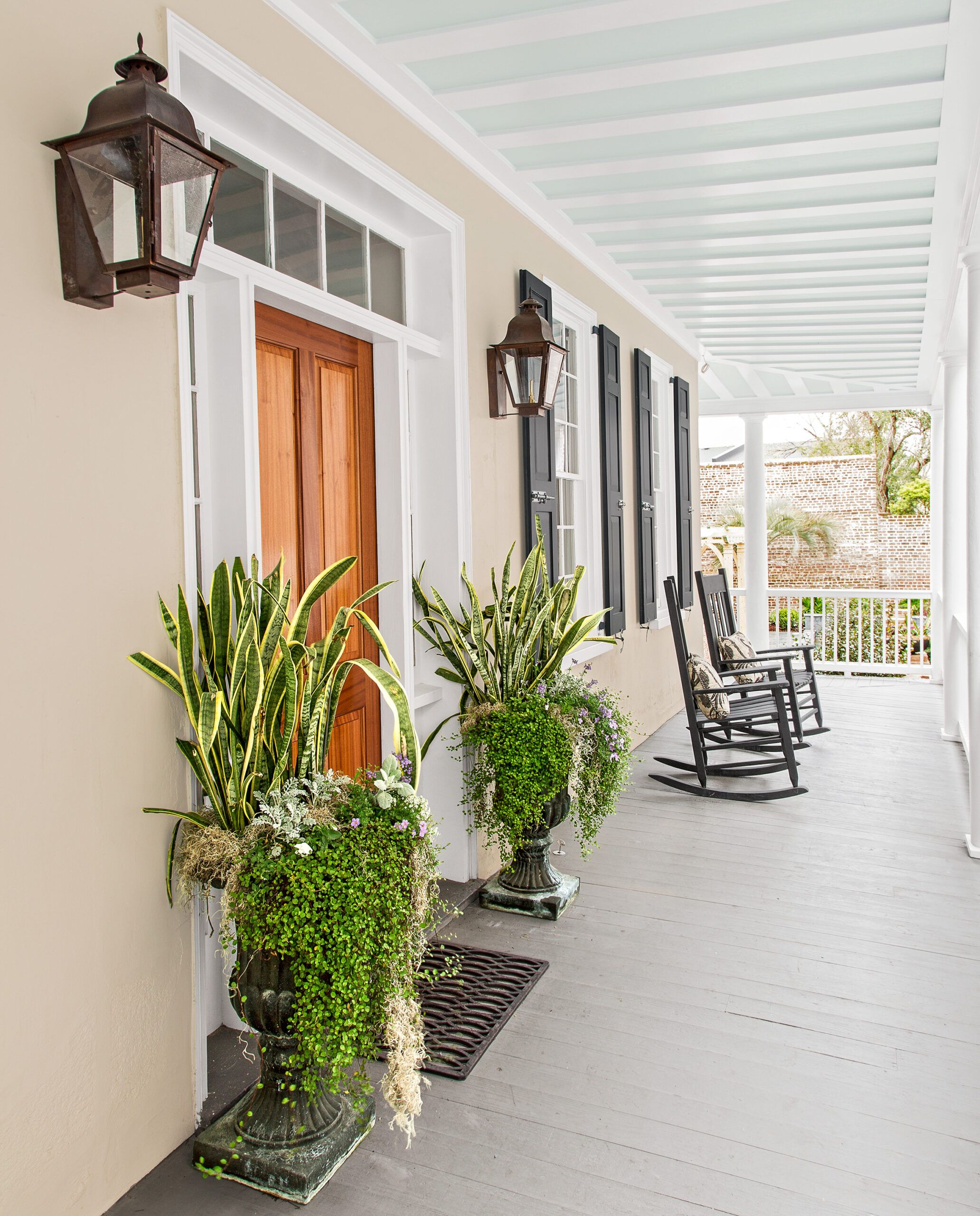
Shown: Strict city rules govern changes to a historical home that are visible from the street. This house’s front-facing windows and side porches had to be restored, and the exterior brick repointed.
Front door hardware: House of Antique Hardware
Paint: Farrow & Ball’s Hague Blue (shutters)
Entry sconce: St. James Lighting
Back by the Pool
Early on in the renovation, and in consultation with their general contractor, Mark Regalbuto, the Edwardses decided to strip the plaster and lath from the home’s perimeter walls and ceilings to expose the structural brick and the ceiling joists. It was a big move, both in terms of the work involved and as a defining design element for the finished space.
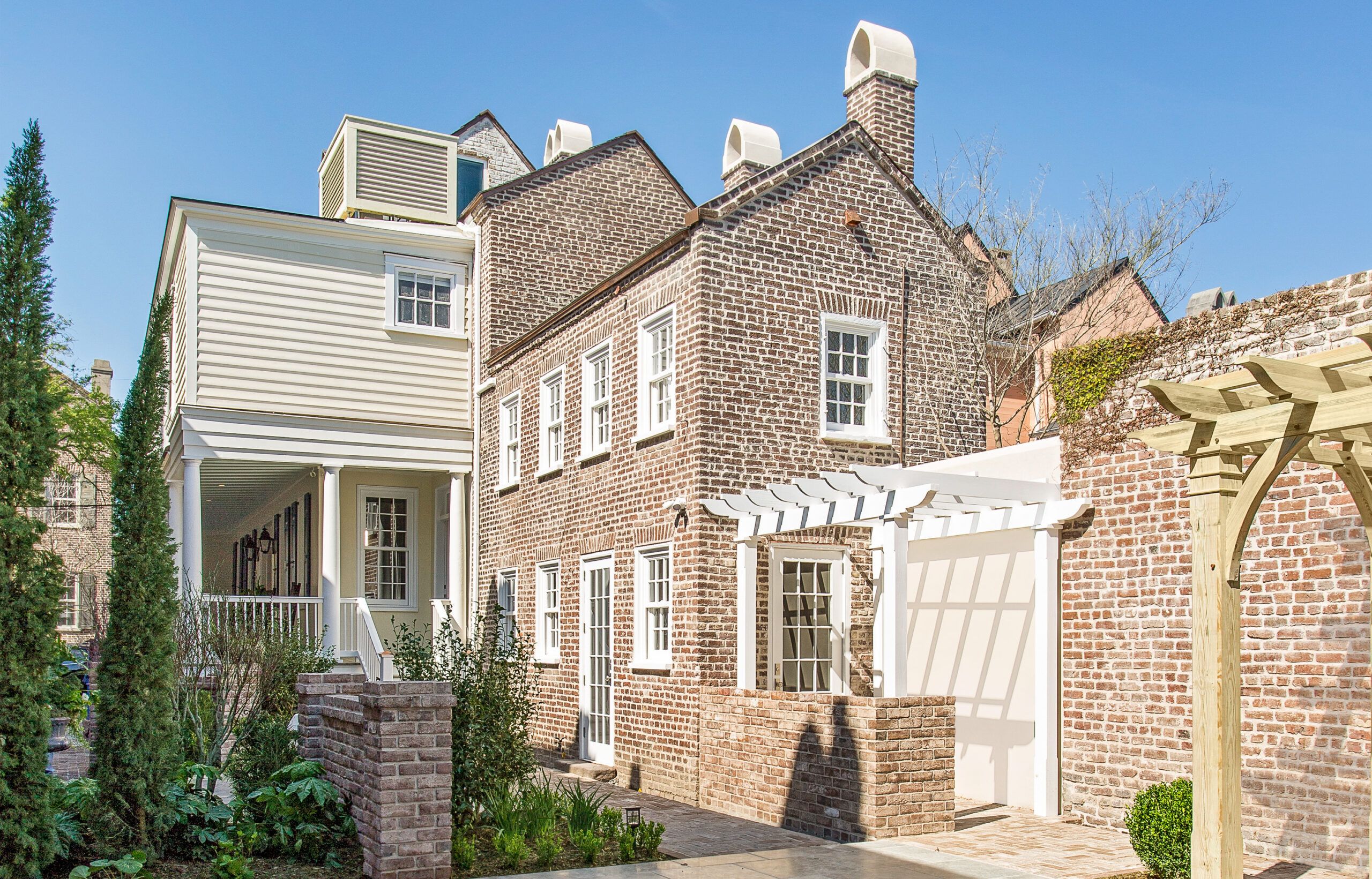
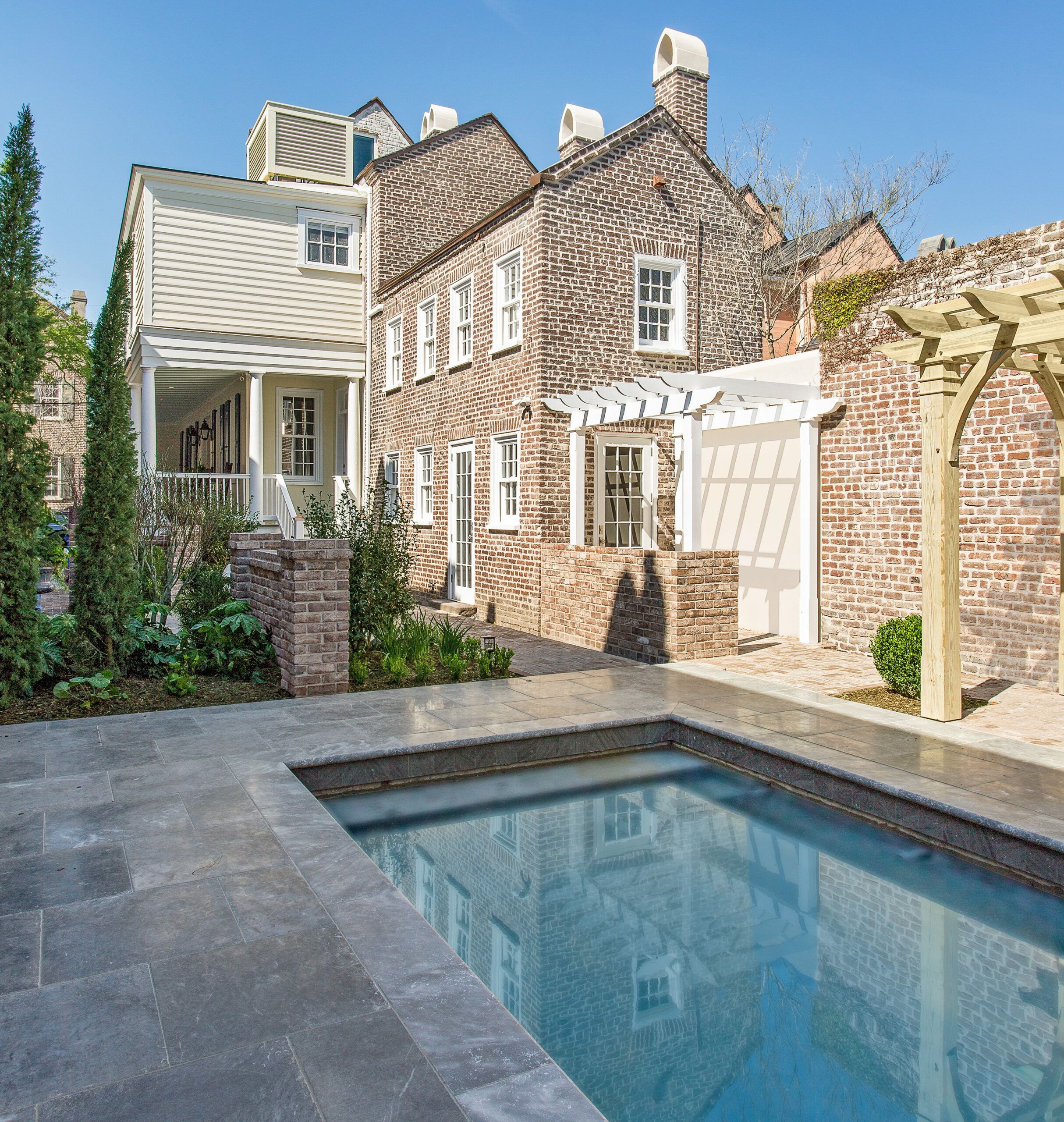
Shown: At the rear of the property, hidden from view, a dipping pool and a pergola-topped seating area lie just beyond the entry to the former kitchen house, which now holds the dining room and an upstairs guest suite.
Kitchen house windows: Marvin
Marble Waterfall
“Exposing the house’s bones added about five weeks’ work,” Regalbuto says. Not only did the plaster and lath need to be carted off, but also their removal meant figuring out how to conceal plumbing, HVAC, and electrical lines that might have run behind the plaster. “It can be tricky hiding everything,” says TOH general contractor Tom Silva. “We ended up building utility chases in the ceilings, from wood we recycled from elsewhere in the house, that look just like some of the original framing.”
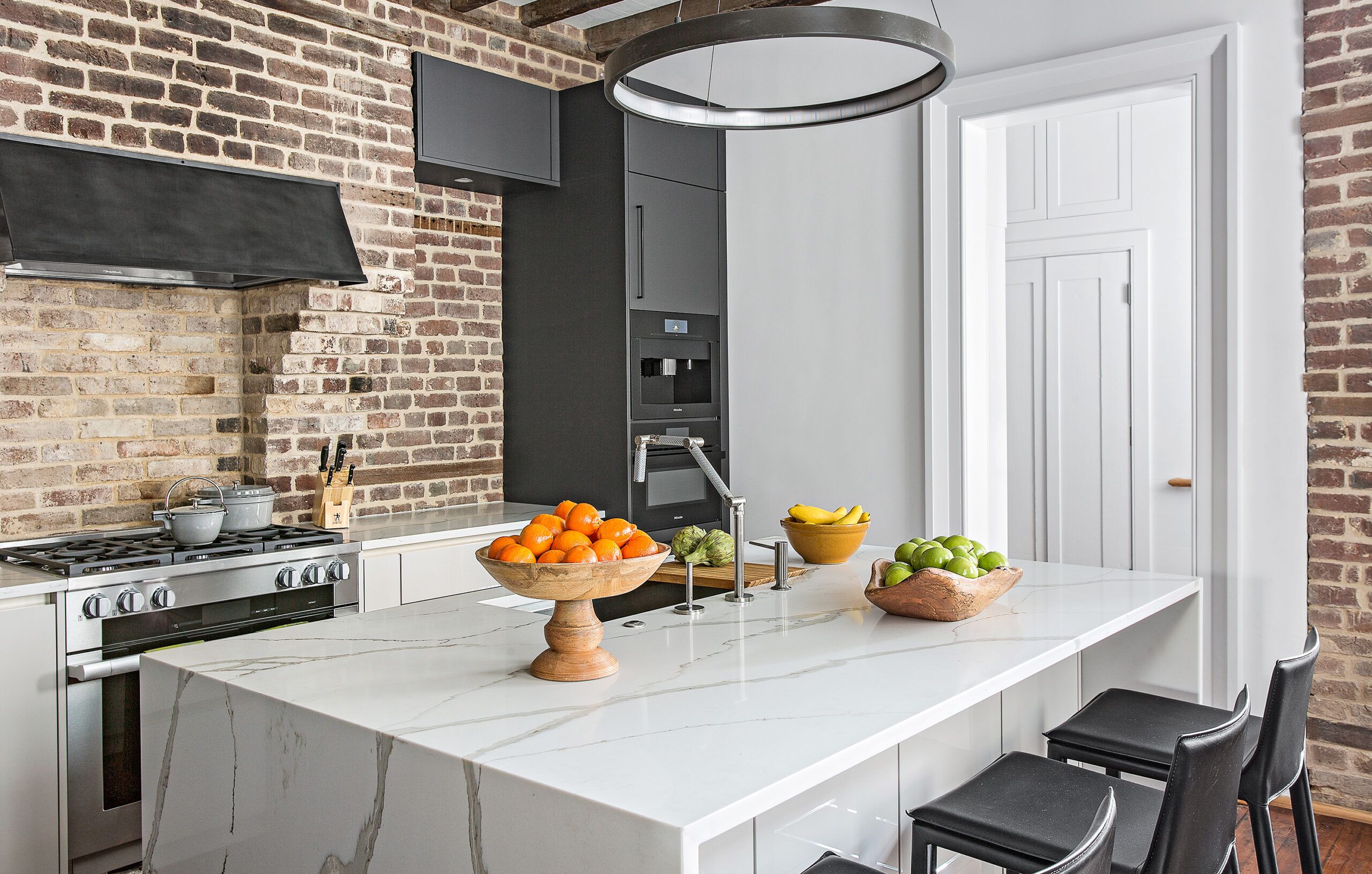
Shown: The kitchen island has a marble-look quartz countertop with a dramatic waterfall edge. The range is nestled into space where a firebox had been, with a custom hood that vents up the existing chimney.
HVAC: The Unico System
Kitchen cabinets: SieMatic
Kitchen faucet and sink: Kohler
Garbage disposal: InSinkErator
Kitchen appliances: Miele
Island countertop: Polarstone
Island pendant: Tech Lighting
Barstools: Hayneedle
Breezy Piazza
With the ceilings exposed, Regalbuto’s crew fastened rigid foam to the floor structure between the joists, then covered the foam with infill pine boards. “When you look up at the ceilings now,” Regalbuto says, “you see what appears to be the underside of the original flooring.”
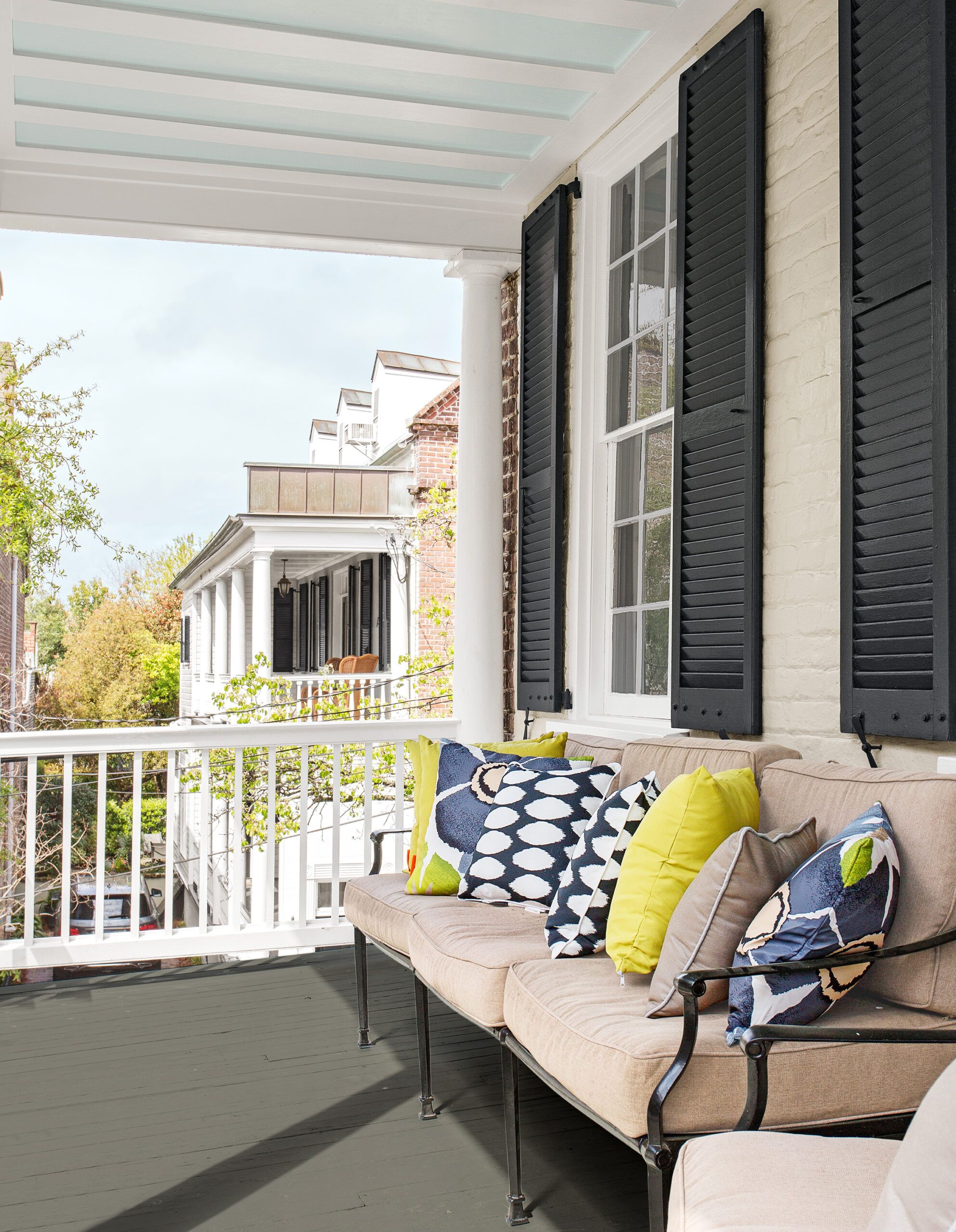
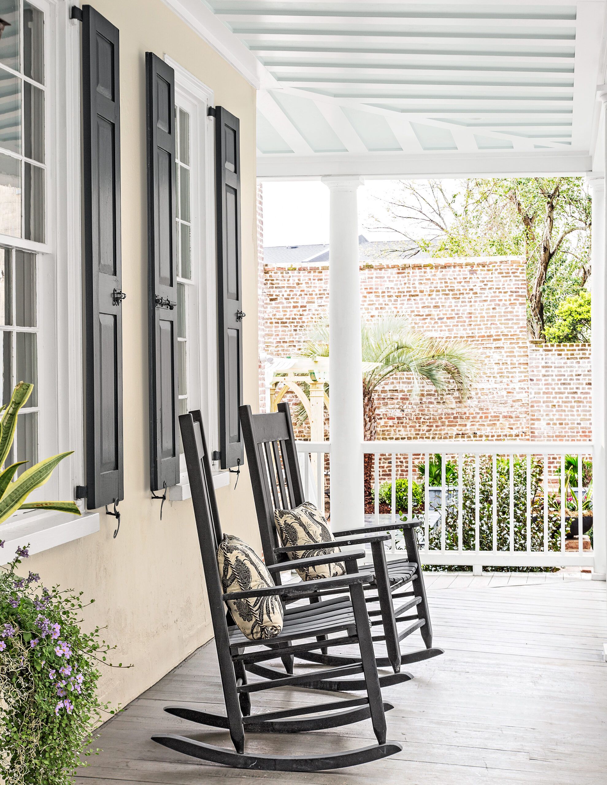
Shown: The top of the two-story piazza, designed to channel a breeze.
Decorative pillows in Ikat, Floral, Square: Hayneedle
Dining Room/Bar
From a design perspective, Kathleen says, “the brick and wood impart a richness and warmth we didn’t get from the original stark-white surfaces.”
Project architect Bill Huey adds that the textures of the wood and brick work well with the smooth planes of the modern cabinets and other surfaces. “You have manufactured surfaces next to the organic handmade materials of the original building,” says Huey. “Each makes the other really stand out.”
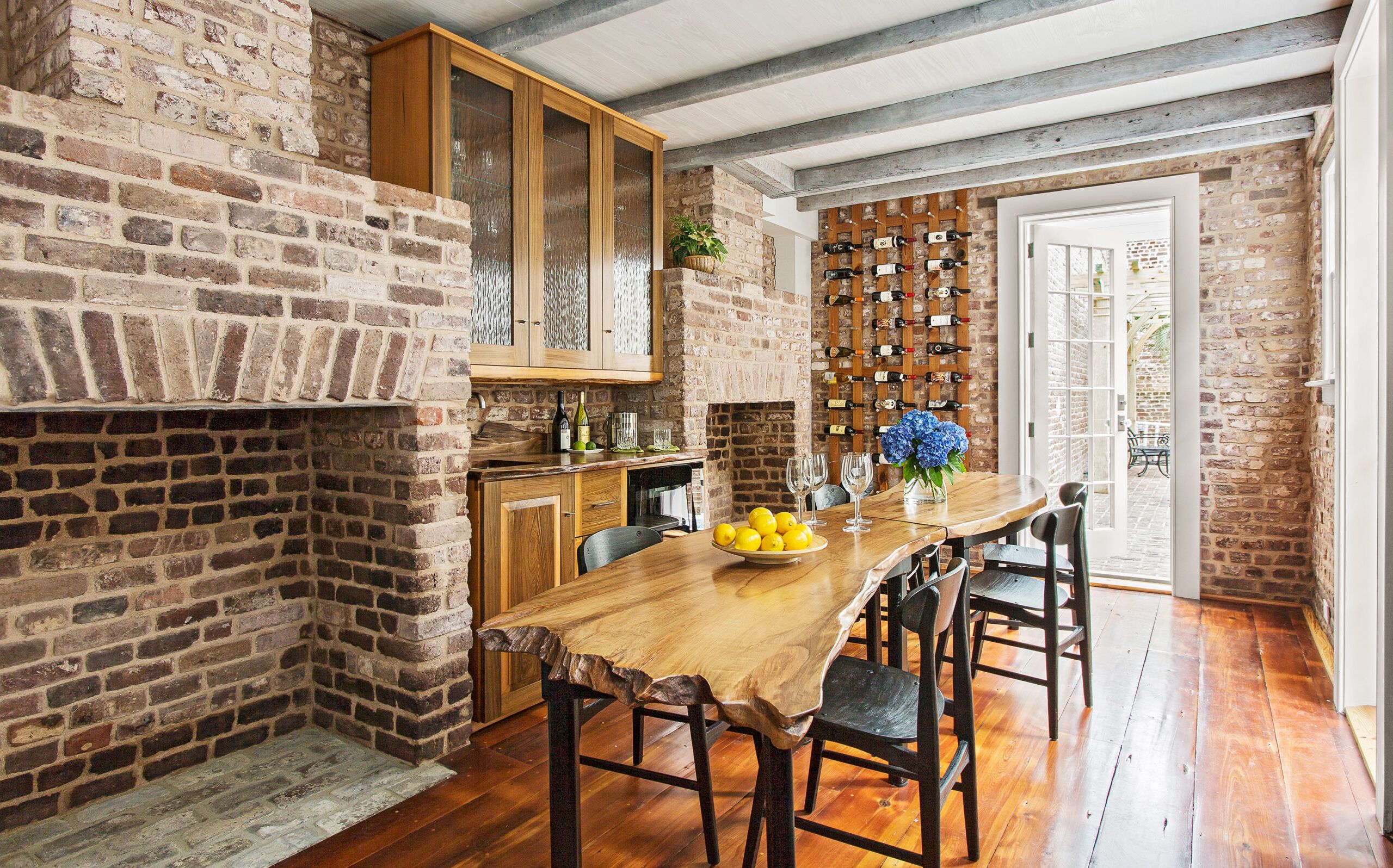
Shown: The 19th-century kitchen house turned dining room retains two original fireplaces: One was used for cooking, the other for heating laundry water. The live-edge dining table and built-in bar feature slabs from a sinker cypress log rescued from a river bottom.
Custom dining table, bar cabinet, and wine rack: Born Again Heartwoods
Clean, Contemporary Living Area
When Kathleen and Scott bought the house, it hadn’t been worked on in many years. Typical of a lot of single houses, the property had a kitchen house—a separate brick structure behind the main house to keep the heat and humidity from cooking and laundry away from the living quarters. “The kitchen house had been used to store some tools and lots of junk,” says Scott, and it had fallen into disrepair. “There were several missing and broken windows when we found it.”
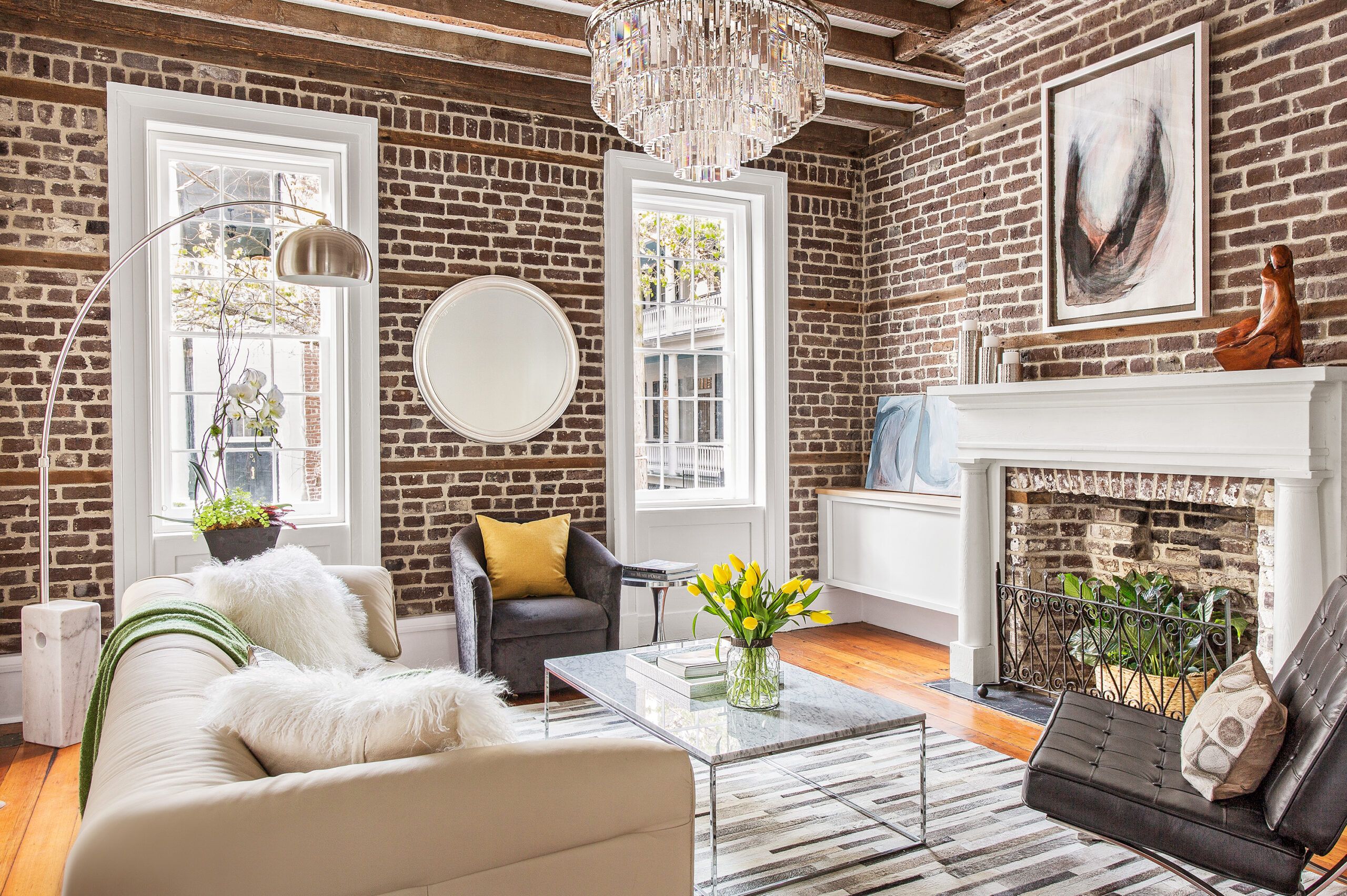
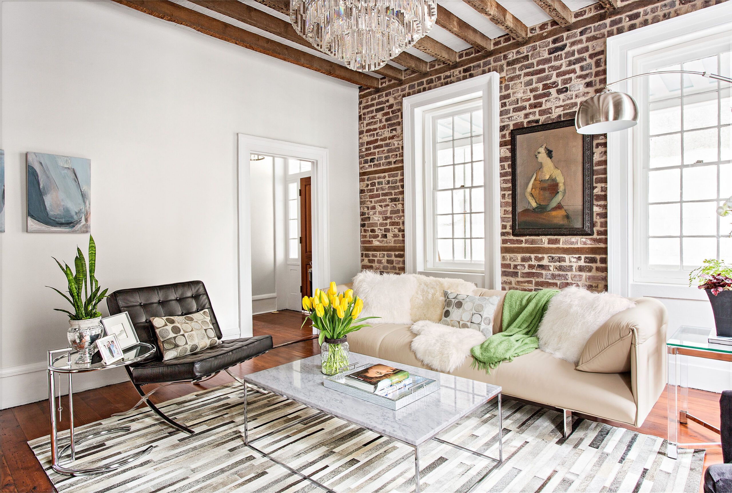
Shown: The living room’s white-painted mantel, window trim, and floating cabinets have a clean, contemporary look that plays off the brick walls and exposed joists overhead.
Sofa, area rug, coffee table, swivel chair, armchair, side table, floor lamp, mirror, chandelier, faux fur pillows, rectangular pillow, candle holder trio: Hayneedle
Living room Artwork: Kirsten Moran
Center Staircase
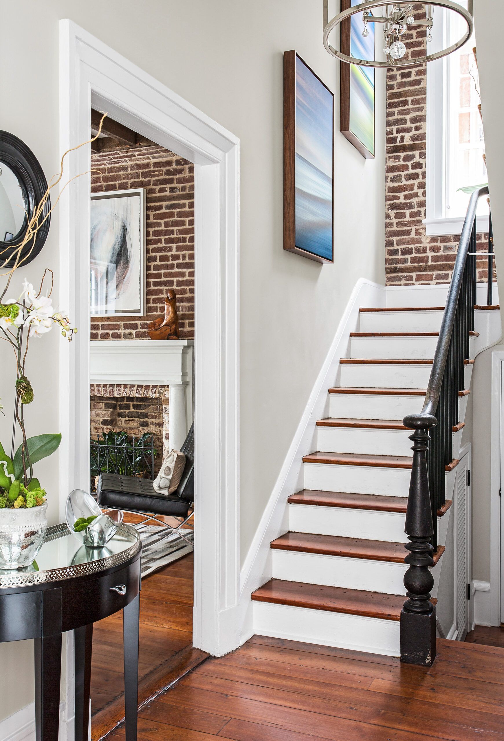
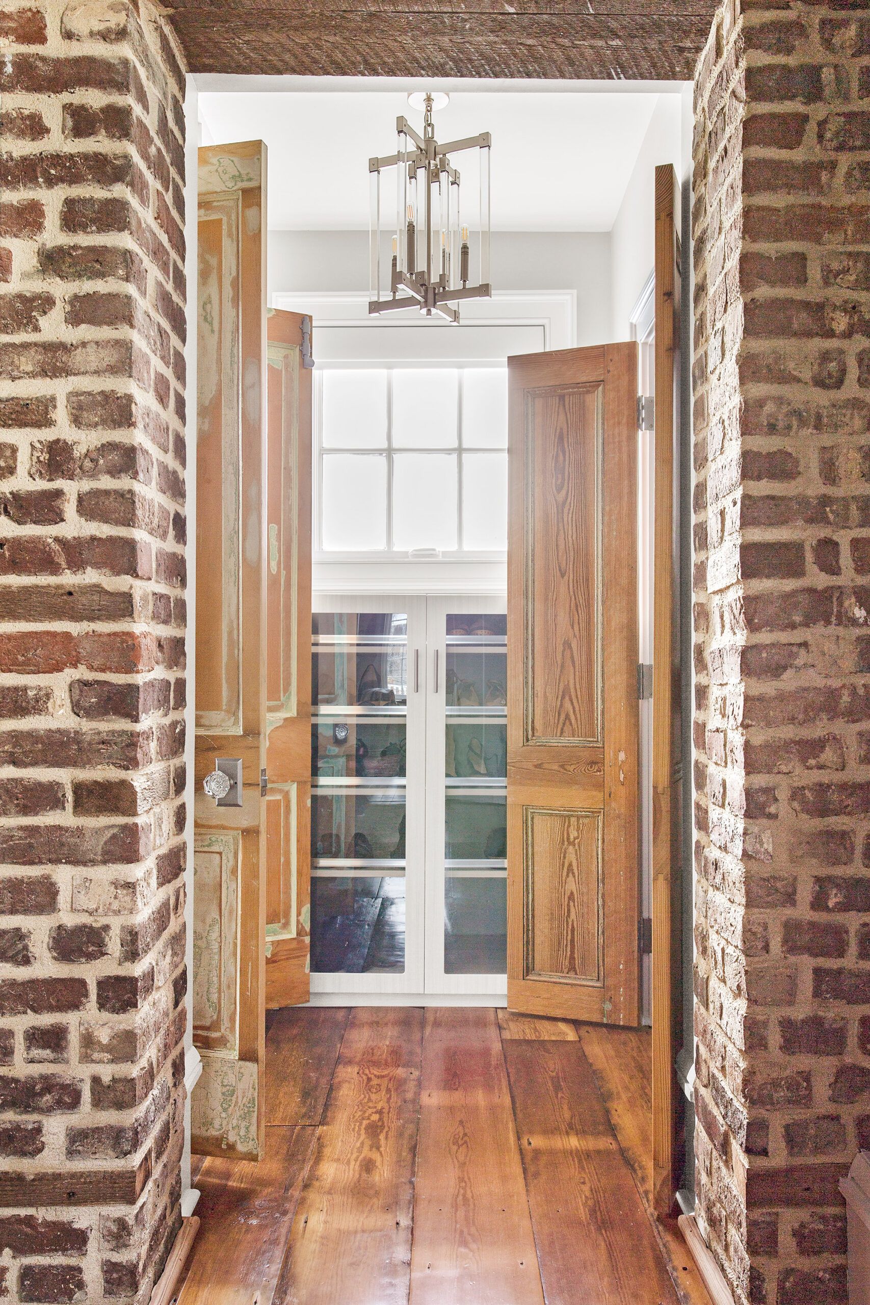
The main house was connected to the kitchen house in the late 19th century by an addition known as a hyphen, according to Huey. But while the hyphen joined the exteriors of the structures, the kitchen house’s brick wall—a literal fire wall—kept the interior spaces separate. Breaking through that wall during the renovation made a true connection between them for the first time. The space inside the connector is now a mudroom with a laundry area. A five-step staircase leads down to the old kitchen, which now serves as the family’s dining room.
Shown: A center staircase rises three stories to the son’s bedroom suite. Heart pine, a durable Southern hardwood, covers the treads and floors.
Stairwell artwork: John Duckworth
Interior Storm inserts: Indow Windows
Master Bedroom
A standout feature of the renovated dining space is the 11-foot-long, 28-inch-wide table designed by Huey and crafted from a centuries-old “sinker cypress” log, pulled from the bottom of the nearby Edisto River, where it had lain for years—a forgotten relic from a 19th-century logging operation.
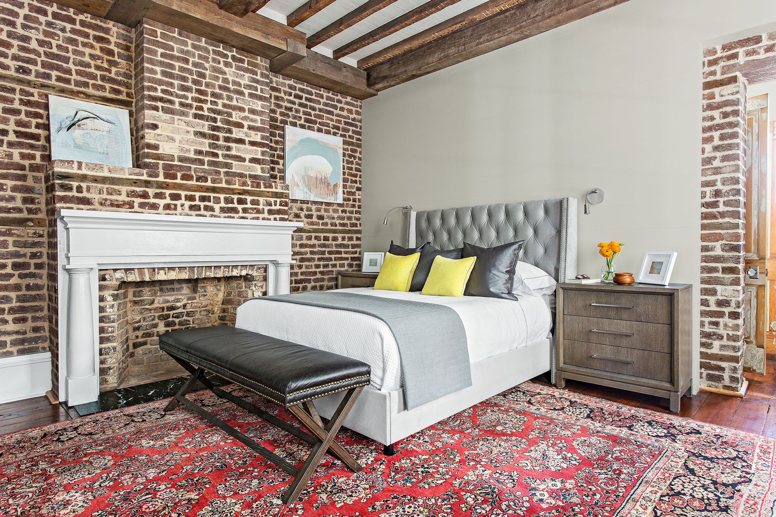
Shown: Smooth drywall behind the bed emphasizes the natural texture of the exposed brick in the master bedroom.
Bed, night stand, decorative pillow, throw: Hayneedle
Linen Cabinet
“The large brick fireplaces in the room—which the homeowners thankfully kept intact—make the space very narrow,” says Huey. As a result, he designed the table to be narrow, with a 2-inch-thick live-edge top that follows the contours of the log’s natural shape and will accommodate staggered seating. Other wood from the same cypress log went into the room’s built-in bar.
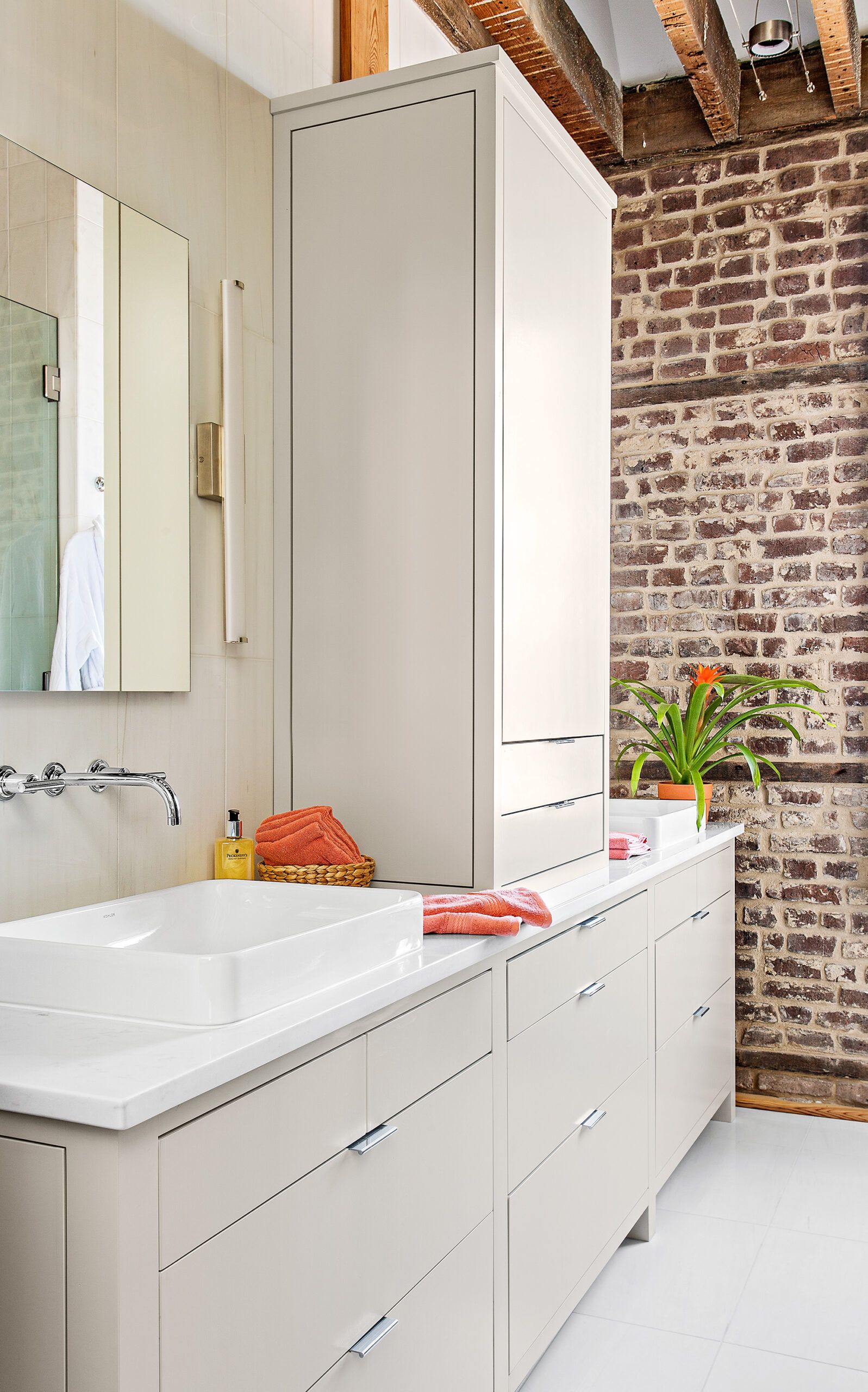
Shown: A tall linen cabinet sits between the double sinks in the master bath.
Master Bath Vanity: Ziacraft LLC
Master bath sinks, faucets, and medicine cabinets: Kohler
Sconces: Tech Lighting
Space-Saving Built-Ins
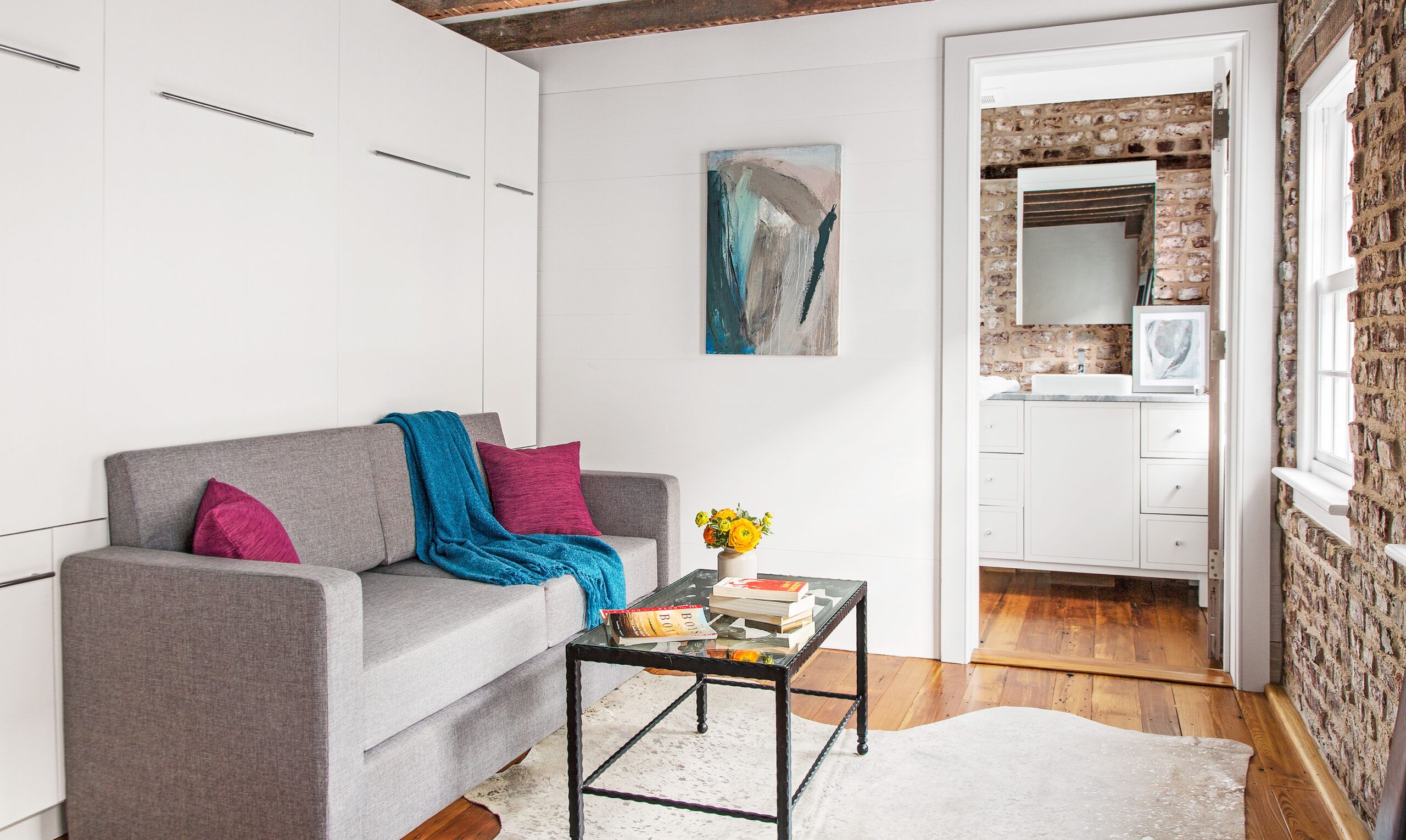
The second floor of the kitchen house was renovated as a guest suite that the Edwardses’ daughter, Abby, will use when home from college. Along with a full bath, the room has a custom sofa that combines with a wall-bed system for sleeping. “For us, it’s a great getaway reading area that can immediately turn into a bedroom,” says Scott.
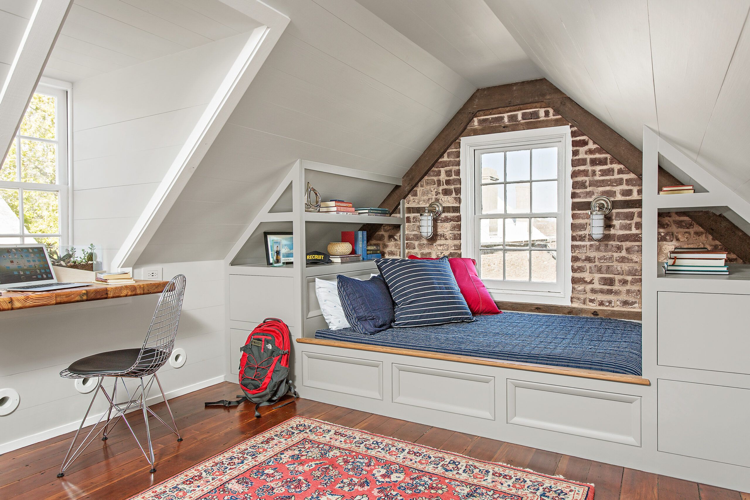
Shown: Built-ins on the third floor take the place of freestanding furniture in the teenage son’s bedroom, saving floor space.
Bedding, chair, pillow: Hayneedle
Sconces: Tech Lighting
Guest Bath
The new kitchen—the former dining room in the main house—presented its own design dilemmas. While early plans called for preserving the original fireplace, space constraints ultimately made this unworkable. The 18-by-18-foot room has three windows and two doors that take up valuable real estate; removing the massive fireplace was the only way to free up enough floor space for cabinetry.
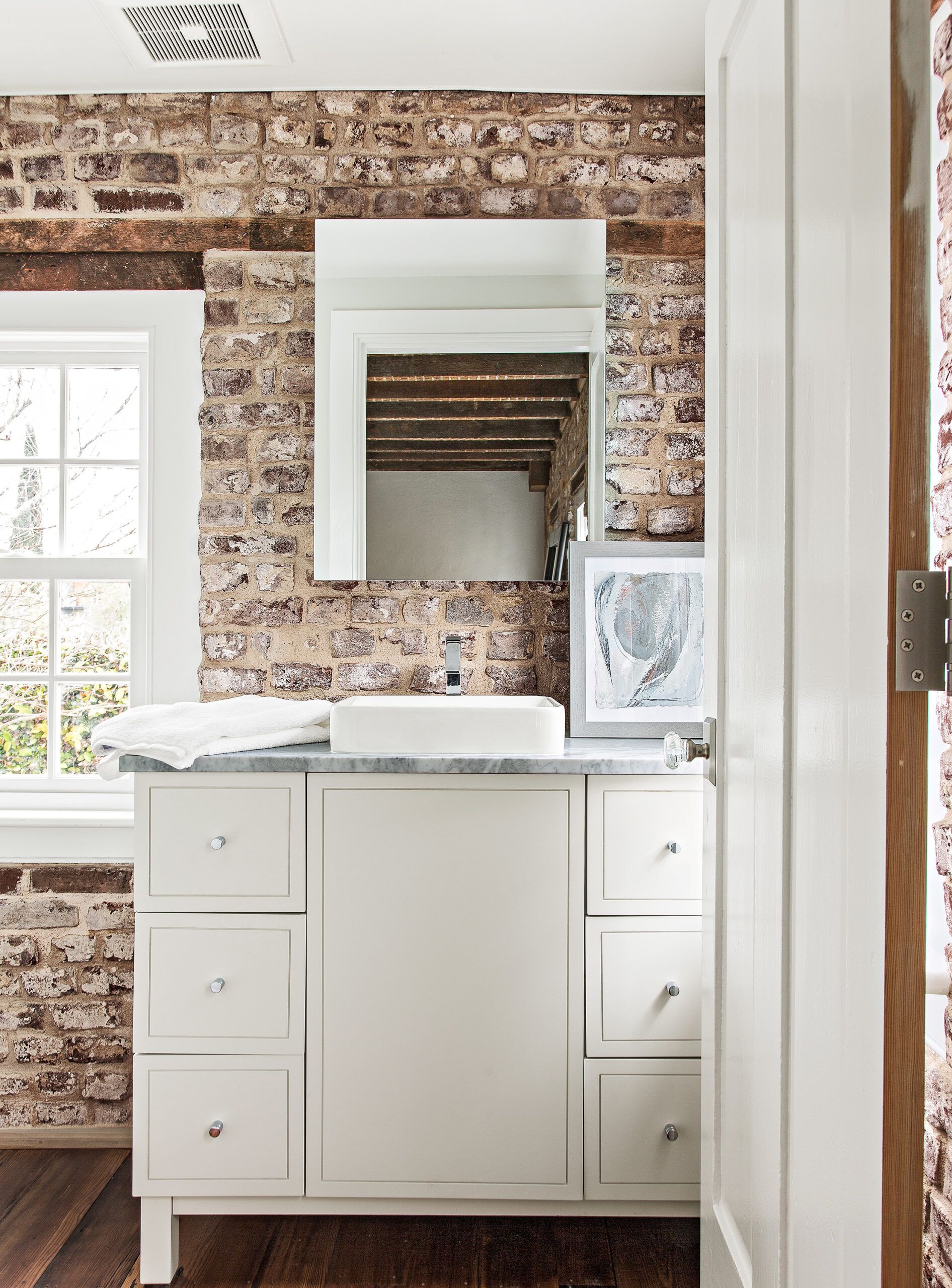
Shown: Under the former kitchen house’s roof and over the new dining room is a full bath, part of the guest suite.
Windows: Marvin
Guest bath sinks, faucets, medicine cabinets, and vanity: Kohler
Ventilation: Panasonic
Towels: Hayneedle
Brick Center Stage
Regalbuto, a local, had run into a similar problem in his own home, and came up with an elegant solution: removing the fireplace, sliding the range in under the chimney breast, and using the existing flue for venting. This allows for a clean, unbroken line of European-style slab-front cabinets in glossy light gray on either side of the range running the full length of the room.
Shown: In the living room, low-slung, clean-lined furniture allows the original exposed-brick walls and heart-pine floors and ceiling joists to take center stage.
Interior storm inserts: Indow Windows
Sofa, area rug, coffee table, armchair, side table, floor lamp, mirror, chandelier, faux fur pillows, rectangular pillow: Hayneedle
Artwork: Kirsten Moran
Alcove
After brick masons took out the firebox, they stepped back the chimney-breast bricks—a process known as corbeling—to the exterior wall. With the stove now tucked back against the wall, centered on the location of the old fireplace, a custom range hood mounted in the chimney flue ventilates cooking smoke and fumes outdoors.
Shown: An alcove between the master bath and walk-in closet holds a dresser cabinet.
Custom cabinet: Tailored Living
Chandelier: Hayneedle
Shower with a View
In the living room, low white cabinets float on each side of the white-painted fireplace mantel, hung from hidden steel cleats bolted to the brick walls and chimney. The cabinet tops—here and throughout the home—are made from reclaimed heart pine that matches the house’s original heart-pine flooring.
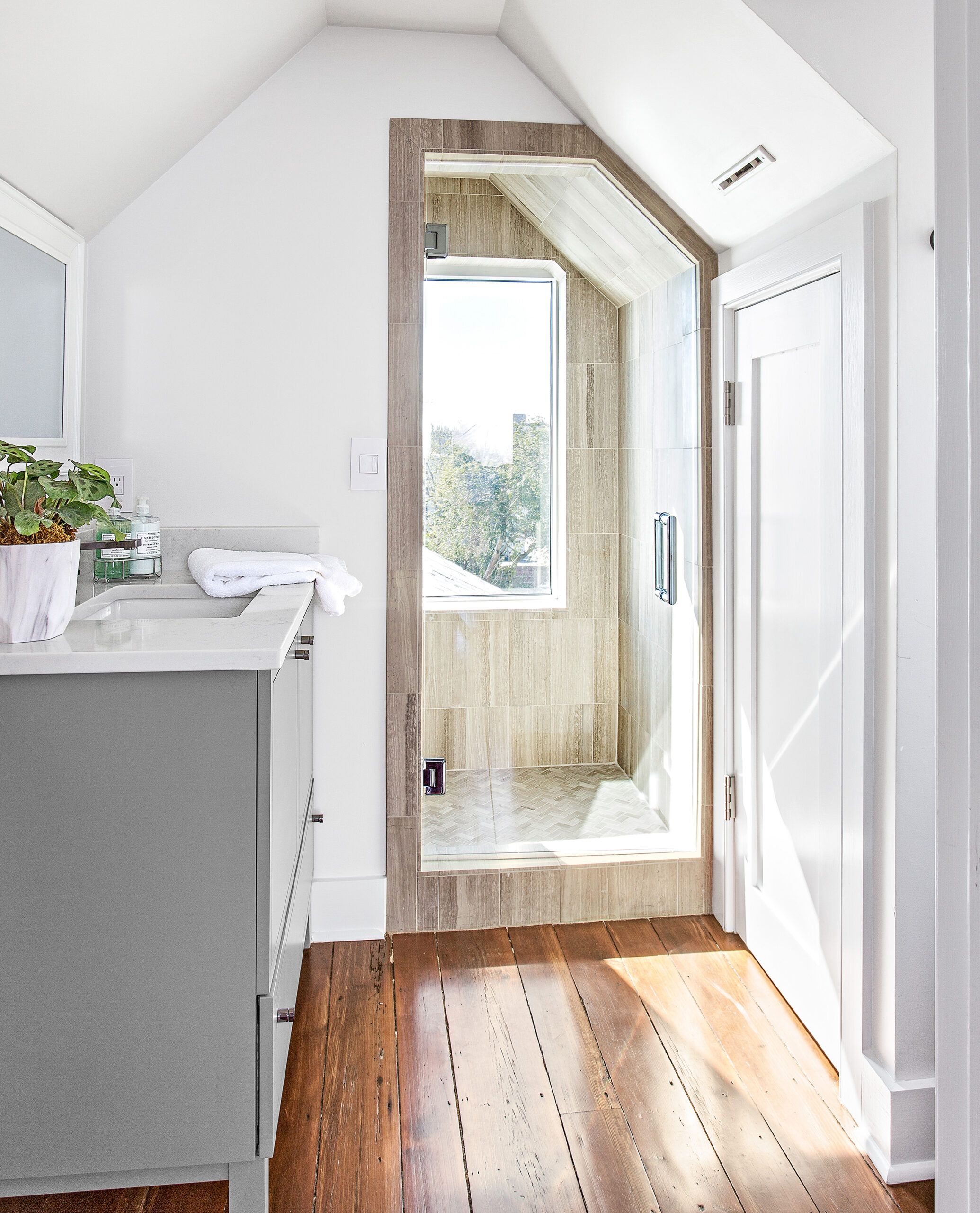
Shown: The shower in the third-floor bath has a full-size window overlooking the side yard. A push-latch door opposite the vanity area accesses a mechanicals closet.
Vanity, sink, faucet, shower fittings, and frameless glass door: Kohler
Wrought-Iron Gate
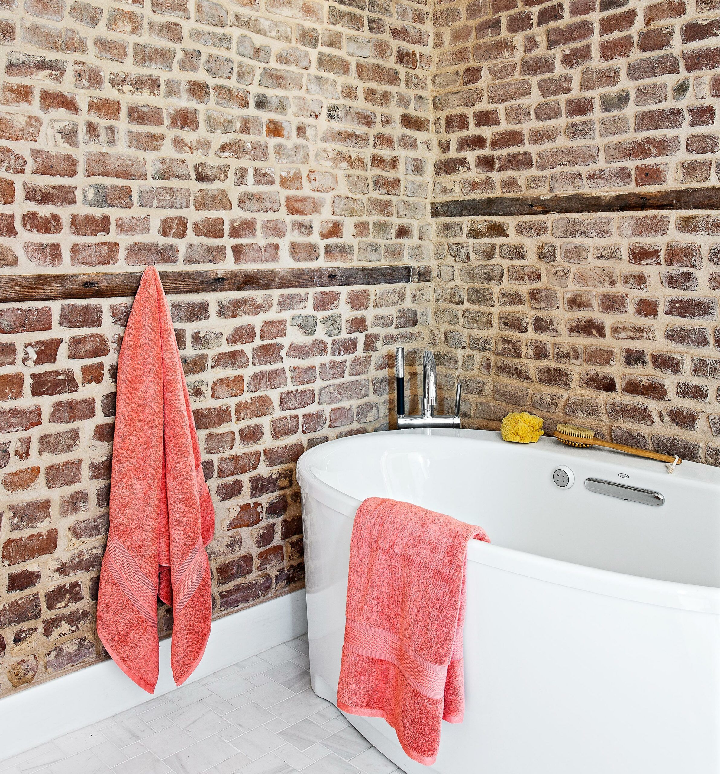
Up the center staircase and beyond the master bedroom, in what was the connector’s second floor, is now a sleek master bath with a linen cabinet between matching double sinks. Space is tight in the relatively small room, which might have prohibited having a separate tub and shower. The workaround: Both tub and shower sit behind a large glass-wall partition with a door to “the wet room,” as Scott refers to it. “It saved a lot of space,” he says. “And it really doesn’t matter if the tub gets splashed when someone is taking a shower.”
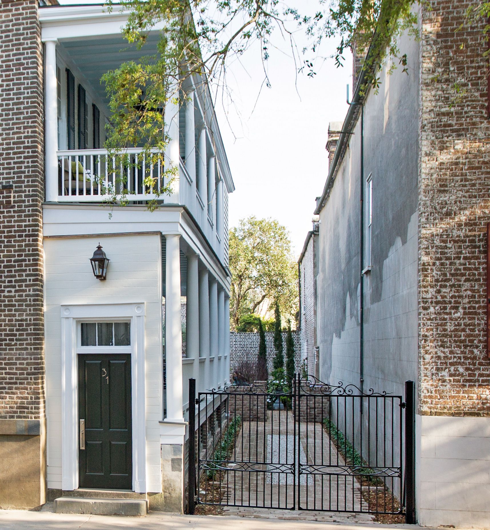
Shown: Students at Charleston’s American College of the Building Arts helped design and execute the new wrought-iron double driveway gate, as part of TOH’s Generation NEXT initiative.
Front door hardware: House of Antique Hardware
Side Porch
Scott and Kathleen expect to spend a lot of their time in the second-floor library across the hall from the master bedroom. The quiet space is fitted with built-in cabinets, bookcases, media equipment, and an office area for Scott. Custom interior storm inserts installed on the original street-facing wood windows help conserve energy as well as block street noise.
Shown: Located five steps above street level, the front door opens from the first-floor piazza, or side porch, onto the home’s center staircase.
Recycled rubber mat: Hayneedle
Upper Piazza
Tucked into the third floor is an aerie for 15-year-old Tradd Edwards, which he will have virtually to himself. His snug street-side bedroom has a built-in double bed flanked with large drawers and storage shelves that follow the angle of the sloped ceilings. A heart-pine desktop is nestled into a dormer alcove nearby. Down the hall, which holds his closet, is a full bath with the old-house quirk of a full-size window in the shower overlooking the side yard.
Shown: The far end of the two-story piazza overlooks the backyard garden, seating areas, and lap pool.
Guest Suite
Walking down the street now, past the Edwardses’ house, you might notice its fresh paint, repointed brick, and renovated two-story piazzas just visible through the new wrought-iron double gate. What you can’t see are the interior improvements, the re-imagined floor plan, the sleek kitchen and baths that bring the building’s original fabric into sharp relief.
Shown: Located upstairs in the former kitchen house, the guest suite holds a sofa that’s part of a fold-out wall-bed system.
BredaBeds sofa and wall-bed system: Tailored Living
Windows: Marvin
Glass-Enclosed
As expected, the family find themselves gathering nightly in the library—”it’s such a warm space,” says Scott. One surprise is how much time they spend outside, reading or having a meal in the private outdoor seating areas that are tucked behind the kitchen house. For these serial renovators, “watching an old house in terrible condition come back to life, with whatever vision you have for it, is one of the most satisfying things ever,” Scott adds. But for now, at least, he and Kathleen are ready to just relax and enjoy the rewards of a job well done.
Shown: The master bath’s tub and shower sit behind a glass-wall enclosure that keeps the rest of the room dry.
Tub and tub filler: Kohler
Poolside Patio
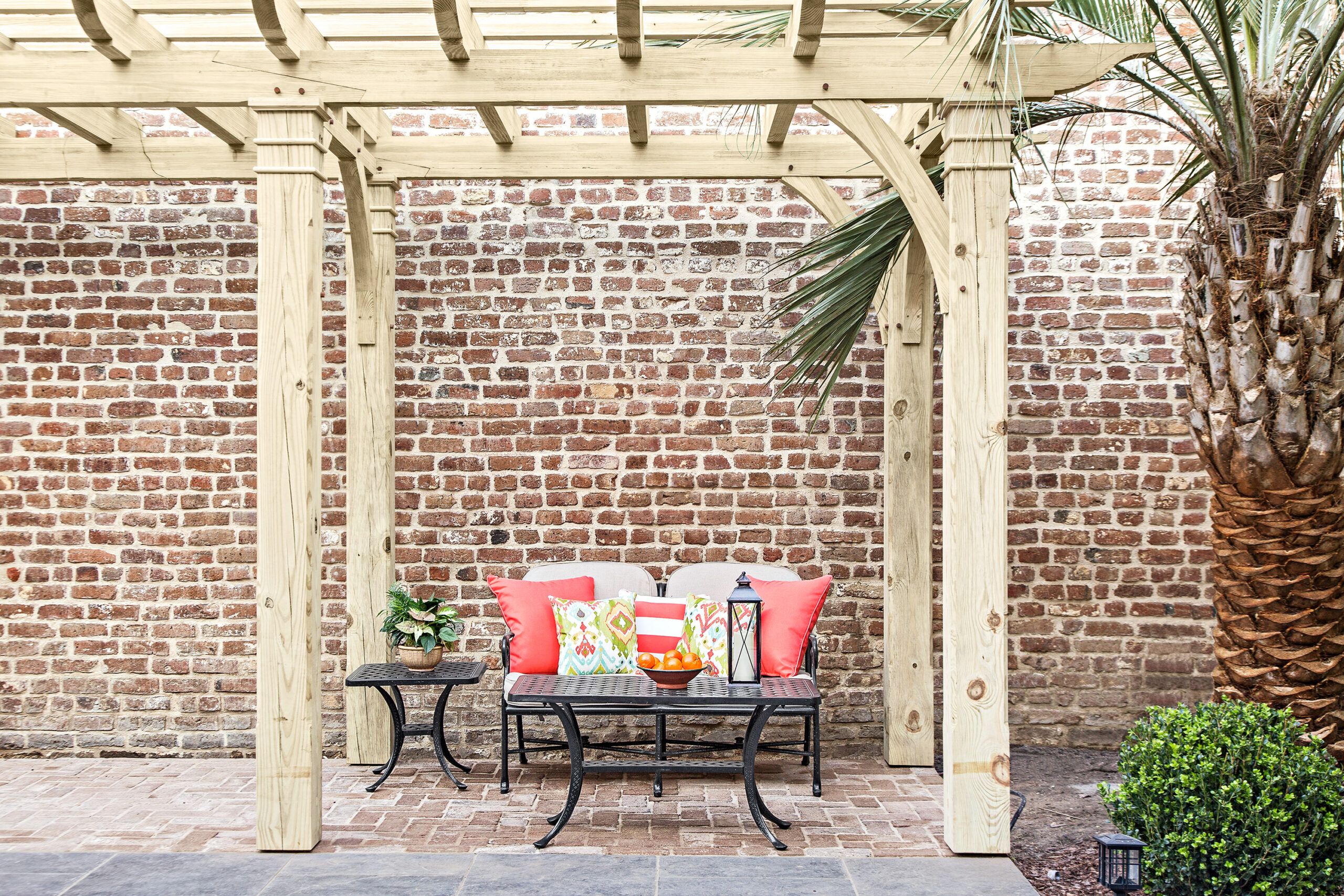
A poolside brick patio holds a seating area defined by a pergola, which was built with help from students at Charleston’s American College of the Building Arts.
Pergola: Timber Artisans LLC
LED lantern; outdoor pillows in solid, striped, multi: Hayneedle
Floor Plans, Charleston South Carolina
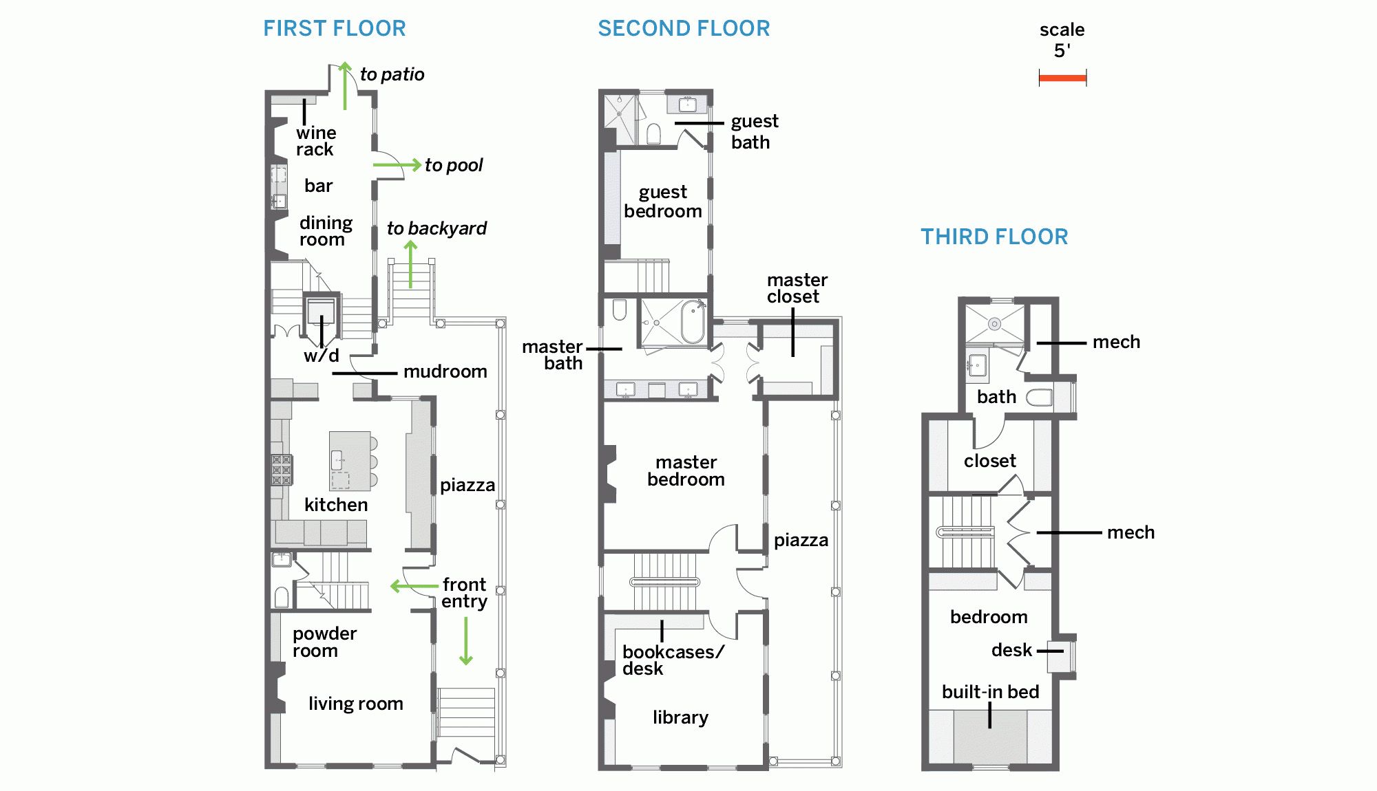
Inside the 2,737-square-foot house, the dining room moved to the old kitchen house, with a guest suite above it, and the kitchen relocated to the dining room’s spot. A mudroom replaced an existing kitchen in the connector. An upstairs sitting room became a library, and a spacious master suite went in; the attic got another bedroom suite.
Architect: Bill Huey, Bill Huey + Associates, Inc.
General contractor: Mark Regalbuto, Renew Urban Charleston
Landscape architect: Glen Gardner Landscape Architect
Lighting designer: Charleston Lighting & Interiors
HVAC installation: B&D Heating and Air
Interior plasterwork: Charleston Plaster
Front-door hardware: House of Antique Hardware
HVAC: The Unico System
Kitchen designer and cabinets: SieMatic
Kitchen faucet and sink: Kohler
Garbage disposal: InSinkErator
Appliances: Miele
Ventilation: Panasonic
Sinker cypress live-edge dining table: Bill Huey (table design); Justin Herrington (carpentry), Born Again Heartwoods
Living room mantel restoration: Ziacraft LLC
Master suite custom closets and closet built-ins: Tailored Living
