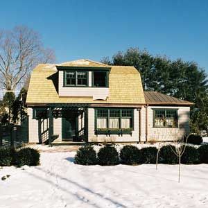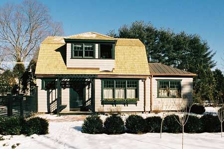
The Concord Cottage offers a mere 1,000 square feet for an entire home: kitchen, dining room, storage, living space, storage, bedroom, baths—and did we mention storage? Jackie Buckley moved from a nine-room house into this cozy little home, and although she jettisoned possessions, she still needed lots of space for books, linens, kitchen gear, clothes, mementoes, and the rest of the “stuff” she couldn’t bear to leave behind. Even with daughter Janet Bernard and her husband Jeff making space for storage in their own basement, it was imperative that the cottage provide enough storage space for everyday items.
Holly Cratsley of Nashawtuc Architects designed a space plan that took advantage of every centimeter allowed by the Concord zoning rules; she created an interior layout on two floors that could be converted to a single-story apartment should Jackie prefer that later. Interior designer Tricia McDonagh of Charles Spada Interiors took an efficient and well-designed space plan and turned it into a beautiful, comfortable, and workable home. Starting from the architect’s layout, McDonagh took the raw shape of the cottage and transformed it into a real home, with detailed drawings and plans for everything from the doorways and entry flooring to the kitchen cabinets and furniture upholstery.
“Tricia is the one who pulled it all together,” says Janet Bernard. “We wanted it to have an overall feeling of elegance and simplicity, very home-like. The first thing we did was work with the architectural elements; in Tricia’s first attack at the space she made the doorways into arches, and she separated the kitchen from the dining room with glass windows.”
McDonagh says she likes working in small spaces, since she sees it as a puzzle, with pieces that have to be made to fit. In a small space, seemingly simple changes in the floor plan can make a big difference—widening the doorways and turning them into archways helped bring more light into every room. “The attributes I give to a project can add warmth,” she says. “The arches give the cottage the character of an old carriage house—that has a little more romance than an old barn, and creates a little formality.”

It was Jackie’s sense of tradition that drove the design, says McDonagh. For example, the basic layout showed the kitchen open to the dining room, in a relatively modern design. McDonagh separated the two rooms with a wall of windows. “The trend toward open kitchen/dining room plans is okay if you have kids and you need to keep an eye on them,” she says, “but it’s gone a little too far. Separating the rooms made the kitchen warmer, and now the dining room can be a separate space. This way you can make it as formal or informal as you need.” McDonagh also enclosed the entry foyer into a defined space instead of allowing the front door to open into the main room of the house.
Once the basic layout was complete, McDonagh turned to what she calls the “backdrop”—the walls and built-ins that define the character of the rooms. “Before Tricia designed the backdrop,” says Janet, “she sat with my mother to ask about what her life is like. How does she live? She reads constantly, and watches news shows and financial shows. She loves to sit and spread out the newspapers.” The respect for tradition, the need for storage, and the desire to spend time reading and relaxing in comfort drove the rest of the design.
“There are lots of storage issues in this project,” says McDonagh. “So everything does double duty. The kitchen banquette has drawers, the living room has a built-in desk and file drawers, and even the mechanical room has some storage in it. There’s a built-in cabinet in the dining room for glassware and other items. The front entry bench opens, and there’s a bench on the stairwell that also opens. Upstairs there’s a walk-in closet, and under the windows there’s a built-in chest of drawers.”
Before she started on the furnishings, McDonagh finished off the backdrop with some fine details for the walls: grid-patterned panels that carry throughout the house and continues up the stairs. “The repetition shows rhythm,” she says. “The panels are a little different from room to room, but they add grace so the house isn’t choppy.” McDonagh also added moldings and chair rails to soften the space and contribute to the antique carriage house feel of the cottage.

Before choosing interior paint, McDonagh suggests looking at furnishings and fabrics. “Once you pick a paint color you’re committing” to a color palette for the room, she says. “It’s better to choose your fabrics and materials first. It’s easier to line up fabrics with chips and pick the right paint color.”
Jackie was clear on her preference for traditional-looking furniture and fabrics. “I’m using things that are simple and classic, not overly prettified,” says McDonagh. “Jackie evokes a warmth, and the house needs to do that, too.”
Janet is especially enthusiastic about the coordination and flexibility of McDonagh’s choices. “It’s all so cool!” she says. “My mother told Tricia from the beginning that she likes traditional-looking things. Tricia chose elegant fabrics that would look like they’d been there for a while, nothing too bold or too overwhelming. There are paisleys, velvet, and a beautiful butterscotch leather on the dining room seats. And she focused on versatility, so that there’s a double purpose for everything. The kitchen banquette has two side chairs, and there are four chairs in the dining room. Their fabrics are complementary so you can bring the two extra chairs in to seat six in the dining room. In the living room, the desk chair can be turned around and used for seating as well, and the dining room chairs can be brought in, since all the fabrics work together. The desk chair can also be brought into the dining room. The fabrics are all low maintenance, easy to care for, and should age well.”
Then it was time to choose colors, and McDonagh waxes surprisingly eloquent about her choice of… beige. “People think beige is simple and boring, but it’s quite nuanced,” she says. “There are so many shades. Some beiges can be so beautiful—they have real depth, they’re just gorgeous. For the walls we picked a historic beige that feels like taupe next to the white trim.”
(If you’ve ever agonized over the tiny color chips in a paint store, only to choose the wrong shade anyway, McDonagh has some advice. “In choosing paint, the secret is restraint,” she says. “Whatever you think is right, take a step or two back. It’s more intense on the walls, and more intense in contrast to colors around it.”)
Finally, McDonagh added the finishing touches —the lighting fixtures, drawer pulls, door hardware, everything. Janet has become her biggest fan. “A lot of people fancy themselves decorators, and they’re good at picking pillows, but Tricia can coordinate everything—fabric, pulls and knobs, even the door hardware and keyholes. There’s not a single area she’s not concerned about. She labors over absolutely everything, and she files things away in her brain. She’ll come back to something you mentioned ten minutes ago and talk it through. Even the door hardware is hand forged, so it looks old. You just want her to come and take over your life, pick out your clothes for you!”

