A Redo for Aging in Place
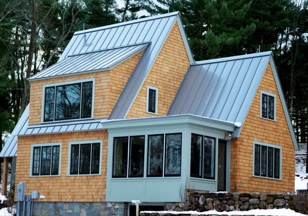
When John and Julie Corcoran began casting about for a place near their home, in Essex, Massachusetts, for Julie’s parents to live, they didn’t have to look very far: A 1935 cottage on a wooded lot nearby happened to be available. But the 1,800-square-foot house, which became the current TOH TV project, needed more than just a run-of-the-mill remodel. Though Julie’s parents are in good health, the Corcorans want them to be able to stay in the home as they grow older. So TOH general contractor Tom Silva teamed up with architect Sally DeGan, designer Keith Musinski, and the rest of the crew to build aging-in-place accommodations into the renovation. While the design stops short of supporting fully independent living for someone in a wheelchair, “the house can easily work for people with limited mobility and other age-related health challenges,” says DeGan. Just as important, it feels comfortable and welcoming instead of cold and clinical. Read on to learn how the pros made the cottage accessible while preserving its coziness, quirks, and charms.
Easy-Access Entry
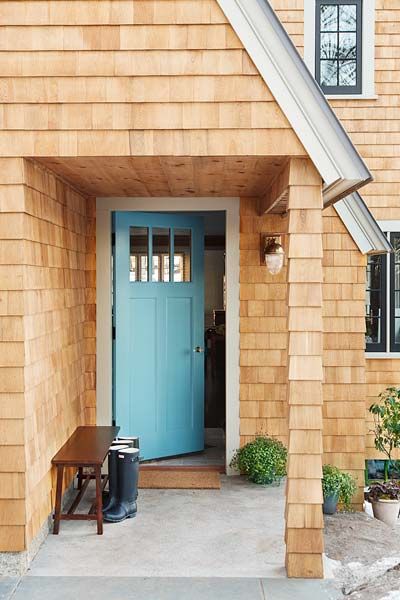
The grade-level porch and a 36-inch-wide front door support people with impaired mobility. “Because the house is perched on a hill, we had to rework the sheathing, framing, and foundation to bring the walkway flush to this spot,” says architect Sally DeGan.
General contractor: Tom Silva
Plumbing and heating expert: Richard Trethewey
Landscape contractor: Roger Cook
Architect: Sally DeGan, SpaceCraft Architecture, Lexington, MA
Landscape architect: Terraink Landscape Architecture, Arlington, MA
Streamlined Cook Space
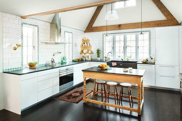
The kitchen boasts easy-to-turn lever taps, cabinets with electric touch-to-open doors and drawers, and a flameless induction cooktop that cools instantly when a pan is pulled off a burner. Off-white walls and backsplash tile reflect natural light to brighten the space. Homey touches, such as tile borders around the windows and an island with furniture-like turned legs, make the space feel anything but institutional. Overhead, salvaged framing timbers were added as decorative accents to play up the steep gable and dramatic peaked ceiling.
Kitchen cabinets: Poggenpohl
Faucet hardware: Jado
Flexible Open Plan
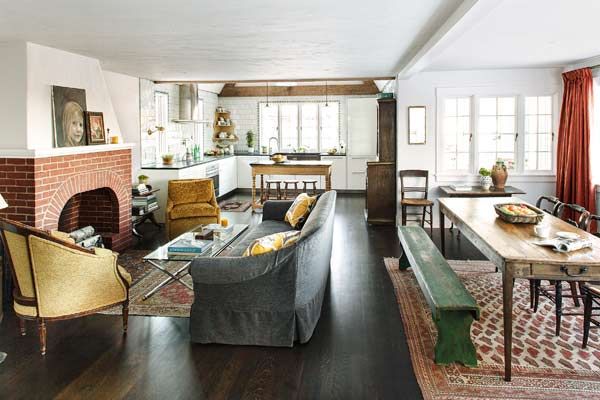
Once divided into small, dark rooms, the first floor’s common spaces were joined into a big open space to allow furniture to be moved or reconfigured easily as the homeowners’ needs change. Tom cut more window openings into the facade, so there’s no need to flip on lights during the day. The bright, airy interior is warmed by oak floors stained chocolate brown and furnishings with texture and time-honored patina. Period touches remain as well: The fireplace was rebuilt using original and salvaged bricks, and the hearth tiles were removed for cleaning, then reinstalled.
Interior designer: Keith Musinski, Equilibrium Design, Beverly, MA; 617-733-5871
Wood flooring: Lumber Liquidators
First-Floor Bedroom
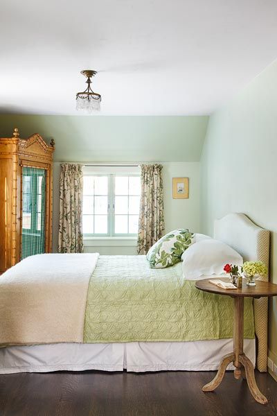
Placing a master bedroom downstairs means no steps to negotiate. Though it isn’t large, this one has enough space to maneuver around the bed, and an opening to the bath (not shown) can be closed off with a pocket door.
Radiant heat: Uponor
Roll-In Shower
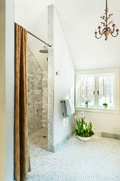
The centerpiece of the spacious and sunny master bath is a curbless shower. Measuring 4 by 8 feet, it has room for both a person in a wheelchair and an attendant, and the fixtures are placed so that you can fine-tune the water temperature before stepping into the spray. One-inch hexagonal marble floor tile, with its tightly spaced grout lines, provides good grip underfoot. “It’s both supportive and attractive,” says designer Keith Musinski.
Windows: Marvin
Floor Plan: Single-Level Living
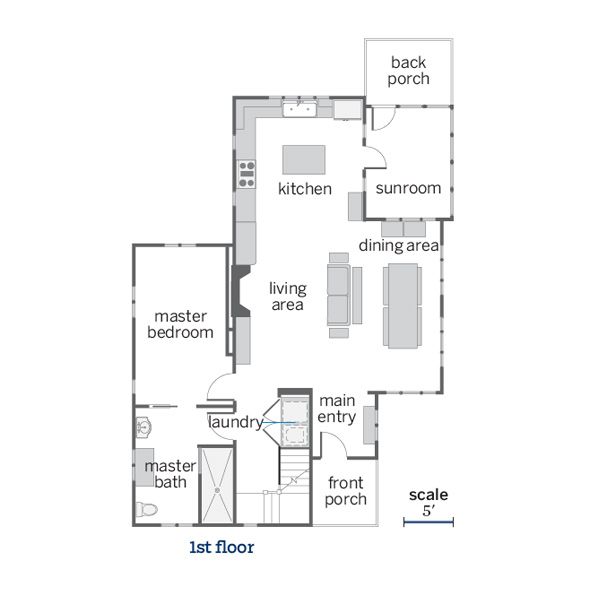
Though the house has two floors, the couple could live entirely downstairs. A niche for a washer and dryer was added adjacent to the master suite, and a doorway to the bedroom was widened to improve accessibility.
Pro Advice: “Designing for aging in place just makes sense when you’re doing a major renovation. Widening doorways and choosing nonslip flooring are easy things you can do to improve safety and comfort without sacrificing aesthetics.” —Tom Silva, TOH General Contractor
