With so many options available, choosing the right paint colors for your home can be daunting. A color wheel can make this process easier by helping you create cohesive and attractive color combinations for your living spaces.
Our guide explains how to use a color wheel, along with tips and examples of complementary color schemes that can refresh your home’s decor.
What Is a Color Wheel?
A color wheel is a useful tool for both professional painters and DIY enthusiasts. It offers a visual representation of color relationships that makes it easier to understand how different hues interact. It’s built from three primary colors — red, blue, and yellow — which combine to create three secondary colors: orange, green, and purple. Additionally, six tertiary colors, such as red-orange and blue-green, are formed by mixing secondary colors.
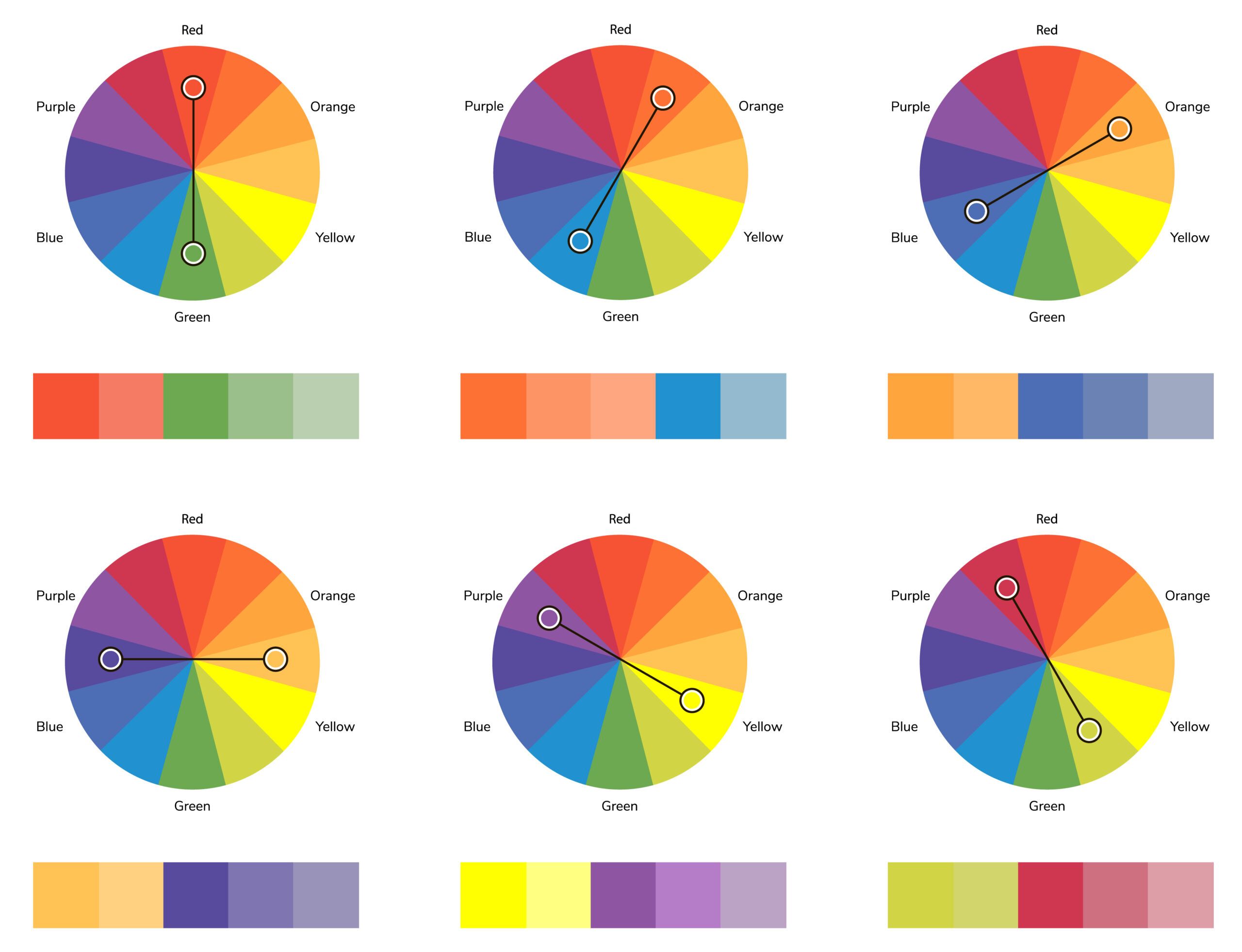
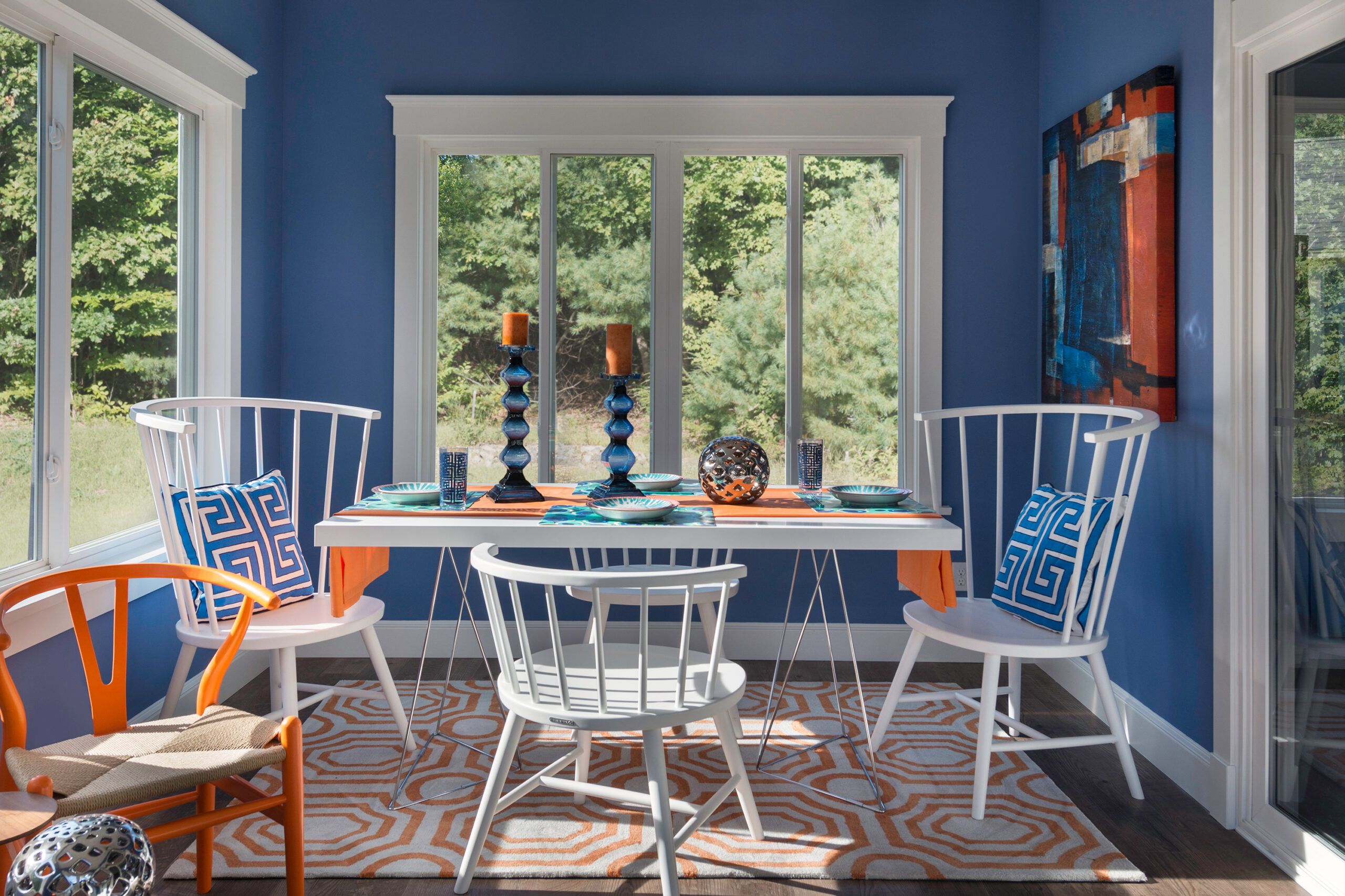
Often, designers look to use complementary colors. These are colors that are directly opposite each other on the color wheel, such as blue and orange or red and green. Complementary color schemes create a vibrant and dynamic look because the colors contrast sharply. This is ideal for making a feature wall stand out or adding bold accents in a room.
Other color schemes include:
- Analogous colors: These are colors that are next to each other on the color wheel, such as blue, blue-green, and green. Analogous color schemes create a harmonious and soothing look, as the colors naturally blend well together. This is perfect for creating a relaxed, cohesive feel in a room.
- Monochromatic colors: This scheme involves using different shades, tints, or tones of a single color. A monochromatic scheme is subtle and elegant, creating a sense of unity and simplicity in the space. This approach works well in minimalist or modern designs.
- Triadic colors: A triadic color scheme uses three colors that are evenly spaced around the color wheel, such as red, yellow, and blue. This scheme offers a balanced and vibrant look, making it great for playful or eclectic spaces.
Color Psychology in Interior Design
Color psychology encompasses not only primary paint choices but also accent colors and decor. These colors, present in furniture, artwork, and accessories, can contribute to the overall vibe of the room.
Traditionally, color wheels are divided into warm and cool colors. Warm colors, like those on the yellow-red side, tend to energize and expand spaces, while cool colors, found on the blue-green side, are calming and can make spaces feel more intimate. By strategically using warm or cool tones, you can influence a room’s mood and perceived size.
Here’s a breakdown of the moods and feelings commonly associated with each color.
- Blue: Promotes calmness and relaxation, making it ideal for bedrooms and bathrooms.
- Green: Associated with nature and growth, it’s perfect for creating a refreshing environment in living rooms or home offices.
- Purple: Conveys luxury and creativity, ideal for accent walls or artistic spaces.
- Red: Stimulates appetite and conversation, making it a good choice for dining rooms or social spaces.
- Yellow: Evokes feelings of happiness and energy, suitable for kitchens and dining areas.
By considering the psychological impact of colors alongside their visual appeal, you can create spaces that not only look beautiful but also support each room’s intended function and mood.
Tips for Using a Color Wheel in Home Design
To help you make the most of the color wheel when choosing paint colors for your home, consider these tips:
- Start with a neutral base: Use neutral colors like white, beige, or gray as a foundation, then add complementary colors as accents. This creates a timeless look that can easily adapt to changing tastes.
- Consider the 60-30-10 rule: Use your dominant color for 60% of the room, a secondary color for 30%, and an accent color for 10%. This balanced approach ensures a cohesive design.
- Use the color wheel to create monochromatic schemes: Choose different shades and tints of the same color for a sophisticated, cohesive look. This is particularly effective in small spaces or areas where you want a serene atmosphere.
- Experiment with analogous colors: Select colors that are next to each other on the color wheel for a harmonious, less contrasting palette. This is ideal for creating serene and comforting spaces like bedrooms or bathrooms.
- Take lighting into account: Natural and artificial lighting can significantly affect how colors appear in a room, so test your chosen colors under different lighting conditions.
Using Complementary Colors
A complementary color scheme is an effective method for choosing paint colors. Complementary colors are found directly opposite each other on the color wheel. When used together, these colors create a striking contrast that enhances the vibrancy of both hues. This approach can help you achieve a balanced and visually interesting look in your space.
When experimenting with complementary colors, consider the proportions in which you’ll use them. Dominating a space with one color while using its complement as an accent can create a visually appealing and proportional setup.
Color Wheel Complementary Color Examples
Understanding complementary color pairs can help achieve a balanced room by blending cool and warm tones. Here are examples of effective complementary color pairings and how to use them in your home.
Red and Green
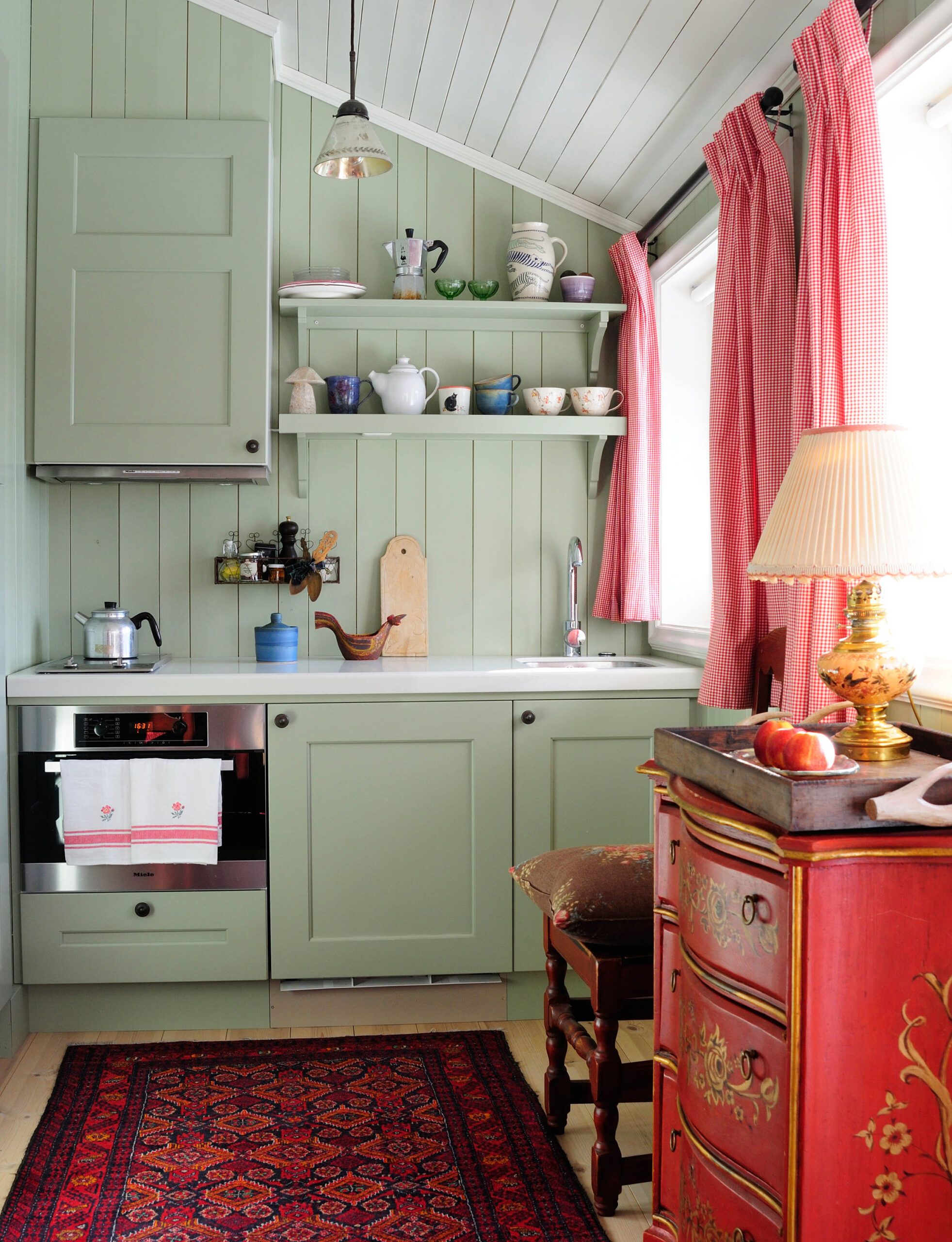
Green, which is associated with nature, paired with the strong passion of red, brings a balance that evokes both calmness and excitement. Such combinations are particularly effective in areas designed for socializing and relaxation, like kitchens and living rooms.
When considering paint colors, consider the finish of any existing woodwork in the room. In this rustic kitchen, the green hues on the walls and lower cabinets beautifully complement the red tones of the sideboard, rug, and drapes. This combination creates a warm and inviting atmosphere while maintaining visual interest.
Red-Orange and Blue-Green
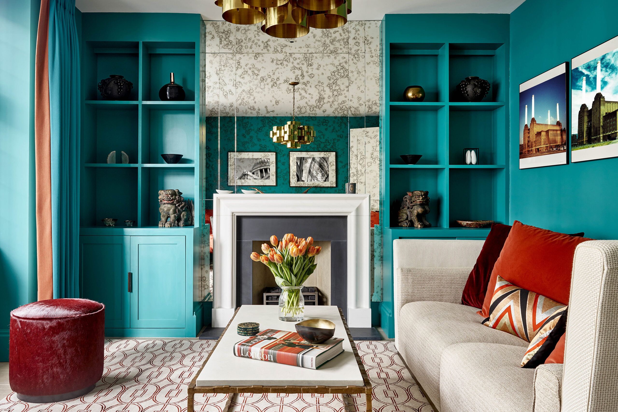
Red-orange signifies energy and warmth, whereas blue-green signifies calm and peace. This contrast can create a vibrant and exciting aesthetic suited for creative spaces such as studios or eclectic living areas.
Complementary colors can be effective in a room even if they don’t have equal prominence. You can use one color as the main focus and the other as an accent. Alternatively, you can introduce small colored accessories into an already-painted room to experiment with the pairing. This approach allows you to gradually incorporate complementary colors without committing to a major change.
Orange and Blue
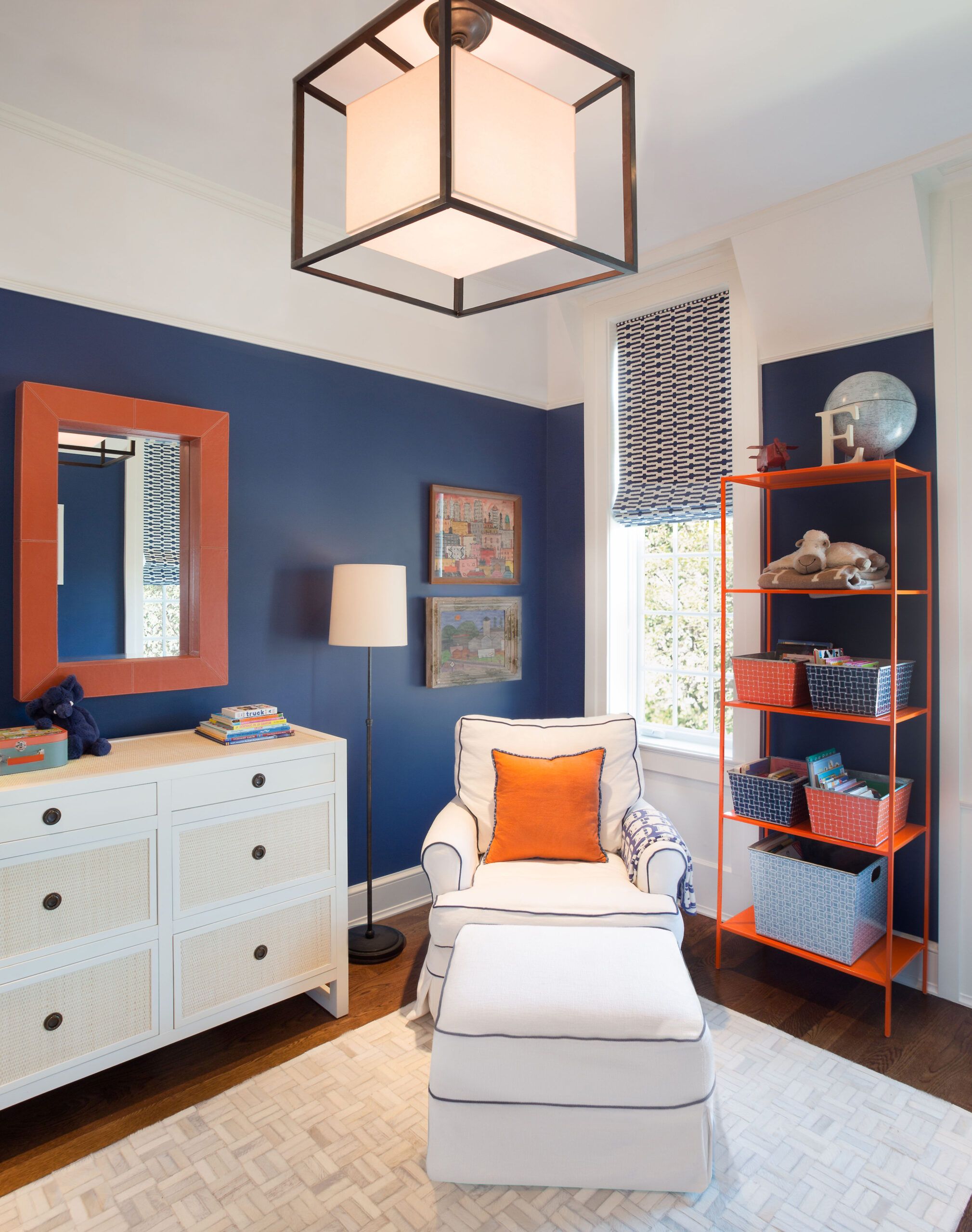
Blue is known for its calming effect, while orange radiates energy. Using these colors together can make a space feel both lively and balanced. This pairing works well in lively areas such as children’s bedrooms or recreational rooms.
When selecting a new paint color, keep your existing furniture in mind. This wall’s deep blue paint accentuates the bright orange burst on the pillow, mirror, and shelving unit. This creates a dynamic and energetic space that feels both cohesive and visually interesting.
Yellow-Orange and Blue-Violet
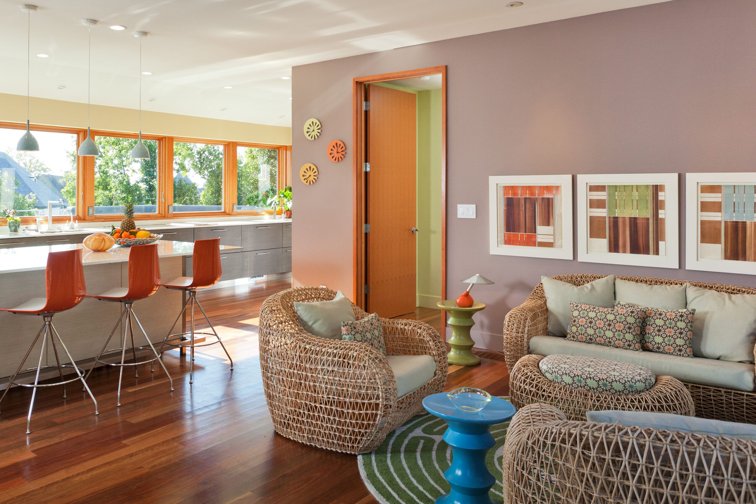
Using yellow-orange and blue-violet pairs the warmth and happiness of yellow with the depth and tranquility of violet. This combination is ideal for communal spaces like family rooms or open-plan kitchens where activity and relaxation happen simultaneously.
Bright colors can breathe new life into traditional woodwork and are particularly effective in casual living areas. When working with more saturated hues, remember that colors often appear more intense on walls than on paint swatches. It’s a good idea to test your chosen colors on a small area of the wall before committing to the entire room.
Yellow and Violet
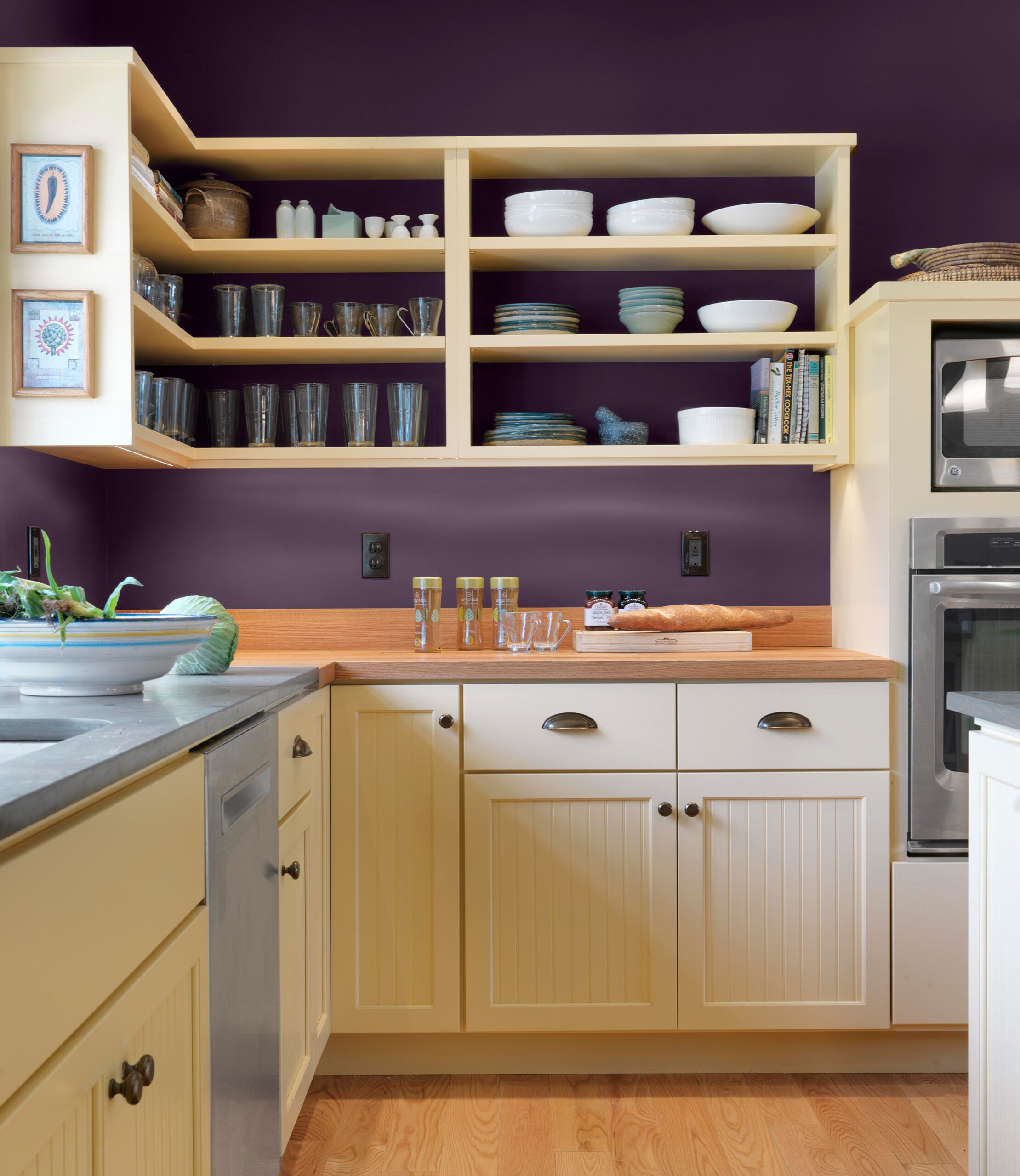
Yellow infuses a space with sunshine and energy, while violet adds luxury and sophistication. Together, they create a versatile pair that can enliven and enrich any room, especially dining areas or entryways where first impressions count.
If you’re hesitant about applying bold colors to your walls, consider using complementary colors as accents in the same room. In this example, deep violet walls are paired with soft yellow cabinets, creating a sophisticated and balanced look. This approach allows you to incorporate complementary colors without overwhelming the space.
Yellow-Green and Red-Violet
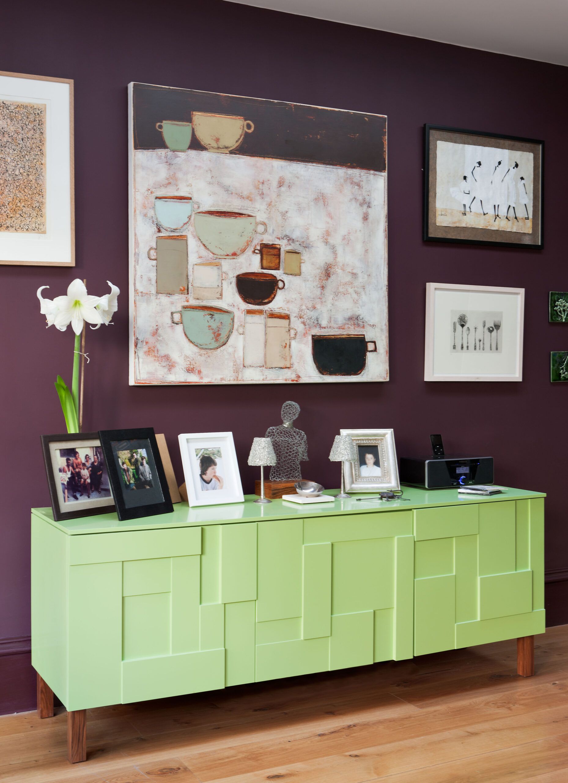
Yellow-green evokes growth and renewal, making it a perfect match with the bold and passionate red-violet. This combination is perfect for personal spaces such as study rooms or bedrooms, where both tranquility and energy are desired.
When using complementary colors, you must balance the intensities of your chosen tones. In this room, the pale yellow-green sideboard perfectly matches the reddish-violet paint on the walls. This creates a harmonious and visually pleasing environment that feels both cohesive and dynamic.
