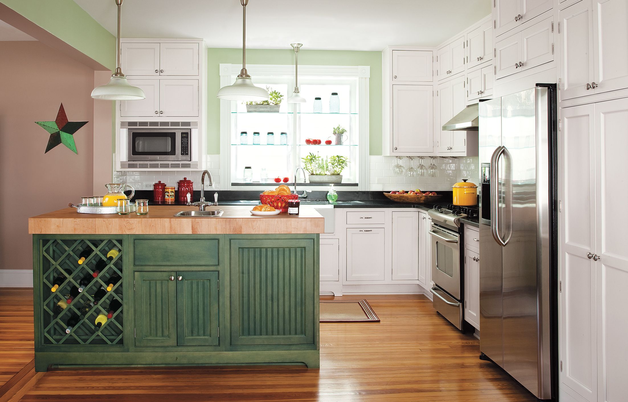
Transforming a home’s layout can open up a world of possibilities, including the ambitious project of swapping the locations of the family room and the kitchen. This was precisely the challenge undertaken by Matt Totaro and his wife, Connie Eiseman, during the remodel of their 1909 house in Catonsville, Maryland. Their goal was to create an open, eat-in kitchen that would serve as the heart of their growing family’s home. Let’s explore how they achieved this dramatic transformation and the benefits it brought to their living space.
Relocating the Cook Space

The decision to relocate a kitchen is not one to be taken lightly. For Matt and Connie, it was a crucial step in creating the home they envisioned for their family. With two children—and a third on the way—they craved an open, eat-in kitchen that would be the centerpiece of their household. The existing family room presented the perfect opportunity to realize this dream.
After gutting the space and taking down a wall to absorb a side porch into the layout, the couple collaborated with kitchen designer Steve Fair to create one large, multifunctional area. The result is a spacious kitchen with an eating area at one end and ample room for entertaining. The new layout allows for smooth traffic flow between the kitchen and the new family room, which now occupies the space where the old kitchen once stood.
A carefully planned island delineates the cooking and cleanup zone, creating a functional work triangle without sacrificing the open feel. To maintain the home’s period charm, the couple incorporated design elements such as pendant lights, soapstone counters, an apron sink with a wall-mount bridge faucet, and refinished pine flooring.
Matt acknowledges the temporary inconvenience of the renovation: “Starting from scratch meant weeks without a place to cook.” However, he adds that “the payoff is having an eat-in kitchen that really serves as the heart of our house. “
Oven range: GE
Range hood: Kobe
Microwave: Frigidaire
Fridge: GE
Cramped Quarters
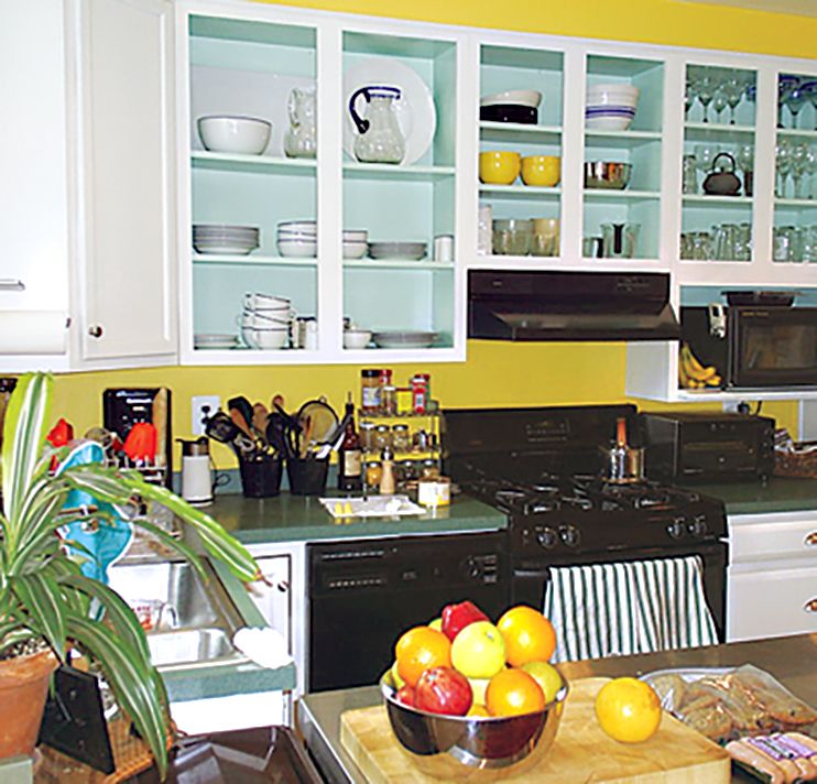
Before the renovation, the kitchen was far from the family’s dream space. Tucked away at the back of the house, it was dated and offered limited prep and storage space. This cramped layout made it difficult for the family to gather and interact while meals were being prepared, and it didn’t provide the open, inviting atmosphere they wanted. The inconvenience and inefficiency of this space underscored the necessity of the bold renovation.
Go With the Flow
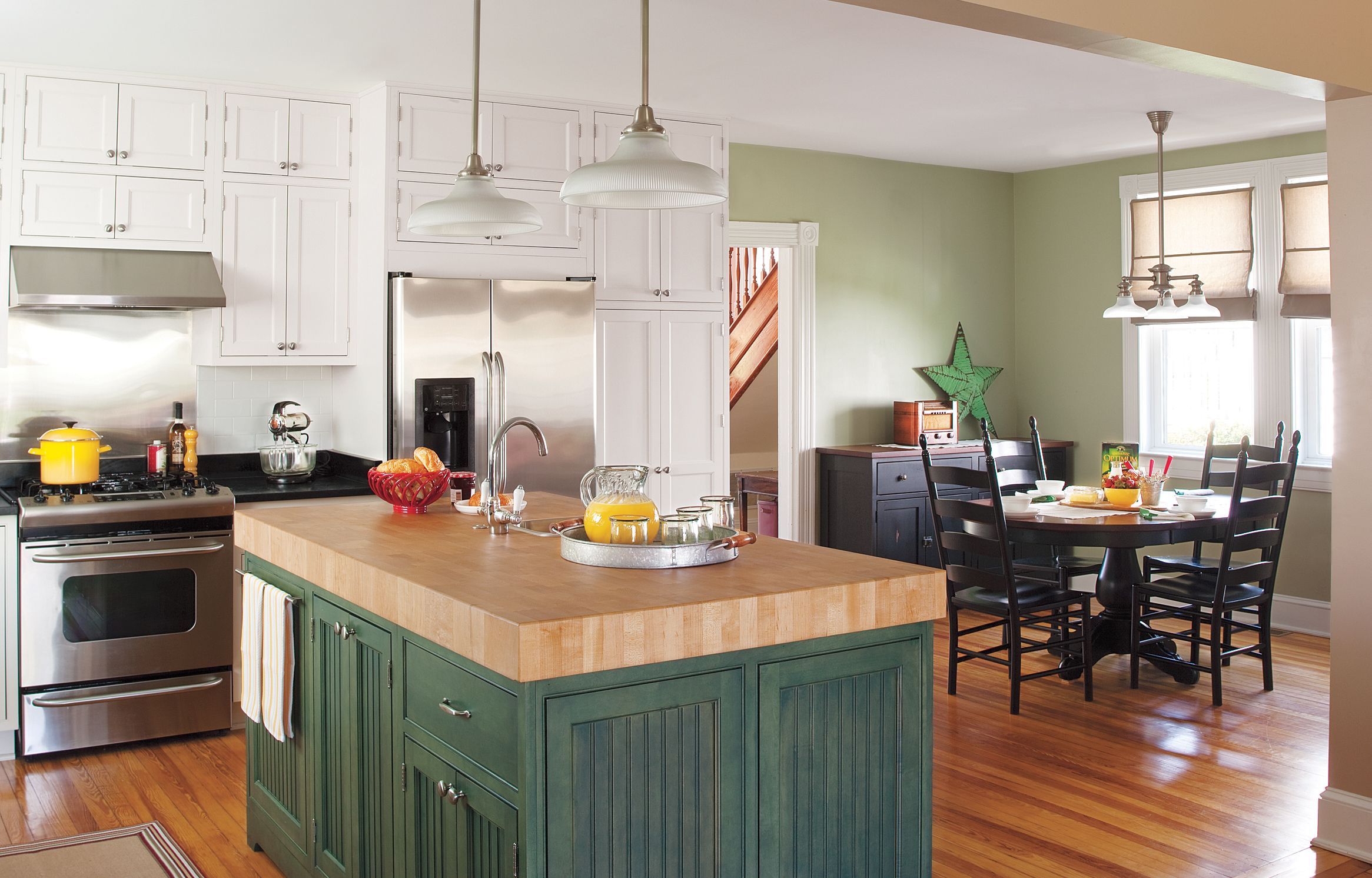
The transformation is striking. Light and traffic now flow freely through the new space, which gained additional windows and an eating nook by absorbing the side porch. This strategic move not only increased the kitchen’s square footage but also dramatically improved its functionality and aesthetic appeal.
The color palette, featuring Sherwin-Williams’ Bonsai Tint, creates a soothing backdrop that complements the natural light flooding in through the new windows. The Newcastle 15-inch pendants from Rejuvenation add a touch of vintage charm while providing ample task lighting over the island and eating area.
Free-Flowing Light
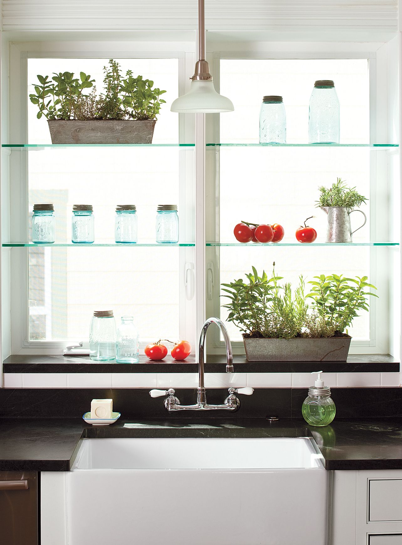
One of the clever design solutions in this renovation is the use of glass shelves above a deep window sill. This feature serves a dual purpose: it invites more light into the space while helping to screen the view of a neighboring house. The result is a bright, airy feel without compromising privacy.
The sink area, featuring a farmhouse-style sink from Barclay Products and a classic faucet from American Standard, becomes a focal point in this light-filled space. The combination of form and function exemplifies the thoughtful design approach taken throughout the renovation, with each element carefully considered and balanced.
Modern Rustic
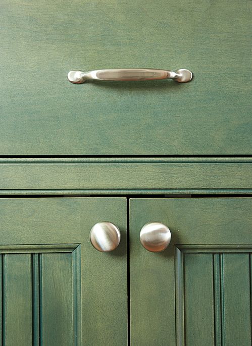
The island is a standout feature in this kitchen, blending modern functionality with rustic charm. Maple cabinets from Brighton Cabinetry, stained in a subtle grayish-green hue, are adorned with knobs and pulls from Amerock and beadboard panels that add a touch of cottage-style warmth. This design choice perfectly balances the kitchen’s modern amenities with the home’s historic character, creating a harmonious blend that feels both timeless and contemporary.
Fair, the kitchen designer, offers a pro tip: “Inset cabinet doors can take exposed hinges, a detail that really adds character to a period-style kitchen. ” This attention to detail is evident throughout the space, creating a cohesive look that respects the home’s heritage while meeting the family’s contemporary needs. By embracing this approach, Matt and Connie were able to infuse their kitchen with personality and charm.
Rack ‘Em Up
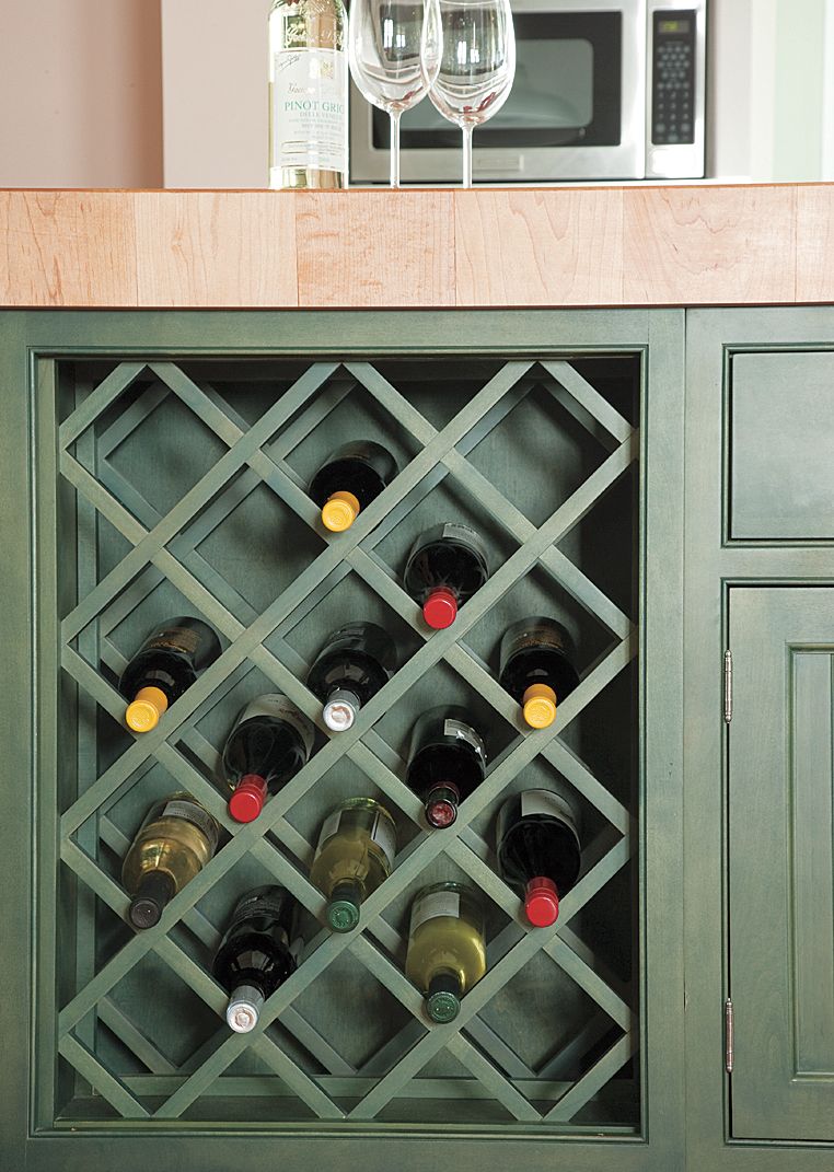
Clever storage solutions are a hallmark of good kitchen design, and this renovation doesn’t disappoint. A built-in wine rack occupies one of the island’s recesses, providing a stylish and practical storage solution for the family’s wine collection. The depth of the rack is carefully calculated to keep bottles tucked neatly inside, maintaining the clean lines of the island while adding a touch of sophistication to the space. This thoughtful integration ensures that no space is wasted and adds another layer of functionality to the island.
Space-Saving Storage
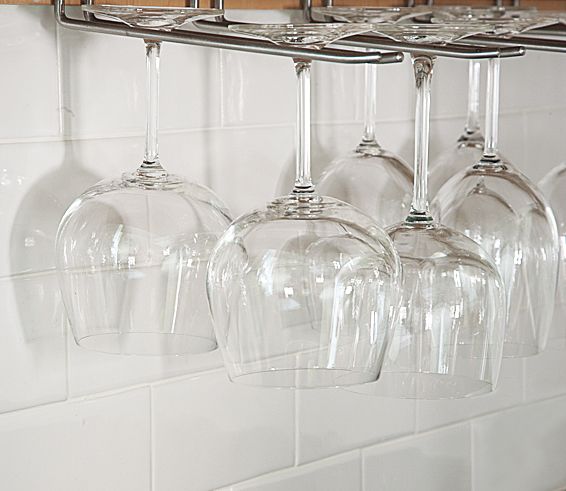
This kitchen design incorporates smart storage solutions throughout. The undercabinet stemware storage near the sink is a prime example of how every inch of space can be used effectively. This feature provides a safe place to store delicate glassware but also keeps it easily accessible for entertaining. By considering these small yet impactful details, the kitchen becomes a more friendly and practical place for everyday use.
The backsplash, featuring white subway tiles from Florida Tile, provides a clean, timeless look that complements the kitchen’s overall design. Its simple elegance allows other design elements to shine while offering a durable and easy-to-clean surface behind the sink and countertops. This careful selection of materials helps tie the entire space together seamlessly.
The Center of Attention
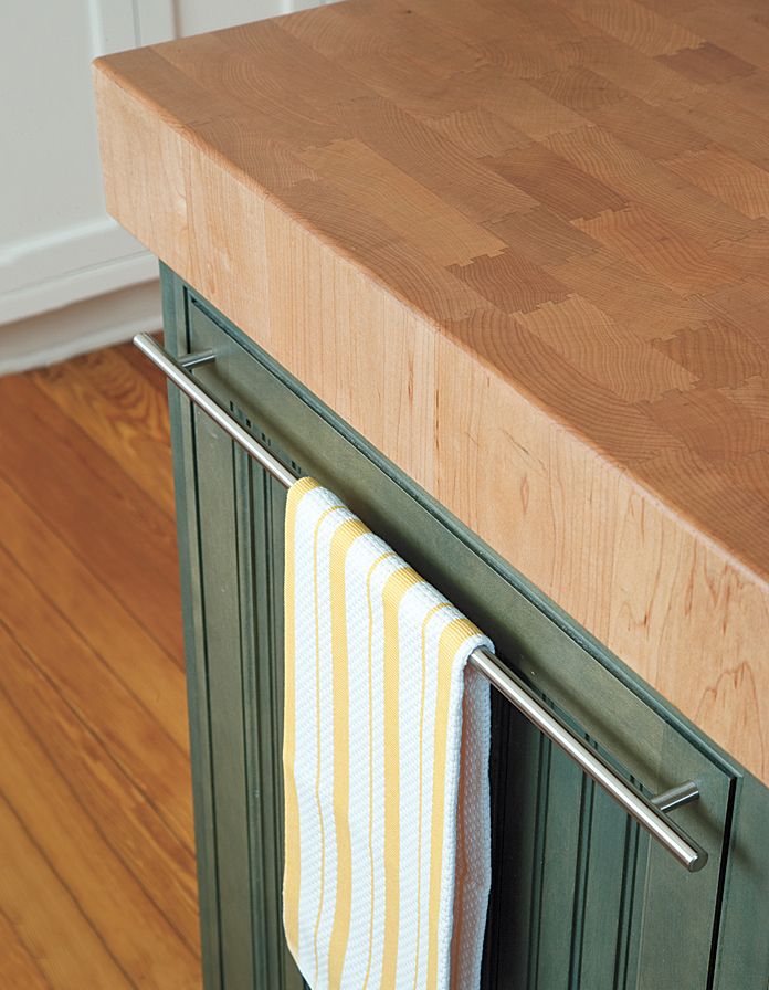
The island serves as the heart of this kitchen, both functionally and aesthetically. Its top, a substantial 4-inch-thick end-grain maple butcher block from Bally Block, provides an ideal surface for food preparation and casual dining. This durable material withstands daily use and adds warmth and character to the space.
A thoughtful detail is the oversized bar pull from Amerock that serves as a convenient dish towel holder. This small but practical addition exemplifies the careful consideration given to every aspect of the kitchen’s design.
Kitchen Floor Plan: Before the Renovation
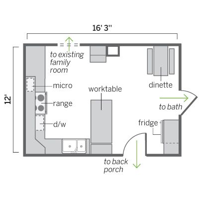
Prior to the renovation, the kitchen, while spacious at 192 square feet, was disjointed and inefficient. Its layout failed to maximize the available space, resulting in a room that didn’t meet the family’s needs. This area would later be transformed into the new family room, allowing for a complete reimagining of the home’s layout.
Kitchen Floor Plan: After the Renovation
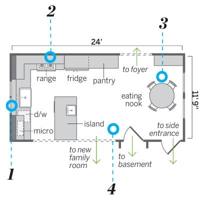
The new kitchen floor plan, using the footprint of the old family room and side porch, shows a dramatic improvement in both functionality and flow. This strategic relocation allowed for the creation of smarter cooking and eating areas, as well as better overall circulation throughout the space. These changes resulted in a room that feels much larger and more connected to the rest of the house.
The renovation included several key changes:
- Framing an interior wall 8 inches inside the exterior wall to accommodate plumbing and create a deep window sill
- Tightening the work triangle by grouping the sink, range, and fridge in one corner, improving efficiency
- Creating a dedicated dining space at one end of the room by incorporating the former side porch
- Opening up the space to the new family room by removing most of a wall, establishing the kitchen as a central hub for cooking, dining, and socializing
These thoughtful modifications allowed Matt and Connie to create a space that was not only more usable but aligned with their vision for a family-centric home.
