Elevated Kitchen
Nearly every evening after dinner, for almost eight months, the Powers family took a walk together. Shutting the door on the house they shared with extended family during the summer months, the foursome strolled down the street, then rounded the corner to the 1920s bungalow they bought nearly a year earlier—and whose renovation was being documented by This Old House for its 40th television season. But while just two-tenths of a mile separates the two houses, the distance traveled was much more than the 400-plus steps. This was a journey home.
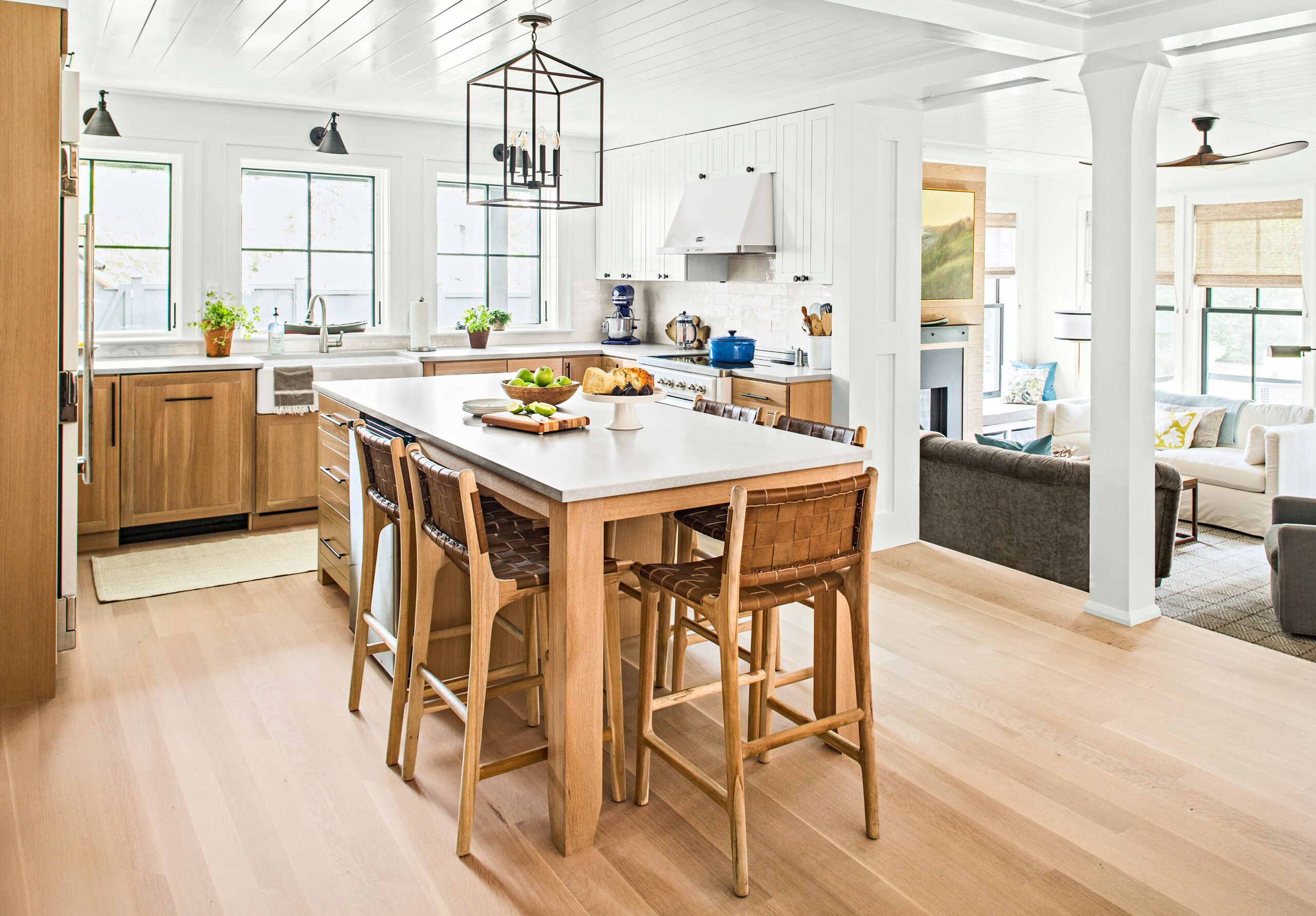
Shown: The 15-by-13-foot kitchen, in the original part of the now 2,300-square-foot house, is open to the living room, located two steps down in the addition. A support column in the 8-foot-wide opening marks the transition. Quartersawn white oak cabinets and flooring create a warm, seamless backdrop for the white appliances, subway-tile backsplash, and quartz countertops, accented with black light fixtures and hardware.
Flooring: Baird Brothers Fine Hardwoods
Kitchen cabinets: Plain & Fancy Custom Cabinetry
Hardware: House of Antique Hardware
Faucet: American Standard
Countertops: Silestone
Island pendant: Clarkson Lighting
Wall lights and ceiling fan: Circa Lighting
Backsplash tile: Somertile
Kitchen stools: Saffron + Poe
Paint: Benjamin Moore’s Chantilly Lace
Powers
“We loved seeing the progress every day, and it gave us all a sense of being involved in every detail,” says architect Don, whose design would grow the house from 1,000 to 2,300 square feet to better suit the family of four, while still preserving its bungalow charm. When it came time to move in last fall, every inch seemed familiar yet somehow better than they could have imagined.
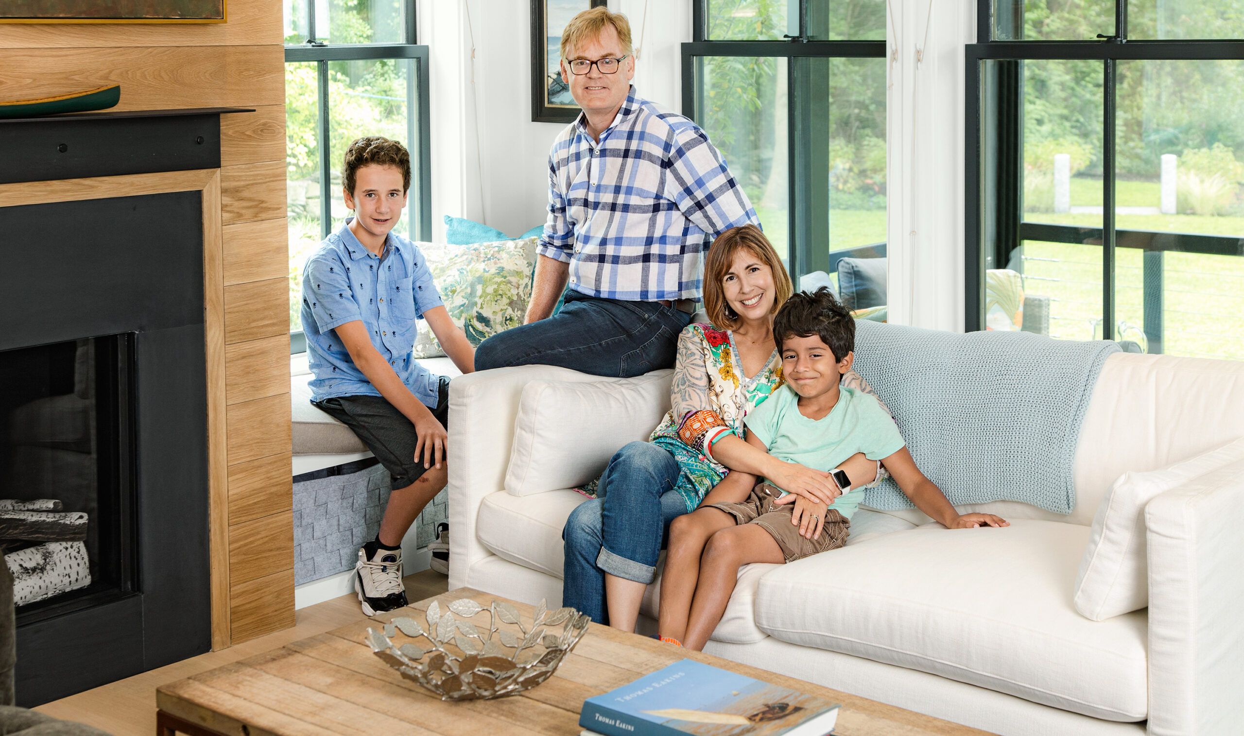
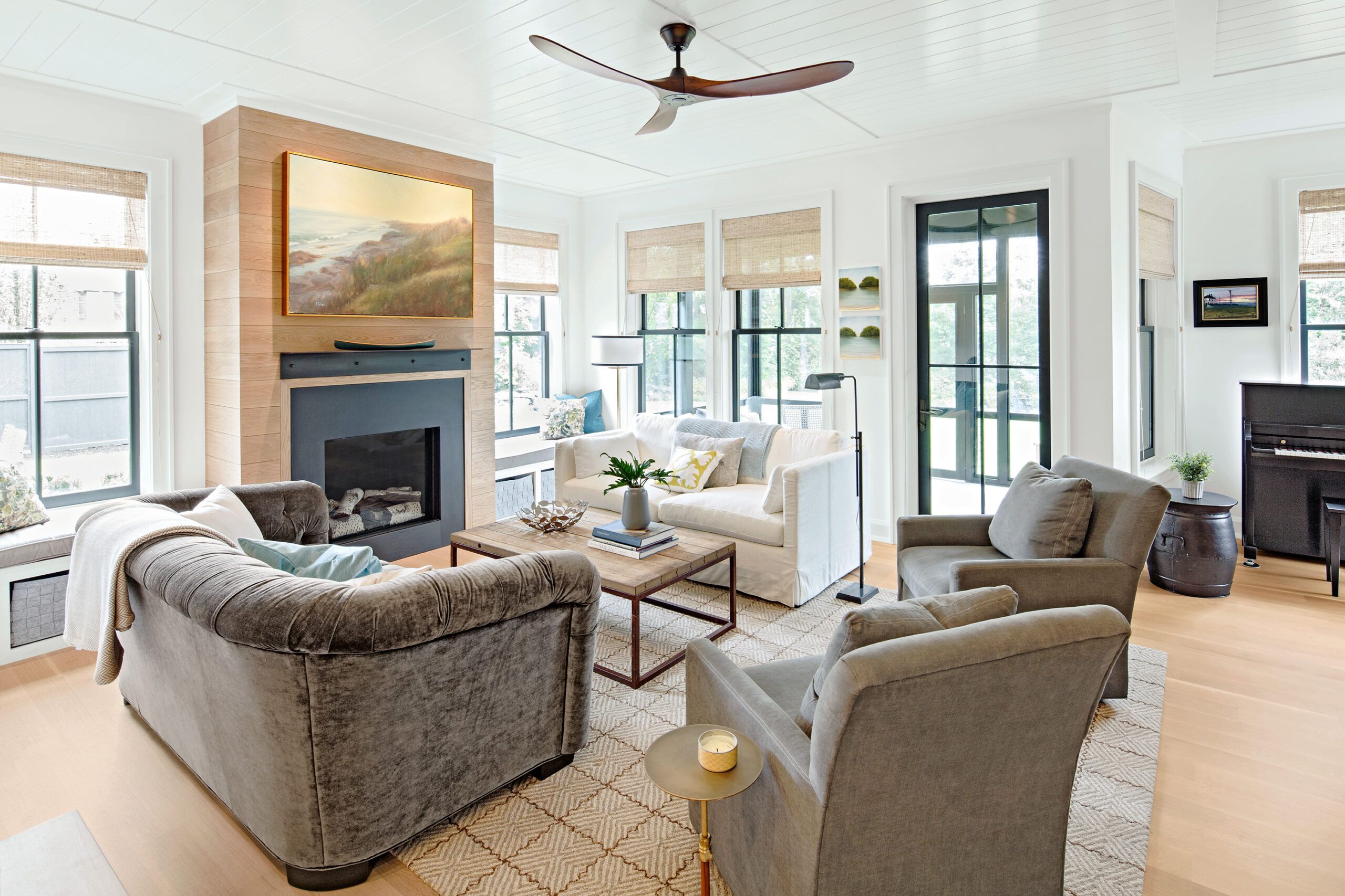
Shown: Architect Don Powers, his wife, Dana, and their sons, Nate, now 13, and Theo, 7, enjoy the light-filled living room.
Fireplace: Ortal
Windows: Marvin Windows and Doors
Dining in the Open
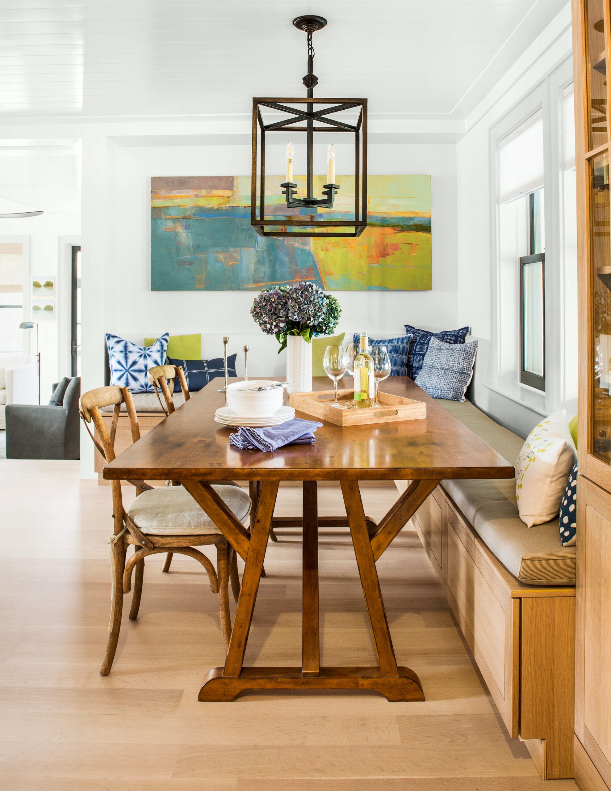
“There’s a feeling of simplicity and continuity,” says Don, commenting on the soothing palette of materials and colors: quartersawn white oak floors and cabinetry, white-painted walls and trim, black window sashes.
“So many of the spaces feel bigger than the room sizes might suggest,” adds Dana, recalling a gathering that took place shortly after they moved in, with a cluster of grown-ups talking in the living room and eight kids hanging out in the adjacent den—behind a solid-oak door that muffled the hubbub. “It felt very comfortable, despite its not being a big house.”
Shown: The open dining area’s built-in banquette occupies space that was in a walled-off living room in the original house.
Living Spaciously
But inside and out, this house holds much more than just clean, comfortable spaces for family and friends. Don and Dana also wanted to create a renovated house that would meet the net-zero building standard, which requires that a house be able to produce all the energy it needs.
Shown: The new living room derives its sense of spaciousness from 9½-foot ceilings, large windows, a light-channeling French door to the screened porch, and the interplay of pale oak, white walls, and glossy painted ceiling planks. The music nook was specially designed for 13-year-old Nate’s piano.
Lighting and ceiling fan: Circa Lighting
Living room furniture: Interior Define
Window treatments: Smith & Noble
Rug: Dash & Albert
Italian Range
“You get to net-zero in a combination of ways, and one key is to make sure you keep the energy produced completely inside your building,” says This Old House plumbing and heating expert Richard Trethewey. For TOH home builder Jeff Sweenor, who served as general contractor, that meant creating a supertight building envelope from the foundation to the roof, with strategically chosen materials such as factory-built insulated, reinforced concrete foundation walls; multiple layers of insulation, including rigid mineral wool and foam panels and both open-cell and closed-cell spray foam; and by using a compressor-assisted air-sealing technique that injects an acrylic-glue-like substance to close up the tiniest leaks.
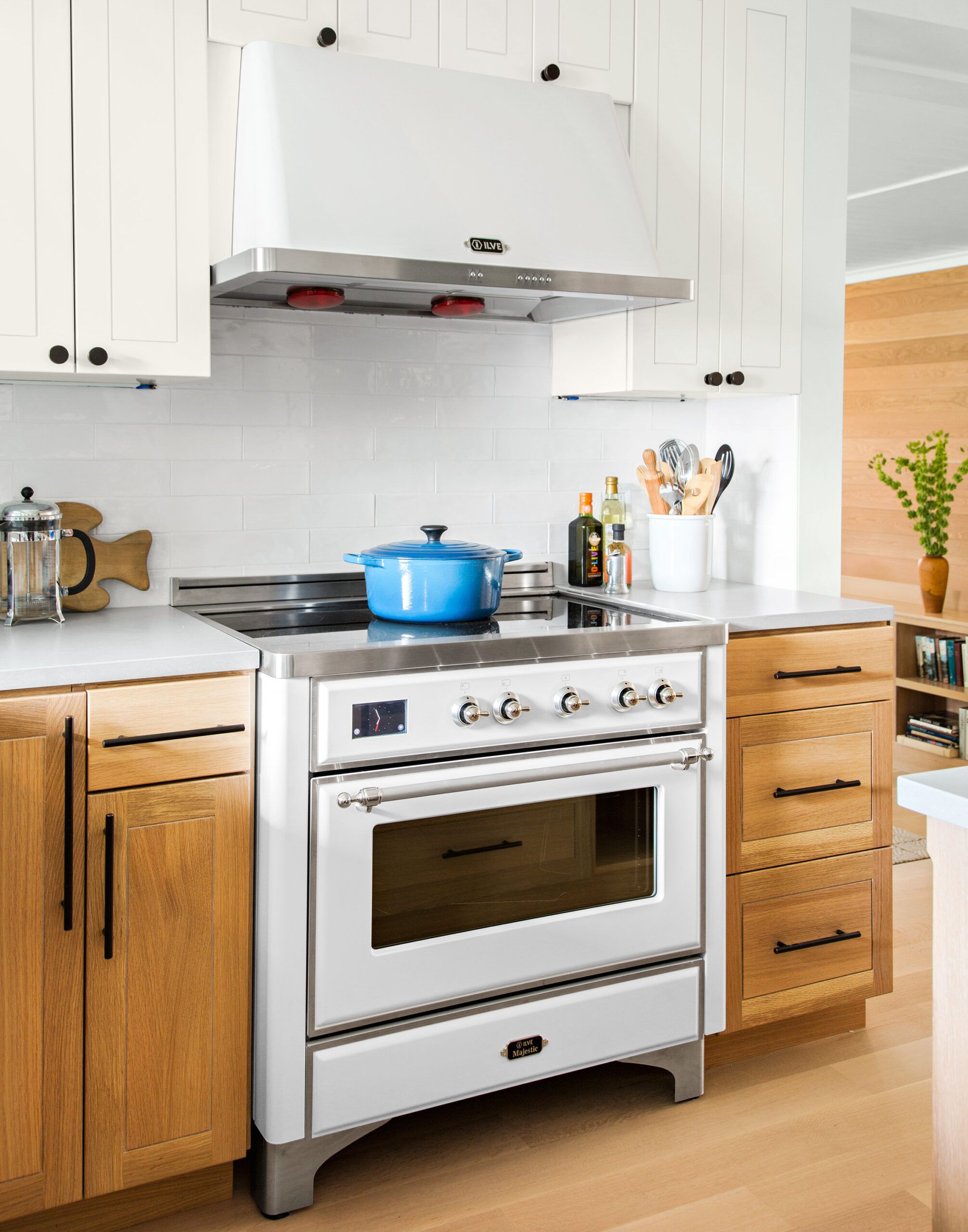
Shown: The handcrafted Italian range combines a cottage-friendly vintage look with ultra-energy-efficient induction technology.
Range and vent hood: ILVE Appliances
Front Entry
Through these efforts, the house—which is in climate zone 5—ended up with impressive R-values: R-62 for the roof (code requires 38); R-33 for the wood-frame walls (code is 20); R-21 for the new basement walls (code is 10); and a U-factor of 0.22 or less for the triple-glazed, argon-filled windows (code is 0.35—the lower the U-factor, the better).
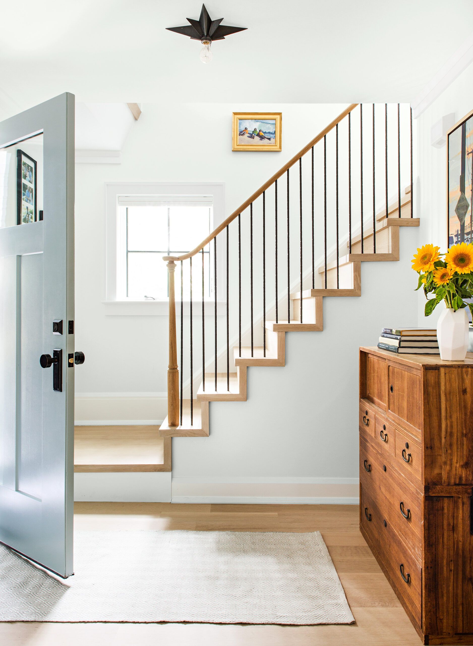
Shown: The front entry is located in the same place as in the original house, but a wall was removed to expose the stairway, which now has quartersawn oak treads and risers, along with a graceful new handrail.
Front entry painting: The Gallery at Taste
Custom Powder Room
“Net-zero in new construction isn’t terribly difficult,” says Sweenor. “The challenge here was combining a 100-year-old house with new additions. We had to account for a lot of inadequacies in the old structure.” Before he could insulate the exterior walls, for example, his crew had to address the haphazard sheathing they uncovered—a patchwork of cabinet doors, beadboard, and even some pieces Don Powers refers to as driftwood. “This was a classic Yankee house, built with whatever wood was at hand,” says Sweenor, whose crew added layers of plywood sheathing to the old exterior walls to ensure a seamless look with the new addition.
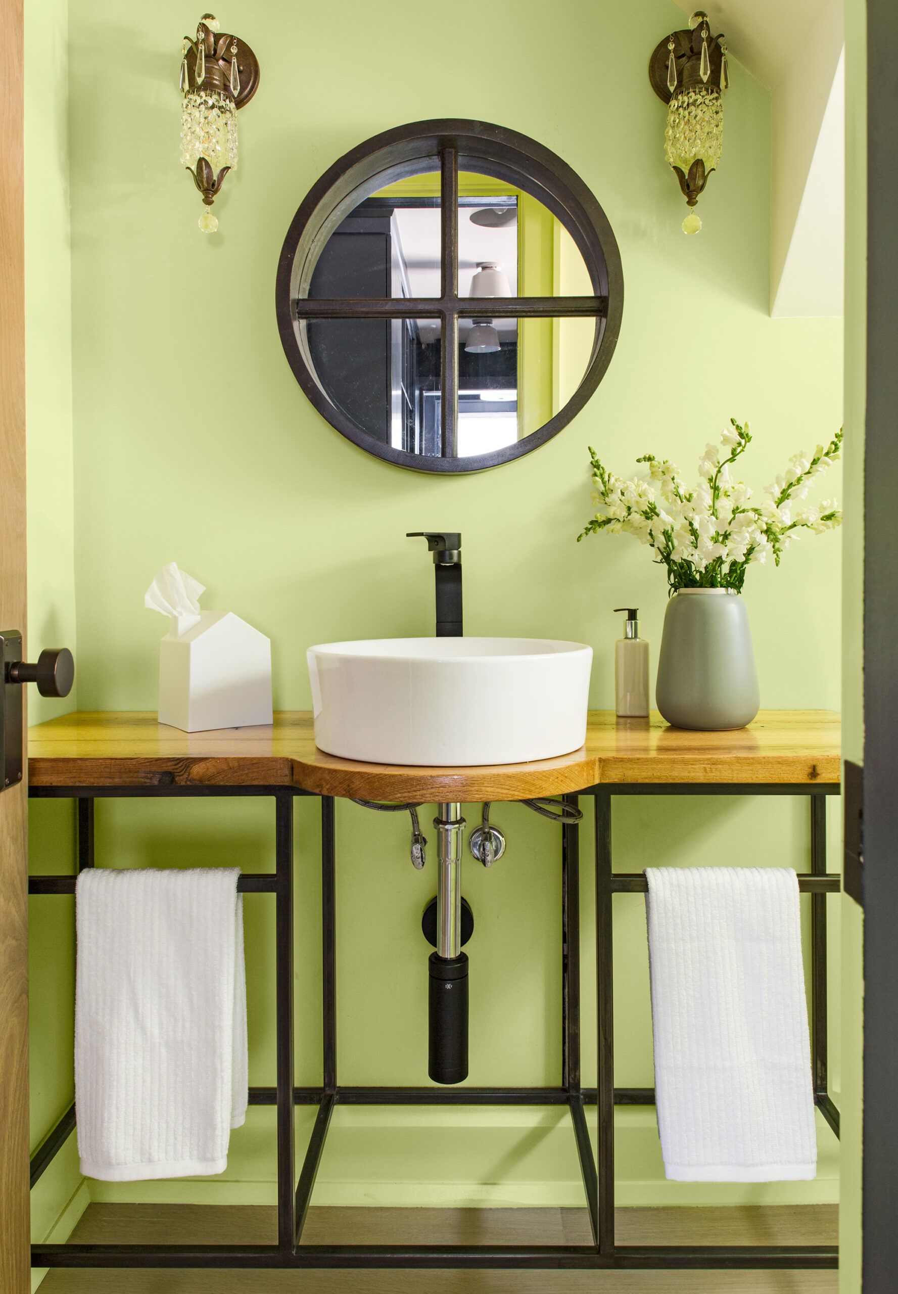
Shown: Bright green walls set off the powder room’s custom metal sink console, designed by Don Powers; he fashioned the salvaged-oak top with help from Tom Silva. The navy-blue mudroom built-ins are reflected in the mirror.
Powder room vessel sink and faucet: DXV
Sink console welding: Old Bristol Line Fabrication
Salvaged oak for console top: Longleaf Lumber
Paint: Benjamin Moore’s Fresh Cut Grass (walls)
Powder room sconces: Circa Lighting
Library Facing Laundry
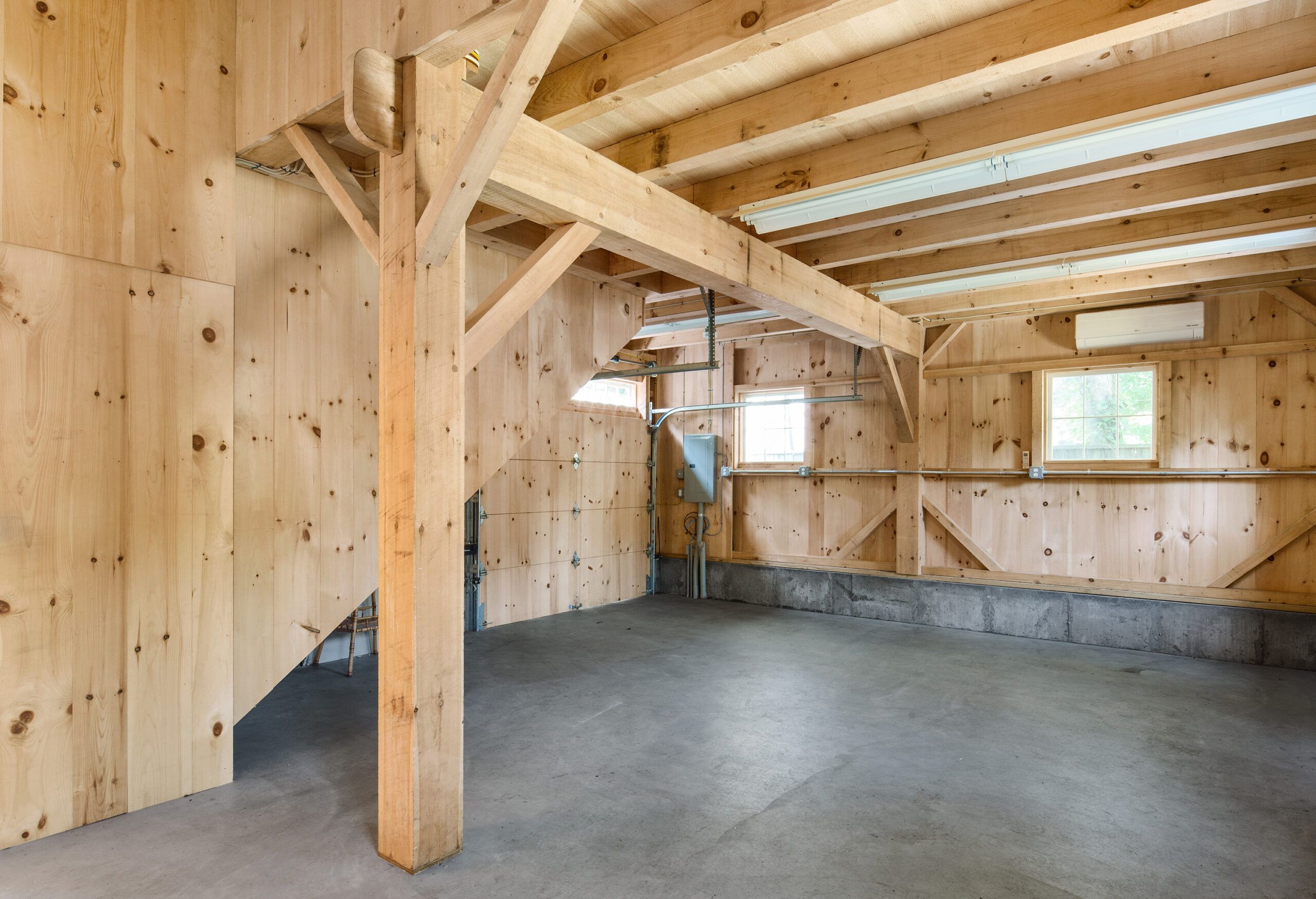
The HVAC system is another key factor in achieving net-zero, and Richard suggested an innovative variable refrigerant flow (VRF) system more common in commercial applications. “The virtue is that the system works to optimize each room’s temperature independently, so it can be heating and cooling at the same time,” he says. To contribute renewable energy, the team opted for solar panels, but rather than have a street-facing photovoltaic (PV) array on the roof of the main house, Don chose a saltbox-style post-and-beam barn kit for the backyard as a new garage/studio, covering its longer south-facing roof slope with a 5-kilowatt PV array of 18 crystalline silicon modules.
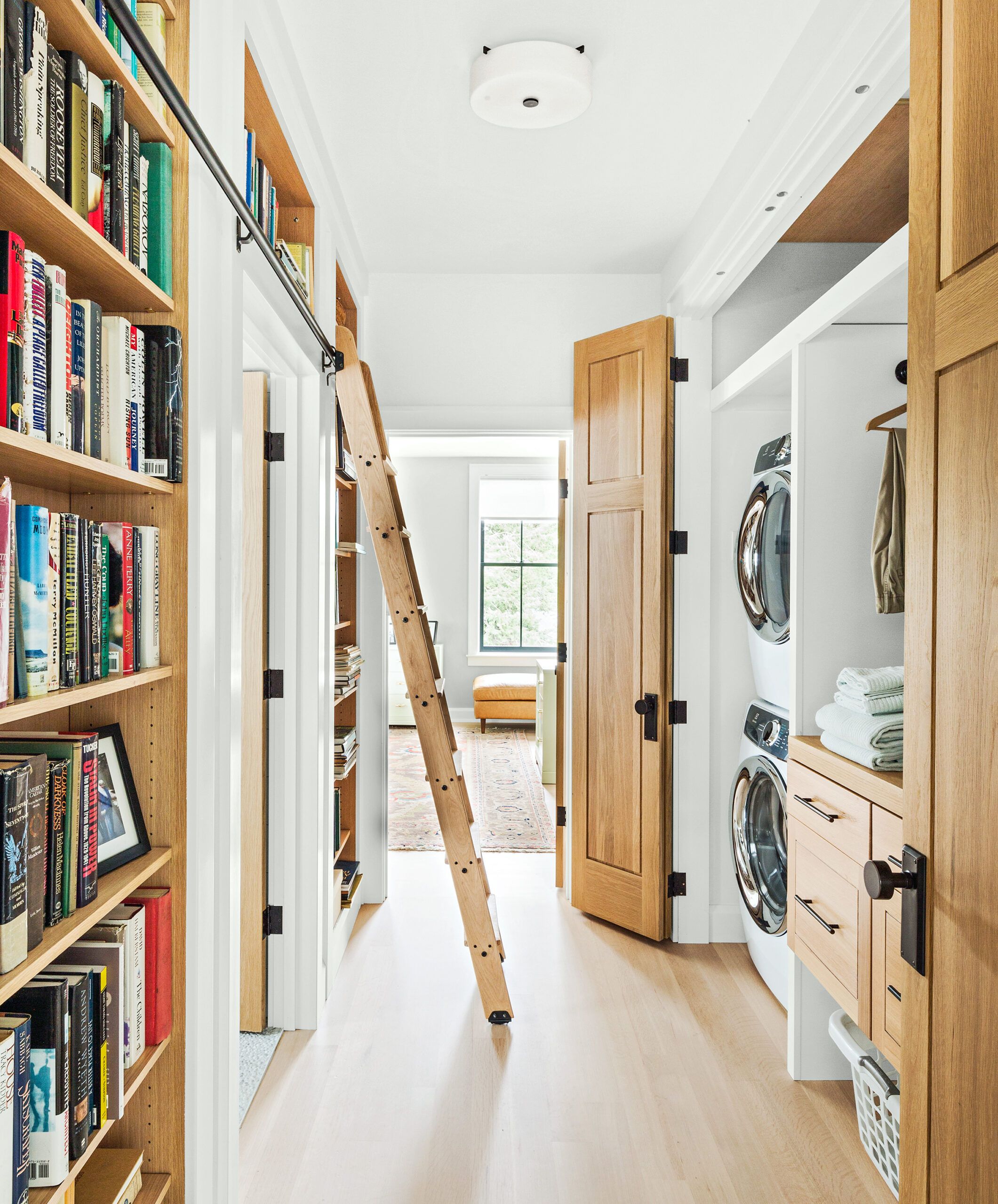
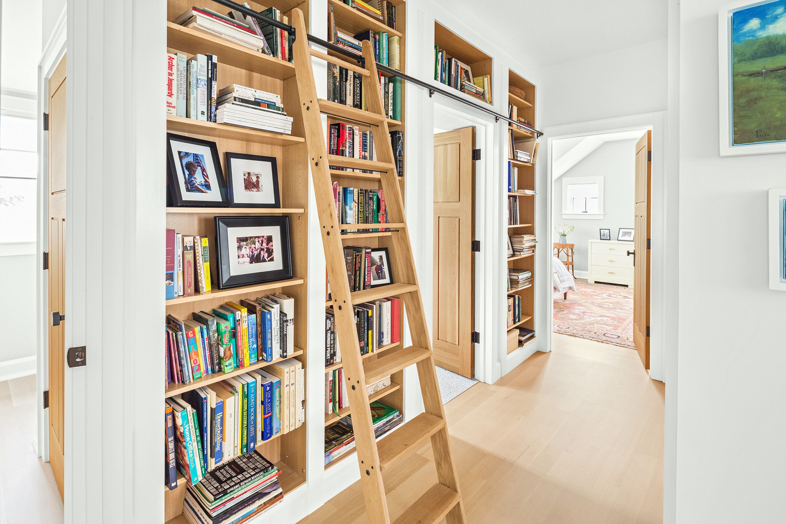
Shown: The upstairs hall is much more than a passageway: It doubles as a library, with bookcases and a built-in rolling library ladder along one wall; laundry facilities line the wall opposite.
Library bookcases: Plain & Fancy Custom Cabinetry
Library lighting: Circa Lighting
Dormer Bedroom
Throughout the course of the project, daily interaction between architect and builder led to on-the-spot problem solving and a steadfast commitment to architectural details that would ensure the house’s bungalow charm. During his evening visits to the construction site with his family, Don would pin up notes, often accompanied by drawings, for the crew. Sometimes, he would find a question scribbled on a stud, and he would leave his answer right there. “It was so easy to exchange ideas and work through decisions this way,” he says.
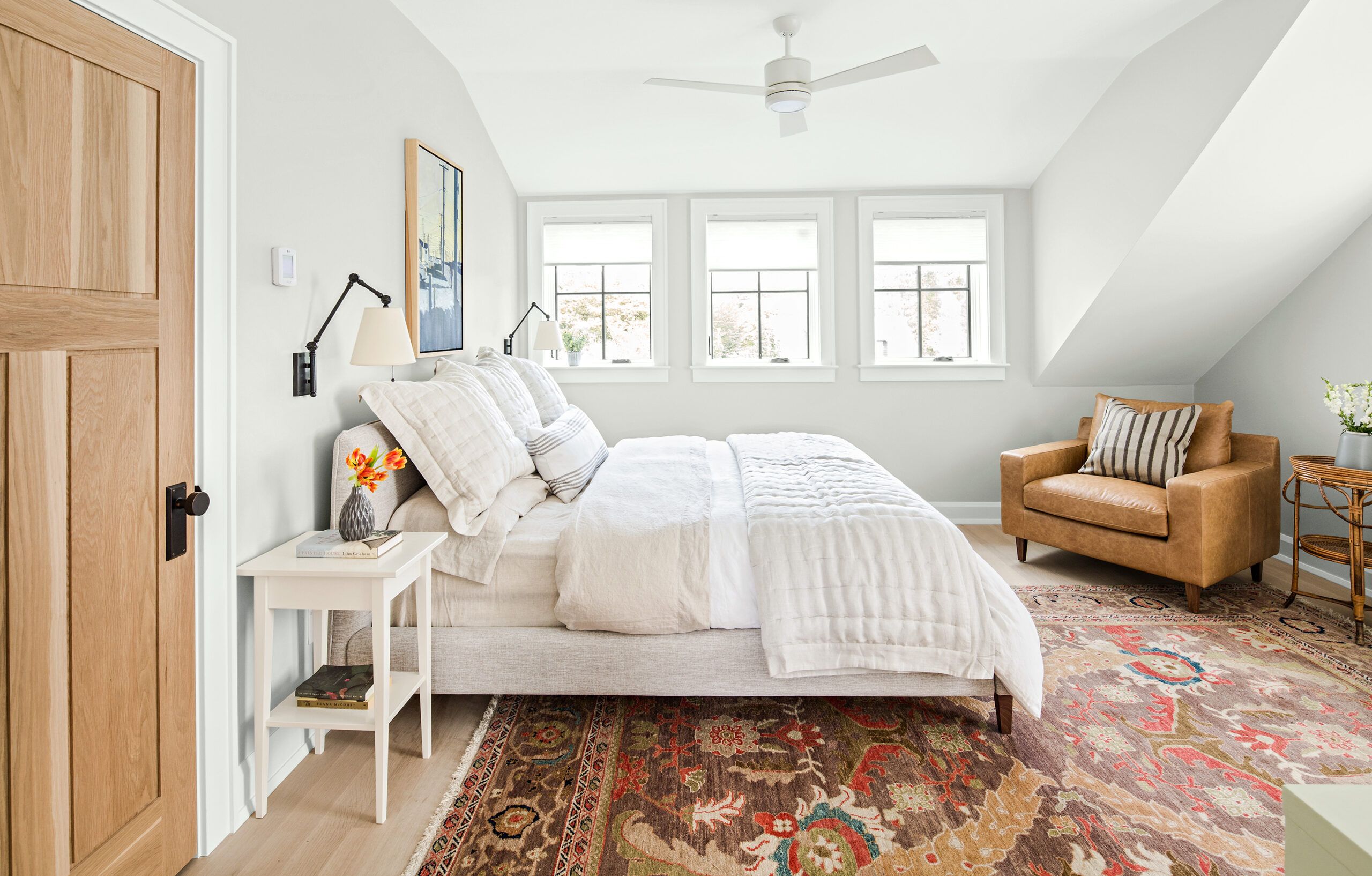
Shown: The master bedroom is tucked into a dormer, with windows facing the backyard.
Mattress: Saatva
Bedside lights and ceiling fan: Circa Lighting
Shiplap Bath
Case in point: arriving at the final design of the interior column that marks the connection between the kitchen and living room, between the old house and the new. “I designed that column over and over again, making it more complicated than it needed to be,” Don recalls. After everyone from Dana to the crew had chimed in with their thoughts, he settled on the same simple flared design used for the porch columns. “In a way, that column is the architectural summation of the whole process.”
Shown: The master bath walls are finished with horizontal shiplap for a cottage look, complemented by a quartersawn white oak vanity and built-in storage cupboards.
Master bath sinks, tub, faucets, and toilet: DXV
Bathroom tile: Somertile
Sink top: Silestone
Cabinet hardware: House of Antique Hardware
Windows: Marvin
Shower Area
Creating a sense of open space in the first floor’s kitchen, dining, and living areas was key to making the small house live larger. Even though the house was doubling in size, it still comes in at less than the national average of 2,555 square feet for a new single-family home. To raise the ceiling height in the new living room to 9½ feet, Don designed the addition to be two steps down from the kitchen, in the existing part of the house, where ceilings are just 8 feet.
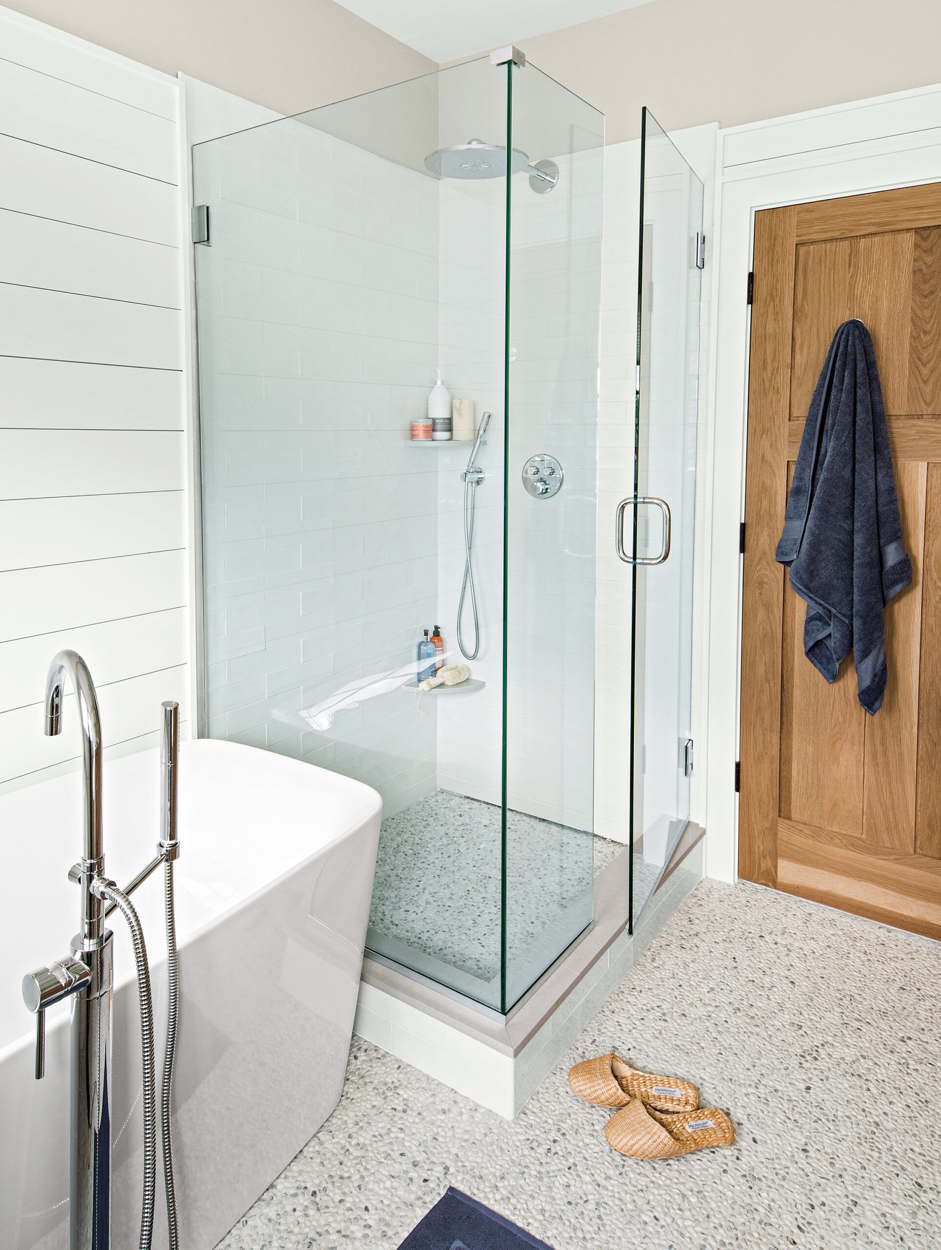
Shower System: GROHE
Shower Drain: QuickDrain
Nate’s Room
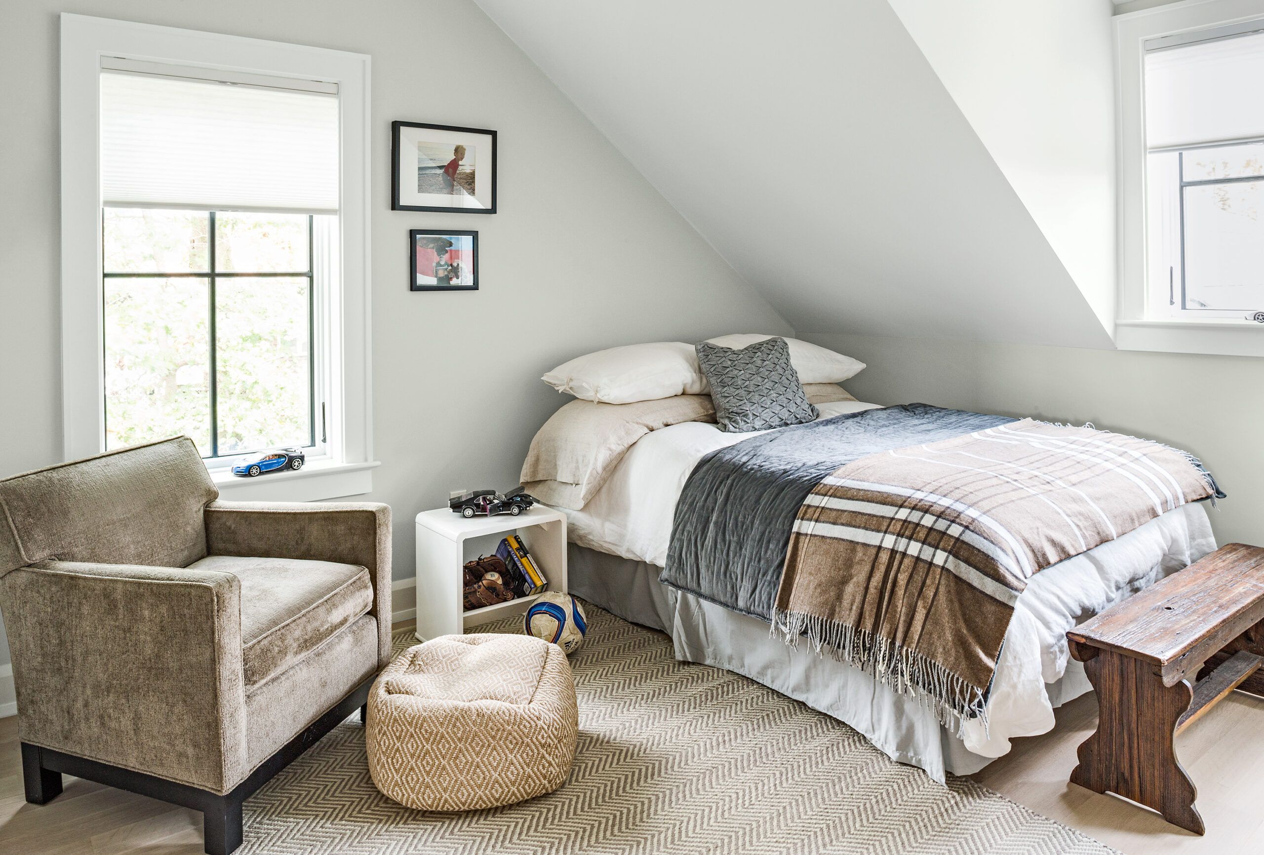
Built-ins are another design theme that optimizes space and utility by ensuring that areas serve multiple functions. Don incorporated display shelving in the half wall alongside the stairway from the living room to the lower-level playroom; he designed window seats flanking the fireplace to increase the living room seating options. Bookcases line one side of the second-floor hallway so it doubles as a library. “With a small house you can’t afford single-use space,” says Dana.
Shown: The original portion of the house’s second floor was reconfigured to give each boy his own bedroom.
Rugs: Dash & Albert
Mattresses: Saatva
Paint: Benjamin Moore’s Gray Owl (walls)
Theo’s Room
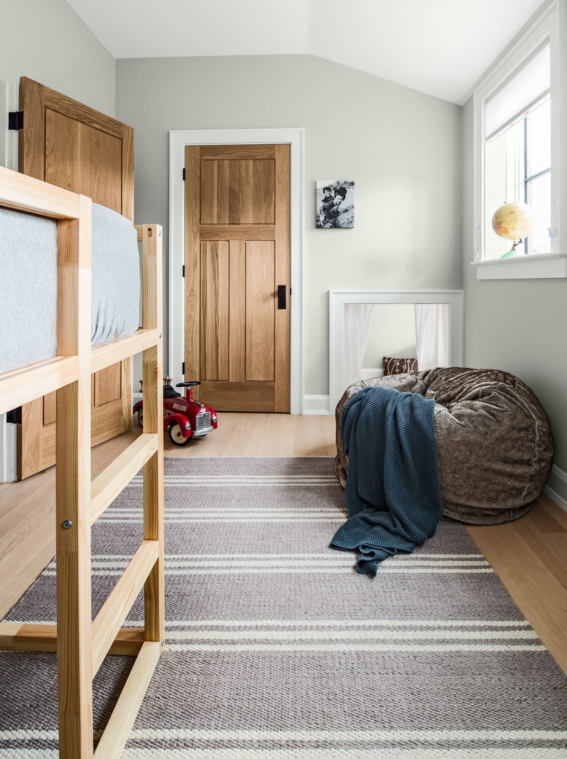
The couple also incorporated special areas for each of their sons. For 13-year-old Nate, a talented pianist, Don designed a music nook in the living room to give him a dedicated place to play that keeps him near the rest of the household activity. For 7-year-old Theo, Don designed a secret room inside his bedroom—a hideaway just large enough for two or three kids to hunker down. For now the opening is covered with a curtain, with plans to add a button-operated bookcase in the opening later on.
Shown: Theo’s bedroom has a curtained hideaway carved out behind the closet wall.
Rugs: Dash & Albert
Paint: Benjamin Moore’s Gray Owl (walls)
Screened Porch
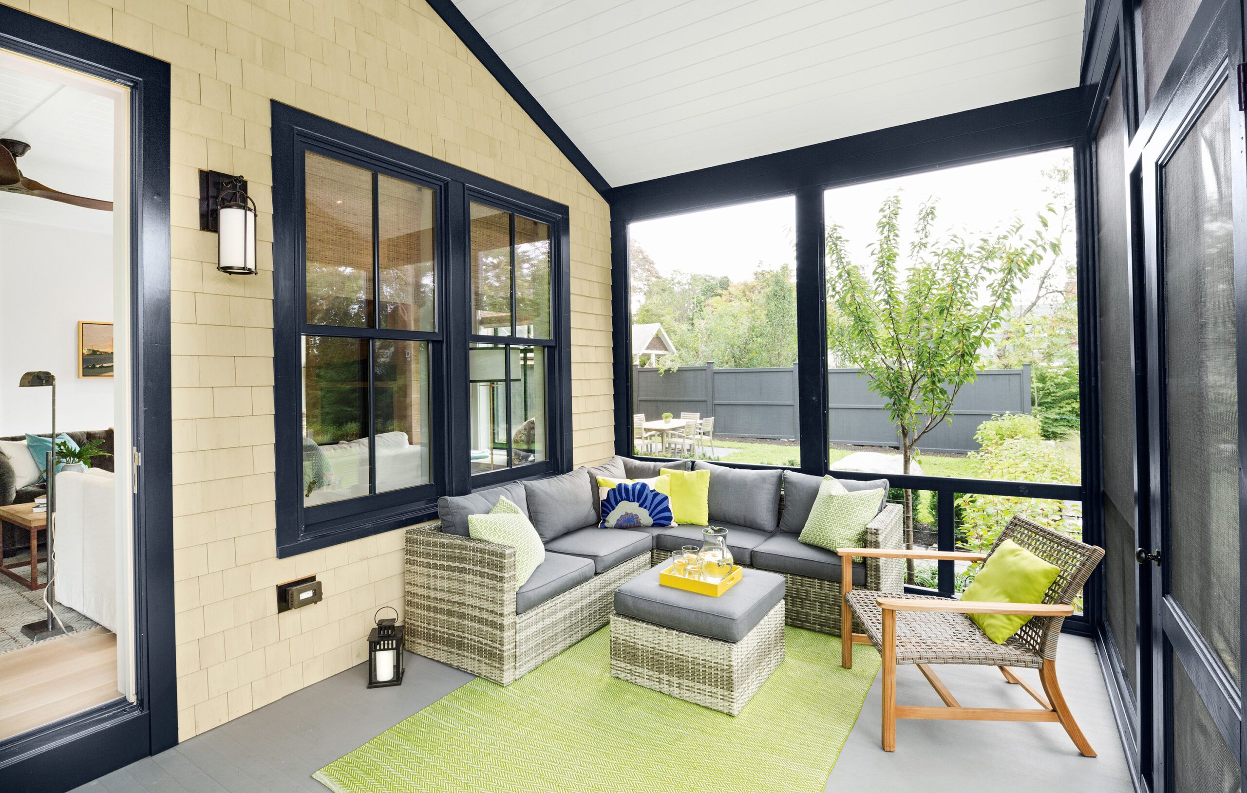
The pale palette and consistent use of quartersawn white oak—for floors, interior doors, kitchen and bath cabinetry, bookcases, the fireplace wall—with subtly varied finishes keeps the overall look light and bright. The floors were lightly whitewashed and given a protective matte clear coat to create the look of nearly bare wood, while the kitchen cabinets have a slightly darker cerused finish. “We wanted a very simple palette throughout the house with lots of repetition and a few breaks, such as the navy-blue mudroom,” says Don. “It’s peaceful rather than exciting, and that’s exactly what we wanted.”
Shown: A screened-porch extension off the living room addition features a composite floor with the look of painted wood and a classic tongue-and-groove ceiling.
Porch flooring: Deckorators
Porch furniture: Allmodern.com
Porch rug: Dash & Albert
Sconce light: Clarkson Lighting
Exterior Accents
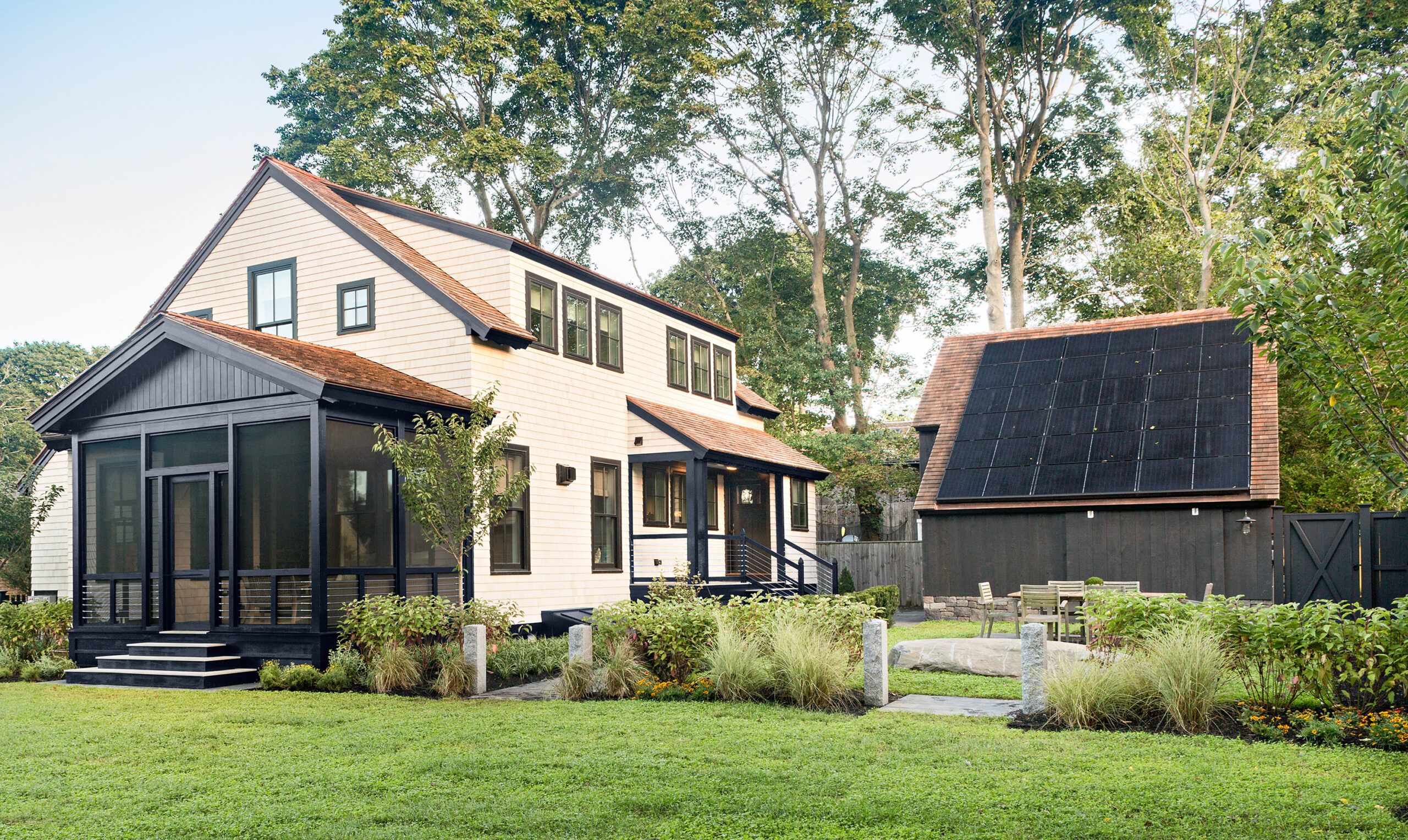
All that simplicity is punctuated with some special touches. In the kitchen, there’s a restaurant-grade refrigerator and a handcrafted Italian stove that uses ultra-energy-efficient induction heating. And the couple added interest to some surfaces that are often ignored, such as the first-floor ceilings, which are clad with poplar tongue-and-groove boards painted high-gloss white to emphasize the cottage look. To add contrast, black is used as an accent throughout—on the windows, the living room fireplace’s fabricated steel mantel and black slate surround, the light fixtures, and the ceiling fans, as well as on the exterior trim, the screened-porch enclosure, and the barn siding.
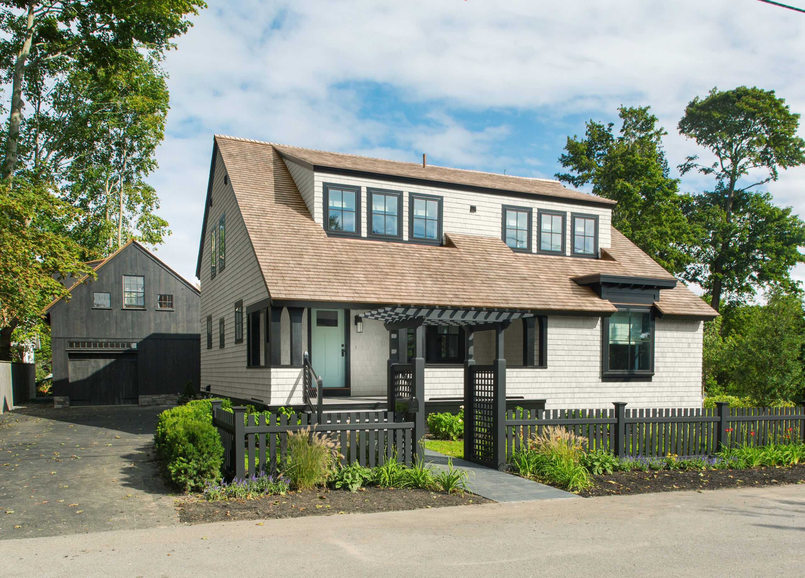
Shown: The main house and barn share black exterior accents; the barn’s steeply sloped south-facing roof holds a photovoltaic array that is key to the house’s net-zero performance.
Solar panel system: Vivint Solar
HVAC: LG
Envelope sealing: Aerobarrier
Foundation: Superior Walls
Subflooring: AdvanTech
Insulation: Rockwool
Ventilation/ERV: RenewAire
Pavers: Unilock
Lawn and trees: Sodco and Fast-Growing-Trees.com
Irrigation: Orbit
Fencing: Greenwich Wood Products
Roof shingles: Liberty Cedar
Cedar siding: SBC
House wrap: GCP Vicar
Sheathing: ZIP System
Cedar breather: Benjamin Obdyke
Spray foam installation: Ecologic Insulation
Spray foam: Gaco Western
Barn: Country Carpenters
Garage door: Superior Garage Door
Library Ladder
More than anything, however, there’s an emphasis on comfort—whether that means delivering a comfortable interior temperature no matter what the New England weather brings, or filling the living room and den with roomy upholstered furnishings for entertaining and snuggling up. “We wanted a great house with or without net-zero,” Don says.
Shown: Quartersawn white oak bookshelves designed by the architect/homeowner line one side of the second-floor hallway, allowing the typically utilitarian space to serve as a library.
Built-in bookshelves: Plain & Fancy Custom Cabinetry
Flooring: Baird Brothers Fine Hardwoods
Library ladder: Sweenor Builders
Post-and-Beam Barn
He estimates the family will need to live in the house for a full 12 months before they can assess whether they have achieved that environmental goal, but they’re not waiting idly by. Just a few weeks after moving in, Don installed an energy monitor on the electrical breaker panel that provides information on which rooms, appliances, and systems are using the most energy.
Shown: The first floor of the post-and-beam barn, built from a kit, serves as a garage and workshop space.
Barn kit: Country Carpenters
Boys’ Bath
“We have got all the elements in place, but lifestyle definitely matters,” says Don. “As time goes on, it will be interesting to get more information, and see how we do.”
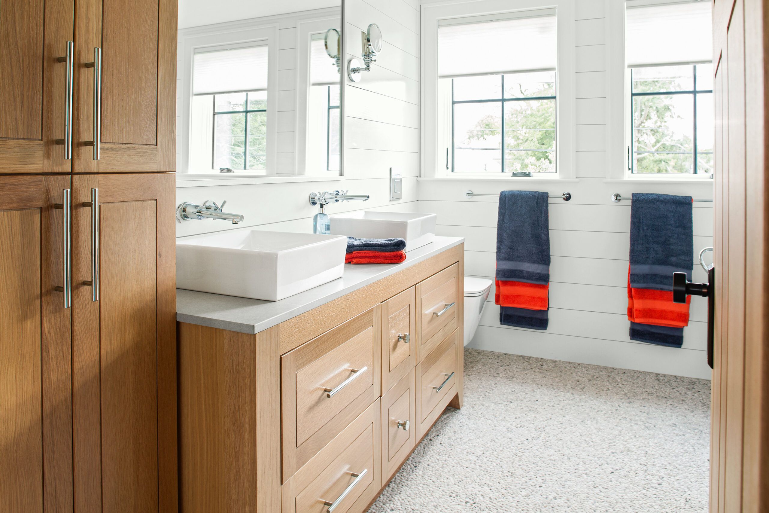
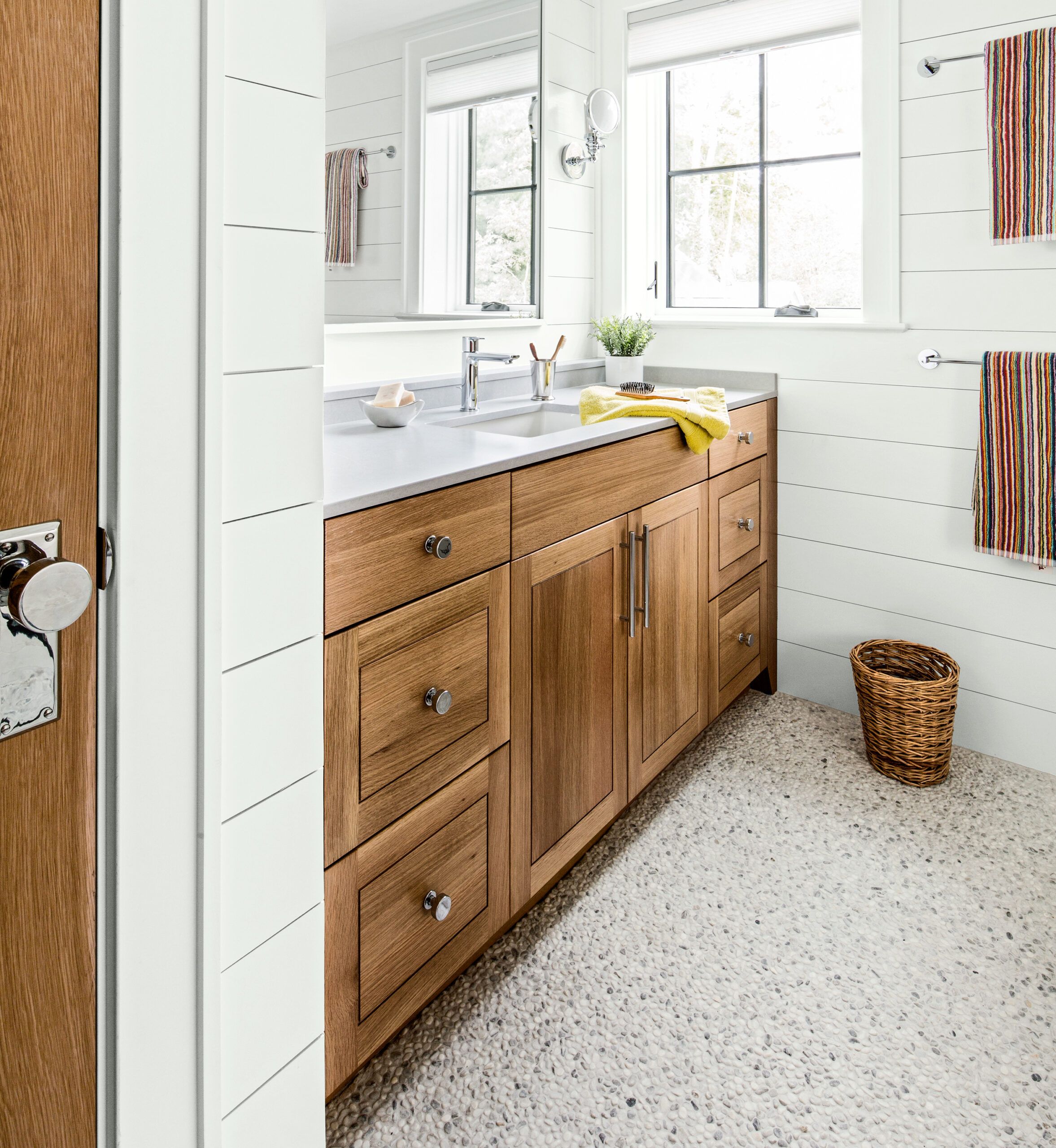
Shown: The two boys share the second-floor hallway bath, which features horizontal shiplap paneling in keeping with the house’s bungalow origins, and quartersawn white oak cabinets.
Custom quartersawn white oak: Plain & Fancy Custom Cabinetry
Sink: American Standard
Sink faucet: GROHE
Tile: Somertile
Hall of Cubbies
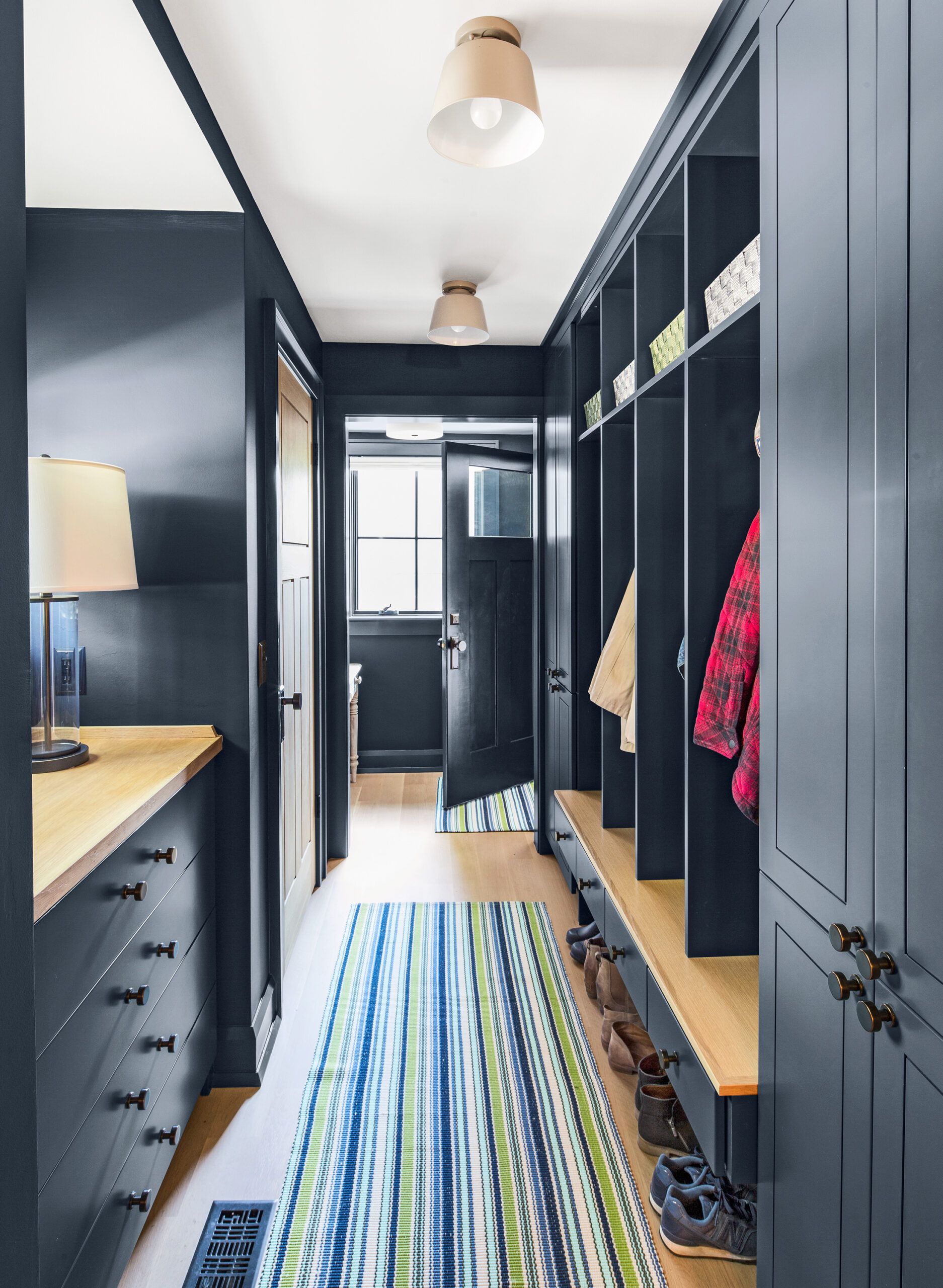
A first-floor hallway tucked behind the kitchen and leading to the back door was designed as a mudroom with built-in lockers and cubbies, plus storage closets. Its dark-blue paint job offers a welcome counterpoint to the otherwise white-and-pale-oak scheme.
Custom cabinetry: Plain & Fancy Custom Cabinetry
Knobs, hooks, and hardware: House of Antique Hardware
Paint: Benjamin Moore’s Hale Navy
Rug: Dash & Albert
Attic Loft
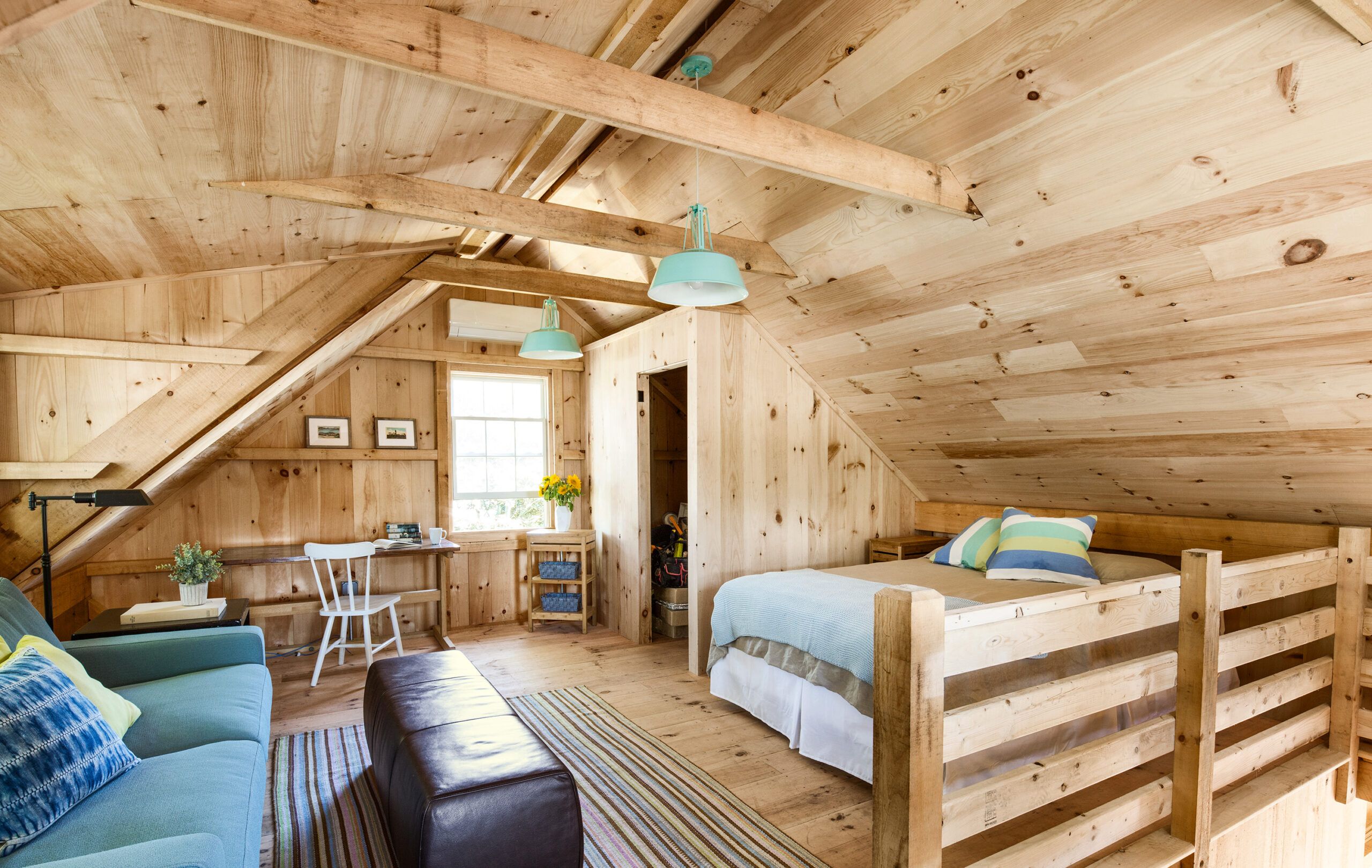
Exposed timbers in the vaulted post-and-beam barn create an atmospheric sleep spot in the loft.
Lighting: Circa Lighting
Storage Banquette
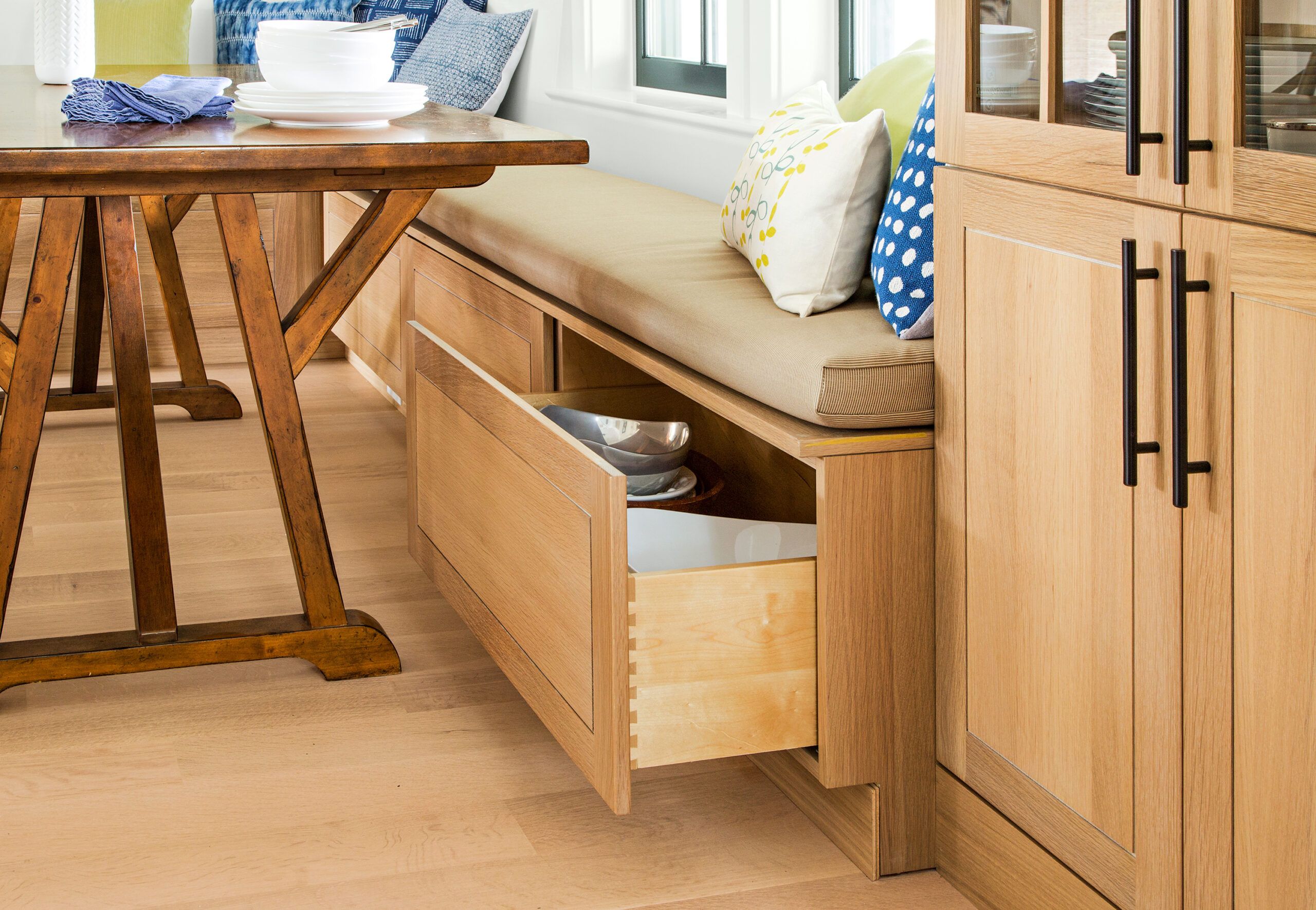
The dining area’s storage banquette and built-in hutch were built from quartersawn white oak, like the kitchen cabinetry.
Custom built-ins: Plain & Fancy Custom Cabinetry
Chef-Caliber
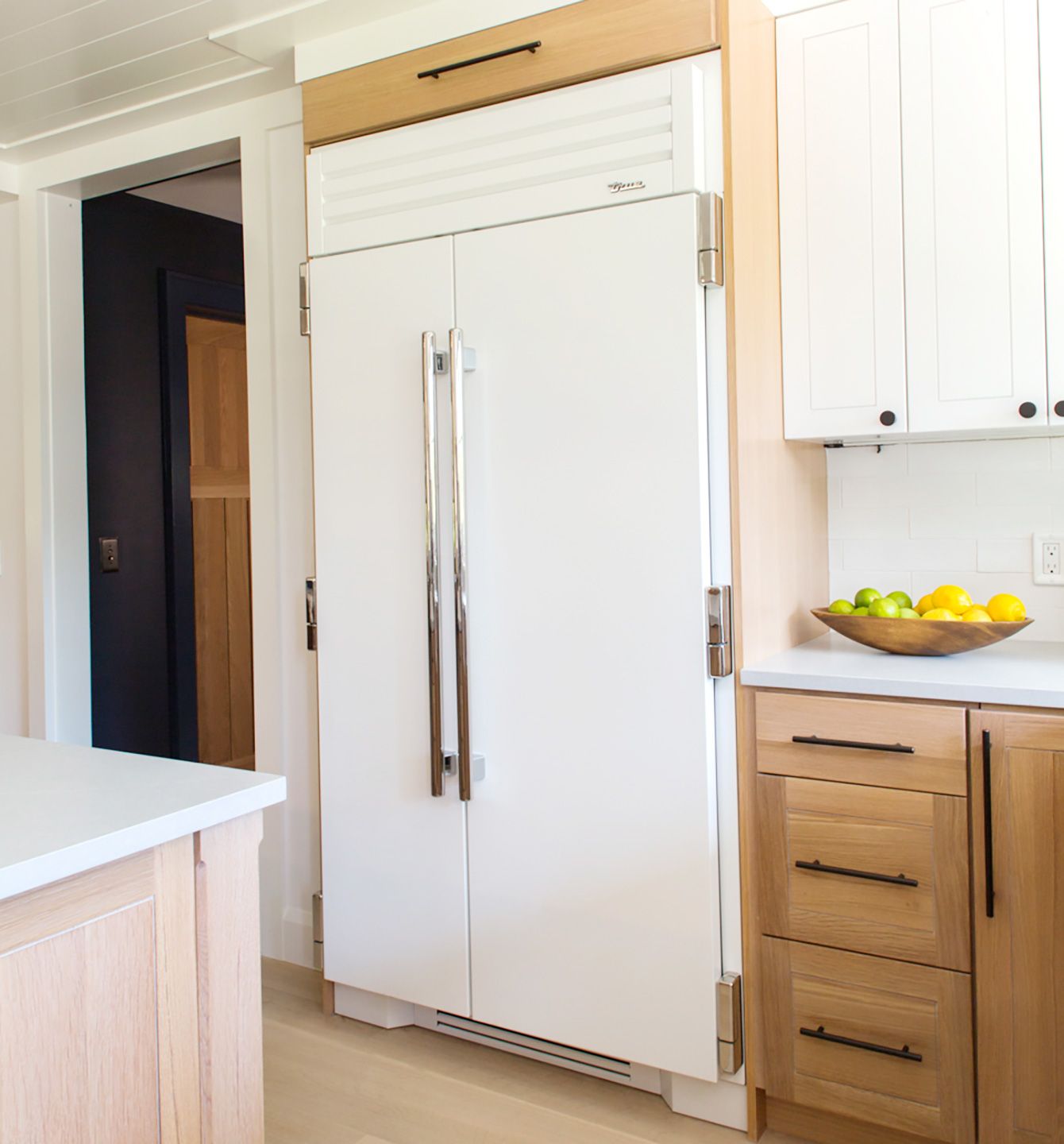
The homeowners chose the matte-white powder-coated stainless-steel refrigerator/freezer—a residential version of a restaurant-supply appliance—for its sleek commercial-style look and chef-caliber functionality.
Refrigerator: True Residential
Floor Plans
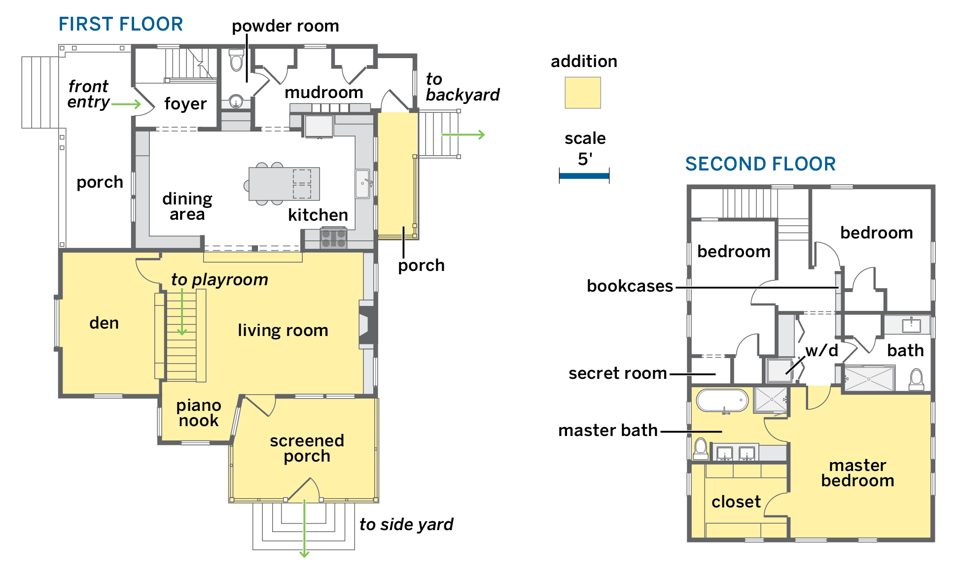
Half of the front-facing dormer windows (above, on the left) were part of the original 1,000-square-foot house, which more than doubled in size. The addition holds a first-floor den and living room, with a screened-porch extension; upstairs is the master suite. Not shown are the lower-level playroom and the backyard barn, which serves as the garage, and its upstairs guest quarters.
