These days, when so many people choose to transform or tear down postwar houses, the owners of this split-level in Chevy Chase, Maryland, bucked the trend. After almost 25 years in residence, they knew their kitchen had to be updated, but they wanted it to integrate well with the rest of the house. They found a kindred spirit in architect Dean Brenneman of Washington, D.C., who respected their wish and told them he’d make it look “as if it were done by the original architect — on his best day and with a good budget.” He would not, he said, create a space that would look like an afterthought. The homeowners, both doctors, had longed to modernize the kitchen for years. But, like many busy couples juggling career and family responsibilities, they didn’t get around to realizing the project until their children moved out. “It makes sense,” says This Old House host Steve Thomas. “Raising kids is such a full-time job that most people can’t imagine going through a six-month renovation — especially one that puts the heart of the house out of commission. But empty-nesters often start entertaining more, and this couple felt they were at a point where they could tolerate the upheaval.”

The Problem
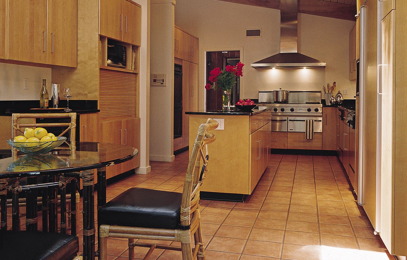
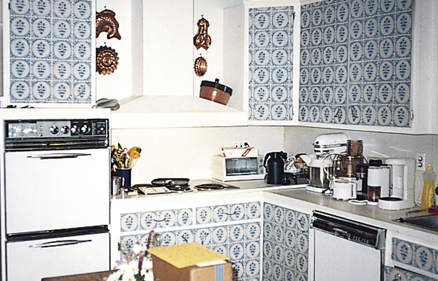
The old kitchen was gloomy, illuminated by just one small window, and burdened with overbearing dark wood beams and trim. Plastic laminate made to resemble Delft tile had been grafted onto the cabinetry in a misguided attempt to bring color and pattern into the room. The layout was awkward as well: Two doors opened into the space and a third led outdoors, turning the room into a thoroughfare, so that everyone passing through would bump into the cook. The wife, who loves to cook, had a very clear wish list. “I wanted an island because I needed extra counter space,” she recalls, “and two dishwashers because I enjoy entertaining but don’t like cleanup, and a professional gas range for flexibility.” Brenneman’s task was threefold: to expand the footprint as much as possible, to improve the traffic and work flow, and to update the kitchen while honoring its mid-century style. To create enough space for a separate breakfast area, he pushed the rear wall back 81/2 feet — the maximum allowed by zoning. He also angled that wall to follow the property’s idiosyncratic lot line. The angle opened up space for a large window with an expansive view of the garden along the newly lengthened side wall. Sliding doors replace the old window and back door. The angle of the wall also echoes that of the gently pitched ceiling, an architectural detail the couple decided to retain. “They wanted to keep the feel of the split-level, and that ceiling was the most concrete link to the original design,” Steve explains. This new breakfast area doubles as a gathering spot for drinks with friends. Nearby are a side-by-side refrigerator/freezer, a wine cooler, and a bar-size sink in the island. “You can get the milk out of the refrigerator and sit down to breakfast or serve drinks and hors d’oeuvres without getting in the cook’s way,” Brenneman explains. “This is an excellent layout,” says Steve, “You’ve got a cook’s area, a food prep area at the sink, an area for someone at the island, and a hanging-out space where you can chat with the cook.”

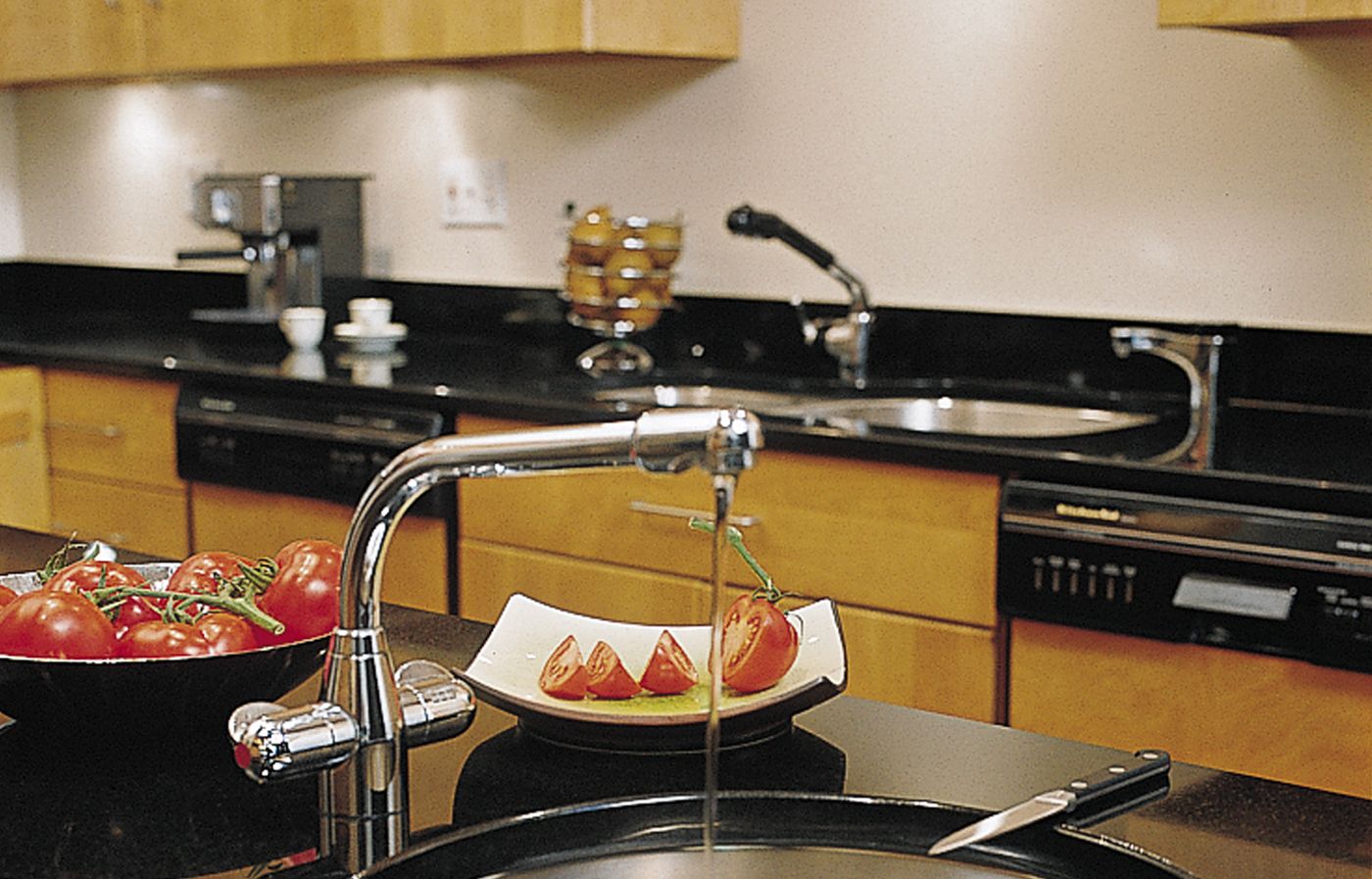
A business trip to San Francisco and a visit to that city’s Museum of Modern Art inspired the homeowners to go with crisp stainless steel and a black-and-blond color scheme for the room. Glossy black granite countertops and wall ovens with black glass doors stand out in sharp contrast to the red birch cabinets. To unify the various zones within the space, Brenneman covered the floor with 12-inch-square terra-cotta tiles. Architect Brenneman prefers custom over semi-custom cabinets. “When you’re renovating a house, the walls are never smooth and the floors are never level,” he explains. “You’ve got to make prefabricated components fit, which involves extra labor. We’ve found that semi-custom is really no cheaper.” Because she is short and didn’t want to have to haul out a step stool to reach the top shelves, the wife requested that the wall cabinets be hung at a lower than normal height. To meet the couple’s culinary needs, Brenneman chose professional-quality appliances clad in stainless steel, including a pair of warming drawers installed under the cooktop. Nearby are a pair of stacking wall ovens and a microwave, plus a garage for small appliances. Finishing Touches
Upgrading the lighting from the old rectangular fluorescent fixture “was tricky,’ recalls Brenneman. “Because we left the original ceiling alone and this part of the house is only one story, we couldn’t rewire easily.” His solution: monopoint fixtures installed on mounting plates, plus task lighting beneath the wall cabinets. Today the kitchen blends seamlessly with the rest of the house — as the wife hoped it would. “We had 24 people over last Thanksgiving,” she says, “and the kitchen made it easy.”

