Kitchen After: Open Setup
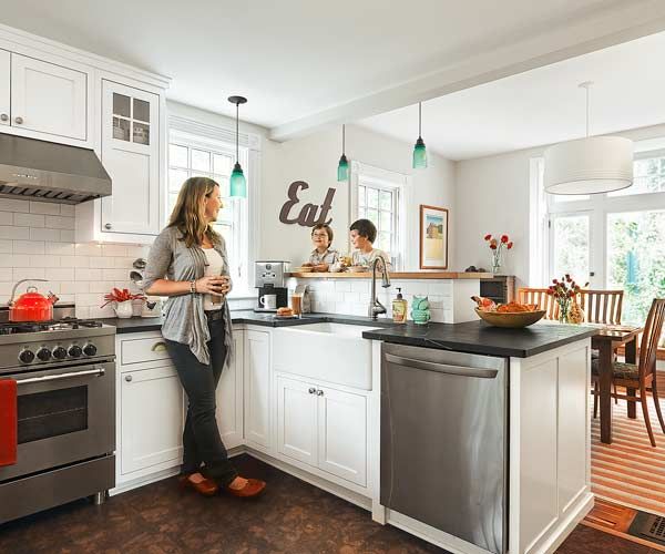
A cottage can feel charming—or just cramped. When Michelle and Paul Hobbs bought their compact 1904 house, the 165-square-foot kitchen had minimal storage and four doorways, and was generally past its prime. “The layout wasn’t efficient, there was very little counter space, and the laminate cabinets were cracking,” says Michelle. Five years later, the couple was finally ready to tackle a redo, with contractor Steven Offenhartz. To create a spacious look, they opened up the kitchen to the rarely used dining room, removing the shared wall and gutting the old cook space.
Shown: Now open to the dining area, the new cook space has a breakfast bar, where Michelle Hobbs and her sons, Ethan, 10, and Davis, 7, grab casual meals.
Kitchen Before: Little Usable Space
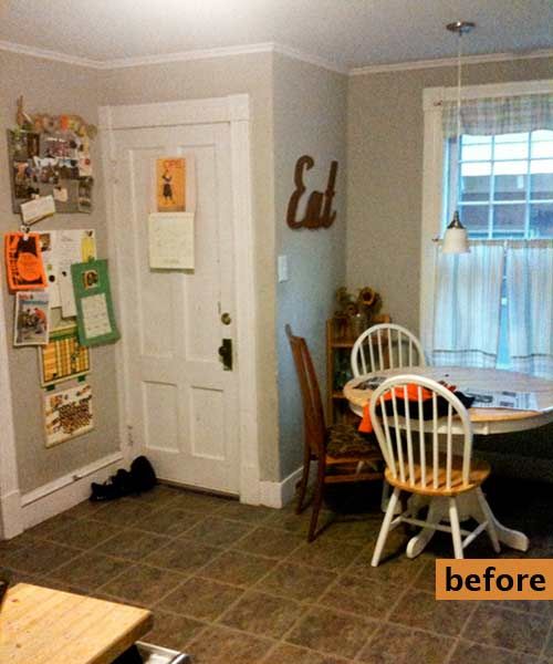
Moving the basement door freed up a usable footprint for a new U-shape layout that included two peninsulas and delineated a back-entry-hall mudroom. A raised breakfast bar provides a perch for casual meals and screens the view of dirty dishes in the open plan. Crisp white cabinets and soapstone counters offer a clean canvas for fun color accents. The kitchen now flows into the bright, bay-windowed dining area. “We spend most of our time here now,” says Michelle. “It’s just a great setup.”
Shown: The basement access was one of four passageways in a kitchen with little usable wall space.
Floor Tiles Built for Backs
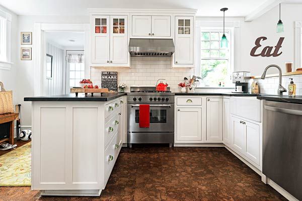
Back-friendly cork tiles cover the floor. Natural soapstone tops the Shaker-style cabinets. One peninsula forms the back entry hall; the kitchen and the dining area are divided by the raised breakfast bar.
Floor tile: Wayfair
Range: Bertazonni
Sink: Porcher
Faucet: Moen
Refrigerator and dishwasher: LG
A Spot to Rest Hot Dishes
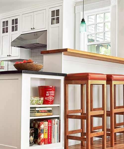
A low open-shelf cabinet with a heat-resistant soapstone top provides a spot to rest a hot serving dish, as well as cookbook storage.
Range hood: Zephyr
Exits with Better Flow
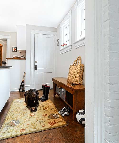
A back entry hall now leads past the relocated basement door and into the kitchen. New awning windows bring in light and air, and a mudroom bench offers a perch for shoes and bags.
Windows: Marvin Windows and Doors
A Pull-Out Take on Microwaves
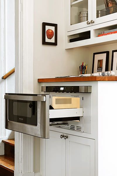
A microwave drawer fits neatly beneath a wood-countertop landing area for keys and mail.
Microwave: Sharp
Cabinets: Shelburne Fine Woodworking
Mason Jar Pendant Lights
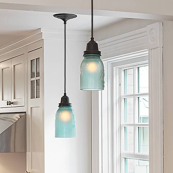
Pendant lights made from frosted-blue-glass mason jars add a touch of soft color.
Pendants: Conant Metal & Light
Colorful Glass Details
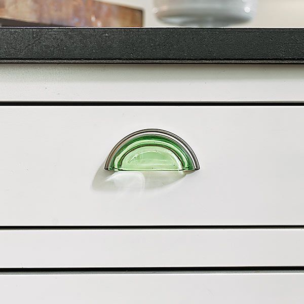
Green-glass bin pulls add another hint of color and complement the glass pendant fixtures above the wood-topped breakfast bar.
Pulls: Lewis Dolin
Floor Plan Before: Inconvenient Space
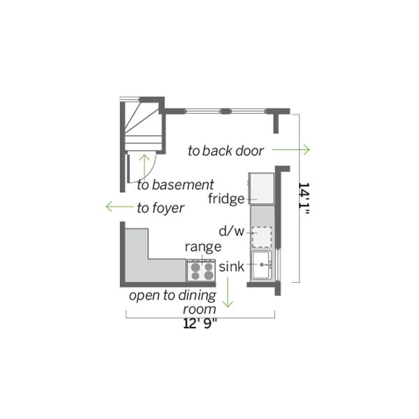
The 165-square-foot kitchen had four passageways and minimal usable wall space for cabinets.
Pro Tip: “If you’re looking to match existing trim, poplar is your best bet. It mills much better than pine and holds paint well.” —Steven Offenhartz, contractor, Burlington, VT.
Floor Plan After: Efficiency Achieved
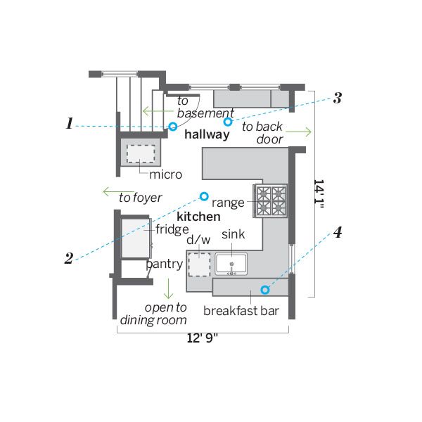
The new, more efficient workspace is open to the dining area and sections-off a back entry hall.
1. Shifted the basement door out of the kitchen’s traffic pattern, making room for a cabinet with landing space and a microwave drawer along the new fridge/pantry wall.
2. Created a U-shape layout in the gutted space, with the range at its center and the sink and the dishwasher a few steps away.
3. Established a back entry hall on one side of the kitchen, shortening two windows for privacy and creating space for a mudroom bench.
4. Added a raised breakfast bar to separate the kitchen from the dining area, where a wall with an open passageway once stood.
