Walls Get in the Way
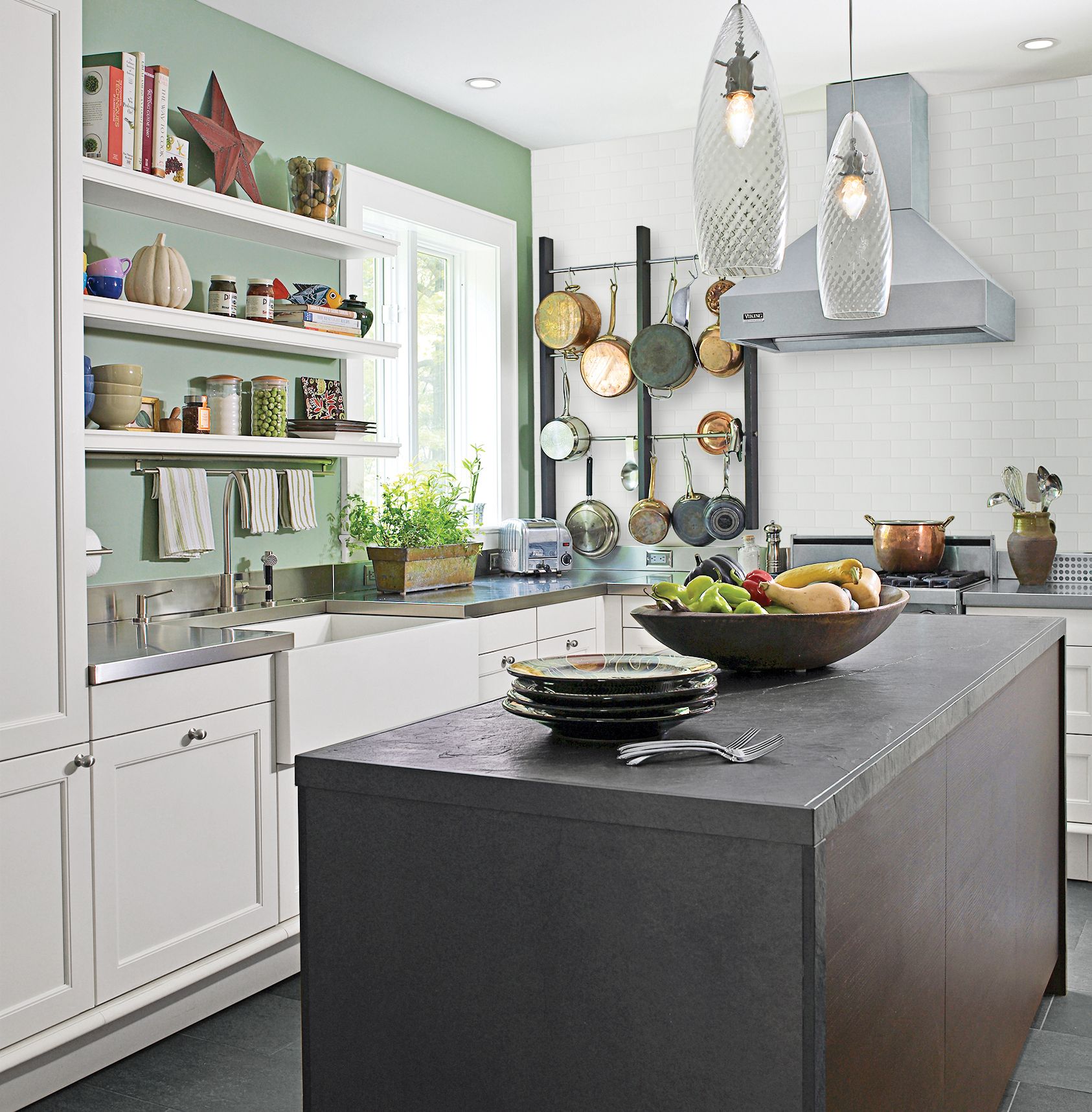
Face it. In a lot of old houses, walls get in the way. That was certainly the case for Susan Smart and Art Westerinen, who two years ago acquired a 1901 Shingle-style house in Montclair, New Jersey. The house, which was a jumble of rooms after a 1920s transformation split it into two apartments, was due for a gut renovation, starting with its cramped galley kitchen. But the obvious solution—knock down the wall it shared with the living room—would mean sacrificing a treasured fireplace. So Susan trained her sights on two walls with less weight, annexing an extra bathroom to gain space at one end and removing two slivers of wall at the other. “Then I took creative liberties to make the room feel more open,” she says.
Breaking the Rules
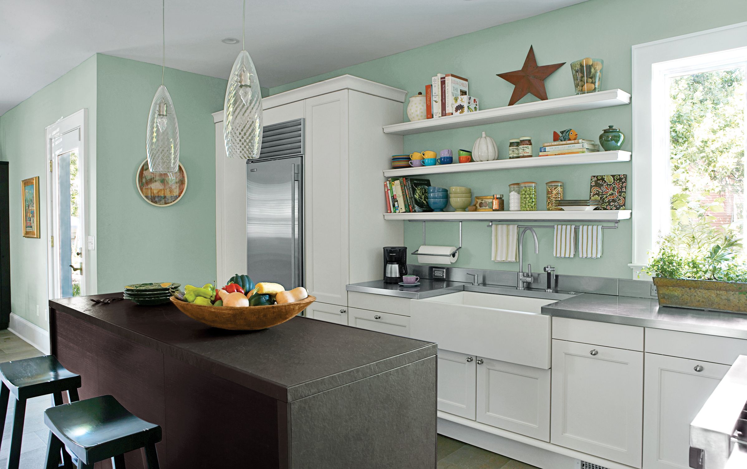
As a veteran kitchen designer, Susan was able to break a few of the usual rules. She jettisoned Rule No. 1—when you need more storage, add more boxes—by nixing upper cabinets in favor of open shelves. As for Rule No. 2—put the sink under a window for the dishwasher’s sake—she figured no one looks up while loading the machine, so why not give the view and a little natural light to the family’s regular guest chef, Art’s mother, Julia. To make the look her own, Susan opted for an innovative mix of styles and materials. Traditional painted base cabinets and a solid-surface farmhouse sink keep the kitchen grounded in its past, while a sleek island topped with slate, along with stainless-steel appliances and countertops, help give this working kitchen a loftlike feel. “Not everyone has the right setup for a great-room kitchen,” Susan says, “but you can always make the most of the space you’ve got.”
Open Shelves
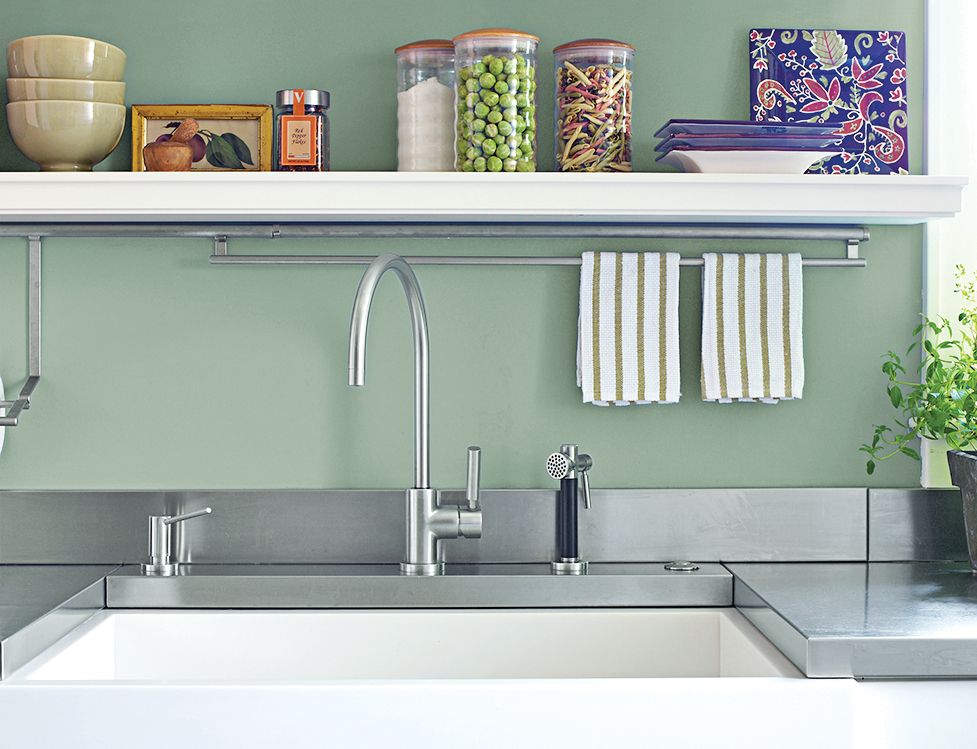
Open shelves display mementos—and no need to open and close doors in search of a cereal bowl.
Faucet: Dornbracht
Corian sink: K & E Fabrications.
Paint: Misted Green, Benjamin Moore.
Stainless Steel Work Surfaces

Slate and stainless steel, while nontraditional, add functionality. Hygenic stainless steel is best for homeowners who appreciate “work surfaces that get a few scratches and dents like you see in restaurant kitchens,” says designer/homeowner Susan Smart. Slate, which in this case was factory-sealed to resist stains, adds a note of luxury. “It’s like I set a piece of Asian furniture down in the middle of the room,” she says.
Countertops: SieMatic
Custom Pot Rack
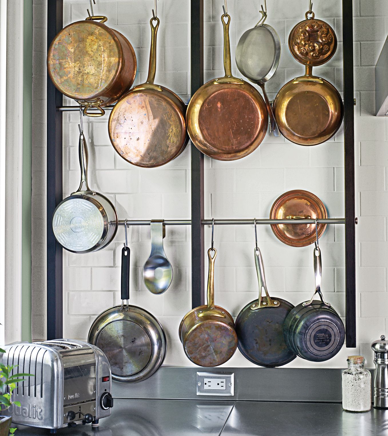
A custom wall-mounted pot rack, designed by Susan, keeps pots near the cooktop. The pine frame is stained to match the island’s pine base, and subway tiles keep the area crisp-looking and easy to clean.
Tile: Waterworks
Storage
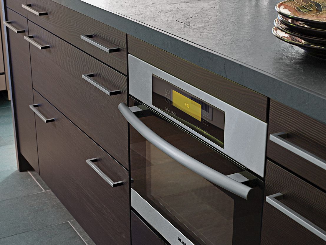
Souped-up storage on the sink side of the island includes 36-inch-wide drawers that are 8¾ inches deep for plates and stock pots; they also have knife-block inserts, slide-outs for spices, and recycling and garbage bins. A built-in microwave/convection oven helps keep counters uncluttered.
Cabinets and pulls: SieMatic
Kitchen Before
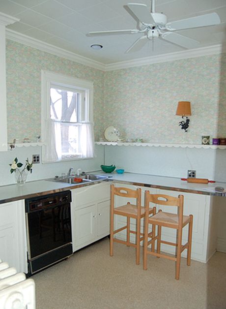
The old 1920s gallery kitchen had crown moldings, laminate counters, and linoleum flooring.
Floor Plan: Before
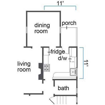
The 11-by-11-foot kitchen was boxed in by a bath, the dining room, and a living-room wall.
Floor Plan: After
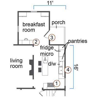
What They Did
1. Took over a bathroom to add 55 square feet, allowing the homeowners to extend an L-shaped run of cabinets, move the range to a better spot, and drop an island and two stools in the center of the room.
2. Knocked out two slivers of wall and removed a narrow doorway leading to the former dining room. This surgery, coupled with the addition of a second passageway between the kitchen and living room, eased traffic flow and created a more spacious feel.
3. Relocated a doorway between the kitchen and the back porch. Eliminating the door swing—and an adjacent radiator—opened up space for a 7-foot-tall pantry, one of two flanking the fridge.
4. Sealed up one window to gain wall space over the sink for open shelves. The redesign, meanwhile, positioned a food-prep area under the former bathroom window, which they replaced with one nearly 12 inches wider. “It made more sense to have a window over a counter,” says designer/homeowner Susan Smart. “Today, with dishwashers, you don’t need the window for daydreaming at the sink. It’s better to have one where you spend time chopping onions and reading recipes.”

