Dated and Jumbled: Before
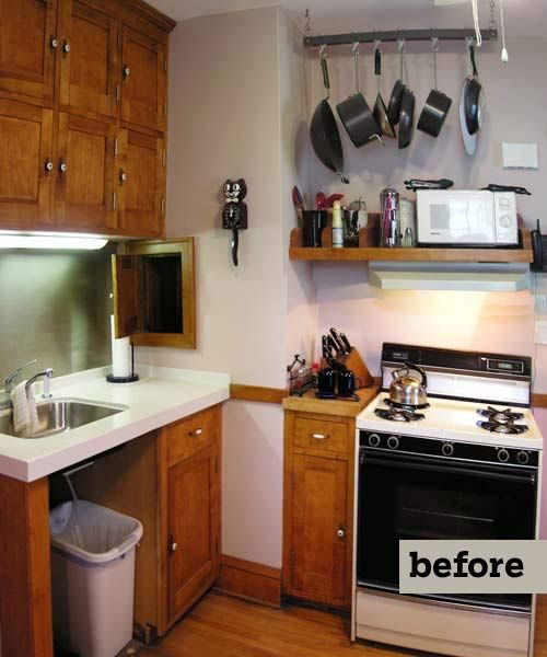
Designer Chris Christofferson freed up an empty wall for cabinets by moving a poorly placed opening. Then he rearranged the layout, working with Molly, who served as the general contractor. It was a challenge to juggle bids, schedules, and deliveries, she says, and the work stretched to nine months, but she has no regrets. “Usually the newness of something wears off, but every time I walk in there I smile,” she says. As for storage, “I even have a few drawers with absolutely nothing in them.”
Shown: Dated cabinets and appliances (no dishwasher) and an illogical layout hampered productivity.
Kitchen Design Cravings: After
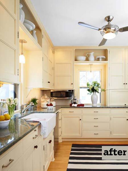
Cupboards and drawers were what Molly Dinneen craved. An inviting style and reliable appliances were also missing from the kitchen of her 1925 Minneapolis foursquare, but the limited mishmash of original and 1980s near-match cabinets was what really got to her. Turning to the David Heide Design Studio, she asked for a bright, functional space with a place for everything. She could do without an island, but she did want granite countertops, stainless-steel appliances, and a roomy apron sink. And did we mention more storage?
Shown: New spots for the range and sink, capacious cabinets, and lots of counter space provide fresh style and function.
Designer: David Heide Design Studio
Paint: HC-36 Hepplewhite Ivory (cabinets); Benjamin Moore
Custom pendant-light fixture: Lightworks
Ceiling fan: Minka Group
Rug, tray, and herb container: West Elm
Mugs and pedestal server: Pottery Barn
Flow With a Craftsman Dining Room
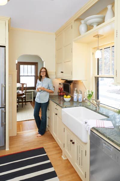
Homeowner Molly Dinneen pauses at the new opening, which was relocated and redesigned to blend with the Craftsman dining room.
Paint: OC-43 Overcast (walls); Benjamin Moore
Sliding Convenience
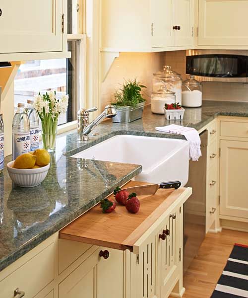
A slide-out chopping board hovers near the sink and over a cabinet pullout with bins for trash and recycling.
Countertops: Capital Granite
Microwave: GE
Bowls: Target
Vases: Pier 1
Paneled Door for Max Light
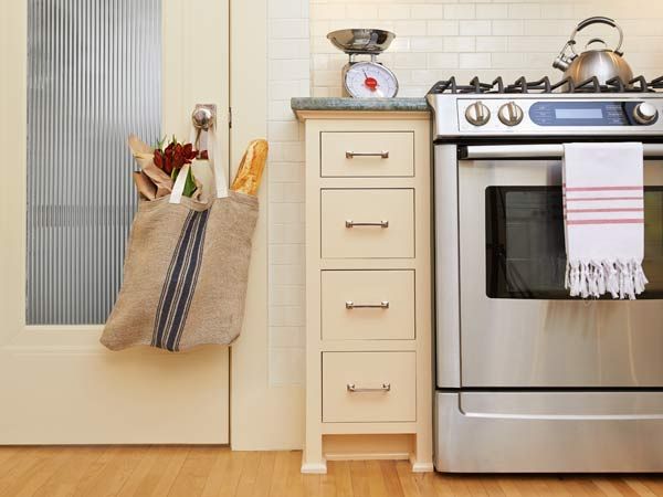
Light-channeling reeded glass replaces the center panel in the door to the back entry.
Door inset: GlassArt Design
Pulls: Rejuvenation
Range: Bosch Home
Refrigerator: Liebherr
Circulation Cutouts
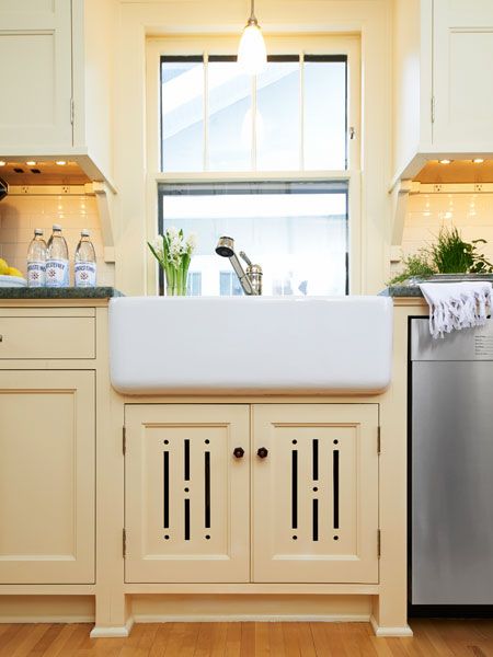
Decorative vent cutouts add detail and allow radiator heat to circulate. Furniture-like feet add to the period feel.
Sink and faucet: Rohl
Dishwasher: Miele
Casing to Blend
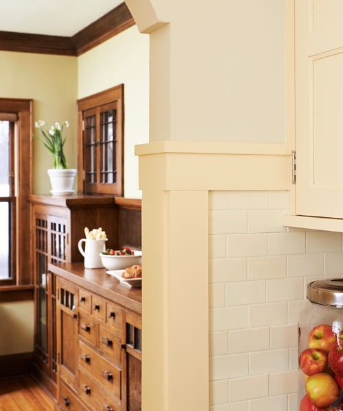
Simple flat casing matches the original trim and mimics the wainscot cap in the adjacent dining room. Scaled-down tile makes the room feel larger.
Tile: Revival Tileworks; fantasiashowrooms.com
Flash of Red
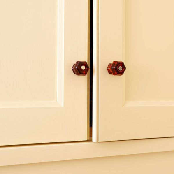
Red glass knobs add a shot of color and contrast with the brushed-nickel pulls, flagging the mix of old and new.
Knobs: House of Antique Hardware
Floor Plan Before: Disjointed Space
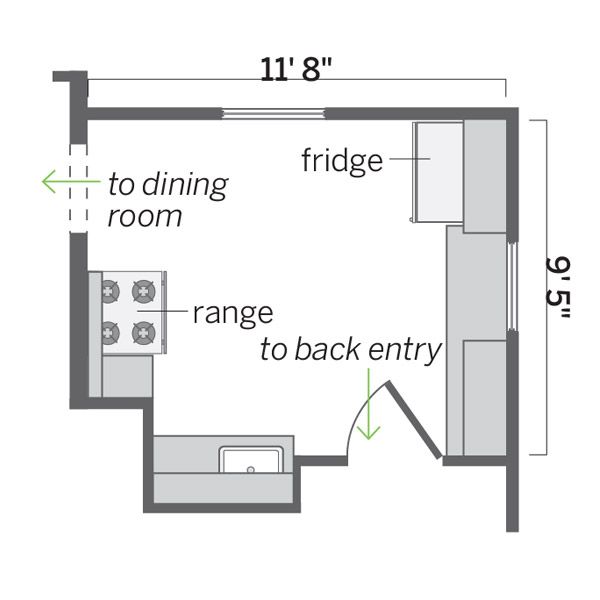
The 110-square-foot space held a disjointed array of old cabinets and appliances.
Pro advice: “By extending the subway-tile backsplashes down to the baseboard around the stove and refrigerator, we gave the kitchen a fully tiled feel at a minimal cost.” —Chris Christofferson, Kitchen Designer
Floor Plan After: Shift for Function
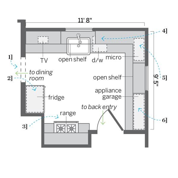
Shifting an opening 20 inches allowed for a more functional layout in the same footprint plus more storage and prep space.
1. Centered the opening, which allowed cabinets to go up on the adjacent wall.
2. Moved the fridge to the range’s old spot and added upper cabinets.
3. Relocated the range and flanked it with utensil drawers and prep space.
4. Created a cleanup zone under the window and lined the wall with storage.
5. Wrapped more cabinets and prep space around the wall where the fridge had stood.
6. Incorporated a clutter-reducing appliance garage under a pantry cabinet.
