Palettes With Personality
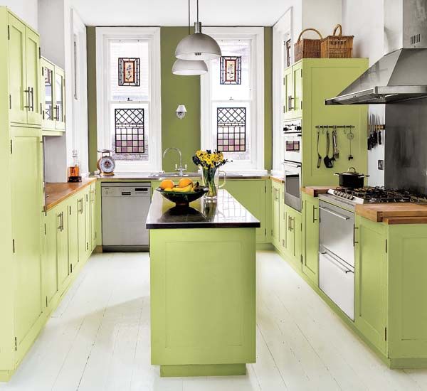
White cabinets and safe wall colors? They’re a no-brainer. Which is why all your neighbors have them. But with a little imagination and our paint-color know-how, you can mix it up in the kitchen to give it a whole new mood; just think about the feeling you’re after, from warm and lively to calm and collected.
We like palettes with a strong personality. They stand up well to today’s favored finishes, from stone and butcher-block countertops to stainless-steel appliances to gleaming honey-colored or ebonized floors. Got stained-wood cabinets that you just can’t cover? Simply identify their predominant shade—yellow, orange, red, brown—and assemble your palette around it. Read on for color combos sure to turn any cook space into something special.
Lively Greens
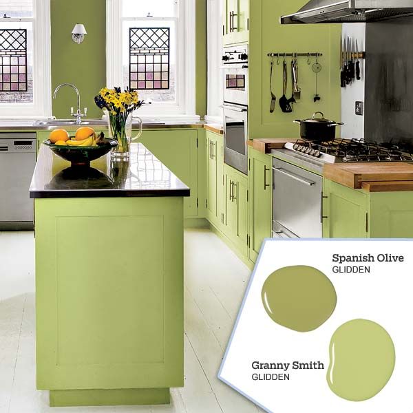
Yellow-based greens feel sunny and inviting. “With lots of crisp white trim, apple and olive greens can be really refreshing,” says Kathryn Precourt, an interior designer based in Ashfield, Massachusetts. Precourt notes that such greens are popular today because they evoke nature and the environment and so have positive associations. In this high-ceilinged space, two vibrant shades warm up stainless-steel appliances while an abundance of white-painted surfaces keeps them from seeming too bright. These high-voltage hues also add energy to the room by ramping up the available natural light.
Colors: Granny Smith, Spanish Olive. From Glidden
Soothing Vintage Blues and Greens
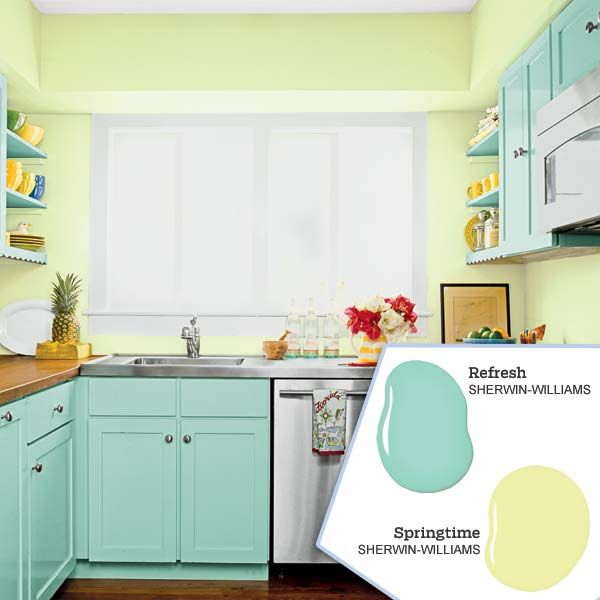
Soft, optimistic shades of blue and green bring the outdoors in and can make a kitchen visually interesting in a subtler way than higher-contrast two-color schemes. In the kitchen shown here, cheerful bands of green and blue add pep to a compact workspace and blend well with wood countertops and floors that have warm amber and cherry undertones. These casual, comforting colors have an inherent versatility, says Dorienne West Farzan, an architectural designer and colorist in Newport, Rhode Island, and can be equally at home in a seaside setting or a vintage cottage or amid retro furnishings.
Colors: Refresh, Springtime. From Sherwin-Williams
Bold Red, Plus Two More
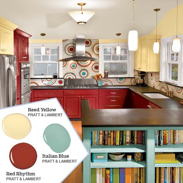
The trick when using three paint colors is to balance their intensity and keep nonpainted surfaces uniform, says Seattle architect and interior designer Sheri Newbold. Graduated saturations help make this colorful scheme work: The energetic red is bright, the blue is a midtone, and the yellow is a softer shade. Uninterrupted stretches of sophisticated black countertops, honey-colored flooring, and consistent cabinet and window trim contribute to the room’s well-composed, orderly feeling. The repeating pattern in the tile backsplash ties the three colors together.
Colors: Italian Blue, Red Rhythm, Reed Yellow. From Pratt & Lambert
Warm Harvest Hues
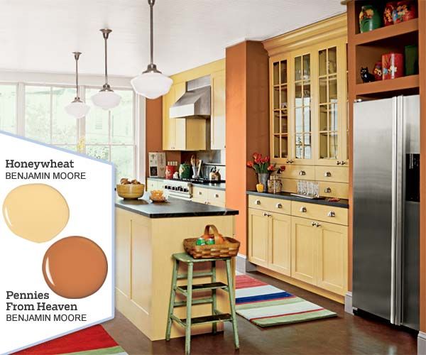
For years, kitchen designers have noticed how beautifully three colors borrowed from items in the produce aisle—carrots, corn, and peas—can create hearth-like warmth in a cooking and gathering space. These colors are especially effective in taking the chill off stainless steel and in bringing out the rich tones in wood floors or ceiling beams. “Choose one of these hues if you have a small kitchen and don’t want to divide it up,” says Doty Horn, a color consultant in the New York City area. “Use two or all three if your kitchen is larger.” Carrots and corn flavor the kitchen shown here, with only the slightest hint of peas in the striped runners, which could easily be amplified with more green accents.
Colors: Honeywheat, Pennies From Heaven. From Benjamin Moore
Elegant Shades of Blue
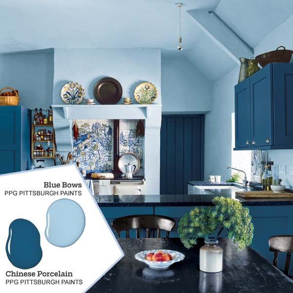
Rich, saturated shades of blue have a time-honored, traditional look and evoke Chinese porcelain, says Josette Buisson, a color forecaster who works with PPG Pittsburgh Paints. Buisson, who says she is seeing more of these blues in living rooms and kitchens, likes to layer dark and midtone indigos for an understated elegance similar to the effect in the space shown here. The blues on the walls and cabinets are unified by a blue-and-white tile mural and extend an element of formality from the open dining room into the cook space, an effect that is reinforced by black countertops and chairs and a table painted navy blue.
Colors: Chinese Porcelain, Blue Bows. PPG Pittsburgh Paints
