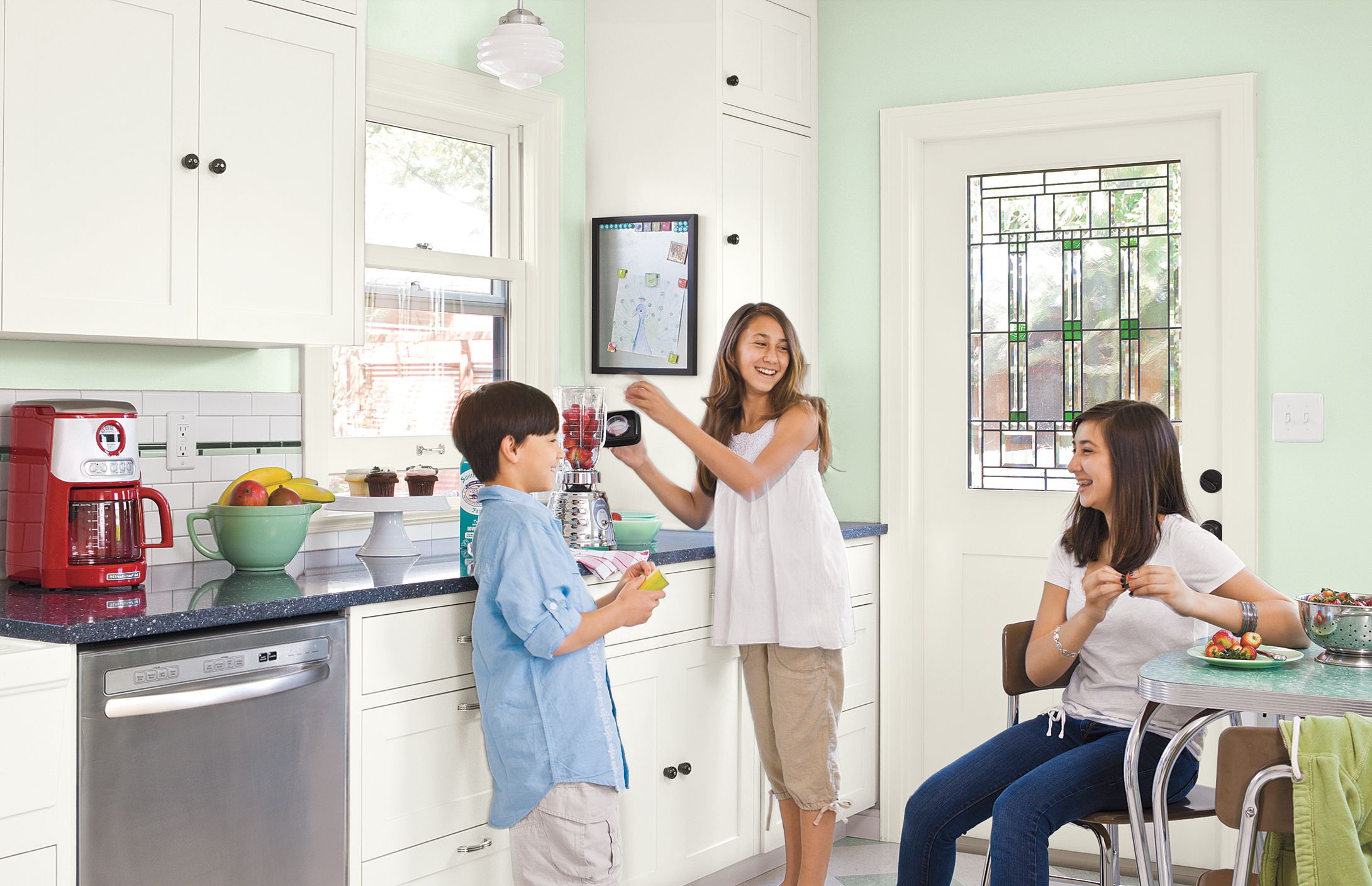
Functional Family Kitchen

WHO> Linh-Co Nguyen, Rick Burke (and Dawson, Ali, and Maddie, too!)
WHERE> Seattle
WHAT> Created a hard-wearing space with an eclectic vintage look
We fell in love with our 1920s house, which was built to last. Not so much the kitchen, which was late ’60s. We wanted to give it more character and function. We also wanted space for a family-size table, so we hired a framer to knock out a dividing wall and enclose a small back porch. Then we hired a pro to make our cabinets. But we did everything else ourselves, including hanging those cabinets. The kids even helped us wiggle the last one in place. They also helped choose the floor pattern.
Shown: Dawson, Ali, and Maddie Burke enjoy a slightly bigger, totally rebuilt space that has Art Deco pendants, a diner-style table, and a clean new look.
Before: Dull, Dated, and Dreary
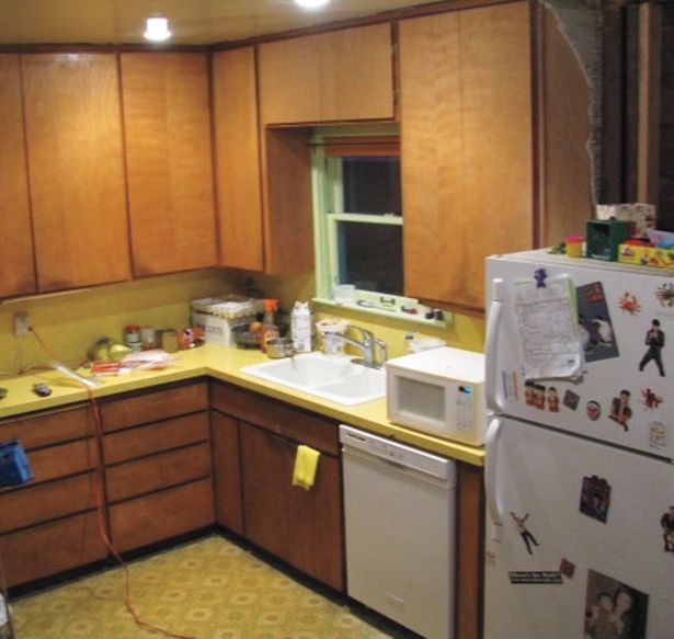
I hate high-maintenance anything, so we went for commercial vinyl tile, along with quartz counters, which don’t need sealing, and wood windows that are low-maintenance aluminum on the outside.
Shown: Harvest-gold laminate, dull brown cabinets, and a mottled-mustard floor made the kitchen feel dreary.
After: Light, Bright Space on a Budget
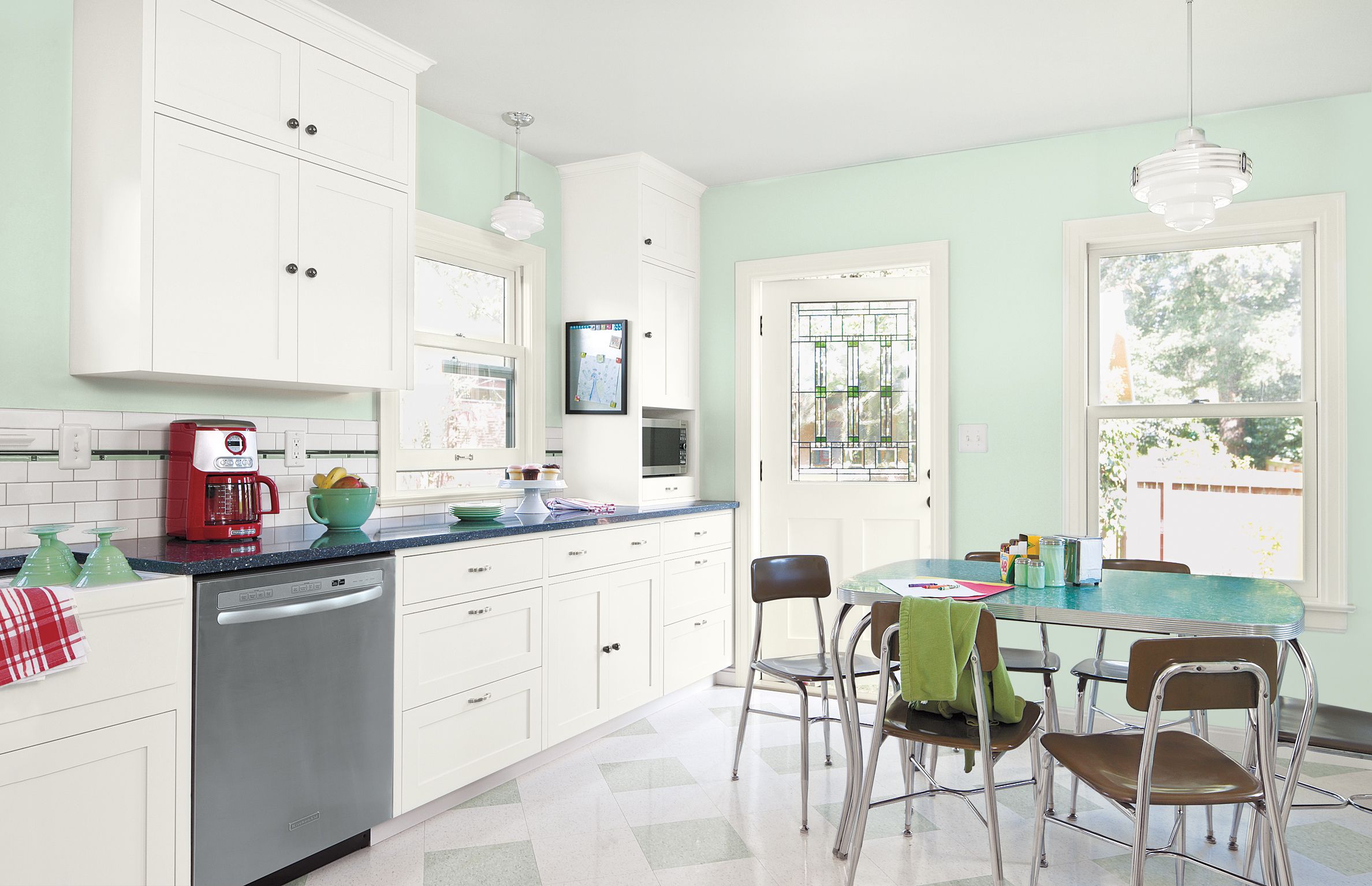
I also like a bargain: I found a chrome-trimmed table on Craigslist and school chairs at a surplus store. Friends always say how much they like the kitchen. Some even seem convinced it came with the house!
Shown: Lighting fixture from Rejuvenation; Cabinet paint from Miller Paint in Italian Ice
To-the-Ceiling Cabinets
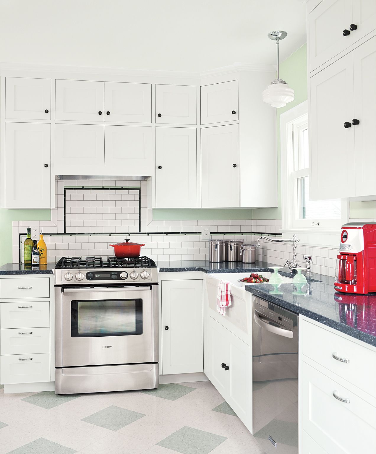
Custom cabinetry finished with white acrylic enamel lend a period look. Soft-green walls echo the floor squares as well as the slim green accent tiles paired with black dots and trim in the backsplash.
Shown: Cabinets from Cabinet Works in Seattle
Built-In Hutch
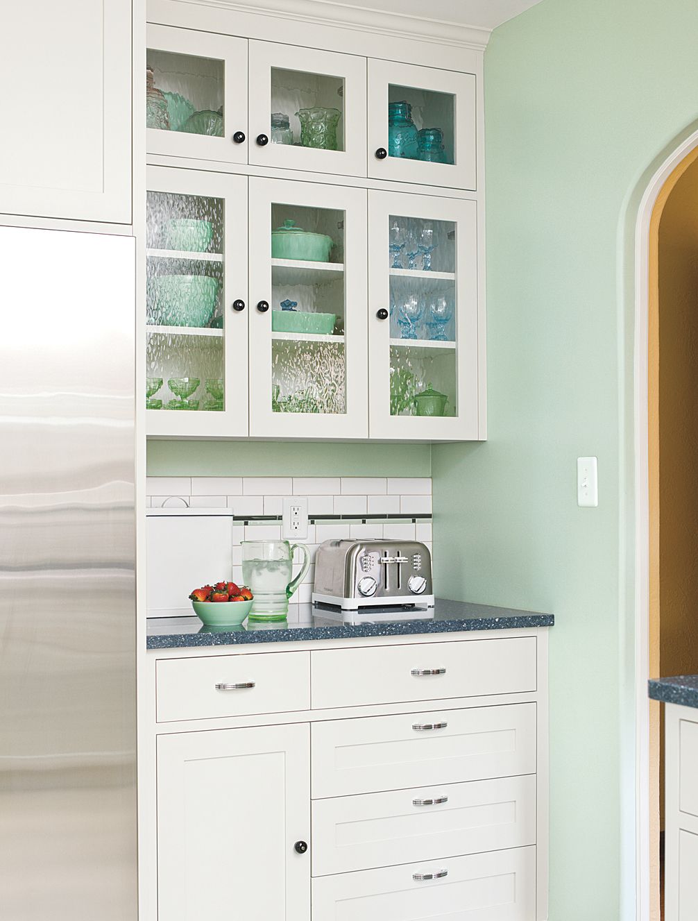
A hutchlike assembly of wavy-glass-front upper cabinets and paneled lower units shows off our collection of vintage Jadite. Chrome pulls with black ridges coordinate with plain black knobs.
Shown: Backsplash tile from American Olean; Art Deco cabinet pulls in Chrome from Rejuvenation; Retro Round Glass Knobs from Van Dyke’s Restorers
Low-Maintenance Materials
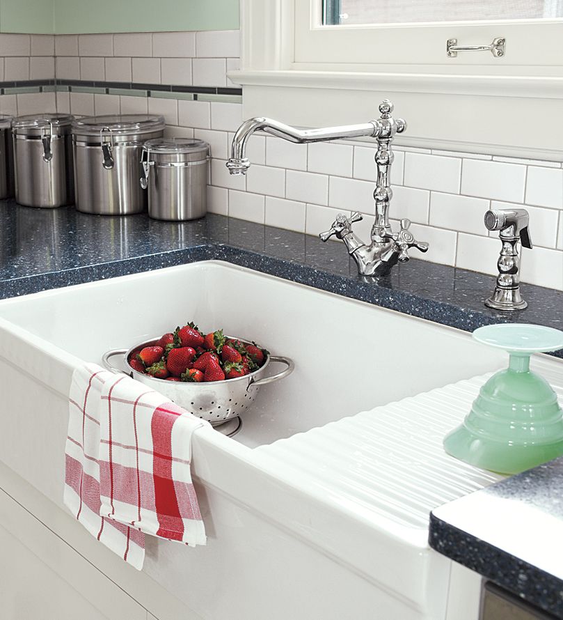
We used easy-care surfaces including ceramic tile and engineered quartz. The sink had an integral drain board, and a vintage-style faucet with just a single stem to clean around.
Shown: Matte white subway tile for backsplash from American Olean; Counter from LG Hausys; Sink from Whitehaus; Faucet from Blanco
Space-Saving Storage
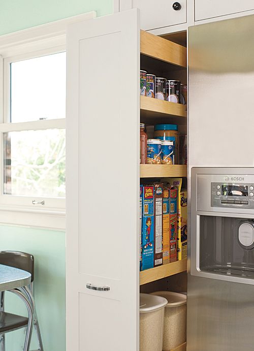
This pullout pantry organizes bulky cans and boxes and helps to form a snug niche for the fridge.
Shown: Refrigerator from Bosch
Fresh Flooring
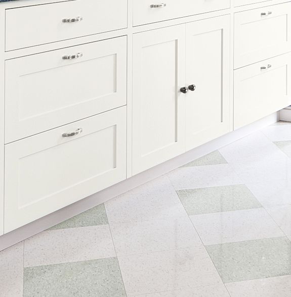
A fresh green-and-white checkered floor tile pattern replaced the old mustard-colored flooring. The new floor ties the room together by marrying colors of the cabinets and walls.
Shown: Floor tile from Armstrong in Excelon
Appliance Garage
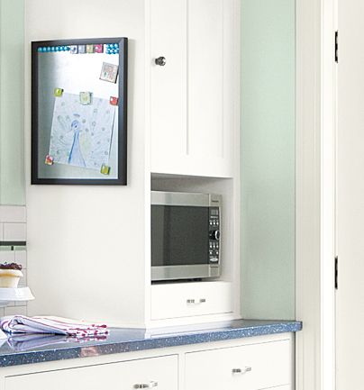
Built-ins were designed to accommodate the family’s appliances. But the most important detail in any kid-friendly kitchen? A message and reminder board, that also serves to put Crayola masterpieces on proud display.
Shown: Art Deco cabinet pull in Chrome from Rejuvenation
Homeowner Tip: Mix and Match

Linh-Co says, “Save by mixing high- and low-end materials. We made cafeteria-style flooring look special by pairing it with perfectly fitted custom-made cabinets.”
Floorplan: Before
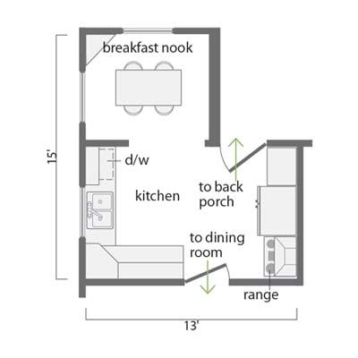
At about 160 square feet, the kitchen was too small to hold a family-sized table and too dark for comfort.
Floorplan: After
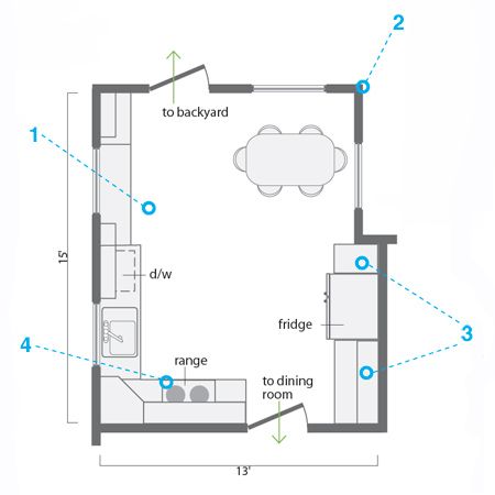
Annexing a 45-square-foot porch created a more workable layout; adding windows brightened the space.
1. Opened up the breakfast nook by removing a dividing wall. This allowed for a longer run of cabinets and countertops.
2. Squared off the room by bumping out an exterior wall where a back porch had stood, making room for a bigger table. Relocated the back door, swapped it for one with a stained-glass panel, and added two more windows to channel natural light into the space and enlarge the view.
3. Created a fridge niche with a pullout pantry on one side and cabinets arranged hutch-style on the other.
4. Freed up the range, which had been jammed in a corner, by moving it to the other side of the dining room door.
