Speeded-Up Remodel
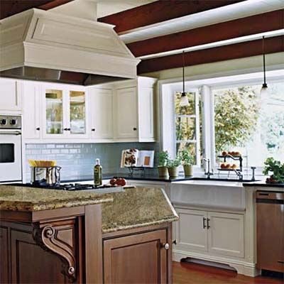
Nothing moves a project forward like a deadline. In this case, it was a daughter’s announcement that she wanted to have her wedding reception at home—in just four months. The 1950s kitchen in her parents’ Long Beach, California, ranch house was a decent size but not fit for company, with its outdated finishes and confined layout.
Combining Two Rooms
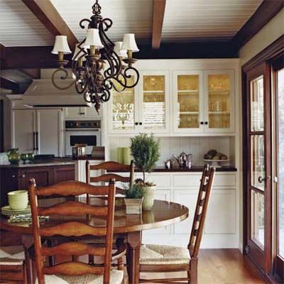
A partial wall and L-shaped peninsula separated the kitchen from the family room, boxing in the cook. And though the couple had lived for 20 years with this less-than-perfect union of the two rooms, when their daughter shared her wedding wish they turned to local kitchen designer Dana Jones for help.
Ready for a Wedding
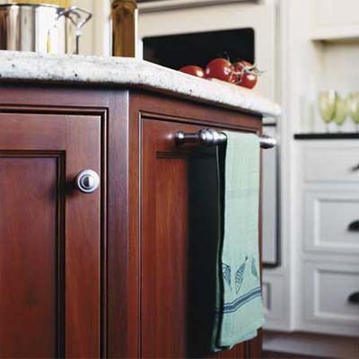
“We had to keep the footprint if there was any chance of getting done on time,” says Jones, who opened up the room by removing the peninsula and adding a big bay window. Clever built-ins and plenty of white paint made it feel even more spacious, as did an island facing the family room, “so the cook is kept in the loop during gatherings,” Jones says. “Weddings included.”
Cherry Countertop
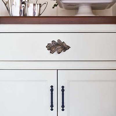
A cherry countertop and antiqued brass oak leaf and bar pulls give the built-in hutch a distinctive, custom look with leaf pulls from Notting Hill.
Raised Snack Bar
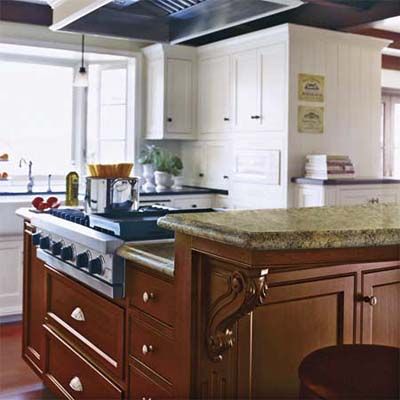
The raised snack bar on the cherry island helps hide the hardworking cooktop. Golden Beach granite tops its whole surface. Along the sink wall, what remains of the dividing wall that separated kitchen and family room is filled with cabinets (the built-in hutch sits on the other side). The end of the wall is paneled with V-groove and finished with a low cherry-topped cabinet for added storage. The vent hood liner is from Best by Broan and the cooktop and wall ovens are from Viking. The sink and faucet are from ROHL, and the windows are from Andersen.
Painted Mantel Shelf
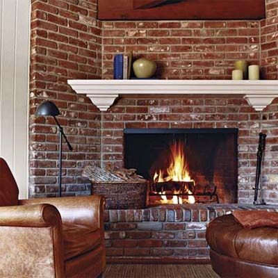
A painted mantel shelf ties in with the white kitchen cabinets and updates the family room’s 1950s brick fireplace.
Open Shelves
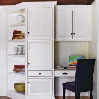
Open shelves are angled toward the seating area by the hearth. The desk area’s bottom cabinet is designed to hold a speaker for a plasma TV. The cabinets are painted in creamy conversion varnish, and the walls are celery interior latex, both by Sherwin-Williams.
TOH Pro Advice: Dana Jones, kitchen designer, Long Beach, California says, “Decide ahead of time where every pot, tray, and glass will go. Then, when the kitchen’s done, you can just look at your notes and put everything in its place.”
Before
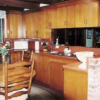
Honey-colored cabinets, terra-cotta counters, and a peninsula made the 228-square-foot kitchen feel crowded.
Before Floor Plan
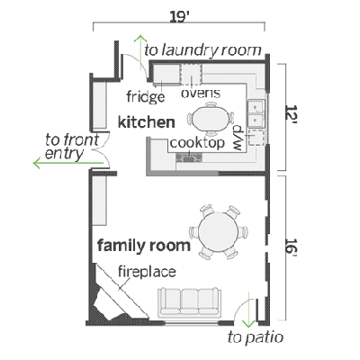
An L-shaped peninsula boxed in the 12-by-19-foot kitchen.
What They Did
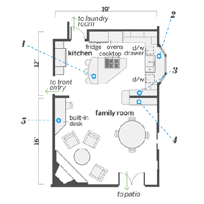
The peninsula came down in favor of an island, and a bay window added a lot more light.
1. The island has breakfast-bar seating, storage cabinets, and a sight line from cooktop to family room so that the cook can be part of the action.
2. More light and a feeling of spaciousness became possible with a bay window that’s 8 feet wide and 18 inches deep.
3. A full wall of cabinets with an appliance garage was added to what remains of the dividing wall, maximizing storage and prep space.
4. A hutch is built into the dining-area side of the dividing wall. A low cabinet caps the wall’s exposed end.
5. A built-in desk adds storage for files in the family room. The angled side—on the same axis as the clipped end of the island and based on the angle of the hearth—allows for extra seating fireside.
