Before: Isolated, Dated Kitchen
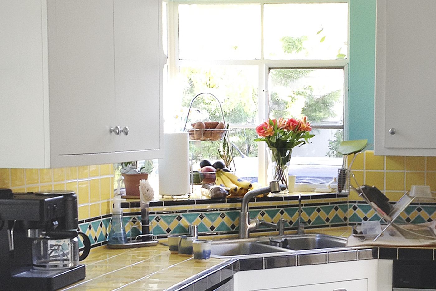
Storage and counter space shortages are standard issue in old-house kitchens, and Jill Martin and Andrew Kylander-Clark’s was no exception. But the couple, who share the 1940s bungalow, in Santa Barbara, California, with their two young sons, had a site- (and sight-) specific complaint: The kitchen was one big blind spot. “It was cut off from every other room in the house,” says Jill, an avid home cook. “I needed to be able to make a meal and see what my kids were up to.”
Shown: Marooned at the front of the house, the kitchen had an odd corner sink and dated finishes.
Family Kitchen with a View
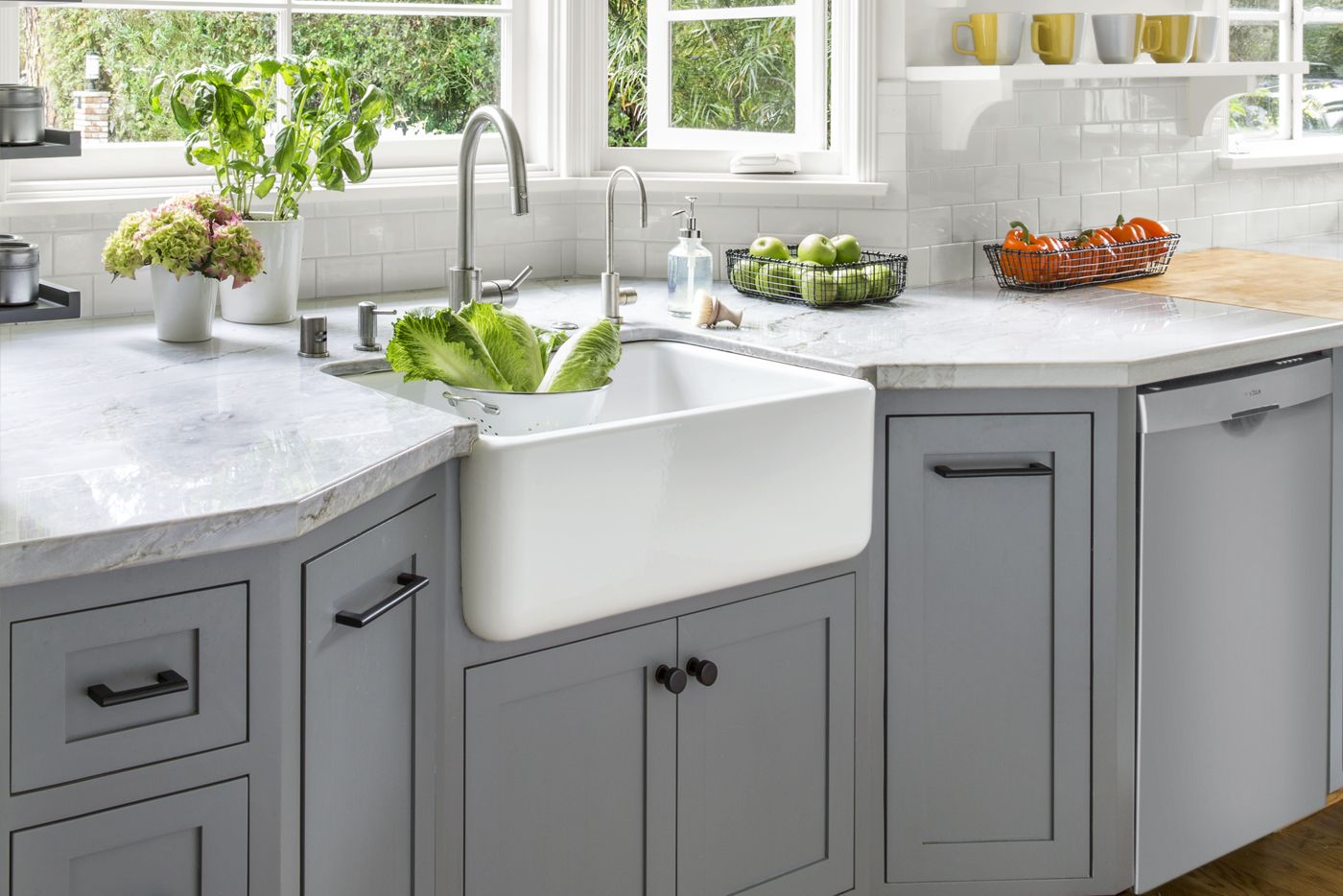
Interior designer Jessica Risko Smith, charged with redoing the space, had a simple solution—fix the flow. First up: removing the door and wall that closed off the kitchen from the laundry at one end and the narrow pocket door to the dining room at the other.
After: Ample Storage and Meal-Prep Room
Ditching both created wider passageways to open up the space. Next, moving the sink tapped a light-filled alcove—and allowed for Jill’s coveted farmhouse basin. Now the kitchen has ample meal-prep areas and is packed with both open and closed storage. “We doubled our counter space and found a place for everything,” Jill says. “All while improving the view in every direction.”
Shown: The sink got a new home in an existing bay with all-new windows for front-yard views. Open shelves and storage cubbies keep the space feeling airy and bright.
Sink: Rohl
Faucet: Grohe
Filter faucet: Water Inc
Cool Custom Cabinets for Easy Flow
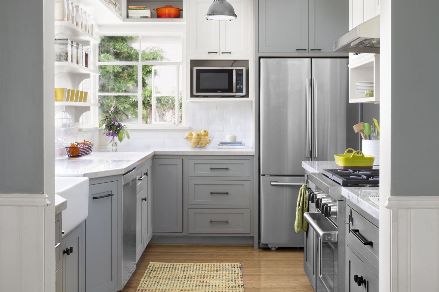
Lots of light, a cool color palette, and vastly improved flow make the galley-style kitchen feel spacious and inviting. Jill wanted a calm, clean look, so she opted for custom cabinets painted dove gray, which carries through to the upper walls of the adjacent dining room.
Contractor: Below Magid Construction
Custom cabinets: Utt Construction
Paint (gray cabinets): Sherwin-Williams’s Cityscape
Microwave: Whirlpool
New Hardwood Floors Stained to Match
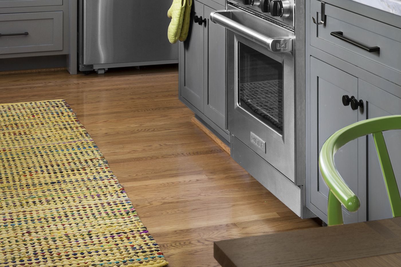
The new hardwood floors were stained to match those in the rest of the house. They offer a warm contrast to the cool-gray cabinets.
Refrigerator: Samsung
Lights: Restoration Hardware
Range hood: Windster
Cabinet knobs and pulls: Emtek
Hand-Painted Tile Focal Point
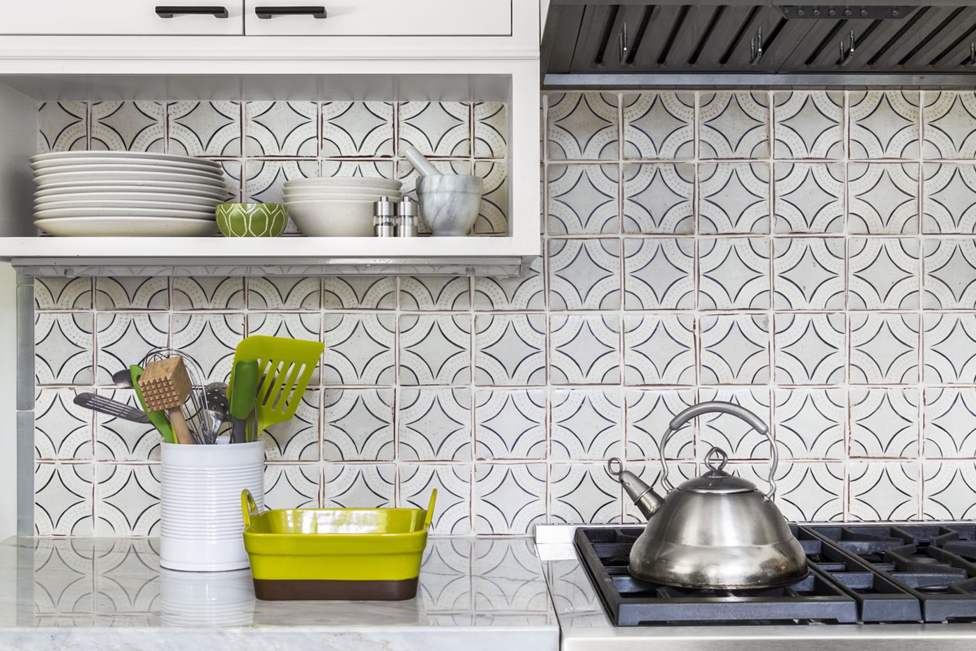
Hand-painted tile on the range wall adds a big-budget touch to the economical white subway tile used elsewhere in the room. Andrew, a geologist, vetoed stain-thirsty marble counters in favor of equally pricey gray-veined quartzite, which can be as durable as granite.
Tile: NS Ceramic
Range: Wolf
Pretty, Smart Butcher-Block Prep Area
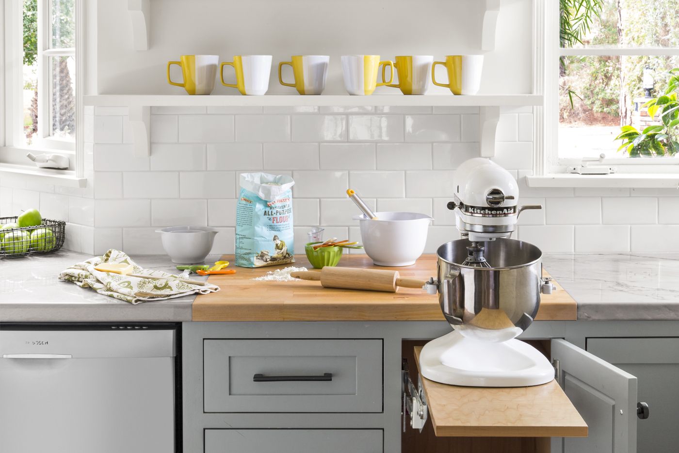
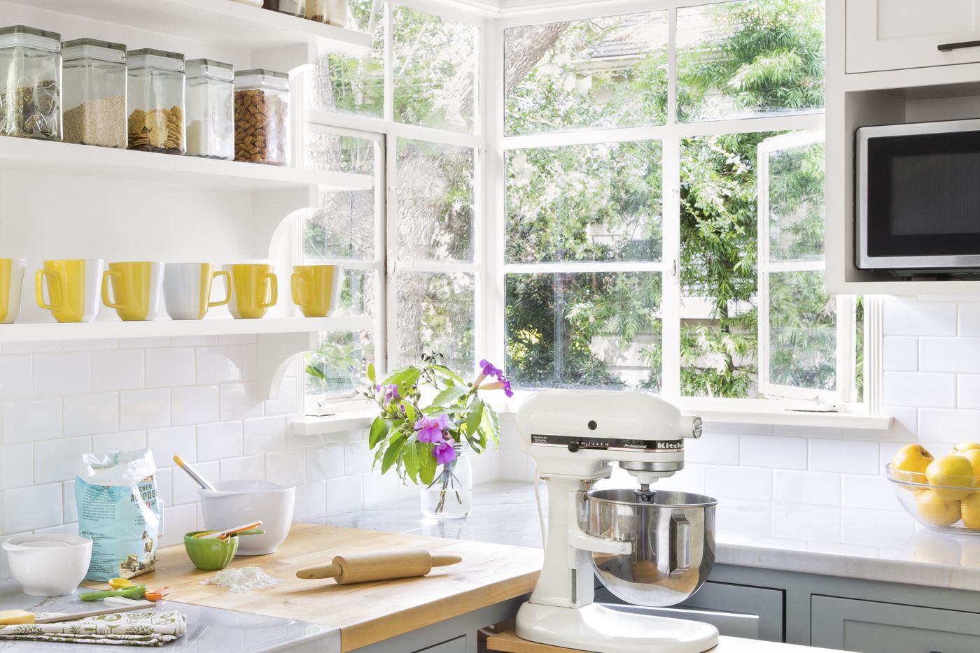
A food-prep station to the right of the sink includes open dry-goods storage, a stretch of built-in butcher block for knife tasks, and a lift insert in a lower cabinet for the stand mixer, which formerly lived in the laundry-room closet.
Homeowner tip: “A section of butcher-block countertop disguises a necessary seam in the veined quartzite. And it’s so useful—it’s one of the things I love most about the kitchen.” —Jill Martin, Santa Barbara, Calif.
Butcher block: IKEA
Subway tile: Buena Tile + Stone
Dishwasher: Bosch
Elevated Open Storage for Cookbooks
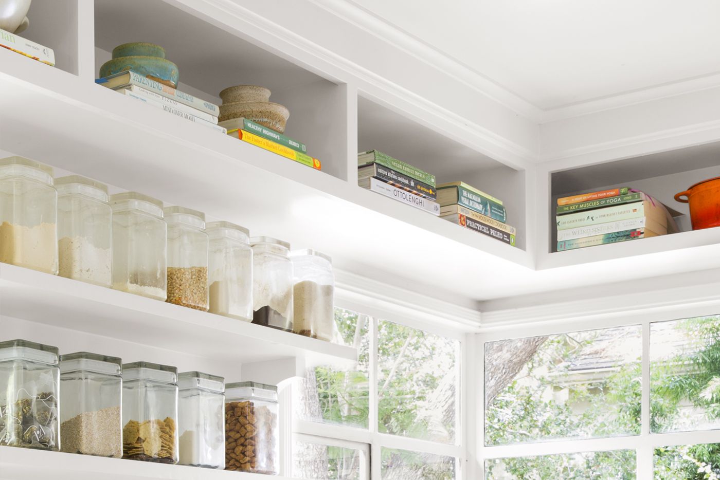
A step stool makes accessing ceiling-high storage easy. The “pocket” shelves were deliberately left open so that Jill wouldn’t forget about her trove of cookbooks and serving pieces.
Paint (walls and upper cabinets): Frazee Paint‘s Akamina
Secluded Cookspace: Floor Plan Before
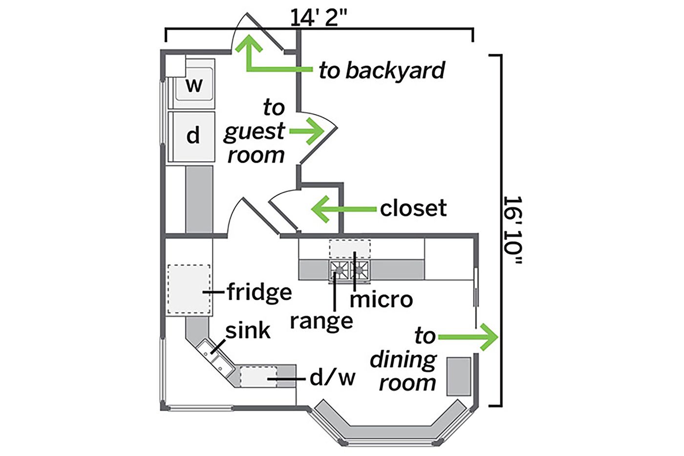
Awkward doorways to the laundry and dining rooms made the kitchen feel cut off.
Spacious Family Space: Floor Plan After
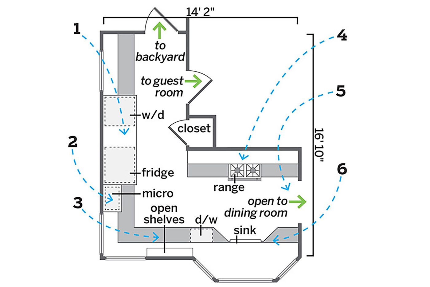
Incorporating the laundry room and dining area into one continuous circuit makes the home’s first floor more functional and family-friendly.
1. Removed the laundry-room door and wall, making space for a large pantry cabinet between the fridge and new stacked washer and dryer.
2. Moved the microwave next to the fridge to allow for a proper range hood.
3. Created a cook’s center with open shelving above a built-in butcher-block counter.
4. Centered the new range on the interior wall.
5. Removed a pocket door and widened the opening to the dining area.
6. Raised new bay windows to accommodate the sink. Added pull-out waste bins on either side, set at angles that follow the bay.
