Double Time
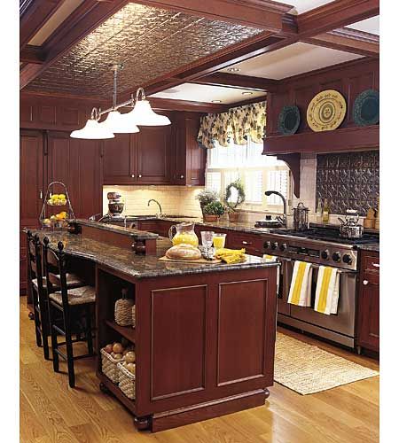
For the users of this kitchen, two gourmet cooks who love to entertain, double workstations and top-of-the-line appliances were a must. They requested two of everything, including commercial-grade refrigerators, dishwashers, and ovens. But they also wanted the look to suit their Colonial Revival home.
Cherry panels help twin refrigerators and dishwashers blend seamlessly into the kitchen’s traditional look. The central island provides plenty of work and storage space, plus seating for two.
Old and New
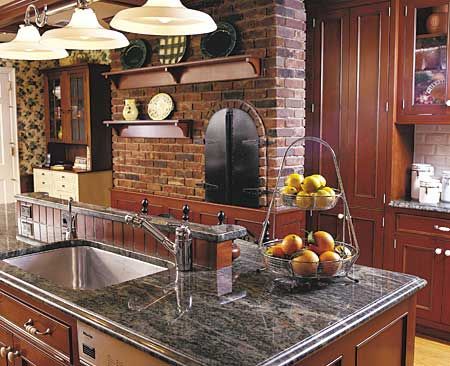
The homeowners enlarged the space to create plenty of elbow room, working the existing Dutch oven and brick surround into the new decor.
A new 9 1/2-foot island holds a sink, dishwasher, speed-cook oven, and roll-out trash bin. Seating on one side allows guests to perch without getting in the way of the cooks.
Focal Point
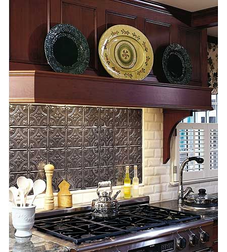
A custom-covered hood gives the range a hearthlike look, and the built-in mantel serves as a display area. The stamped-tin insert behind the cooktop echoes the section of tin ceiling above the island.
Smart Solution
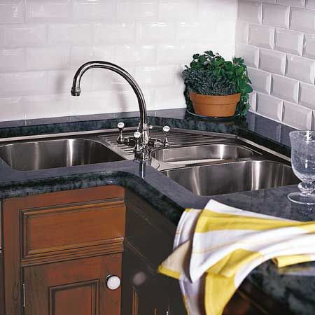
A triple-bowled corner sink, placed alongside the refrigerators and a dishwasher, defines one food-prep/clean-up area. A corner sink is a great antidote for wasted space because its plumbing fills up the corner cabinet, otherwise difficult to reach and see into. This frees up room for more-useful storage elsewhere.
Sink For All Reasons
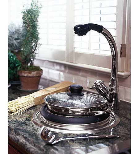
A cooking sink, set into the counter next to the range, comes with its own double-boiler/steamer insert and is designed for pasta, potatoes, or anything else that requires a big pot of water. It has its own electric heating element (operated by a wall switch) and drain. Its tall, arched faucet swivels and has a pull-out spout for filling pots as far away as the cooktop.
Cooking Time
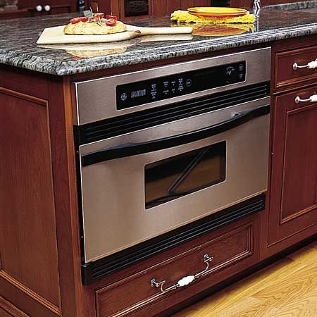
A speed-cook oven uses a combination of heating elements—two 1,500-watt halogen lightbulbs at the top, one 1,500-watt halogen bulb on the bottom, and microwave—to cook as fast as a microwave, but brown like a conventional oven.
Design Details
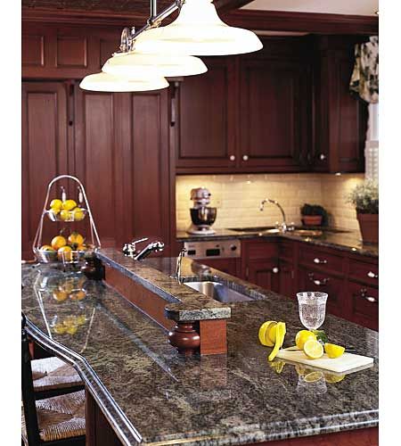
Furniture-style feet punctuate both ends of the granite-topped island’s raised partition, which was designed to shield diners from food-prep and clean-up mess. These feet also accent each corner of the island’s base.
Before
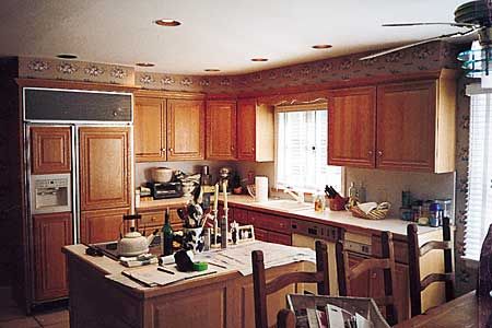
The original kitchen lacked style and functionality, with dated cabinets and appliances.
Poor Layout
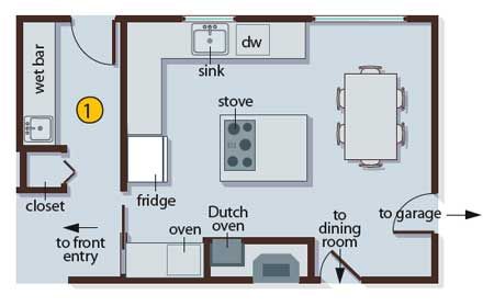
It was too cramped for two cooks, making the likelihood for kitchen collisions high.
What They Did
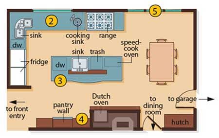
To gain space, the homeowners removed an interior wall so they could expand the kitchen into a neighboring hallway, which had been used as a makeshift butler’s pantry. They sealed up a back door in the process.
They enlarged the L-shaped layout to accommodate two food-prep/clean-up stations—each with its own sink and dishwasher—and to provide ample counter space and maneuverability for two people to work.
To maximize storage and display space, floor-to-ceiling cabinets and a custom-made hutch now flank the brick wall opposite the new appliance-packed island.
To access the backyard deck, windows in the dining area were replaced with triple French doors.
