Looks Like a Million Bucks
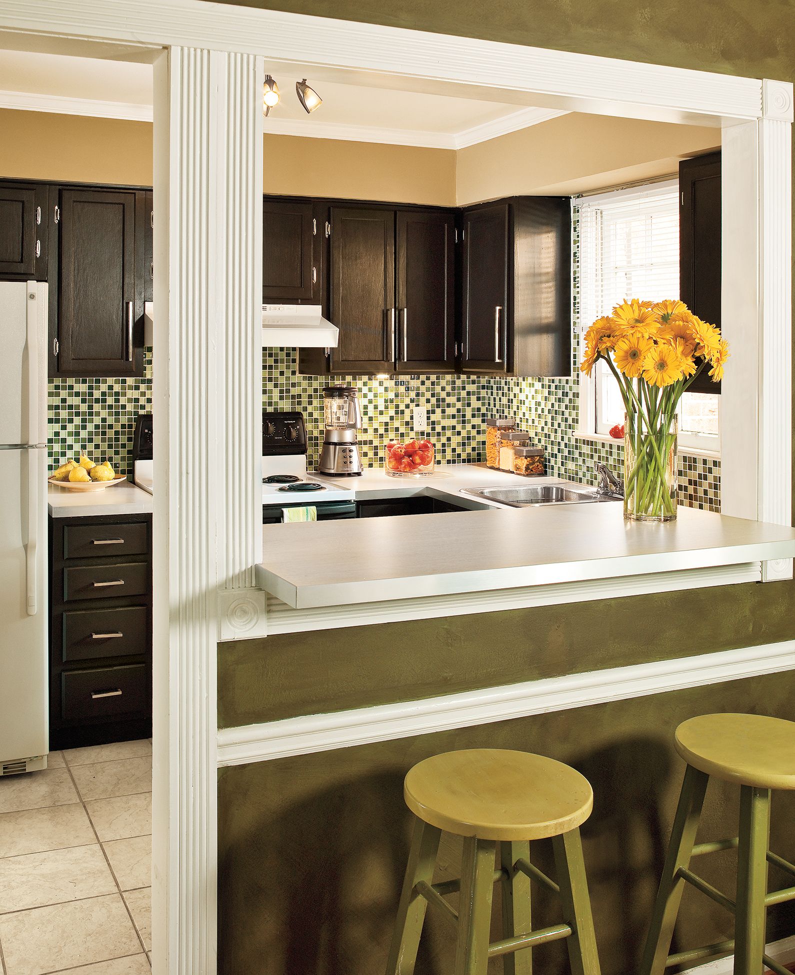
With kitchens, simple does not necessarily equal streamlined. For homeowners Eduardo Perez and Moo Sirikittisup, the kitchen that came with their Atlanta condo fell short on both frills and function. Builder- grade cabinets and white laminate counters set a cheerless, monotonous tone in an open space that can be seen from the front door. And washing dishes meant looking at a worn wood cabinet, as the window didn’t line up over the sink. Opening the dishwasher blocked the oven door and vice versa. “It was a sad-looking space,” says Eduardo.
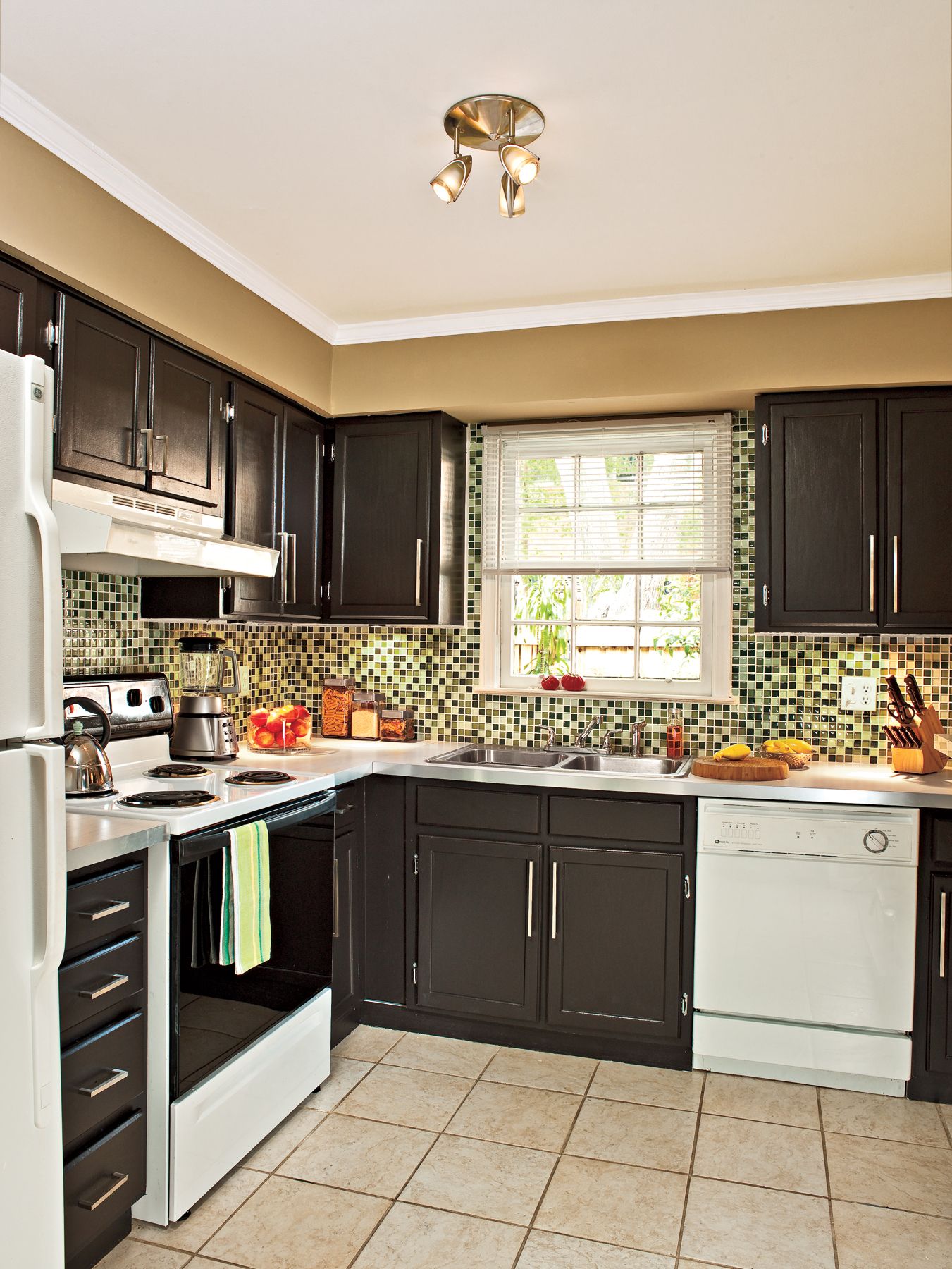
Shown here: The green walls of the adjacent dining room inspired the kitchen’s new backsplash.
Sad-Looking Space
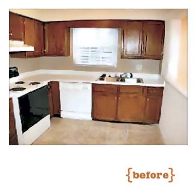
A bland color scheme and an awkward layout made this kitchen boring and inconvenient. So after a year—and with some DIY know-how passed down from his contractor dad—Eduardo spent two weeks removing the oak cabinets, refinishing and reinstalling them, then putting in new counters. The sink and the dishwasher swapped places, improving the room’s flow, and he added sleek new hardware and fixtures to update the space.
Beautiful Backsplash
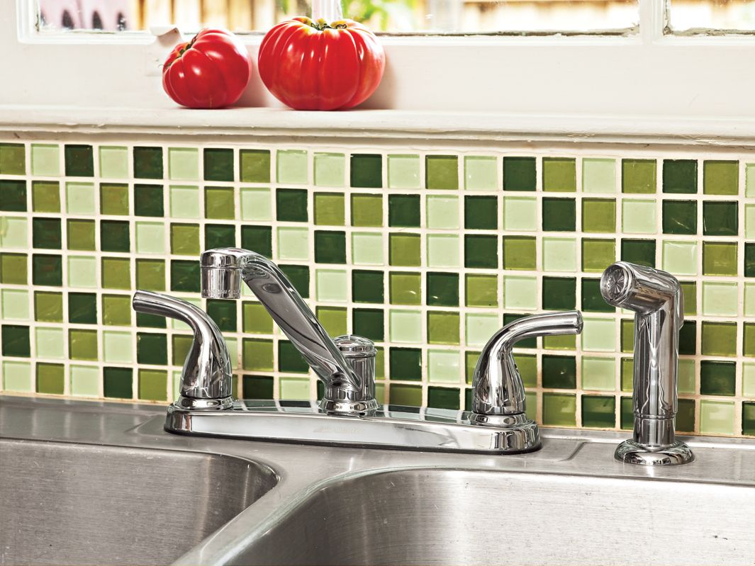
The new faucet (Delta) is classic and functional, with a graceful shape. The priciest splurge was the colorful mosaic tile (Casa Italia, Green Mix Mosaic Glass from Floor and Decor Outlets of America), but the green-and-white glass-tile backsplash brought in a finishing touch of color. Says Eduardo, “Now, when I walk in and see the kitchen, it makes me smile.”
Homeowner Tip: Eduardo picked up a small wet saw for just $59: “It cut the glass tiles like they were cookies. It was so easy.”
Dynamite Details: Cabinet Pulls
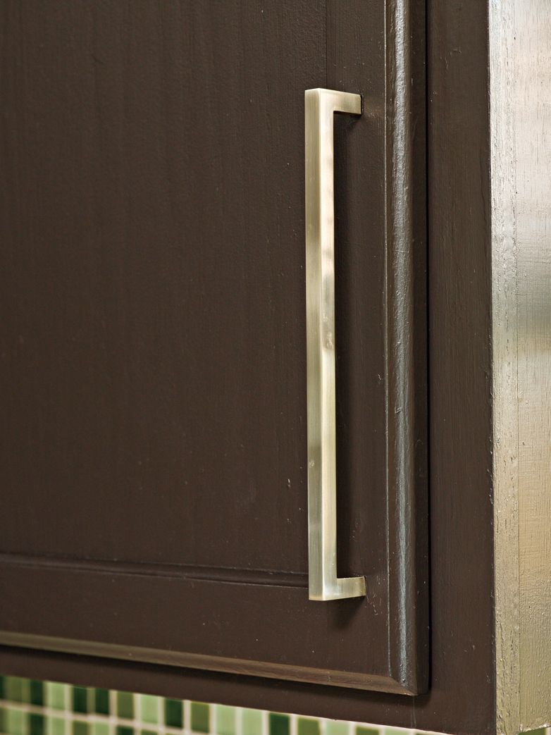
The removed-and-reinstalled cabinets look like completely new boxes, thanks to a DIY paint job. Rectangular bar pulls (IKEA) updated the cabinets and complemented their new modern chocolate-colored finish.
Dynamite Details: Lighting
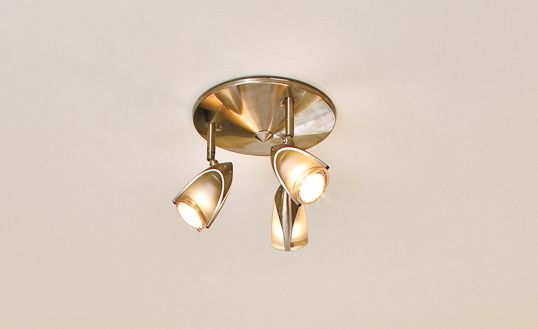
An inexpensive home-center find, the spotlight fixture (Home Depot) targets its beams on the kitchen’s separate workstations. And, the brushed-nickel finish matches the new cabinet pulls beautifully.
Finding Storage in Small Spaces
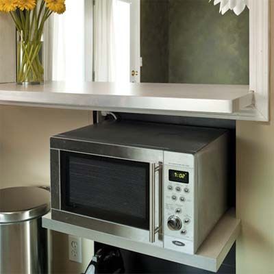
Since the kitchen is on the small side, the homeowners added shelves underneath the breakfast bar area to hold the microwave and other appliances when not in use. This smart use of space clears up the countertop for food prep and other everyday use.
Eduardo and Moo are saving for the next phase of the makeover: new appliances. But for now, chocolate-colored paint (Behr) on the cabinets and a countertop swap (IKEA), along with nickel-finish fixtures and cool green mosaic tiles complete the contemporary makeover.
Project Tally
• Removed and reinstalled original cabinets in a slightly new configuration, $0
• Replaced old laminate counters with new ones that have stainless-steel edge banding, $300
• Put a fresh coat of paint on walls and ceiling, $34
• Sanded original oak cabinets and brushed on a gallon of new chocolate-brown paint, $28
• Added a brushed nickel, three-light ceiling fixture, $35
• Swapped in nickel-finished cabinet pulls, $80
• Upgraded the kitchen faucet, $45
• Added undercabinet pucks for task lighting, $45
• Installed new glass tile mosaic backsplash, $400
TOTAL: $967
