The Toned-Down Kitchen
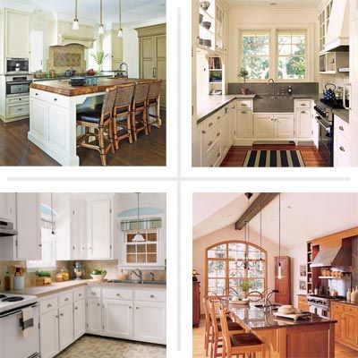
Bold wall color or sterile white everything are not the only design choices available for the hub of the home. Richness in texture—the looping pattern of wood grain, the glint of metal pulls, and the dazzle of granite—can actually warm up your kitchen and make it more interesting. And if you’re investing in beautiful woodwork on the cabinets, why not show it off? A wall of neutral paint is all it takes to make it shine. To give you inspiration for turning your cookspace into an elegant, toned-down haven, here are some of our favorite examples of kitchens that keep it natural.
Honey-Hued
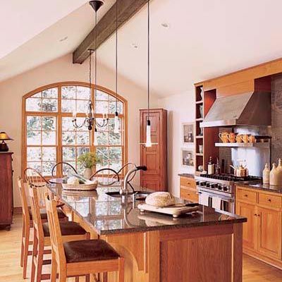
Handsome wood cabinets provide all the color necessary for this open-plan kitchen.
Learn about how light fixtures can make or break your kitchen’s look.
Marble Focal Point
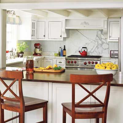
A marble backsplash, framed like a work of art, and countertops brighten this space and informs the soft gray bead board and white cabinets. A wooden bar top and seats tie the space into the rest of the home.
Add a dose of charm to your kitchen with inspiration from our favorite cottage kitchens.
Into the Woods
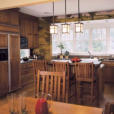
Classic Arts and Crafts style showcases natural materials with a hand-wrought look.
White Bright
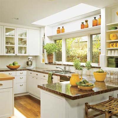
Russet marble countertops ground a timeless white kitchen made even brighter with an extended skylight directly over the sink.
Practical ideas abound in this kitchen remodel thought up by the resident cook.
Sleek Yet Soft
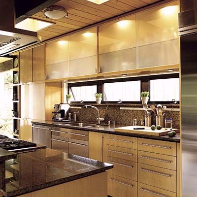
Abundant light from both windows and lighting brighten the pale wood and mottled granite of this modern space.
Beauty Brought into Focus
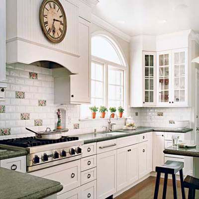
Milk-white paint and subway tiles create a backdrop for fine detailing: veined, green-gray granite counters, oak flooring, flower-decorated tiles, and glass-fronted cabinetry with ring pulls.
See how a San Francisco designer enlarged this galley kitchen for dinner parties.
Neutral Doesn’t Mean Boring
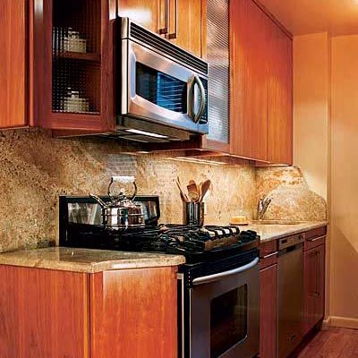
Natural-colored surfaces can sport plenty of color, as this kitchen, with cherry cabinets, mocha granite, and red oak floors, shows.
Exquisite kitchen details transform an average cookspace into a true classic.
Crisp Yet Cozy
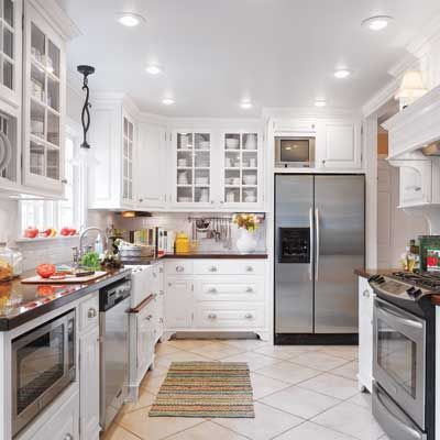
Biscuit-hued floor tiles and walnut countertops warm this white kitchen.
Check out these one-room reader remodel winners for ideas to customize your own home.
Wood is Good
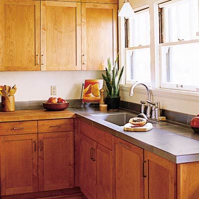
It would be a shame to hide these beautifully constructed solid-wood cabinets behind a coat of paint.
Trick out your culinary hub with some of our best kitchen tips.
Paint It Black
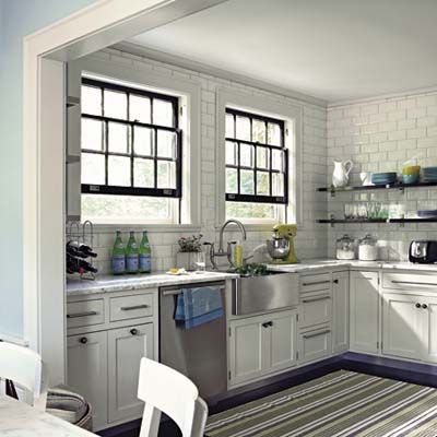
Touches of ebony—on windowframes and open shelving—pick up the veining of the marble tiles and emphasize the rhythm of the subway tiles.
Smart design and lots of cabinets add light and function in the same kitchen footprint.
Stylish Stone

Honed stone tiles set at an angle give texture and add interest to this stylish taupe-and-cream space.
Great design makes for fully functional small kitchens.
Get the Look
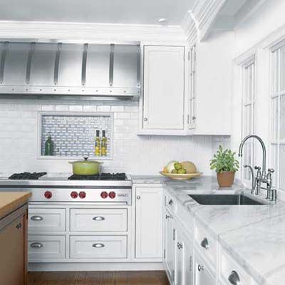
Zoolander isn’t the the only one with steely good looks: Check out this kitchen with its four-foot-wide studded steel range hood.
Freshly Pressed
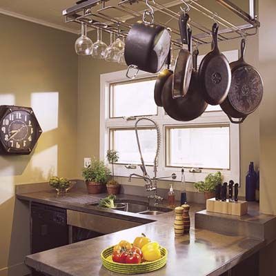
Walls the color of extra virgin olive oil makes the perfect muted backdrop for a serious kitchen.
Get ideas for your own cramped space with these small, efficient kitchen ideas.
Tone on Tone
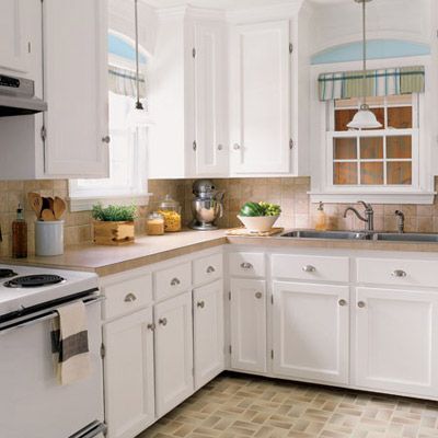
Tumbled tile backdrops and shadow-glazed floor tiles tie together this kitchen.
Since completing the charming budget kitchen remodel, homeowners spend a lot less time in their living room.
Cool Beauty
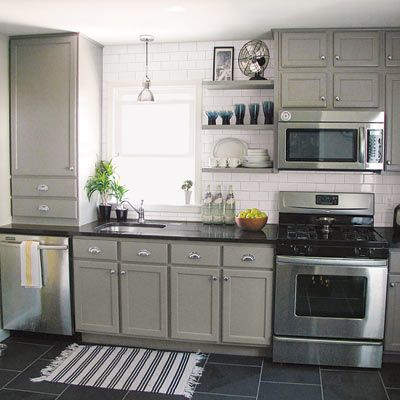
Green-gray cabinetry and slate flooring give this space an easy elegance.
See how TOH readers gave their spaces new life on a shoestring budget.
Cafe-Au-Lait Cool
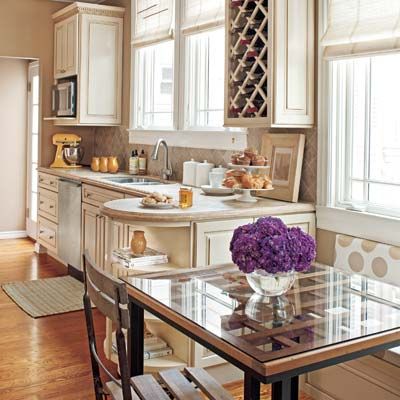
Shades of buff and maple sugar used from the elegant cabinetry to polka-dot upholstery highlights an elegant space.
A Mediterranean-style interior gets updated with pale accents and modern colors.
Balanced and Beautiful
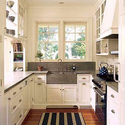
Warm wood floorboards and cool soapstone counters make this classic galley kitchen sing.
Paneling, Updated
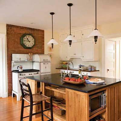
Salvaged wood paneling ties in nicely with the exposed brick backdrop of the vintage stove. And old schoolhouse-style light pendants.
Read these pro tricks for creating a modern vintage kitchen.
Keeping It Real
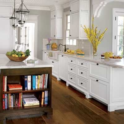
Dark wood in the island’s base and on the floor keeps this kitchen from being overly pristine.
This Colonial-style house is chocked full of kid-friendly classic details and storage solutions.
Fresh and Creamy
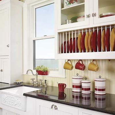
The subtle color difference between taupe beadboard and cream cabinetry makes details pop.
Homeowners put more than a few fresh coats of paint on this revived Texas Queen Anne.
Classic and Subtle
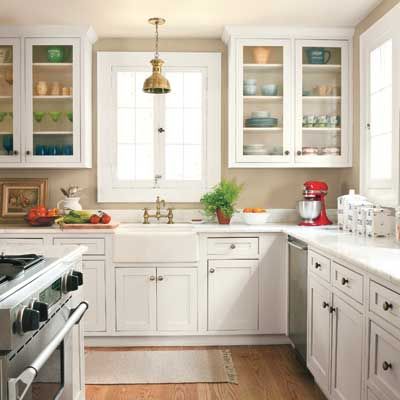
Grey-beige paint picks up the grain of broad oak floor boards.
A bumped-out, chic colonial is what homeowners have to show for unexpected flooding and a long renovation.
Well Composed
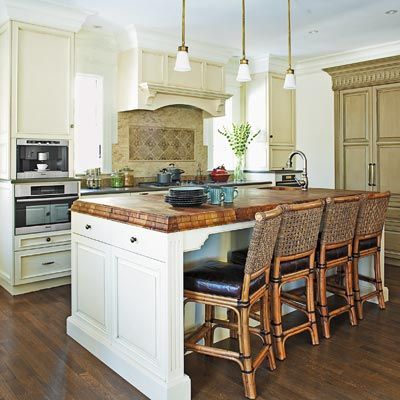
An island with an oiled walnut countertop, a wall of glazed gray-olive woodwork, and tumbled tile backdrop keep this space natural while white paint keeps it bright.
One family renovated this house with late-Victorian-era grandeur to stay for the long run.
Above Board
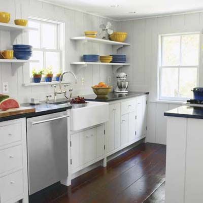
Matte, dove-gray wall paneling keeps the focus on beautiful, broad floorboards.
The new galley design and open shelving give this kitchen class looks and function.
Great with Slate
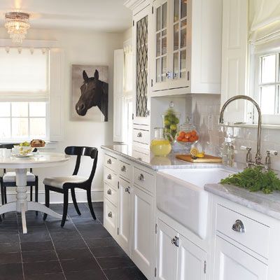
Bring the outdoors in with flooring material traditionally used on patios.
See the palette of weatherrd grays that an interior designer used in a 1700s saltbox home.
