Move or Improve
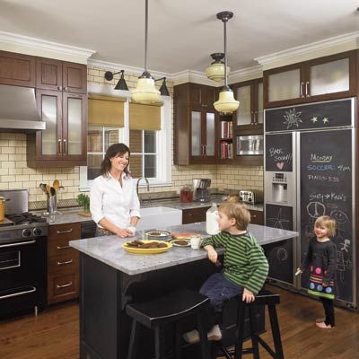
The kitchen can play a pivotal role in the “move or improve” debate. It certainly did for Tracy and Michael Wysockey of Oak Park, Illinois. While they loved the architecture of their 1920s Tudor Revival—think black-and-white-marble foyer, leaded-glass windows, paneled oak doors—just five years after moving in, they were considering selling. Ultimately the couple turned to kitchen designer Rebekah Zaveloff to reimagine the space. She found that by cutting back a wall leading to the back staircase and removing the pantry, she could gain 6 square feet for a new layout that included a center island and a more open connection to the eating area. To create a period style in sync with the house, she used creamy subway tile with charcoal grout, custard-glass schoolhouse lights, a farm sink, and dark cabinetry. Now traffic flows more easily, there’s more counter and storage space, and life is good. Says Tracy, “I never knew I could like a kitchen this much!”
Shown: Now the space has a period look that suits the Tudor-style house. Here, Tracy Wysockey with Beau, 6, and Livy, 4, two of her four kids.
Pendants: Schoolhouse Electric
Before: Cramped and Outdated
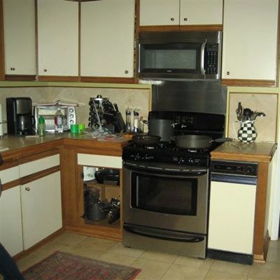
With four young kids in the mix, navigating the room’s dysfunctional layout was making daily living a chore. There was minimal counter space; the fridge door blocked the entryway; and worse, an unheated pantry closet made the space uncomfortable in winter.
Black X-Front Cabinets
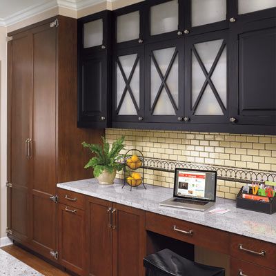
Detailed cabinets with opaque ribbed-glass doors nod to the house’s black-and-white-marble foyer and distinguish a desk area that doubles as a bar.
Custom Cabinets: KitchenLab LLC
Visual Interest
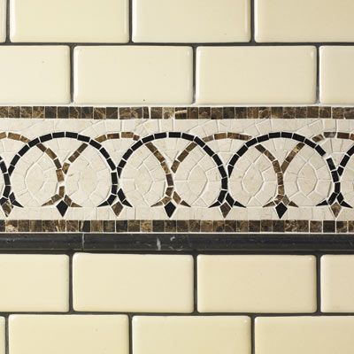
A tile border made of stone mosaic lines the desk/bar wall; it coordinates with a geometric accent along the range wall.
Stone mosaic tile: Ann Sacks
Chalkboard Fridge Panels
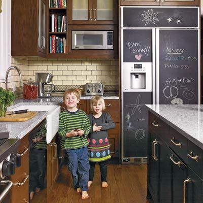
These creative fridge panels hide fingerprints and show off doodles. The same wall holds the microwave, cookbooks, and small appliances.
Homeowner Tip
“Don’t hesitate about an island because you think it will clutter the room. It’s great for bringing the family together.”—Tracy Wysockey, Oak Park, Ill.
Refrigerator: GE
Pale Colors
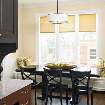
White trim and beige walls make the opened-up dining space feel light and bright. New windows and oak floors blend with those in the rest of the house.
Pendant: Circa Lighting
Seating Solution
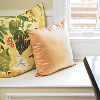
A built-in bench in the eating area helps streamline the space and adds architectural interest.
Counter Space
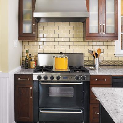
A sliver of white granite to the left of the range gives the cook some elbow room.
Range: Five Star. Hood: Vent-A-Hood. Custom cabinets: KitchenLab. Knobs and pulls: Restoration Hardware
Light Fixtures
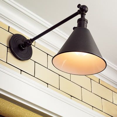
Library lamps provide over-the-sink task lighting and another sophisticated bronze accent in the room.
Wall-hung fixtures: Circa Lighting
The Plan: Before
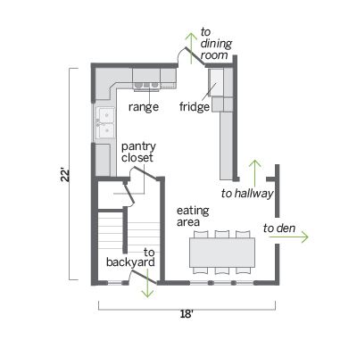
The fridge and range flanked the door to the dining room, impeding traffic flow. Prep and storage space were minimal.
The Plan: After
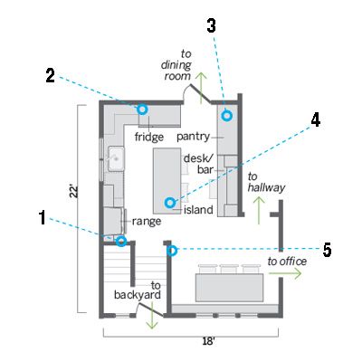
Annexing the pantry closet and cutting back the wall opposite it allowed for an island and reconfiguring the appliances.
1. Removed the pantry closet to create a new home for the range and hood.
2. Moved the fridge to where the range had been, so it’s now just steps from the sink.
3. Created a new pantry with floor-to-ceiling cabinets. The long counter next to it acts as a desk and doubles as a bar when the couple entertains.
4. Added an island to gain more prep space as well as a family gathering spot.
5. Cut back the wall opposite the old pantry for a better connection with the eating area.
