After: Space-Saving Kitchen
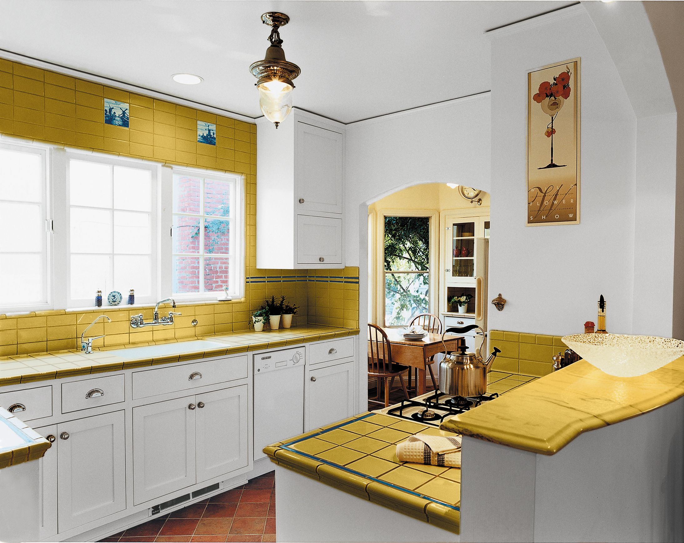
Having maximized square footage for numerous clients over the years, architect Jerri Holan could tap a wealth of space-saving ideas when it came time to redo the modest kitchen in her own Albany, California, home. Expanding its approximately 9-foot-square dimensions would have interfered with her desire to host holiday meals in the adjacent dining room and to preserve the charming separate breakfast nook that came with the 1930 Spanish Colonial Revival bungalow. So she resolved to maintain the kitchen’s footprint but gut the dark tile from a 1980s “update” and rethink the full-size range that constricted the space’s flow. Removing doors and scaling down appliances allowed several feet of extra countertop space with additional base cabinets tucked under it. Replacing the solid wall behind the stove with a half-wall that has an arch overhead makes the room feel bigger and frames the view of the new butter-yellow tile, cream cabinets, and new casement windows.
Before: Plain and Dark
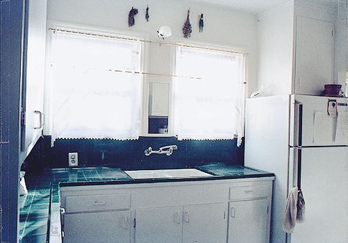
The plain white kitchen had dreary dark tile and felt cramped.
The Plan
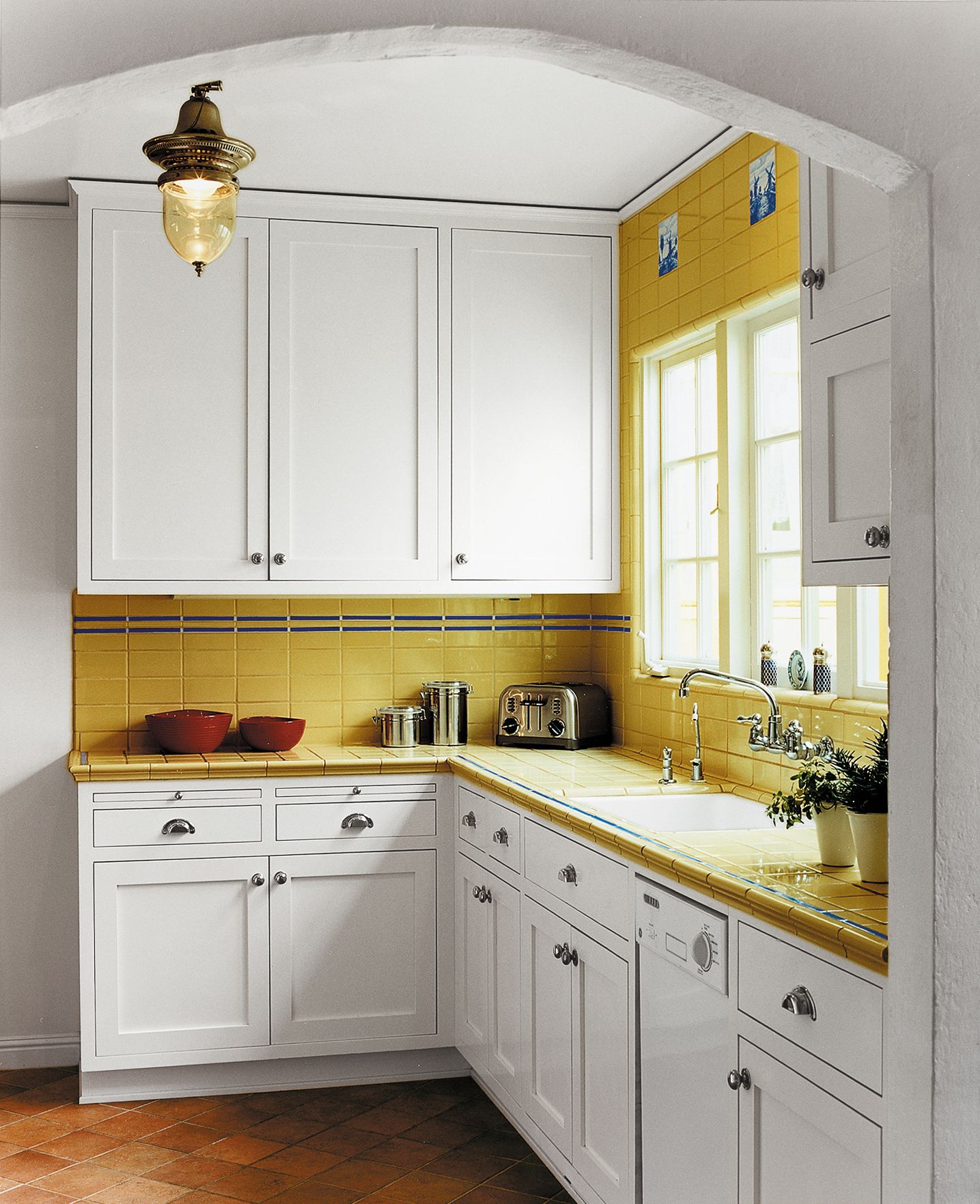
1. Removed doors to eliminate their space-hogging swings, easing traffic flow. Archways patterned after an original one between the kitchen and the breakfast nook give the new openings added character.
2. Opened up the wall that had separated the kitchen from the rest of the house. On the dining room side, a curved shelf 9 inches above the range and its flanking countertops provides a resting place for serving dishes. The raised half-wall allows light in but screens cooking messes from the dining area.
3. Scaled down and rearranged appliances to squeeze in more storage and counter space. Switching out a full-size range for an 18-inch GE model opened up 12 inches to its right, now filled by a base cabinet with a tiled counter. Replacing the 27-inch fridge and moving it across the room to where a skinny pantry cupboard had been allowed for 2 more feet of cabinets and workspace. It also made space for an 18-inch dishwasher.
4. Shortened the cabinet run perpendicular to the sink wall by a foot. This further eased the path to both the dining room and the stairs to the driveway.
5. Changed windows over the sink to maximize natural light. Two easier-to-open, crank-handled casements flanking a fixed window replaced the old aluminum double-hungs divided by a section of wall.
Charming Breakfast Nook
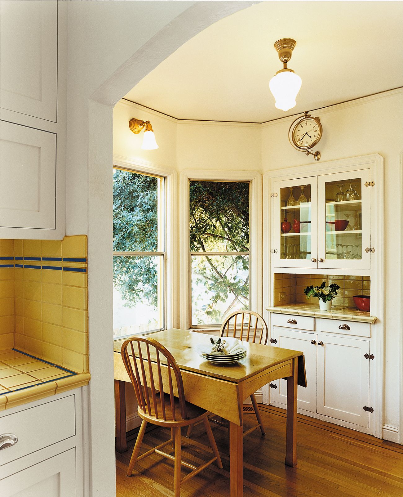
A flared sconce and schoolhouse pendant with opaque glass shades, both from Rejuvenation, add to the breakfast nook’s period charm.
Slide-Out Cutting Boards
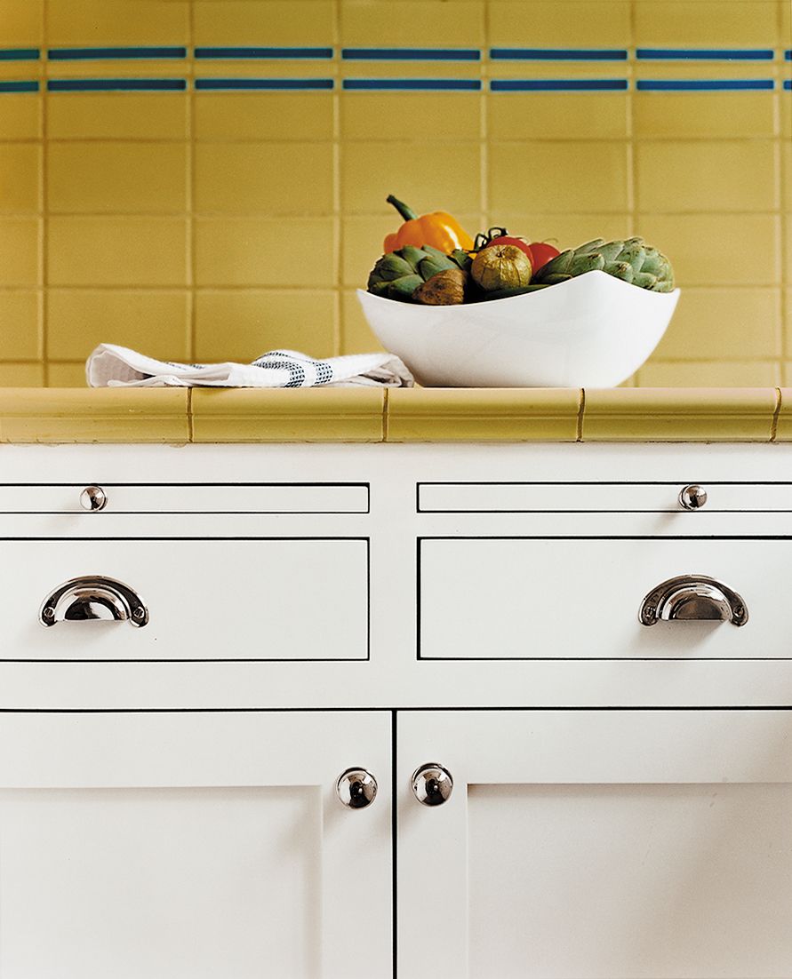
Slide-out cutting boards were often found in kitchen cabinets of this era—they’re also a practical space-saver in a small room. The nickel-finish knobs and bin pulls are a classic touch, with a low profile that doesn’t jut out and interfere with traffic flow.
Cohesive Display Case
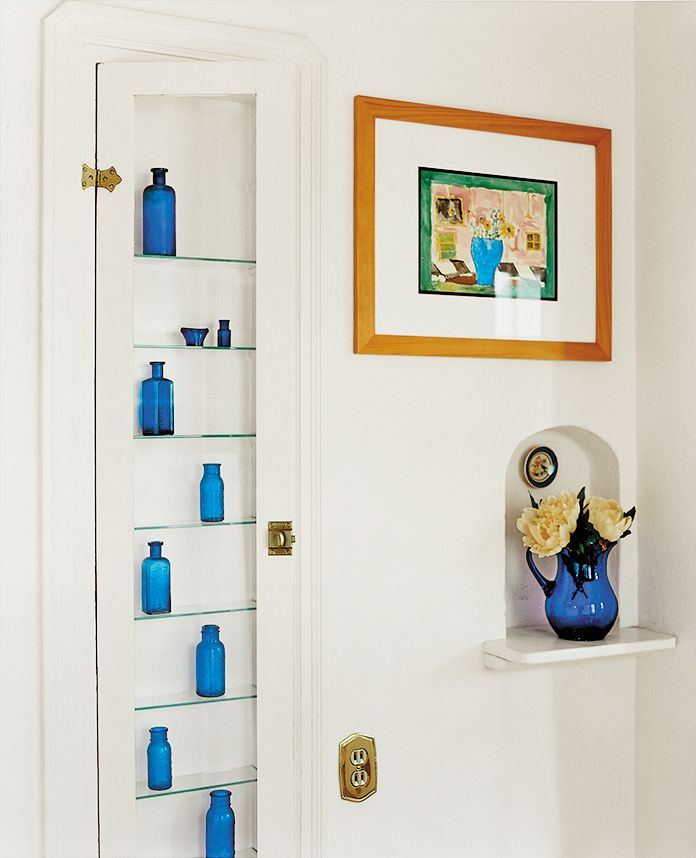
A display case the homeowner made by retrofitting a built-in ironing-board cubby with a glass door panel and shelves now showcases her collection of vintage blue medicine bottles. The wall niche next to it, originally intended for resting a hot iron, offers a spot for a pitcher of fresh flowers.
Faux Terra-Cotta Floor
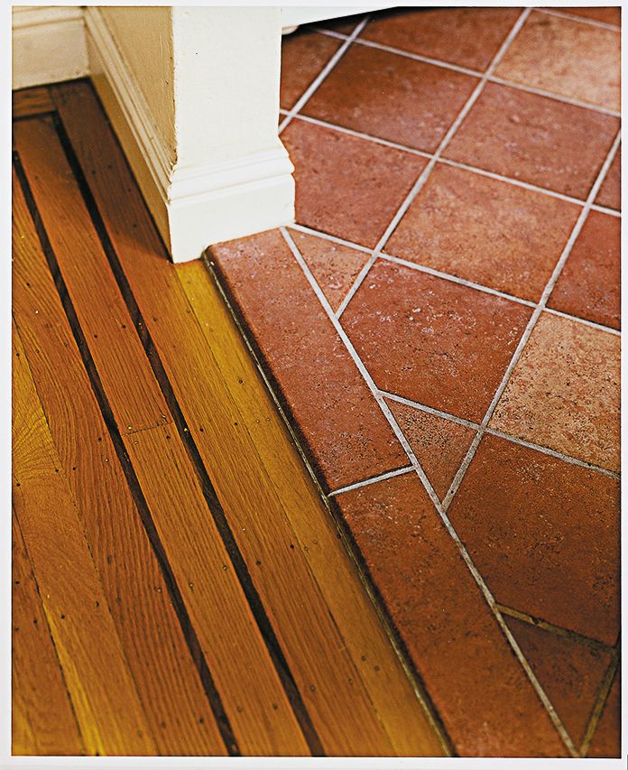
Terra-cotta-look floor tile is actually durable porcelain. Its size and color emulate that of flooring in similar 1930s kitchens and complement the eating nook’s original walnut-banded oak boards.
Handcrafted Accent Tiles
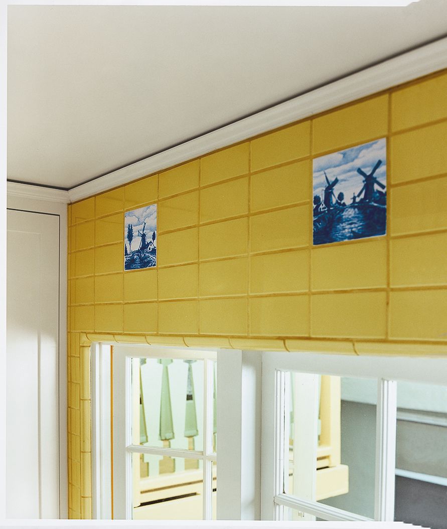
Handcrafted blue-and-white tiles picked up at an antiques fair are a nod to the handmade Mexican tiles often found in similar Spanish-style bungalows. Set amid yellow field tile that extends all the way to the ceiling, they draw the eye up and away from the view of a neighboring house out the windows.
Before Floor Plan: Tiny Footprint
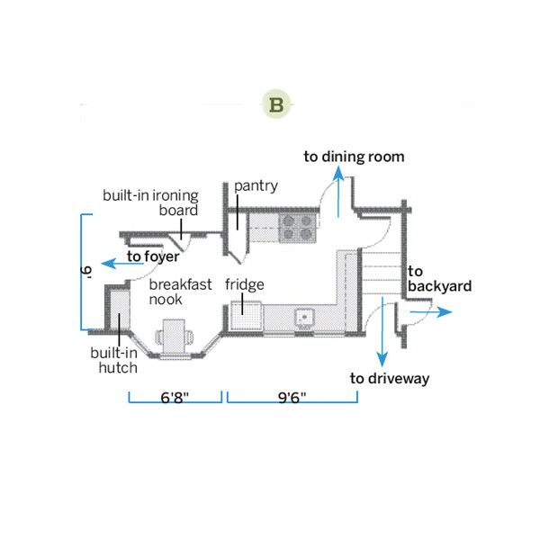
At 9 by 9½ feet, the kitchen had a compact footprint.
After Floor Plan: More Usable Space
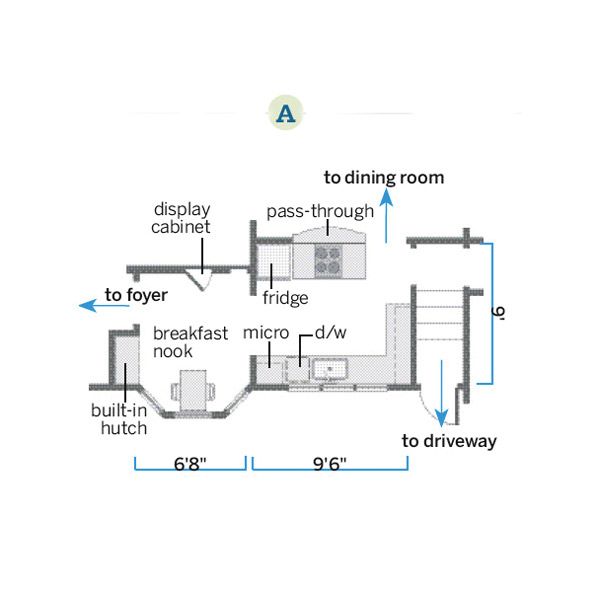
Eliminating door swings and a skinny pantry cabinet created more usable space. Relocating and downsizing appliances allowed for more counter area and storage cabinets, plus better flow. Opening up the range wall made the space feel airier.

