Eco-Kitchen Remodel
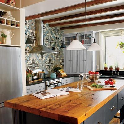
Sometimes the best way out of a bad kitchen is to salvage what you can and recycle the rest. Bronwyn Reice and Kenny Grono, who run an eco-oriented design/build firm out of their Victorian-era rowhouse in Philadelphia, loved the bare-bones kitchen’s big windows and the breakfast room’s built-in hutch but couldn’t wait to connect the two spaces to make a single, more stylish, more functional space. Patterned cement floor tiles from Avente create a colorful, hard-wearing backsplash.
See more details from this renovation in Remove a Kitchen Wall, Gain Unique Style.
A Spacious Host Kitchen
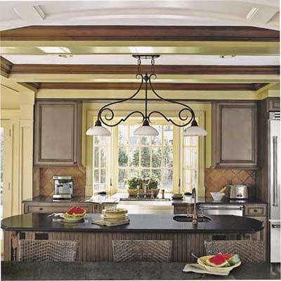
A host kitchen is an amenity old-house purists often sacrifice to enjoy a pristine period home. But in Brian and Judith Turner’s 1926 Tudor Revival, the kitchen wasn’t authentic—or especially inviting. The basic layout may have been original but the sterile space was a holdover from a 1960s “update” and jerry-rigged, with the refrigerator relegated to the adjacent mudroom in order to fit in a table and chairs. In addition, the kitchen suffered from a severe lack of storage space, with just a few cabinets around the sink and on the wall opposite it.
To give the Turners the gracious cooking and eating space they were after, with good flow with the rest of the New Rochelle, New York, home, architect Carol J.W. Kurth first annexed some closet-size spaces next door, then replaced the wall shared with the TV room with a breakfast bar.
See More from this before and after in .
Old Meets New
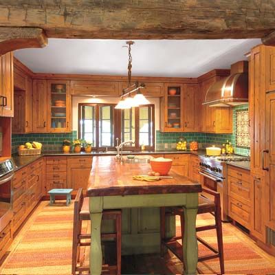
Just because a kitchen is new doesn’t mean it has to look that way. During the four-year run-up to their redo, Jennifer and Barnet Malin lusted for furnishings weathered by time—or by design. Picturing colorful tilework and honey-colored woods that would be compatible with their 1940s Spanish Revival house in Santa Monica, California, they turned to architect Deborah Teltscher.
They asked her to carve out space for a baker, a barbecue fanatic, and two junior apprentices—and to work in a pair of carved wood columns from Guatemala they’d spotted in an antiques store. Teltscher and contractor Ron Haslam annexed space from two adjacent rooms to expand the kitchen to a 14-by-14-foot square—”large enough, but still cozy,” as Teltscher puts it—with an island big enough to do homework at one end and frost a cake at the other. Distressed alder cabinets with pitted bronze pulls, reclaimed chestnut flooring, and hand-glazed tile contribute to the rustic look.
A Roomy Kitchen
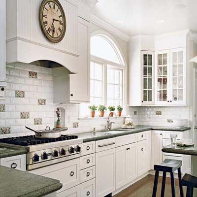
To accommodate prepping for the owners’ frequent dinner parties, designer Beth Laughlin expanded this 1928 San Francisco kitchen by taking down a wall that divided the space from an adjacent breakfast nook at one end, and removing a sliver of wall with a doorway to the laundry area at the other. Now one continuous galley, the enlarged kitchen has a peninsula with two stools where friends can hang out while the hosts are at the stove. There are two distinct prep-and-cleanup zones: one along the original sink wall and another in a butler’s pantry alcove (where the washer and dryer had stood), complete with double ovens and the all-important second sink.
See more of this remodel in A Kitchen Fit for Dinner-Party Prep.
Speeded-Up Remodel
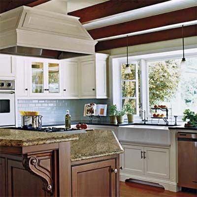
Nothing moves a project forward like a deadline. In this case, it was designer Dana Jones’ daughter’s announcement that she wanted to have her wedding reception at home—in just four months. The 1950s kitchen in this Long Beach, California, ranch house was a decent size but not fit for company, with its outdated finishes and confined layout.
See how these homeowners made it happen on a deadline in How to Open Up a Cramped Kitchen.
Bright and Balanced Kitchen
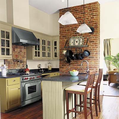
With three active doorways, a brick chimney wall, and a floor-to-ceiling window to reckon with, all the kitchen’s contents—including the chief cook and head dishwasher—found themselves pushed up against the room’s sole uninterrupted wall.
Designer Beth Haley helped improved the flow by reconfiguring the space into distinct stations devoted to prep, cooking, and cleanup. By removing a short peninsula and a table that was shoved in front of the one window to serve as additional work area, the designer made way for a granite-topped island with a prep sink, under-counter storage, and bar-stool seating. Period-style materials such as galvanized zinc and beadboard combine with four well-coordinated shades of green, gray, and gold paint to create a vintage look.
Check out more before-and-after photos from this remodel in Balanced Workstations Help a Small Kitchen.
Fixing an Awkward Layout
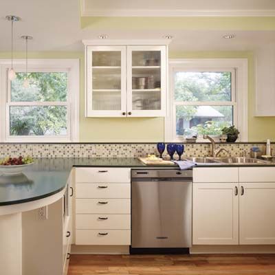
When the fridge blocks an exterior door and the counters are so shallow that the dishwasher sticks out, you know you’ve got problems. But for Aida Pollard and Jon Maloy, the cockeyed configuration of their kitchen was the least of it. “I love to prepare quick, easy meals,” says Aida, “but with only one small window for ventilation, it got so hot I could barely be in there 15 minutes.” After 20 years of living with the pinched cooking quarters in their 1949 cottage, the couple knew where to turn: the Austin, Texas, design-build firm CG&S, where Aida works as business manager.
Architect Stewart Davis devised a plan to take down the wall separating the kitchen and dining room, bringing in air and light by allowing the kitchen to annex a window and expand by about 50 square feet. “Meal prep no longer feels like solitary confinement,” says Aida, pointing to a peninsula that allows her to chat with friends and family while dicing onions.
See more of this much-needed makeover in Lose a Wall, Gain a Workable Space.
Money Well Spent
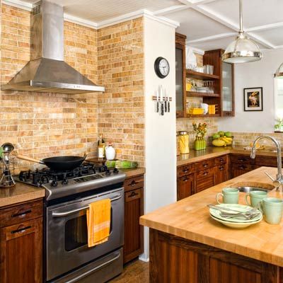
There’s slow food and fast food, each with its attractions. Dick VanNewkirk, who likes to build as well as braise, believes it’s best to take one’s time. He spent “about a year” renovating this kitchen, in the 1939 cottage he and Karin Gately share in Wilmington, North Carolina—and that was with Karin working alongside him, from demolition and design to painting and tiling. While sticking to a $12,000 budget, they didn’t stint on tools and materials, managing to acquire, for example, their very own cement vibrator and mixer—helpful in making concrete countertops—and a vacuum press, which Dick used to add jatoba veneer to the cabinet fronts. Here, marble wall tile, concrete countertops, cabinets made with exotic woods, and a butcher-block-topped island step up warmth and function.
Great White Kitchen
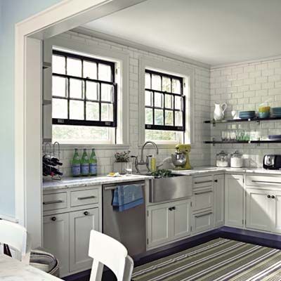
These days most of us start a project by considering how little we can do—not how much—to transform a space. When Lyn and John Matejczyk wanted to rework their dated Minneapolis kitchen, with its red counters, blue-stained maple floor, and pickled cabinets, they dreamed about turning it into a giant mudroom and starting fresh in the nearby sunroom. Then cooler heads prevailed—local architect Todd Hansen being one of them.
Together, the trio embarked on a dramatic but entirely cosmetic update of the kitchen, continuing the same finishes in the adjacent breakfast room and pantry so that the three spaces worked as one. Hansen chose materials and finishes for their light-reflecting qualities: beveled white subway tile, Carrara marble counters, cabinets painted a gray-toned white, and lots of stainless steel. The look is clean and bright, with an updated traditional feel.
Check out the rest of their beautiful space in Same Space, Whole New Look in the Kitchen.
Budget Kitchen Remodel
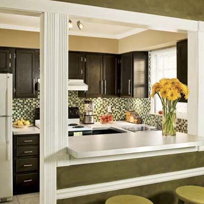
With kitchens, simple does not necessarily equal streamlined. For homeowners Eduardo Perez and Moo Sirikittisup, the kitchen that came with their Atlanta condo fell short on both frills and function. Builder- grade cabinets and white laminate counters set a cheerless, monotonous tone in an open space that can be seen from the front door. And washing dishes meant looking at a worn wood cabinet, as the window didn’t line up over the sink. Opening the dishwasher blocked the oven door and vice versa. “It was a sad-looking space,” says Eduardo. But some warm-brown cabinet paint, a vibrant glass-tile mosaic backsplash, and new fixtures changed all that.
See how they did it all for less than a thousand dollars in The $967 Kitchen Remodel.
Kitchen With Fresh Flair
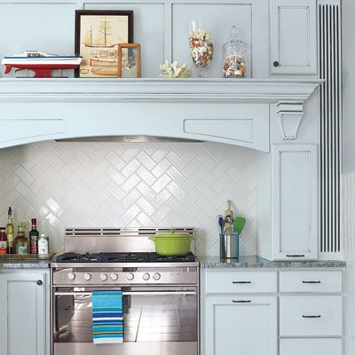
Traditional doesn’t have to mean predictable. When Christopher Nicolussi and Francis Devlin bought their 1880s foursquare in Ocean Grove, New Jersey, they knew they wanted a roomier kitchen for cooking and entertaining, finished to fit their style as well as the rest of the house. Previous owners had carved out a rental unit, turning the original coal-stove kitchen with its sadly sloped floor into a makeshift knotty-pine cook space for tenants. Architect Mark Pavliv suggested siting the new kitchen there but enlarging the space by annexing an adjacent bath and opening up a back staircase that had been walled off.
Light, Bright Kitchen
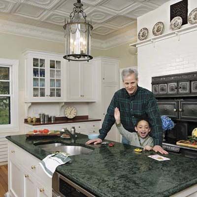
Kitchen remodels are complicated beasts anywhere but even more so in a historic house, where modern efficiency often seems at odds with charming detail. Such was the quandary facing James Bryant as he considered the much-needed update of his Newton, Massachusetts, home.
Designed in 1883 by famed Boston architects Peabody & Stearns, it was a preservation-minded homeowner’s dream—despite a bumpy history as a girls’ school and a boardinghouse. “I was lucky to find the house in near-original condition,” says James. Unfortunately, the kitchen was dysfunctional.
“I really wanted the same old kitchen, but much nicer.” Local architect Anita Rogers and contractor Paul Eldrenkamp gave him just that—with one big change. The kitchen now flows directly into the breakfast room, which retains a handy sink but gave most of the plumbed area over to a new half bath. The embossed metal ceiling, original iron stove, and pine floors remain. In fact, without a close look, you might not know that a major renovation took place here.
See the shocking before photo and more beautiful post-renovation shots in An Elegant Old Kitchen Gets More Efficient.
Budget Kitchen Redo
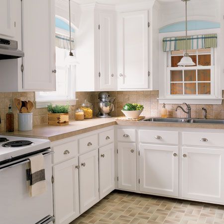
When people walk into your home, you hope the first rooms they see make a good impression. For homeowners Samantha and Bryan Langdeau, that meant working nights and weekends putting together a better, more efficient kitchen. New upper cabinets mean the Langdeau’s no longer have to walk across the house for Tupperware and pots they used to store in a guest bedroom closet. Plus, they dressed up the dated room with new hardware, fixtures, and trim. “Now we find ourselves in the kitchen more often than the living room,” says Samantha. “It’s one of our favorite spaces.”
See A Charming Kitchen Revamp for $1,527 to learn more about how these homeowners transformed their kitchen on a budget.
Modern Makeover
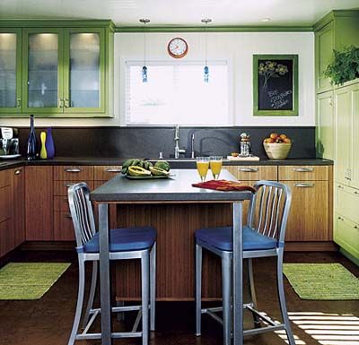
For the owners of this home, a designer-contractor duo, a small, dated kitchen wasn’t acceptable. By knocking down a wall, updating the amenities, and adding color, they created a space that feels open and airy.
The green pantry wall covers the spot where a back door stood. The concrete subfloor, exposed when vinyl was removed was cleaned and colored with an acid-based stain. Toekicks were built 1 inch higher than normal to allow for future installation of wood or tile.
See more of this colorful remodel in An Affordable, Modern Makeover Opens Up a Cramped, Dated Space.
Creating Ample Charm
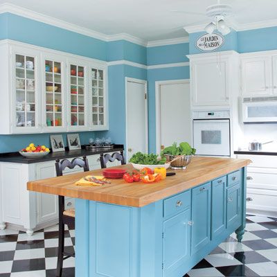
Try renovating on a budget and see if you don’t trim a bit here and a bit there until the best details are gone. Unless, of course, you’re a pro like Melinda Dodson, who would rather sacrifice a couple of big-ticket items than a half-dozen small ones. The interior designer conjured this kitchen for friends Chris and Tela Webb, in El Dorado, Arkansas. “It was the least-expensive project I’ve ever done,” she says, “yet it’s one of my favorites.”
Reworking a 1980s Kitchen
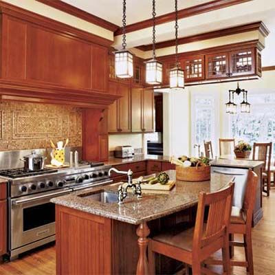
It can be a challenge to find an old home’s true personality under the onionlike layers of improvements. When the owners of a 1908 Arts and Crafts house in Briarcliff Manor, New York, decided to rework a poorly laid-out addition that held a cold 1980s kitchen, they had to find a way to channel the space’s long-obliterated Craftsman spirit.
One thing was clear: Nothing about the walled-off kitchen worked—neither its utilitarian style and lack of seating nor its isolation from other rooms. After two years of scribbling ideas on napkins, the couple called on local contractor Eric Messer and architect Carol Kurth.
See more photos of this traditional space in Period Look Kitchen, Updated Function.
Small Kitchen Gains Space
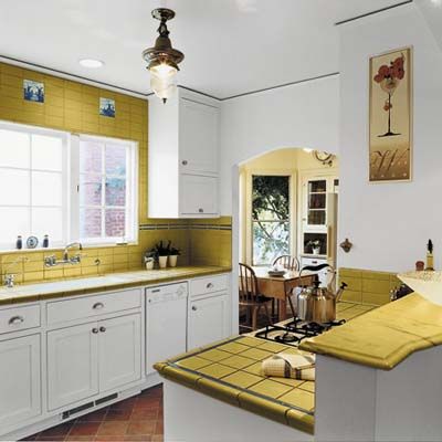
Having maximized square footage for numerous clients over the years, architect Jerri Holan could tap a wealth of space-saving ideas when it came time to redo the modest kitchen in her own Albany, California, home. Expanding its approximately 9-foot-square dimensions would have interfered with her desire to host holiday meals in the adjacent dining room and to preserve the charming separate breakfast nook that came with the 1930 Spanish Colonial Revival bungalow.
So she resolved to maintain the kitchen’s footprint but gut the dark tile from a 1980s “update” and rethink the full-size range that constricted the space’s flow. Removing doors and scaling down appliances allowed several feet of extra countertop space with additional base cabinets tucked under it. Replacing the solid wall behind the stove with a half-wall that has an arch overhead makes the room feel bigger and frames the view of the new butter-yellow tile, cream cabinets, and new casement windows.
See the rest of this remodel in A Small Kitchen Gains Space Within the Same Footprint.
Making a Kitchen That Lasts
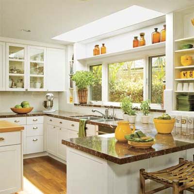
When the emphasis of a kitchen remodel is handsome practicality, the room can work hard for years without looking out of sync with the times. That’s what the avid cook who owns the space shown here envisioned, having endured a badly planned galley kitchen for years. The house that she shares with her husband and their two sons in Manhattan Beach, California, was built in 1940 as a one-story weekend place not meant for serious cooking.
Needing more room overall, they asked local architect Michael O. Eserts to add a second story and a kitchen that would be “simple and clean, and which they would still love in 30 years,” says Eserts.
See all of the photos from this classic before and after in Simple Kitchen Design, Timeless Style.
Old Fashion, New Function
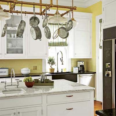
Period home, generic kitchen. It’s a familiar finding for buyers looking to score an old house full of original detail. And it was just what David Schloss and his wife, Abigail, ended up with when they moved into their 1875 home in Nyack, New York. The Queen Anne’s architecture was largely intact, with one exception: The kitchen was a shoddy, circa-1964 number thoughtlessly tacked on the back. Just as bad for the pair of avid cooks, the space was dinky. Minimal counter space was always cluttered, three tiny windows provided little light, and opening the fridge door blocked the only passage to other rooms.
A pot rack keeps cookware out of the way but within easy reach. Made of brass bar rails, it looks at home in the Victorian-era house. Baking supplies are stored under the island. The cool marble top is perfect for rolling out dough.
See more photos from this before and after in Old Fashion, New Function.
Deal Hunters Get a Luxe-Look for Less
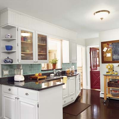
How do you afford stainless steel and stone on an almond-bisque-and-laminate budget? For this Connecticut couple the answer was to preserve elements of the existing kitchen that were still in good shape, cut out labor costs by doing the work themselves, and shop sales and Craigslist.
They stayed within the $6,000 budget by keeping the basic layout, painting the oak cabinets rather than replacing them, taking a carpentry course, and trolling the Internet and roaming big-box stores in search of well-priced replacements.
Take a look at ”We Redid Our Kitchen for $6,000!” to pick up a few money-saving pointers and design ideas.
End Of An Era
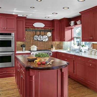
Just as certain clothes can signify an era, so can some kitchens. The one in Laurie and Kent Adamson’s Cape Cod-style house, in San Clemente, California, dated to 1985 and revealed its past with “oak, lots of oak!” says Laurie, from honey-colored floors to golden cabinets to whitewashed decorative beams. Though Laurie, an occupational therapist, and Kent, an orthopedic surgeon, love to entertain, they waited 19 years and until the last of their three children was a teenager—before tackling the room.
Then they got to work. Guided by local designer Debbie Nassetta, they created a smart-looking, high-functioning cooking space in the 13½-by-19-foot kitchen without moving walls or changing the locations of the island, cooktop, wall ovens, or sink. Barn-red Wood-Mode cabinets and walnut and marble counters replaced the 20-year-old oak boxes and acres of ceramic tile.
For more pictures from this remodel, see A Kitchen With the Same Old Footprint, Bold New Design.
Practical Design, Period Appeal
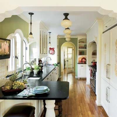
It’s tried-and-true advice: Live in a space for a while before you remodel it. For Alicia and Craig Collins, waiting a long while (11 years!) seems to have paid off big-time. The couple put up with the shoddy galley kitchen in their 1930 Spanish Revival–style house for over a decade.
Bad enough were the worn cabinets and awkward layout, but the room also lacked the kind of details found throughout their home, which has arched doorways, wrought-iron work, and an art-tile fireplace surround. Alicia, an avid cook, craved a top-notch range, and with the family having grown to include three children, they needed more food storage. Kitchen designer Dana Jones’s solution delivered both without adding on. By incorporating a butler’s pantry—just one cabinet and a swinging door between the kitchen and the dining room—she gave the room an extra 50 square feet, allowing for more counter space, a snack peninsula, two sinks, an alcove for the pro-style range, and a double refrigerator-freezer.
See more in A Practical Kitchen Design With Period Appeal.
Same Size, Sunnier Spirit
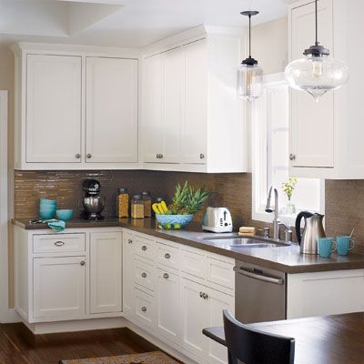
It can pay to take your time. Ten long years passed before Kristin Sharpe and her husband, Mike, finally did something about their kitchen’s bumpy tile countertops, crammed cabinets, and lack of gathering space. But as they pondered every possibility, from demolishing a wall in their Southern California ranch house to building an addition, they also refined their vision. The result: a same-footprint redo, put in place by general contractor Michael Dubin.
“We did a lot of research and testing,” says Kristin. To create a more spacious feel, they enlarged a pass-through to the family room, where their twins, now 9, hang out; added a skylight; and restricted the palette to vanilla and chocolate—right down to the walnut floor. Light-reflecting glass tile and pendants as delicate as soap bubbles brighten the space. “With the bigger pass-through, I can watch the kids while cooking,” says Kristin, “and finally we can all gather in the kitchen for dinner.” The wait, in other words, was worth it. Their favorite feature? The cocoa-colored glass tiles.
You can see the rest of this remodel in A Kitchen With the Same Size but Sunnier Spirit.
Ditching a Boring Color Scheme
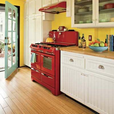
Nothing revives an old room like an energetic new color scheme. In Rich and Sue Linder’s 1940s ranch house in Laguna Beach, California, a previous remodel left behind a washed-out white kitchen, save for the sensational 1945 stove Sue inherited from her mother. White beadboard and glass-front cabinets mixed with open shelves; a red range hood and pendants helped tie in the vintage range. Still, the room looked a little tired.
Post-remodel, the cabinets and counters stayed the same, but a carefully composed riot of colors makes the remodeled room as warm and welcoming as its 1940s stove.
See more of this vibrant transformation in Bold-Color Kitchen Makeover.
Relocating the Cook Space
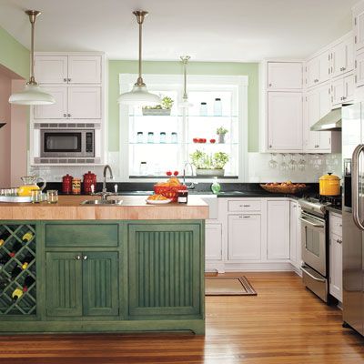
Start rejiggering a home’s layout and almost anything may seem possible’ including swapping the locations of the family room and the kitchen. For Matt Totaro and his wife, Connie Eiseman, moving the kitchen was one of several improvements made during the remodel of their 1909 house, in Catonsville, Maryland. With two kids’ joined later by a third’ they craved an open eat-in kitchen situated at the center of the household. The existing family room presented just the right spot.
So, after a work crew gutted it, taking down a wall to annex a side porch as well, the couple worked with kitchen designer Steve Fair to finish one large space with an eating area at one end and plenty of room for entertaining. Today, traffic flows from the kitchen to the new family room (located where the old kitchen stood), skirting an island that delineates the cooking-and-cleanup zone. Pendant lights, soapstone counters, an apron sink with a wall-mount bridge faucet, and refinished pine flooring reinforce the home’s period look. “Starting from scratch meant weeks without a place to cook,” says Matt, “but the payoff is having an eat-in kitchen that really serves as the heart of our house.”
See more of this open-plan kitchen in Relocating the Cookspace for a Bright, Functional Kitchen.
Walls Get in the Way
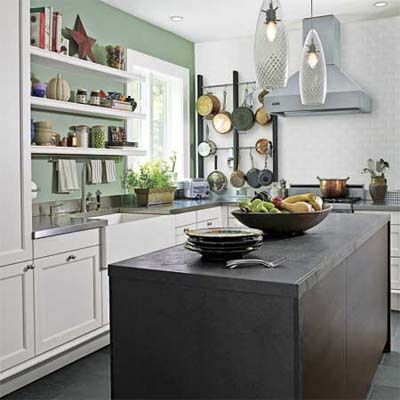
Face it. In a lot of old houses, walls get in the way. That was certainly the case for Susan Smart and Art Westerinen, who two years ago acquired a 1901 Shingle-style house in Montclair, New Jersey. The house, which was a jumble of rooms after a 1920s transformation split it into two apartments, was due for a gut renovation, starting with its cramped galley kitchen.
But the obvious solution—knock down the wall it shared with the living room—would mean sacrificing a treasured fireplace. So Susan trained her sights on two walls with less weight, annexing an extra bathroom to gain space at one end and removing two slivers of wall at the other. “Then I took creative liberties to make the room feel more open,” she says.
See more of this before and after in Kitchen Before and After: Rules Are for Breaking.
Limited Room
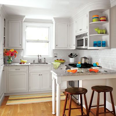
When quarters are tight, layout is critical. Consider this hardworking kitchen, configured by designer Heidi Piron for serious cooks Liza and Peter Tulloch. Owners of a 70-year-old Colonial Revival in Summit, New Jersey, they had two kids, one dog, and lots of ideas when they asked Piron to improve the workings of their 110-square-foot kitchen. She did so without changing its footprint, and left the sink under the window so Liza could keep an eye on the kids.
She also converted an out-of-the-way broom closet into a message center that doubles as a storage-packed serving area. To make the room seem larger, she suggested glass subway tile and other light-reflecting finishes, like pale granite and red-oak flooring. The cabinets fit together precisely, with a pullout for spices and oils, squeezed in near the range, “in a frameless cabinet, which offers a bit more space inside than one with an inset door,” Piron notes. Says Liza, “As the space was quite limited, every inch was thoughtfully maximized.”
See more of this great white kitchen in Two Cooks, One Small-Space Kitchen.
Modern Layout, Classic Details
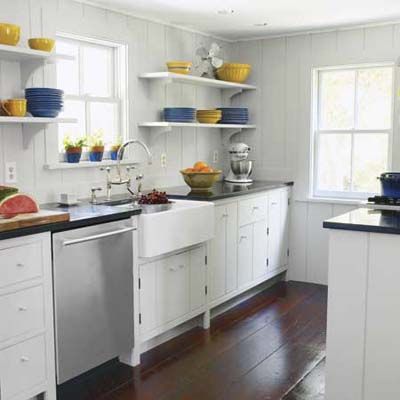
Sometimes the simplest solution is also the best, especially when righting past renovation wrongs. So thought Rina and Brittain Stone after seeking the advice of architect Kurt Sutherland in solving the layout and traffic-flow problems of their 1749 Dutch Colonial’s kitchen in Accord, New York. The kitchen was in a small, closed-off addition put on 100 years after the house was built and was configured in the 1960s as a U-shape with honey-hued cabinetry and marbleized laminate counters. This made the space feel crowded, and it looked dated by today’s standards.
The architect’s plan was straightforward: Bust out the bottom of the “U” to create an efficient galley with prep, cooking, and cleanup stations arrayed along two walls instead of three. By relocating the back door and enlarging the passageway into the adjoining living room so the two line up, Sutherland was able to open up the kitchen to both indoors and out, while rerouting foot traffic away from the main work zone. Period details such as painted cabinets, soapstone counters, and an apron-front sink unite the space with the rest of the 18th-century farmhouse.
See more of this modern kitchen before and after in A Functional Kitchen Layout With Period Details.
Modern Function, Vintage Flair
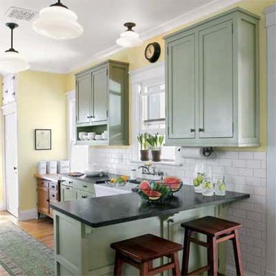
When you work all day in a high-tech job, it’s nice to come home to a warm, nostalgia-inducing kitchen. But don’t let this one’s vintage-look cabinets and old-fashioned touches—or the relaxed air of homeowners Eric and Elizabeth Ryterski—fool you. Behind the handsome, oil-rubbed bronze hardware lies the soul of a smooth-running machine, where every detail was carefully plotted by Eric, an electrical engineer, and Elizabeth, who turned the dining room into a hall of inspiration by lining the walls with pages torn from TOH.
While their Louisville, Colorado, house was built circa 1930, the kitchen dated to the 1980s. “It wasn’t old, just outdated,” says Elizabeth. It had little storage, and its layout was counterproductive too.
The Ryterskis had major ambitions and a microbudget, so their six-month redo would be strictly DIY. They mapped out an open plan in which all the modern conveniences would be hidden. “It’s an old house, and we both like older things,” says Eric. The first step was taking down the wall that separated the cramped kitchen from the adjacent dining room, giving the family one big L-shaped space.
Functional Flaws
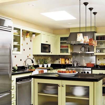
Shortly after moving into their 1950s North Tustin, California, ranch house in 1998, Jason and Irene Jacobson renovated the kitchen with help from an interior designer. While pleased with the way the new space looked, they found some negatives. Drawers to the left of the range didn’t open at all. Ones to the right were so skinny as to be useless, and abutted a tall pantry unit that limited elbow room while cooking. Plus, the bi-level island had a skimpy work surface.
Fast-forward several years: While adding on a master suite, the couple started talking to kitchen and bath designer Dana Jones about their kitchen. Jones suggested relocating the laundry—which sat in a closet in the L-shaped space—to the addition. Moving it created a domino effect, making room for a walk-in pantry and for reconfiguring the area around the range. “We didn’t want to redo the room from scratch,” says Irene. “Little tweaks made it all work.”
See more photos in A Kitchen Facelift Offers a Fresh, Functional Redo.
Fresh and Functional
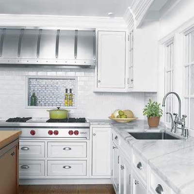
Ever wonder what a kitchen designer’s dream kitchen looks like? For Carrie Deane Corcoran, it doesn’t have the carved-wood cabinets and granite counters seen in many showrooms. After moving into her Colonial Revival in New Canaan, Connecticut, she stripped out just such a kitchen. “It didn’t reflect me, or the way I cook,” says Corcoran.
Corcoran gutted the room and sold its contents to a contractor for $12,000. She got rid of a center support post by installing a steel beam, freeing up room for a larger island. She specified pro-grade appliances. White cabinetry and pale-marble countertops make the new kitchen feel clean and bright. Mixed materials and varying heights turn the island into a multitasker with two Sub-Zero freezer drawers to the right of its sink.
For more photos of this kitchen redo, see .
Freshly Vintage
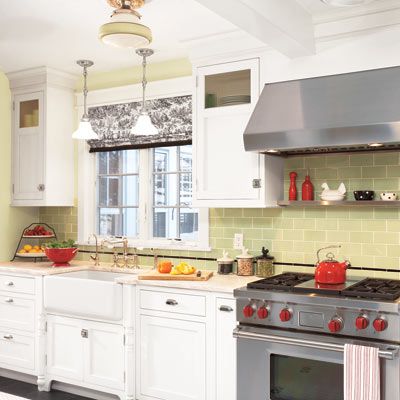
Sometimes, living with a dysfunctional, dated space for years allows you to really envision the look and utility you want. When Butch and Bonnie Filippi got ready to overhaul the eat-in kitchen in their 1918 house in Westwood, New Jersey, they yearned for a more period-appropriate style along with more storage and prep space—not to mention a 36-inch range and 42-inch fridge. But they liked the room’s proportions and saw no reason to make it bigger.
Now everything’s new but looks old again, from the cabinets’ recessed panels and reeded-glass inserts to the black and white hexagon floor tile, vintage-green wall tile, and schoolhouse lights.
See more photos in Brand-New Kitchen Design, Same Footprint.
Character-Filled Kitchen
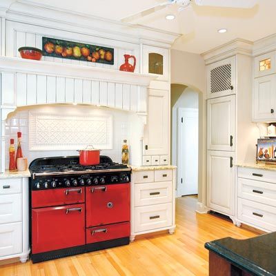
Redoing a kitchen in a well-preserved 1920s house requires equal regard for the past and the present, and that was clearly the case for Jack and Shelley Trenouth, owners of an 82-year-old stucco house in Victoria, British Columbia, Canada. They longed for a high-performance cooking space with the latest built-in appliances but also craved a strong period style. “Character was so important to us,” says Shelley.
See more from this remodel in Old-World Kitchen, Gracious New Fit.
A Kitchen Opens Up for Better Flow
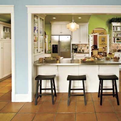
Vintage kitchens often end up with a layout that defies logic, and the one in Susan and Chuck Creacy’s 1920 bungalow in Lexington, Kentucky, was no exception. A back door invited the couple’s dogs to troop in from a small entry porch and settle in front of the fridge. A bedroom door and the front hall led smack into the cooking area, which lacked direct access to the dining room. Gathering in the kitchen with friends and family wasn’t really an option. And despite its white walls, “the kitchen was dark and cramped,” says Susan.
Susan, Chuck, and their sidekicks, Guinness and Gilbert, enjoy an upgraded space that now connects to the dining room via a new arched opening. Terra-cotta floor tiles ground the airy space. Easy-care stainless-steel counters replaced crumb-catching tile and coordinate with new pro-style appliances.
For some homeowner tips and more photos of this kitchen remodel, see A Kitchen Opens Up for Better Flow.
Expanded Space
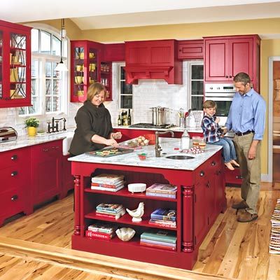
One way to know what’s wrong with a kitchen is to live with it for a couple of years. A great way to fix it is to share your vision with an architect and a carpenter who have already created something similar—in the architect’s own home. “That was my apprenticeship,” says wood wizard Dave Michael, recalling his path from the vaulted kitchen of architect Jon Sarkesian to the one they built for David and Jennifer Dilley.
The Royal Oak, Michigan couple had worked with Sarkesian on the redo of a family-owned furniture store when they asked him to bump out their 1940s bungalow, enlarging its kitchen to suit a family of four. “They wanted to keep the scale cozy,” says Sarkesian, who expanded the space—but not too much—with a light-channeling, barrel-vaulted ceiling and an open plan.
Kitchen Practicality Meets Period Style
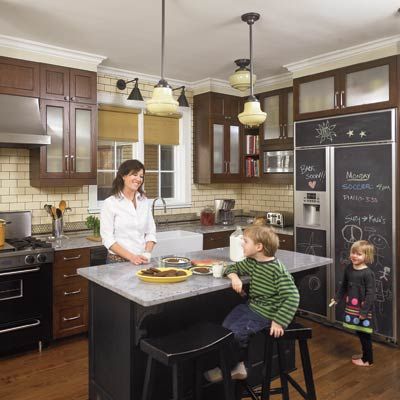
The kitchen can play a pivotal role in the “move or improve” debate. It certainly did for Tracy and Michael Wysockey of Oak Park, Illinois. While they loved the architecture of their 1920s Tudor Revival—think black-and-white marble foyer, leaded-glass windows, paneled oak doors—just five years after moving in, they were considering selling.
Ultimately the couple turned to kitchen designer Rebekah Zaveloff to reimagine the space. She found that by cutting back a wall leading to the back staircase and removing the pantry, she could gain 6-square-feet for a new layout that included a center island and a more open connection to the eating area. To create a period style in sync with the house, she used creamy subway tile with charcoal grout, custard-glass schoolhouse lights, a farm sink, and dark cabinetry. Now traffic flows more easily, there’s more counter and storage space, and life is good. Says Tracy, “I never knew I could like a kitchen this much!”
Check out Kitchen Practicality Meets Period Style for more information on this remodel.
Family Time Kitchen
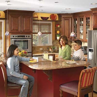
When the kitchen is the social hub, a confined layout definitely puts a damper on the festivities. Alfredo and Ivonne Espinel of Rutherford, New Jersey, knew when they bought their 1950s ranch house five years ago that the 12-by-16-foot kitchen, bisected by a peninsula, was less than ideal for big get-togethers. “Family is the first thing, all the time,” says Alfredo.
He and Ivonne, who came to the United States from their native Ecuador as children, now have two kids of their own, ages 12 and 13, and an extended family of more than 30 relatives who gather at their home every weekend. “We cook a lot, and there wasn’t room for everyone to be together,” Alfredo says. With dated appliances, an awkward peninsula, and no space for a large table, the kitchen couldn’t handle the family gatherings that are central to the Espinels’ way of life.
See more pictures from this transformation in Family-Friendly Kitchen Makeover.
Updated, White Farmhouse-Style Kitchen
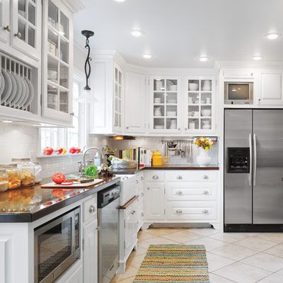
Professional blueprints and a deadline are always a good idea. But what if you have more time and how-to chops than cash? After 27 years and nine houses, Gregg and Nancy Alling were eager to redo the kitchen in their 1968 house in Toledo, Ohio, but couldn’t do it all at once.
To-the-ceiling cabinets and trim, light-reflecting finishes, a built-in plate rack, a tiled toekick, and niches for the fridge, TV, and microwave add function and updated traditional style.
See more on this remodel in A Total DIY Kitchen Redo in the Same Footprint.
Functional Family Kitchen
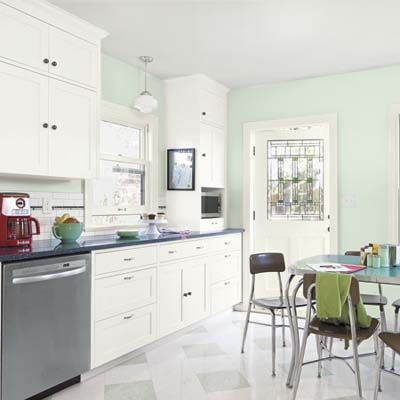
This 1920s house in Seattle had a 1960s-style kitchen. It needed more character and function and the homeowners wanted space for a family-size table, so they hired a framer to knock out a dividing wall and enclose a small back porch. They splurged on hiring a pro to make custom cabinets and did everything else—including hanging the cabinets—themselves. “The kids even helped us wiggle the last one in place. They also helped choose the floor pattern,” said homeowner Linh-Co Nguyen.
See more of this family’s DIY transformation in A Handsome Kitchen That Handles Hard Knocks.
Creating a Family Hub
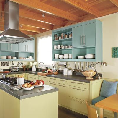
A good remodel often pays homage to the past while functioning very much in the present. When Stacy and David Eisenmann bought their 1920s house in Albany, California, they delighted in its vintage charm, which stopped short of the kitchen—a bare-bones box with tile counters and a window painted shut.
To create an airy gathering space that would open to a family room, David and Stacy, an architect, along with fellow architect Sarah Willmer and general contractor Jamie Carlen, bumped out one wall and took down two others, combining the kitchen and a laundry area into one large space.
See more of this remodel in A Vintage Kitchen Gets New Spirit.
Gorgeous Green Kitchen
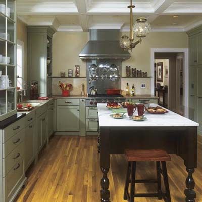
Ask four strong-minded people to collaborate on a kitchen design and you may get open warfare. But call on product and graphic designers Robert and Bonnie Briggs of Lexington, Kentucky, local kitchen designer Laura Dalzell, and carpenter-contractor David Wilds, and you’ll get a high-functioning, sophisticated setting for cooking and socializing alike—in less than three months. Robert and Bonnie assembled their dream team after four years of bumping into each other amid the pickled-oak cabinets and fluorescent lights of their Georgian-style house’s 1980s kitchen.
See more from this kitchen remodel in Same Size Kitchen, Fresh Look and Function.
Creating an Open Kitchen
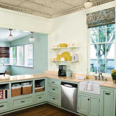
Few rooms are more appealing than a bright, open kitchen that invites family and friends to gather round. So after Tracy Stephenson Shaffer and her husband, Doug, gutted the makeshift cooking space in their 1852 cottage in Baton Rouge, Louisiana, they wanted to connect the kitchen to an adjacent family room, using a peninsula with stool seating on one side to delineate the two. The open-plan configuration would also keep the focus on the crowd-pleasing 1950s Chambers stove that inspired the room’s vintage style.
Fortunately, the couple was willing to take on most of the work themselves, with plenty of help from Tracy’s dad, who salvaged the original heart-pine floor and built the Shaker-style cabinets. Sweat equity freed up funds in the couple’s $15,000 budget for new wiring, plumbing, and gas lines, as well as a $2,600 overhaul of the old stove. With one wall down, two dreary rooms became one cheery family room kitchen with a separate table for playing games and doing crafts with their young daughter, Sara.
The new space, together with the mini mudroom they created in an entry alcove, honors the history of the home and functions much more efficiently, says Doug. Which is another way of saying that they nailed the period look and got the family-friendly upgrade they needed, too.
See more in A Kitchen Gets Modern Flow With Major Savings.
Vintage Character, Better Function Too
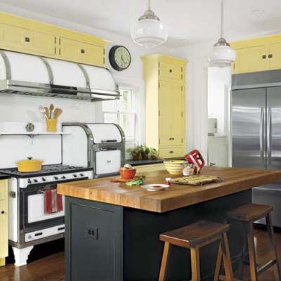
When you fall in love with a house for its great character, remodeling is a matter of helping new spaces live in harmony with old ones. At least, that’s how Tom and Kim Prescott saw the renovation of their 1866 Italianate home and its woefully outdated kitchen. The couple and their three daughters lived in the suburban Naperville, Illinois, house for 10 long years before tackling a major overhaul that included bumping out the kitchen and adding an adjacent laundry room. By then, working with architect Fred Burghardt, kitchen designer Pamela Polvere, and contractor Marty Brummel, “we knew exactly what we wanted,” says Tom.
Their wish list included more storage and prep space and a big dose of vintage style, including a spot for the rebuilt 1930s Magic Chef stove that Tom bought on eBay and drove home from Montana. Today, after adding and subtracting space, the Prescotts have Shaker-style cabinets, honed black granite and butcher-block countertops, and room to hang out, making the kitchen their go-to spot. Says Tom, “It finally feels right, like having a part of the house that was always missing.”
See more of their remodel in A Better-Functioning Vintage Kitchen
Period Style, Up-to-Date Function
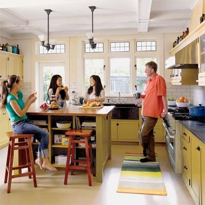
Working with designer Kim Clements, they negotiated other challenges, too, including the missing joists found while poking under the floor. When a wall came down—as part of the scheme to have the kitchen and the family room trade places—Clements realized ceiling beams had to go back up in a convincing old-house way. Details like arches trimmed to match ones on the porch also make the new space “feel like it has a heritage,” she says—with amenities, of course, including a gas line threaded outside to feed Vance’s grill.
See more of this remodel in A Period-Style Kitchen With Up-to-Date Function.
