Old Meets New

Just because a kitchen is new doesn’t mean it has to look that way. During the four-year run-up to their redo, Jennifer and Barnet Malin lusted for furnishings weathered by time—or by design. Picturing colorful tilework and honey-colored woods that would be compatible with their 1940s Spanish Revival house in Santa Monica, California, they turned to architect Deborah Teltscher.
They asked her to carve out space for a baker, a barbecue fanatic, and two junior apprentices—and to work in a pair of carved wood columns from Guatemala they’d spotted in an antiques store. Teltscher and contractor Ron Haslam annexed space from two adjacent rooms to expand the kitchen to a 14-by-14-foot square—”large enough, but still cozy,” as Teltscher puts it—with an island big enough to do homework at one end and frost a cake at the other. Distressed alder cabinets with pitted bronze pulls, reclaimed chestnut flooring, and hand-glazed tile contribute to the rustic look. As for those columns, Teltscher used them to frame the opening between the kitchen and a new family room/dining area. “The house was inspired by Spanish missions,” says Jennifer. “And now you could say our kitchen was, too.”
Before

The Malins’ chilly white galley was the last place the couple, both busy doctors and serious cooks, wanted to gravitate to with their two young kids. “We hated it—we bumped into each other all the time,” Jennifer recalls.
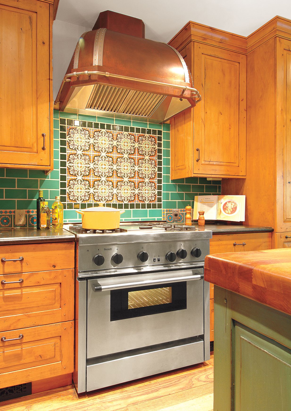
Splash of Color

The range backsplash was designed by homeowner Jennifer Malin with the help of software on the tile maker’s website.
Tile: California Pottery and Tile Works. Range: Thermador
Room for Everyone

With its extra elbow room and prep space, the kitchen is a natural gathering spot. Here, Barnet Malin tackles dinner with the help of Miles, 7, and Lila, 9.
Key Details: Iroko-Topped Island

An island topped with iroko, a West African hardwood, offers a sight line to the light-filled dining area and a patio beyond it.
Homeowner Tip: “Before building an island, be sure to measure all your clearances to ensure that you can get into the fridge without bumping into a barstool.” —Barnet Malin
Key Details: Hand-Glazed Tiles

Hand-glazed tiles brighten the room’s warm wood tones and echo the home’s Spanish Revival–style roots.
Key Details: Rustic Materials

Rustic materials with a warm, broken-in look include honed Atlantic Black granite counters, distressed and glazed knotty alder cabinets, and textured bronze pulls.
Range hood: RangeCraft
Cabinets: Cottonwood Cabinets
Pulls: Emtek
Guatemalan columns: Dos Gallos Furniture
Key Details: Salvaged Beams

Salvaged beams in the family room/dining area tie it to the kitchen with its reclaimed chestnut floor.
Beams: Conklin’s Barnwood
Flooring: Mountain Lumber Company
Before: Small and Inefficient

The 160-square-foot kitchen had a work area just 8 feet wide, with a small table isolated at one end and no central prep or gathering spot.
What We Did

Better laid out (and equipped) in a 14-foot square, the kitchen is anchored by an island with a prep sink and stools.
1. Opened up the kitchen to a new family room/dining area via a wide passageway framed by salvaged wood columns.
2. Put in an island 3 feet wide and 7½ feet long where kids and guests can hang out—or wash salad greens at the prep sink.
3. Added a second oven, a microwave, and freezer drawers across from the range/fridge wall—no more traffic jams during marathon meal prep.
4. Installed a double-hung with a swing-in screen to serve as a pass-through for the outdoor barbecuer and his kitchen staff.
5. Added more counter space within easy reach of the main sink and range.
