After: Aged-Well Look
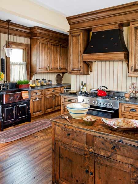
Often the best way to deal with a botched kitchen renovation is to take cues from the rest of the house. For the most part, Dawn Marshall and husband Ernie Lucca’s Victorian-era cottage, in Hillburn, New York, had aged well, retaining much of its original woodwork, including the floors, the casings, and the staircase. But the kitchen was another story.
Shown: Hickory cabinets with built-up crown molding and a painted-and-glazed beadboard backsplash help create a period look.
Range: Bertazzoni
Before: Mismatched Kitchen
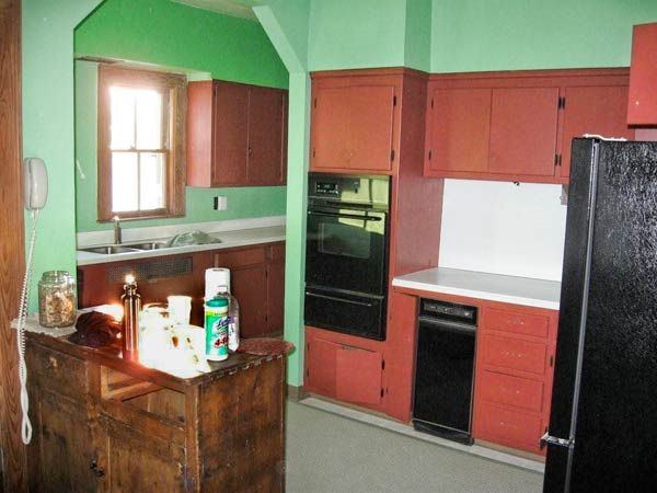
Updated in the 1950s, the cook space was cut in two by an awkwardly placed arch, resulting in a choppy, impractical layout. “I really wanted to improve the work area,” says Rose Marie Carr of Kitchens by Rose, “and to make the kitchen look like it belonged to the rest of the house.” And Dawn wanted a green renovation. When the crew went to rip up the pine floors, she scraped off the linoleum herself—soaking it in hot water to avoid potential asbestos fibers—to save the original boards. “It took me about two weeks,” she says.
Construction lasted 10 long months, but the result was worth it: a well-laid-out space with warm hickory cabinets, a wheat-colored beadboard backsplash, and an antique sideboard repurposed as an island. “I didn’t cook much before,” Dawn says. “But now that the kitchen is finished, I love to.”
Shown: A 1950s renovation left this 1906 house with an inefficient kitchen that turned a corner
Scrub Station
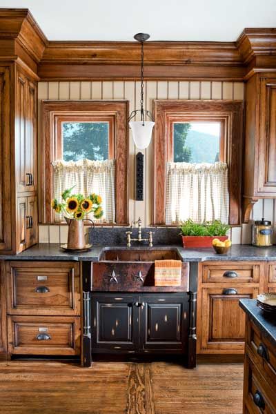
A washstand-style sink cabinet, stained black and with visible distress marks, highlights the copper sink and bronze-finished bridge faucet. The original window casings got a coat of English Pine stain.
Faucet: LaToscana
Sink: Copper Sink Store
Character Lights
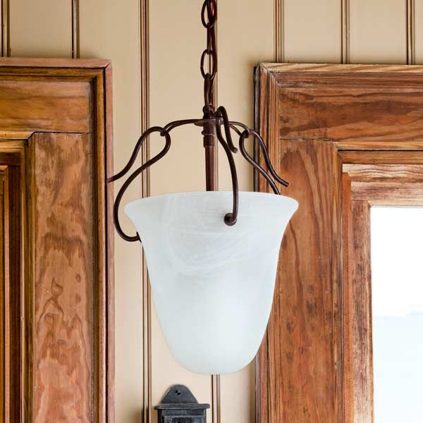
Period-appropriate pendants were discovered online by the homeowner, who was determined to avoid recessed cans.
Lighting: Feiss
Dressed to Distress
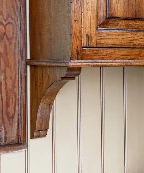
Hickory cabinets were stained and distressed to look well worn. All glues and coatings used are zero-VOC and formaldehyde-free. Old-school individual beaded boards make up the backsplash.
Cabinets: Christiana Cabinetry
Sideboard-Turned-Island
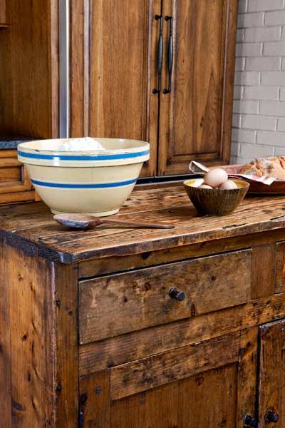
An antique sideboard, inherited from the homeowner’s father, is used as an island to provide additional workspace. The back of the brick chimney, discovered under wallboard, was painted and left exposed for a rustic touch.
Patched-Up Planks
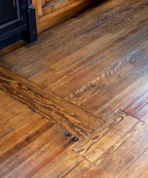
A floor patch marks where the butler’s-pantry wall once stood (the space was absorbed long ago). The floors in the former butler’s-pantry are oak, while the rest are North Carolina pine.
Stain and clear coat: EcoProcote’s TimberSoy Natural Wood Stain and Acri-Soy Penetrating Clear Sealer
Fresh Top
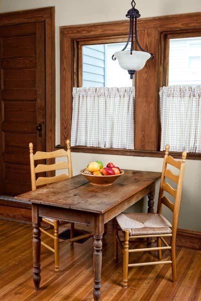
The vintage kitchen table was refreshed with a pine-plank top. New wood windows are stained to match the original casings.
Windows: Woodright by Andersen
Floor Plan Before: Halved Space
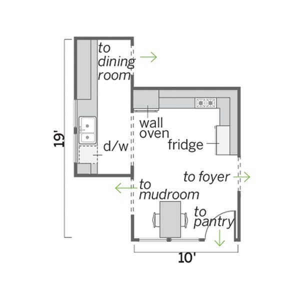
The space was cut in two by an arched passageway and didn’t have a well-organized work area.
Homeowner Tip: “Research green options ahead of time, if that’s important to you. There are lots of great products out there, but not all contractors are familiar with the choices.”
—Dawn Marshall, Hillburn, N.Y.
Floor Plan After: Workable Room
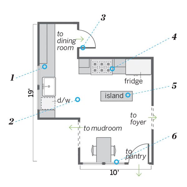
Most of the arch wall came down to open up the 210-square-foot kitchen. This allowed for a more workable layout with an island for added prep space.
1. Removed the soffits to accentuate the 12-foot ceilings.
2. Opened up the room by demolishing an arched passageway that divided the space in two.
3. Rehung the swinging door to the dining room, which had been stored in the basement.
4. Put in a range to unite the cooktop and the wall oven; shifted the fridge to this wall for a more open feel.
5. Added an island for a central work surface and to replace lost cabinet space.
6. Replaced all the windows but kept the existing casings and reused all the hardware
