Fixing an Awkward Layout
When the fridge blocks an exterior door and the counters are so shallow that the dishwasher sticks out, you know you’ve got problems. But for Aïda Pollard and Jon Maloy, the cockeyed configuration of their kitchen was the least of it. “I love to prepare quick, easy meals,” says Aïda, “but with only one small window for ventilation, it got so hot I could barely be in there 15 minutes.” After 20 years of living with the pinched cooking quarters in their 1949 cottage, the couple knew where to turn: the Austin, Texas, design-build firm CG&S, where Aïda works as business manager.
Opening Up the Kitchen
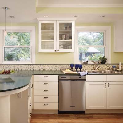
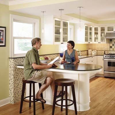
Architect Stewart Davis devised a plan to take down the wall separating the kitchen and dining room, bringing in air and light by allowing the kitchen to annex a window and expand by about 50 square feet. “Meal prep no longer feels like solitary confinement,” says Aïda, pointing to a peninsula that allows her to chat with friends and family while dicing onions. That funky door disappeared, and larger replacement windows and a range hood that vents outdoors help take care of the Texas heat. Aïda and Jon, a theater technician, wanted to splurge on lighting and tilework, so they chose midpriced appliances, laminate countertops, and painted cabinets. “We couldn’t be happier,” says Aïda. “I’m amazed we waited so long.”
Soffits
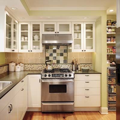
Soffits, set off by a ribbon of color, hold recessed lighting and give the upper cabinets a finished look. The wall paint is Kelly-Moore’s Misty Meadow. The sink and faucet are from Kohler. The range is from Maytag, and the range hood is by Broan. Pantry pullouts are by Elfa.
TOH Homeowner Tip: Aïda Pollard, Austin, Tex., says, “Don’t stint on lighting. We have four types—task, undercabinet, recessed, and pendant—all on dimmers, so we can set the mood, whether we’re cooking or having a glass of wine.”
Fridge Cabinet
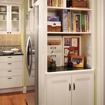
The full-height fridge cabinet has open shelves and a landing strip for keys and mail near the doorway to the den. The fridge is KitchenAid, and the pulls and knobs are by Amerock.
Windowsill Shelf
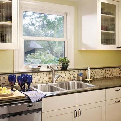
The windowsill shelf, 5 inches deep and topped with the same laminate as the counters, holds plants while adding depth and weight to a space-defining wall.
Bar Stools
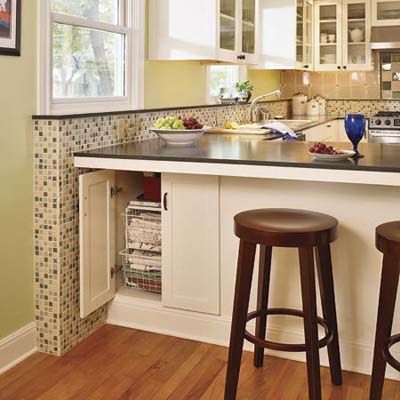
Bar stools invite guests and sous-chefs to pull up to the peninsula. Cabinets hold table linens on one side and a microwave on the other. The pendants are from Tech Light, the countertops are from Wilsonart Laminate, and the stools are from Storehouse.
Tiles
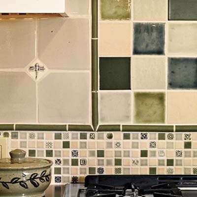
A trio of tiles in carefully coordinated styles and colors makes an eye-catching backsplash, complete with a dragonfly inset. The tile is from Walker Zanger (large squares) and Pratt & Larson (others).
Before
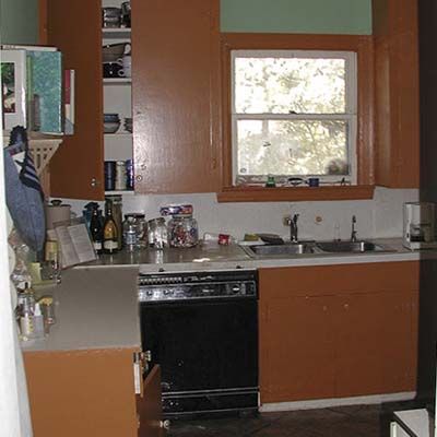
Tobacco-brown cabinets, tight quarters, and still air made cooking in the old space a nonstarter.
Before Floor Plan
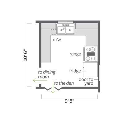
The 100-square-foot kitchen was a model of inefficiency, with scant storage, dated appliances, shallow counters—and not enough of them.
What They Did
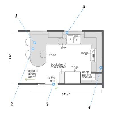
1. Added a curved peninsula between the kitchen and dining area. The peninsula replaces a wall that was torn down, allowing the kitchen to expand by about 50 square feet, and light and air to flow through.
2. Created extra storage under the peninsula and plenty of space on top to prepare meals and share snacks.
3. Moved the doorway to the den to create space for a fridge enclosure that has shelves on one side and, on the other, hides a pantry designed without doors for the convenience of the cook.
4. Closed off an exterior door formerly blocked by the fridge and added a counter and
open pantry shelves to the right of the range.
5. Rebuilt the sink wall with two large windows and a 5-inch-deep windowsill shelf atop a long tiled knee wall.
