Before: A U-Shaped Cramp
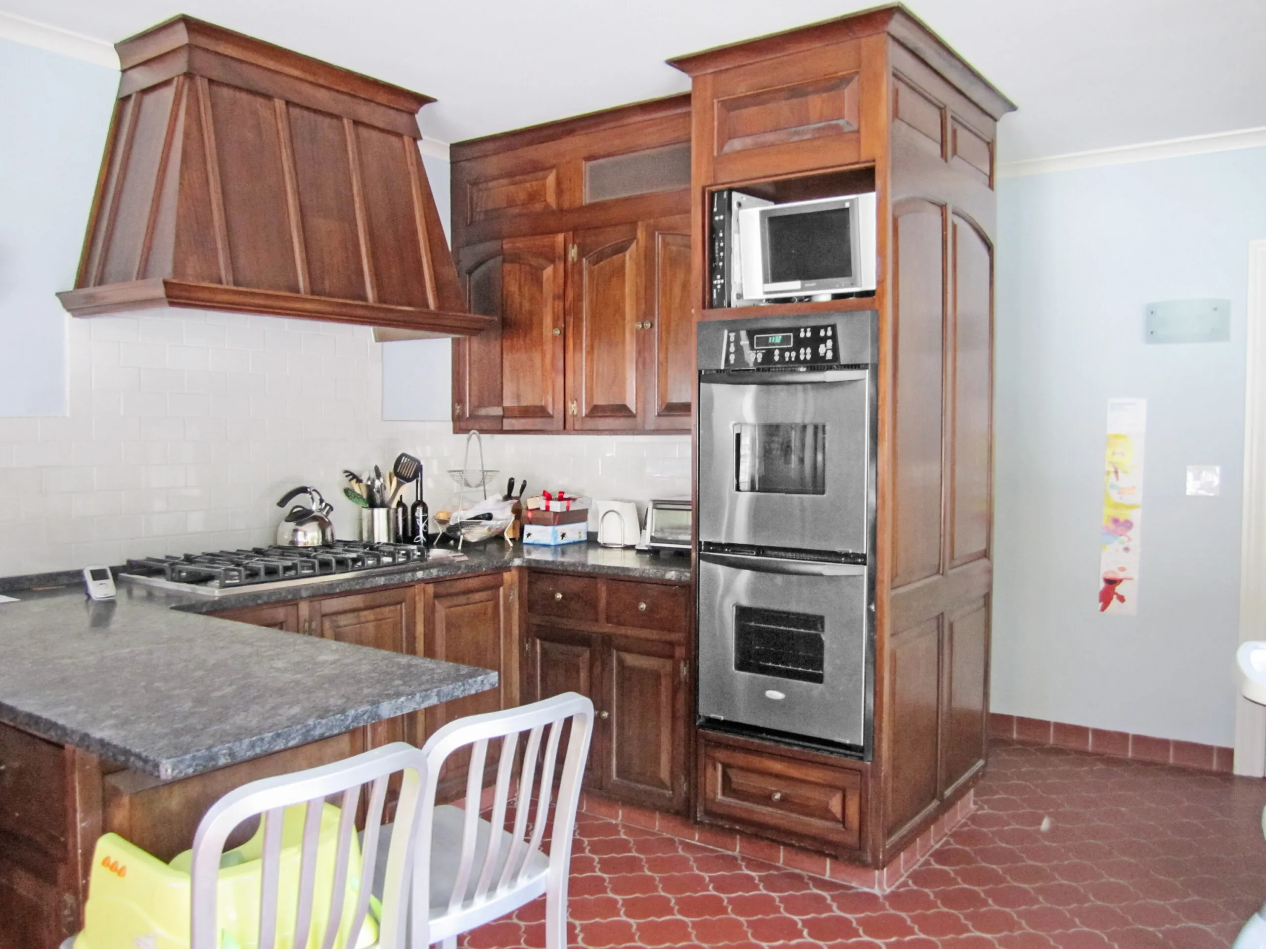
The 1920s Tudor was lovely save for one thing: The warren of rooms just didn’t work for a couple with three young children. Having moved from a Manhattan apartment, Jamie Donner lasted two years in the Summit, NJ, house before crying uncle. “I fell in love with the charm of the house and the beautiful yard,” she says. “But the kitchen was like a closet, sequestered at the back. And you couldn’t see the backyard.”
Shown: The old kitchen was turned into the family room. Its U-shaped layout was cramped for a family of five, and its heavy, traditional look didn’t suit their style.
Free-Flowing Update
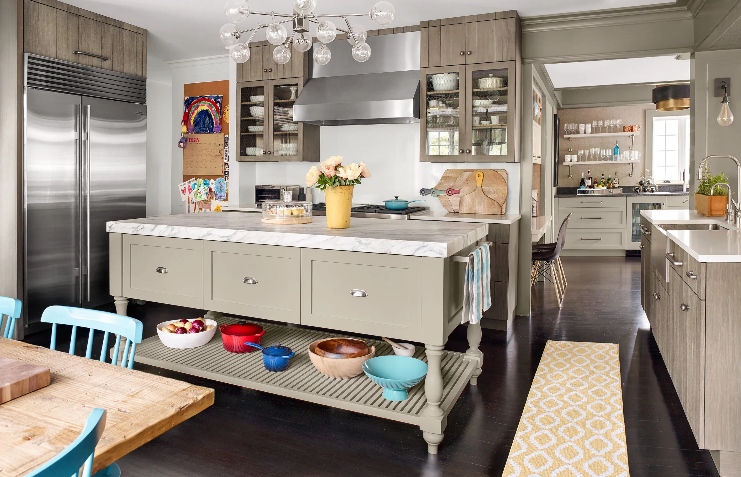
Working with a creative team that included architect Michael Chiarella, interior designer Magda Chiarella, and kitchen designer Heidi Piron, the Donners reworked the core of the first floor. In the end, they swapped the locations of the kitchen and family room, turned the former breakfast room into a wet bar, and exchanged a home office for a butler’s pantry, adding a built-in desk near the wet bar. The result is a more open plan with cooking, serving, and gathering areas—plus a fresher, more informal look that still suits the traditional house. “The rift-cut oak plank-style cabinetry feels casual and somewhat contemporary,” says Piron. “Then there are traditional elements such as the painted island with turned legs.”
Shown: In the new kitchen, rebuilt in the family room space, rift-sawn oak plank-style cabinets and a marble-topped island create a contemporary-traditional mix. A wet bar went in where the breakfast room had been.
Cabinetry: Premier Custom-Built, Inc.
White countertops: Caesarstone
Island top: Calacatta marble
Family Dining
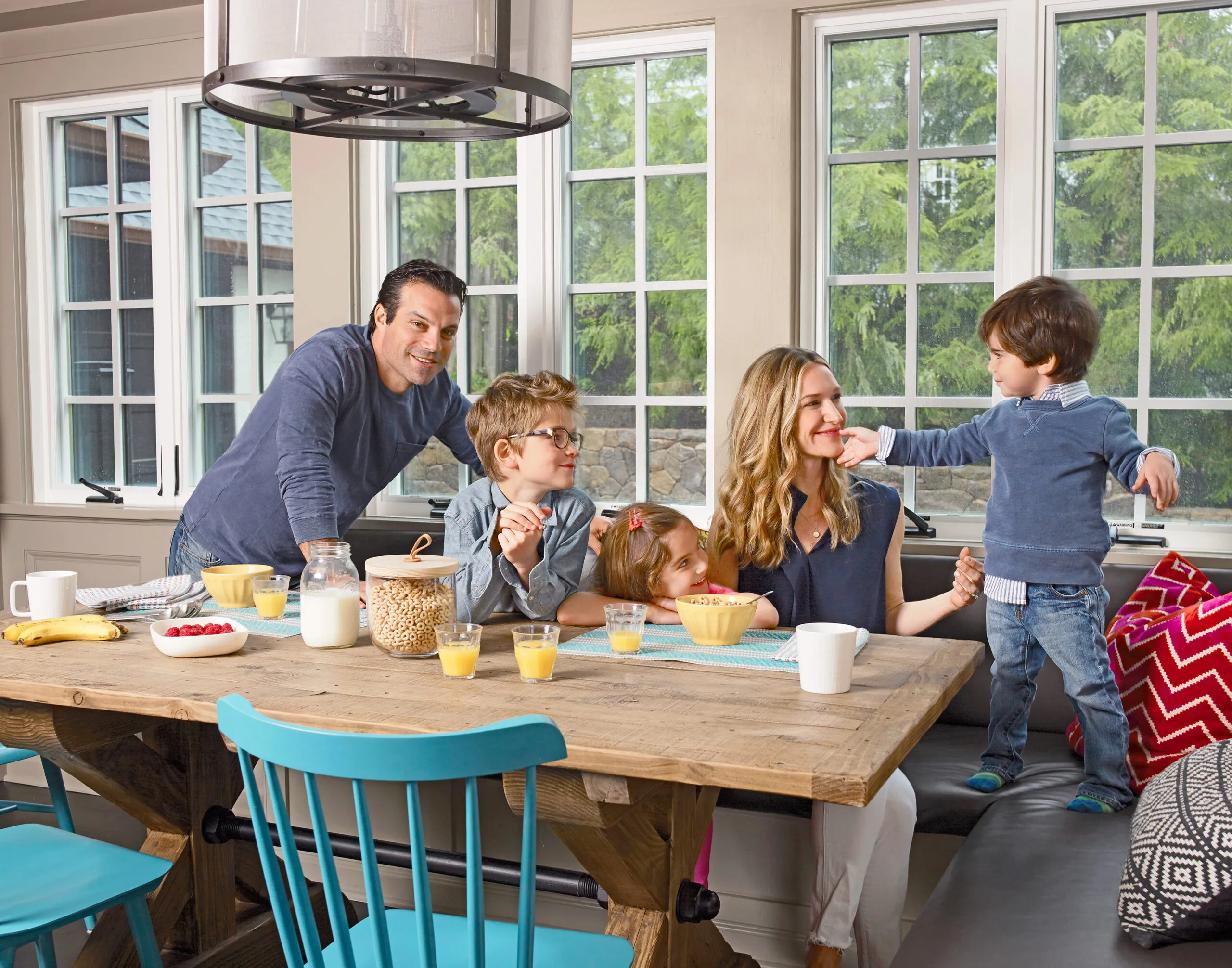
Having to decamp to the basement during almost nine months of construction and rely on an ad hoc kitchen complete with hot plate was all worth it, says Jamie. “Now we spend 98 percent of our time in the renovated spaces, and we can see that beautiful yard all the time.”
Shown: The new window-lined breakfast nook opens up backyard views. It is the main dining space for the family (from left): Kevin Donner; Riley, now 10; Quinn, now 6; Jamie Donner; and Duke, now 4.
Windows: VistaLuxe by Kolbe
Table: Restoration Hardware
Sink with a View
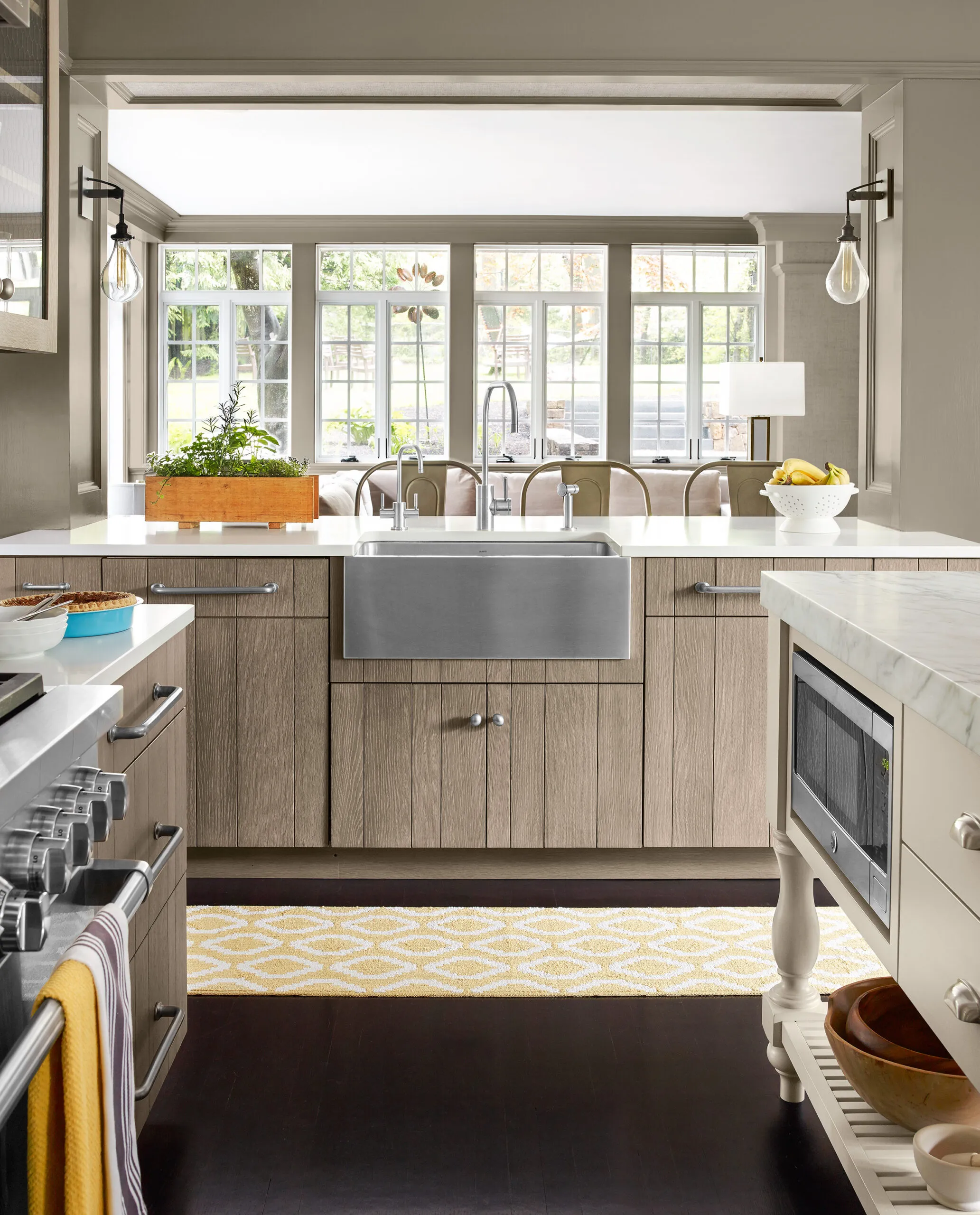
A load-bearing wall was opened up for the sink island, which has seating on the family room side and views outdoors. A beam overhead and posts wrapped in millwork provide the needed support.
Farm sink: Blanco
Faucets: Waterstone
Windows: VistaLuxe by Kolbe
Sleek Range
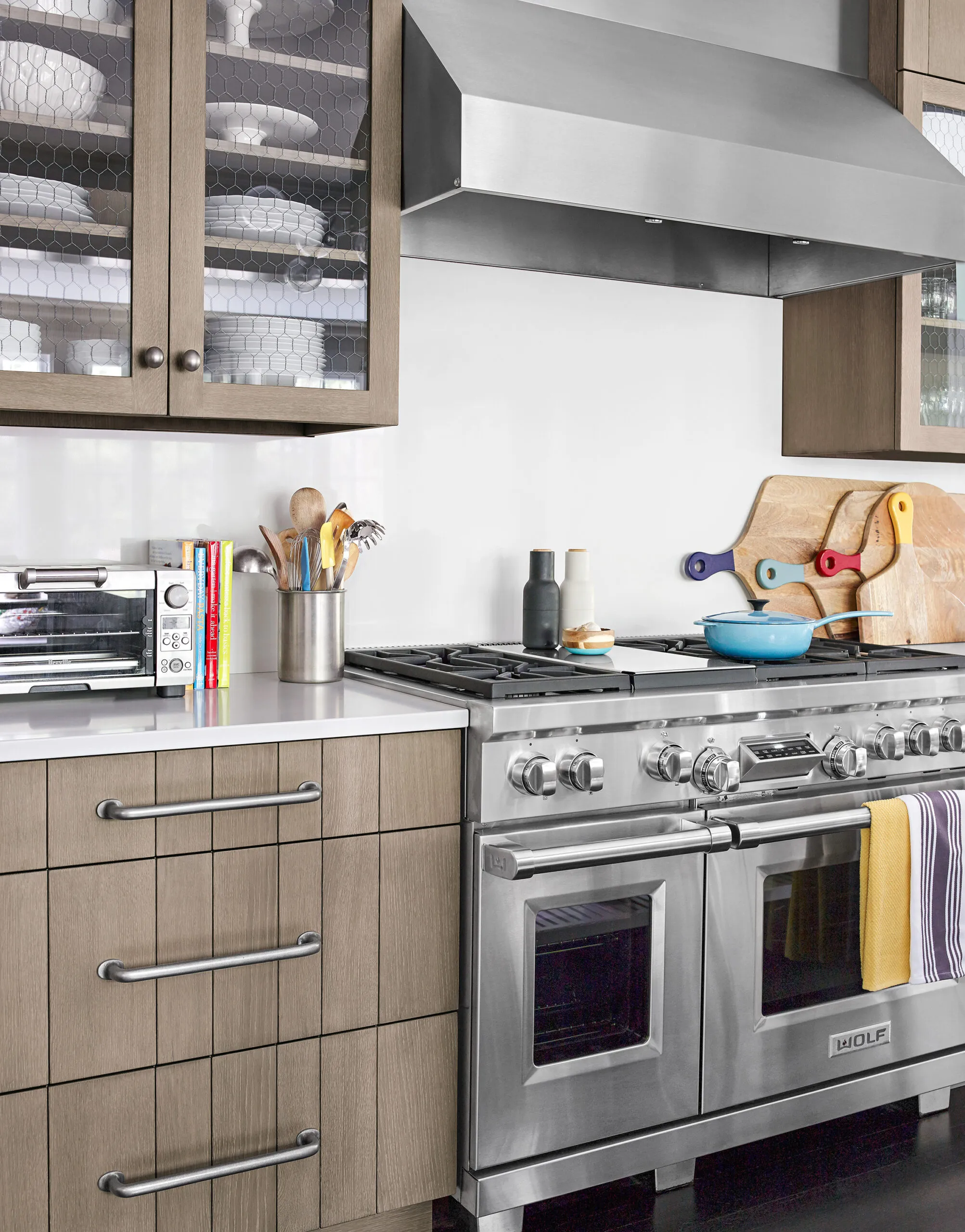
The sleek look of the stainless-steel range and hood is enhanced by the white quartz countertops and backsplash. Deep drawers provide storage for pots and pans; the random-width planks on their rift-sawn oak fronts are perfectly aligned.
Range: Wolf
Range hood: Vent-A-Hood
Glass-Front Cabinets
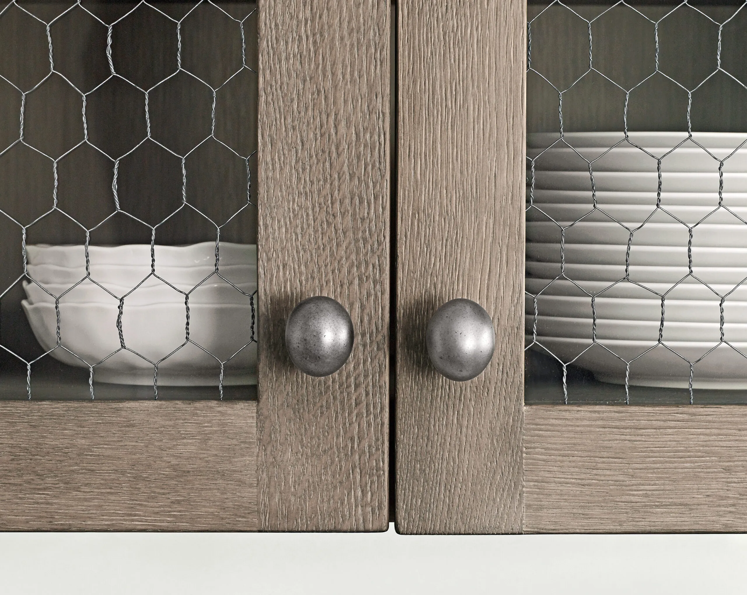
Cabinet doors on the range wall feature chicken wire encased in glass, a casual look that’s easier to clean than exposed wire. The rift-sawn oak is wire-brushed and stained so the grain shows through.
Cabinetry: Premier Custom-Built, Inc.
Knobs: Top Knobs
Coffee Station
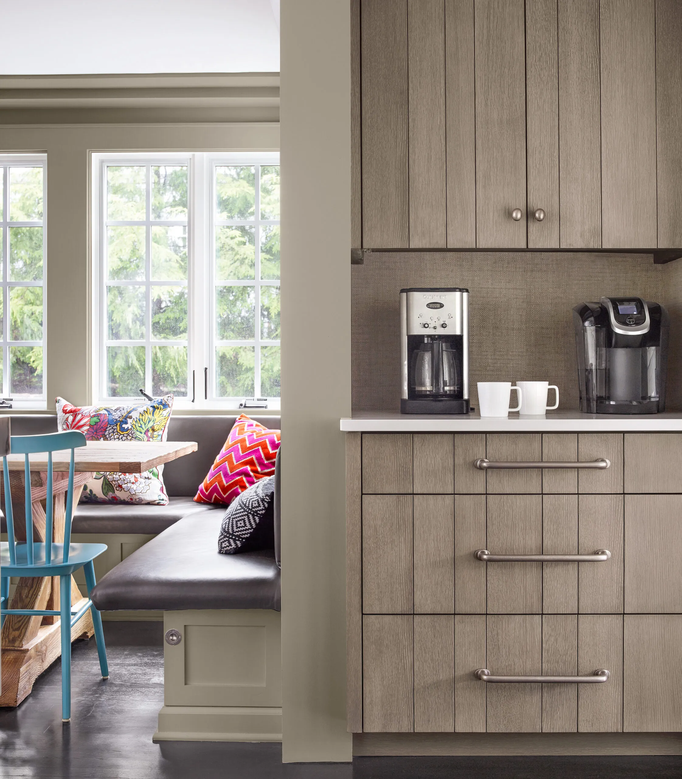
A coffee station is conveniently set up next to the breakfast nook. New wood casement windows have flat muntins that mimic those on the house’s existing metal windows. All the lower cabinets hold drawers.
Cocktail Staging

The wet bar provides a staging area for cocktails on the patio just beyond the nearby back door. The built-in desk offers a spot for recipe browsing or homework.
Countertop: Honed black granite
Bar sink: Franke
Undercounter refrigerator: Marvel
Open Shelving
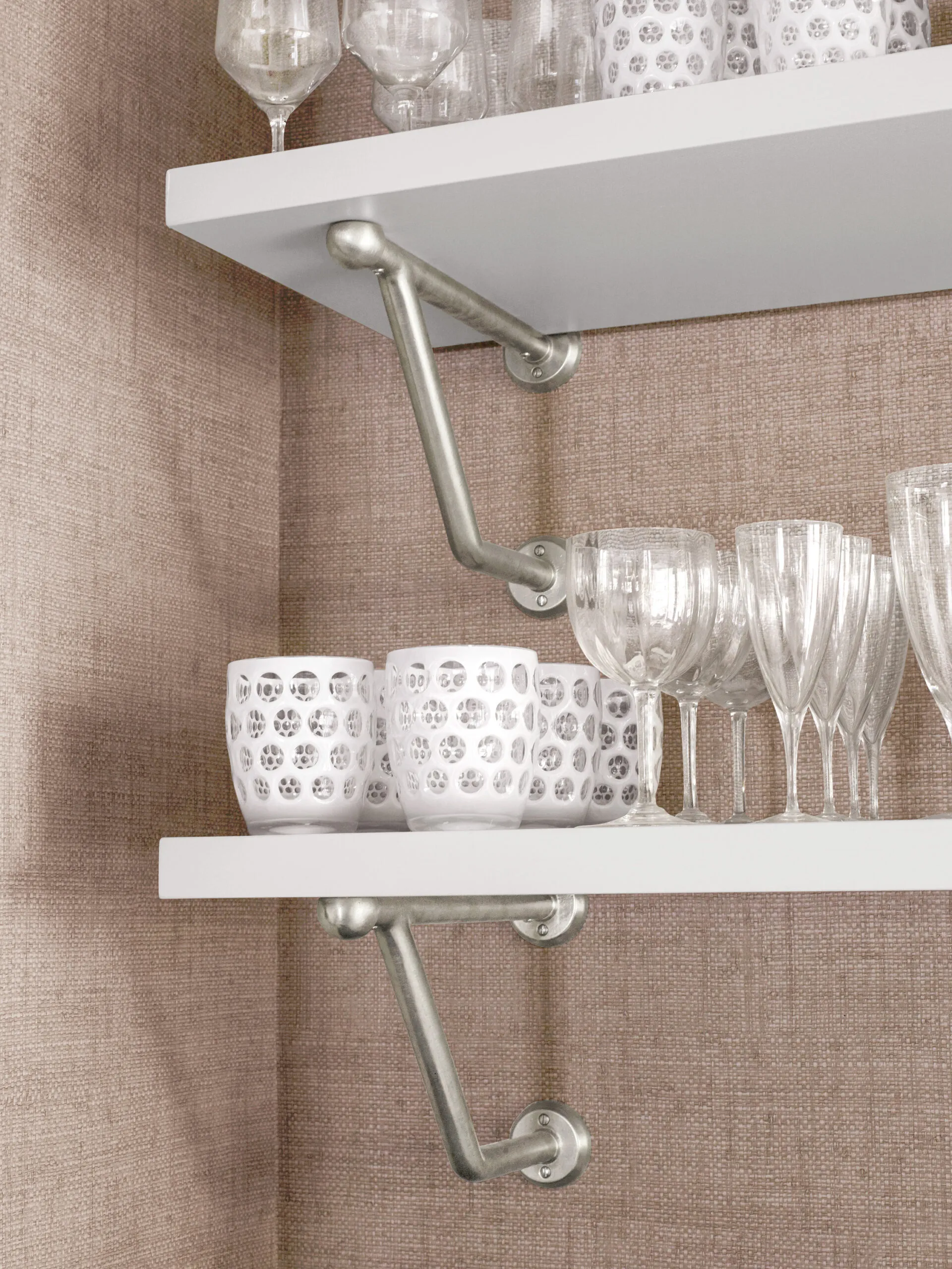
Glassware serves as a decorative focal point on open shelving in the wet bar, where the walls are dressed up with grasscloth wallpaper.
Wallcovering: Thibaut
Island Storage
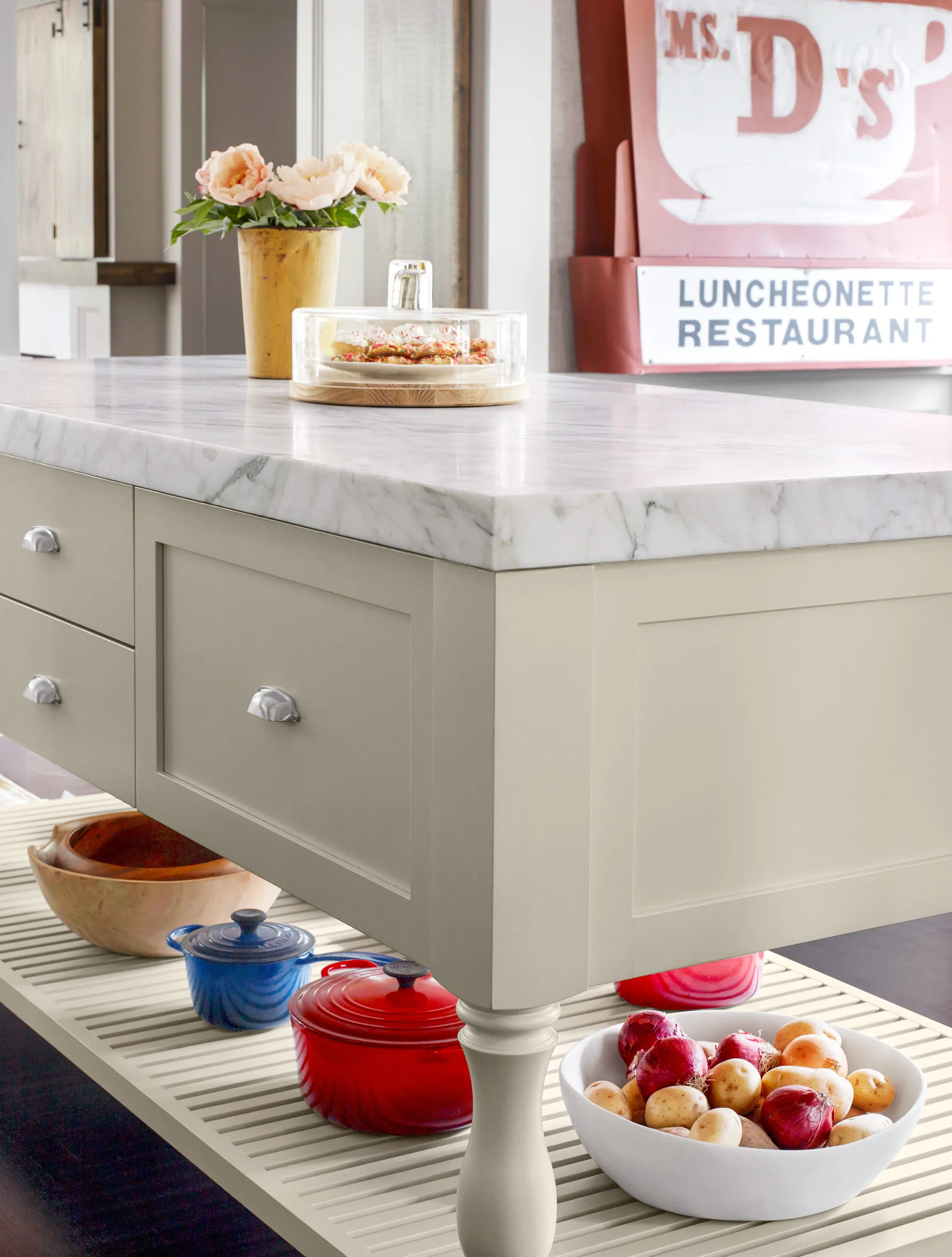
The furniture-like island has a warm brush-painted finish, turned legs, and cup pull hardware. The slatted bottom shelf holds large serving pieces.
Pulls: Top Knobs
Island top: Calacatta marble
Before Floor Plans

A U-shaped cooking zone was isolated at the back of the house and was separated from the eating area.
After Floor Plans
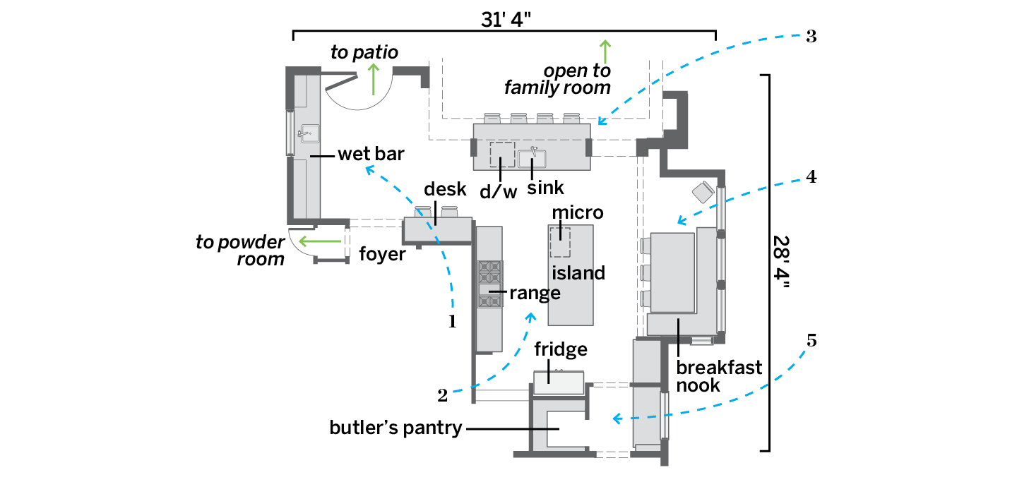
After swapping spots with the family room, the kitchen got a more open and functional layout
1. Turned the former breakfast room into a wet bar with access to the patio.
2. Created a cooking zone with the range wall, a center work island with a microwave, and the fridge.
3. Added a second island that holds the cleanup zone, with a sink and dishwasher—and seating on the family room side for snacks.
4. Turned a 12-by-6-foot alcove into a nook that’s the family’s main dining area, “even when the grandparents are over,” says Jamie.
5. Connected the kitchen to the formal dining room via a butler’s pantry (the old home office) for staging big meals.

