One-Dimensional Cookspace
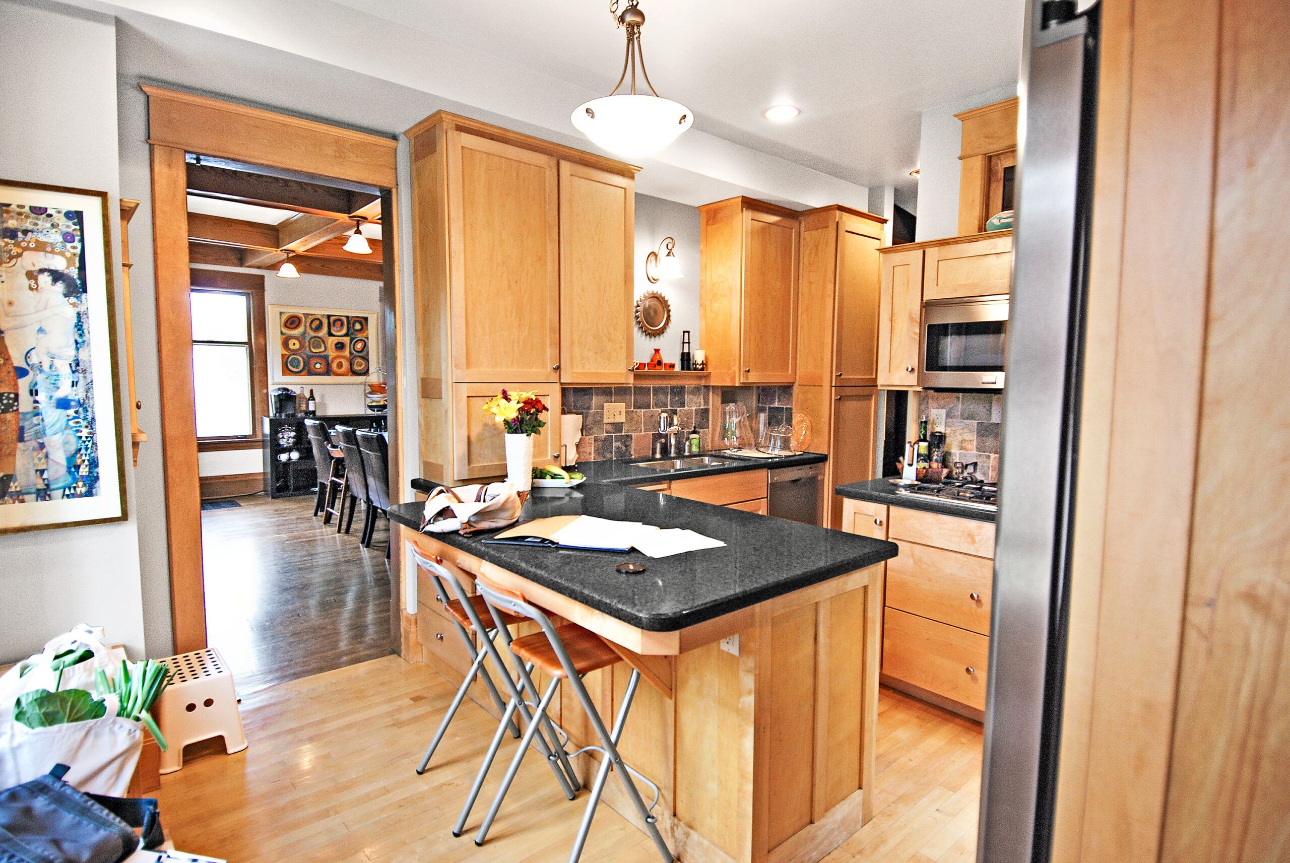
A remodeled kitchen in good shape may seem like a bonus when buying a house, but if the layout is clunky and the look an affront to the architecture, you still might need to start over. Caroline Schnieders and Yvette Soignier decided to do just that after buying the 1908 foursquare in St. Paul, MN, they share with their two sons. A peninsula impeded flow to the fridge, range, and sink, making it a tight squeeze for two cooks. And while the 10-year-old maple cabinets and floor were usable, they felt out of sync with the other rooms.
Shown: Way too much maple covering the cabinets and floors made for a one-dimensional look. A cumbersome peninsula hemmed in the cook and undermined circulation.
Pretty Perfect Kitchen

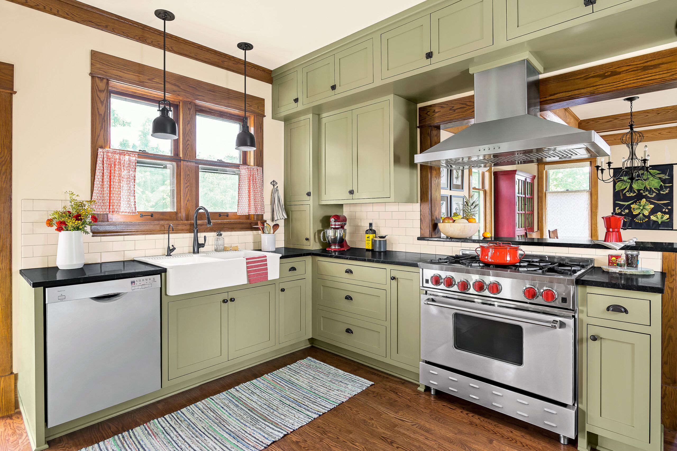
When called in to help, Zoe Kardasis Sturtz and Ryan Sturtz of Edit Design Build Studio scrapped the peninsula to free up floor space. They rebuilt the wall shared with the dining room to create a large pass-through connected to a new passageway for more openness and flow. Adding a breakfast bar on the dining room side provided seating for kids’ meals. Relocating the sink under two windows improved the view. Oak flooring and soapstone counters helped to ground floor-to-ceiling cabinets painted a historical green.
Shown: In the opened-up space, a pro-style range beneath the pass-through blends with vintage-green cabinets, soapstone counters, and a subway tile backsplash. A run of deep, ceiling-high cabinets along the range wall hides a support beam.
Range: Blue Star
Vent hood: Elica
Faucet: Kohler
Dishwasher: Bosch
Windows: Marvin
Pendant lights: Feiss Lighting Experts
Paint (walls): Mannequin Cream; (cabinets) Dill Weed; (ceiling) Mayonnaise; Benjamin Moore
The Homeowners

“We love the open layout,” Yvette says. “We can really function in here, and still chat with the kids at the dining room table. The kitchen is beautiful, and suits us and the house perfectly.” As for their newish former kitchen? Nearly everything was donated to a Habitat for Humanity ReStore. A happy ending all around.
Shown: Caroline Schnieders, left, and Yvette Soignier, who share the house with their two young children, wanted a kitchen that reflected the style of the home, but with modern conveniences and flow.
Tailor Made
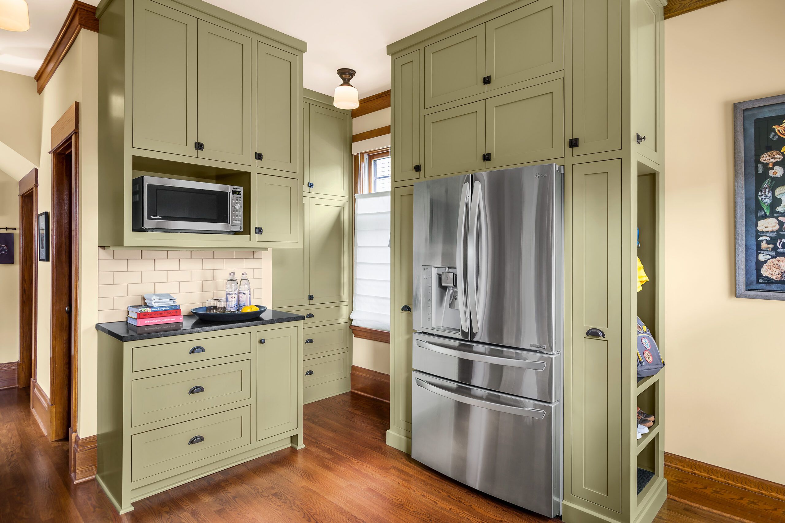
The new configuration added about 16 linear feet of cabinet storage. A microwave niche above a section of open countertop serves as a snack-and-drinks center. Around the corner, a windowed nook holds custom pantry cabinets and drawers where the back staircase had been.
Microwave: Panasonic
Recessed lights: Schoolhouse
Cool Enclosure
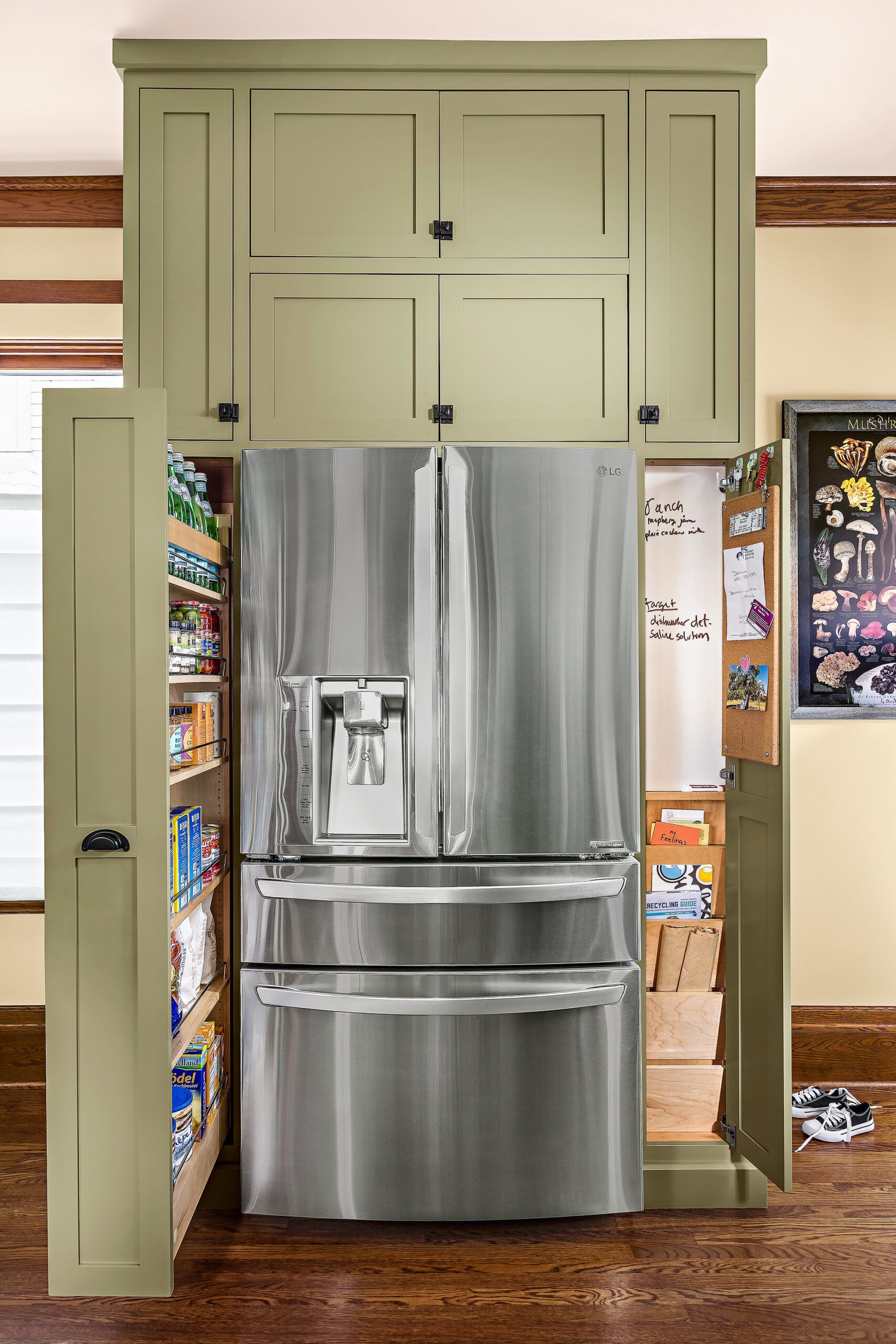
No space wasted here! This clever fridge wall boasts a slim slide-out pantry unit on one side and a shallow message center behind a pantry door on the other. The cabinets got a sprayed-on conversion varnish finish for extra durability and moisture resistance.
Cabinet hardware: Rejuvenation
Closed for Viewing
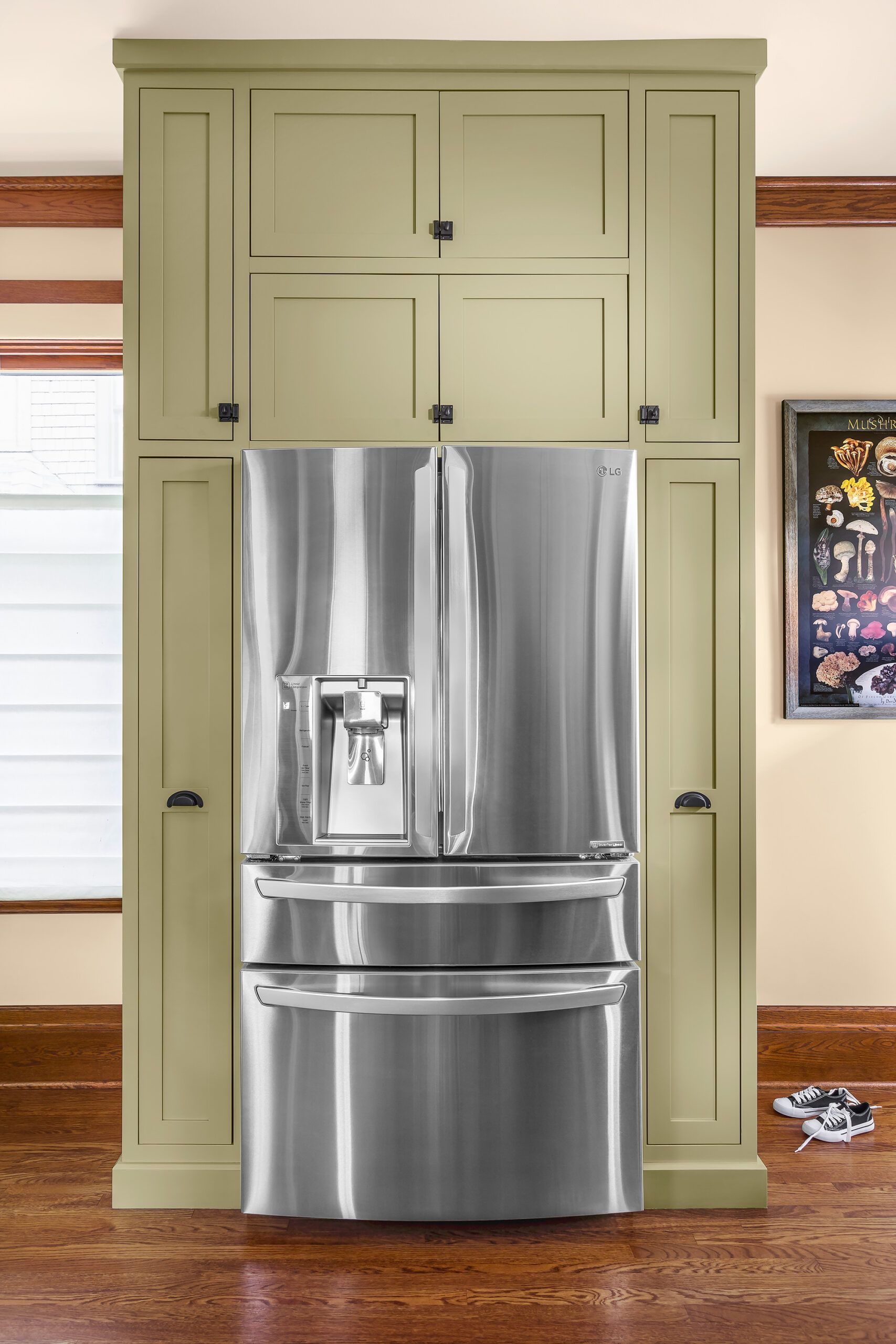
Yes, sleek stainless can coexist with a vintage vibe. “Remember, you are putting a new space in an old home,” says designer Zoe Kardasis Sturtz. “Work with cues from the original home, but don’t attempt to create a reproduction.”
Refrigerator: LG
Grab and Go
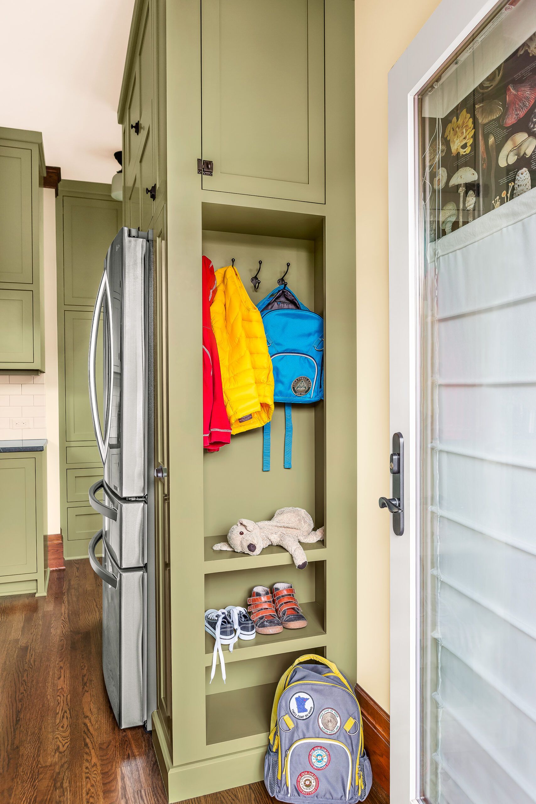
A drop zone with hooks and shelves keeps shoes, backpacks, and outerwear organized by the back entry. A door with a full glass panel brightens the space; a top-down Roman shade adds light control and a measure of privacy.
Double Your Sink
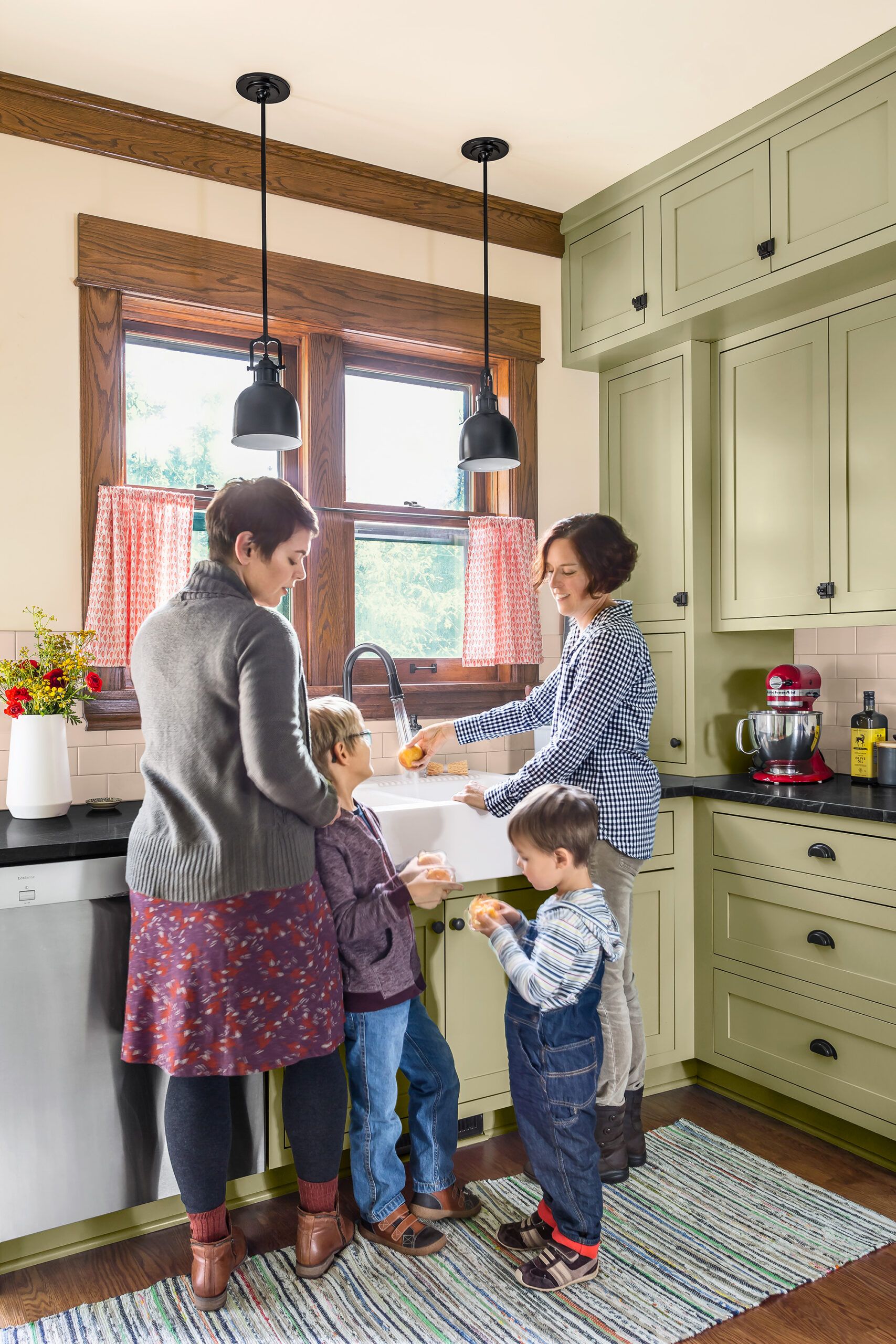
“We seem to generate a lot of dishes!” says Yvette Soignier (left), shown with Caroline Schnieders and their sons Eliot, now 7, and Arlo, now 4. “A double sink allows you to use one side for dishes and the other side for washing fruits and vegetables.”
Sink: IKEA
Before Floor Plans
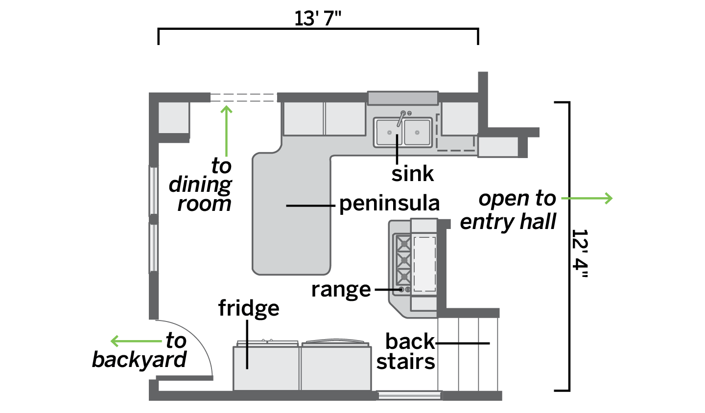
A peninsula and a back stair wasted space and left little room for two cooks to move around.
After Floor Plans
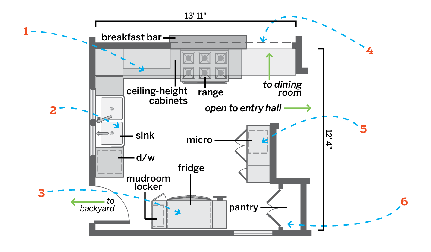
The 172-square-foot space is more open and more comfortable, with better views and improved function. Ceiling-high cabinets along the range wall conceal a structural beam and yield bonus storage.
- Removed the peninsula for better flow; closed up the dining room entry to create a longer cabinet run.
- Moved the sink in front of the two windows; installed shorter double-hungs to allow for the plumbing.
- Put in custom fridge cabinets with a slide-out pantry on one side, a drop zone on the other.
- Created a new, slightly larger opening to the dining room joined to a pass-through over the new range location; a breakfast bar accommodates snack time. These changes also eased circulation to and from the entry hall.
- Added a cabinet for the microwave and a drinks station where the range had been.
- Scrapped the back staircase for built-in pantry storage.
