Before: Awkward Peninsula
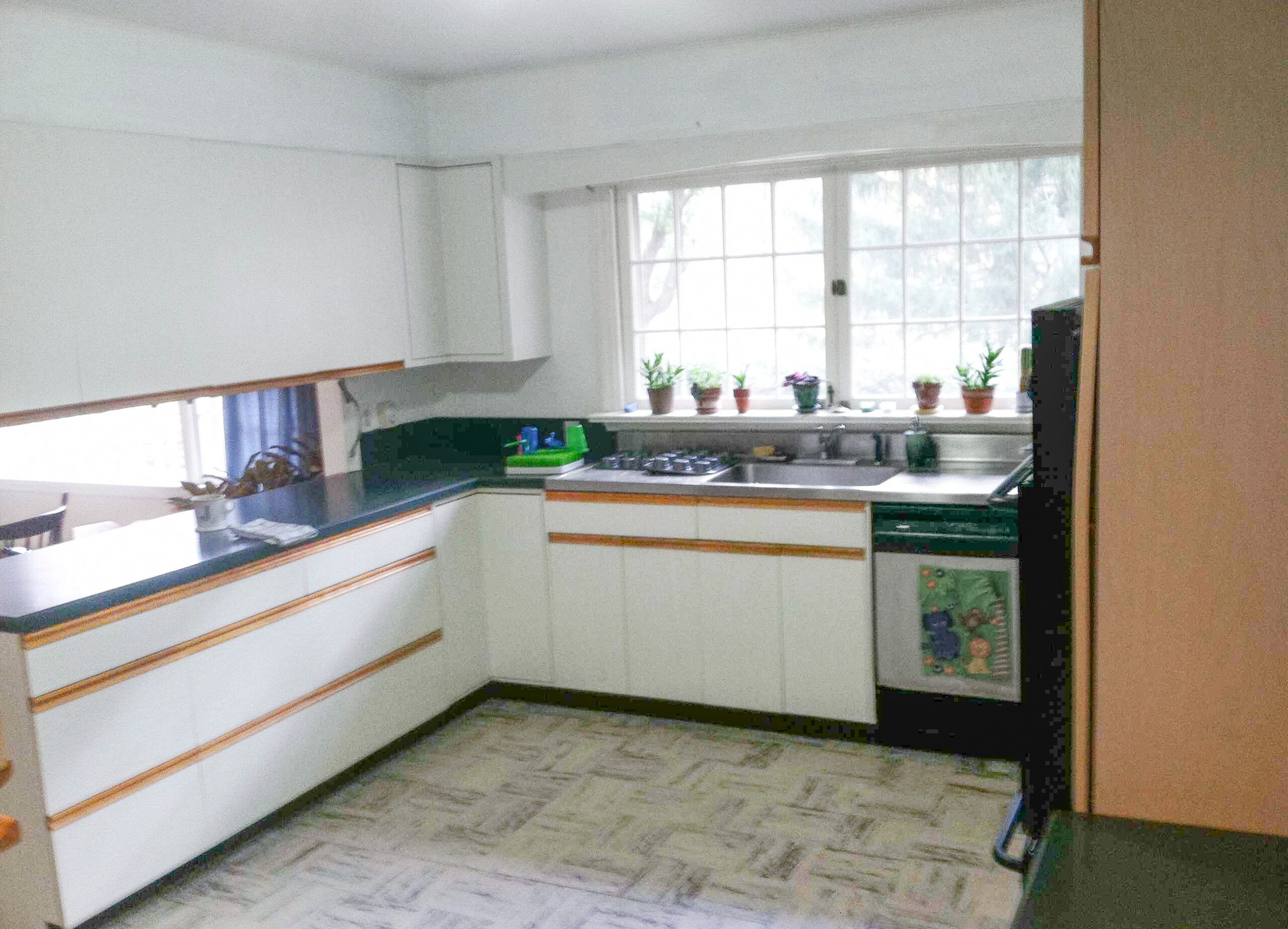
A successful remodeling project requires vision. Lucky for Kim and Jeff Shake, both graphic designers, being able to visualize an idea—in this case a spiffy new kitchen—is part of what they do.
When the couple bought their custom 1957 ranch in Trumbull, CT, they were wowed by the built-ins and oversize windows. The kitchen was another matter. Wood-trimmed laminate cabinets were holdovers from the 1980s, and a peninsula with cabinets hanging over it cut the kitchen off from the dining room. The small side-by-side refrigerator and 24-inch wall oven were no match for the family of four, either.
Shown: The kitchen had 1980s oak-trimmed laminate cabinets and an awkward peninsula with cabinets suspended above it.
Beauty on a Budget
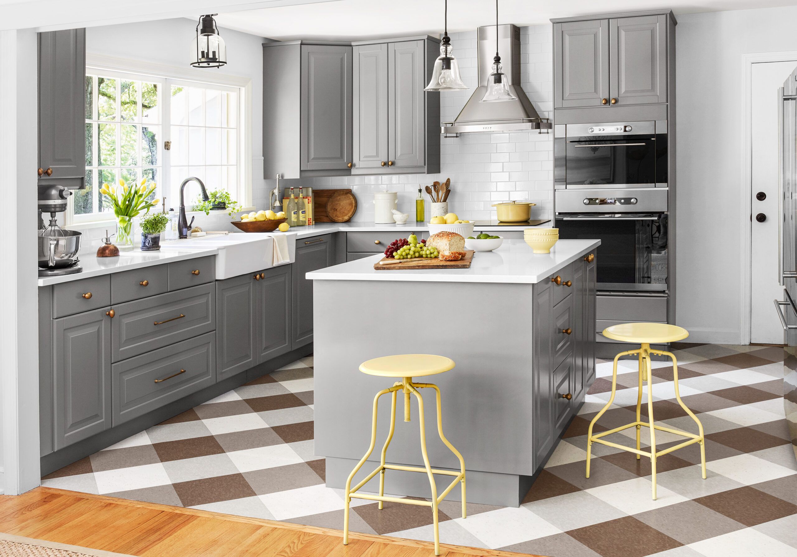
It took nearly four years of planning before the Shakes raised sledgehammers to the old cabinets. They replaced them with units bought at and installed by IKEA, which they figure saved them $3,000. Impressed with the quality, they bought most of their appliances there, too, applying the savings toward a large French-door fridge. Jeff helped with plumbing and electrical hookups.But the scene-stealer is the floor. Kim pored over many plaid patterns to devise one using four colors of vinyl composition tile, which she bought online. When she and Jeff laid the tiles, she says she knew her vision was 20/20. “We were like, this is fantastic!”
Shown: Cool-gray raised-panel cabinets strike just the right balance between traditional and trendy. An island offers a gathering place that doesn’t cut the kitchen off from the dining room.
Cabinets, sink, cooktop, ovens: IKEA
Floor tile: Armstrong
Paint: Behr’s Cottage White (walls)
The Reno Crew

“They had a blast,” Kim says of sons Kyle, 8 (foreground), and Luke, 10, who helped with the kitchen demolition. Handy Jeff is holding the family beagle, Pixie.
After: Fully Open
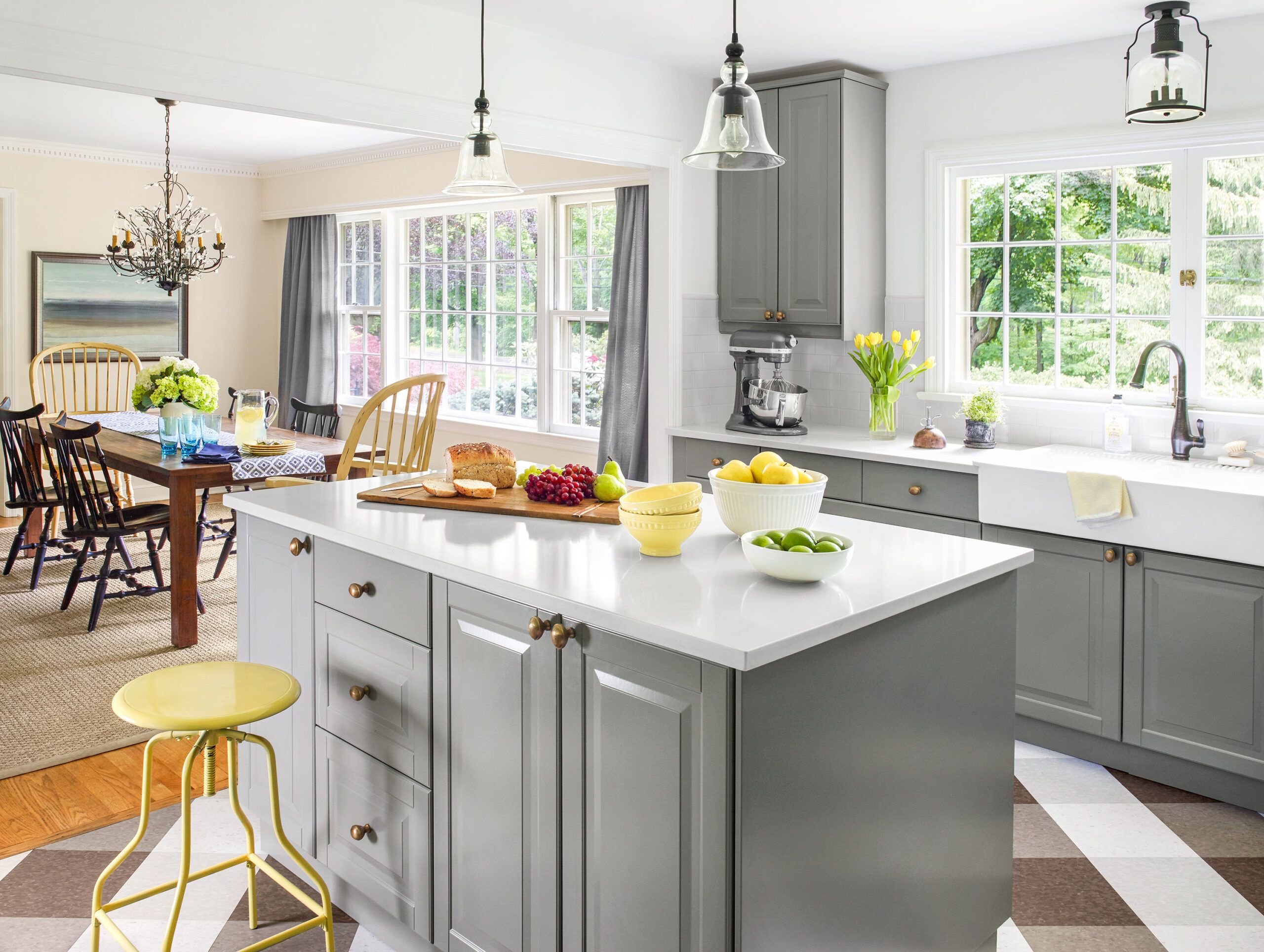
With the old cabinets out of the picture, the Shakes’ kitchen is now bright, welcoming, and fully open to the adjacent dining room.
Dining table: Crate & BarrelDetails: Get the Messages
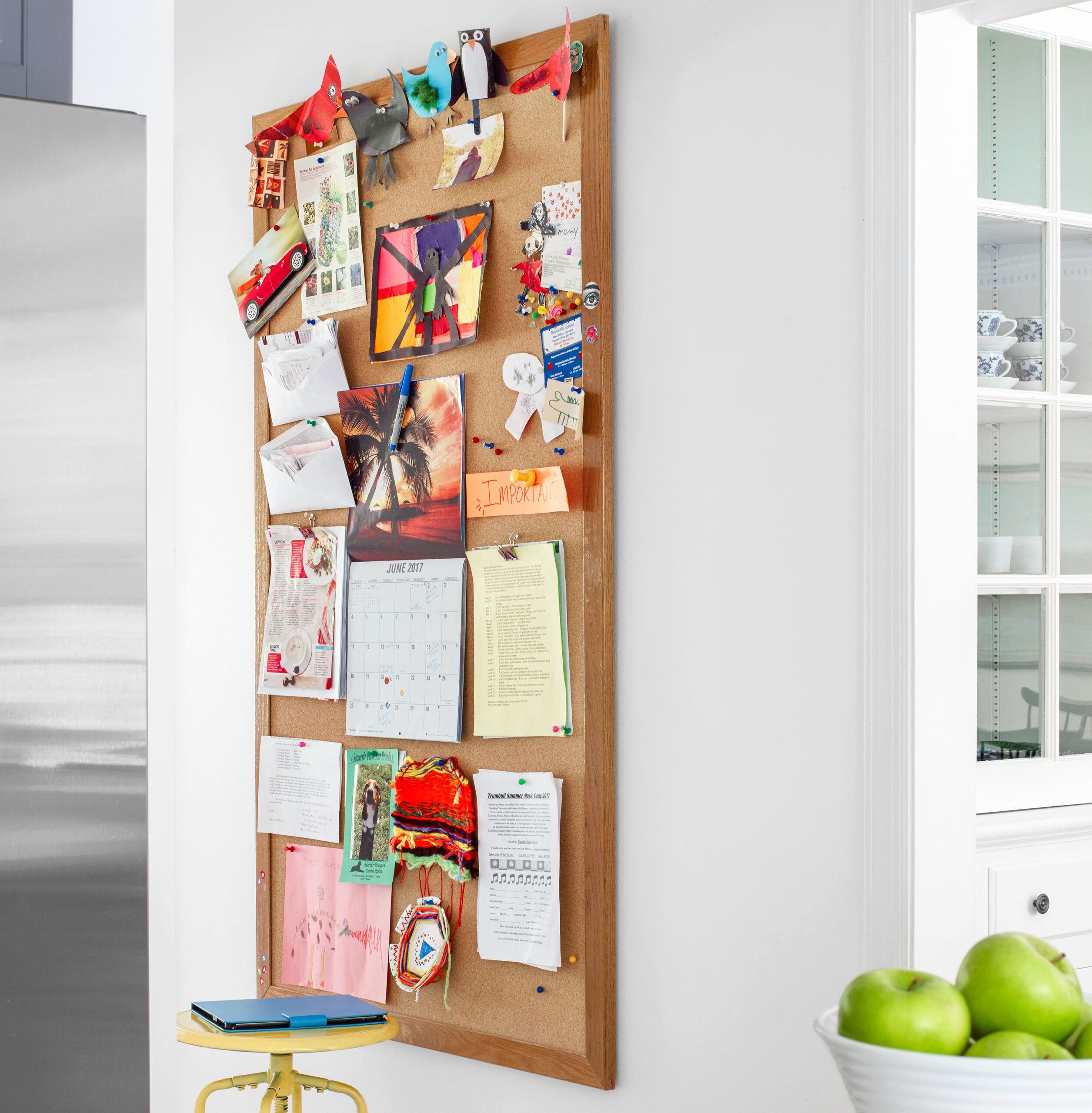
A message board near the fridge serves as a family information hub, where school forms waiting to be filled out share space with prized artwork and aced tests.
Fridge: GE MonogramPicture Pocket
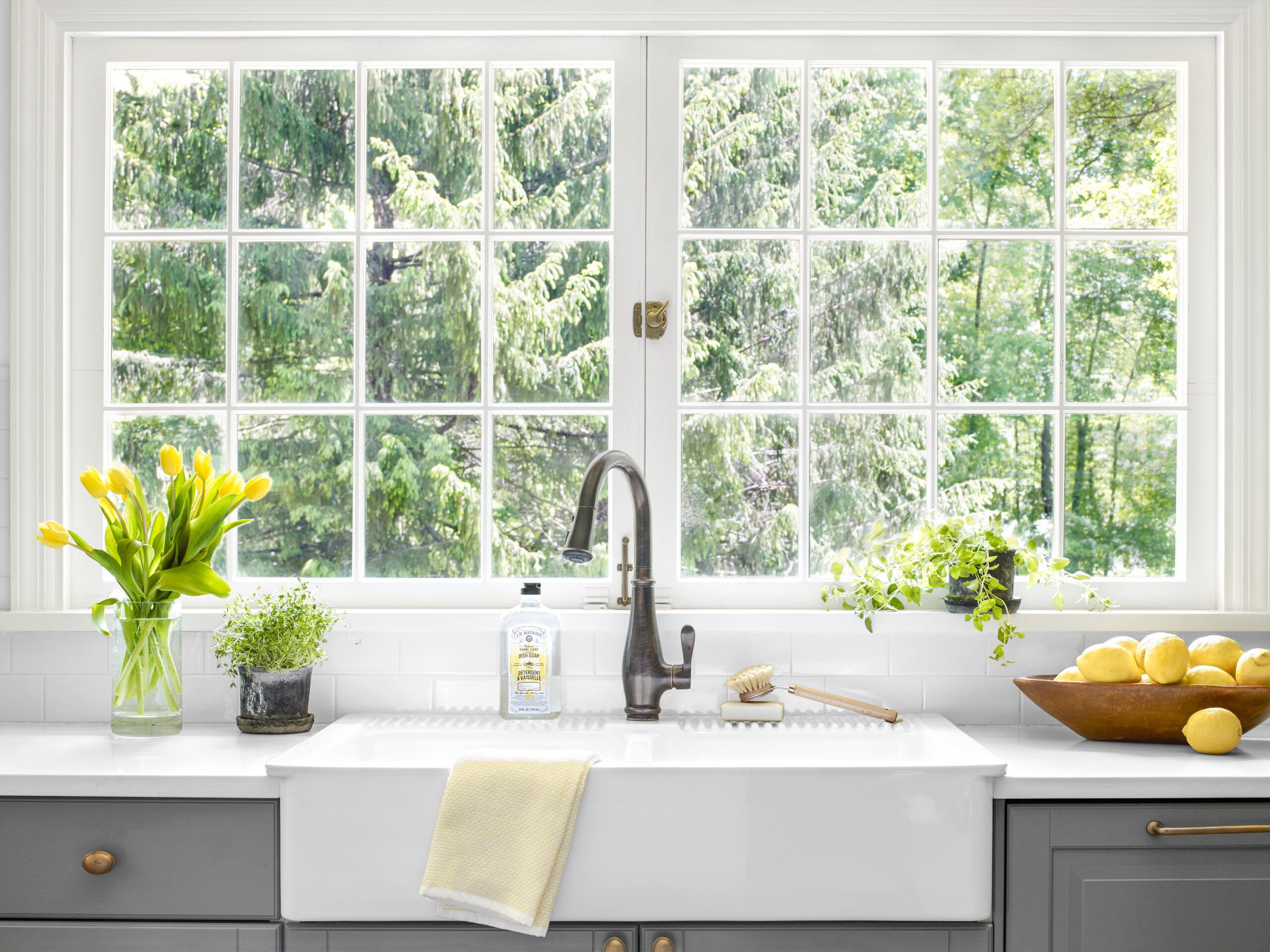
The home’s large, original windows—including these pocket windows over the sink—were a big draw. The sink location stayed the same, but the existing stainless-steel model was ditched for a hefty farmhouse style.
Faucet: KohlerTile and Counter
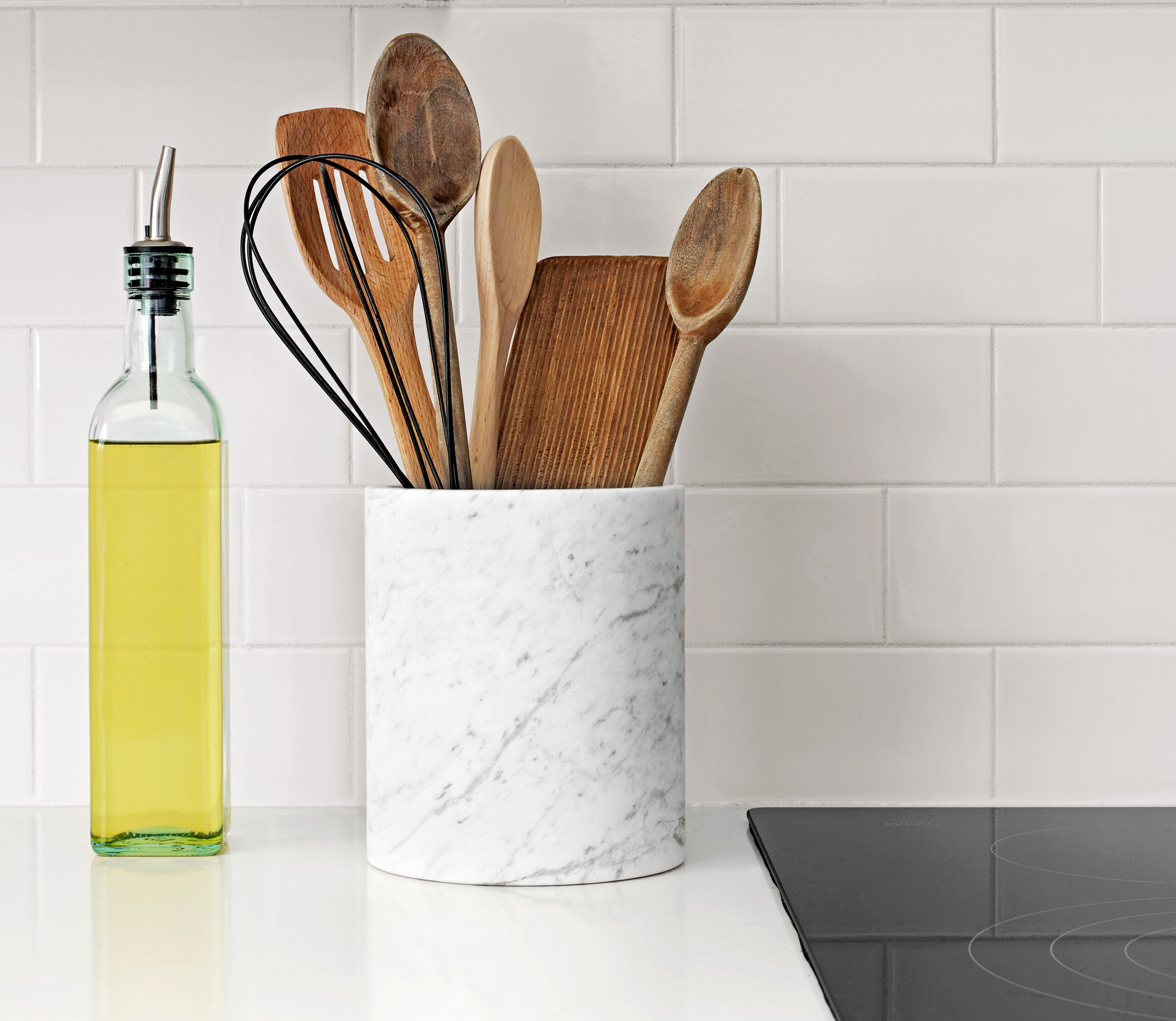
Simple white subway tile arranged in a one-third running bond pattern is an economical way to get a look that won’t go out of style. The quartz countertops were a splurge.
Tile: The Home Depot
Countertop: PentalEasy Dish Storage
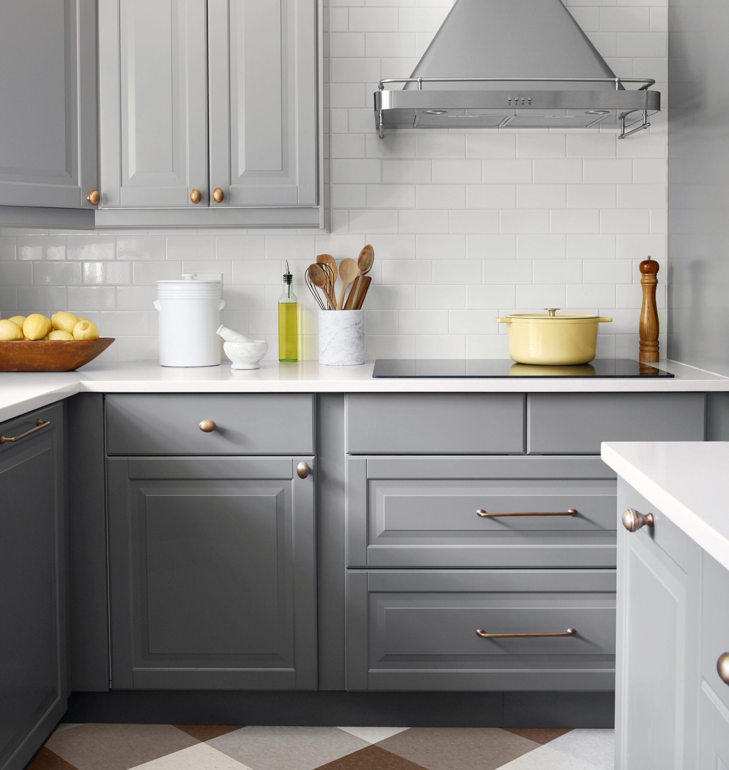
Deep drawers below the cooktop hold pots and pans; drawers elsewhere keep stacks of dishes easy to reach.
Vent hood, cooktop: IKEAWarming Plaid
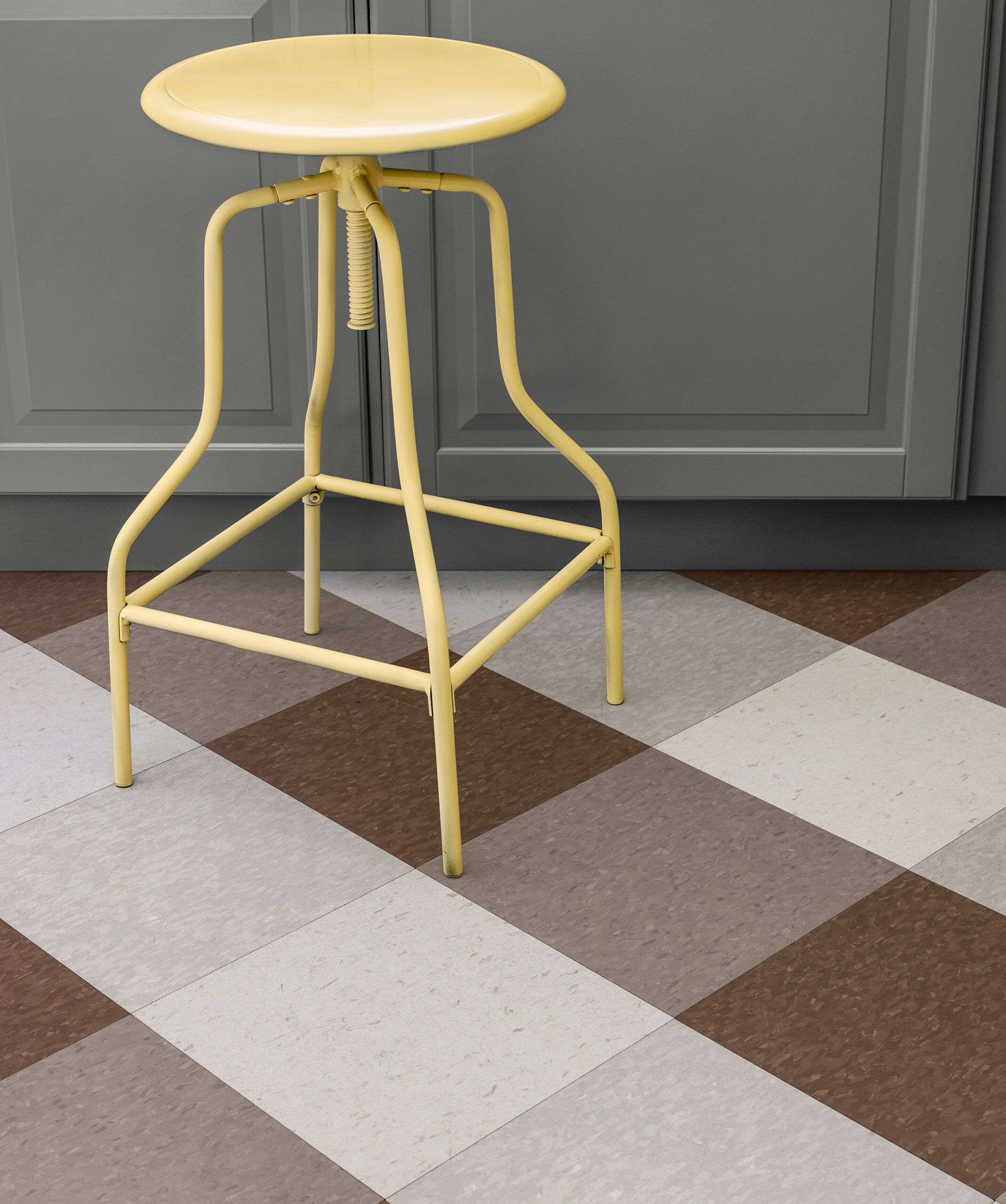
In selecting floor tiles, Kim was careful to choose colors that would warm up the gray cabinets. Splashes of color come from the accessories.
Vinyl composition floor tile: Armstrong’s Sandy Beach, Oyster White, Earthstone Greige, and ChocolateStool: Target
Brass Touch
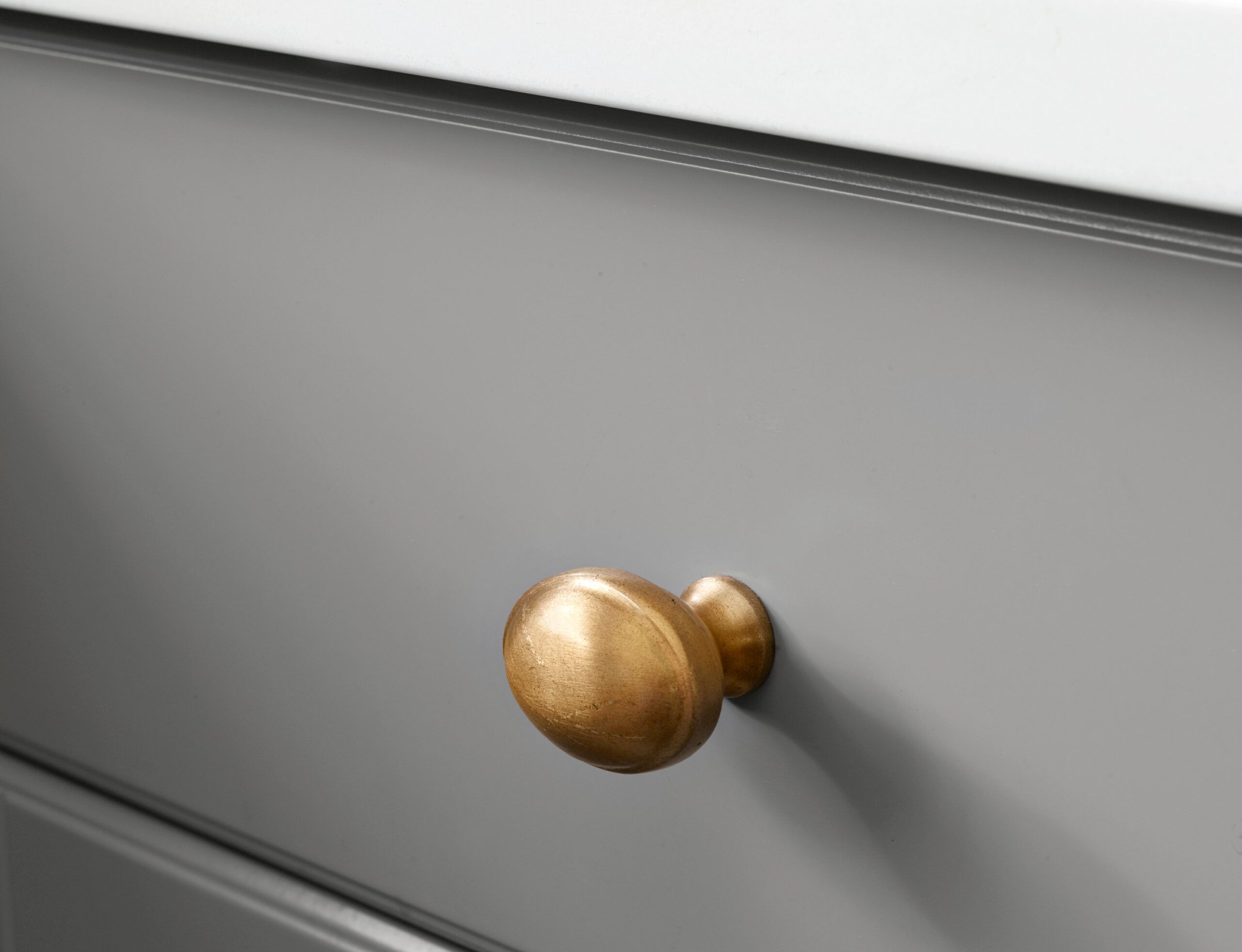
Kim searched high and low for just the right antiqued-brass hardware to complement the bronze-finish faucet and coordinate with the floor colors.
Knob: Pottery BarnPendant Balance
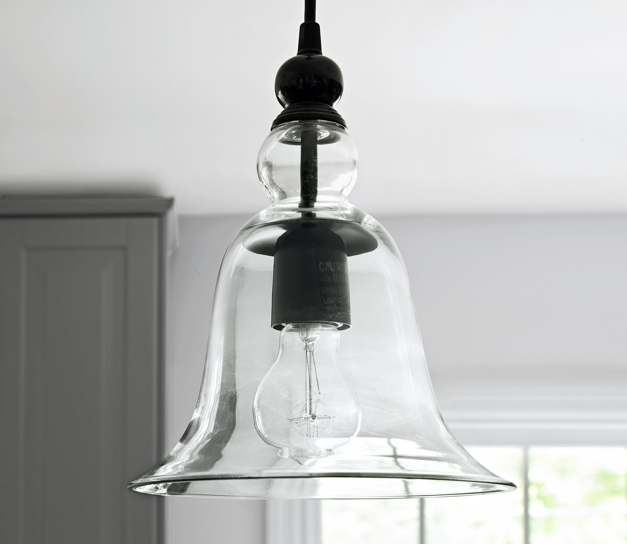
The pendants Kim found offer the perfect balance between traditional and modern. In retrospect, however, she says she might not choose clear glass—it gets too dusty!
Pendant: Pottery BarnIsland Space
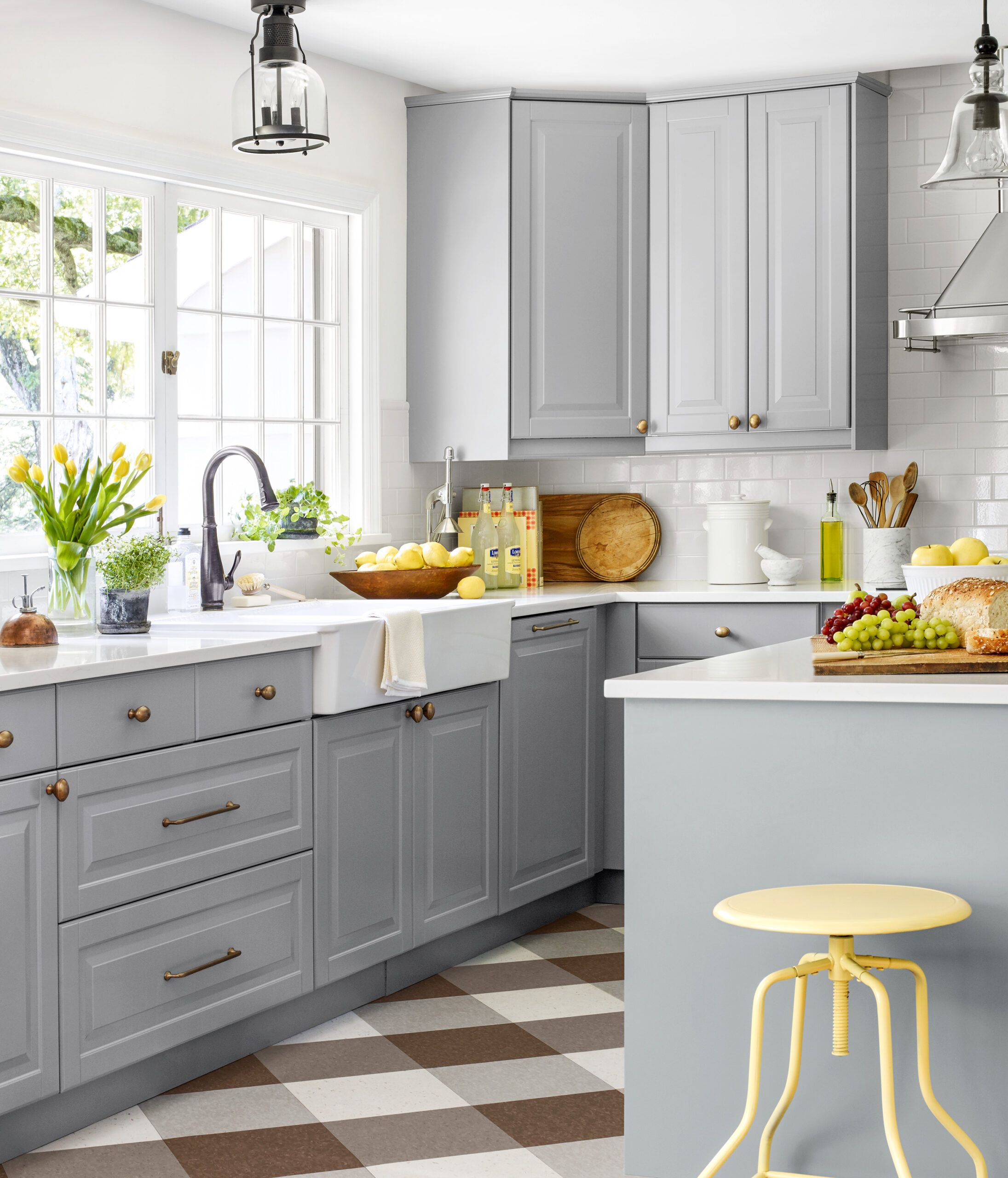
Just steps from the sink, the new, multipurpose island measures roughly 5 by 3 feet. “It’s great for serving,” Kim says. “We use it as a bar, a buffet; it’s just a great place to hang out.”
Ceiling light: Pottery BarnFunky Charm
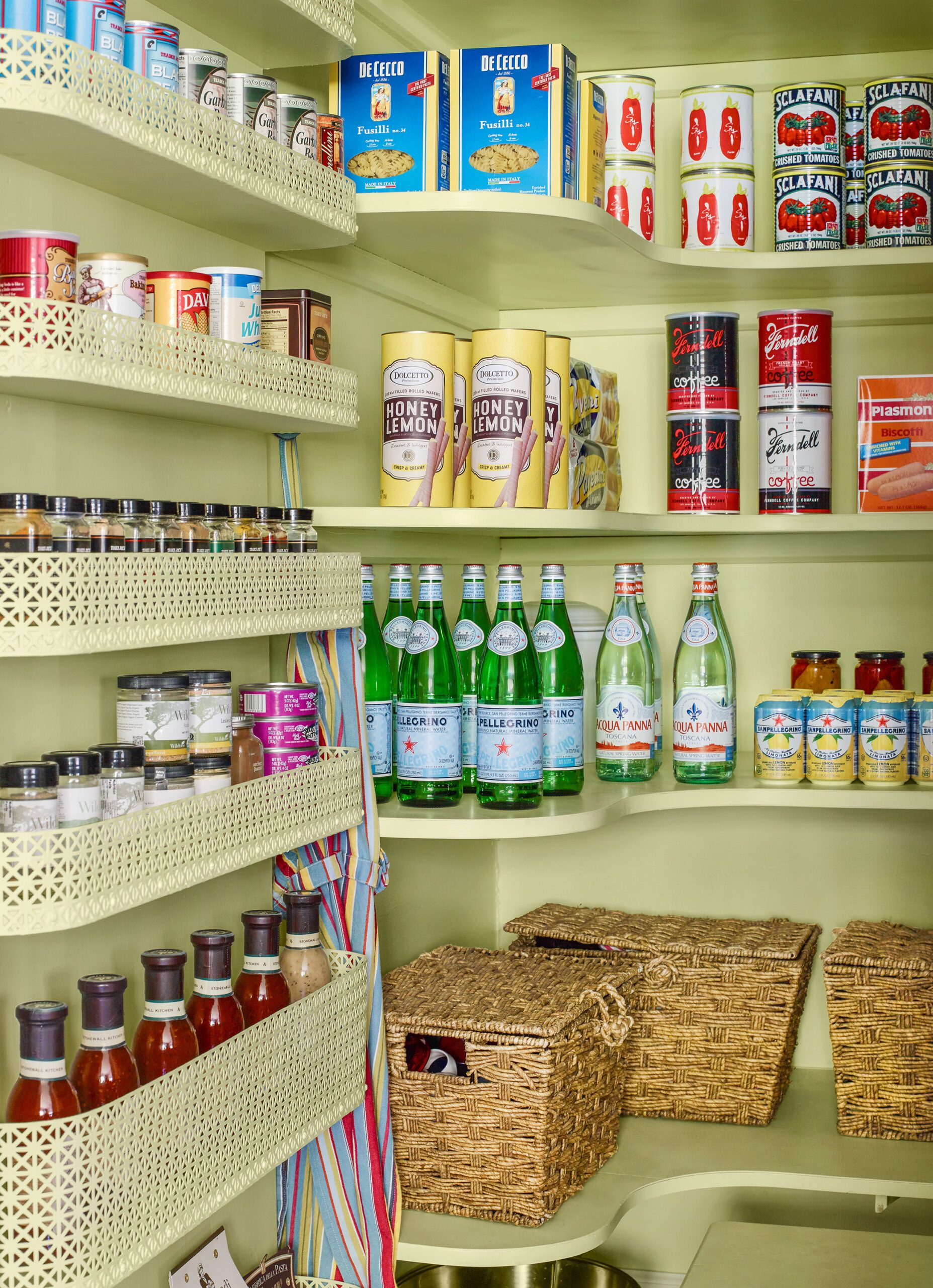
The original pantry, about 6 feet deep and 5 ½ feet wide, was not only functional, its shelving—curved along the back wall, with shallower side shelves made of pierced metal—gave it a funky charm that Kim loved. She brightened it with a few coats of soft-green paint.
Paint: Behr’s Fresh Pear (discontinued)Pantry Pocket
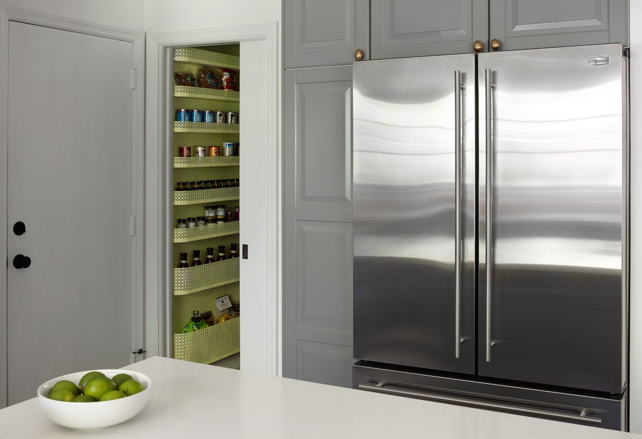
The pantry’s pocket door, an existing feature, eliminates a floor-space-hogging door swing.
Before Plans
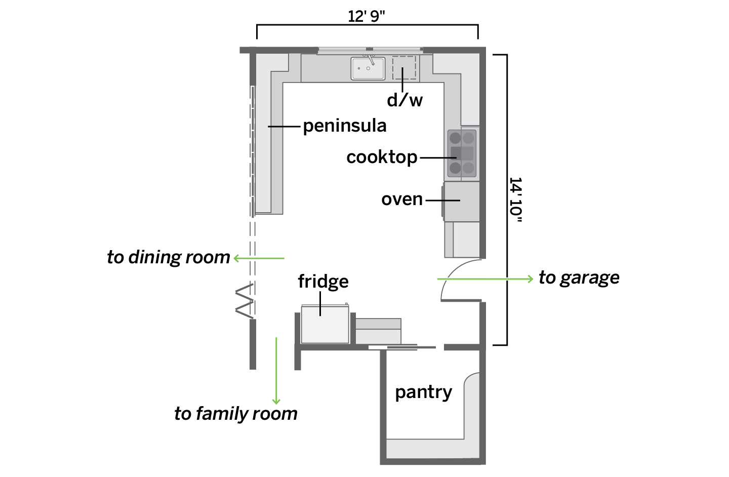
The sink and appliance layout worked, but a peninsula isolated the cook.
After Plans
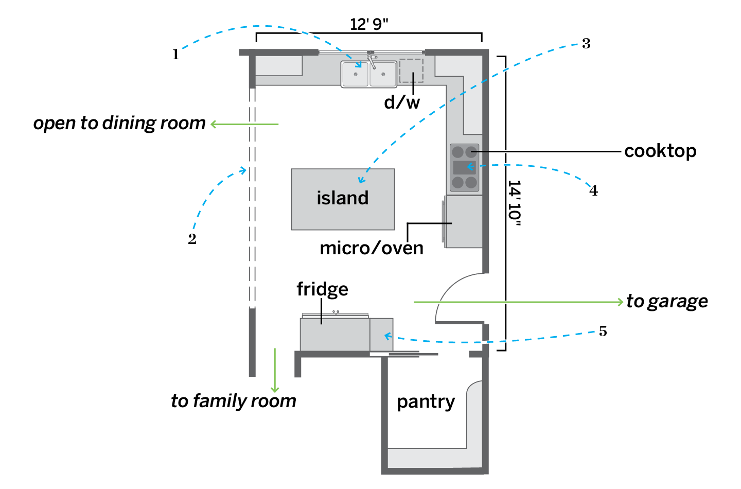
Removing the peninsula and the cabinets above it opened up the space for better flow; an island provides a place to gather.1. Kept the original sliding pocket windows, but swapped in an extra-deep double-bowl farmhouse sink.
2. Connected the kitchen to the dining room by removing the peninsula and the cabinets hanging above it.
3. Added an island for meal prep, buffet staging, and socializing.
4. Replaced an undercabinet vent hood with an airier chimney style.
5. Centered a new, larger model on the fridge wall, with smaller cabinets on one side.
