BEFORE | Hemmed In
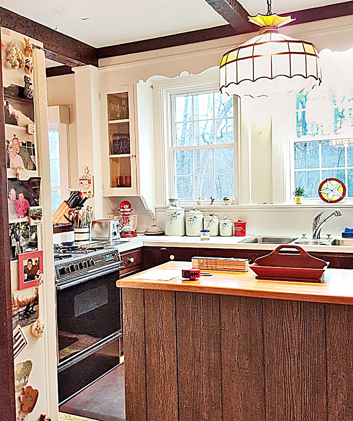
A kitchen is not a recipe, so a remodel needn’t start from scratch. That was the guiding principle Steve and Gay Clyburn of Monroe, NC, followed in maintaining a pair of existing glass-front cabinets joined by a scallop-trimmed soffit in the 1928 Cape Cod–style home that Gay inherited from her parents three years ago. “We wanted the kitchen to be beautiful and practical for two working cooks,” says Gay, “yet look as if it had always been that way.”
Shown: An unvented range sat in a peninsula that hemmed in the space; laminate and vinyl finishes felt dated.
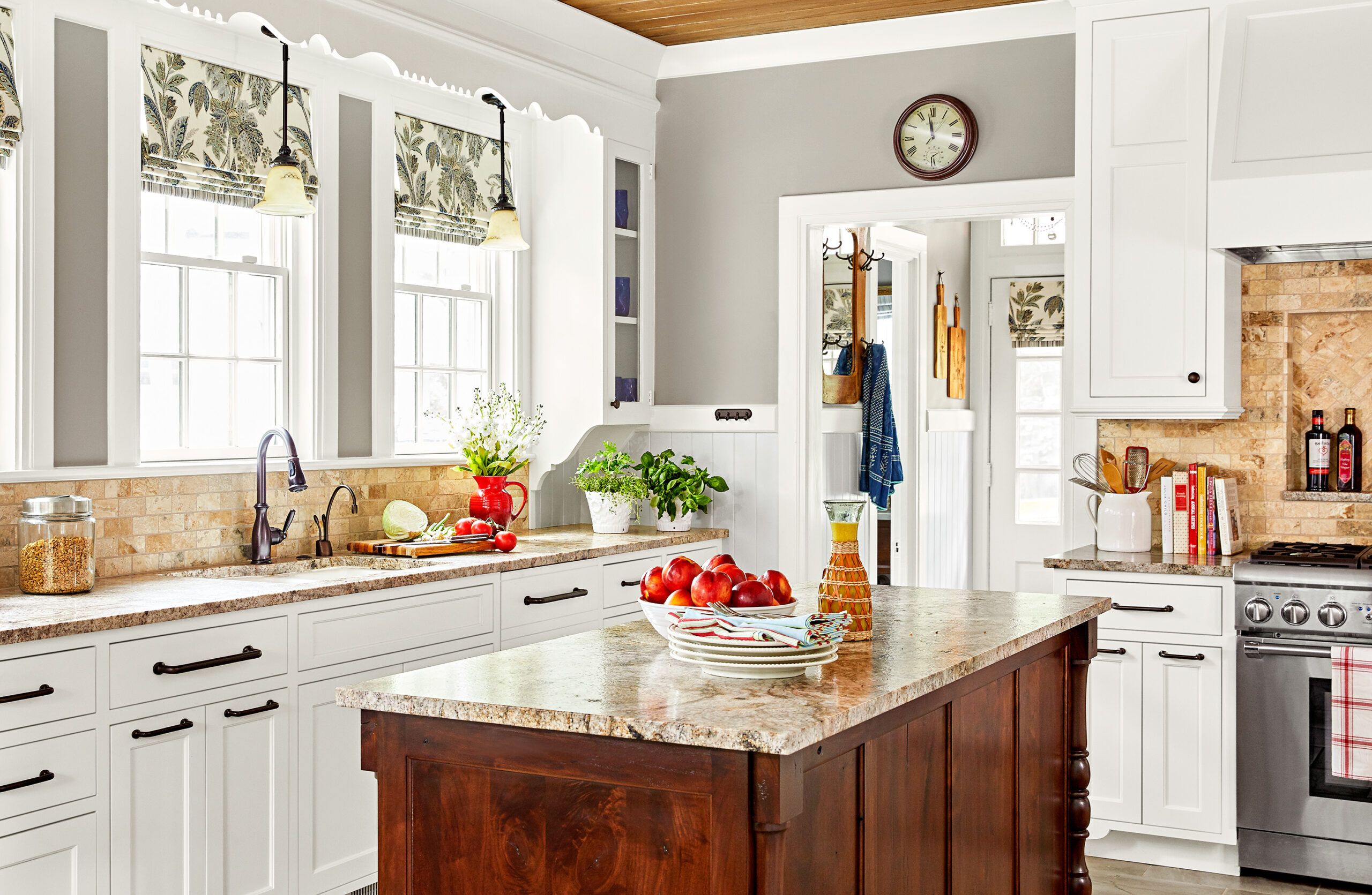
AFTER| Island Craft

So the couple enlisted the help of designer Wanda Horton, who suggested demolishing a peninsula separating the kitchen from the breakfast nook, and fully opening up the cook space to the eating area, yielding a combined space of 308 square feet. A pro-style, six-burner range and vent hood moved to the opposite wall, where an underused built-in desk had stood. A new undermount sink went in beneath a bank of divided-light double-hung windows that preserve views of the Clyburns’ 13 scenic acres. A slightly enlarged work island and perimeter counters offer ample, distinct prep stations. Crisp white flat-panel cabinets inspired by the vintage originals incorporate ergonomic banks of deep drawers.
“We kept the best architectural features, while greatly improving the comfort and function,” says Steve of the refreshed space. To which Gay succinctly adds, “It’s perfect!”
Shown: A slightly larger island crafted of salvaged walnut is a pleasure to look at—and work at. The tumbled-travertine backsplash and leathered-granite countertops add subtle natural textures and patterns.
Contractor: Byron Lawson Builders, LLC, Charlotte, NC
Paint: Argos (walls), Sherwin-Williams; Decorator’s White (cabinets), Benjamin Moore
Poplar Ceiling
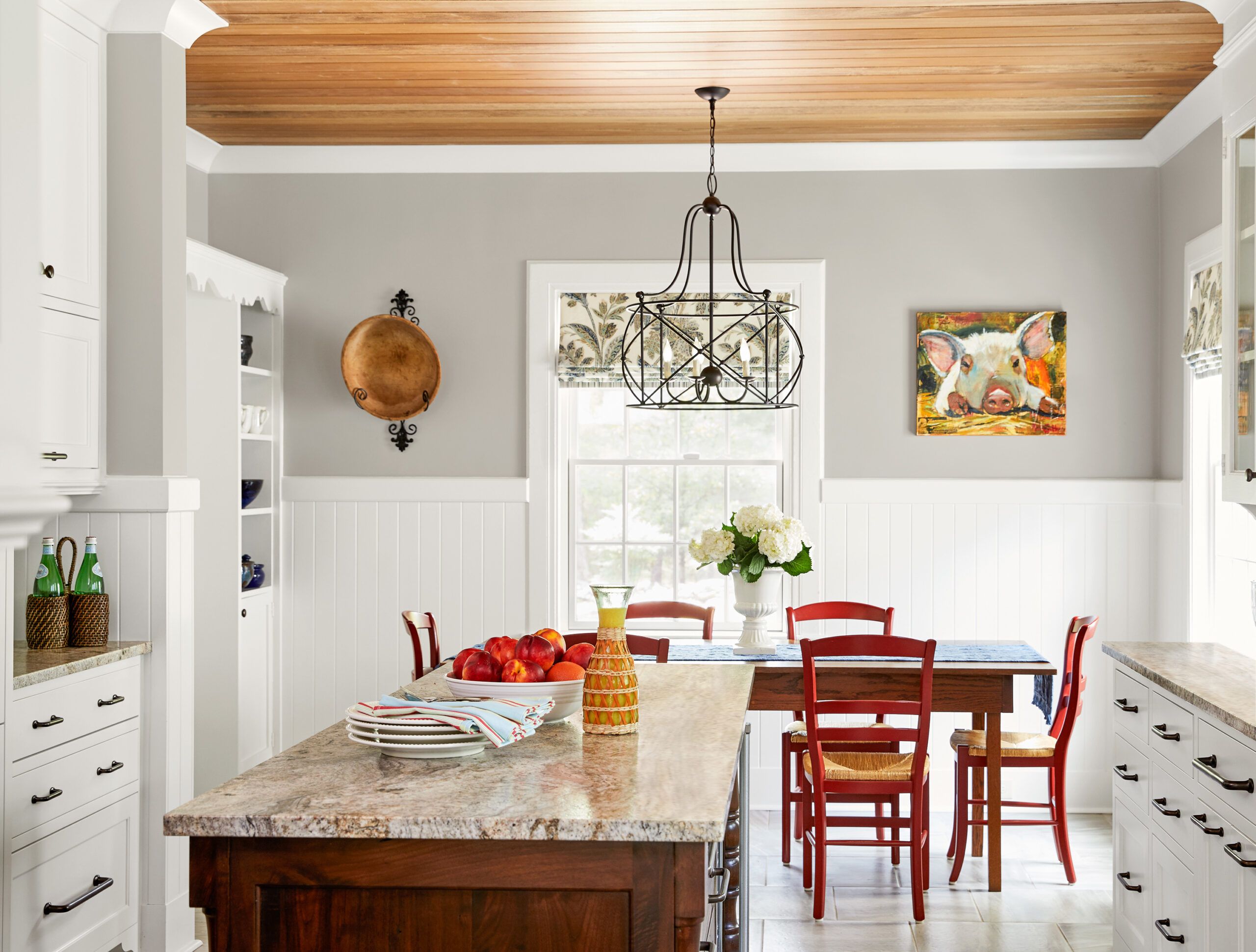
Poplar, an appealing but not particularly hard wood, is well suited to a ceiling treatment. Here, it brings a natural-wood element that contrasts with the crisp white cabinets. V-groove wainscoting in the same width as the poplar boards offers a cohesive look.
Beverage Fridge
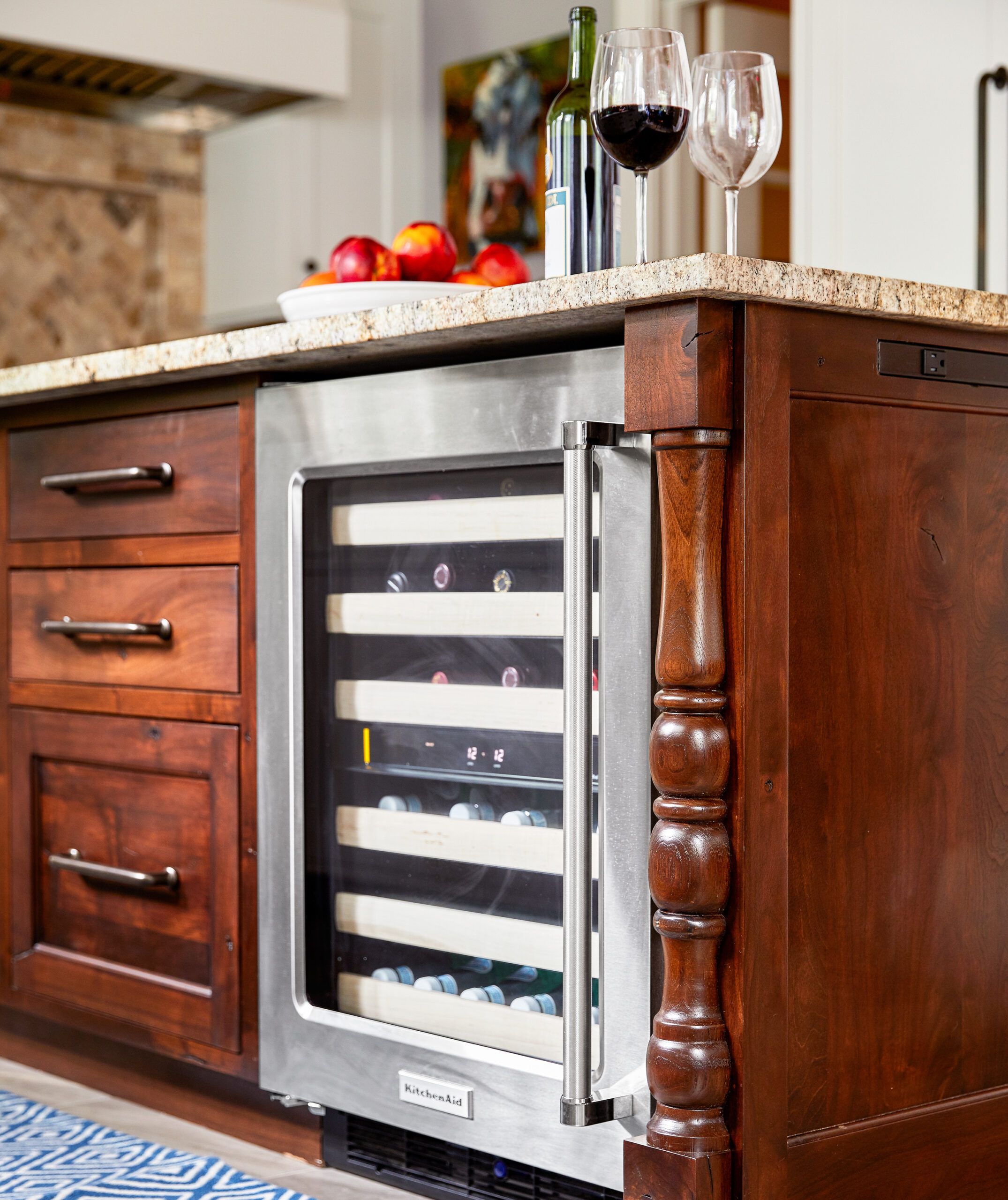
Everyday dishes are stowed in the island’s deep drawers. “What a relief not to have to pull heavy pottery from an overhead cupboard,” Steve says. A beverage fridge keeps wine and water at the ideal temperature.
At Home on the Range
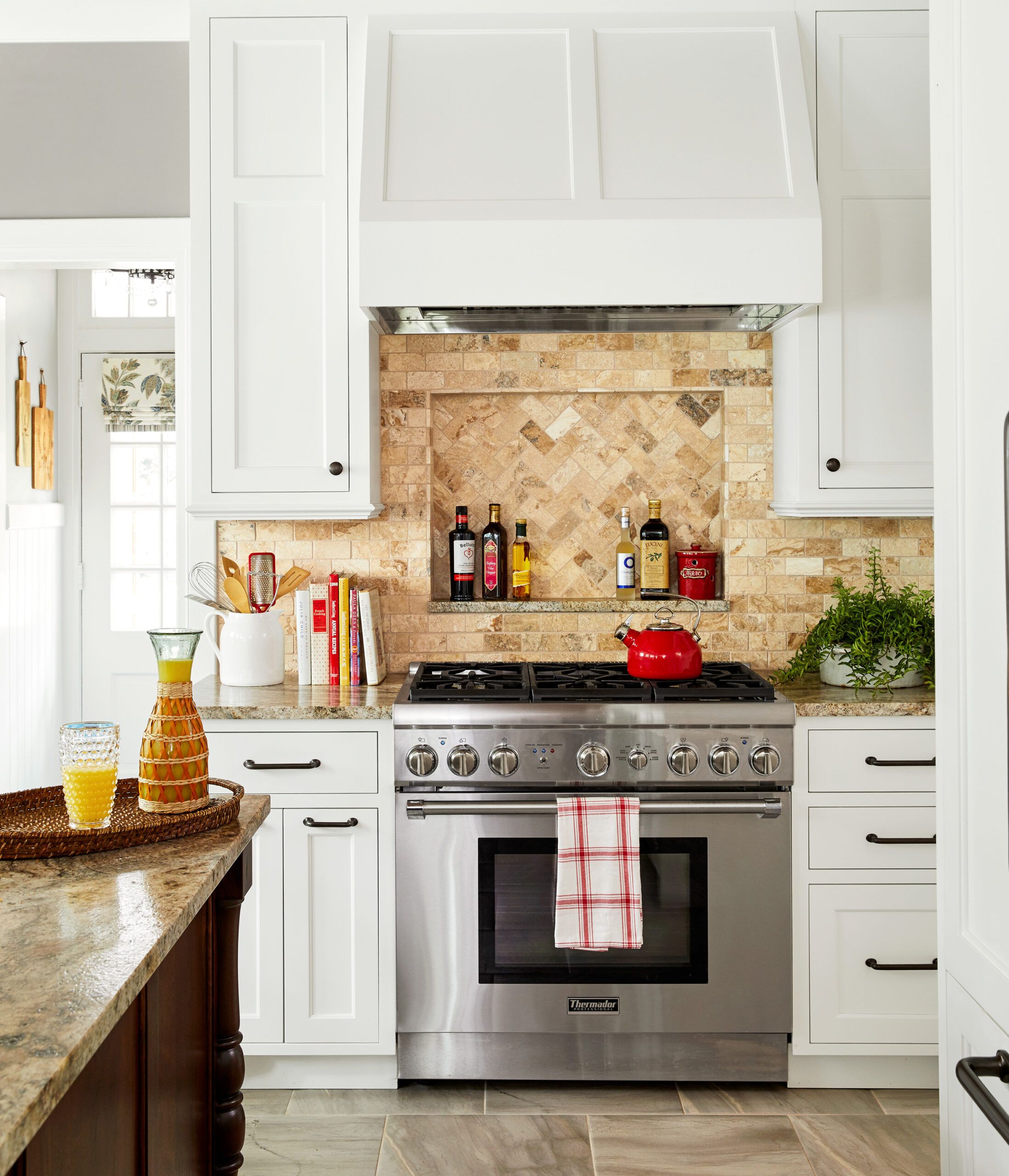
Steve, who calls himself a “sauté-flipping show-off chef,” longed for a range hood to provide task lighting, proper ventilation, and the droning sound he calls “a Zen bass note to cook by.” His arsenal of oils sits at the ready on a recessed ledge behind the range.
Range: Thermador
Baker Plus Chef

A retired chef and restaurateur, Steve commands lots of prep space to create his specialty dishes, while the “more self-contained” Gay handles the baking. “Nothing strengthens —or tests—a marriage as much as two people sharing a workspace,” says Gay. “This kitchen makes cooking together a dream!”
Countertops: San Luiz leathered granite; Tile Collection
Built-Ins
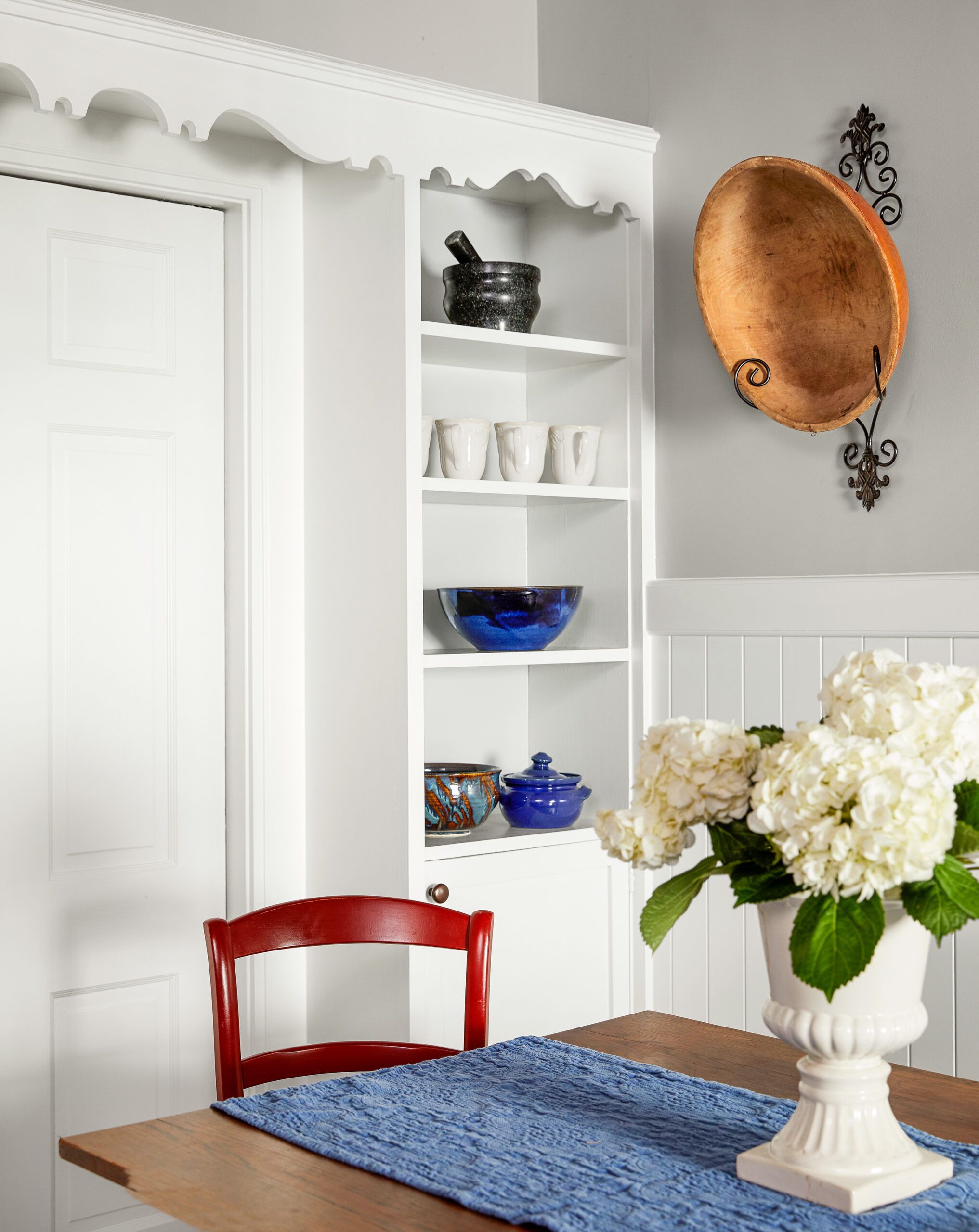
Trim on an original built-in cabinet in the breakfast area echoes the scalloped valance framing the kitchen windows.
Lighter Sink
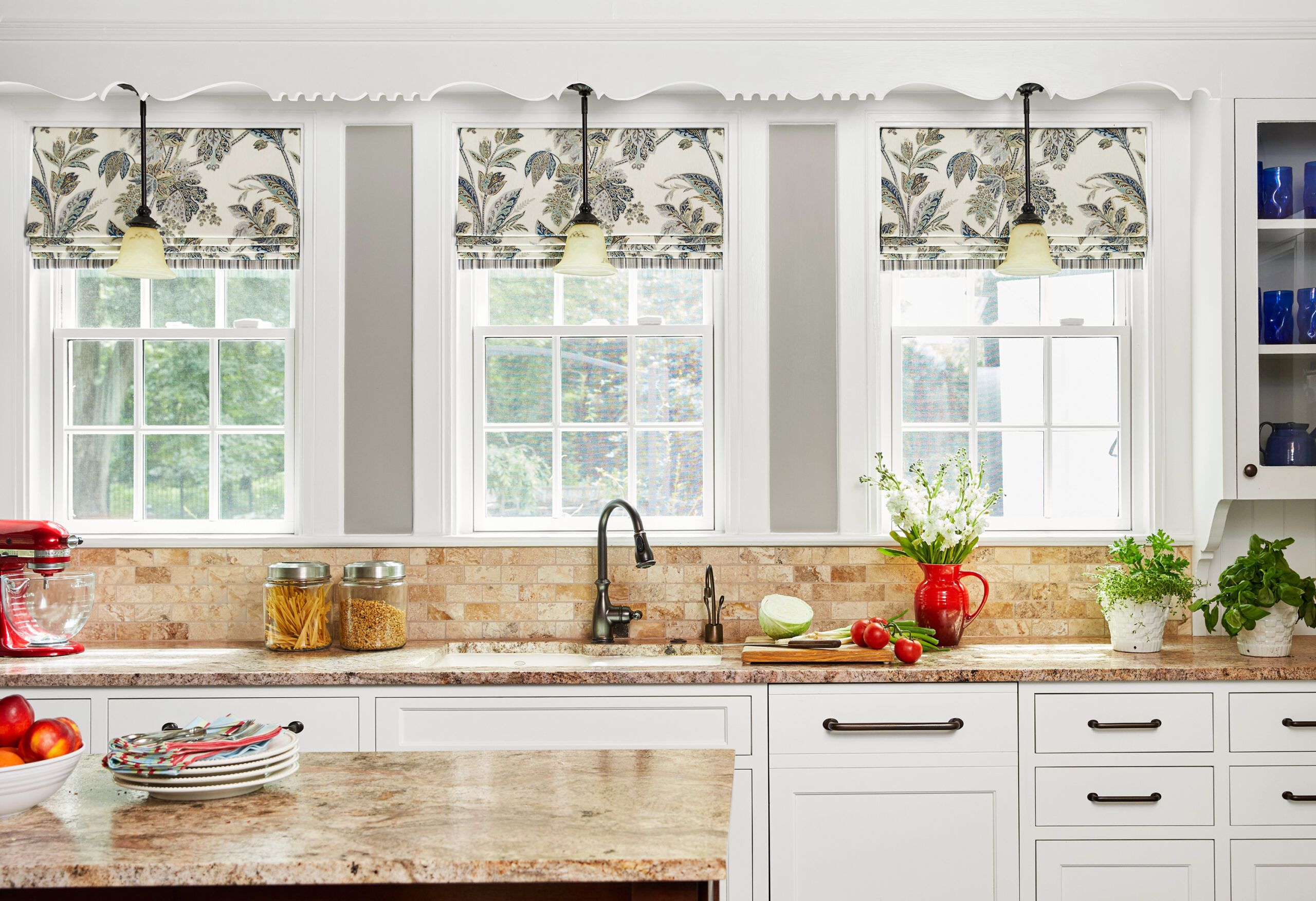
A “nervous” flickering fluorescent over the sink was removed in favor of a trio of pretty mini-pendants.
Sink: Kohler
Faucet: Moen
Lighting: Lee Lighting
Floor Tiles
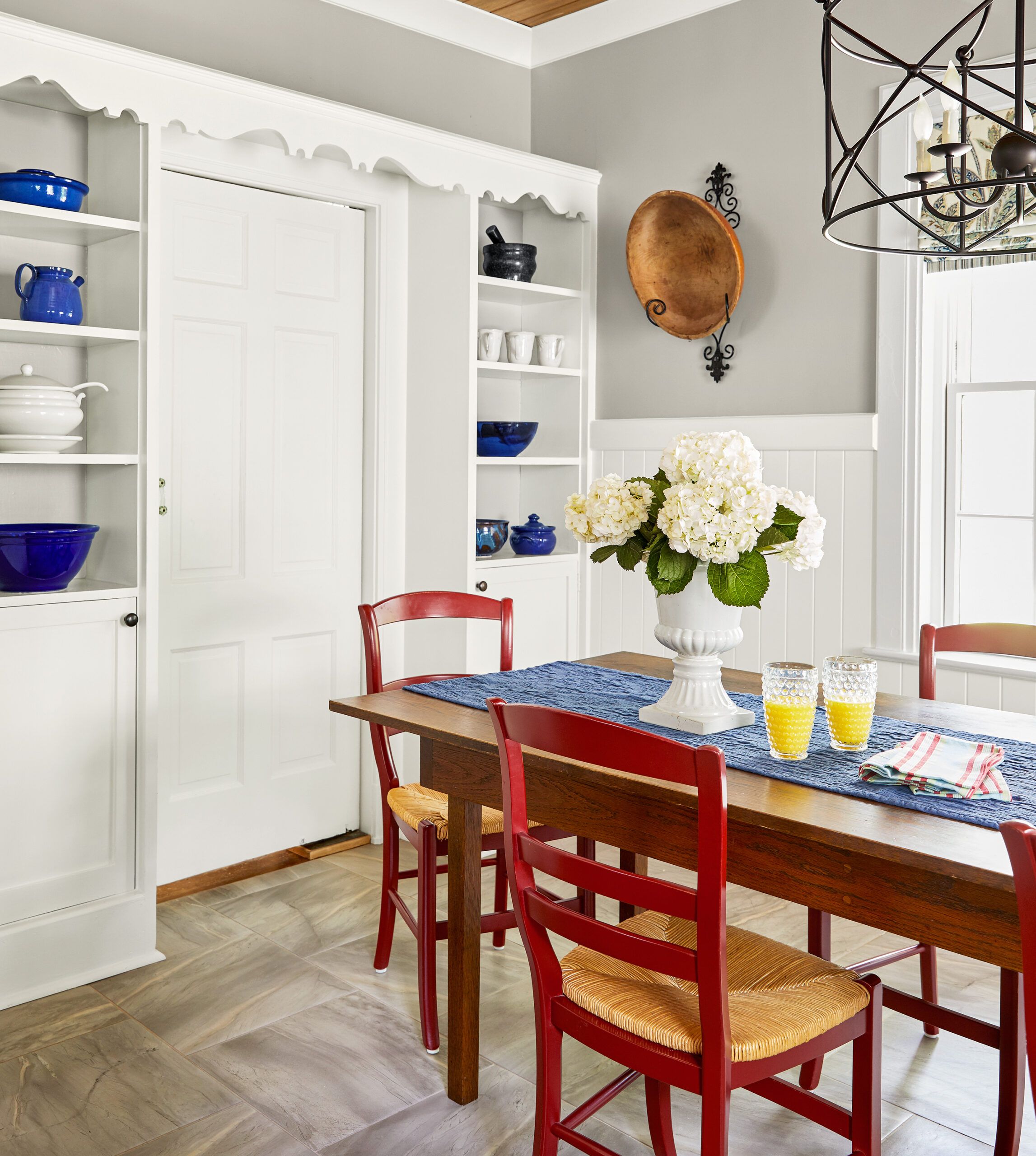
The eating area’s open shelving and scalloped valance are also original elements the homeowners preserved. The cottage-style V-groove wainscoting is new. Easy-care 18-inch porcelain floor tiles stand up to two dogs and one cat—all rather messy eaters, say the homeowners.
Floor tile: Boulevard Gracia Tile Collection
Rustic Backsplash
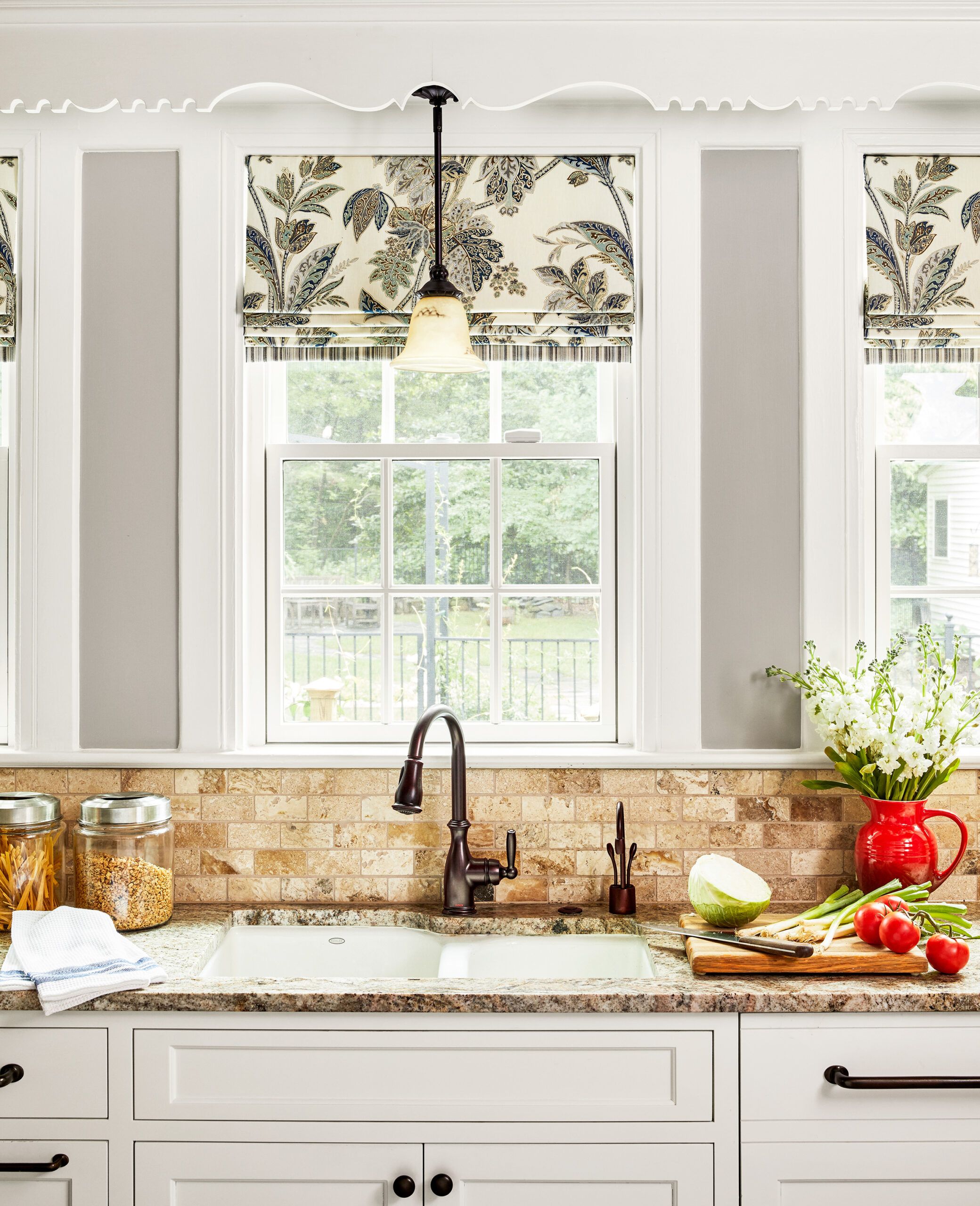
The rustic travertine backsplash tile—achieved by tumbling the stone in a rubber drum with rocks, sand, and water—has variations in color that nicely complement the leathered-granite countertop.
Backsplash: Picasso Travertine Mosaics, Tile Collection
Mudroom Hall
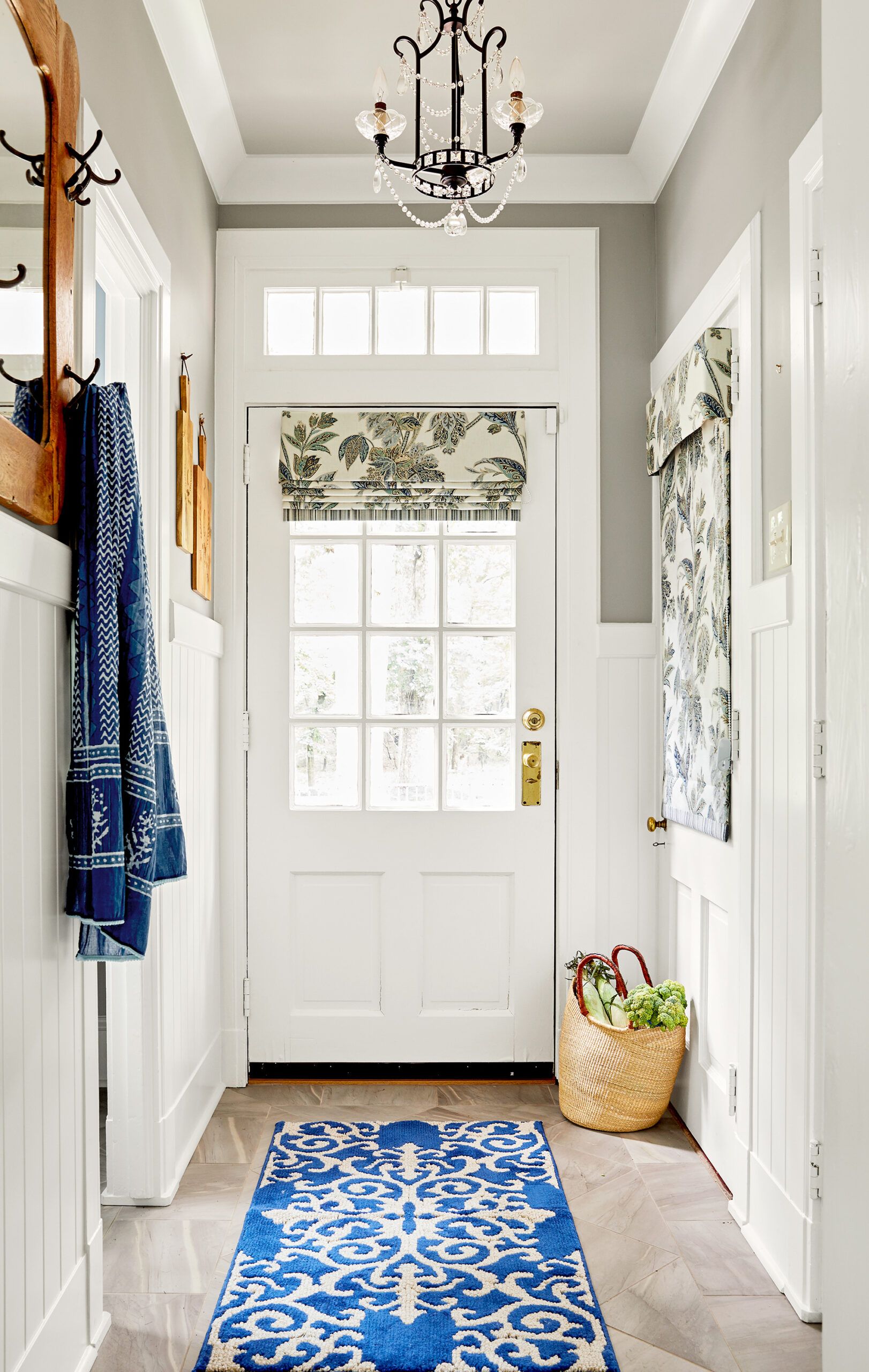
The porcelain floor tile, V-groove wainscoting, and lighting in the side-entry mudroom hall echo the kitchen finishes. “Material mixes can visually divide a space,” says designer Wanda Horton. A pantry closet in the hall boosts dry-goods storage.
Better Dimensions
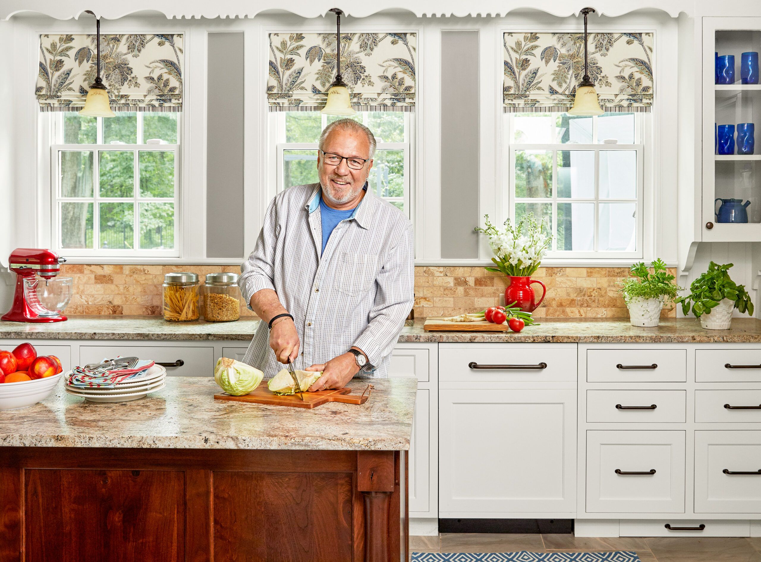
“The countertop and island dimensions were greatly improved,” says Steve Clyburn, who worked in professional kitchens for 30 years. The couple chose hardworking granite with a leathered finish for its soft matte look and feel.
Before Floor Plans
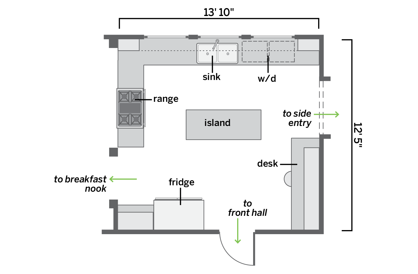
A traffic-blocking peninsula and a washer/dryer beside the sink crowded the space.
After Floor Plans
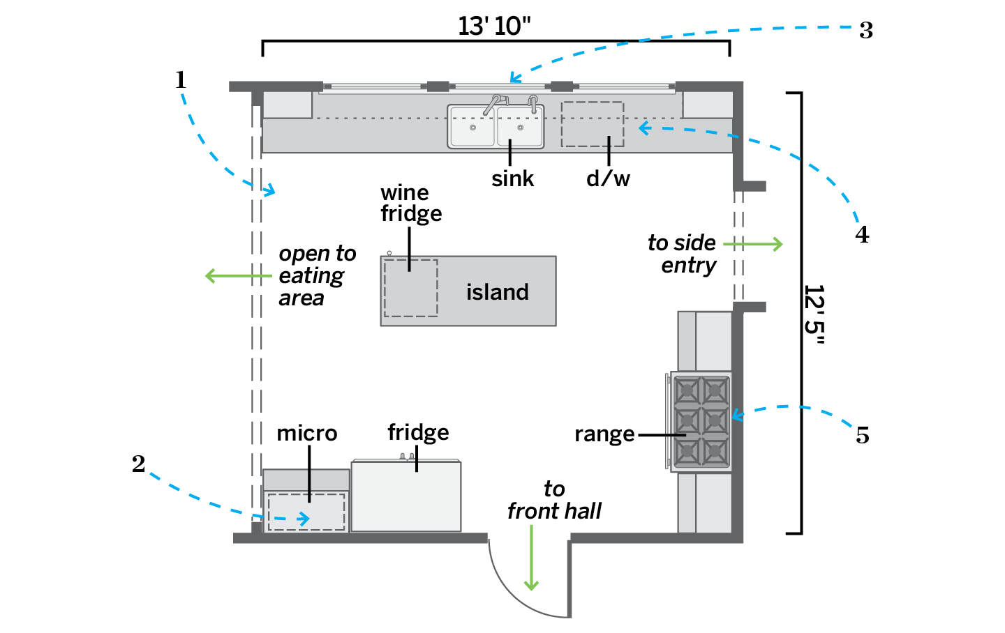
Opening the kitchen to the eating area improved flow. Adding a dishwasher and a vent hood eased cooking for company.
1. Scrapped the peninsula and replaced a visible support post with an engineered beam for a wide opening onto the 9-by-14-foot eating area.
2. Hid the microwave in an upper cabinet with a flip-up door alongside the refrigerator.
3. Replaced three original casement windows above the sink with double-hungs.
4. Swapped a washer/dryer for a dishwasher and banks of deep drawers.
5. Removed a desk and upper cabinets and put in a range with a vent hood that exhausts up a chase and out the attic.
