Thinking outside the box—or footprint—can make all the difference in a renovation. For Gabrielle Cohen, an avid cook, the kitchen in the 1936 Colonial Revival she shares with her husband, Leigh, and their three teenagers in Mamaroneck, NY, lacked many must-haves: a place to gather, and adequate prep and storage space. And while the kitchen looked out onto scenic wetlands, one poky window didn’t invite in the view.
For two years Gabrielle and her designer-friend Sarah Robertson put their heads together trying to redesign the space without busting into the brick exterior walls. But ultimately only bumping out the space by several feet all around would deliver what the Cohens wanted.
Architect Bana Choura swapped the existing kitchen and dining area locations, adding windows on the sink wall and sliding French doors in the dining area. Robertson designed oak cabinets with well-thought-out storage inside and a gray finish with a cerused look that echoes the trees outdoors. The changes enabled a large island as well as a “breakfast bar” wall that holds cereal and beverages. “In the end, the wait and expense were worth it,” says Gabrielle. “I love looking out at that view every day.”
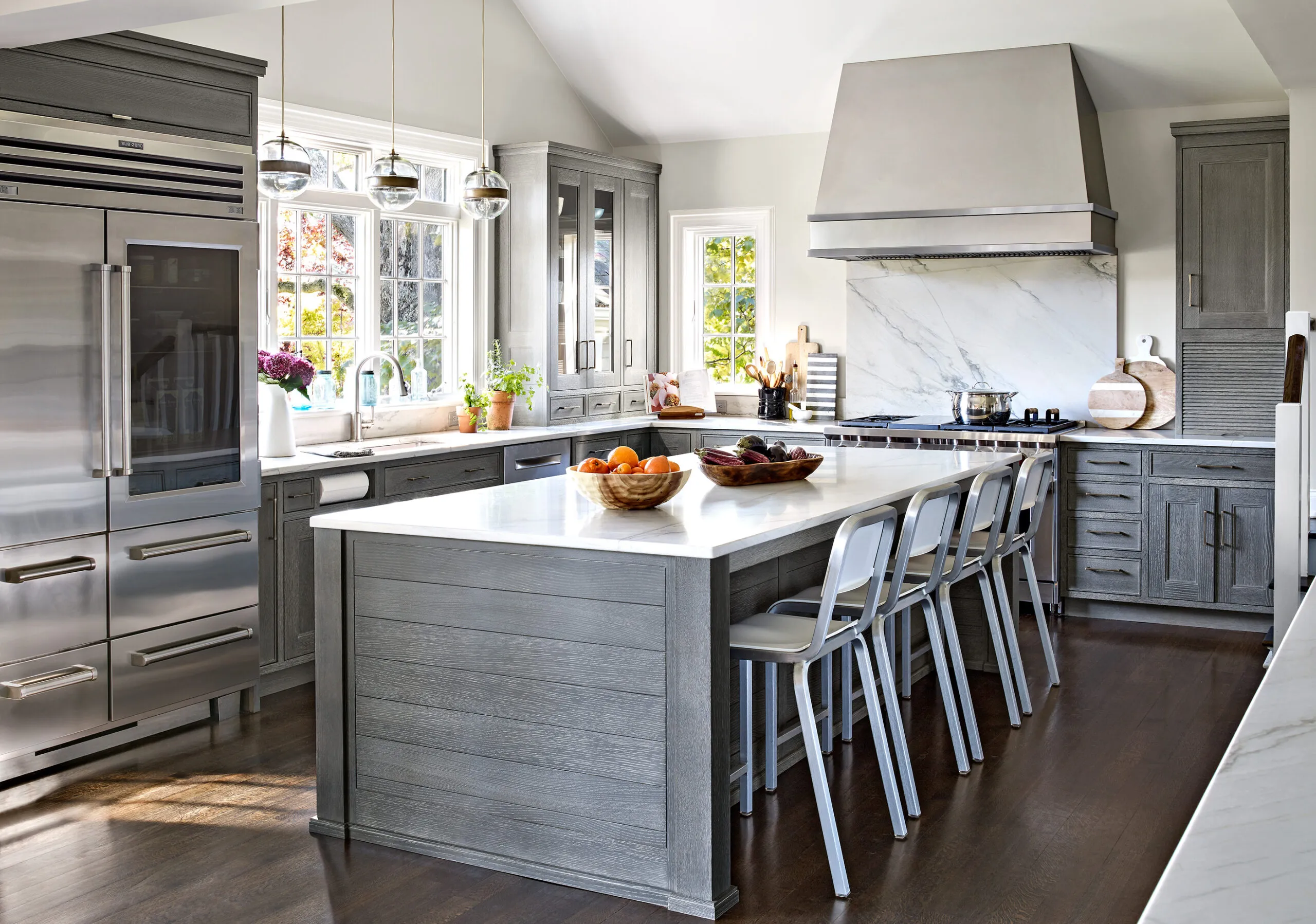
Shown: Bumping out the former dining area on two sides allowed it to be recast as a roomy working kitchen with a 9 1/2-foot-long island topped with quartzite. Windows above the sink offer expansive views outside.
Contractor: Nick Girardi, NGI Development, Mount Vernon, NY. Range: Wolf. Range Hood: RangeCraft. Paint: Light Pewter (walls); Benjamin Moore. Countertops and backsplash: White Macauba quartzite, Marble America, New Rochelle, NY. Dishwasher: Bosch.
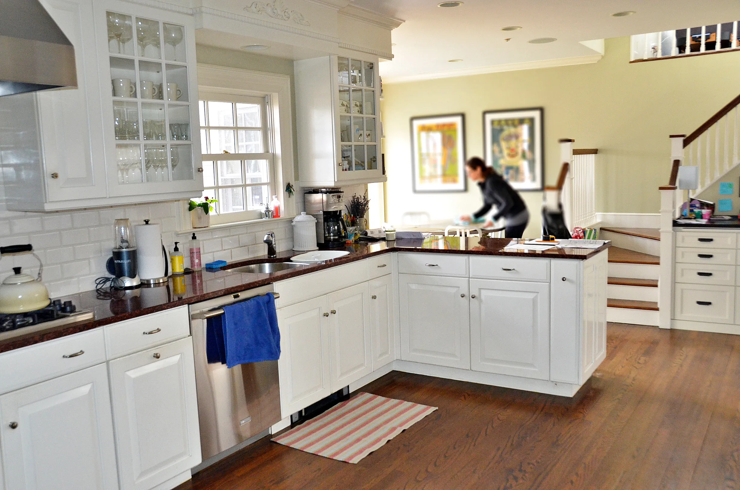
Before: The old kitchen was outfitted with white-painted cabinetry, and a peninsula that cut off the workspace from a small dining area.
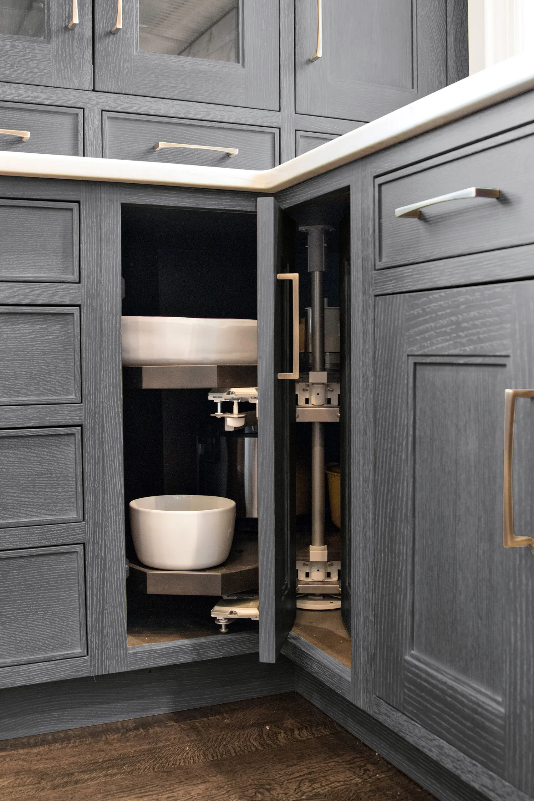
The doors on this corner storage unit retract and rotate inside the cabinet for easier access to items on its shelves.
Corner lazy Susan: Kesseböhmer. Hardware: Schaub & Company.
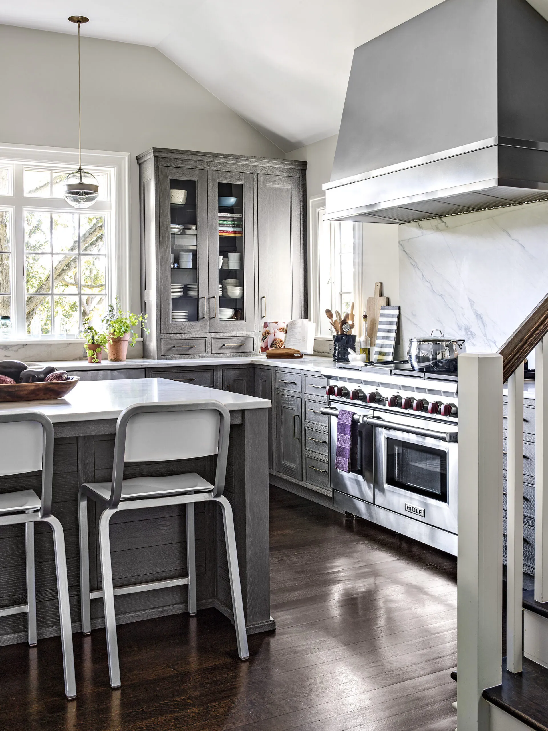
A glimpse of stair railing perpendicular to the stove wall reveals where steps go to the second floor. The staircase—which did not move—now leads up from the kitchen.
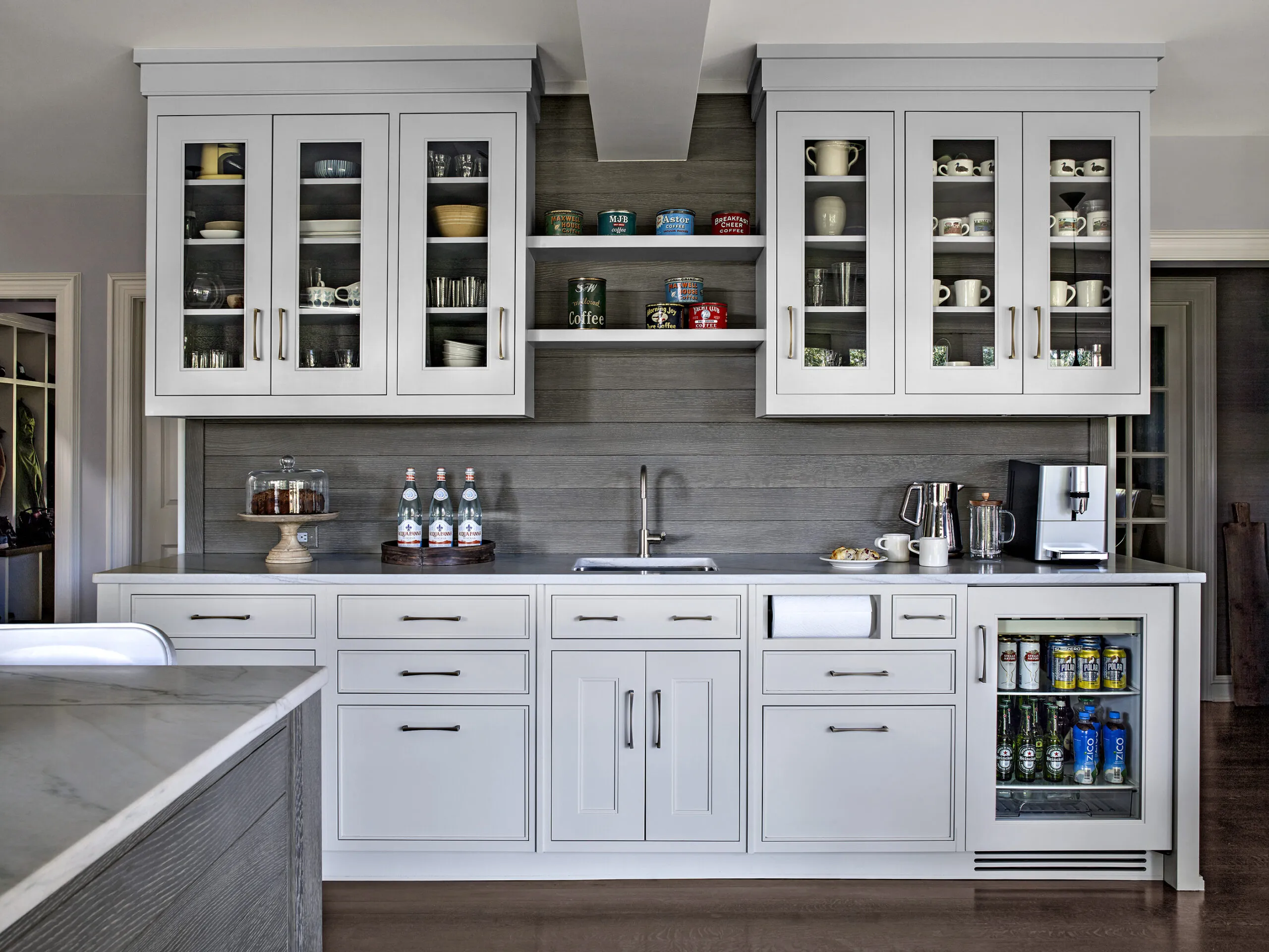
Open shelves above the breakfast-bar prep sink make room for a steel support beam that went in when a load-bearing wall was removed in the expansion. Another clever detail: a handy built-in paper towel roll for this sink, and one for the main sink across the room.
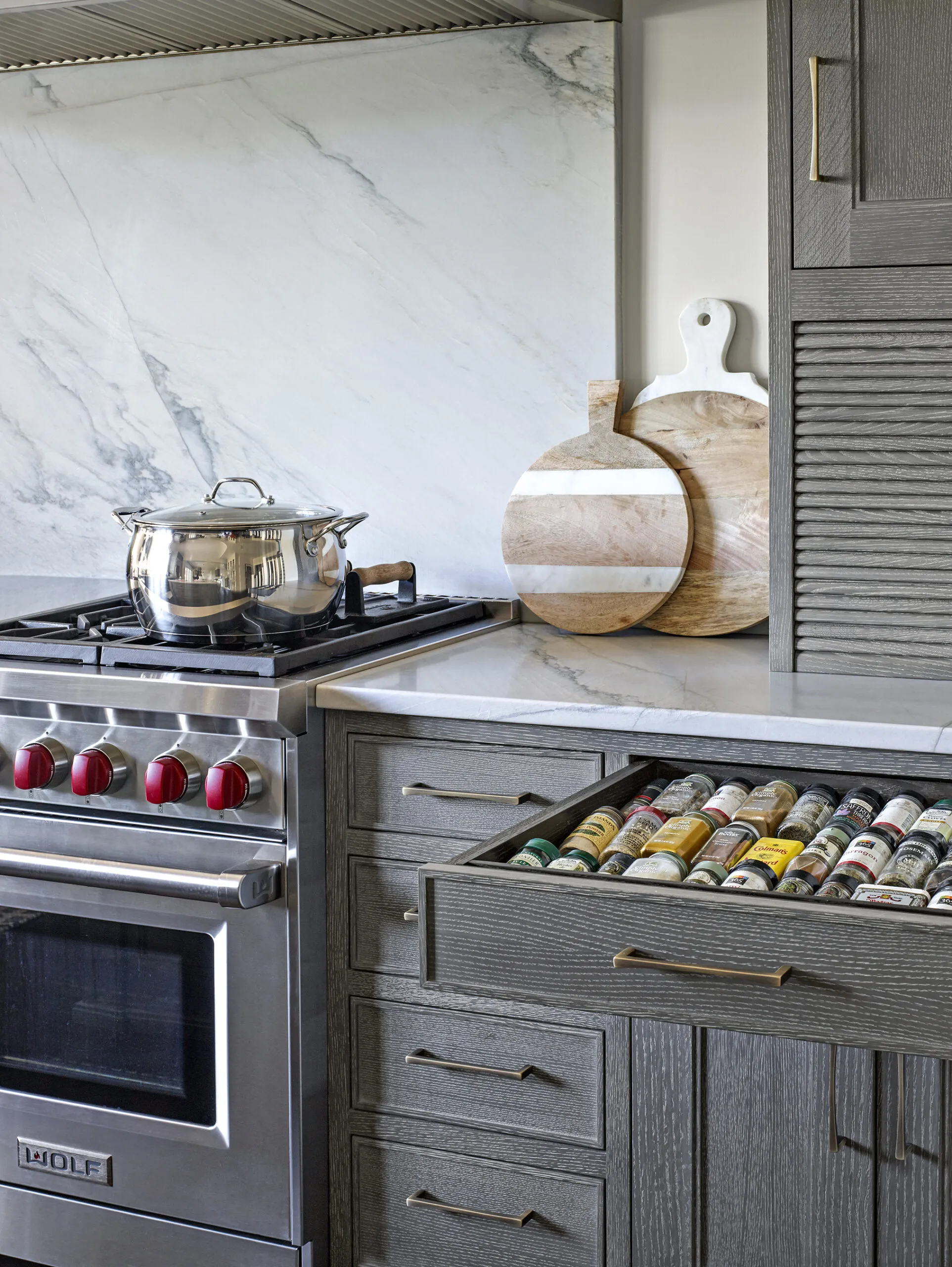
Stove-side drawers stock an orderly lineup of spices, while an outlet-equipped appliance garage behind a tambour door holds Gabrielle’s food processor and smoothie blender.
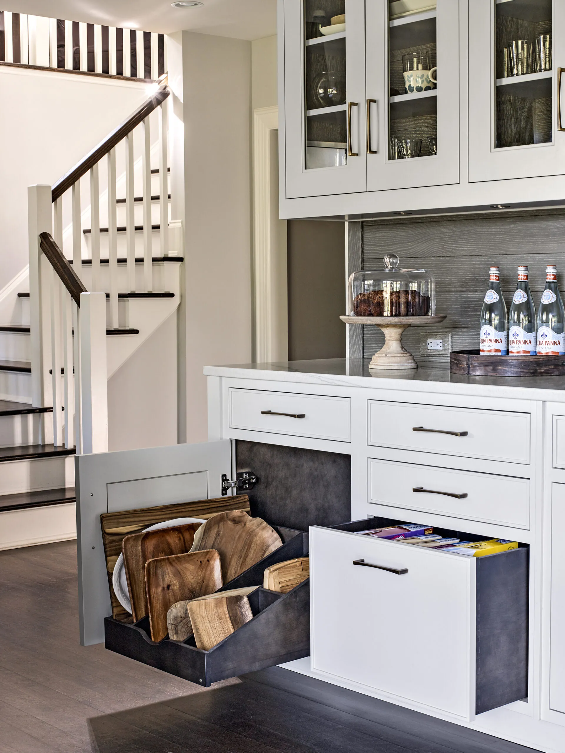
Trays and cutting boards stand ready for use in a partitioned roll-out at the end of the breakfast-bar wall. A 14-inch-deep drawer alongside it is tall enough for cereal boxes to stand upright.
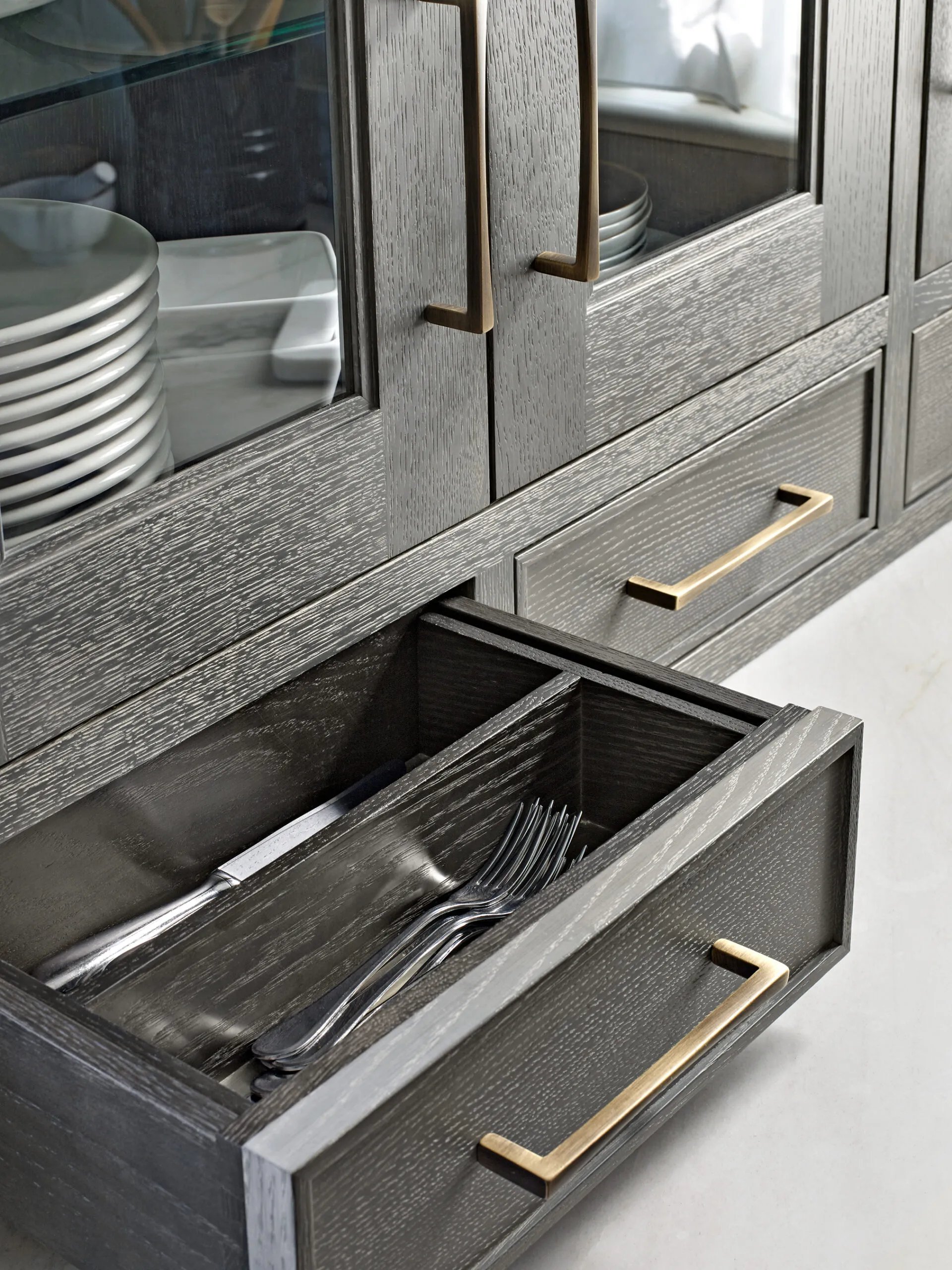
Three cutlery drawers sit on the countertop to the right of the sink for easy access; the bottoms are lined with easy-to-clean metal sheeting. The oak cabinets’ interiors are finished with a dark stain, a look Gabrielle admired in a friend’s kitchen.

“It just made sense to add on and make it the space they really wanted,” says designer Sarah Robertson (right), who worked with Gabrielle Cohen (left) and her husband on the remodel. The decision to break into brick exterior walls ended up being the key to creating a kitchen that meets the family’s needs.
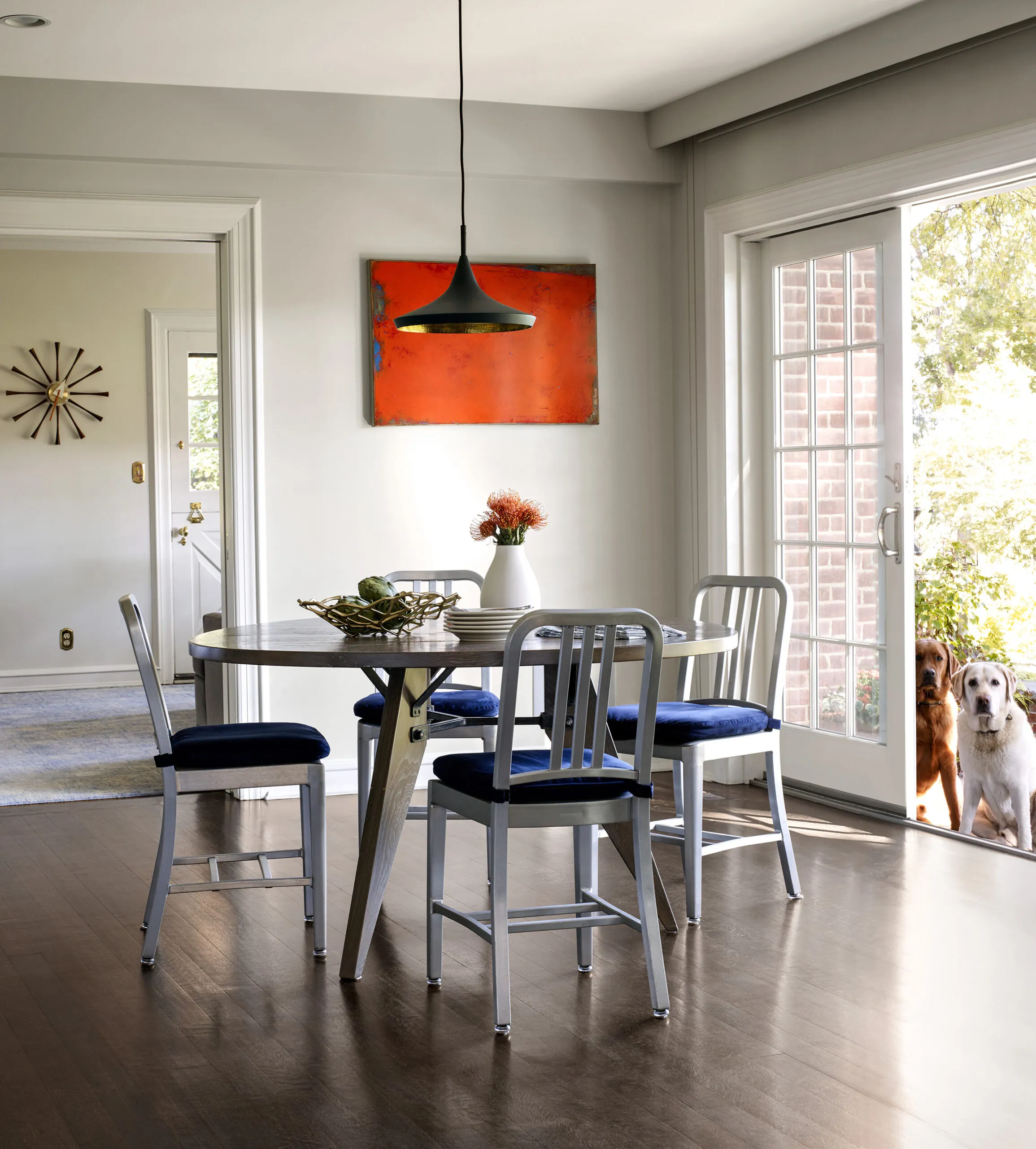
The casual eating area now has sliders, providing easy access to the backyard for everyone—including the family’s Labrador retrievers, Cisco and Salty—as well as broad views of a nature preserve behind the house. Aligning the sliders with the entry to a new butler’s pantry on the other side of the room allows sunlight to stream all the way into the dining room.
Windows and sliding door: Andersen Windows. Dining area table: Old Wood Company. Chairs: Emeco. Dining area pendant: Tom Dixon.
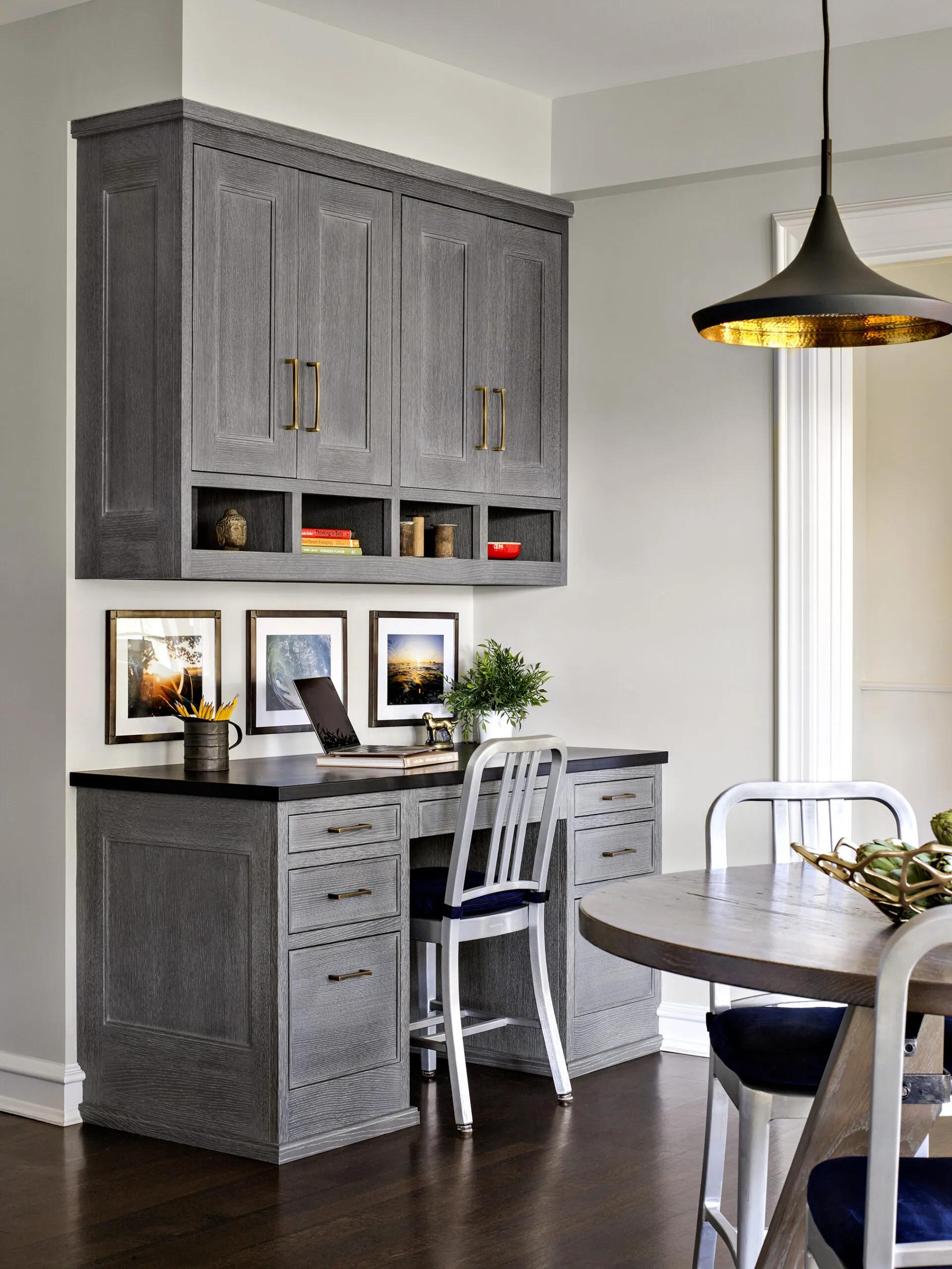
A built-in desk in the eating area helps to keep family paperwork organized. It has the same stained (gray) and glazed (cream) cerused-look finish as the rest of the custom cabinetry.
Custom cabinetry: Studio Dearborn by Schrock at Walnut Creek
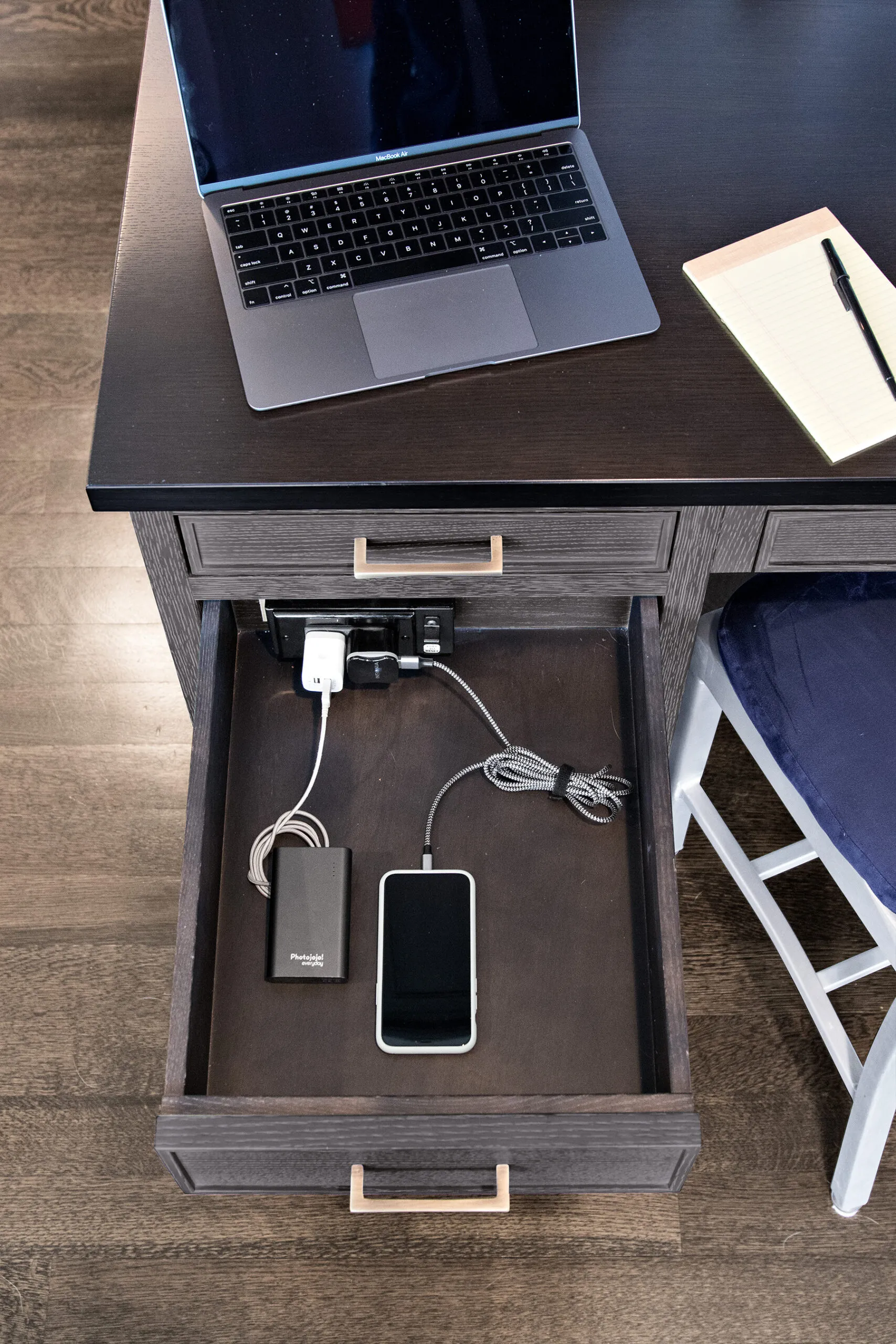
A charging station hidden inside one of the desk drawers keeps electronic devices juiced up—and cords out of sight.
In-drawer charging station: Docking Drawer.
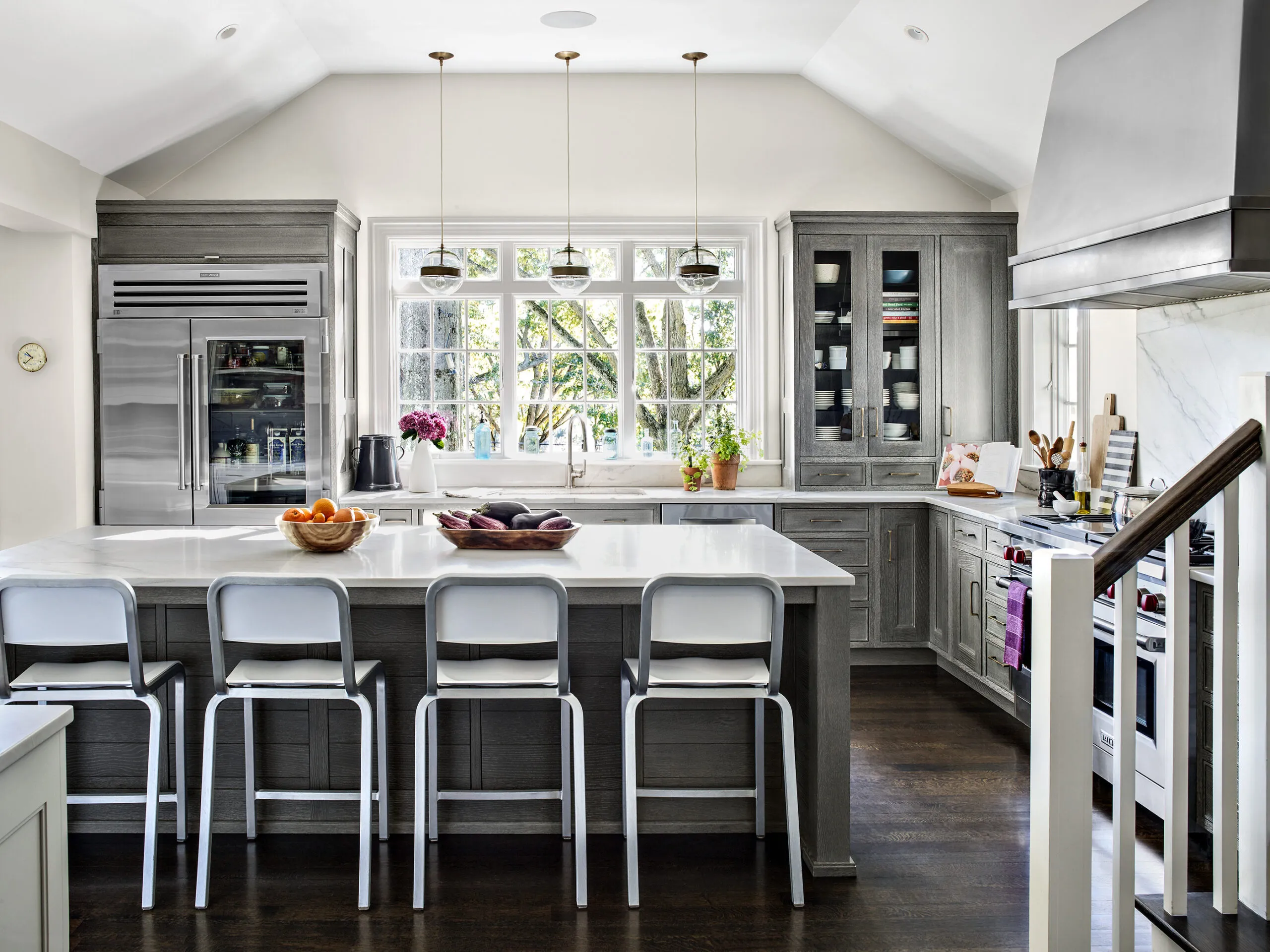
Raising the ceiling helped to create an airy, light-filled space. Extending upper cabinets right down to the countertop visually balances the bulk of the 48-inch refrigerator on the other side of the bank of windows. Originally concerned about the fridge’s size, Gabrielle now says she loves the extra space, including a drawer big enough to hold a turkey.
Fridge: Sub-Zero. Kitchen pendants: Arteriors. Stools: Emeco. Faucets: Kallista. Sinks: Franke.
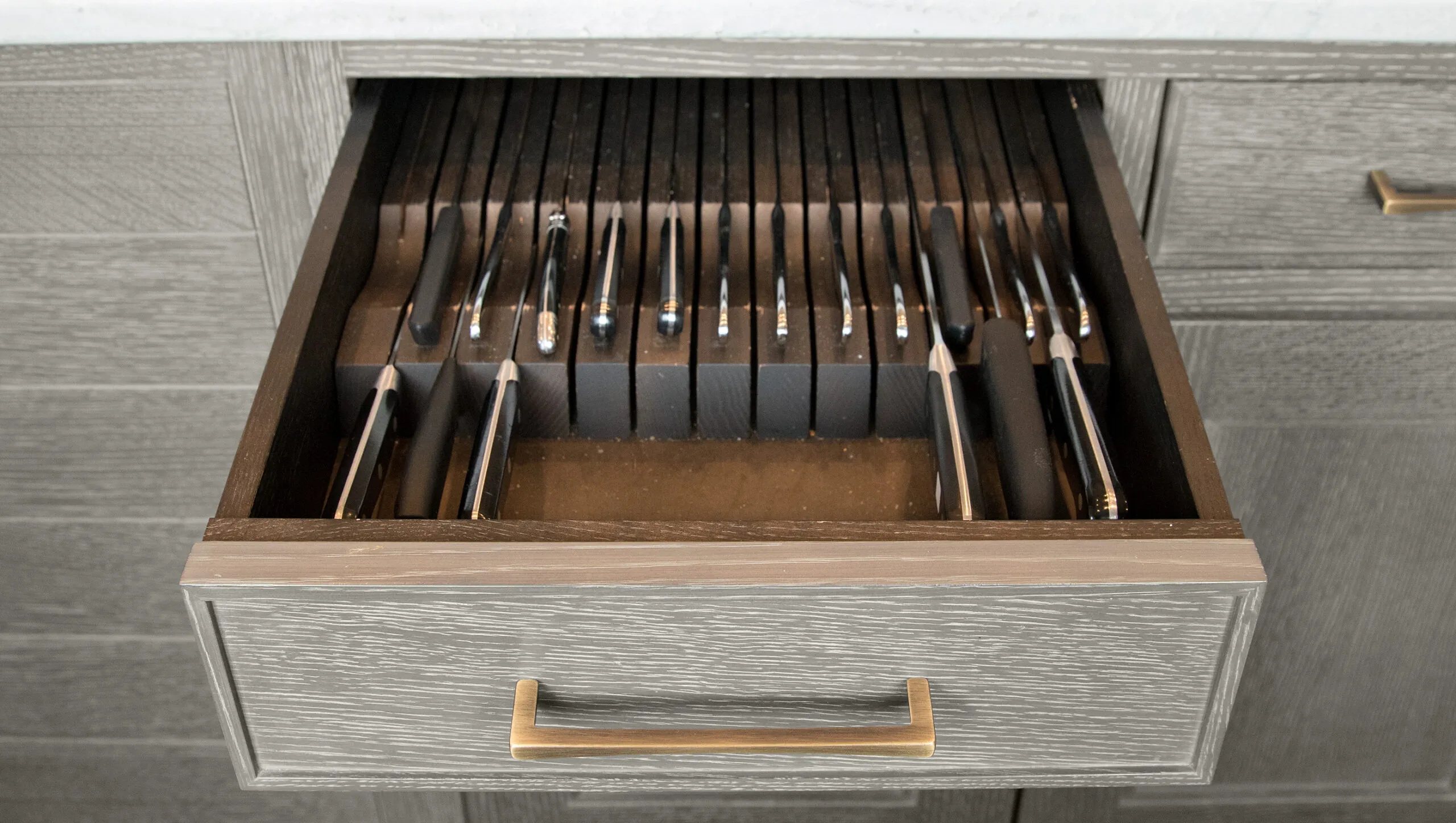
The homeowner’s Henckels knives are kept convenient—and protected—in an island drawer close to the sink with a slotted wood insert.
Drawer pulls: Schaub & Company.
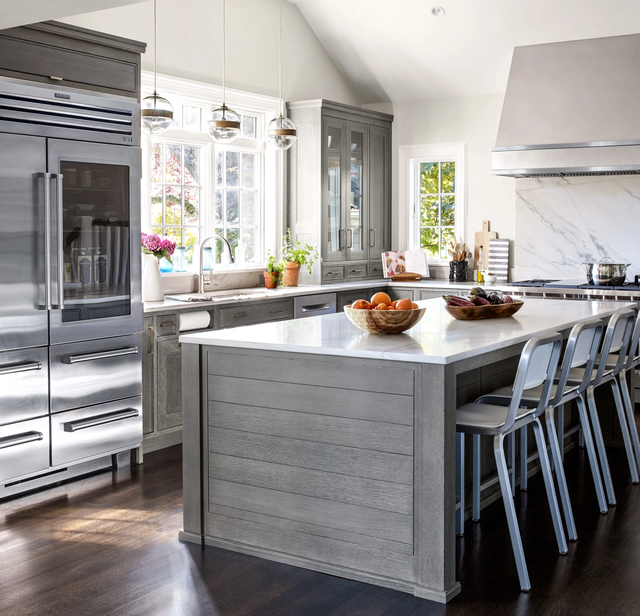
The island, which measures just over 4 feet wide and 9 feet long, provides plenty of uninterrupted space for food prep. The cross-cut quartzite top offers the look of marble without the maintenance. The island also houses a microwave, utensil and knife drawers, and pot storage on the end facing the stove.
Refrigerator: Sub-Zero. Range hood: RangeCraft.
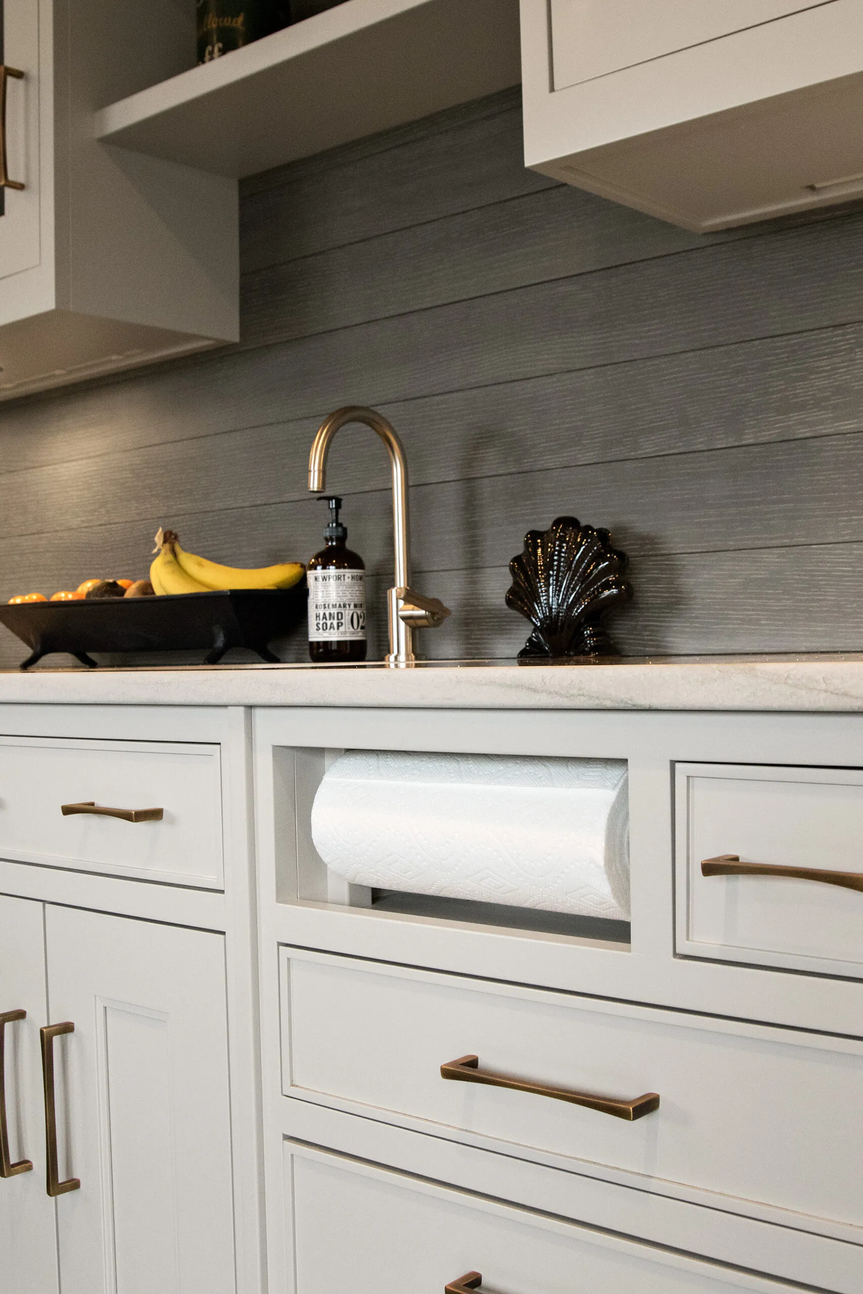
The breakfast bar is painted grayish white to suit husband Leigh’s more traditional taste, with the shiplap backsplash above stained gray to match the color of the other cabinets’ cerused-look finish.
Backsplash stain: Nimbus Gray (breakfast bar backsplash); Benjamin Moore. Faucet: Kallista.
Floor plans
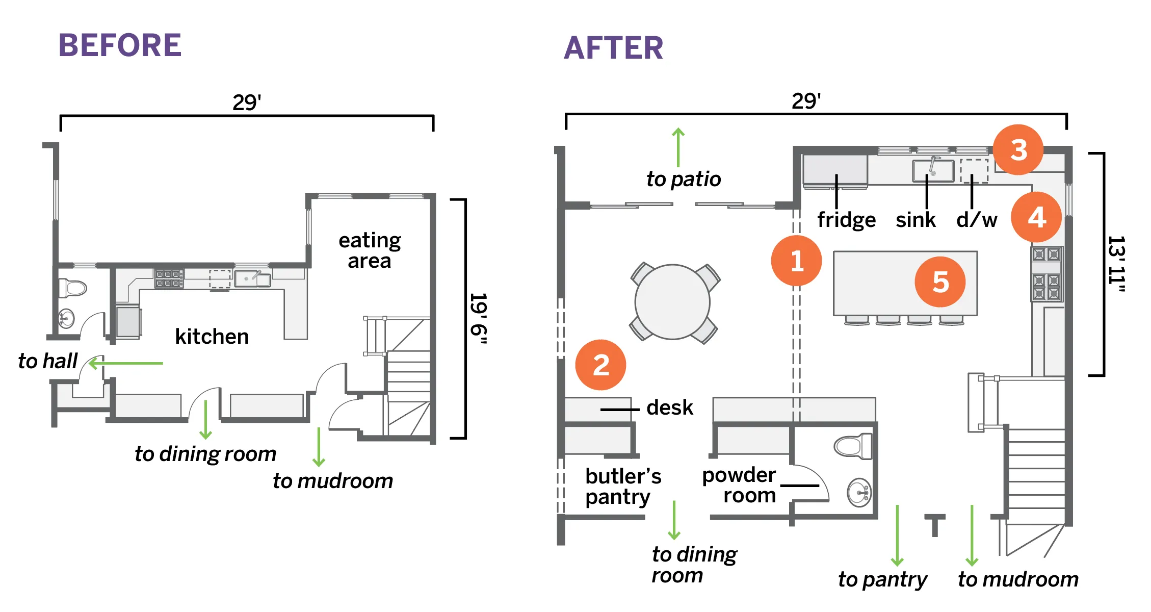
Before
The 335-square-foot kitchen lacked prep and gathering space for the family, and had a limited view for the cook. Storage was tight.
After
Swapping the kitchen and eating area locations and enlarging both spaces delivered a 498-square-foot cook- and family-friendly kitchen with a large island and views.
- Swapped the eating area and kitchen, bumping out the back wall by 4 feet in the new kitchen and 6 1/2 feet in the new eating area.
- Annexed a closet and powder room, to widen the eating area by 4 1/2 feet; put in a built-in desk and sliding doors to a patio, then walled off a new butler’s pantry and a new powder room.
- Widened the new kitchen by about 8 feet, placing the sink on the back wall with three windows over it and the fridge to one side.
- Centered the range on the new sidewall and added a window to one side.
- Built a 9 1/2-by-4-foot island, big enough for food prep and casual meals.
