This article appeared in the Fall 2021 issue of This Old House Magazine.
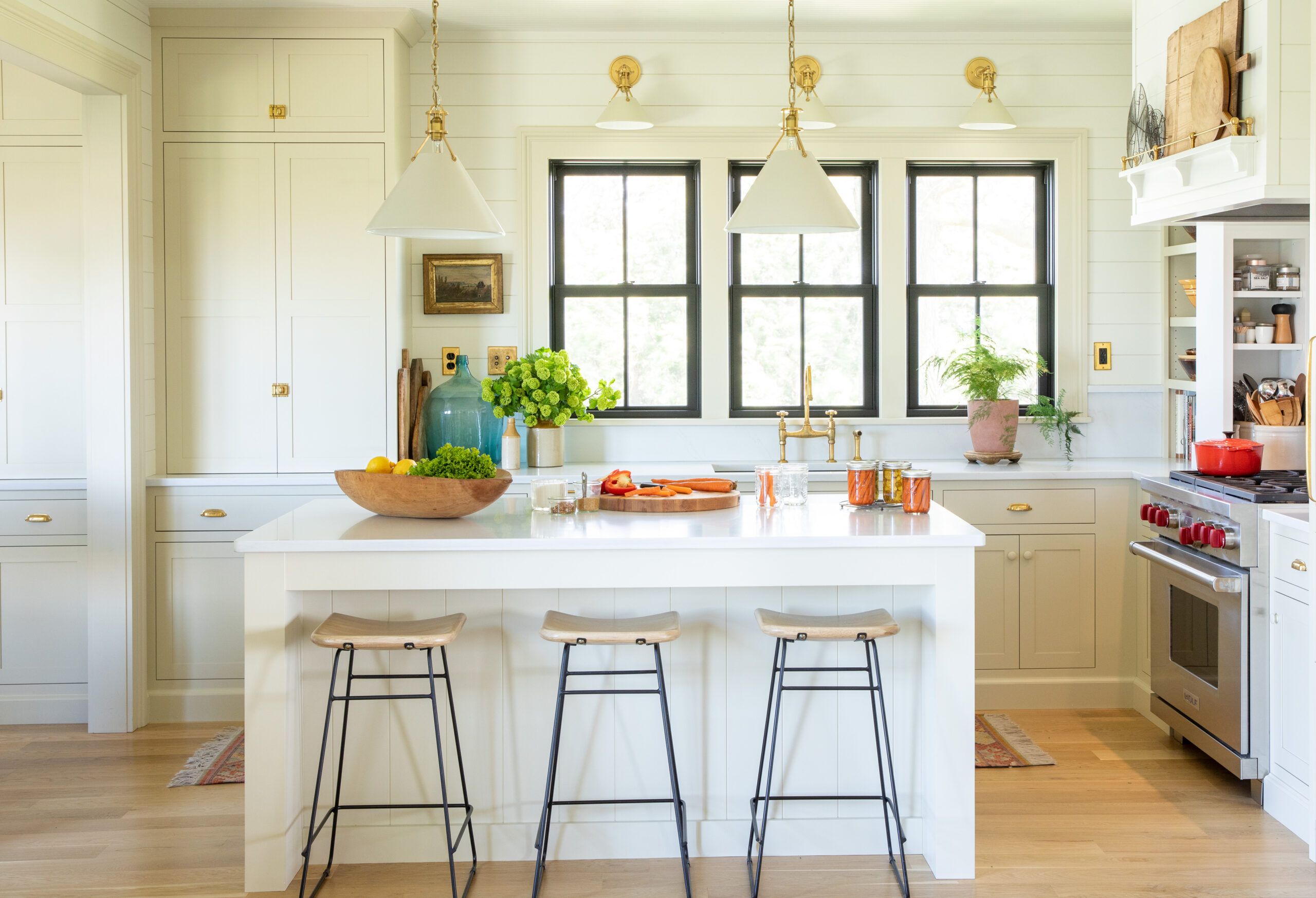
Shown: Shaker-style cabinets and two-over-two double-hung windows are period appropriate yet fit nicely with an unfussy island, a pro-style range, and sleek quartz countertops. Contractor: Ramsey Creek; Custom cabinets, islands, and range hood: Brighton Cabinetry; Windows: Marvin
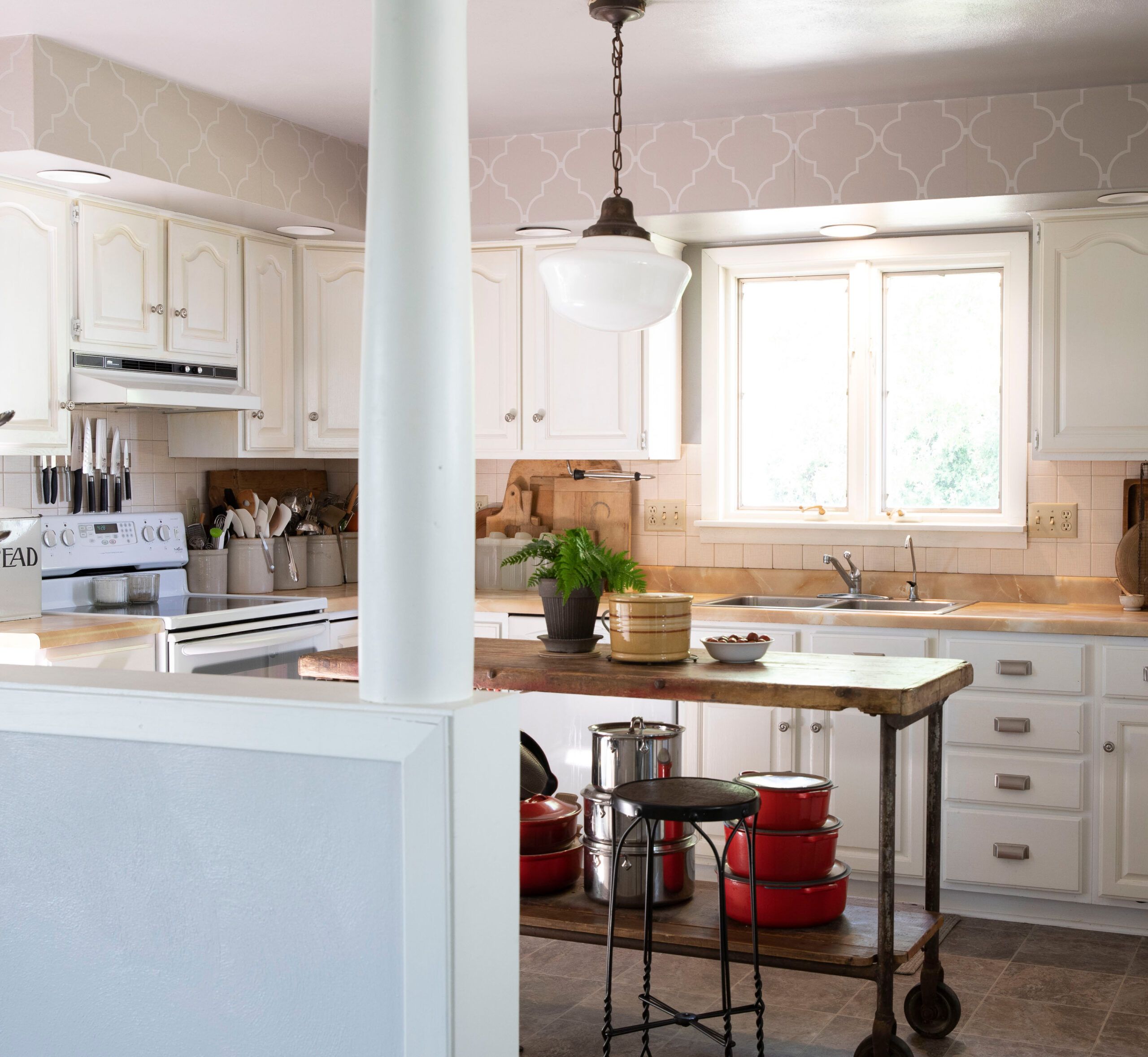
Loving an old house—even one that’s been in your family for ages—doesn’t mean you have to live in the past. Just ask Kaleb Wyse, whose family grows corn and soybeans in Mount Pleasant, IA, on land they’ve been farming for four generations. After buying his grandparents’ house, a circa-1890 American Foursquare, more than 10 years ago, Kaleb was ready at last to tackle the kitchen renovation. His challenge: to balance restoring the room’s “farmhouse soul” with his need for a practical workspace that suits how he cooks, entertains, and blogs (the food and gardening Wyse Guide website is his brainchild). The cook space, last redone in 1982, was “dark and closed off, with limited counter space, poor flow, and no seating,” says Kaleb, who drafted the design and served as general contractor. “I wanted to bring back the original farmhouse feel, while gaining open space and function.”
Widening the passageway between the kitchen and dining room greatly improved the flow. Annexing a hallway and half the mudroom adjacent to it made space for a dedicated baking area. Painted Shaker-style cabinetry and shiplap walls have a timeless look, and practical touches like pantry cabinets with pocketing doors add convenience. “My grandparents are amazed at how large it all seems, and my mom, who lives across the road, loves the light, airy feel—she wants me to design her kitchen next,” Kaleb says. Despite spending months riding herd on the project, he adds that he wouldn’t change a thing. “Every time I walk in here, I smile.”
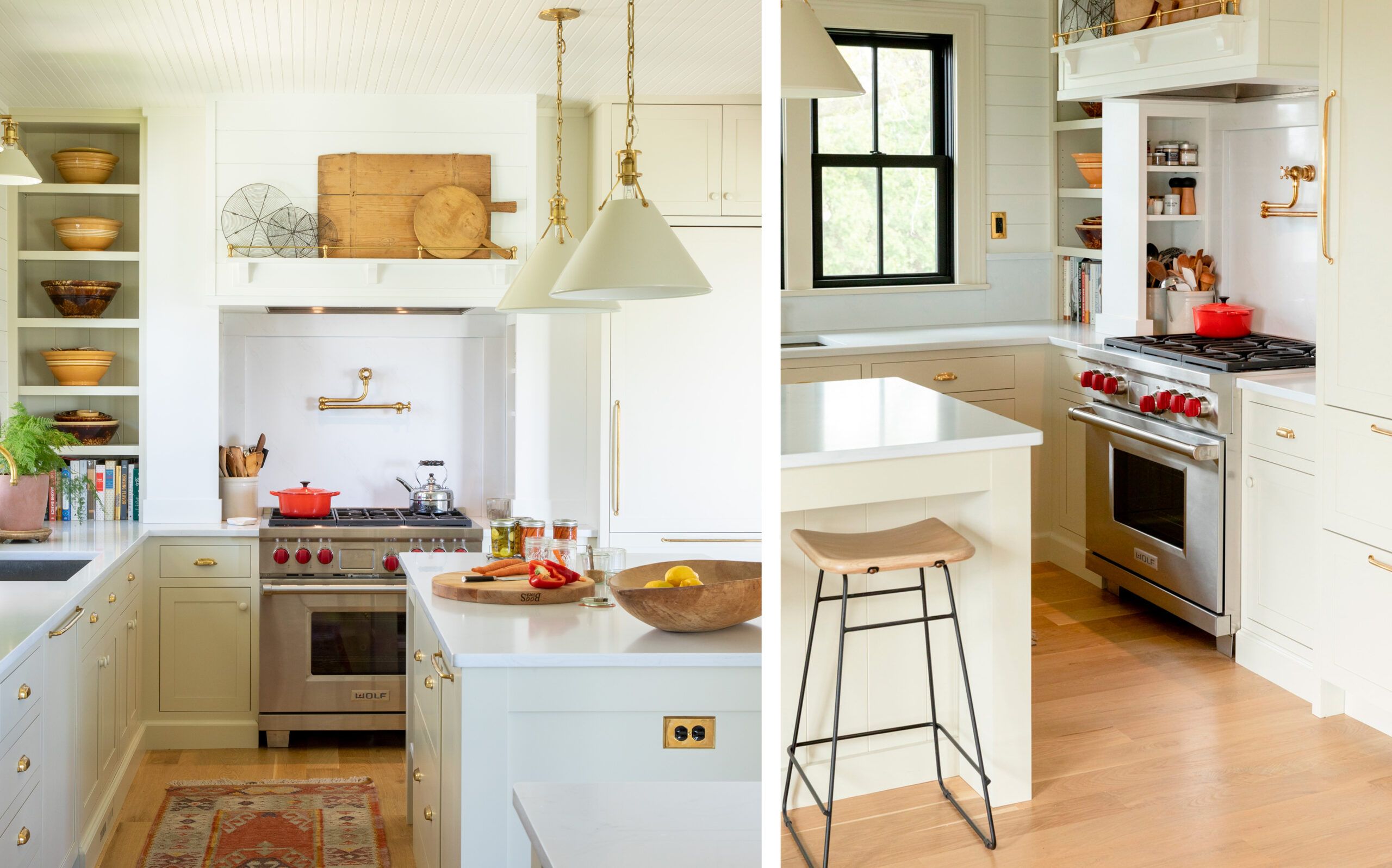
Left: A section of open shelving and 9-foot ceilings make the kitchen feel airier. The range, relocated to the fridge wall, is dressed up with a mantel-style vent hood that has a shelf where Kaleb displays collected cutting boards and wire racks. Quartz countertops: Aurea Stone; Faucet and pot filler: deVOL; Lighting: Hudson Valley Lighting
Right: “I hate wasted space!” says Kaleb, who built in stealthy storage around the range to keep spice jars and cooking oils within easy reach. Though he calls the pot filler a luxury, he finds it very handy for canning. Gallery rail (on range hood): Paxton Hardware, LTD.
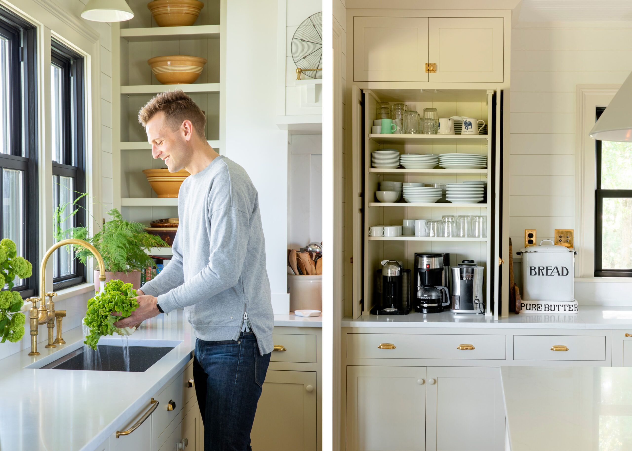
Left: Kaleb opted out of the classic apron sink: “I wanted utility, so a deep stainless-steel sink just made sense.” This one has integrated accessories, like cutting-board and drain inserts, for workstation function. The high-arc faucet accommodates tall stockpots. Sink: Kohler
Right: Tall pocketing pantry doors are “the best of both worlds,” Kaleb says, offering a clean look when closed, and the grab-and-go convenience of open shelving when recessed. When family and friends come over, he suggests they help themselves; the flatware drawer is directly underneath. Hardware: House of Antique Hardware
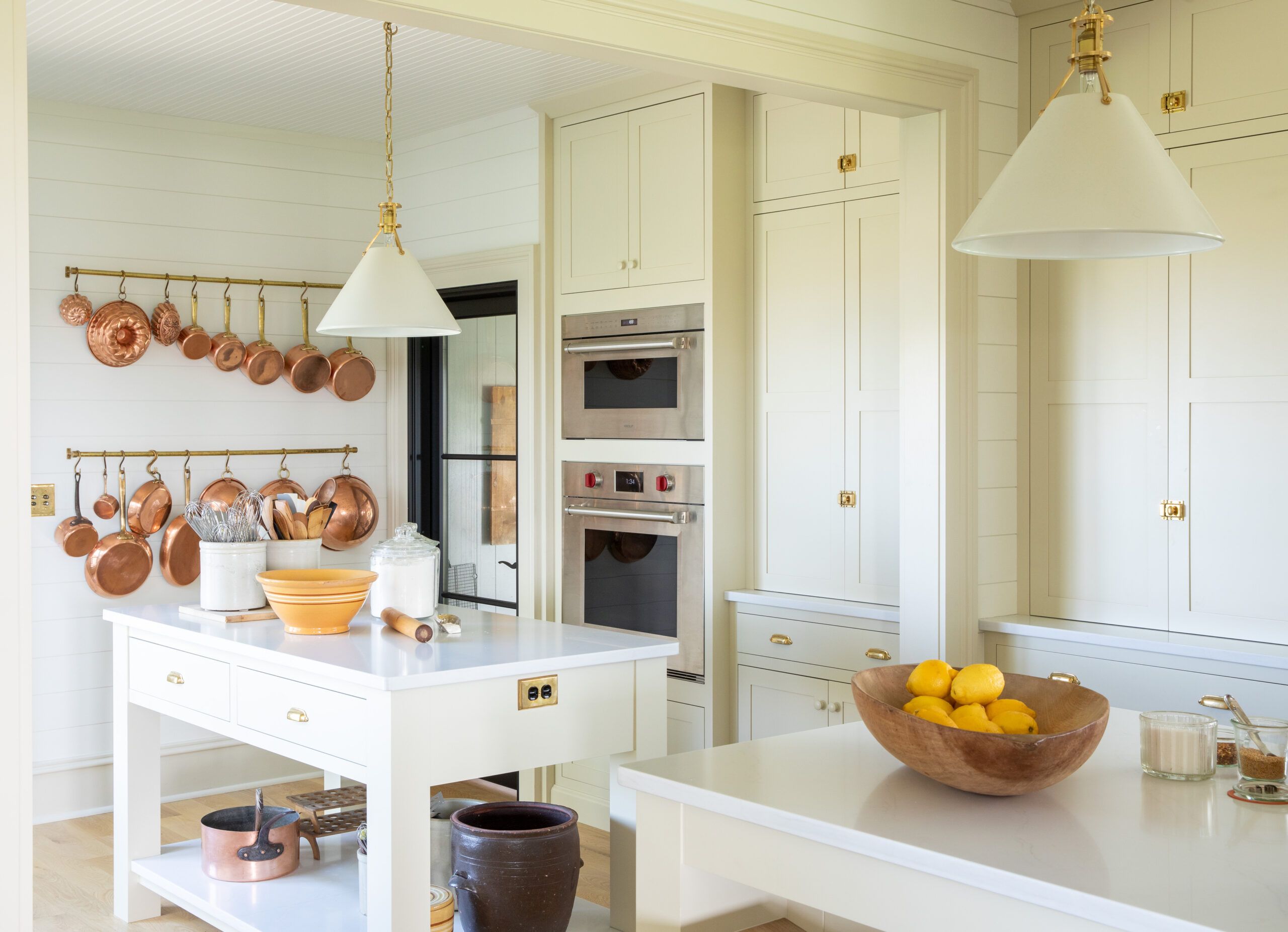
To boost prep space, Kaleb created a baking center in the annexed section, with a dedicated island opposite a wall oven and a pantry cabinet that holds a stand mixer and associated supplies. The island’s quartz top stands in for marble, providing a cold surface for rolling out dough; more quartz on the lower shelf offers space for cooling racks. Paint (cabinets): Wool Skein, Sherwin-Williams; Refrigerator, wall oven, range, and microwave: Sub-Zero/Wolf
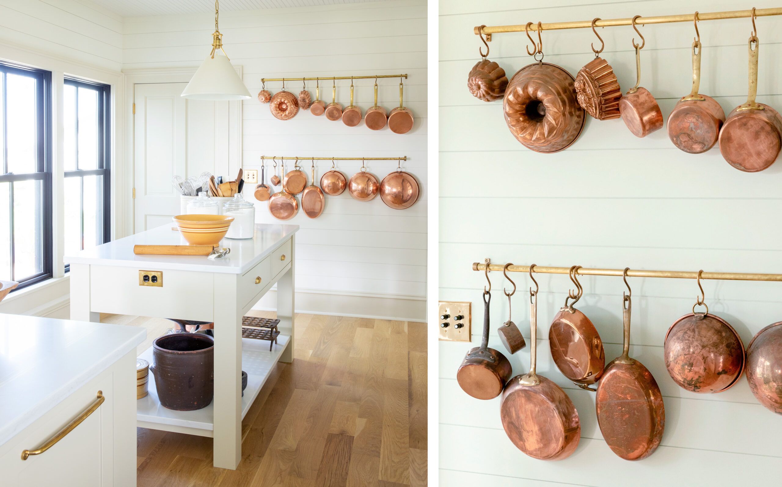
Left: The door to the garage stayed, but a pair of large windows now overlook the back patio, where a sliding glass door had been. The baking island is topped with quartz, and so is the lower shelf, where Kaleb sets baked goods to cool.
Right: With a wide expanse of shiplap-covered wall to fill, Kaleb came up with the idea of installing two unlacquered brass rails with S-hooks to display his collected copper cookware. While he does use the pots, he says, they also add a glow to the space, especially when sunlight pours in. Shiplap: BlueLinx
Get the look
Modern function combines with farmhouse simplicity for a kitchen that is as hardworking as it is easy on the eyes.
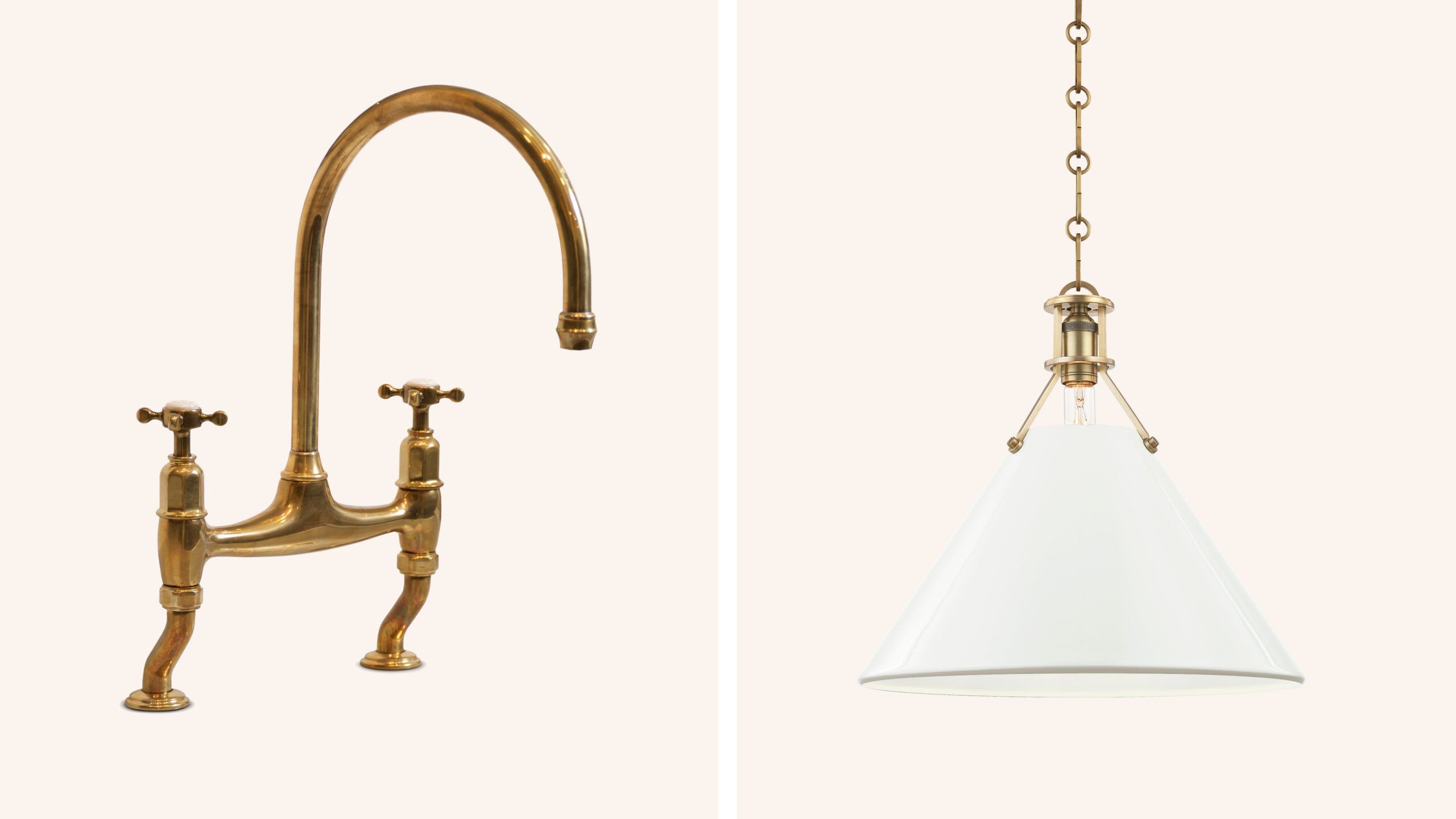
Left: Bridge faucet / DEVOL
“This timeless design easily could have been in use a hundred years ago,” Kaleb says. “The unlacquered brass is already starting to patina, which I love.” Aged Brass Ionian Tap, $1,080; deVOL
Right: Metal pendant / HUDSON VALLEY LIGHTING
Brass-accented industrial lights tie the look together, and “painted metal shades are easier to clean than fabric—important in a kitchen.” Painted No. 2 Pendant, $650; Hudson Valley Lighting
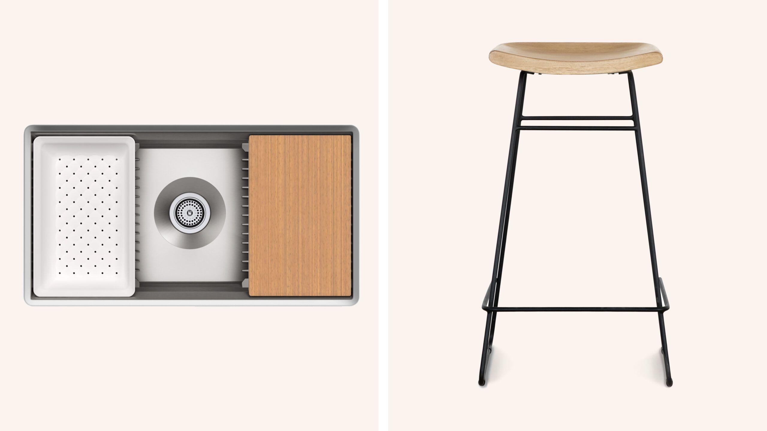
Left: Workstation sink / KOHLER
At 11 inches deep, this stainless-steel basin holds a party’s worth of dirty dishes. Kaleb makes good use of the cutting-board, drain-rack, colander, and washbin inserts. Prolific Sink, $1,537; Kohler
Right: Barstools / McGEE & CO.
Kaleb likes mixing new pieces that have clean lines with antiques to “quietly update a space.” Williamsen Counter Stool, $275; McGee & Co.
Floor Plans
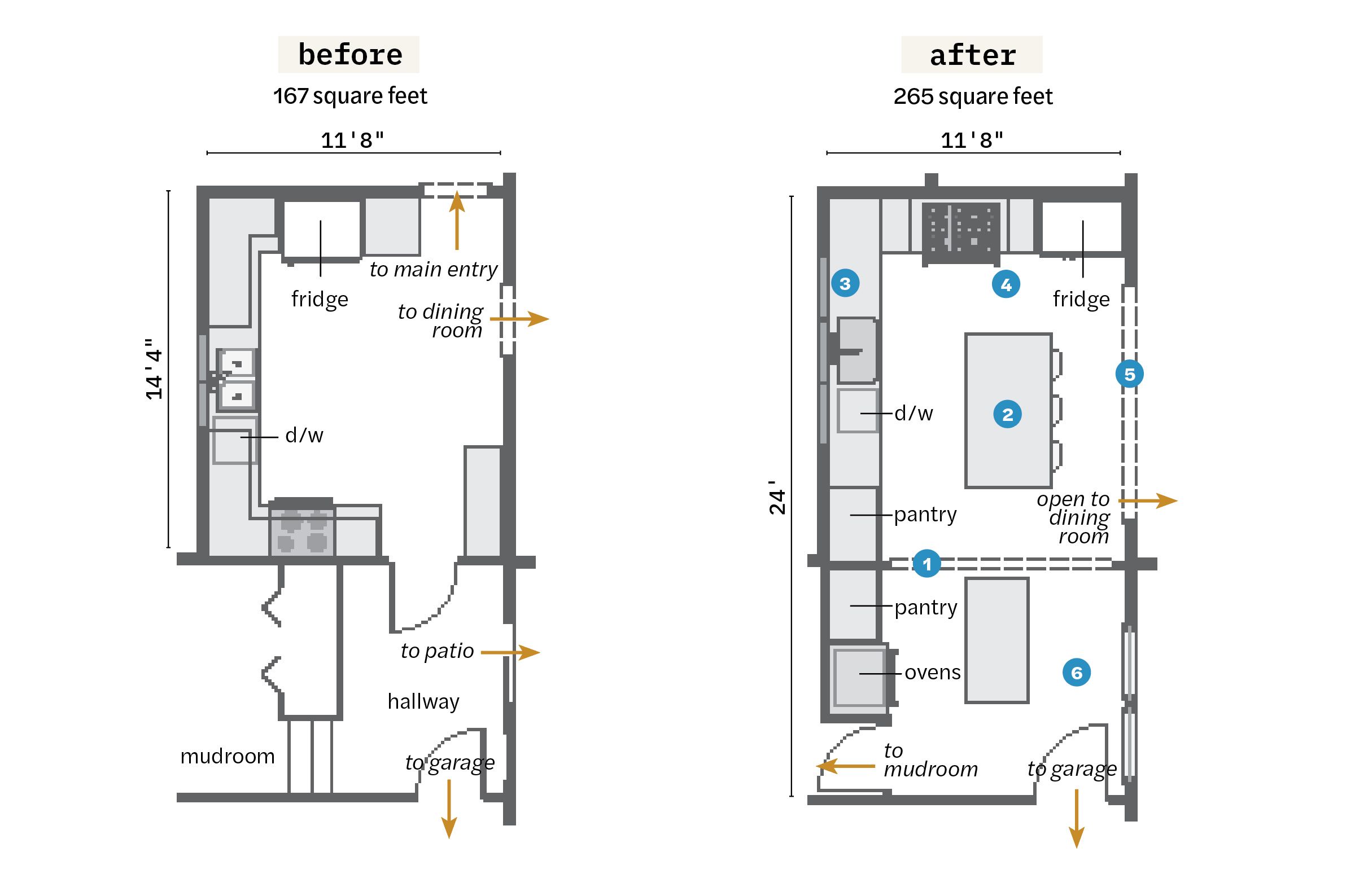
Widening connections and combining two spaces improved traffic flow in and out of the kitchen. Large cased openings preserve a period feel.
- Removed most of a wall to annex a hallway and part of a mudroom for 98 square feet of additional space.
- Centered an island in the original kitchen area with stool seating on one side, and cookware drawers and a trash pullout on the other.
- Replaced two small windows with three larger ones, centering a new workstation sink below them, with a dishwasher to the left.
- Moved the range and closed up a doorway, adding a built-in fridge with panels in its place.
- Widened the cased opening between the kitchen and the dining room by 7 feet.
- Created a baking center in the annexed space, with an island, stacked microwave and wall ovens, and a pantry for baking supplies. Added a French door to the new mudroom and replaced a sliding glass door with windows.
