This article appeared in the Fall 2022 issue of This Old House Magazine.
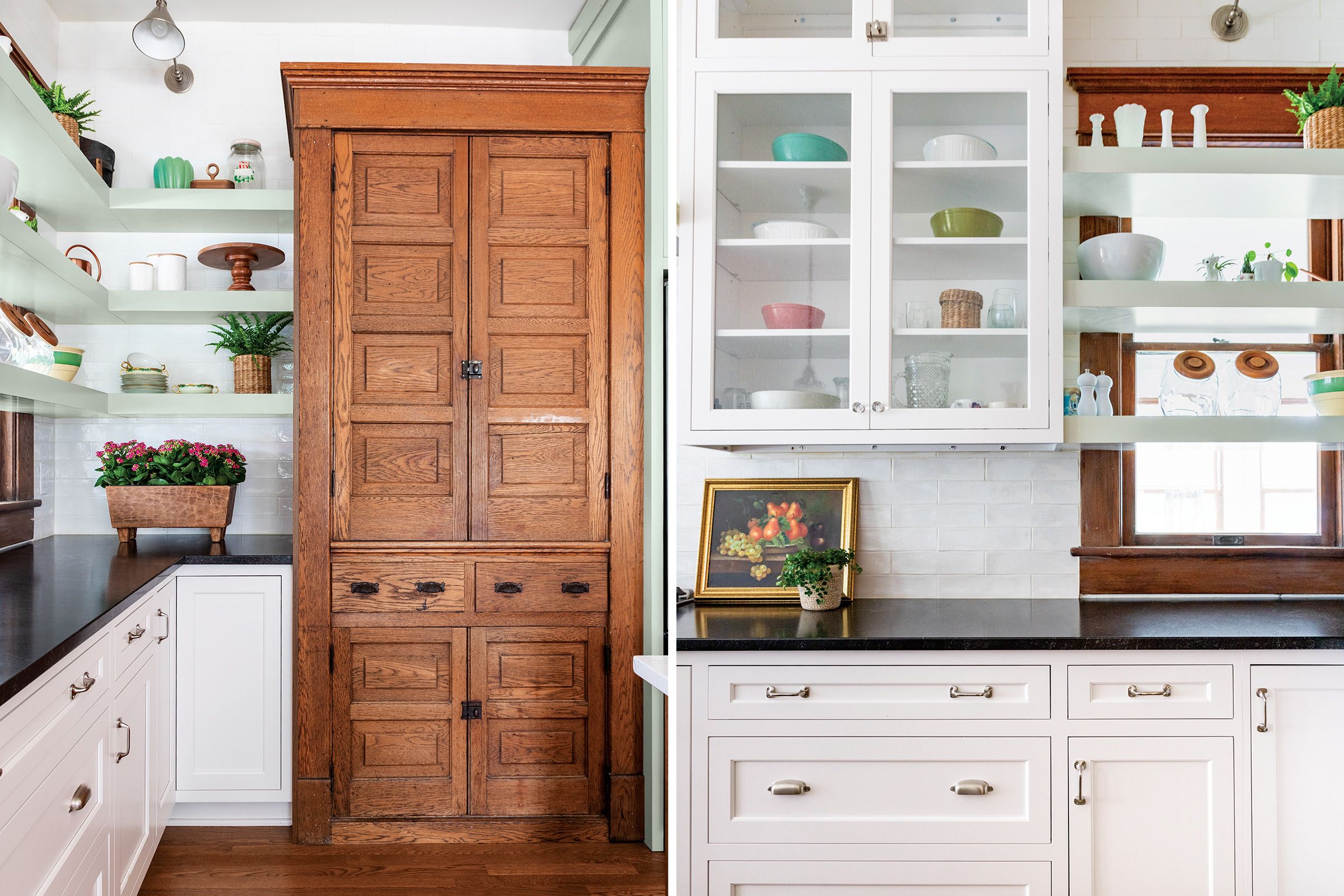
Few folks buy a turn-of-the-century house without some appreciation for its original details. No surprise, then, that Indianapolis homeowners Kaela and Cason Cusack hoped to honor the built-in oak hutch in their circa 1895 American Foursquare’s kitchen.
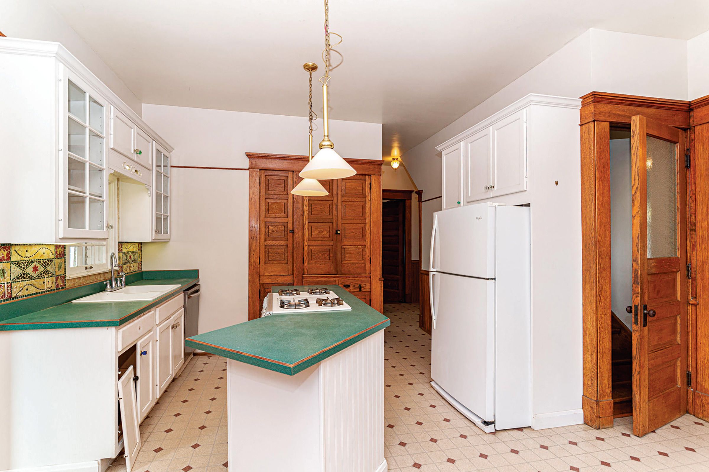
Last renovated in the 1990s, the room also held an awkward angled island that hemmed in the cook, a fridge that blocked traffic, and scant storage and prep space. “We wanted to preserve the beautiful woodwork but make the room flow better so that cooking would be fun,” Kaela says.
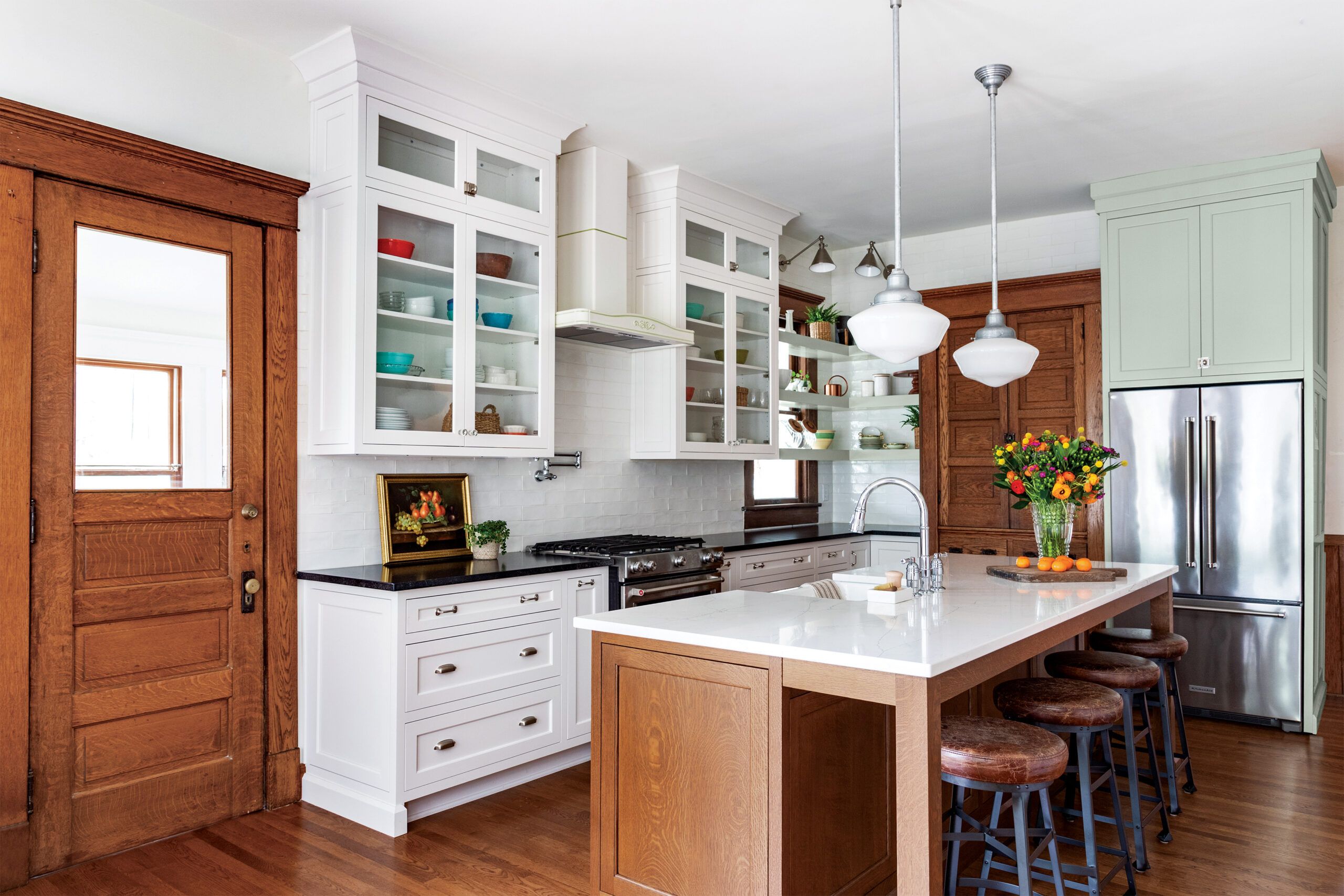
Using the hutch as the cornerstone of her vision, designer Tiffany Skilling had the piece disassembled, then scrapped the butler’s pantry behind it to extend the run of base cabinets by about 6 feet. Two-thirds of the three-door hutch was rebuilt and installed along the new wall, with the fridge nestled neatly beside it.
Floor Plans
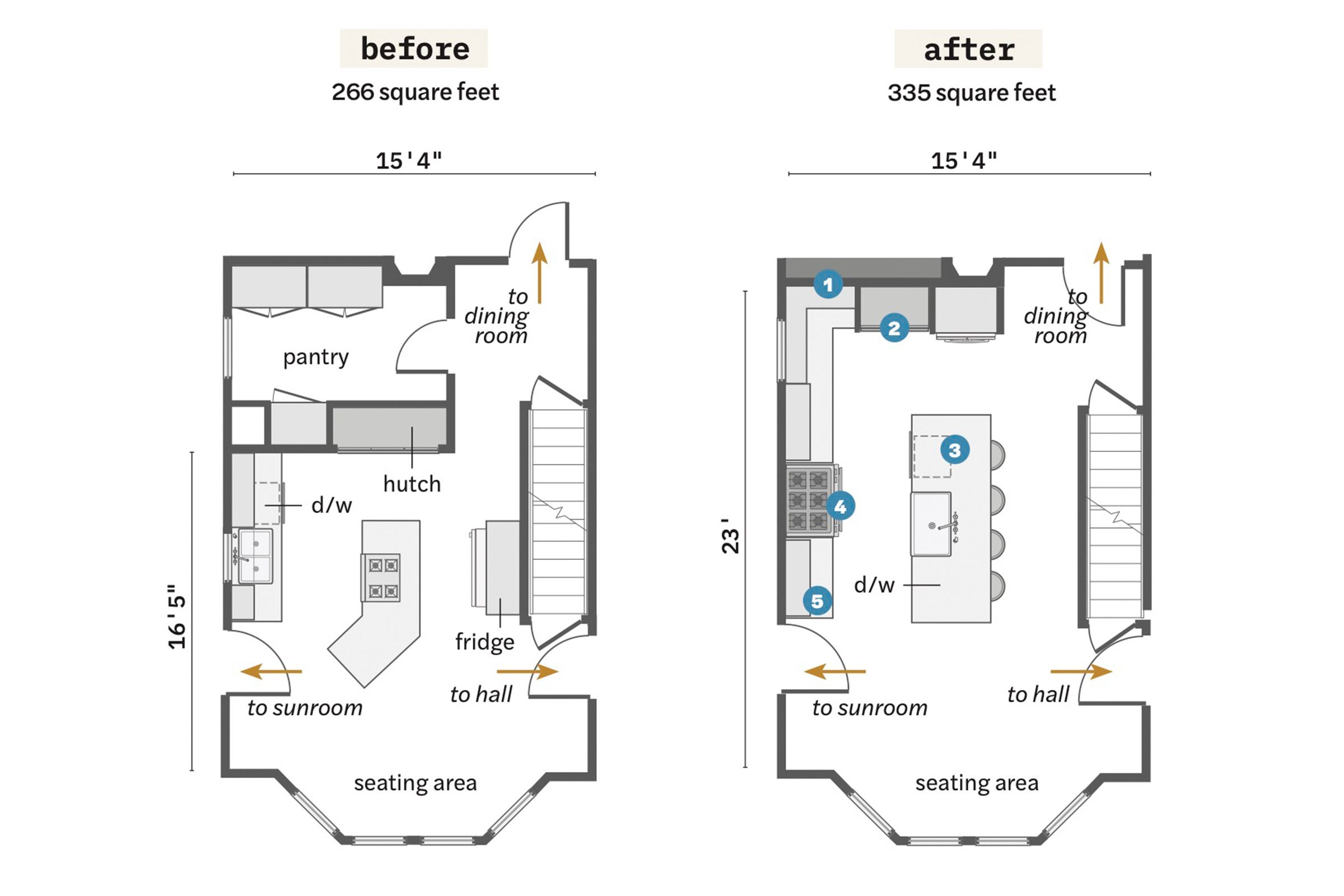
Annexing space from a 40-square-foot original butler’s pantry and relocating appliances opened up room for more functional storage and prep space, while improving traffic flow.
- Scrapped the pantry and built a wall in line with the back of the dining room fireplace to enable an L-shaped run of cabinetry, adding about 61/2 feet of additional cupboards.
- Relocated and rebuilt the original oak hutch along that back wall, reducing its width by a third; positioned the refrigerator to its right, freeing up the route to the dining room.
- Built a wider, longer center island that has counter seating and holds a dishwasher alongside the sink.
- Moved the range to where the sink had been, closing off an interior window to allow for a vent hood.
- Replaced all the cabinets, running uppers to the ceiling to increase storage space
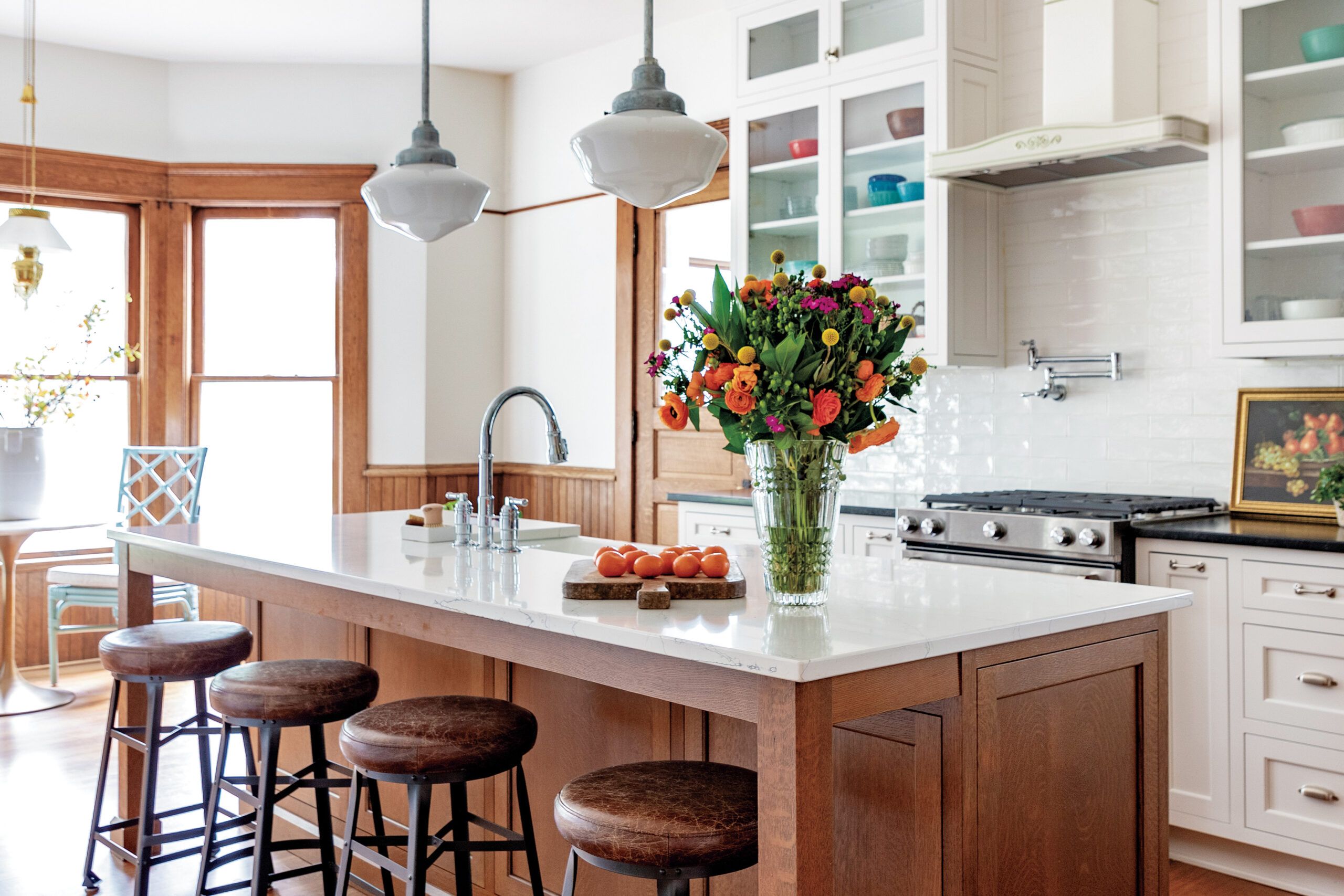
The range, formerly in the island, swapped places with the sink, and a vent hood was added, while a new white oak island was crafted to echo the original doors and trim.
“An island with just an overhang feels unfinished to me. Here the island’s chunky legs ground the piece and create impact.”—TIFFANY SKILLING, principal designer, Tiffany Skilling Interiors
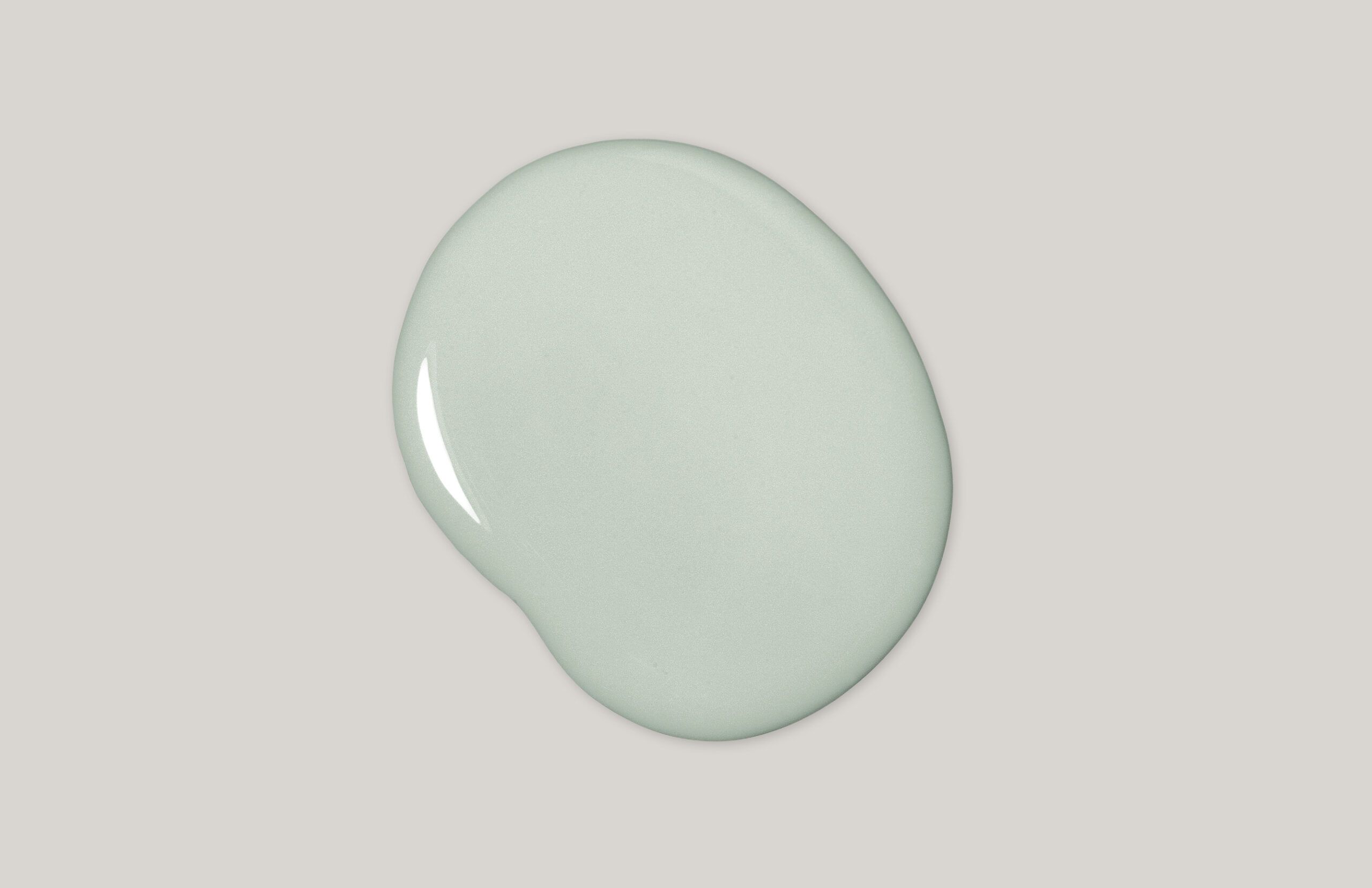
The ideal counterpoint to all that wood? Clean, bright-white cabinets and touches of pale green. “Salvaging the built-in was 100 percent the right decision, and the openness of the new layout is great,” Kaela says. “We have friends over, host family holidays, and eat breakfast at the island every morning. The kitchen is now a true gathering place.”
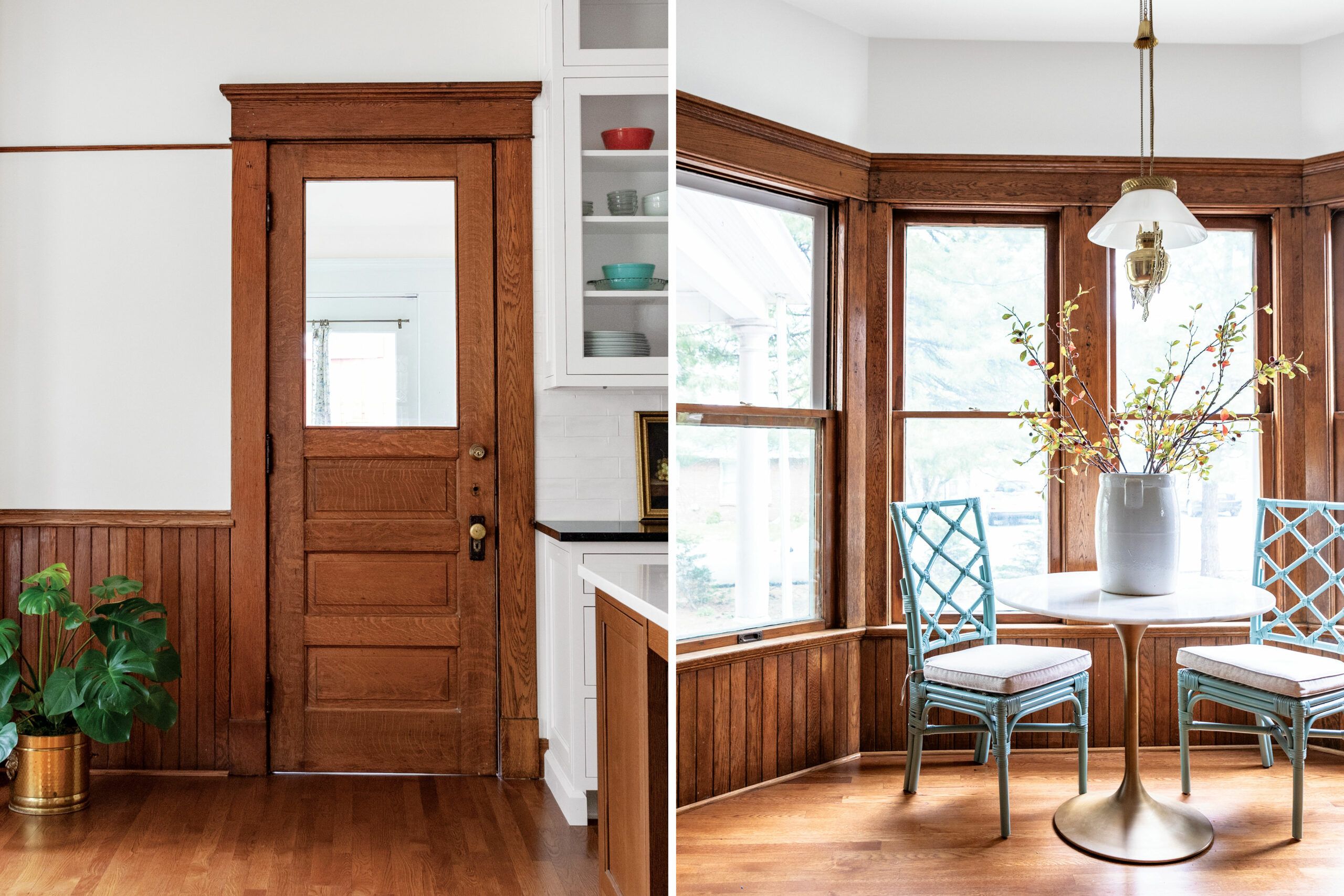
“From what we can tell, all the quartersawn tiger-oak woodwork in the house has never been painted,” Kaela says. “We are extremely lucky!” To complement the existing casings, wainscoting, doors, and windows, the new white oak flooring was given a warm-walnut stain.
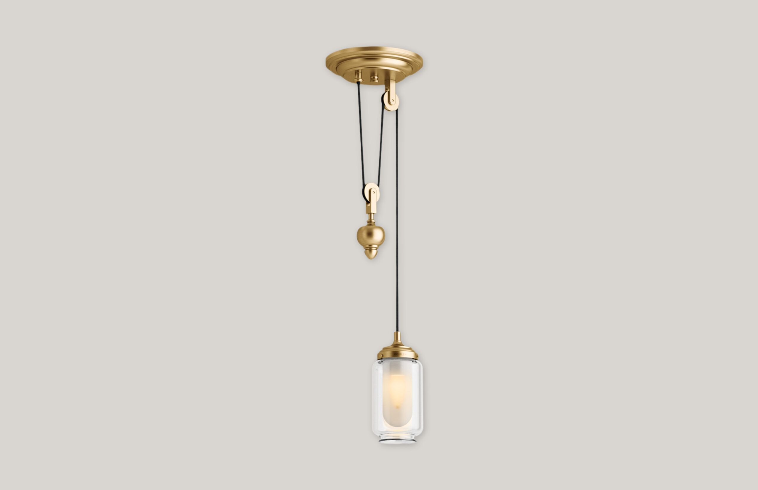
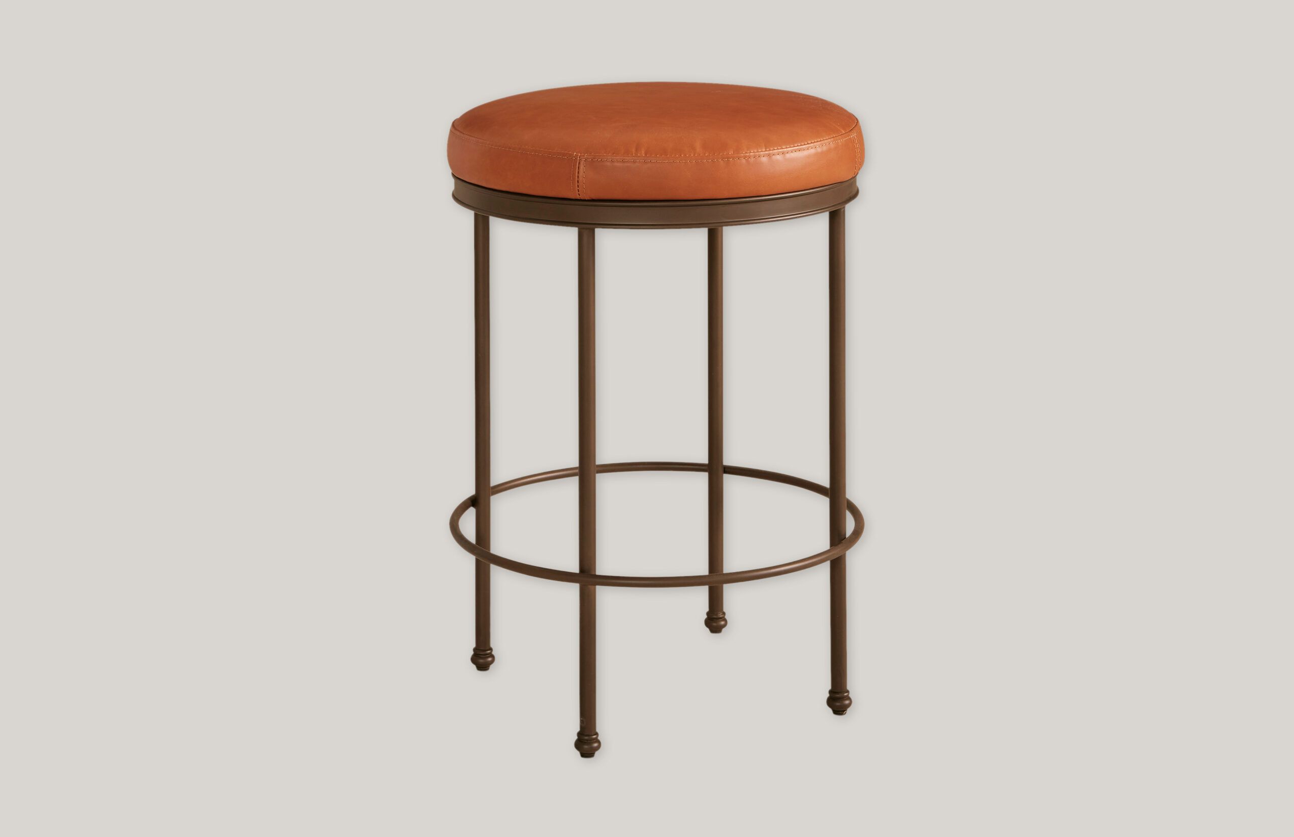
Get the Look
These updated classics nail the vintage feel and offer practical advantages, too.

