This article appeared in the Summer 2023 issue of This Old House Magazine.
Lots of space. Lots of wood. Lots of light. Sometimes too much of a good thing can be, well, too much. Especially when there’s also too little openness, too little function, and too little flow. That was the case at Heather and Andrew Altobelli’s gracious vintage house in Westfield, NJ, which came with a sprawling kitchen wing that lacked another essential ingredient: warmth. “I’m a foodie, and I need a kitchen that’s a hub where we can all be together,” says Heather, who loves to cook and entertain.
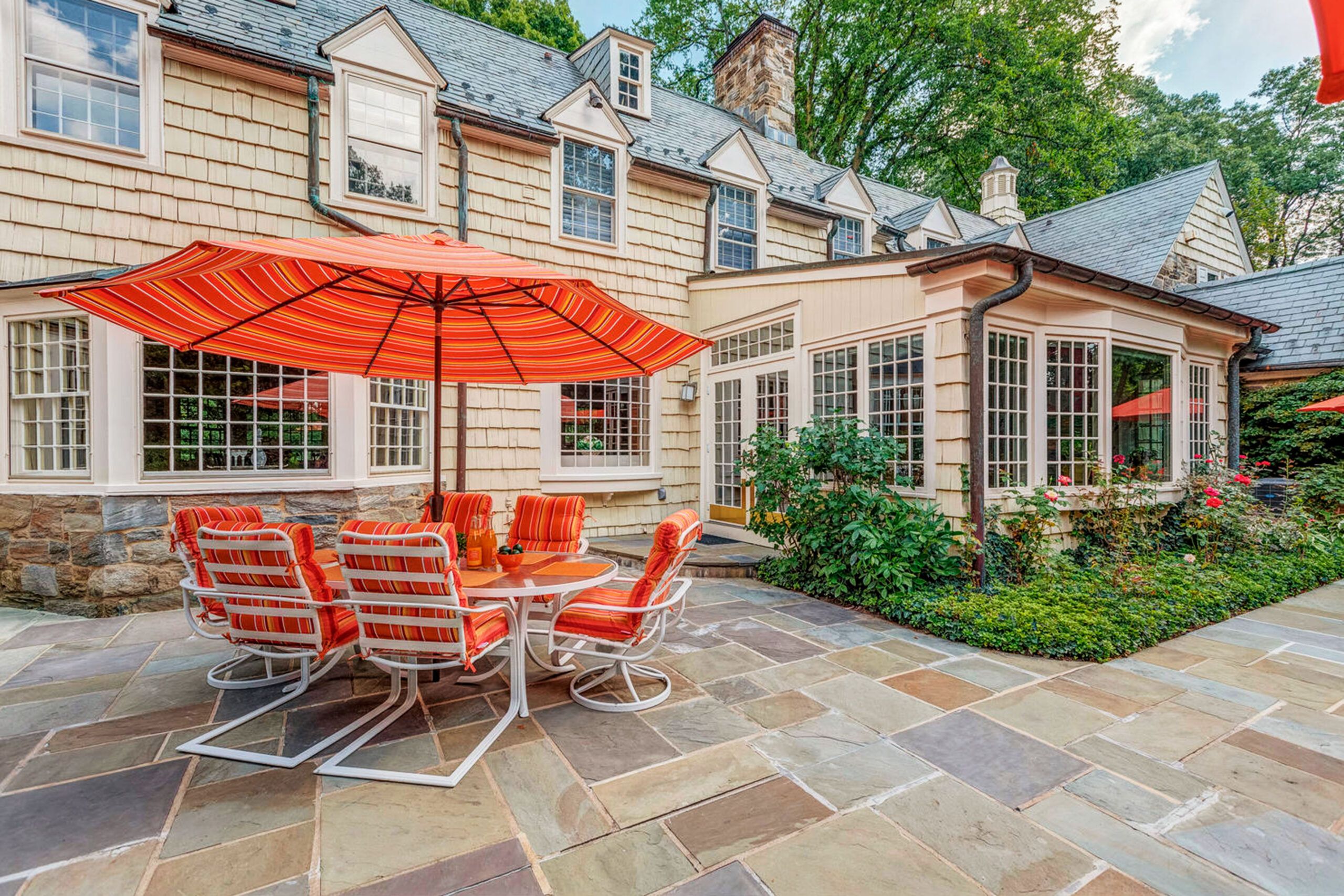
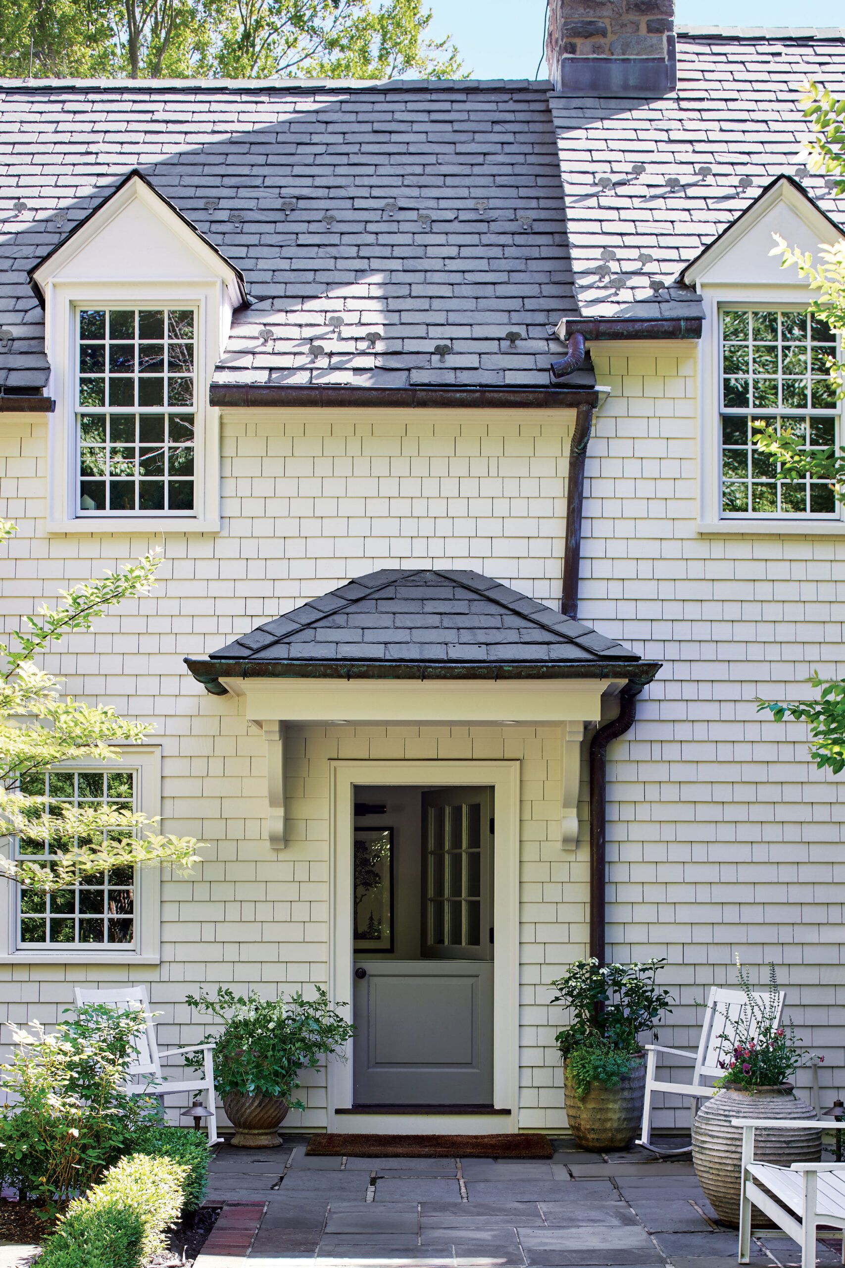
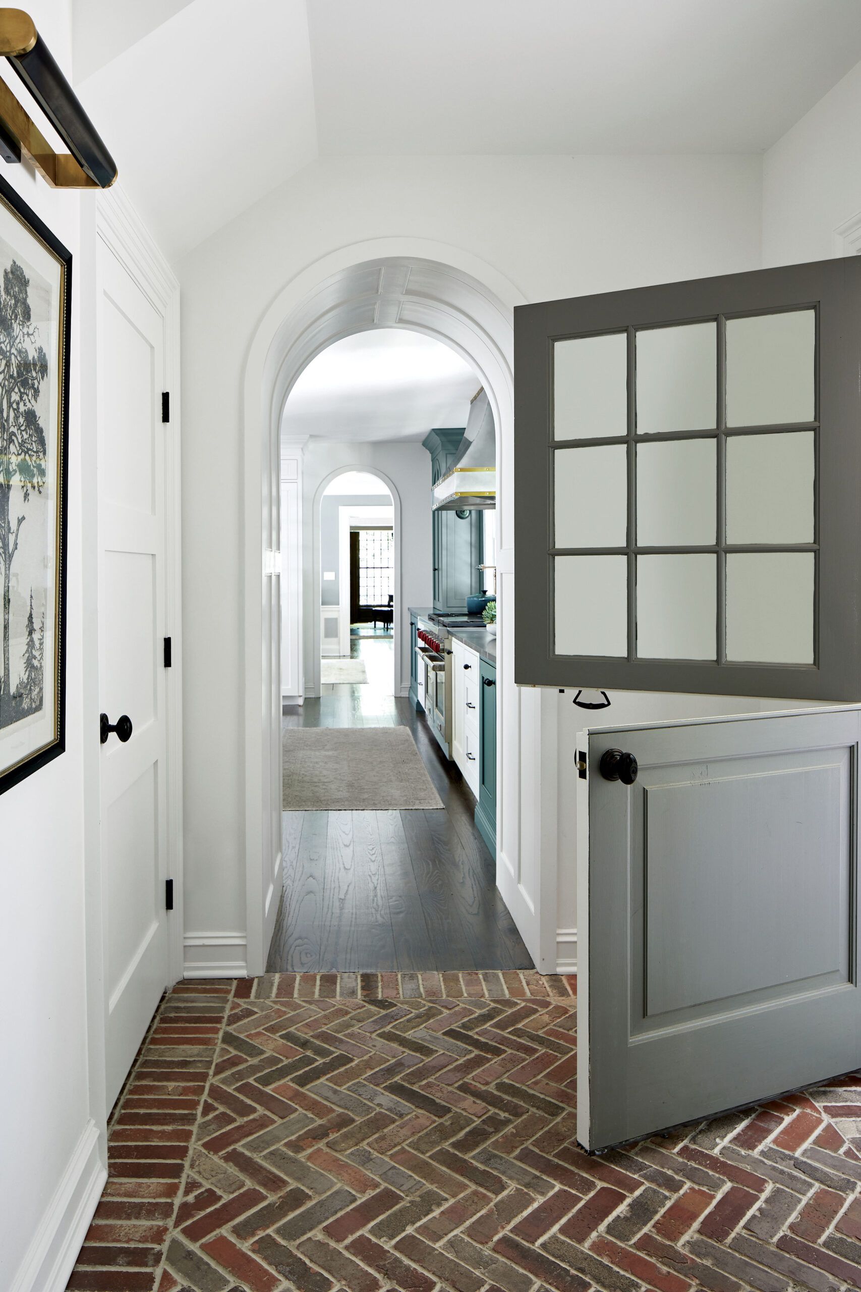
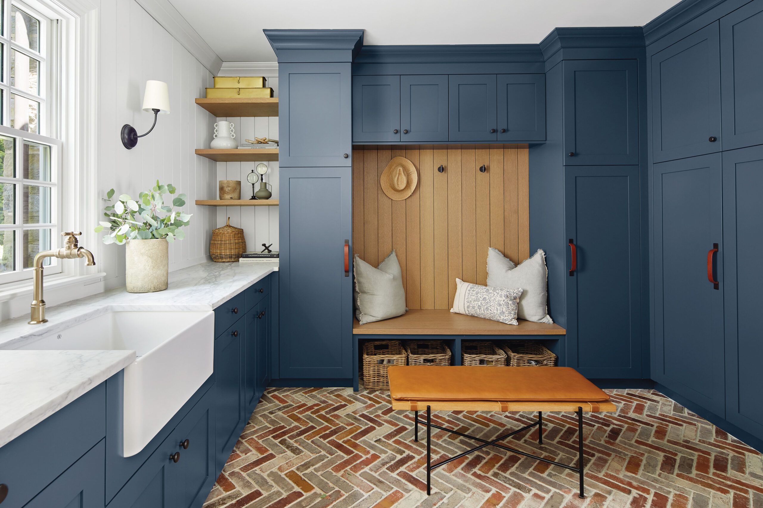
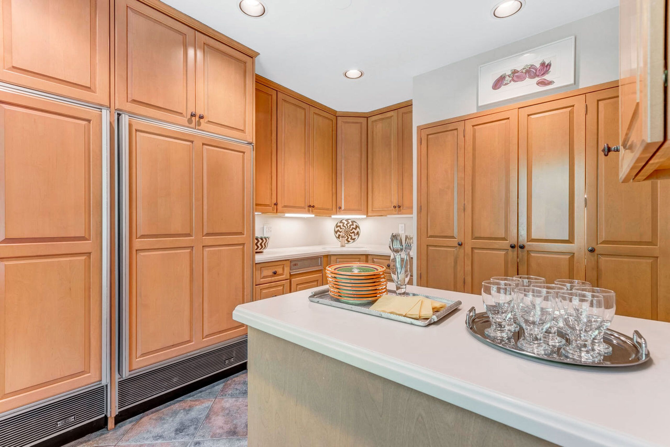
Enter builder Mike Mroz and his wife, interior designer Ellie Mroz, who were hired to rethink the existing space and exchanged walls of 1990s glazed-maple cabinetry for an eclectic mix of finishes that echo the home’s original wood-paneled walls, handsome moldings, and weathered-brick exterior accents. The revamped kitchen is now open to an inviting breakfast room and connects to a charming entry that leads to a large mudroom and an upgraded bath—convenient with a swimming pool just outside. An outdoor dining area and snack bar create a seamless connection between indoors and out. The result: renovated spaces that feel both modern and timeless. Best of all, says Heather, “we kept the integrity of the house.”
Remaking an Entrance


Cooking Up Togetherness
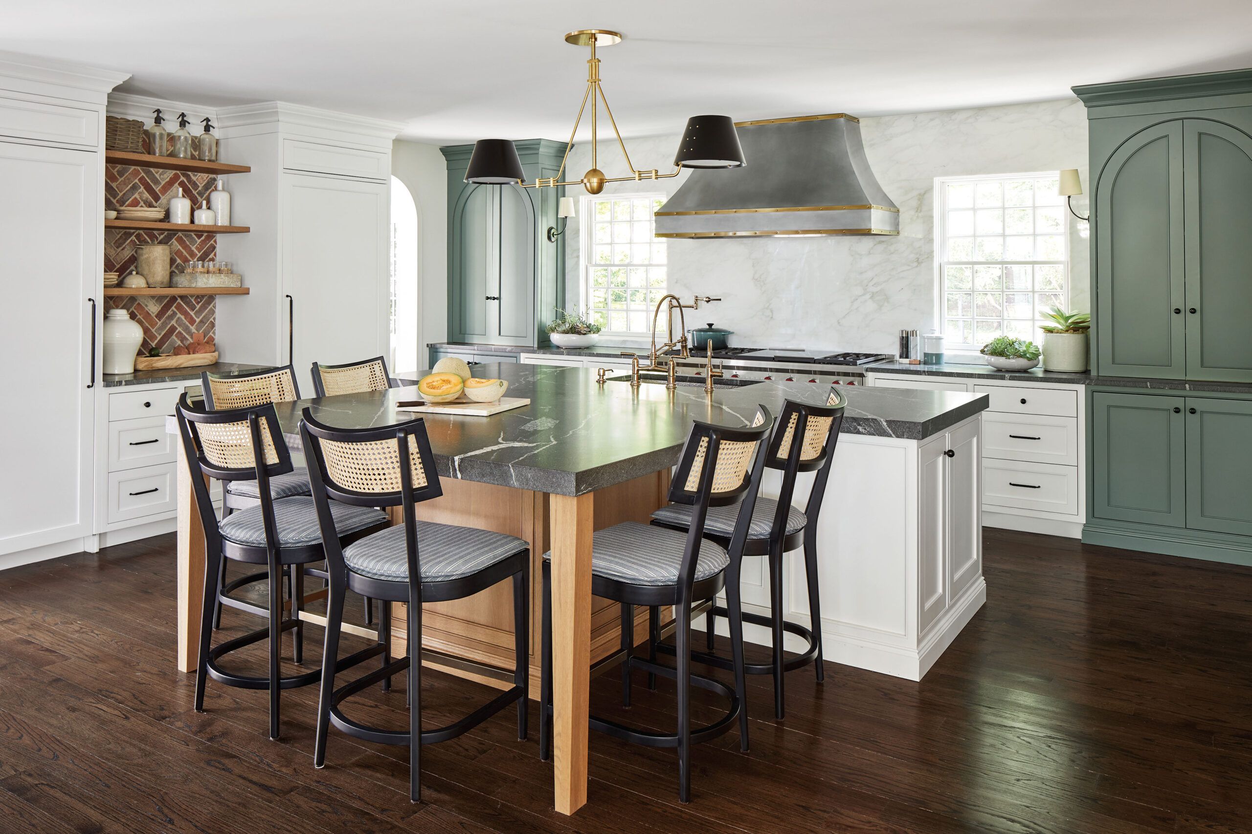
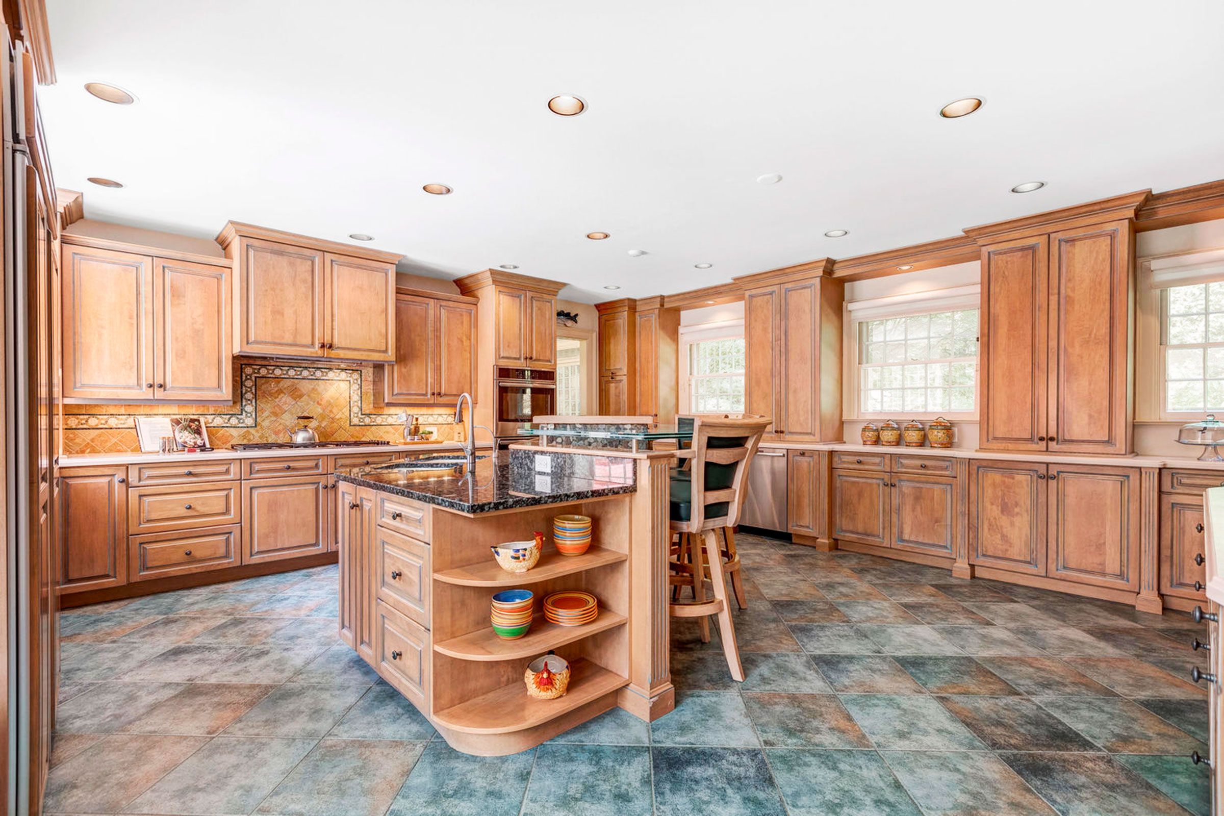


Heather needed an upgraded kitchen with equipment for a serious cook and space for the three kids to gather. She also wanted an open layout that took advantage of the treescape outside. “The old kitchen was stuffy, with lots of cabinets that made it feel closed in,” she says. Carpenter Azzam Ezmat varied the cabinet finishes to keep them from overwhelming the space, while a double pendant, simple sconces, and under cabinet LEDs were added to create more layered lighting.
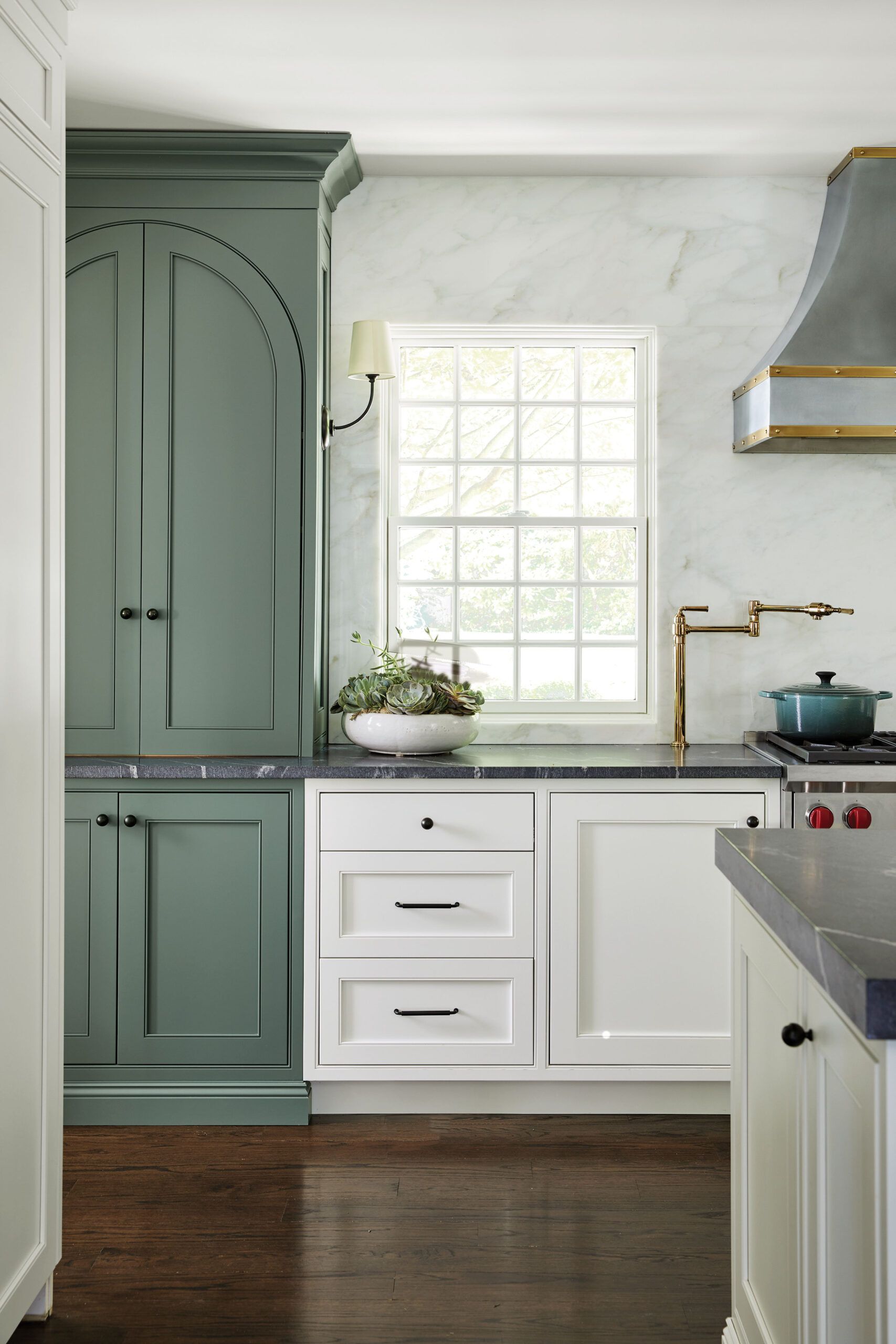
The 15-by-19-foot kitchen features a wall devoted to cooking, with a 60-inch pro-style range under a zinc vent hood trimmed with brass. Granite-topped cabinets store pots and pans, with appliance-lift shelves for an air fryer and a toaster. The island holds the main sink plus a 5-foot-square table section that seats six and is used for homework, snacks, and some meals. A brick niche with open shelves echoes the mudroom floor and sits between separate 36-inch built-in freezer and refrigerator columns. New red oak floors match those in the rest of the house.
A play of colors and textures adds visual interest. Tall blue-green cabinets that echo the arched doorways offer a contrast to the white-marble backsplash and base cabinets; honed-granite countertops and wood floors add deeper tones. A new 12-over-12 double-hung window set into the marble-clad wall provides a view of the trees along the front of the property.
Beauty and the Bath
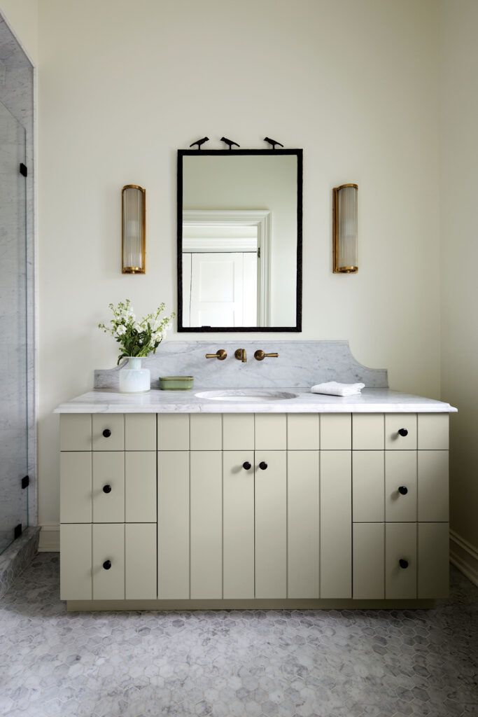
The existing full bath across from the mudroom was gutted and fitted with a walk-in shower for après-swim cleanup. Mike rebuilt the room with a slightly reduced footprint to accommodate a separate laundry closet he located across from it.
The pale-celadon vanity has a marble top and a washstand-style backsplash with curved sides. The three birds crowning the mirror frame are an homage to the three children in residence.
Floor Plan
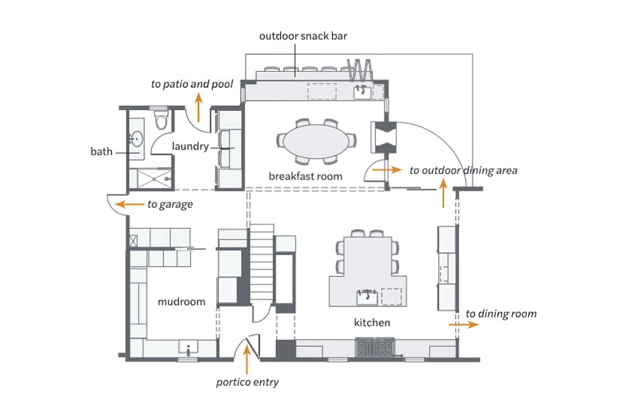
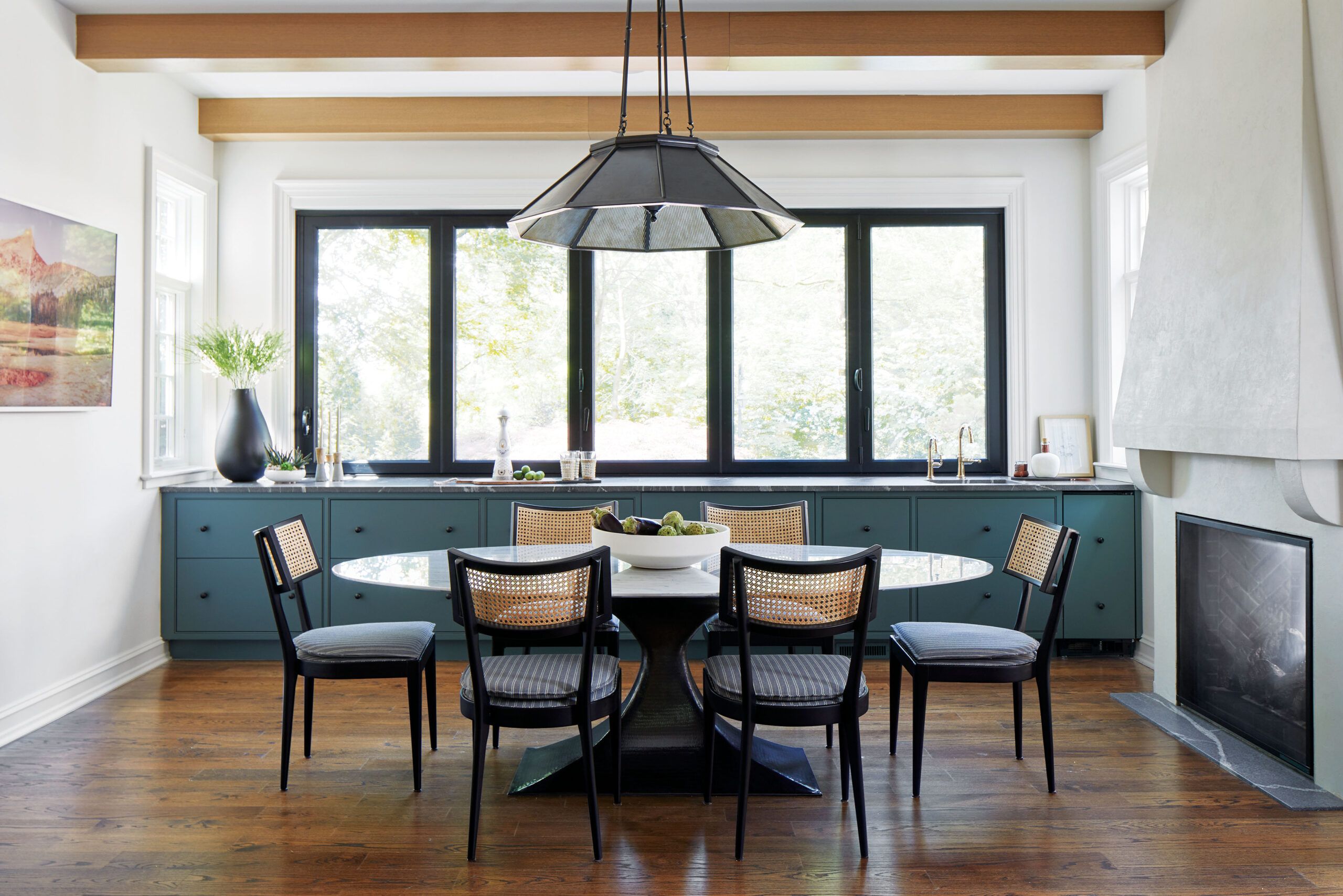
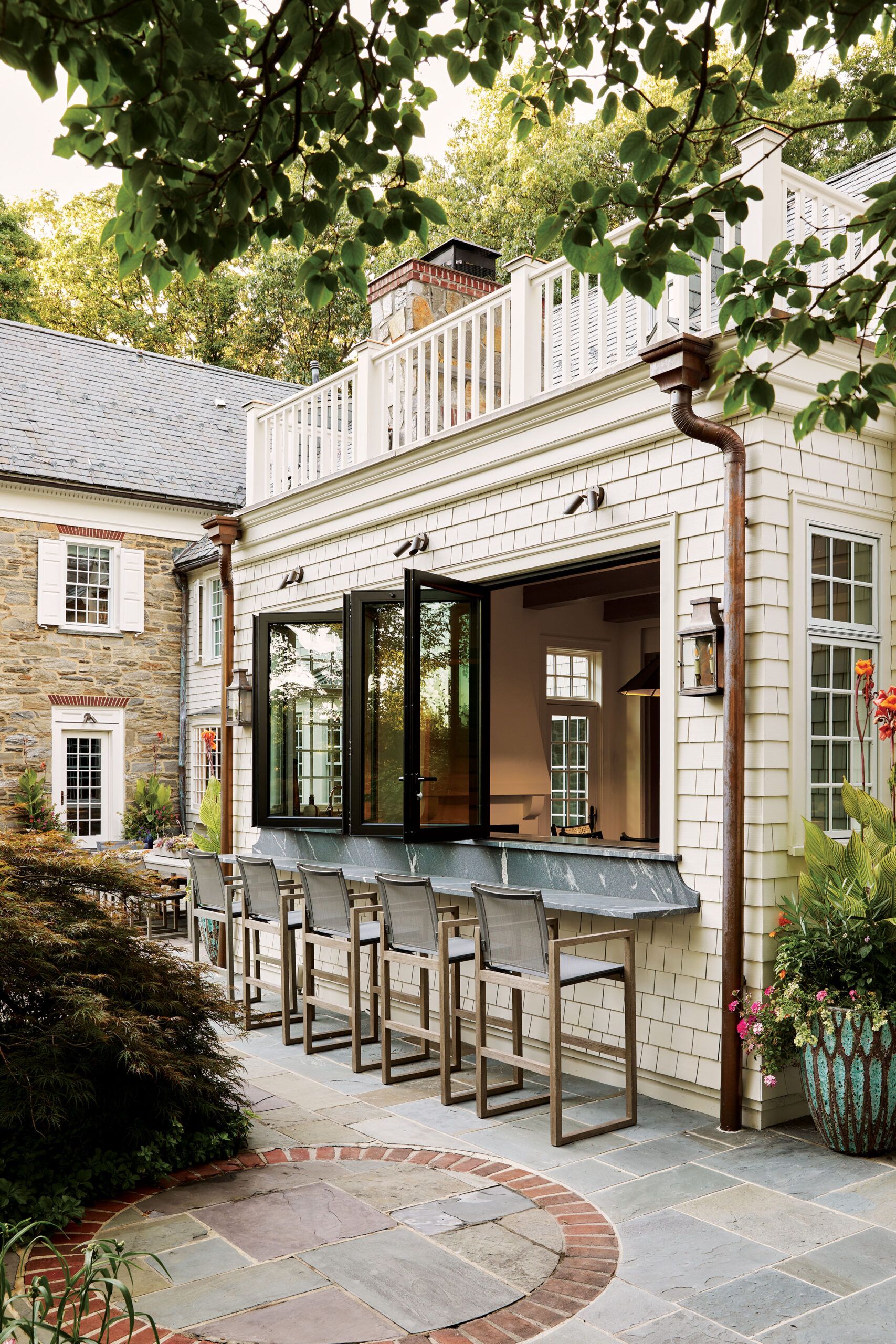
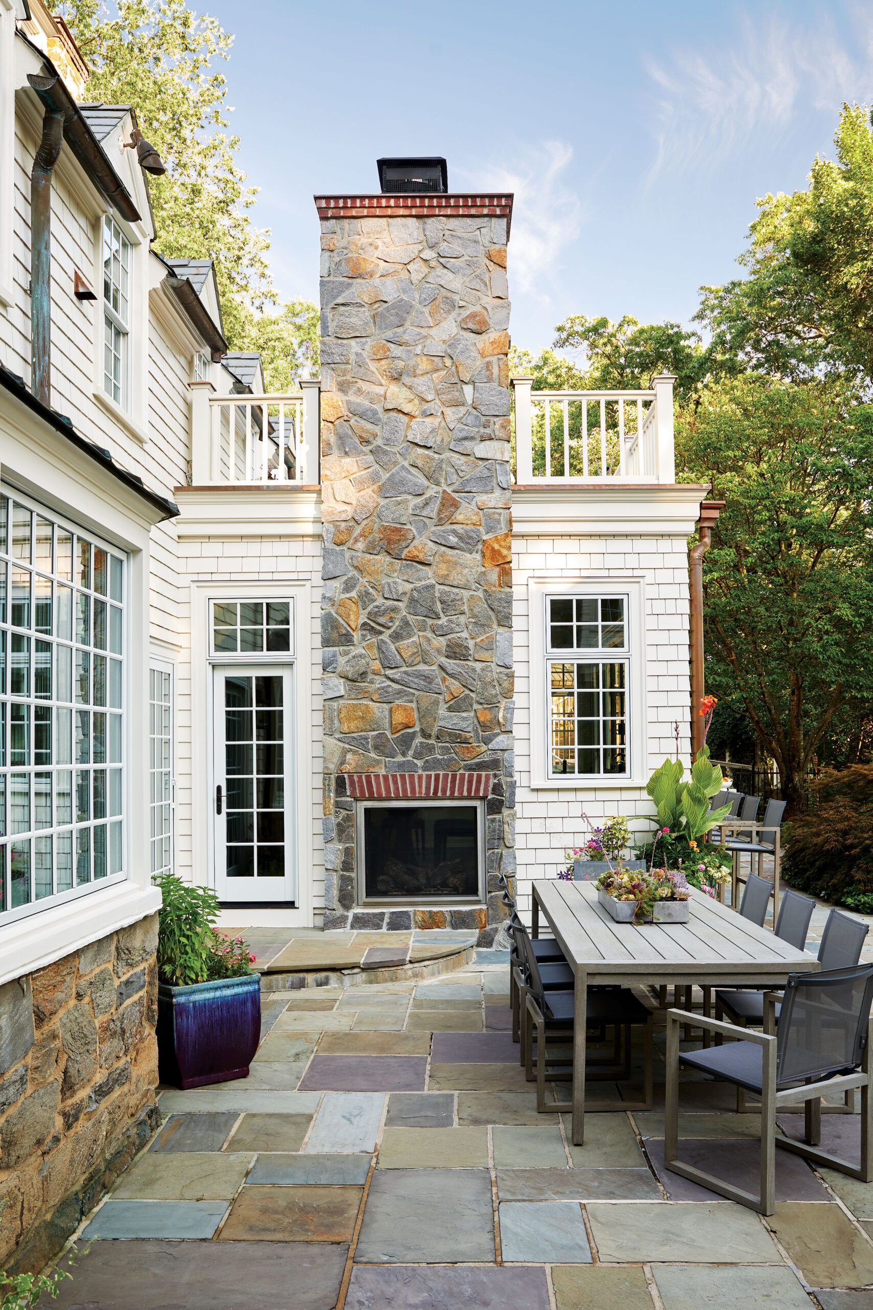
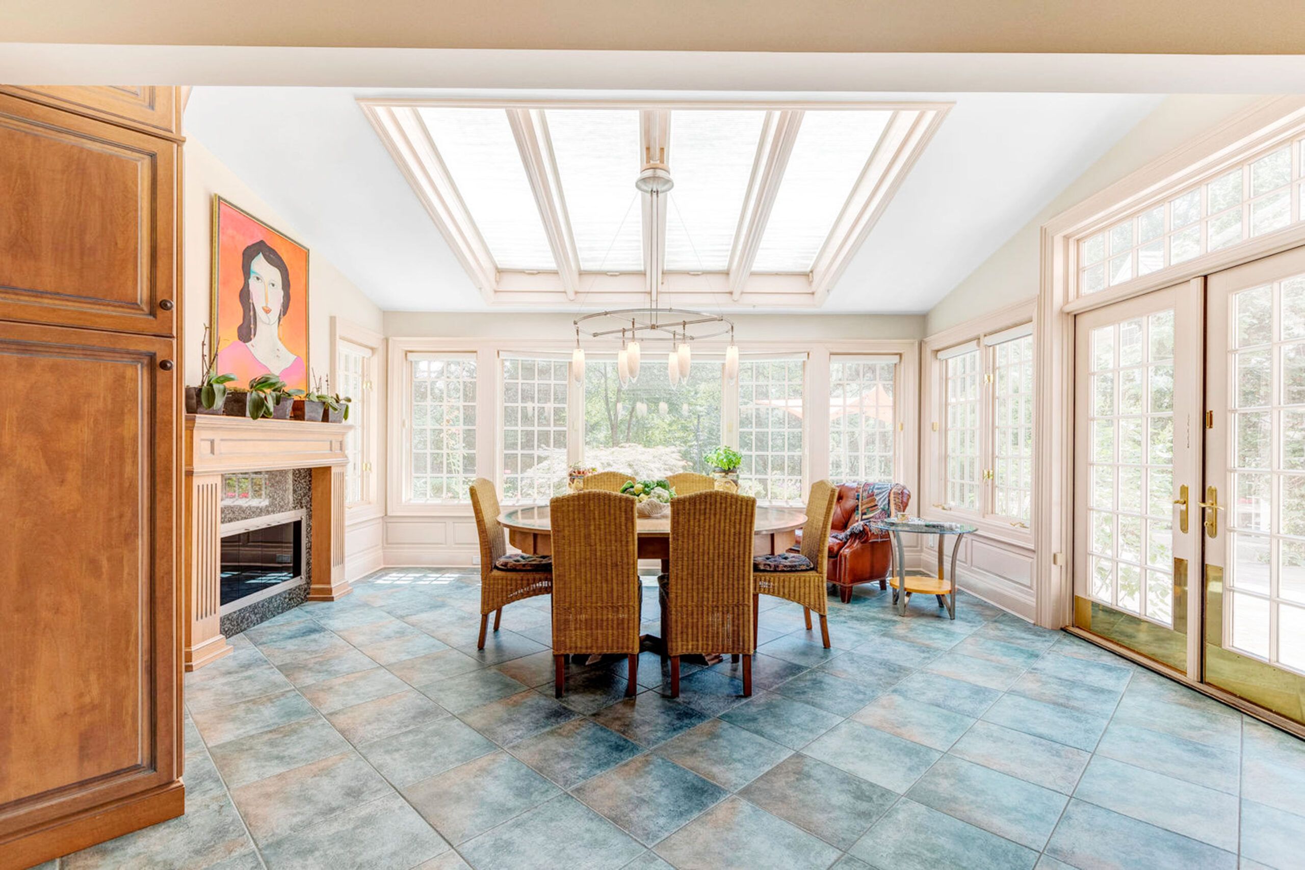
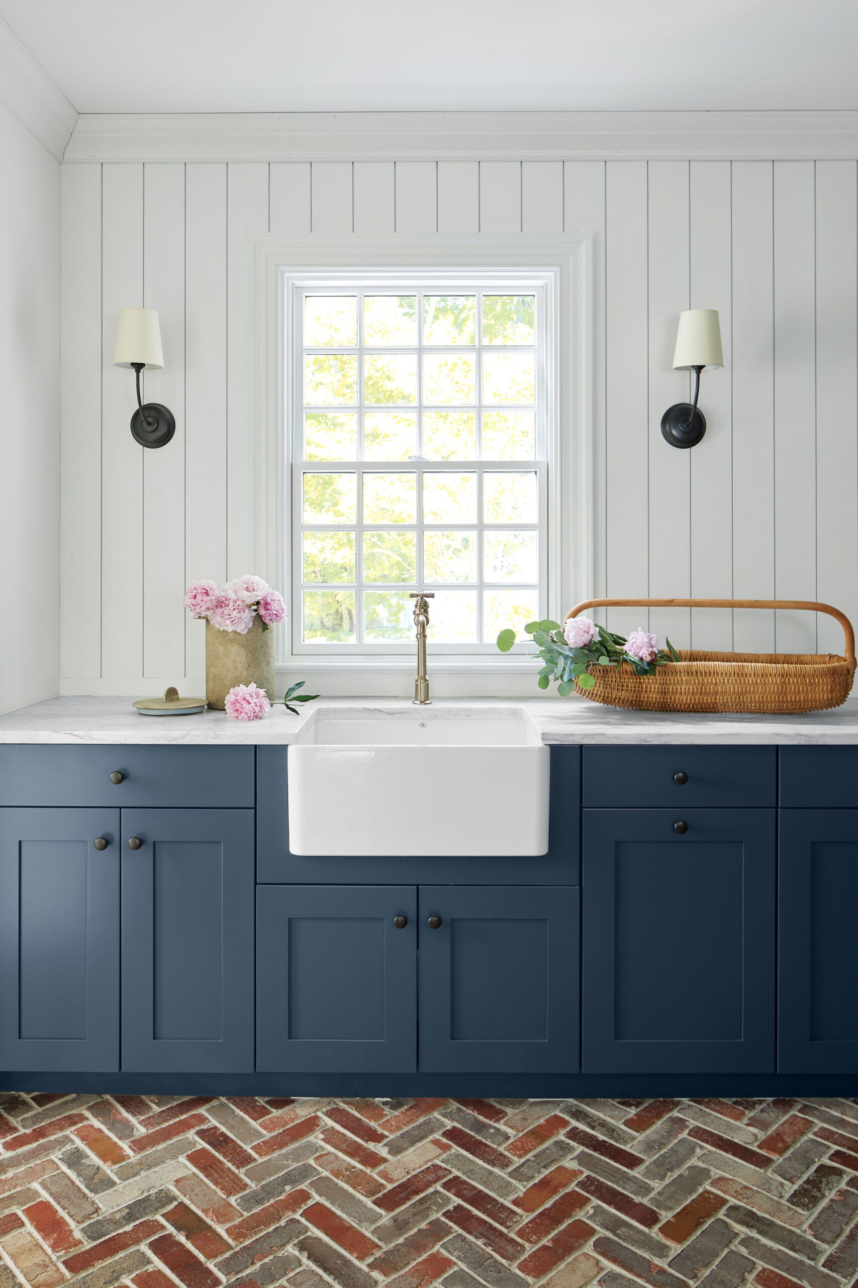
The renovation reworked about 1,000 square feet of existing space, which includes the kitchen, breakfast room, mudroom, bath, and laundry. The mudroom now occupies the former scullery kitchen; the bath ceded some square footage to a new laundry closet that sits across from it. The kitchen’s enlarged island and the breakfast area’s relocated fireplace and wall-to-wall base cabinets—along with a flat ceiling sans skylights— improved those rooms’ proportions, making them more inviting. Replacing a shallow window bay in the breakfast room with a 14-foot-long folding multi-panel window that services a new snack bar enhances the spaces’ indoor-outdoor connection.
Indoor-Outdoor Dining
