This article appeared in the Fall 2023 issue of This Old House Magazine.
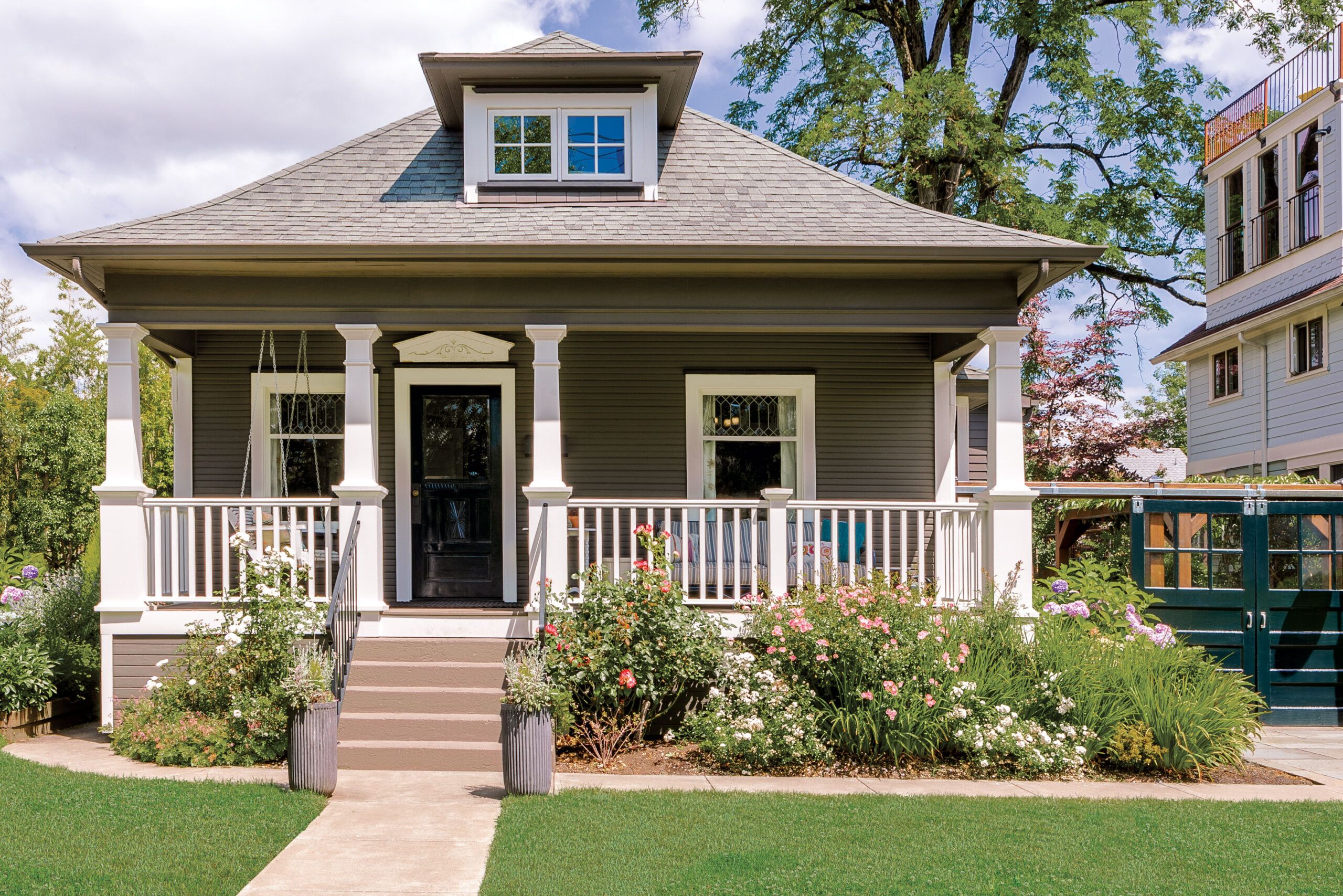
Good things are worth waiting for, and for Kerri Hoyt-Pack of Portland, Oregon, her home is a very good thing indeed. She has spent nearly two decades renovating the 1909 Craftsman, working in stages as funds (and fortitude) allowed.
And with each improvement, she has brought it closer to the vision she had when she first toured the place in 2004. Back then, the options seemed endless and the project daunting. But, she discovered, if you’re patient and pay attention, a house will tell you what it wants to be.
Fortunately, Kerri is a good listener. The house she saw on that initial visit was crying out for help. Although the structure itself was sound, with four square rooms below, two tiny rooms above, and a good-size porch in front, its charms were hidden under blue shag carpeting, linoleum flooring, and boring beige paint. A regrettable bay window in the kitchen overlooked a decrepit garage and enough chain-link fencing to furnish a dog pound.
“But we took another look,” recalls Kerri, who had a husband, Dan, at the time, as well as two young daughters and a limited budget. “There were so many kids on the street, and there was something special about it. I stood in the house and closed my eyes, and I could see it becoming a place I loved.”
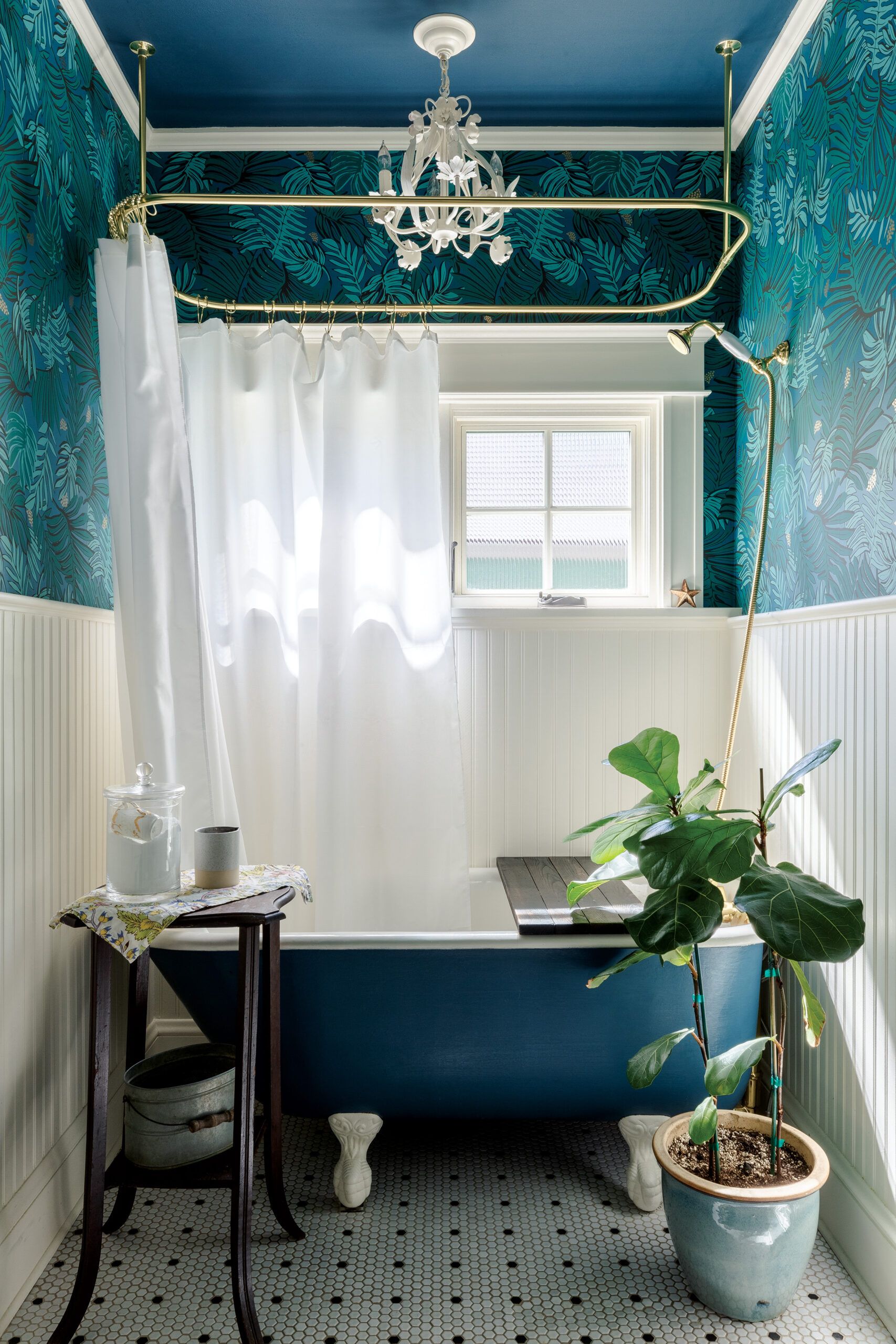
The little two-bedroom, one-bath house just needed cosmetic updates at first to make it habitable. Kerri and Dan tore out the carpeting and linoleum themselves, revealing fir floors, which they had refinished. After moving in, they painted the house inside and out, choosing a brown exterior that still generates compliments from passersby. The one spot that needed more than a surface intervention was the house’s bedraggled bathroom. They added new white hex tile, beadboard paneling, and fresh paint, and they removed a closet on the outside wall to make way for a vintage claw-foot tub—a gift from a friend who was remodeling.
Initial improvements done, the family moved in. Three years later, when Kerri’s employer at the time, Nike, sent the family to China for two years, she and her husband seized the opportunity to expand the house in their absence, commissioning Anne and Richard De Wolf of Arciform, a Portland design-build firm specializing in old houses, to update the electrical, plumbing, and HVAC systems, and create a two-story addition that would more than double the size of the 1,032-square-foot home. Undertaking such a massive project from the other side of the globe wasn’t the easiest feat to pull off, but Kerri returned to Portland periodically for work, and the rest of the time relied on Skype—and her faith in Arciform—to carry then day. “It probably wasn’t the wisest thing,” she concedes in retrospect, “but it ended up great, and we were able to avoid most of the challenges of living through construction with young kids.”
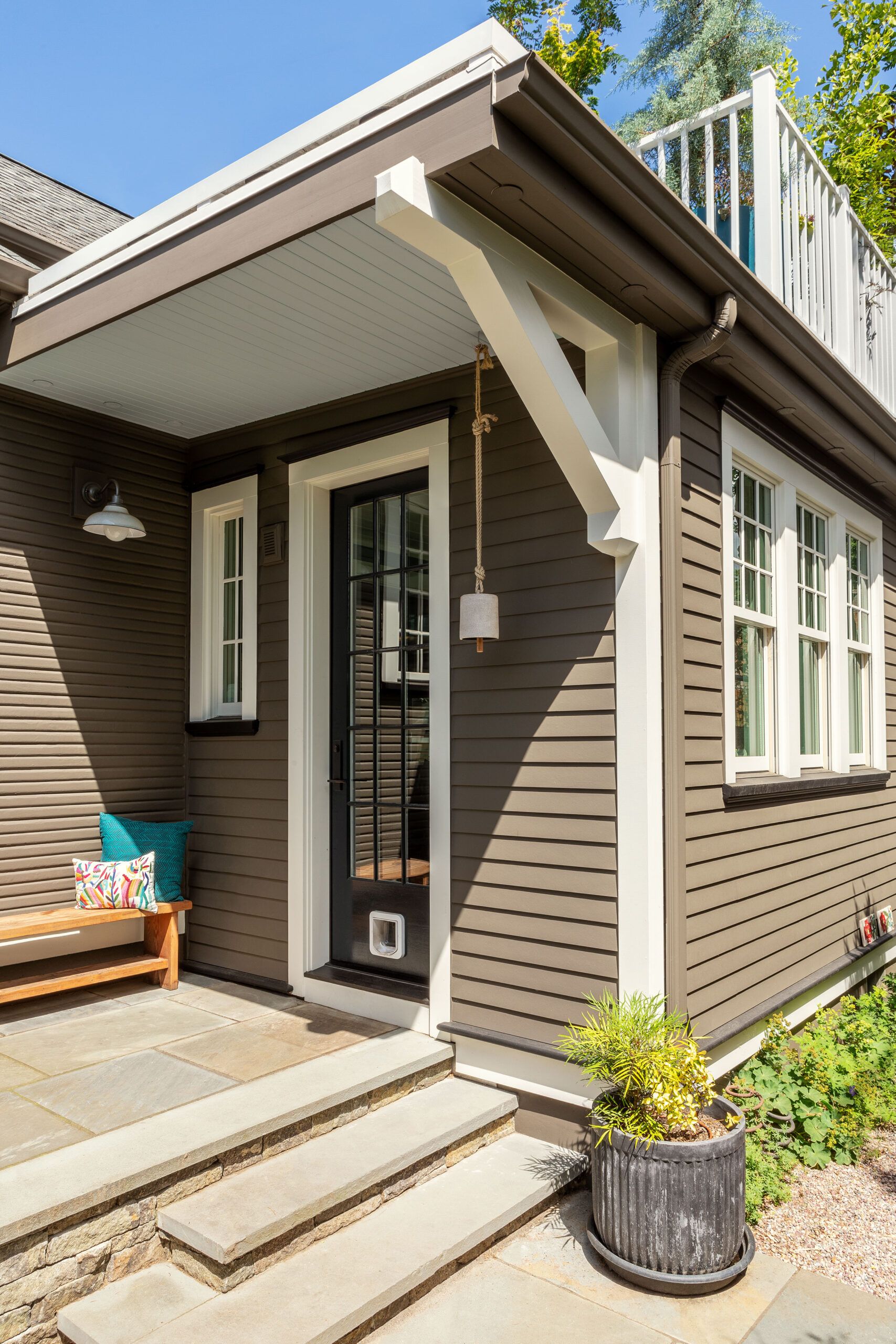
By tearing down the old garage and placing the addition at the rear of the house, Arciform was able to preserve the home’s low-key facade and maintain its scale in relation to the neighboring houses. The addition mimics the form, windows, and details of the original structure, and while an exact match couldn’t be found for the existing novelty siding, the dark paint hides any discrepancies. “The goal was to really respect and honor the character and history of the house, and be able to take it into the future,” Kerri says.
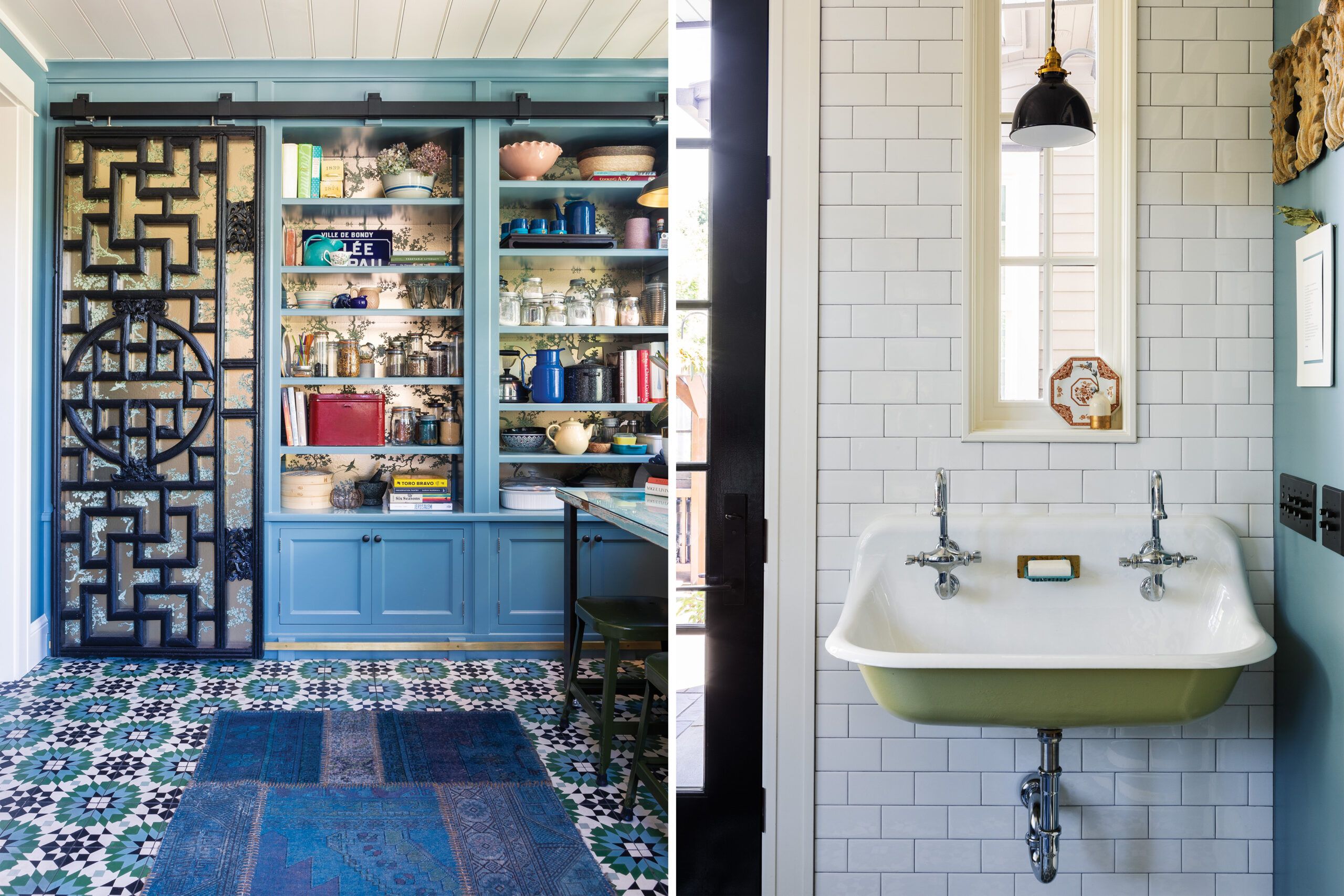
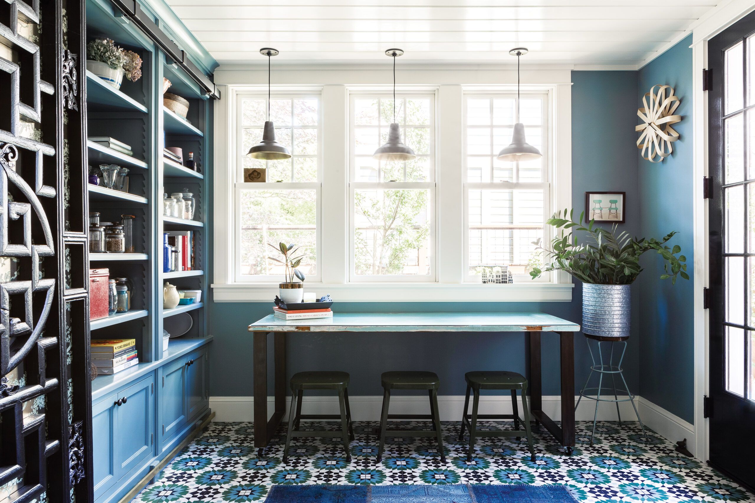
The first floor of the addition held a mudroom, family room, playroom, pantry, and utility area with access to the basement, while the second floor offered a primary bedroom and one and a half baths. Because the original front door opens directly into the living room, the design team took the opportunity to add a secondary entry on the side of the addition that led into a centralized mudroom; that oriented traffic through the house and connected the existing kitchen with the new living areas in back. A generous staircase at one end led to the second floor, replacing narrow, rickety original stairs that used to hem in the kitchen and bisect the rooms above. By making the ascent more gracious, the designers succeeded in making the upstairs feel more like a second level of living space and less like an attic.
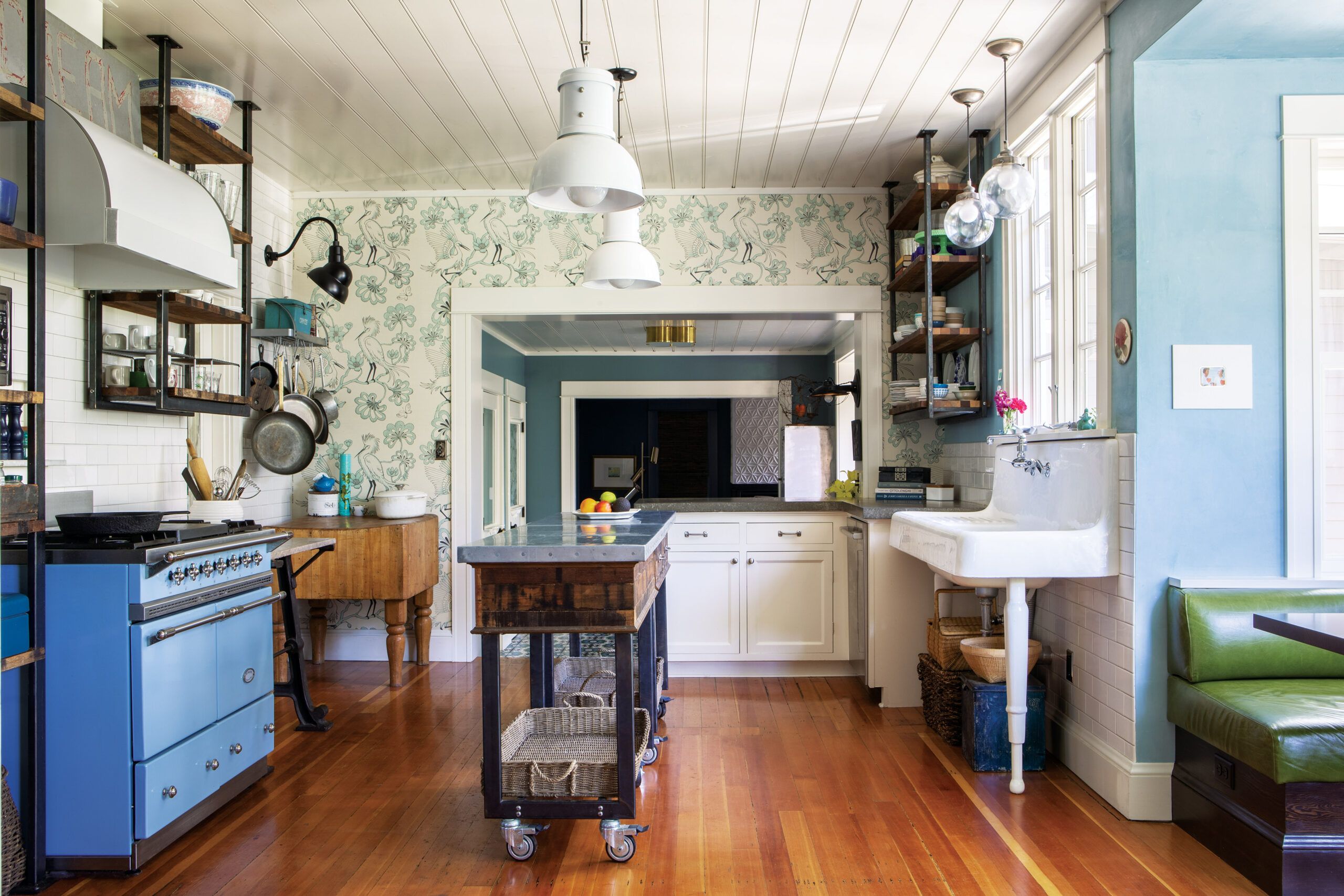
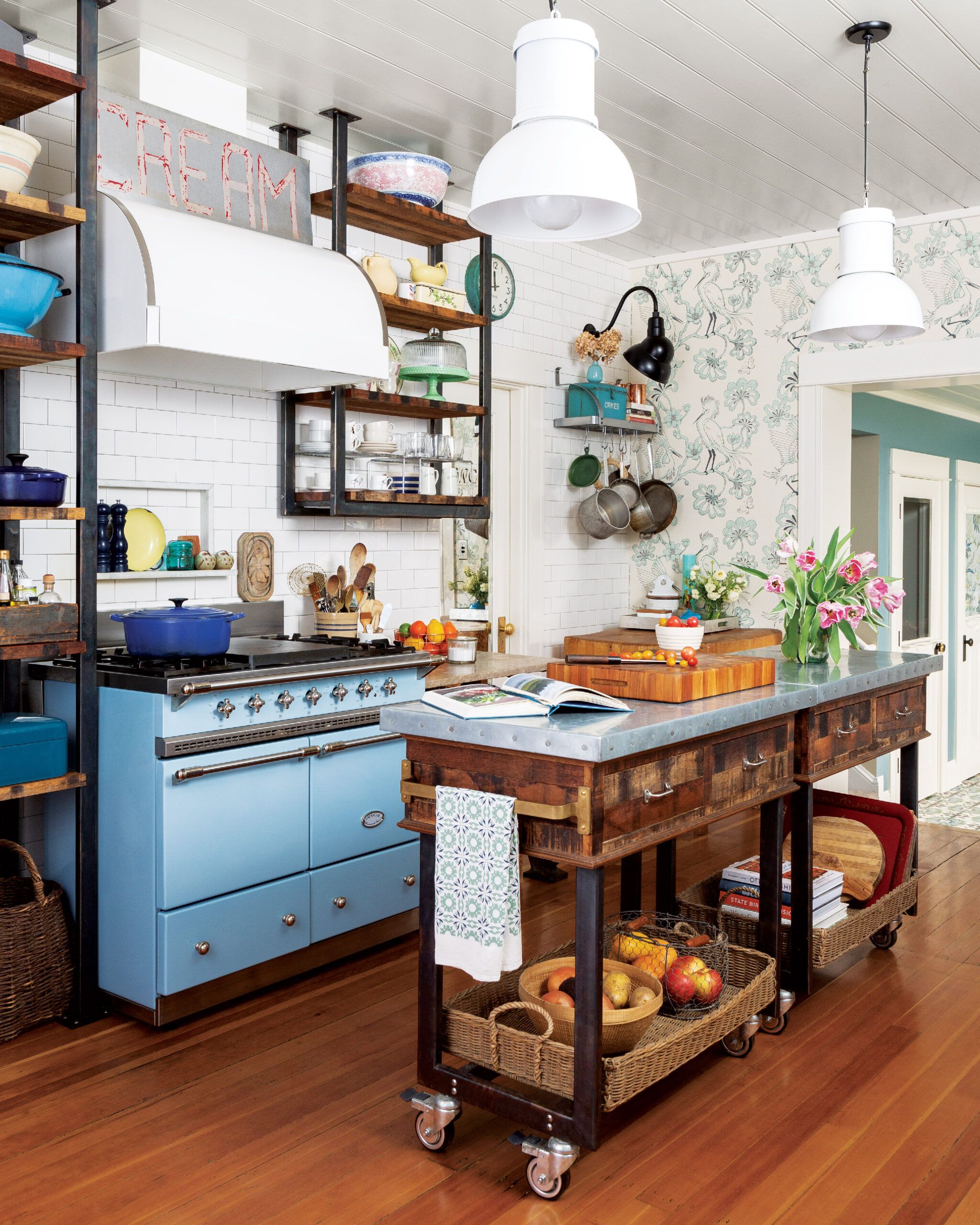
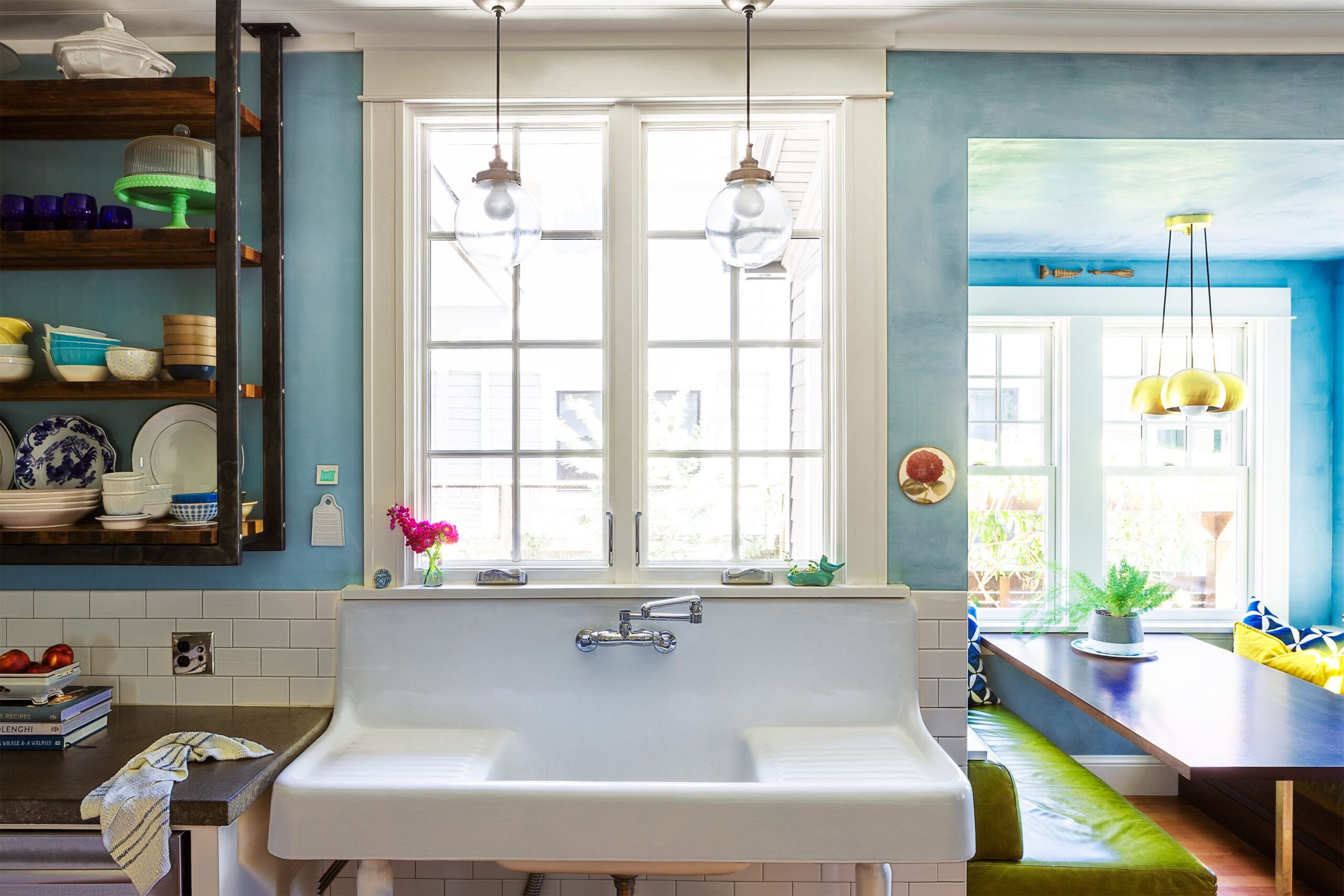
After spending two years in the expanded house, Kerri focused her attention on the kitchen. “If the new connecting space became the nervous system of the house, I wanted the kitchen to be its heart,” she says. Working again with the team at Arciform, she gutted the space and widened the passageway to the front dining room. When a conventional kitchen proved to be too expensive, Kerri opted to go the unfitted route, mixing stand-alone period-style pieces like a porcelain console sink and a salvaged butcher-block table o wheels with industrial elements such as factory lights and open iron-and-wood shelving that she had made. Even the pale-blue Lacanche range was left freestanding, offering a homey antidote to today’s surgically sleek cook spaces.
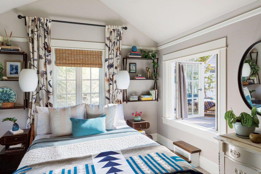
The existing dormers were previous additions that didn’t match the rest of the house, so Kerri redid them in 2013 and rebuilt the structurally unsound front porch, replacing its ill-fitting columns with tapered ones that felt more authentically Craftsman. Three years later, divorced and with her daughters preparing to leave the nest, she launched another project that resonated withher more personally. “That was when I really embarked on the job of creating a house that was mine,” Kerri says. She bumped out one wall of the kitchen to create a sunny, booth-style breakfast nook with upholstered leather banquettes flanking a custom table, which instantly became one of her favorite spots in the house. She also bumped out the mudroom, doubling its size, turning one wall into a storage pantry, and adding a hand-washing sink. Arciform also added a roof deck on top of the new space, which Kerri accesses through a window in her bedroom.
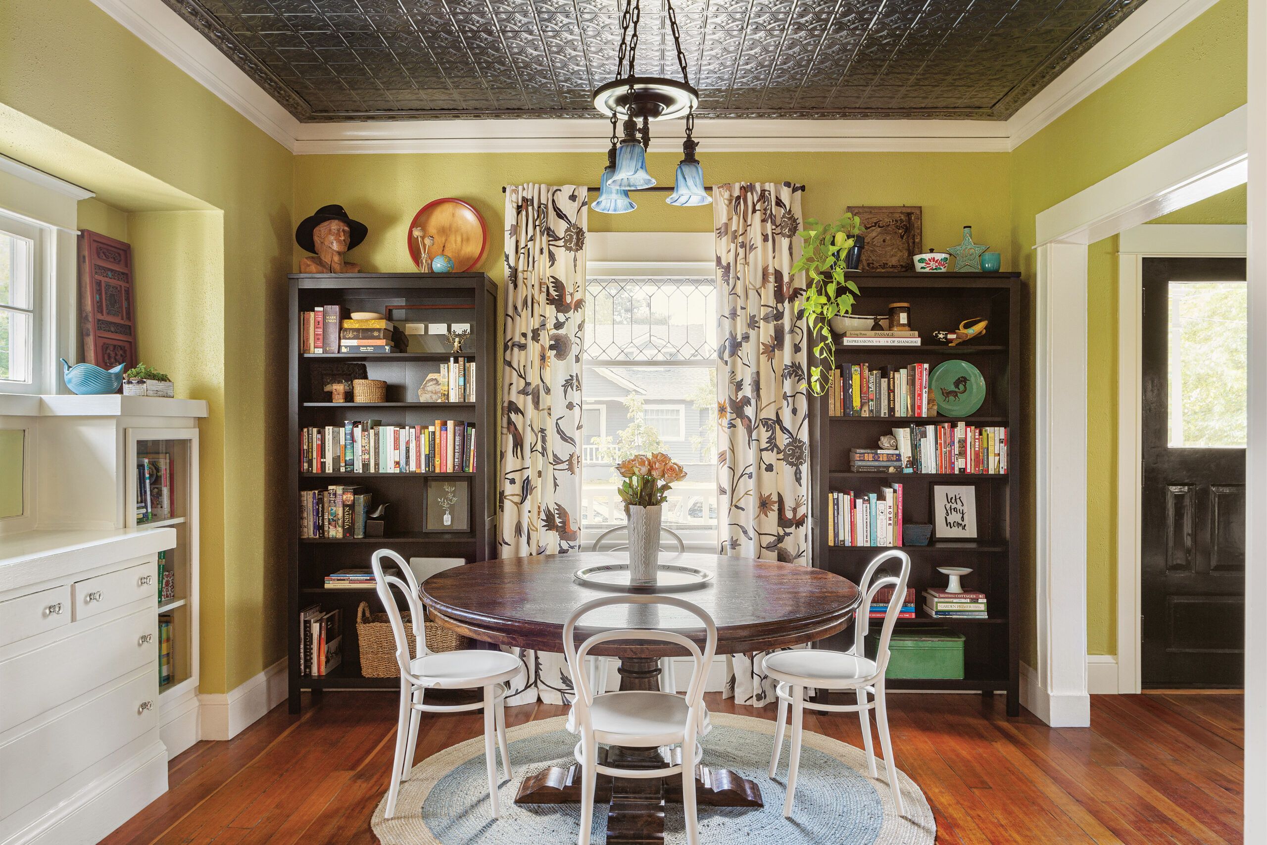
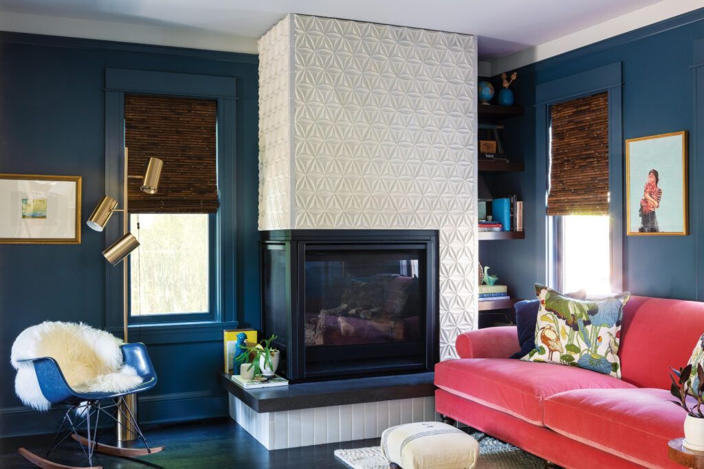
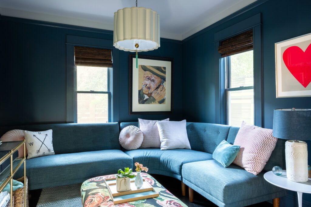
Most recently, she moved the laundry to a loset on the second floor, remodeled the former half bath and added a shower, and tucked a ducted mini-split system into a neighboring knee wall to moderate temperatures in the sunny front part of the second floor. Downstairs, she united the family room and the old playroom, which are separated by a cased opening, with a deep midnight blue. “The painters thought I was crazy, but it’s cool in summer and cozy in winter,” she says—especially with the addition of a gas fireplace. She was no less bold making over the living room and dining room, which she painted an eye-popping yellow-green, a color that goes remarkably well with the warm fir floors and new pressed-tin ceiling.
Remodeling a home over time has its advantages, acknowledges Arciform project manager Joe McAlester. While you’ll pay to mobilize a crew and equipment with each phase, and materials and labor costs will increase over the years, he figures those factors might add only 5 or 10 percent to your overall cost. “It can work for the client’s budget,” he concedes, “and might offer the chance to modify plans as their needs and family situations change.”
That was certainly the case here. “My life changed a lot,” Kerri says, looking back at nearly 20 years of home ownership. “My kids grew, I split up with my husband, I repartnered. So the house has had to morph and change with me.” Although Kerri can’t think of anything she’s wanting to update right now, who knows what the future will bring. The house might have its own opinions. And if it does, she’ll be listening.
Renovation Recap

- THE HOMEOWNER: Kerri Hoyt-Pack runs her own leadership-development practice and shares her home with her partner, Neal Bridgnell, a high-school chemistry teacher.
- THE HOUSE: Built in 1909 and set on a 44-by-100-foot lot, the two-bedroom, one-bath home offered classic Craftsman looks but limited space.
- WHY SHE CHOSE IT: The house was well priced and located in a great area, near friends and with plenty of kids for Kerri and her then-husband’s two daughters to play with. After a modest refresh, they could live there until they were ready to tackle more substantial changes.
- WHAT SHE DID: Remodeled in stages over nearly two decades. Initially, removed a closet to enlarge the one bath and redid surfaces. Then upgraded systems and built a two-story addition with a family room, playroom, and mudroom downstairs and a primary suite and hall bath above. Later, renovated the kitchen and porch. Bumped out a dining a nook and mudroom addition. Moved the laundry upstairs; added outdoor spaces.
- LESSONS LEARNED: As Kerri’s life changed over the years, she altered the house to reflect those changes while always respecting its character. Her advice: “Trust your instincts. Listen to people, but also be patient. Allow the house to tell you what it needs. Give yourself time to grow along with it.”
An Urban Outdoor Oasis
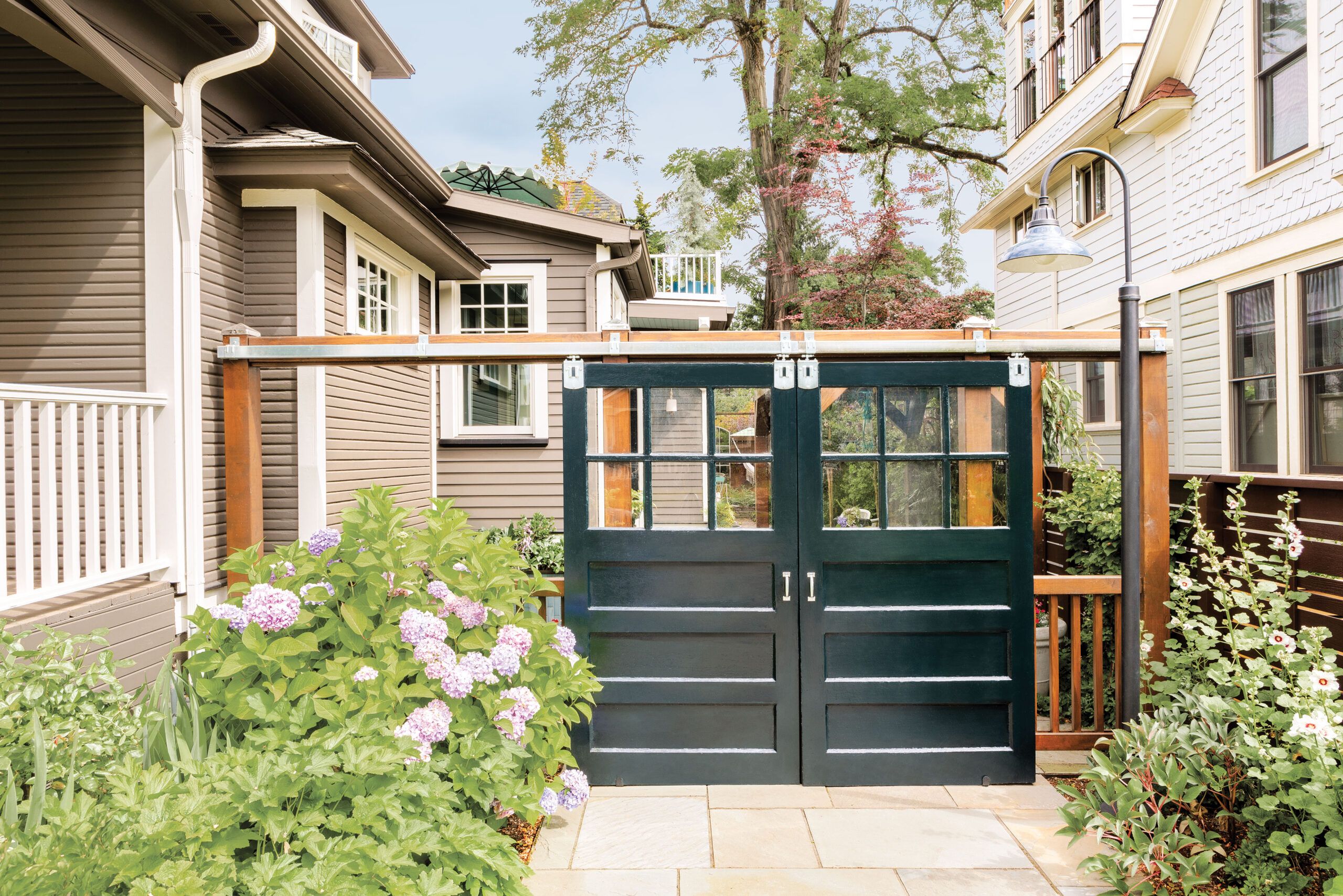
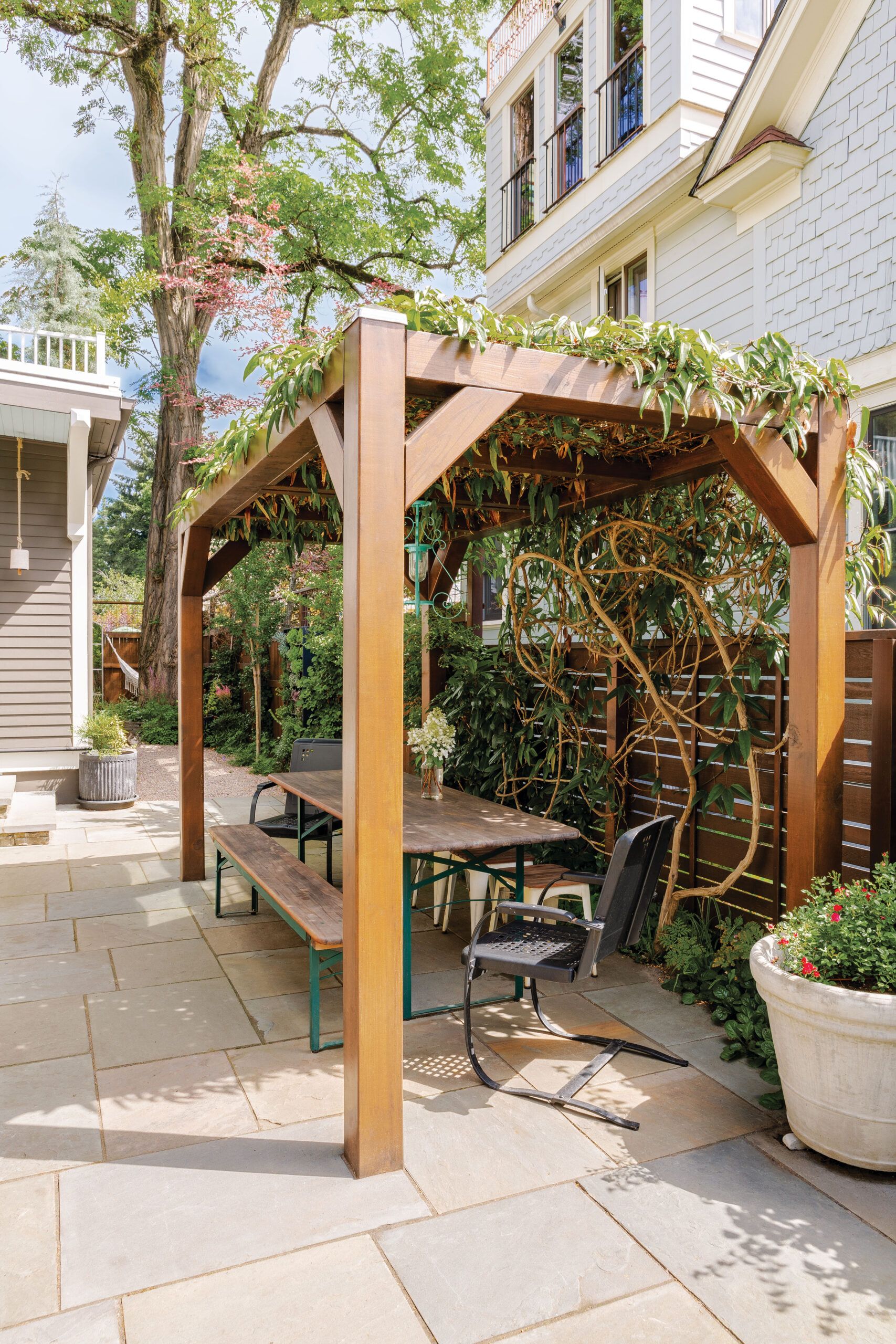


With a lot just measuring 1/10 acre and a rear addition that extends nearly to the property line, outdoor living space was at a premium for city dweller Kerri Hoyt-Pack. So to make the most of what was there, she and the design-build team at Arciform transformed the back part of her driveway into a courtyard. They kept the concrete driveway in front, where Kerri parks her car, but paved the rear portion, which extends to the back fence, in bluestone. Four cedar posts support a beam that spans the driveway courtyard and holds a track for two barn-style sliding doors, which provide a sense of enclosure and a modicum of privacy when Kerri entertains. A pergola draped with clematis stands off to the side of the paved area, sheltering a dining table with a chandelier overhead.
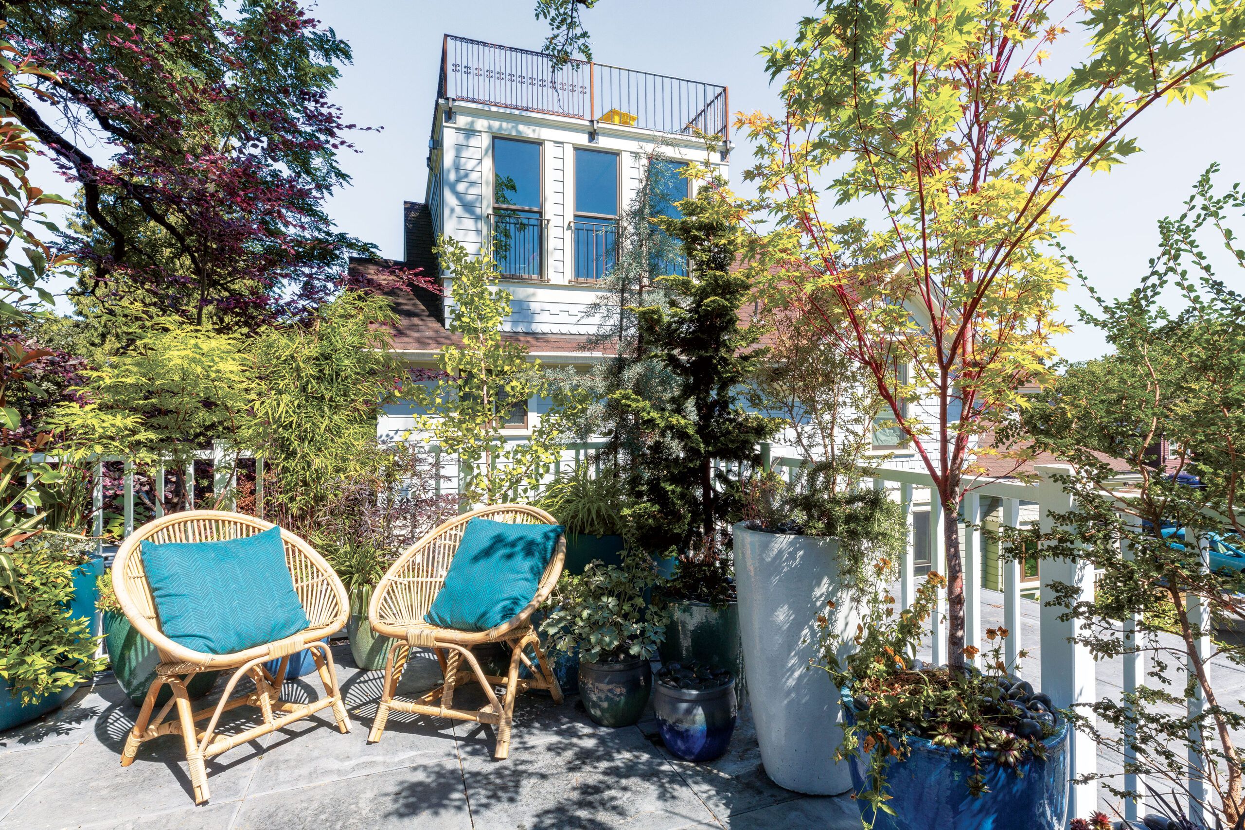
Overlooking all of this is a roof deck, which Kerri accesses by stepping through a window in the primary bedroom. Built on top of the second mudroom addition, it’s lined with a jungle of potted trees and plants, offering a lush, private retreat from the world. The spaces may be small, but the open-air respite they offer is invaluable. “The outdoor living areas are like the rest of the house,” Kerri says. “They’re not big spaces, but they’re all thoughtful.”
Floorplans
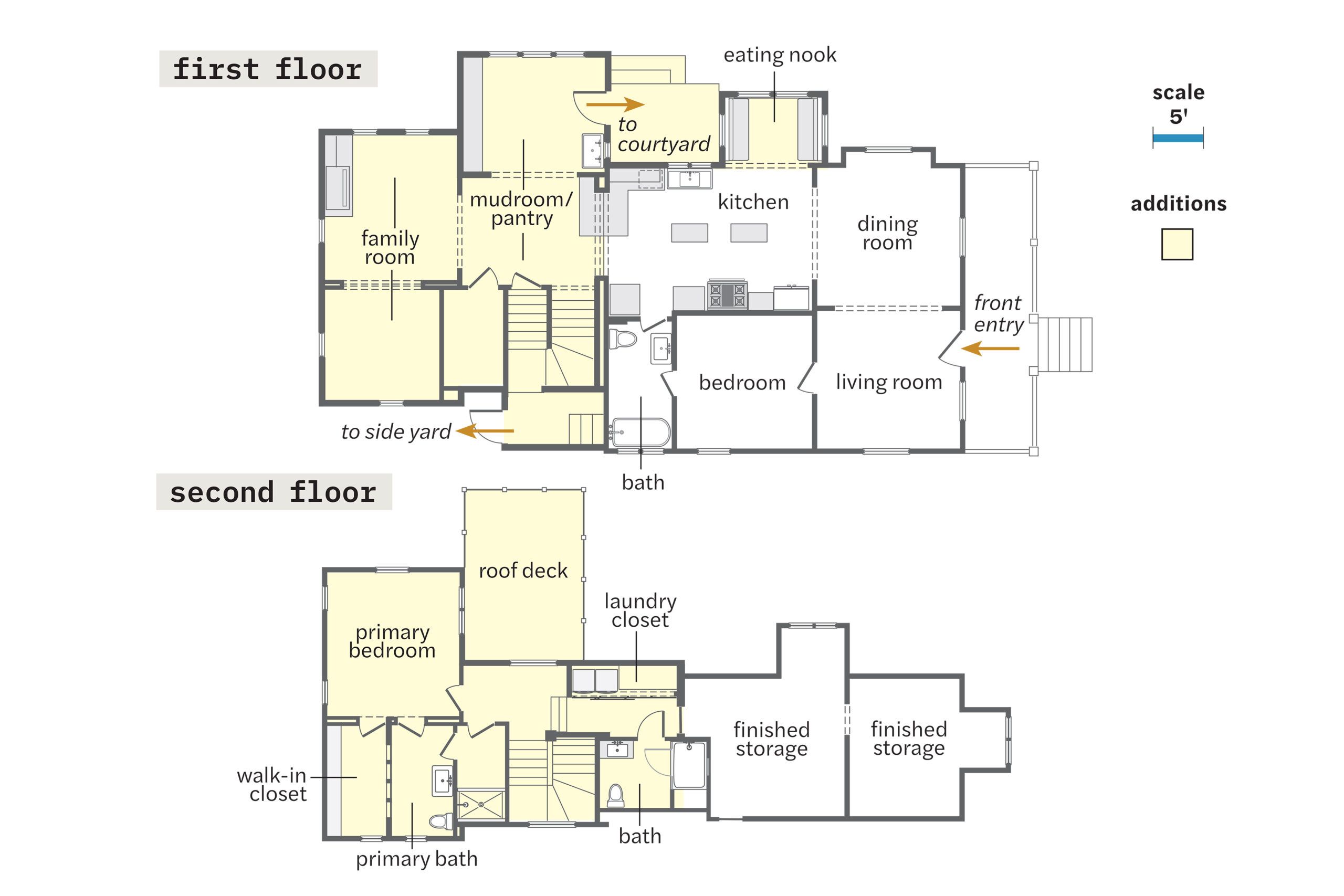
On the first floor, the dining room, living room, bedroom, and bath remain from the original 1,032-square-foot house, as do the storage rooms above. The kitchen expanded with the demolition of the original staircase and the addition of a banquette alcove. A rear addition increased the living area to 2,083 square feet; it made room for a mudroom (later doubled in size) and a family room and playroom (now used as one living space), as well as a new staircase to the second-floor primary suite and walk-in closet, plus a hall bath and laundry closet. The two front rooms on the second floor are finished storage.
