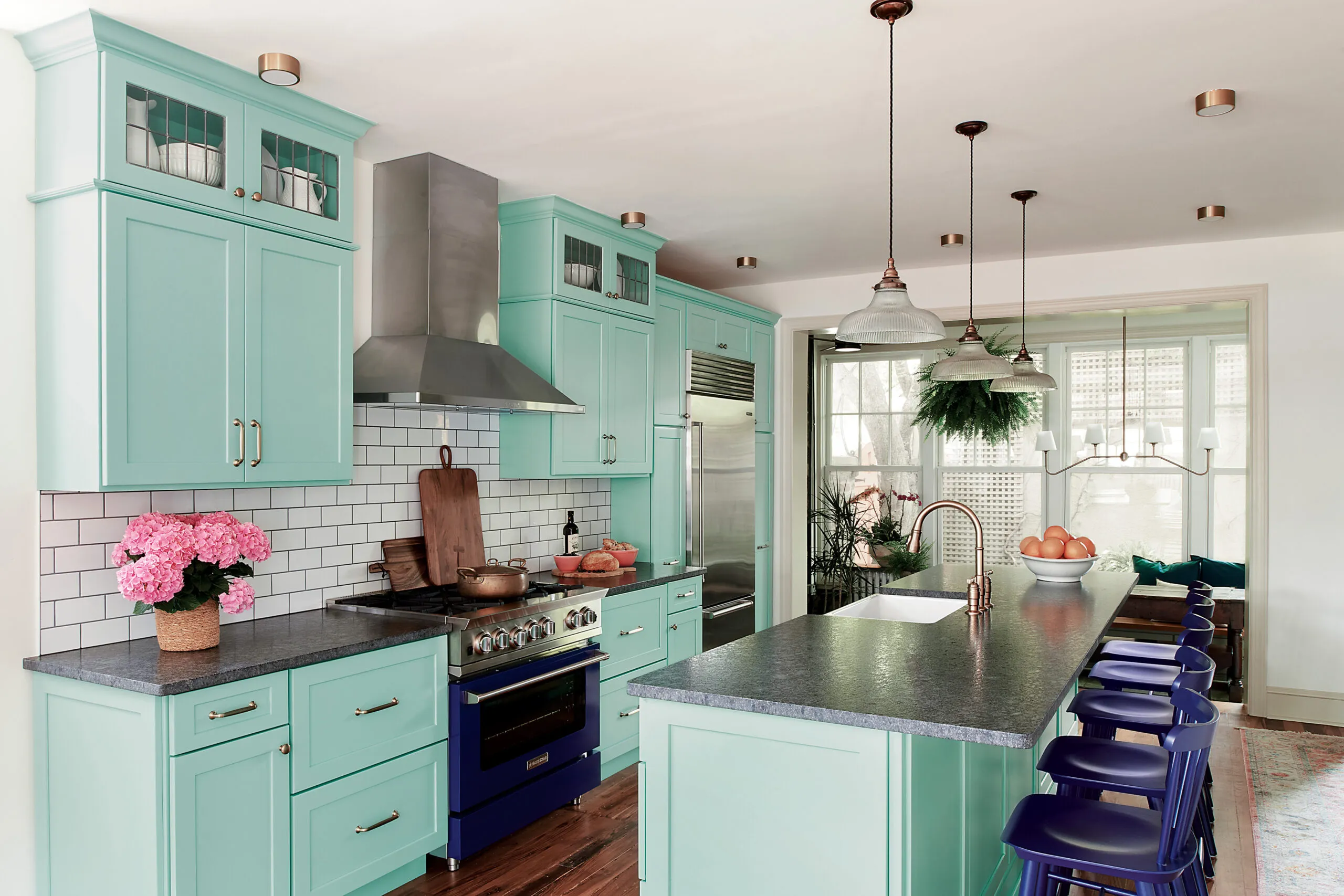
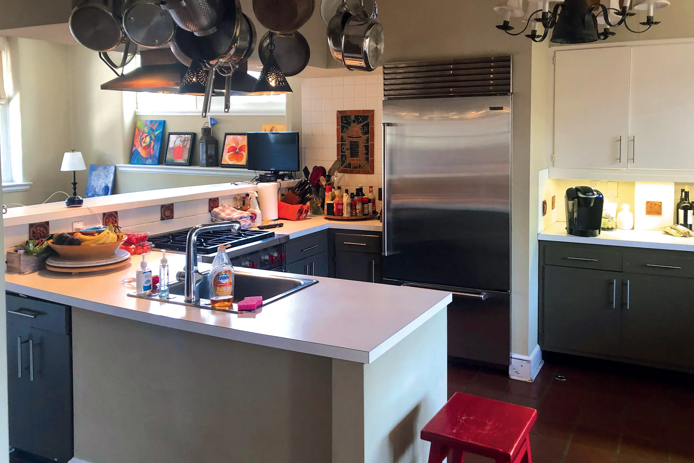
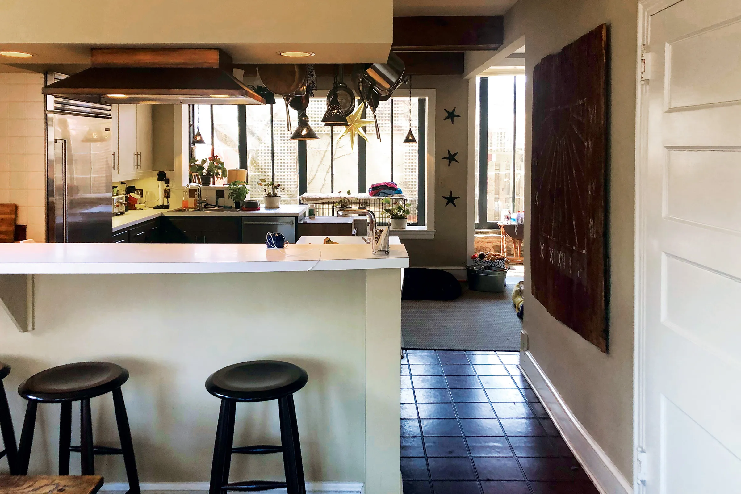
Even a big kitchen doesn’t feel welcoming if it’s just plain dull. So when Philadelphia homeowners Marshall and Jenn Schwartz were ready to fix floor-plan flaws in the cook space of their 1890 stone Colonial Revival, they wanted a big change. “The kitchen’s choppy flow meant we could only use about a third of it,” Jenn says. “And it looked dingy, not our style at all—we love color!”
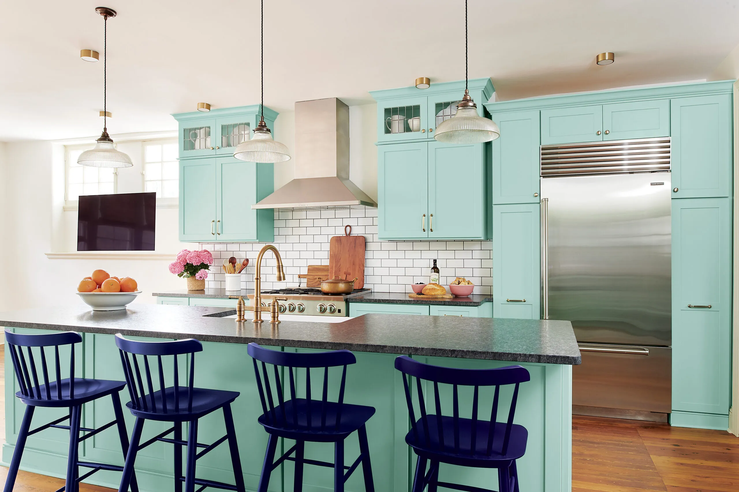
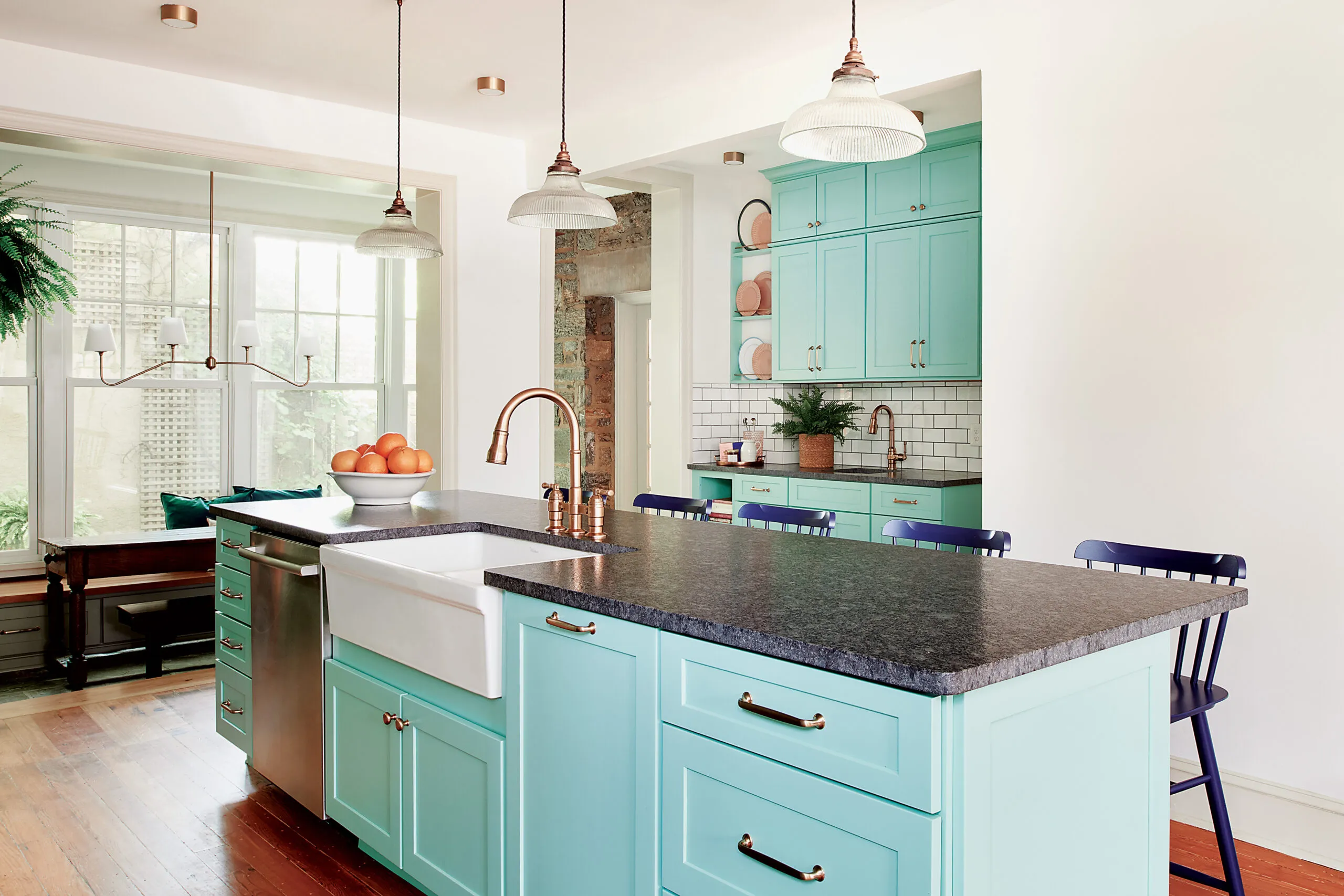
So Airy Kitchens creative director Sean Lewis eliminated a confining U-shaped work zone that cut off access to a sitting area at one end and an enclosed porch at the other. Then, he created an open-ended galley with a 4-foot-wide corridor; the range and fridge sit along the wall with a more-than-10-foot-long island holding the main sink and dishwasher across from it. Removing soffits made space for ceiling-high cabinetry—in an eye-catching mint green.
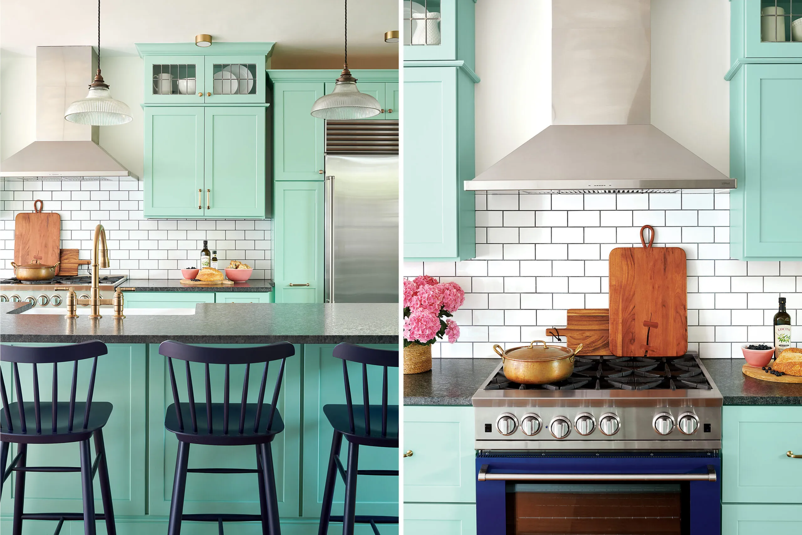
“The renovation gave us great flow and two unobstructed linear work zones that keep us from running into each other,” Jenn says. “The space is unique and inviting, yet fits with our old house. Quite simply, it feels like us!”
What They Did
A peninsula on one side of the cooking zone and a half wall on the other hemmed in the 275-square-foot kitchen.
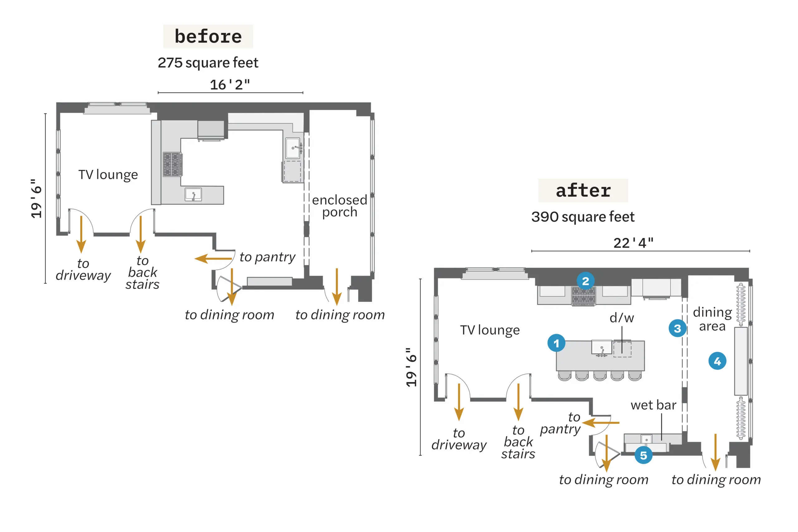
- Demolished the peninsula, where the range and prep sink had been, opening the cook space to the adjacent TV lounge.
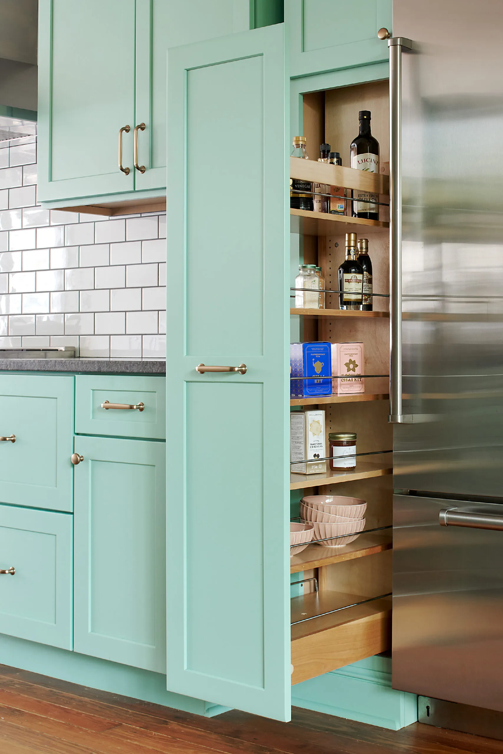
- Put the range on the wall where the refrigerator had been, shifting the fridge to the right and flanking it with tall pantries.
- Removed the half wall, placing the main sink and dishwasher in an island just over10 feet long and 3 feet wide, creating a 4-foot work aisle on one side and an eating area on the other.
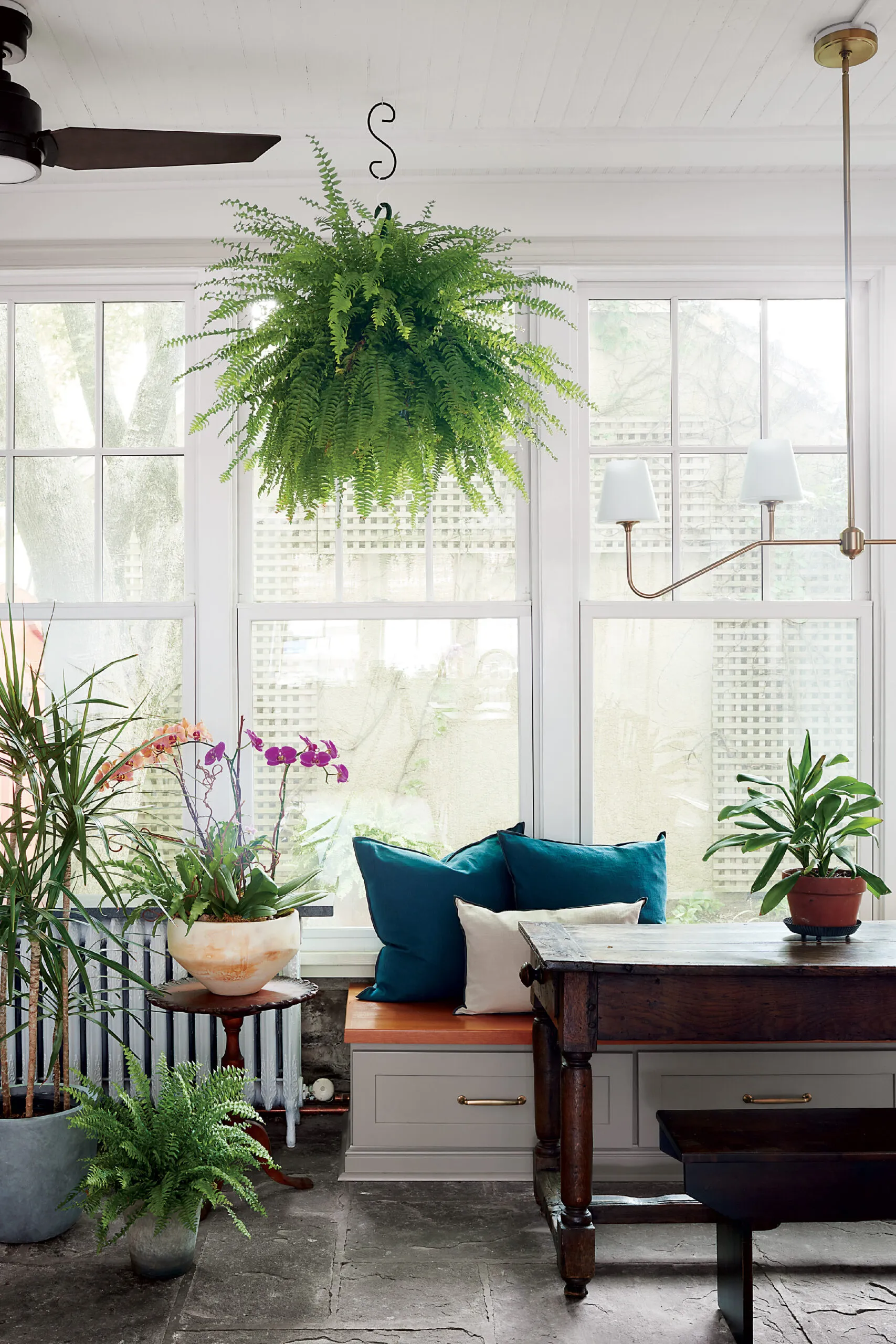
- Turned the 115-square-foot enclosed porch into a dining area, rebuilding the exterior wall with new windows and adding a built-in bench (relocating radiators at either end), plus a table with a freestanding bench.
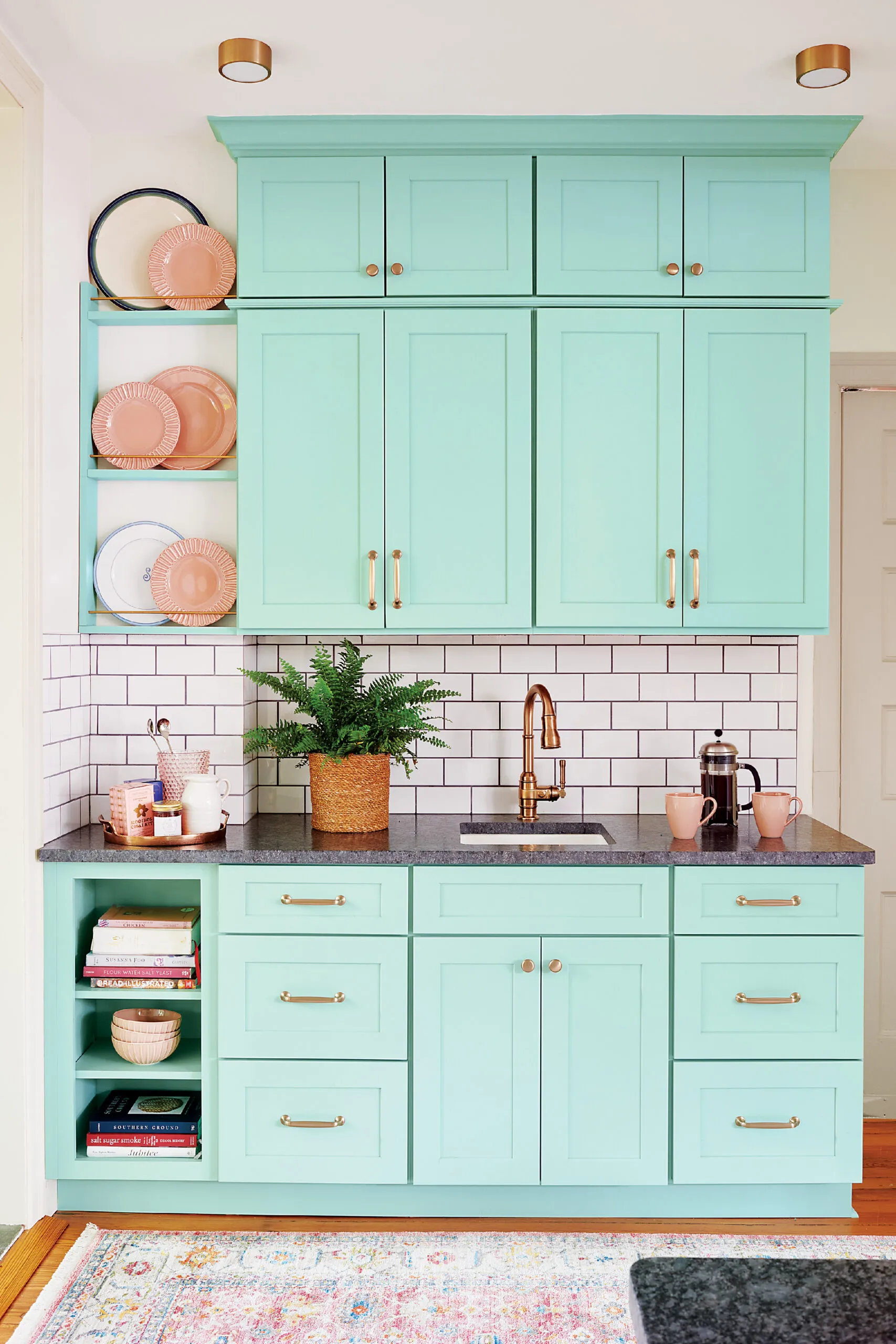
- Built in a wet bar with upper and lower cabinets and open shelving in the alcove leading into the dining room.
Tips for Using Color in the Kitchen
Incorporating a fresh new hue or two is a balancing act, says designer Sean Lewis. Here, he shares his secrets for successfully using color in the kitchen.
Use a rendering program to help bring the design to life.
“It’s easy to fall in love with colors—patterns and materials, too—but a good designer will employ one of these computer-graphics programs to show clients exactly how the proposed elements will look in their space, in a 3D model. It’s like clothing: You never know how pieces of an outfit will look until you put them on together.”
Vivid shades feel at home in a vintage kitchen.
“In older homes the kitchen often had a piece of furniture, such as a hutch, that was painted in a saturated shade. What’s more, on a psychological level, people often find that bright or strong colors feel more vintage than grayed-out or subtle tones because of our long-term familiarity with them. We started learning about bold colors in kindergarten.”
Work in some wood to boost your comfort level.
“Whenever we’re designing a kitchen with painted cabinets, we try to include natural wood somewhere—on the floor, with floating shelves—to add some extra warmth. Plus, the honey tones in wood, already present in many older homes, look especially good with cool greens and blues—timeless colors that also happen to be on-trend right now.”
Keep it all in the family.
“When trying to find secondary colors to complement the main color, stay with related shades. Feel free to vary the intensity, however—in this kitchen the blue-green cabinets have an almost pastel vibe while the cobalt stove and stools are dark and rich. My own kitchen has olive-green cabinets with yellow-green trim and a blue-green slate floor— they look great together!
