Spanish Revival Style: Rich with Detail
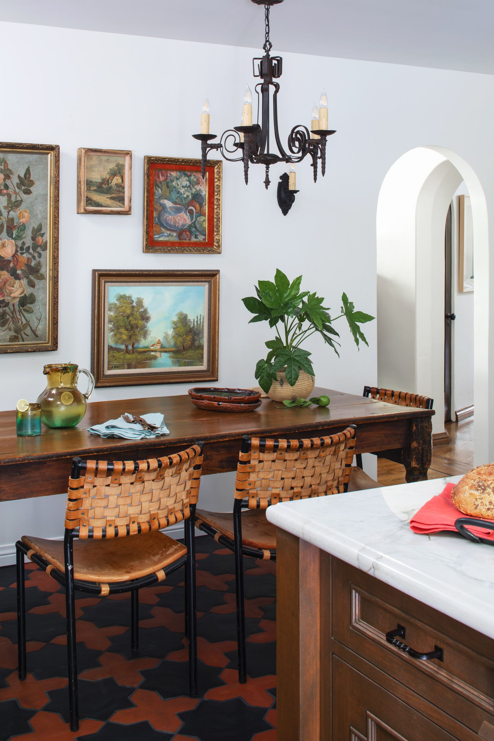


Built in the first half of the 20th century, Spanish Revival houses feature stucco walls inside and out, archways, large windows, elaborate ironwork, heavy wood beams, and decorative tilework.
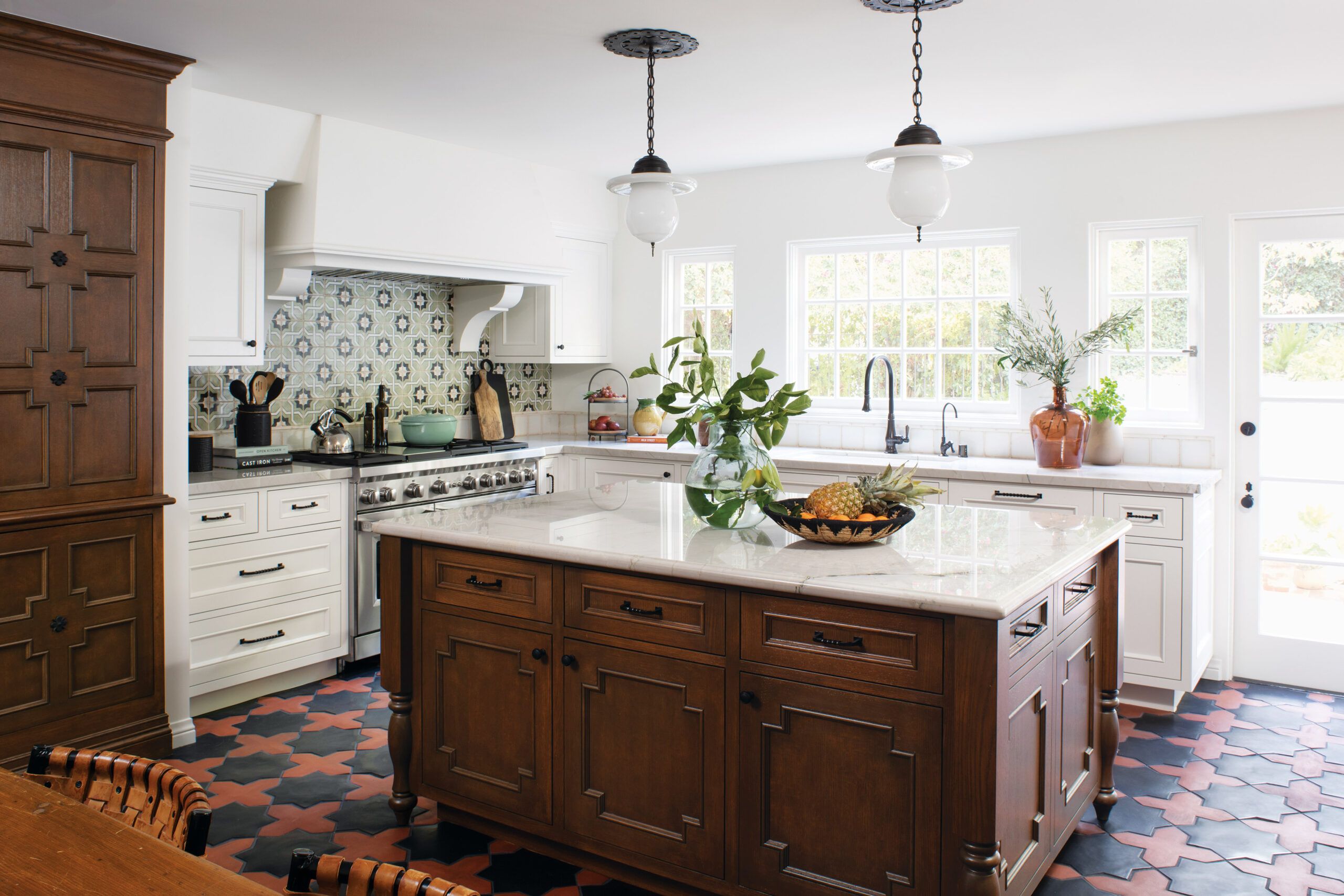
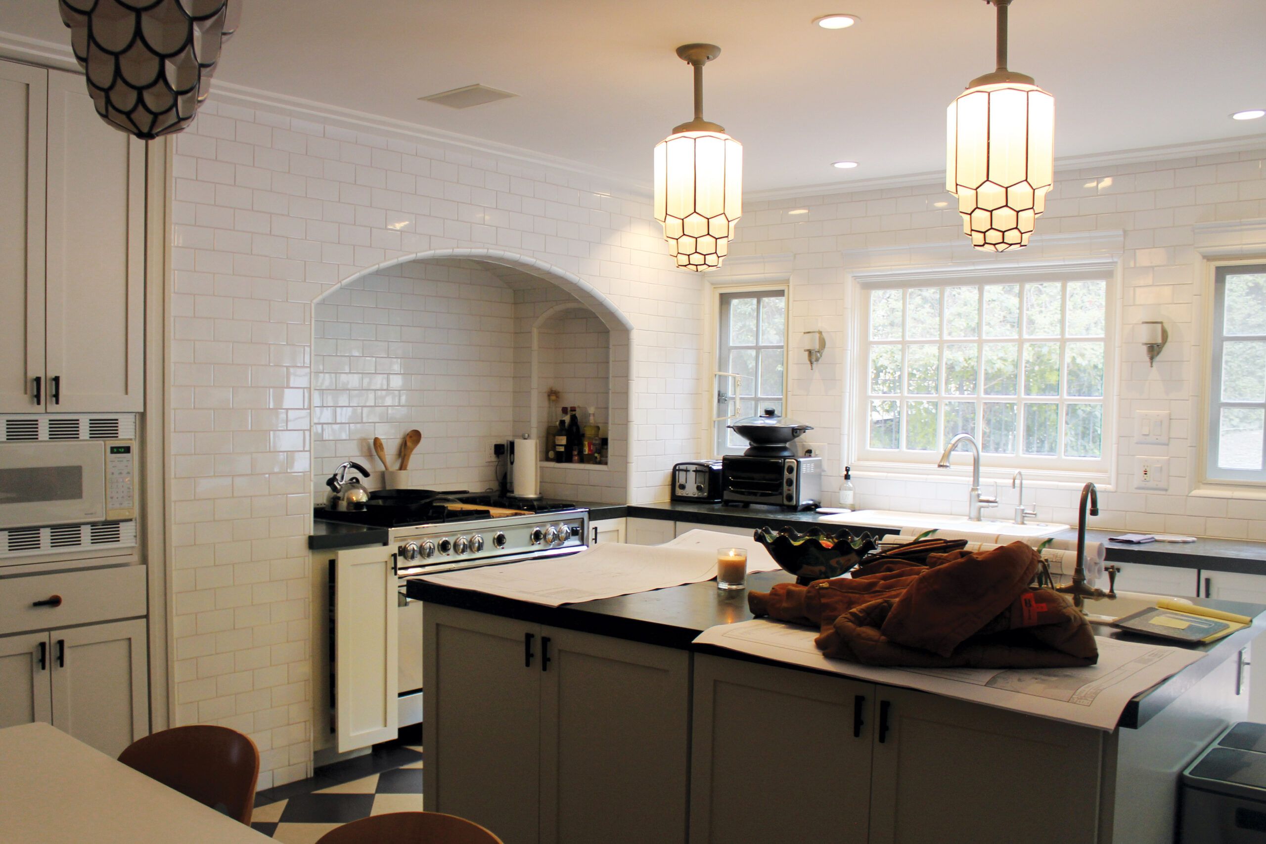
Talk about a disconnect: Somewhere along the line, the kitchen in Wrenn and Bill Chais’s 1926 Spanish Revival in Los Angeles got an Art Deco redo. “We wanted to renovate the kitchen to complement the character of our house,” says Wrenn. So the couple hired architect Bryce Buckley and designer Rebecca Craig of HartmanBaldwin to restore the right vibe, while boosting storage and prep space.
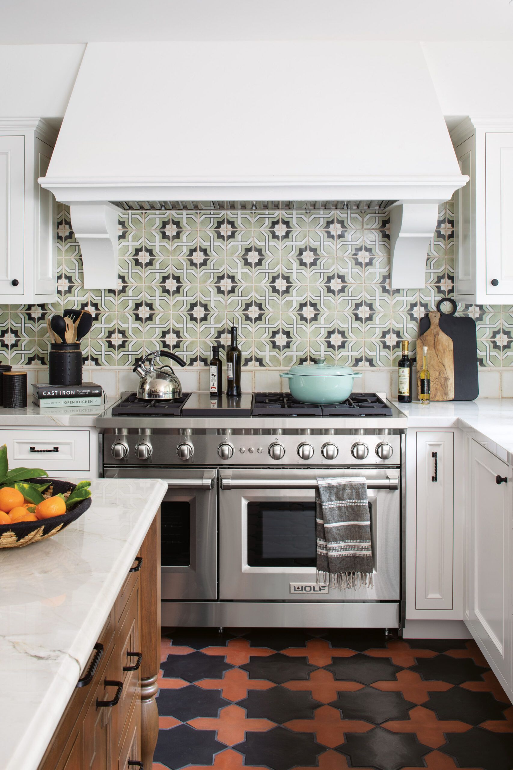
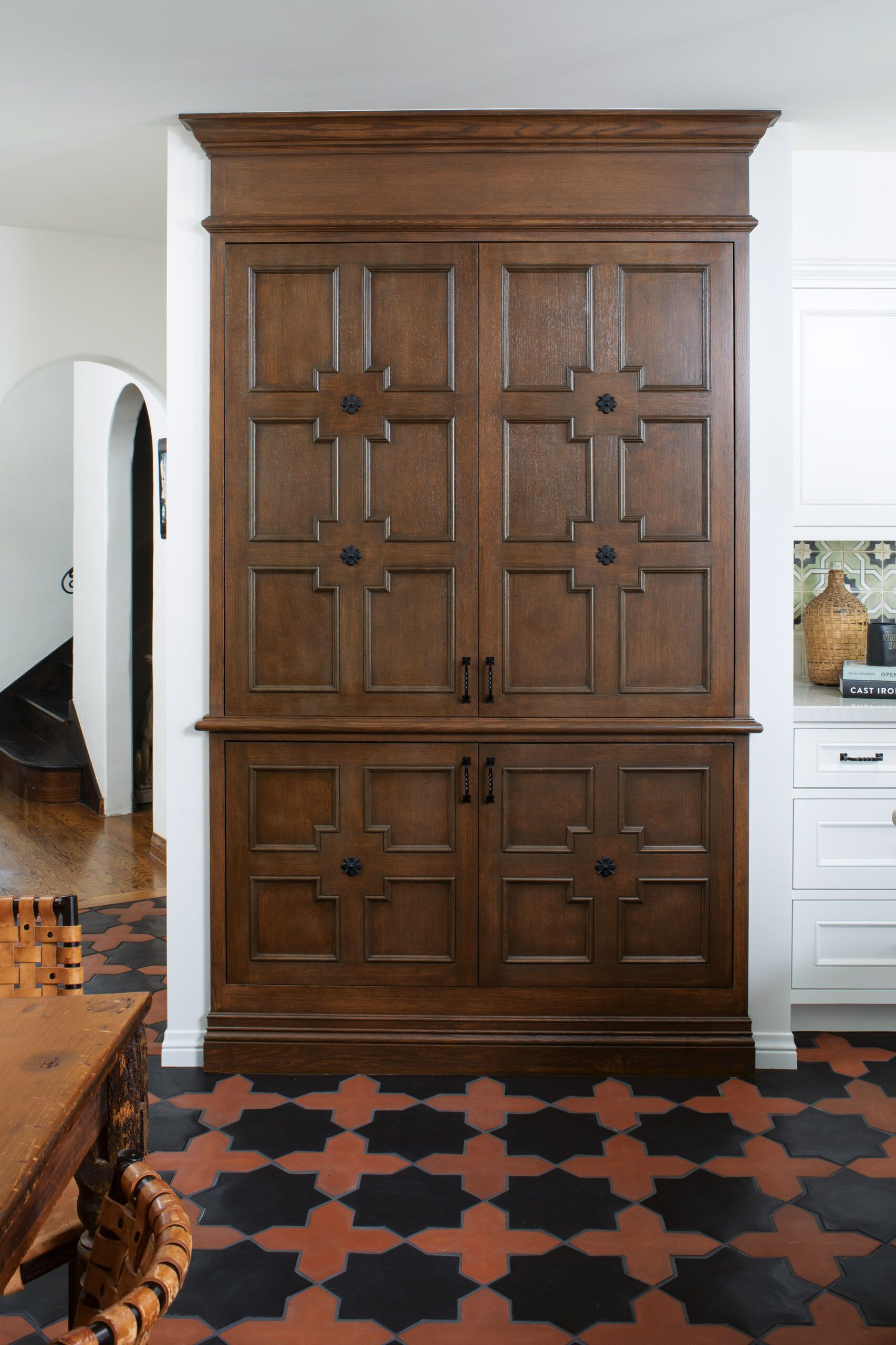
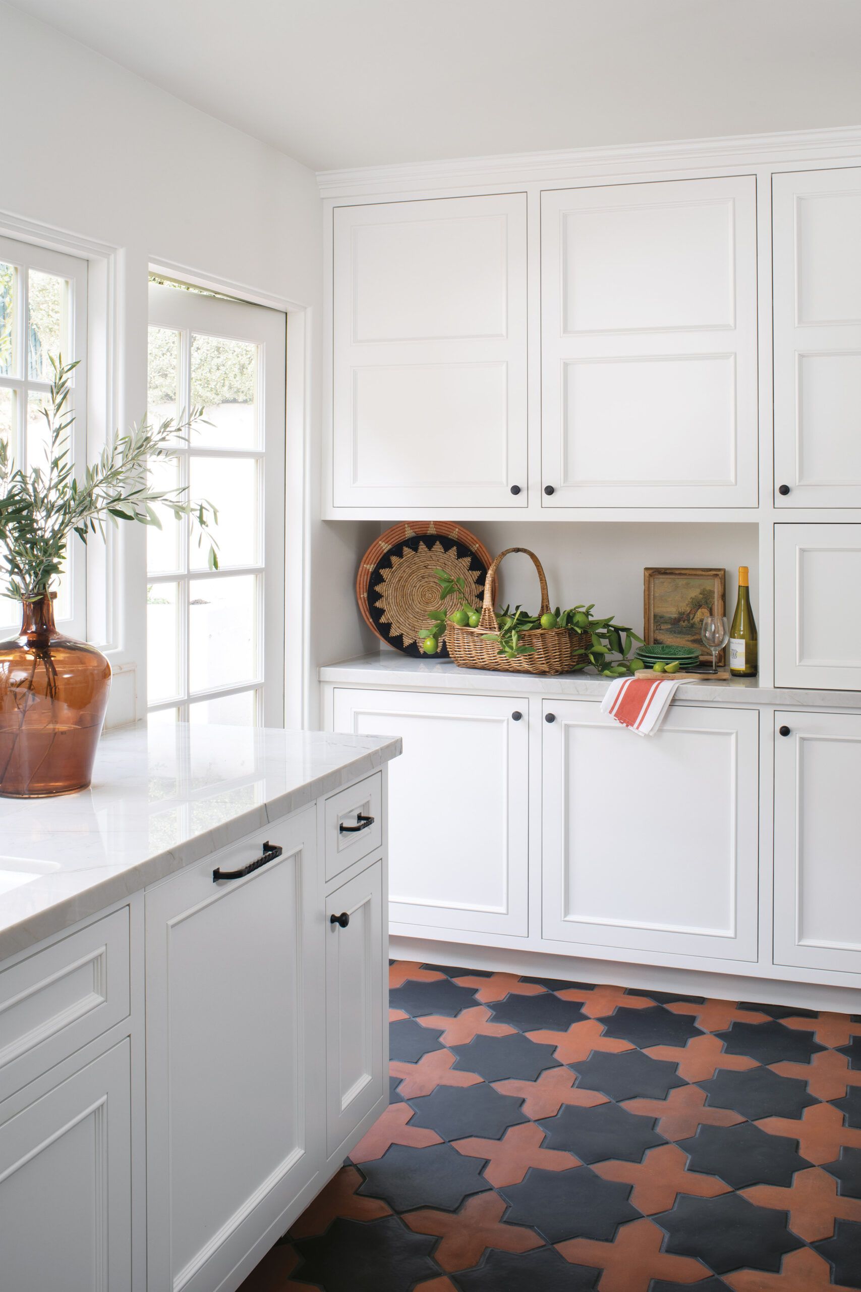
“Our job was to find that perfect balance between honoring the architecture of the house and upgrading the functionality,” says Craig. That meant saying good-bye to an alcove that hemmed in the range, so they could add cabinets and countertops in its place. While the new white perimeter cabinetry is fairly simple, a highly decorative dark-stained oak island and a detailed built-in pantry evoke the furniture of the period style.
Star-and-cross floor tile and a complementary backsplash further the Spanish flavor, as do the iron-look hardware and salvaged pendant lights. “The new kitchen is welcoming and authentic,” says Wrenn. “It has revived the soul of the house.”
What they did
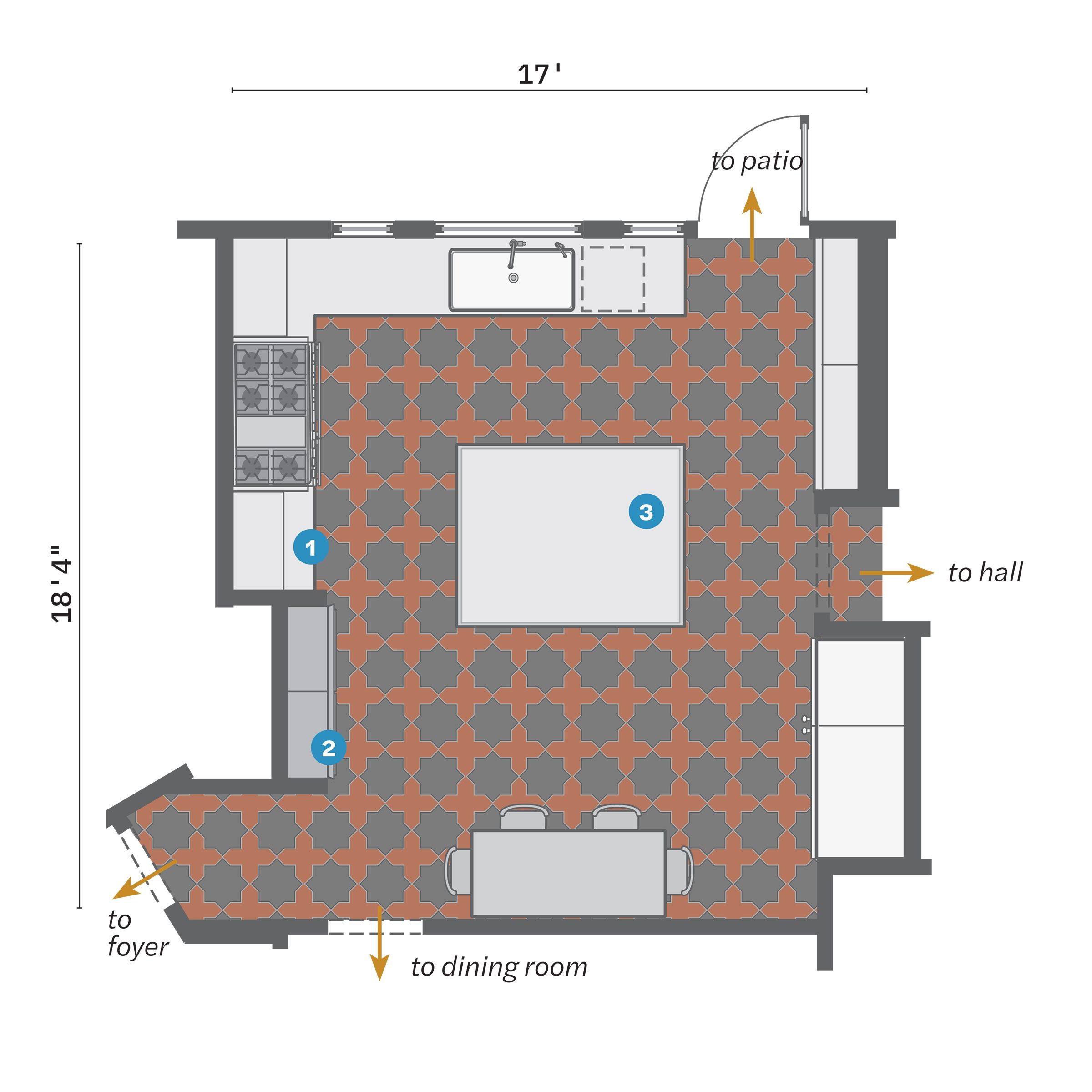
Appliances and fixtures were well placed in the 312-square-foot kitchen; a few strategic changes enhanced storage and prep space.
- Demoed the alcove, creating space for cabinets and countertops on either side of a new range; the sink and fridge kept their locations.
- Replaced an existing pantry cabinet with a deeper one that sits proud of the wall by several inches.
- Built a new island 2 inches wider than its predecessor, with drawers dedicated to specific utensil and small-appliance storage.
Victorian Revival Style: Exuberant Color and Pattern
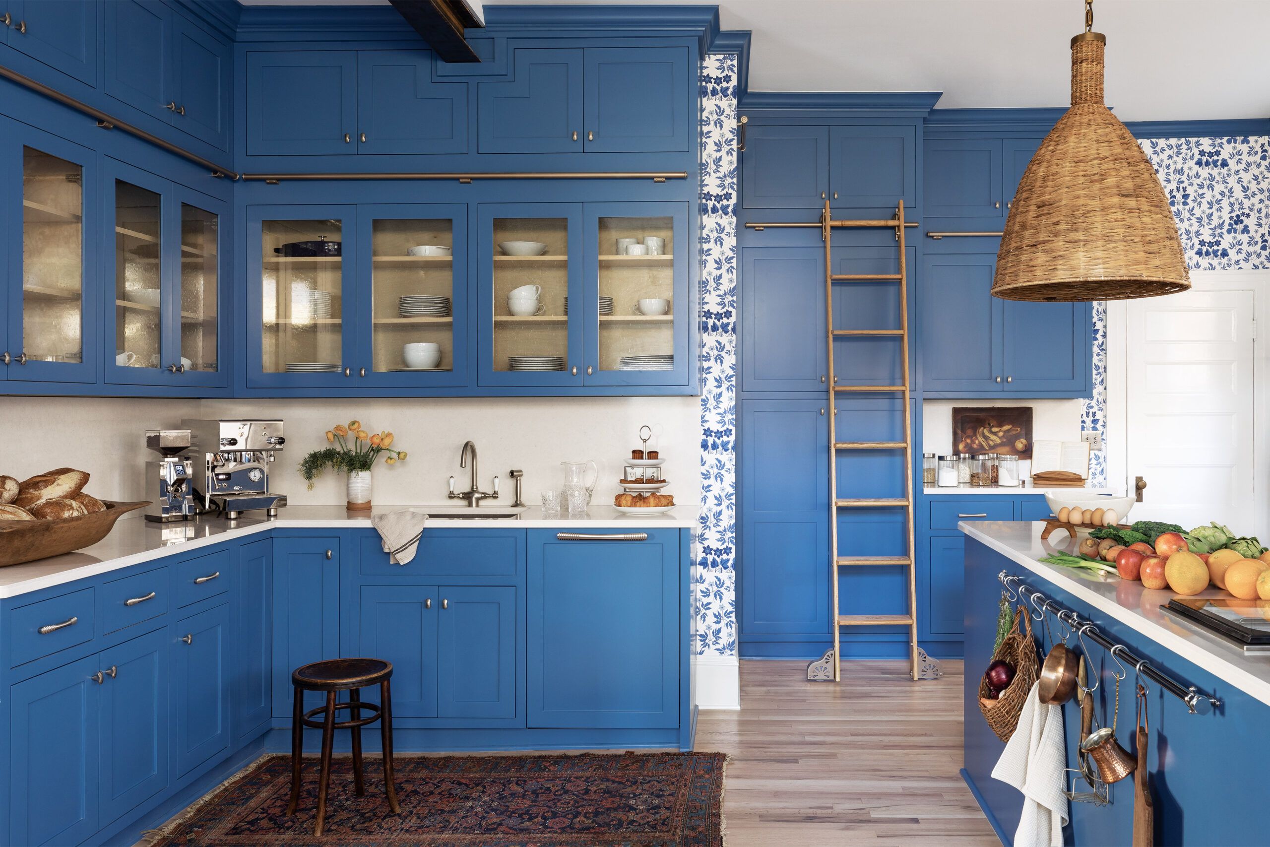
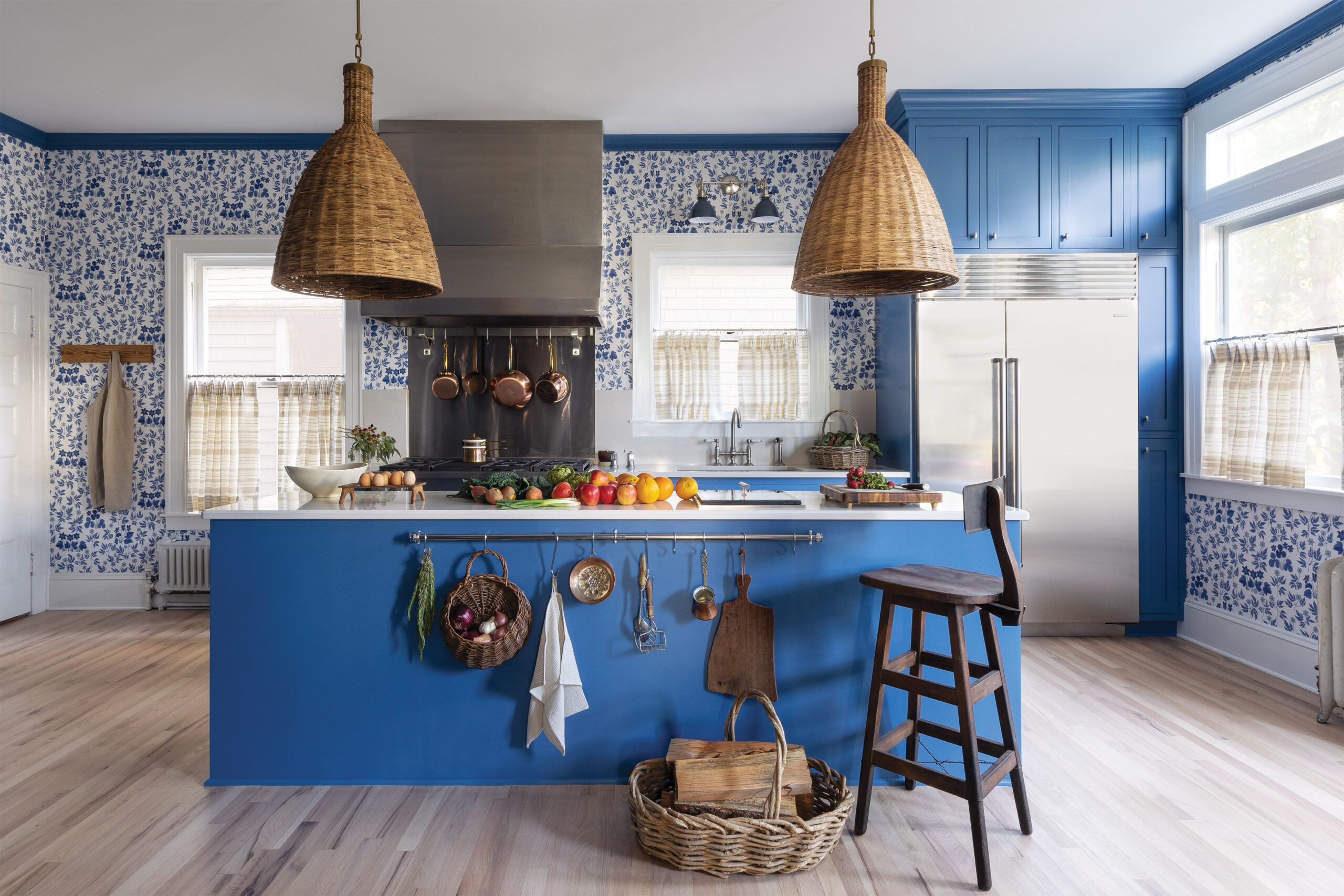
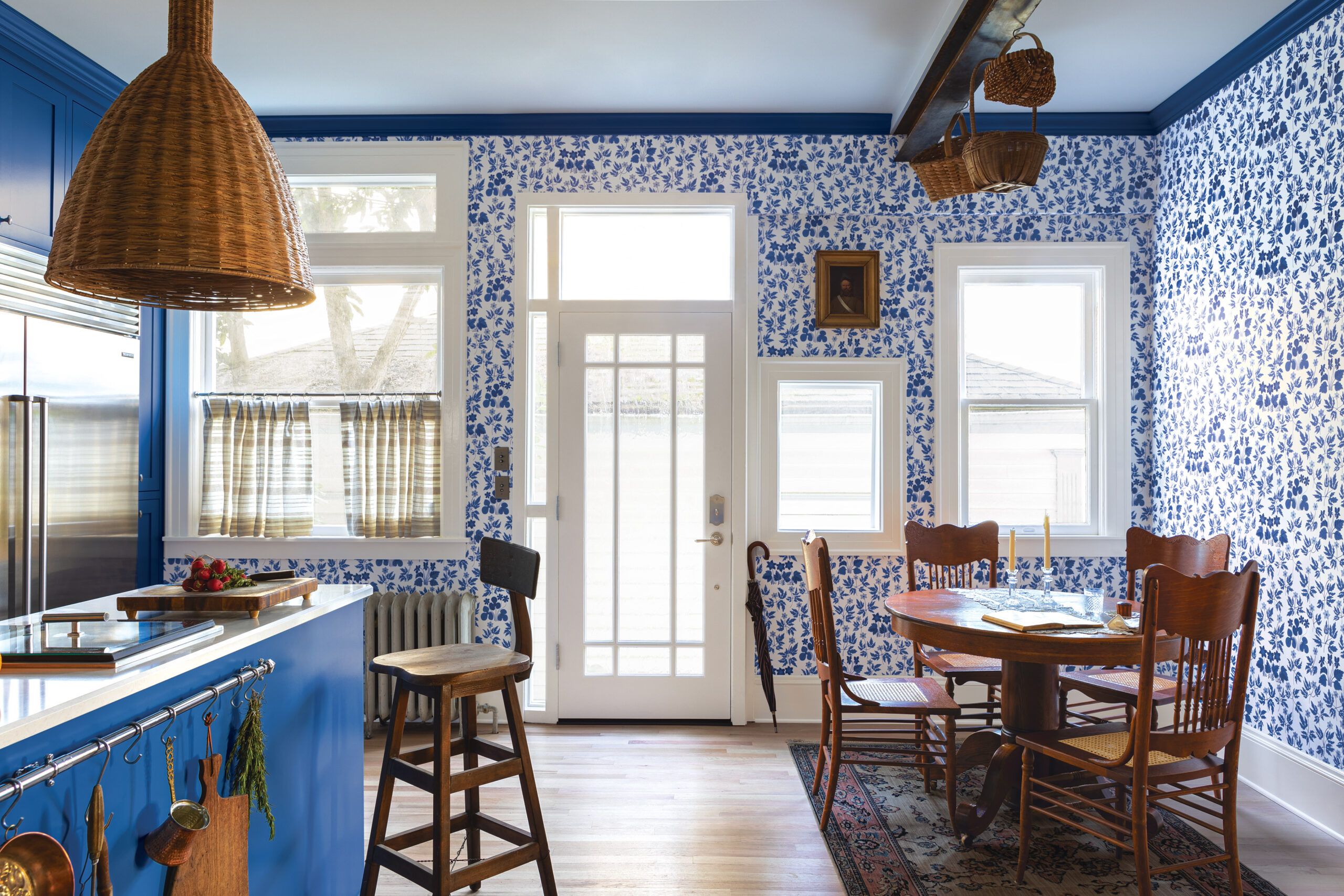


Ornate Victorian Revival style was fashionable between the mid-1800s and the early 1900s. Though ornamentation is a hallmark of Victorian architecture, kitchens were utilitarian, with less-elaborate millwork and furniture pieces instead of wall cabinets. Strong color and pattern, however, remained prominent.
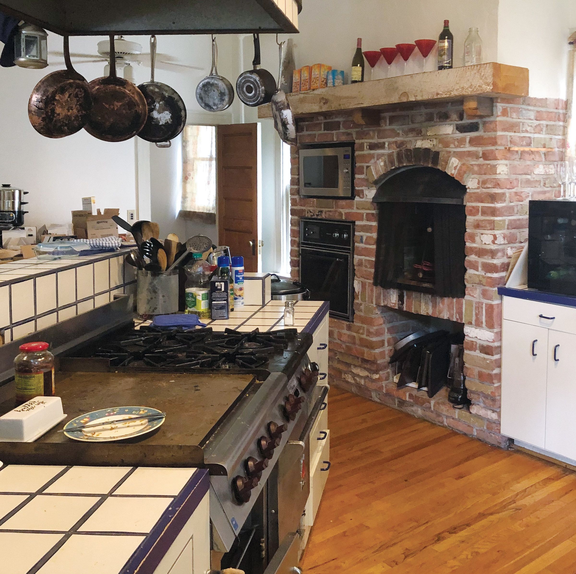
While original details are desirable, trying too hard to maintain them can amount to a foolish consistency. The kitchen of this 1900 Victorian in Portland, OR, had five doors taking up potential storage and workspace and a brick fireplace with a badly damaged chimney. To make matters worse, a 1990s renovation added an oddly angled island and a peninsula that blocked traffic.
“It’s always a juggling act between an older home’s architecture, the clients’ personal taste, and how a modern family functions, then pulling it all together visually and structurally,” says designer Krisanna Sanders of Recast Homes. Her solution was to free up square footage, eliminate obstructions, and reposition appliances and fixtures in sensible ways for the homeowners, avid home cooks who entertain frequently.
To give the space a Victorian flavor, Sanders relied on rich-blue paint, a modernized floral wallpaper, and natural materials, including original red oak floors (given a pale Swedish finish), stone countertops, and the woven textures of baskets and pendant shades. Her takeaway advice for any such project: “Don’t be afraid to go bold with paint or mix textures for a layered, collected look.”
What they did
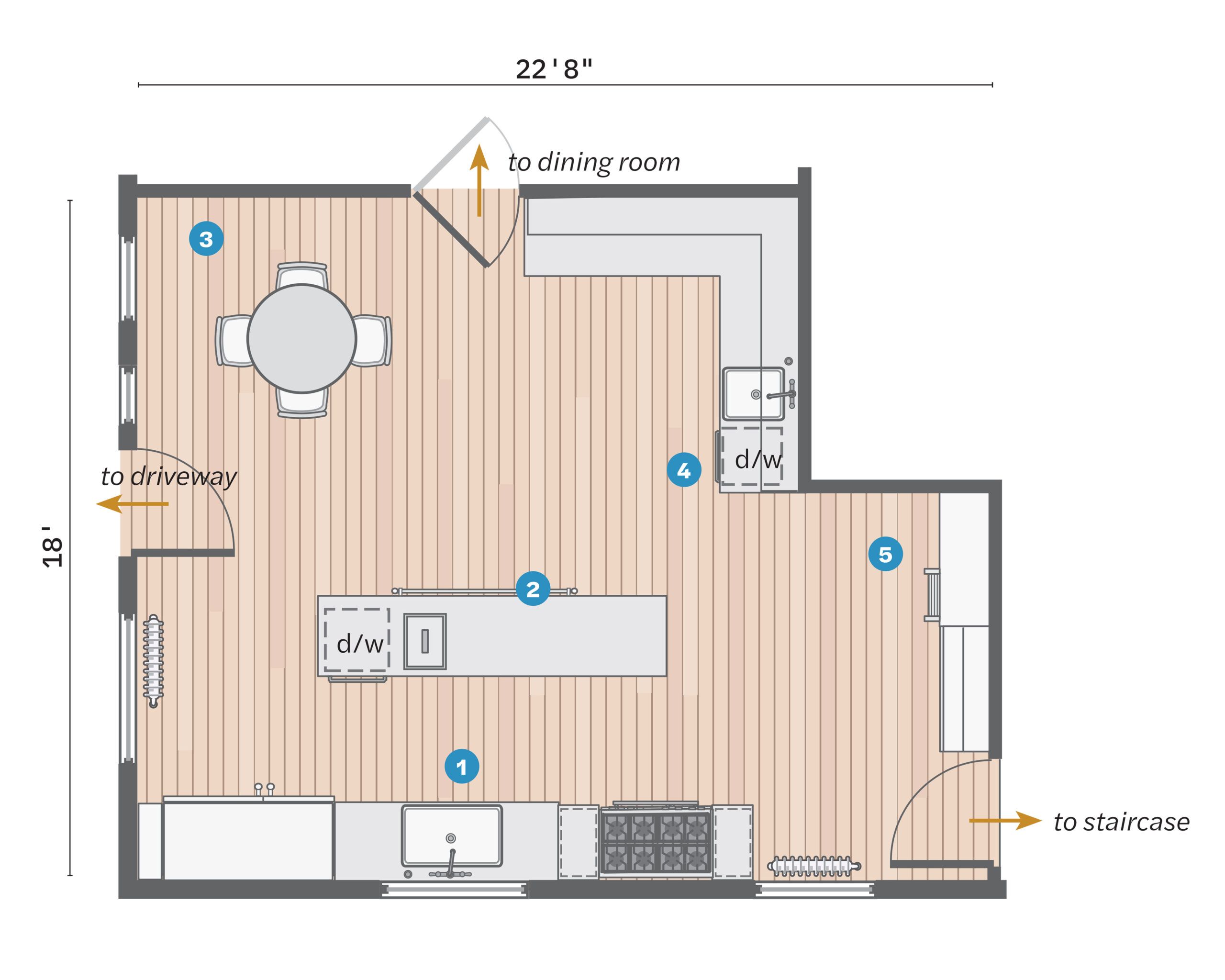
Though huge at 385 square feet, the kitchen had too many doors, and the existing appliances were poorly placed, which squandered space.
- Demoed a peninsula and nonworking fireplace, installing the range, sink, and fridge along the south wall.
- Built an island 56 inches from the sink wall to create a working galley.
- Closed up a second door to the dining room to make a spot for casual meals.
- Added ceiling-high cabinets with a library ladder and a prep sink off the dining room to facilitate formal meals.
- Sealed up a second door to the back stairs for another bank of cabinets.
Craftsman Style: Simple by Nature
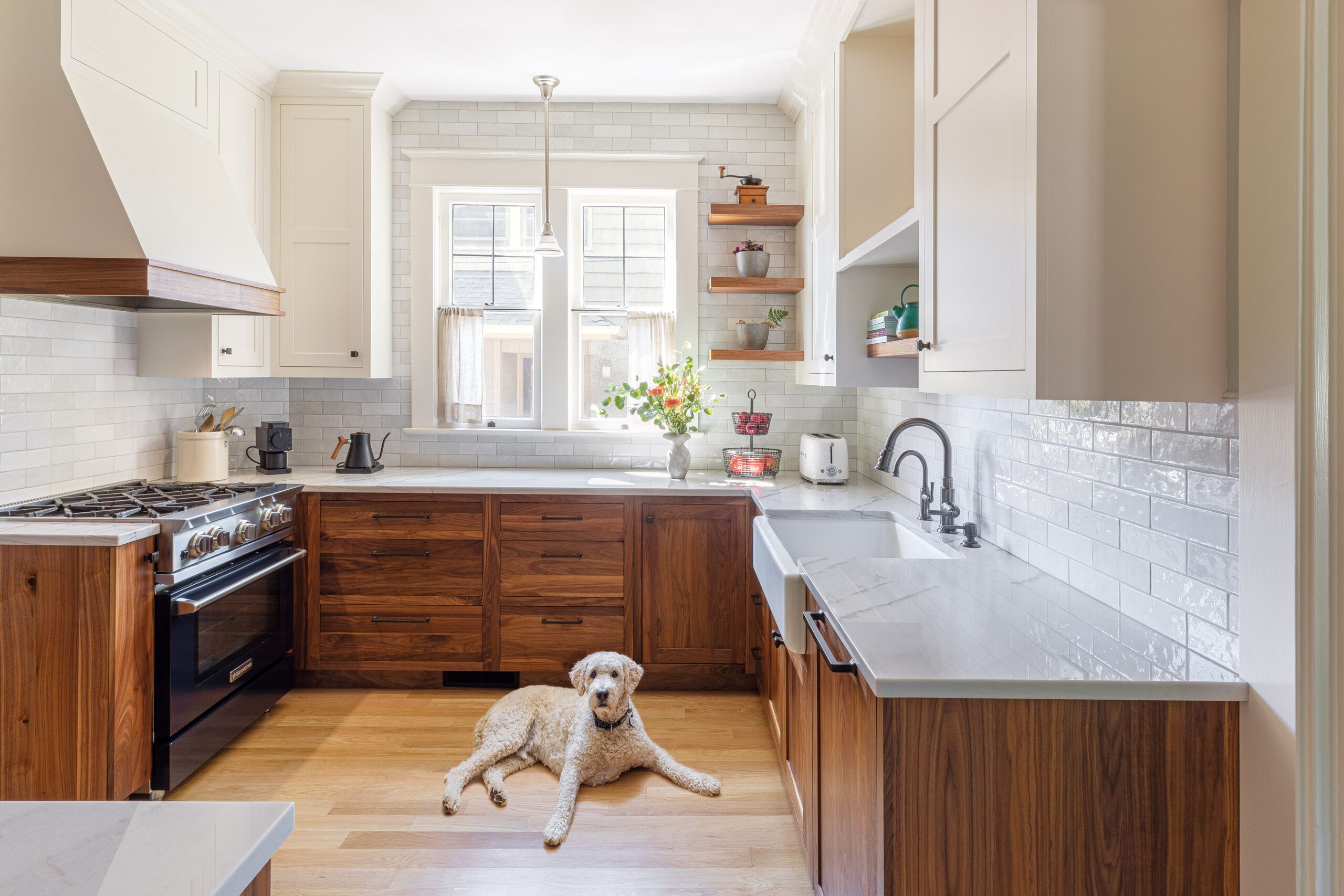
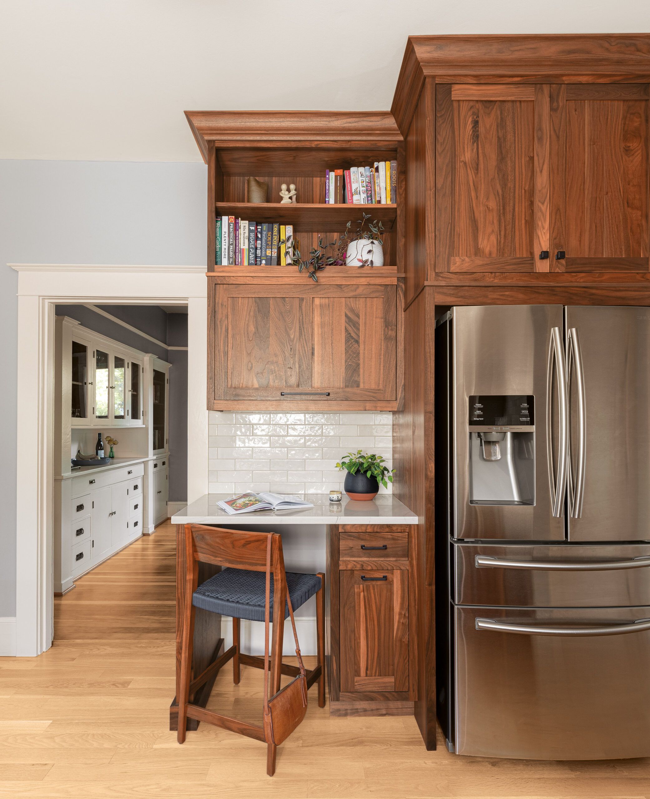
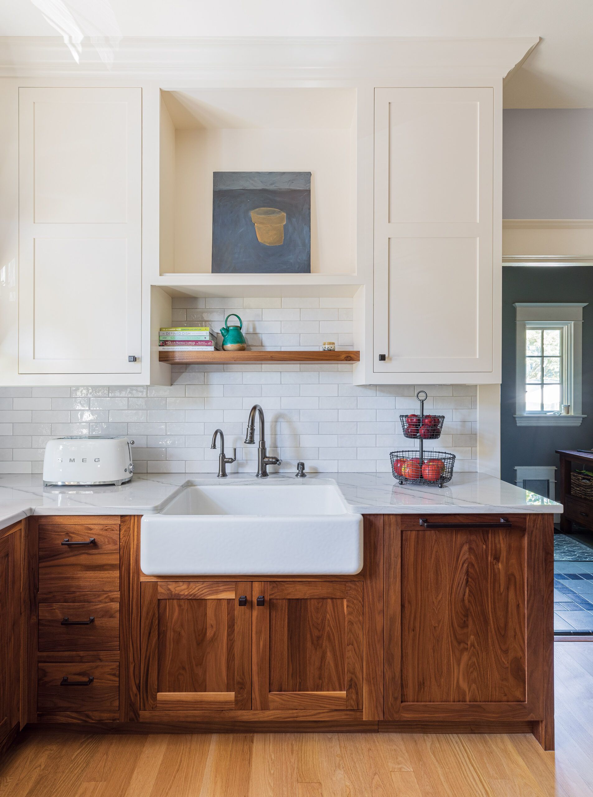
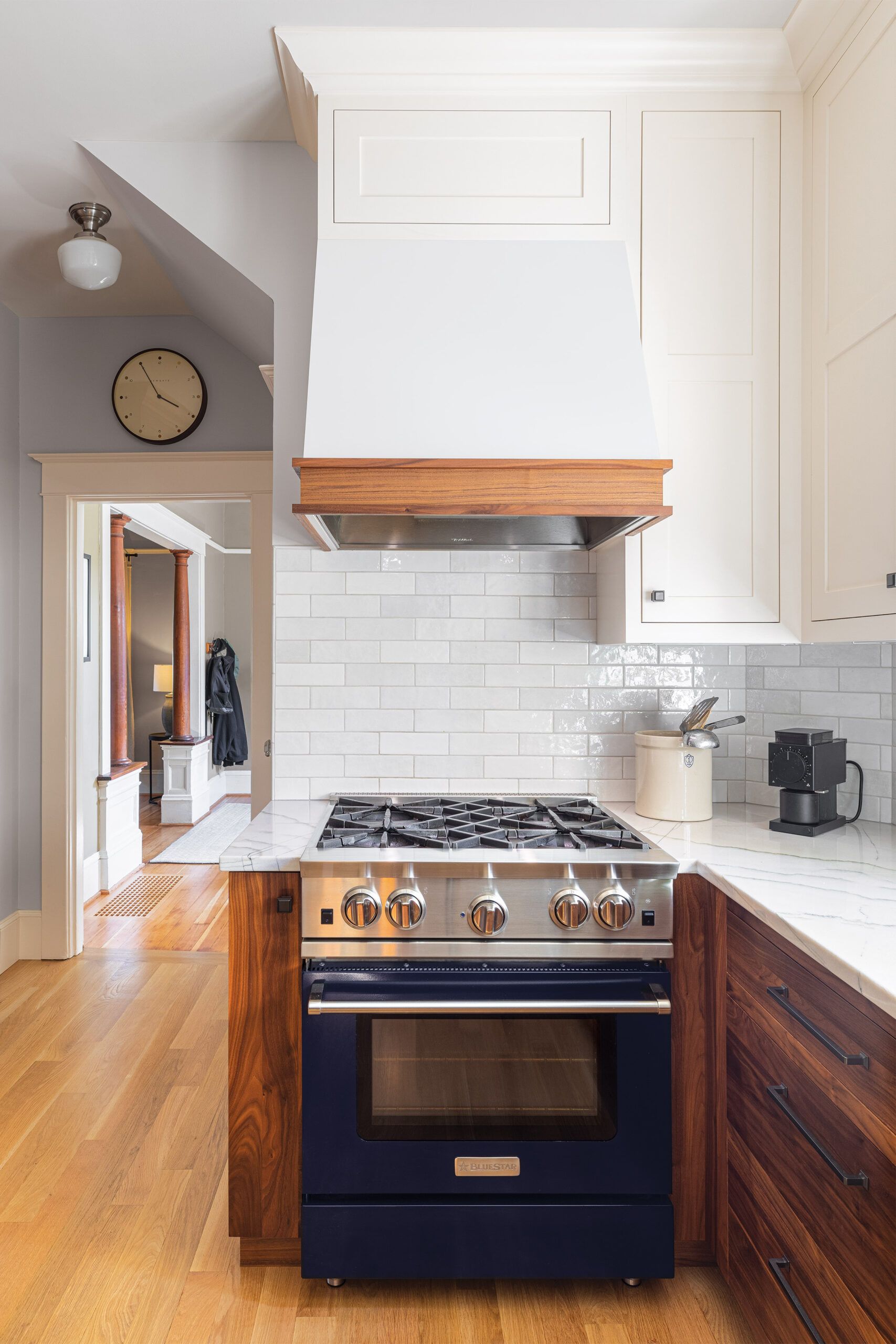


A backlash against Victorian opulence, Craftsman architecture arose around 1905, continuing until about 1930. It is characterized by simple, sturdy forms that celebrate hand-craftsmanship, showcasing natural wood elements such as beams, trimwork, and built-ins, and an earth-tone palette.
After years spent in a rambling Victorian-era home in Portland, OR, Andrew and Raina Lasse longed for something simpler—and found it in a 1910 American Foursquare whose interior was full-on Craftsman, with trademark flat casings, columned room dividers, and a built-in hutch in the dining room.
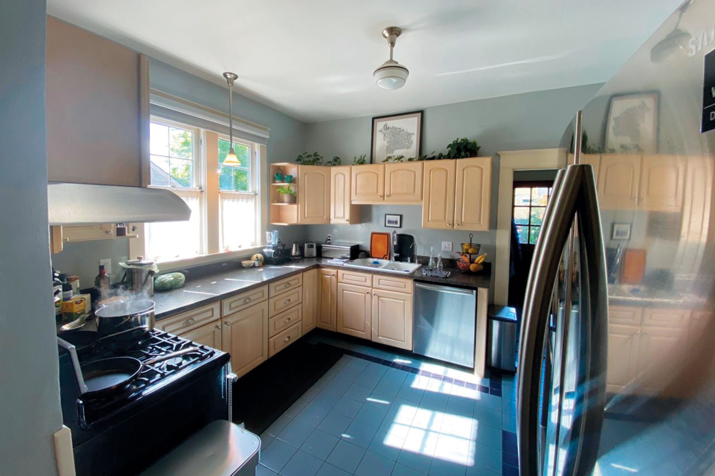
The small kitchen, however, had “that classic country-kitchen look from the 1990s,” says Andrew. Think builder-grade cabinets with a pickled finish, laminate countertops, and blue tile on the floor. It was also short on cabinets and, due to a defunct chimney that ran beside it, had a super skinny pantry.
Flat-panel cabinets with inset doors, raised to ceiling height, were key to improving both function and form—frill-free in the Craftsman tradition, yet rich and welcoming via the beautiful tones and wood grain of clear-stained walnut on the lower units. White uppers and subway tile with pale wood floors offer a light counterpoint—and offset the often overcast Northwest skies.
“Timeless design and high-quality workmanship ensure that this kitchen can last another 100 years,” says Bill Myles, owner of Craftsman Design and Renovation, which took on the project. It certainly has a forever feel for the Lasses. “It was important for us to honor the integrity of our house,” Andrew says. “The new kitchen does that while being totally in line with how we operate daily. It even inspires us to cook more!”
What they did
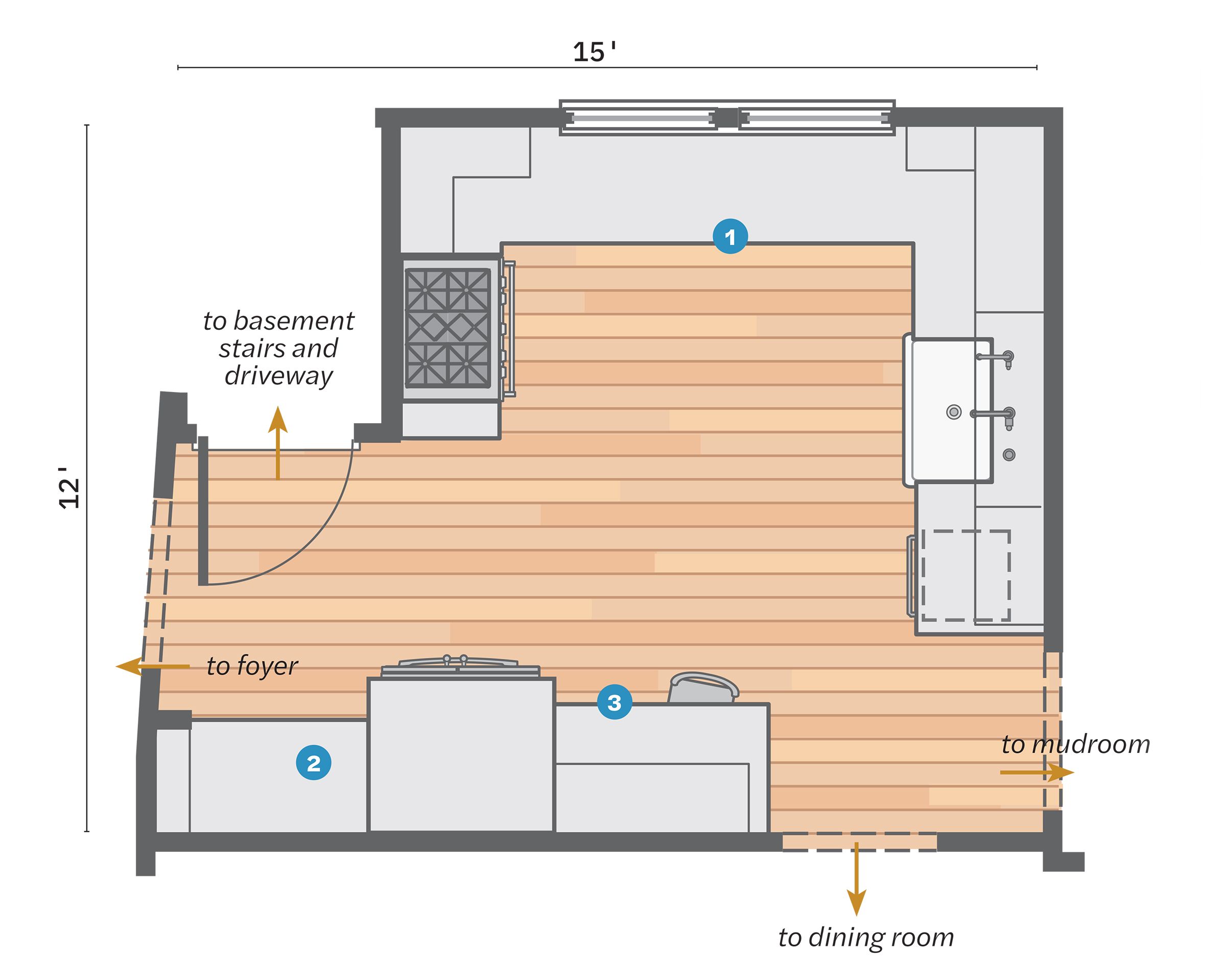
To retain the proportions of the original house, the homeowners chose to work within the existing kitchen’s 152 square feet.
- Kept the layout, with the main prep area along the windows, and the fridge, sink, and range remaining in their places.
- Removed an unused chimney stack alongside the old pantry, nearly doubling its storage.
- Ran all the new cabinets to ceiling height, including ones added above the fridge, and over a desk to its left.
