Perfect Disguise
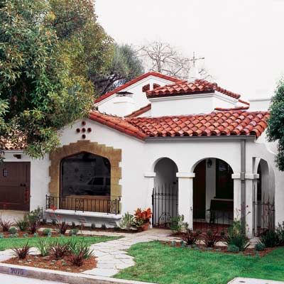
No matter what style your house is, the trick for any addition is to make it appear as if it were always there,” says This Old House master carpenter Norm Abram. It’s a challenge he and the rest of the crew helped tackle on the latest TOH TV project, a 1933 house in Los Angeles’s densely built Silver Lake neighborhood.
Keep reading to see how the homeowners intermingled original and new elements to create a timeless feel for their family’s home.
Shown: The gabled addition at the back of the house fits right in, thanks to careful stucco work and red clay barrel tiles that were salvaged during demolition and installed on the new roof’s visible perimeter.
Keeping It Classic
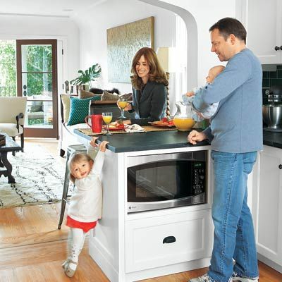
Of course, some houses’ features are easier to re-create than others. The owners’ 1,500-square-foot two-bedroom, one-bath home, bought before they were married and had two children, was a Spanish Colonial Revival with lots of distinctive features, like cove ceilings and Moorish-style arched openings.
Shown: Homeowners Kurt Albrecht and Mary Blee wanted to keep the period feel of their existing kitchen.
Before: What They Had
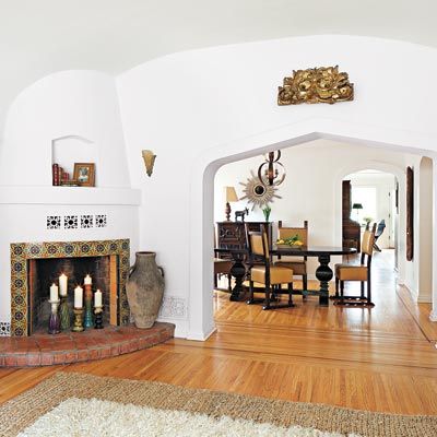
There were clear Art Deco influences, too, in the bathroom and kitchen. A less skillful renovation team might have balked at the couple’s desire for an updated kitchen, more family space, and extra bedrooms and baths that would blend in with the existing house.
Shown: The living and dining rooms were mostly untouched.
After: Old Meets New
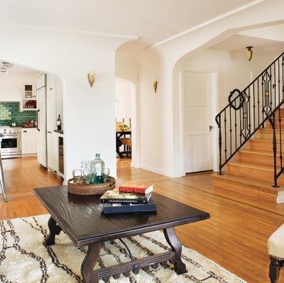
They might have even turned tail and fled when they saw the tight site: Hemmed in by neighbors on each side, and facing a strict local code limiting the addition’s footprint to 750 square feet, where would the new rooms go?
Shown: A new family room blends in with the old spaces by incorporating their architectural features and finishes: Moorish-style arched openings, cove and tray ceilings, off-white plaster walls, and inlaid wood floors.
Before: Preserved But Unpolished Kitchen
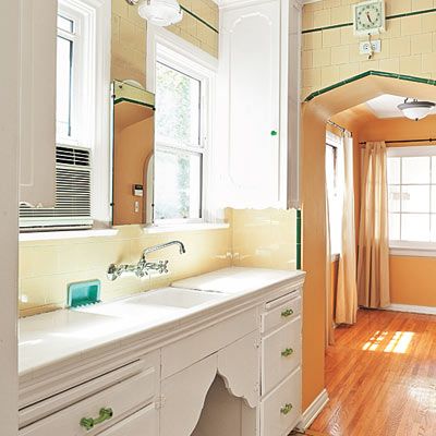
Luckily, the project’s contractor, Los Angeles-based Home Front Design + Build, has faced similar challenges before. “This firm specializes in Southern California vernacular styles, so they’ve got the right skills, expertise, and craftsmen for this type of renovation,” says TOH master carpenter Norm Abram.
Shown: The kitchen had a period feel, but lacked the spirit and warmth that the Blee family wanted.
After: Vintage-Modern Kitchen
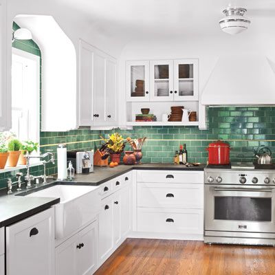
Their small-footprint, two-story addition gives Kurt and Mary the spaces they asked for, and with some help from interior designer Rachel Horn, each room got the period features they cherish. “We love it,” says Kurt.
Shown: To improve the floor plan, they extended the room by a few feet and opened it up via an archway to the family room while closing off the entry to the small library to add the range wall.
Before: Mismatched and Outdated Bathroom
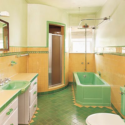
Bold, candy-colored tile in the old bathroom didn’t suit Kurt and Mary’s taste. But they were determined to keep the flavor of the old bath’s charm.
After: Eclectic Bath
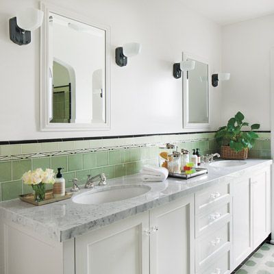
For their new master bath, they went with a contemporary palette of soft greens and white, adding borders and accent tile that evoke classic Art Deco baths.
Attention to Detail
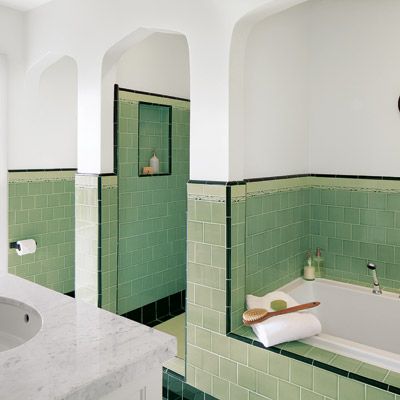
They also opted to bring in the Spanish Colonial Revival style by using arches to frame the toilet, shower, and tub alcoves. The arches give each of these spots distinction and privacy while helping the bath blend in with the adjacent master bedroom.
Sweet Sleeping Spot
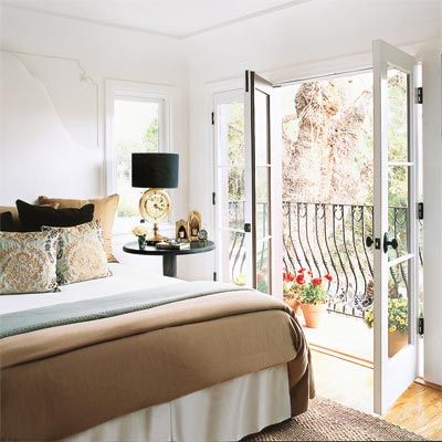
The new master bedroom is only about half the size of the old one. “It feels light and airy, which mattered more than getting a big space,” says Mary.
Making it small allowed space for another bedroom on this floor, which is now their son’s nursery but will one day be a home office.
The couple brought in many beloved features here, like a Juliet balcony overlooking the perked-up backyard, and a star-shaped ceiling medallion modeled after the original in the dining room.
Before: Bland and Bare
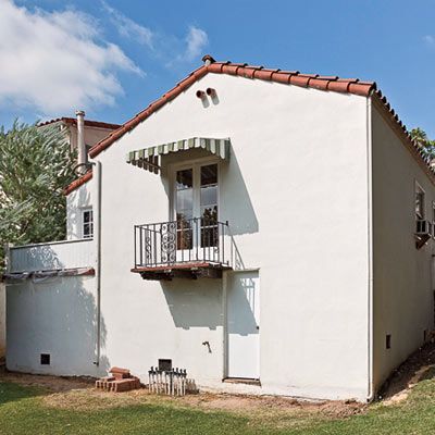
The rear of the house, once monolithic, got a boost from the addition’s period-inspired elements.
After: Better in Back
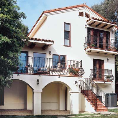
Decorative iron railings and terra-cotta tile add rustic charm, and the ground-level patio, framed by a double archway, echoes the front porch.
More Modern Methods for a Period Look
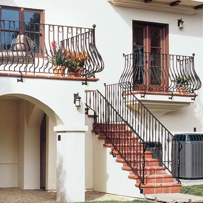
True, Kurt and Mary’s addition is such a dead ringer for the original house that it’s tough to tell the difference between old and new. But behind the look-alike features are up-to-date materials and construction techniques that make such facsimiles feasible. “Using newer methods takes less time and can have a lower price tag, too,” says Home Front president Steve Pallrand. Here’s how Kurt and Mary took advantage of the crew’s know-how to get the remodel they always wanted.
Iron Railings
Instead of having all the pieces hand forged, Kurt and Mary ordered stock railings from a catalog and tapped a local iron shop to weld on extra decorative details. “Adding these finishing touches is more affordable
than making the railings entirely from scratch,” says Robin Bradley of B.O.M. Design, which did the ironwork.
More Modern Methods: Roof Tile

The original handmade clay roof tiles are one-of-a-kind, and not all of them could be saved when the back of the house was torn down. So the parts of the roof that can’t be seen from the street are covered with factory-made clay tile in the same color and shape.
More Modern Methods: Plaster Walls and Cove Ceilings
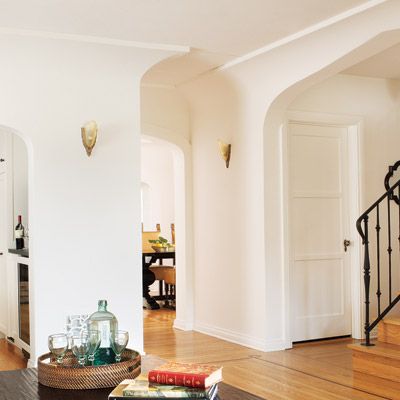
Kurt and Mary felt their remodel wouldn’t be complete without these features. Though Home Front could have opted to apply plaster over metal lath for the walls, they went with a common time-saving method instead, hand-troweling plaster over blueboard, a special drywall made for this purpose.
And instead of building out framing to makes the coves, the contractor layered plaster on top of premade Styrofoam forms that were glued to the walls. Pallrand says these techniques slashed installation time by more than half.
Floor Plan: 1st Floor
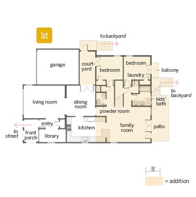
The original bedrooms and bath in the back of the house were torn off to make way for the two-story addition, which packs in four bedrooms, three baths, a family room, and a patio, with enough space left over to enlarge the kitchen.
Floor Plan: 2nd Floor
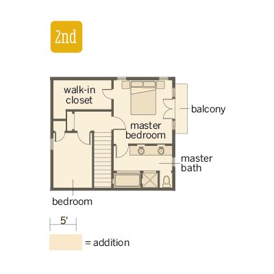
On the second floor, the homeowners enjoy a lofty master suite complete with balcony and walk-in closet.
