Keep a Small House Small
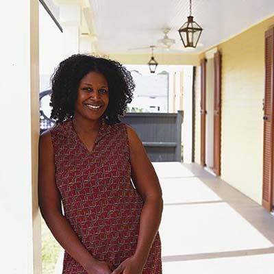
New Orleans is a city of small houses. So when it came time for ceramicist and teacher Rashida Ferdinand to think about making more space in her Lower Ninth Ward home, a renovation recently documented by This Old House television, blowing out the walls or adding a full second story just wasn’t an option. Her addition needed to respect the scale of the area—as well as her budget.
Like a lot of young homeowners, she needed to turn her outdated one-bedroom, one-bath into a modern three-bedroom, two-bath so she could stay for a while—through single life, married life, and family life.
Fortunately, there are ways to expand without being overly expansive: Increase conservatively, make better use of existing spaces, and blend old and new seamlessly. What Rashida ended up with, built from a design by local architect Rick Fifield, is quickly recognizable as the Italianate-style shotgun cottage she bought a year before Hurricane Katrina. Which is surprising, given that they nearly doubled its original 1,200 square feet. A camelback addition—a small, two-story hump at the back of the single-story house—manages to keep the lines of the facade intact. Here’s a look at the simple tenets she and Fifield followed for keeping a small house small.
Preserve the Modest Facade
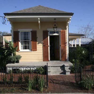
Stand directly in front of Rashida’s newly renovated house and it’s hard to tell that much more was done to it than adding fresh paint and restored brackets. That effect is deliberate, as the addition is contained behind the house and the small second story rises only past the rear of the existing roofline. The front of the house looks just as it did when it was built back in the 1890s. Setting a second-story addition back from the facade below helps minimize it.
Echo Existing Rooflines

Echoing the existing roofline makes a big difference, too. Even when this camelback addition is viewed from the side, it looks congruous because the profile of the new roof matches the old. “If we had extended the second floor over the ell on the side of the house, where the bedroom was, it would have looked really fat, and the roof would have gotten really complicated,” says Fifield. “We
hid the added square footage by making the camelback’s hip roof echo the original.”
Match the Exterior to the Neighborhood
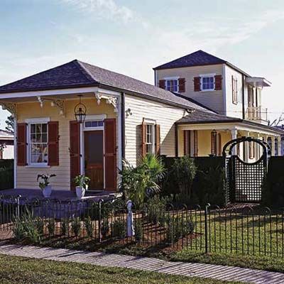
For an addition to fit it needs to mimic not only the lines of the existing house but those of nearby homes as well. Even in areas where there’s an eclectic mix of styles, often the overall scale is consistent. A well thought out addition is sensitive to the neighborhood and doesn’t make the house stand out as the biggest on the block. That means not building an addition 10 feet taller than other houses. It also means keeping an eye on horizontal lines: having the roof height or the individual floors line up with those around them.
Equally important is restraining the footprint. Just because you can expand into a side yard doesn’t mean you should; it might overwhelm the neighbors. Fifield increased Rashida’s house to the side with a long porch that recalls the galleries of antebellum houses. Because it’s open, it doesn’t look so prominent and bulky. Rashida gets added living space without added house—or the cost that goes with it.
Limit Additions to Only What You Need
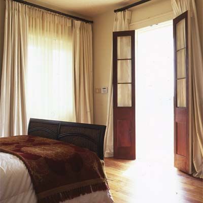
Starting with a one-bedroom, one-bath house leaves the possibilities for expansion wide open. But Rashida knew what she needed, and Fifield showed her that it didn’t require much. She wanted a private family space at the back of the house that was distinct from the public front room, another bedroom on the first floor, and a master suite upstairs to capture the views of the Mississippi River. At first, she wanted all of those spaces to be large enough to lounge around in. “We showed her that she could place the furniture she wanted and have the view that she wanted but still stay in character with the scale of the building,” says Fifield. Now Rashida’s house suits her needs as a solo homeowner, but it will work just as well as a family dwelling later on.
Borrow Details and Proportions to Tie Old and New Together
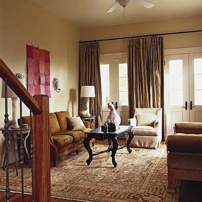
There’s nothing worse than an incongruous addition tacked on like an afterthought. In Rashida’s house, the back addition extends 15 feet beyond the original footprint. But it’s hard to tell that the space wasn’t always there, because the design preserves the shotgun layout. You can still stand at the front door and see clear through the rooms to the back porch.
Architectural details add to the continuity. The same trim profile appears in every room. Similar French doors line the exterior walls throughout. And most important, every room has the same proportions, both in dimension—like many shotgun houses, all the rooms are the same size, 13 by 13 feet in this case—and in vertical sight lines, with matching ceiling, window, and door heights. “One of the most jarring things can be an inconsistent height to the doors,” says Fifield. “So we actually spent extra money to match all the existing doors and windows with new custom units.”
Open Up the Space in the Original House
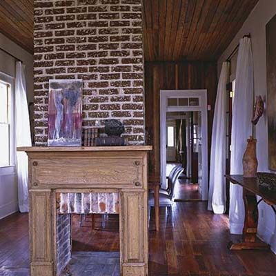
Another key to keeping added square footage to a minimum is looking at how you can reconfigure the old house to better suit your needs. When clients meet with an architect for the first time, it’s a good idea to talk about how their present space could be rearranged—say, a kitchen moved from the front to the back of the house or the existing layout opened up to make the house more functional for modern living. The concept is not just respectful of the original architecture, it’s also a money saver; your budget will go much further if you’re not adding a new foundation, roof, and walls.
When Rashida bought her house, it had two small rooms just inside the front door. Right off, she took down the wall that joined the two to create one open room to serve both as a dining/living room and a gallery space. She also cut a pass-through in the adjacent kitchen to open it up for when she entertains.
Now Rashida has the best of both worlds: a small-cottage feel with airy public and private gathering areas. And she did it all without overwhelming the cozy neighborhood the house suits so perfectly.
Open Up the Kitchen for Entertaining
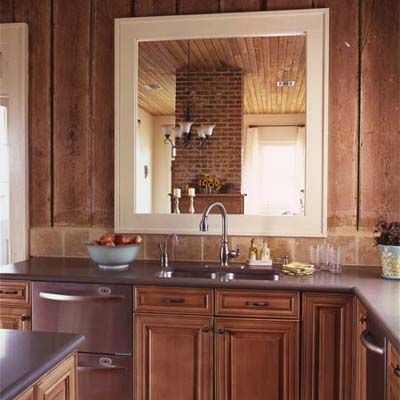
A pass-through from kitchen to dining room opens up the room for entertaining. The homeowner liked the original barge-board walls—made from riverboat wood salvaged in the 1800s—so much that she decided to leave them exposed.
Make a Bath That Fits Your Space
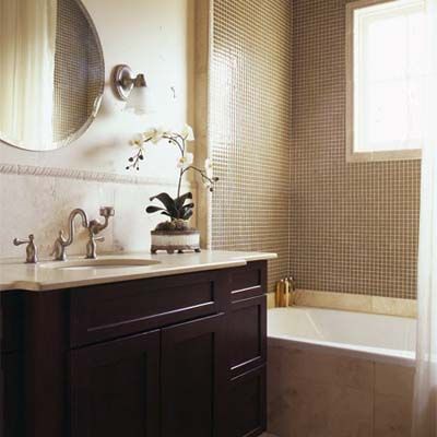
The modestly sized master bedroom and bath fill up the addition’s second story. A porch and balcony off the bedroom will serve as outdoor lounge areas, making the suite feel much roomier.
New Orleans Project House: Before
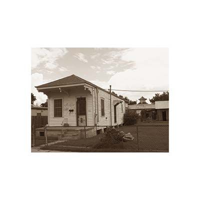
The existing 1890s Italianate-style shotgun house had a side ell that held a single bedroom.
The Plans
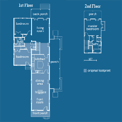
The original L-shaped shotgun gained about 1,000 square feet by adding 15 feet onto the back of the house and then stacking a one-room-wide “camelback” above one side. The living and dining rooms downstairs had already become one. The lone bath moved across the hall, and a laundry took its place. All the new spaces, including the new back bedroom and living room and the master bedroom upstairs, maintain the 13-by-13-foot room size in the original floor plan. The new side porch adds gracious outdoor living space.
