TOH celebrates 30 Years with the Newton Centre Project
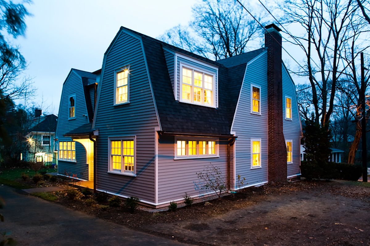
Believe it or not, it’s been three decades since This Old House first began giving viewers a behind-the-scenes look at the secrets of home renovation. This year’s first project focuses on the modest renovation of a 1915 Dutch Colonial in the Boston suburb of Newton Centre. Homeowners Bill and Gillian Pierce purchased the house in 2004 for its convenient location to the heart of town, not to mention its appealing period details.
Small Change for the Better
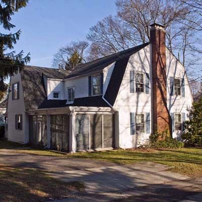
Working with local architect Paul Rovinelli, the Pierces will design a modest 330-square-foot rear addition that will complement the old home’s existing style and scale. The addition will alter the house’s footprint just enough to create space for an eat-in kitchen, a family room, a home office/guest room, and a small library on a landing between the first and second floors.
A Dream House in Need

The Pierces (seen here on their second-floor landing) purchased the house in 2004 for its convenient location near the center of town, not to mention its appealing period details. Still, they knew the tired old place needed some freshening up—not to mention a floor plan more accommodating to their family of four.
Kitchen Before
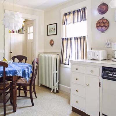
Gillian says the house’s kitchen is way too boxy, with a lot of dead space, and not nearly enough cabinetry. During the remodel, the wall dividing the narrow entryway from the kitchen will be removed, exposing a new bank of windows that will no doubt open (and brighten) things up.
Cramping Their Style
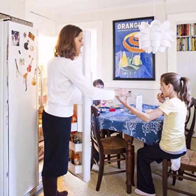
Gillian can hardly open the refrigerator door without bumping up against the kitchen table—and her kids. So the added square footage created by the remodel will no doubt be a big plus. The acoustic ceiling tile will be pried off, and replaced with plaster, giving the room a few more inches of added height, too.
When One Door Closes…
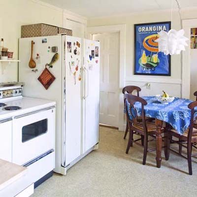
A doorway (behind the fridge on the same wall) leads to what Gillian refers to as the “stairway to nowhere,” since it’s blocked off at the top of the stairwell. The superfluous stairs will be removed, and the basement stairs to the left of them will be relocated to another part of the house, giving the kitchen a substantial amount of added space.
Living Room Before
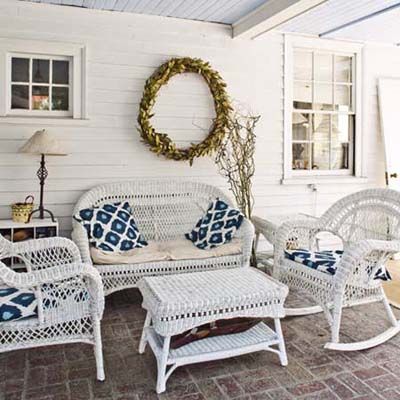
This three-season porch will soon be the location of the Pierces’ new living room. A doorway will be replaced by a large arched entryway—with a barrel ceiling designed by Tom Silva that will create a seamless transition from the original house to the new addition.
Dramatic Entry
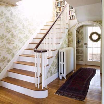
The house’s front foyer will see the most dramatic changes. The stairway will soon lead to an expanded landing where the Pierces’ new home library will be located. And instead of the back porch, that arched entryway will lead to a small family room and kitchen .
By the Book
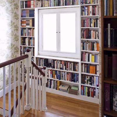
The Pierces loved the colorful look they created by framing their second-floor landing window with bookshelves. While the window will be removed, we’re sure they’ll be even happier with the formal library that will soon occupy this space.
Office Before
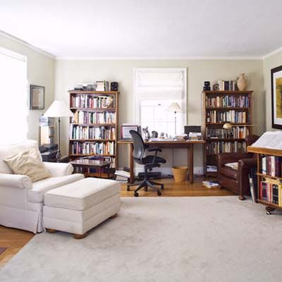
Bill, a fiction writer, does much of his work in this makeshift office, which is housed in the family’s first-floor living room.
Pooch Perch
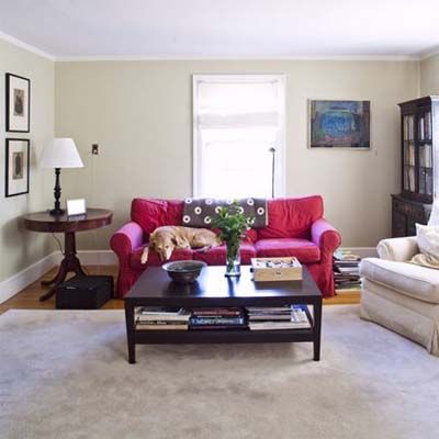
The opposite side of the living room, which, along with being Bill’s office, and the kids’ TV room, also serves as one very luxurious dog house.
Space to Think
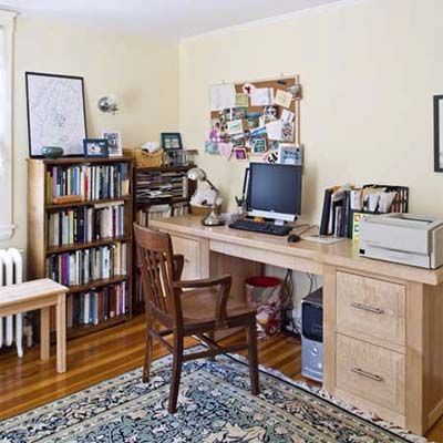
After the remodel, Bill will move his office into what is now Gillian’s second-floor study. In turn, Gillian, a college professor, is relocating her workspace to a new home office on the second floor of the new addition.
