Creating All the Right Rooms
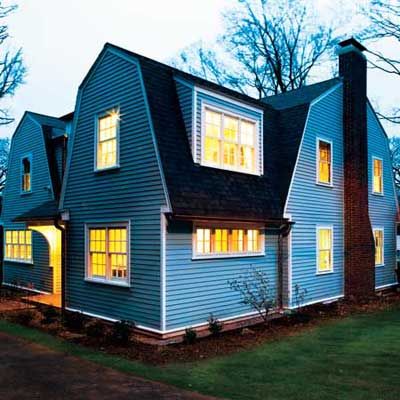
Good-bye, gargantuan great rooms. Sayonara, massive master bedrooms. Just as the average new home size in the U.S. has dipped, additions have been shrinking too, a sign that we’re taking steps to curb energy consumption and lower remodeling costs in an era of rising utility prices and uncertain home values. As many of us learned the hard way, the race to renovate often led to spending too much on a too-big addition with too little planning and, ultimately, rooms that didn’t meet our needs.
The renovation and expansion of this 1915 Dutch Colonial in Newton Centre, Massachusetts, the site of This Old House TV’s latest project, is a handsome example of the kind of modest-scale, well-planned remodel that’s more in tune with the times. “When we moved in, we knew we wanted a bigger kitchen and more room for working at home and having people over,” says homeowner Bill Pierce, a writer and editor, whose wife, Gillian, is a professor at Boston University. “But we decided to live here for a while to get to know the house before plunging into a big project.”
It took the Pierces three and a half years to figure out what spaces they needed and a year of working with local architect Paul Rovinelli to flesh out the floor plans. At 330 square feet, the addition gives them just enough breathing room. Keep reading to see how their refurbished house suits their lifestyle—it’s an inspiration for anybody who wants more room at home.
Window trim, beadboard: Azek
Asphalt shingles: CertainTeed
Copper gutters:
On-site storage:
Before
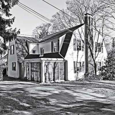
A three-season porch once sat at the rear of the existing house. The new two-story addition was built on the porch’s footprint with the same gambrel roofline as the area to the left.
Family Gathering
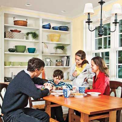
Homeowners Bill and Gillian Pierce enjoy after-school cookies in their revamped kitchen with kids Liam, 8, and Catharine, 11.
Breakfast Area: After
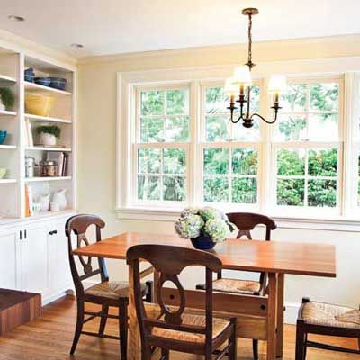
An Eat-In Nook with Room to Move
The table now takes center stage in a cheery, window-lined spot that once housed a half bath. Open shelves keep serving pieces handy for everyday use; Gillian also plans to store her vast array of cookbooks here so that they’re always at arm’s reach.
Cabinets and hardware: Crown Point Cabinetry
Cabinet paint: Farrow & Ball
Kitchen table: Staples Cabinet Makers
Lighting: Yale Appliance and Lighting
Breakfast Area: Before
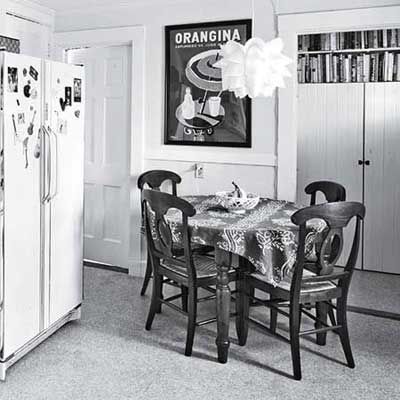
The kitchen table sat in a tight spot between the fridge and a doorway to a side entry.
Kitchen: After
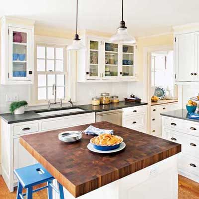
A Kitchen for a Family that Loves to Cook
The room was made longer and wider by removing a second stairway and relocating the half bath. Now it boasts plenty of cupboards and drawers for storage, as well as a handy (and compact) 3-by-4-foot prep island where cooks can chop and slice their way through recipes, thanks to a thick top of end-grain sapele wood. White painted cabinets with antiqued-brass hardware were designed to mimic those in the adjacent butler’s pantry, original to the 1915 house and lovingly kept intact during the renovation. Glass-fronted upper cabinets flanking the sink and window underscore the room’s bright, airy feel.
Cabinets and hardware: Crown Point Cabinetry
Cabinet paint: Farrow & Ball
Dishwasher and refrigerator: GE Monogram
Microwave and range: GE Café
Island top: The Grothouse Lumber Company
Counters: CaesarStone from Stone Technologies
Faucets and fixtures: Kohler
Backsplash tile: Dal-Tile
Lighting: Yale Appliance and Lighting
Powder-room ventilation fan: Broan-NuTone
Kitchen: Before
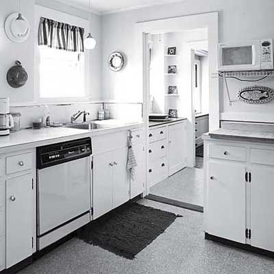
The old, outdated kitchen suffered from an awkward layout and lacked upper cabinets.
Main Hall: After
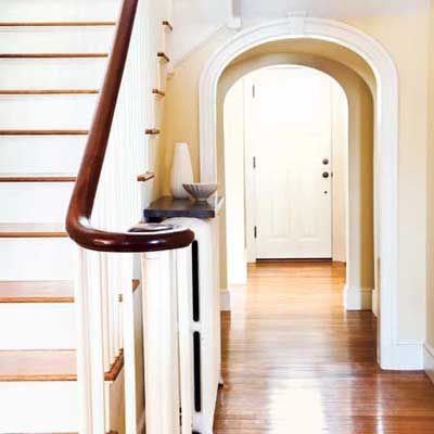
A Hallway that Bridges Old and New
The existing opening, preserved during the renovation, inspired a clever modification to the hallway. Steps leading to the new rooms upstairs had to be cut into the first-floor ceiling in this area during the renovation, resulting in uneven ceiling heights. To mask the problem, TOH general contractor Tom Silva built a second arch, connecting the two with a barrel-vault ceiling that disguises the height discrepancies and creates a cozy transition between the original parts of the house and the revamped and new spaces. “We thought it was a great way to turn a problem into a distinctive feature of the house using an existing architectural element,” says Gillian. “And we’ll always be proud of our ‘Tom Silva original.'”
Paint: Benjamin Moore
Main Hall: Before
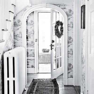
The back entry was framed by a graceful arched opening in the center hallway.
Family Room: After
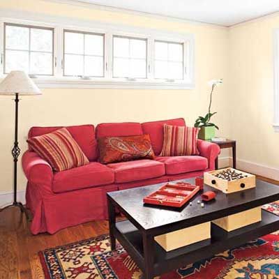
A Dedicated Family Room Where the Kids Can Hang Out
The porch footprint became a 13-by-14-foot family room, where adults and kids alike can play games and watch television. Alternatively, the younger set can take over the family room while the grown-ups kick back in the living room; a doorway between the two spaces allows for easy interaction and circulation. Both entries to the family room were finished with pocket doors, so the space can be closed off to shut out the sound of loud movies or video games. Because the sofa wall is on the street-facing side of the house, smaller windows were placed high up to give the room some privacy without sacrificing natural light.
Paint: Benjamin Moore
Windows: Marvin Windows and Doors
Family-room pillows: Dash & Albert
Porch (Family Room): Before
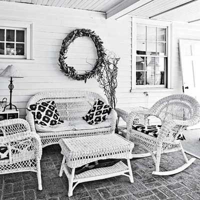
The underutilized three-season porch sat adjacent to the living room, where most socializing took place. “Our living room is a good size, but it was tough when the kids had friends over. There was no place for them to play separately,” says Bill.
Home Office
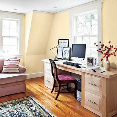
A Home Office that Doubles as a Guest Room
The Pierces often work from home, so Gillian had turned a spare bedroom upstairs into her office, while Bill’s desk sat in the living room. “Not an ideal spot for getting work done,” he says. So Bill moved his desk into Gillian’s old office, allowing her to take over this new, light-filled corner room above the family room, right off the library nook. “I feel like I’m in a cocoon when I’m in here. It’s so peaceful and quiet,” she says. (That’s partly due to the soundproofing qualities of the addition’s spray-foam insulation.) Guests can sleep on the pull-out sofa, and a closet (not seen) makes the space flexible for conversion to a bedroom in the future.
Spray-foam insulation: CertaSpray by CertainTeed
Flooring: Lumber Liquidators
Library: After
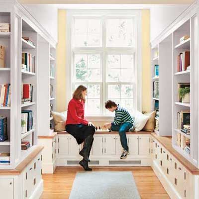
A Nook to Nourish a Love of Reading
The resulting 8-by-10-foot library nook, with custom shelving hand-fashioned by Tom Silva and TOH master carpenter Norm Abram, is now home to much of the family’s impressive book collection and serves as an appropriate entry to Gillian’s new office to the left. Kids’ games and other items are stashed in cabinets below the shelves, and a window seat gives son Liam a quiet spot for playing chess, one of his favorite hobbies. “We’re thrilled with how this space turned out—it exceeded our expectations,” says Bill.
Radiant heating: Uponor
Library rug: Dash & AlbertFlooring: Lumber Liquidators
Library: Before
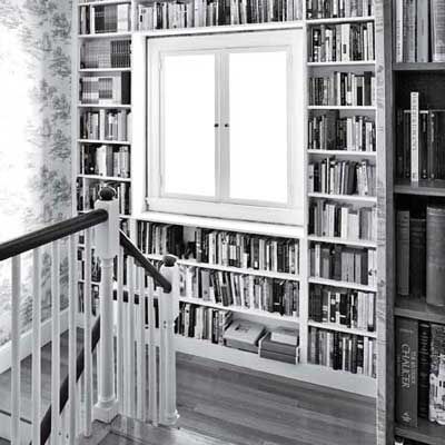
When the Pierces first moved into their home, Bill’s handy father built some shelves around the window on the stairway landing, which housed a small fraction of the staggering number of books owned by this well-read family. “Paul, our architect, loved how light poured down from this window to the front entry,” says Bill. “Since we were adding a second story, he suggested enlarging the space, putting in more shelves, and installing extra windows.”
A Better Mix of Spaces (First Floor)
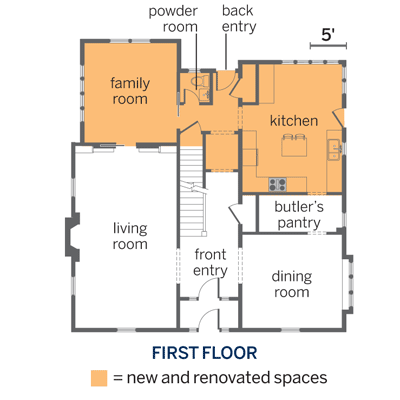
The 1915 Dutch Colonial had good bones, but its floor plan needed an update. A three-season porch came down to make way for a family room and relocated powder room downstairs, and the back entry and part of the center hall were also overhauled, and the kitchen was enlarged without changing the home’s footprint in this area. The other rooms were left alone, save for repairs and replacing knob-and-tube wiring.
A Better Mix of Spaces (Second Floor)
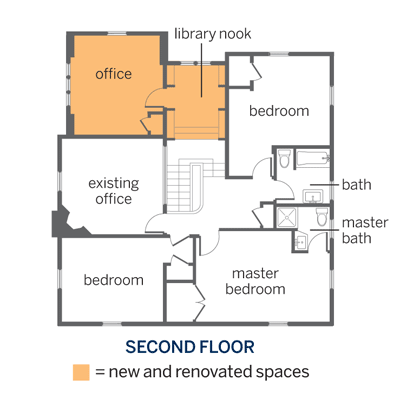
An office and library nook were added upstairs. The other rooms were left alone, save for repairs and replacing knob-and-tube wiring.
