Historical Exterior

For Liz McQuillan Delfino, stepping through her front entry is a lot like stepping back in time. She pushes open the same heavy wood door, glimpses the same quirky fireplace nook, and passes the same staircase she knew growing up. Once the kitchen comes into view, however, it’s clear things have changed in her childhood home. Framed by a columned half-wall divider, the enlarged, opened-up cook space now has an island at its center, all-new cabinetry, quartz and reclaimed-wood countertops, and gleaming stainless-steel appliances—testament to a just-completed eight-month renovation documented on the current season of This Old House television. With the construction dust now settled, the army of contractors, subs, and Generation NEXT apprentices have moved on—and Liz, her husband, Joe Delfino, and their two young daughters are finally moved in.
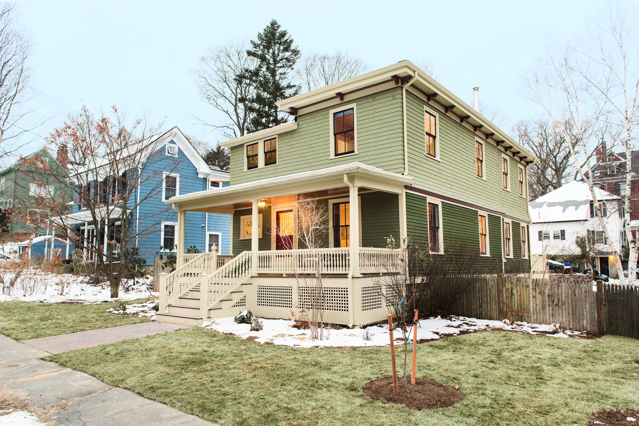
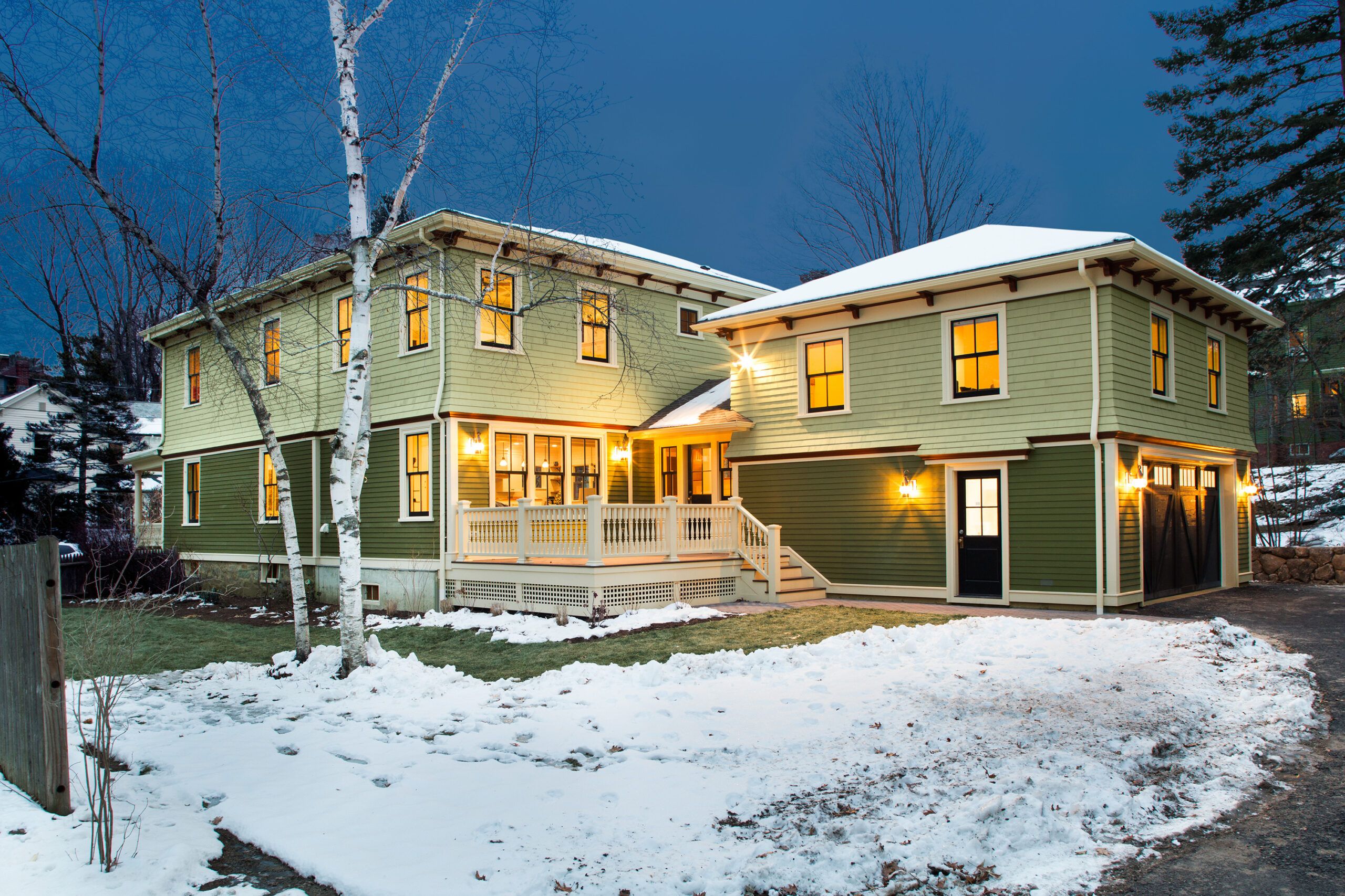
Shown: New shingle siding flares above a lower section of clapboards on the renovated house. The historical two-tone green scheme is accented with off-white trim and deep-red brackets.
WINDOWS: Marvin
ROOF SHINGLES: GAF
CEDAR SHINGLE SIDING: Maibec
FIBER-CEMENT CLAPBOARD SIDING: JamesHardie
PORCH COLUMNS: Chadsworth
PAINT (EXTERIOR TRIM): Benjamin Moore’s White Sand
PAINT (BRACKETS): Benjamin Moore’s Hodley Red
Opening the Space
The 3,000-square-foot, four-bedroom, three-and-a-half-bath home in Newton, Massachusetts, has an updated layout perfect for modern family life. But it also carefully preserves many elements of the old house that Liz cherishes. “The stairs even squeak in the same place,” she says, with a smile. “It reminds me of my mom walking up and down the staircase when I was young.”
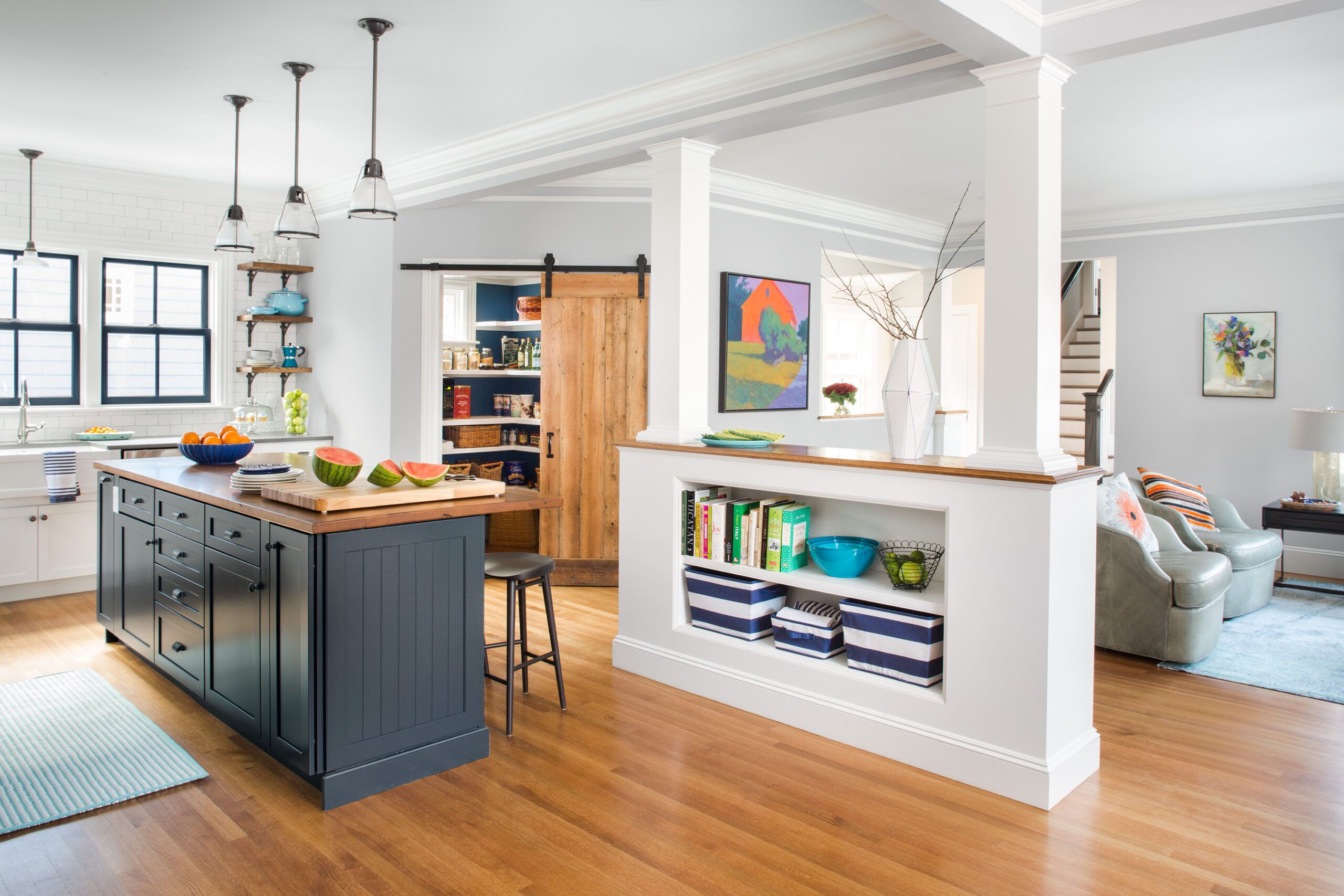
Shown: In the kitchen, bumping out the sink wall made room for a center island. Opening the space to the family room via a columned half-wall divider creates an even more spacious feel. A trimmed-out LVL beam spans the opening, with the help of four support posts.
QUARTZ COUNTERTOPS: Caesarstone
RECLAIMED WHITE OAK (ISLAND COUNTERTOP AND FLOATING SHELVES): Longleaf Lumber
CABINETS: Kraftmaid by Carole Kitchen and Bath Design in White Dove (perimeter) and Midnight Blue (island)
RIFT OAK FLOORING: Allegheny Mountain Hardwood
The Homeowners

After Liz lost her mother in 2015, she and Joe inherited the house. Finally ready to make it their own family’s home, they turned to architect Mat Cummings to help them maximize the square footage, including carving out space for extended visits from Joe’s parents. With the Delfinos’ desire to retain the house’s character in mind, Cummings designed a new open-plan kitchen-dining-family-mudroom flow on the first floor, a new master suite upstairs, and a garage addition with a second-floor guest suite with its own sitting area.
Shown: Liz and Joe Delfino, shown with their daughters, wanted to make the house more comfortable and functional, while keeping many sentimental features.
Efficient Kitchen
What the couple hadn’t anticipated when work began were some of the condition issues that surfaced. “The house was out of level, the roof was out of square, the walls weren’t true, and the floors were uneven,” says TOH general contractor Tom Silva, summing up the challenges. The dining room floor was slightly lower than the adjacent kitchen’s, and since the wall between the two rooms was coming down, the floor had to be torn up and reframed. That negative turned into a positive when Charlie Silva took some of the old-growth timber subflooring to his workshop and turned it into a sliding barn door for the new pantry. The family room, an earlier addition, proved to be so out of kilter that it was faster (and cheaper) to rebuild it. The front porch was so rotted from termites and water damage that it, too, had to be rebuilt—a project the Delfinos had hoped to delay.
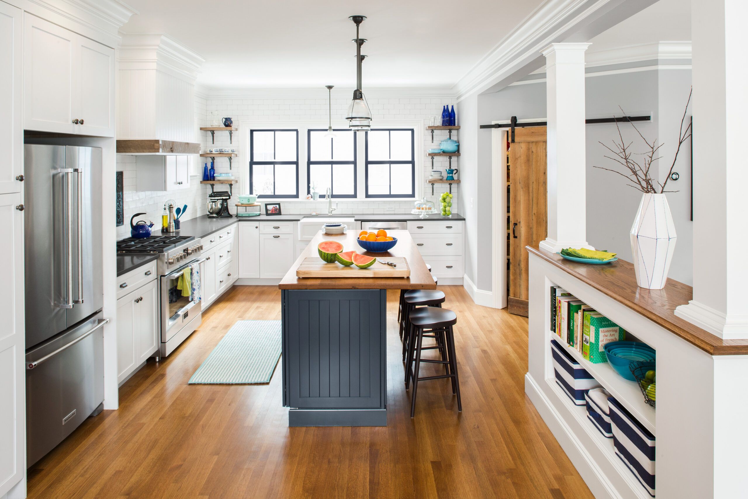
Shown: Three windows mark the kitchen bumpout, which added 90 square feet. The L-shaped layout creates an efficient workspace; the island provides additional prep and storage areas, plus casual seating. White oak floors, a reclaimed-wood island top, and a barn-style pantry door warm up the white cabinets and millwork.
KITCHEN SINK AND FAUCET: American Standard
GARBAGE DISPOSAL: Insinkerator
Dining Room
In an effort to preserve their budget and curb costs, Liz and Joe committed to being active participants in the project, strapping on tool belts whenever possible. Liz worked alongside TOH master carpenter Norm Abram installing new composite deck boards out back, and helped tiling contractor Mark Ferrante lay the tile behind the woodstove. She even took a class in stained glass to create a custom window for the new mudroom area. Joe pitched in on the installation of the exterior shingles, and helped patch plaster walls inside. “Liz is a mechanical engineer and much handier than I am,” says Joe, a software engineer for Google.
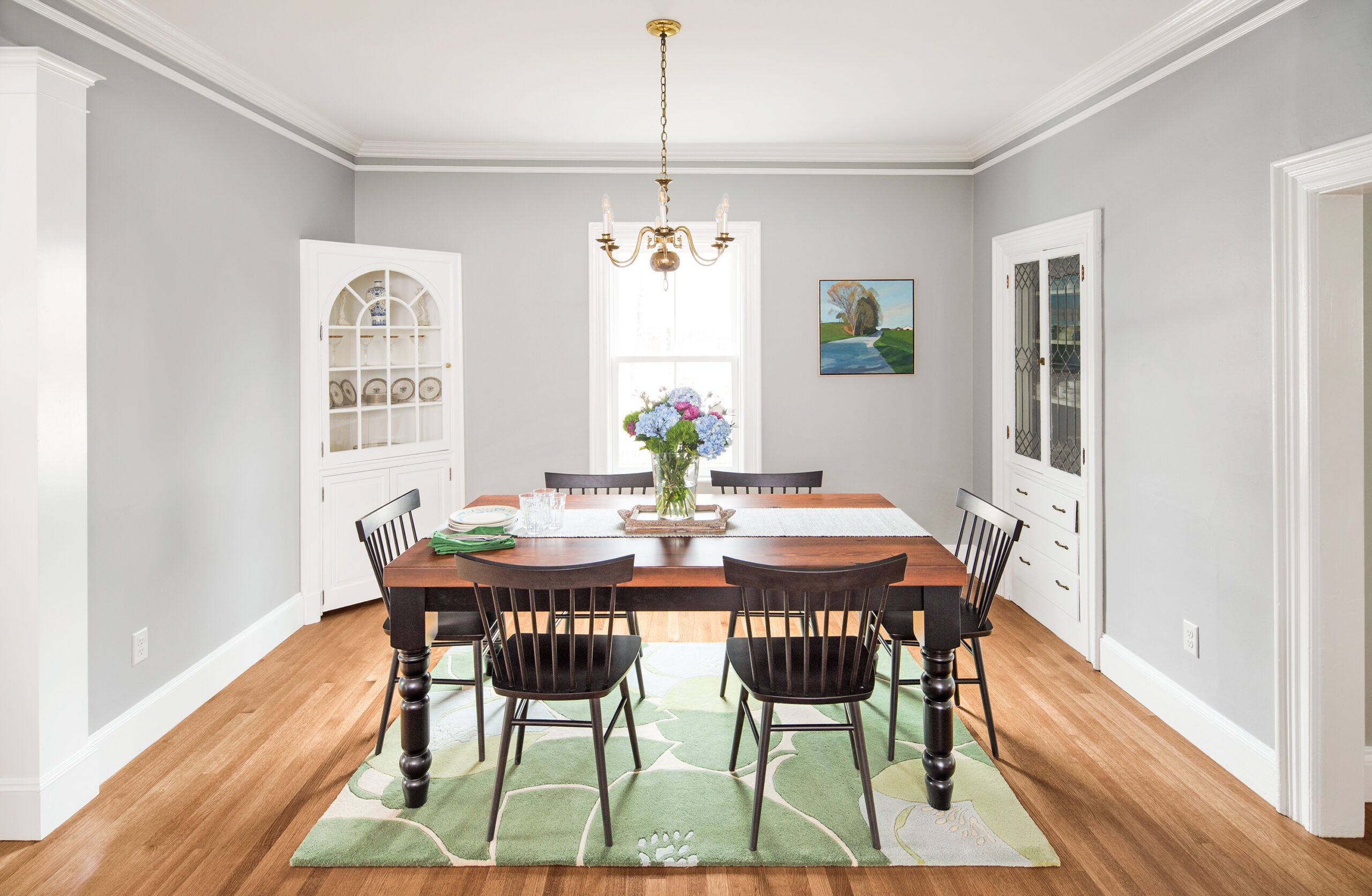
Shown: The dining area retains its corner cabinet, built-in china hutch, chandelier, and crown molding; the flooring is new.
DINING ROOM TABLE: TCW Farm Tables & Furniture
DINING CHAIRS: Room & Board
Family Area
At every turn, the couple held firm to their wish to keep the house’s old charms intact. For instance, while many of the pros on-site suggested replacing the half-height front porch newel post with a more architecturally appropriate full-height column, Liz resisted. “I like our odd little newel post and the old porch balusters,” she says. “They are just so familiar and welcoming to me.” They also insisted on keeping the entry area’s fireplace, where Liz recalls roasting marshmallows as a child, even though the drafty chimney was removed. “People thought it was crazy to keep the fireplace, since it’s not useful,” she says. “But it holds a lot of memories.”
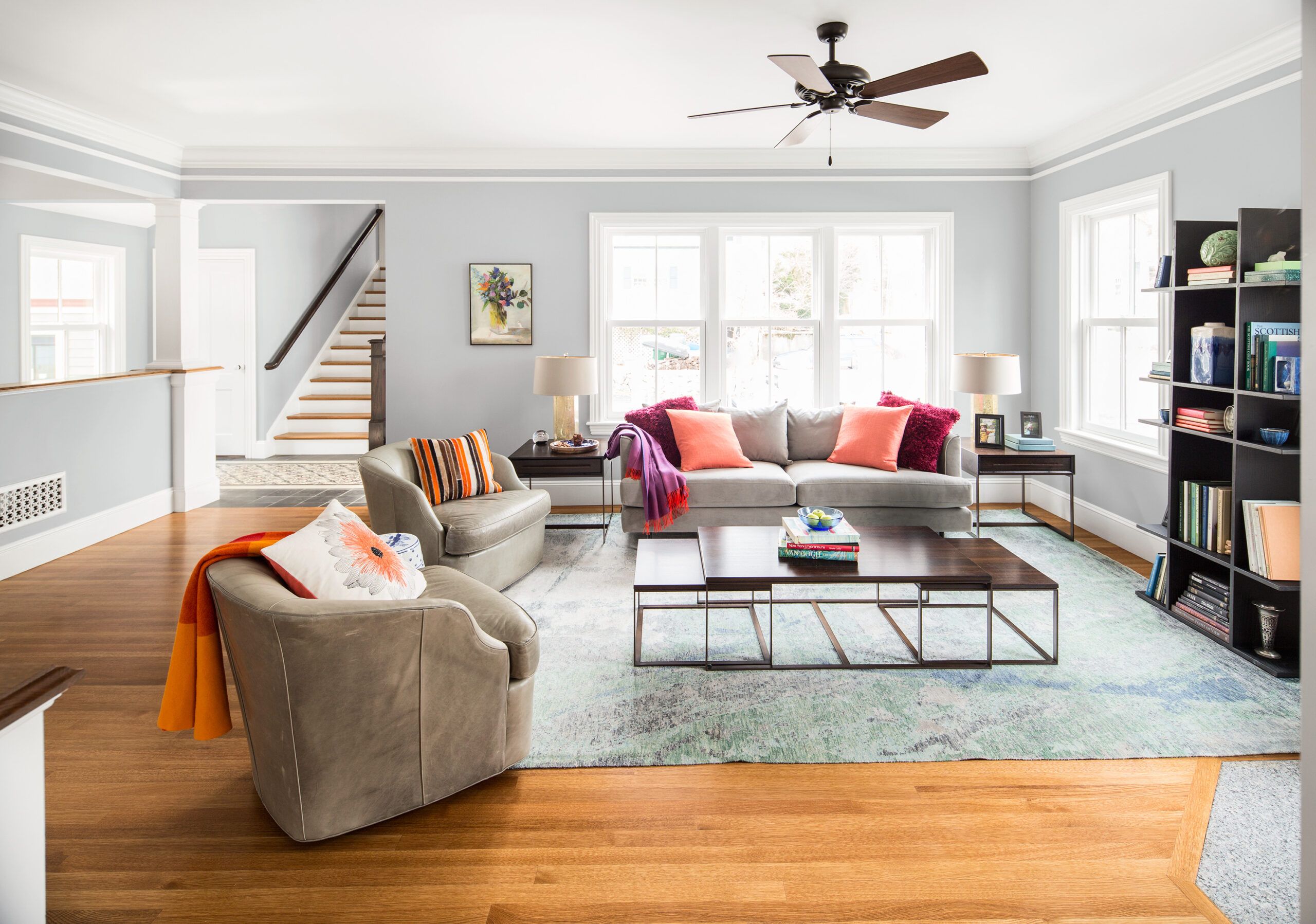
Shown: The family room—a previous addition that had to be rebuilt due to condition issues—is located off the back entry. Tall windows fill the space with light, while a woodstove (not shown) keeps it toasty in winter. On the other side of the half wall are mudroom storage and a powder room. The staircase climbs to the new in-law suite; the closed door leads to the garage.
FAMILY ROOM CHAIRS AND TABLES: Mitchell Gold + Bob Williams
FAMILY ROOM SOFA, LAMPS, AND CEILING FAN: Lucía Lighting & Design
FAMILY ROOM RUG: Landry & Acari
DOOR TO GARAGE (LEFT OF THE STAIRWAY): TruStile
PAINT (KITCHEN, DINING AREA AND FAMILY ROOM WALLS): Benjamin Moore’s Pelican Gray
Master Bedroom
With the addition of new windows and insulation, there’s one thing Liz doesn’t miss: feeling cold. As winter wound down, the house was cozier than it had ever been in her youth—thanks to a new four-zone heating system, the family room’s wood-burning stove, and radiant heat in the master bath, mudroom, and garage.
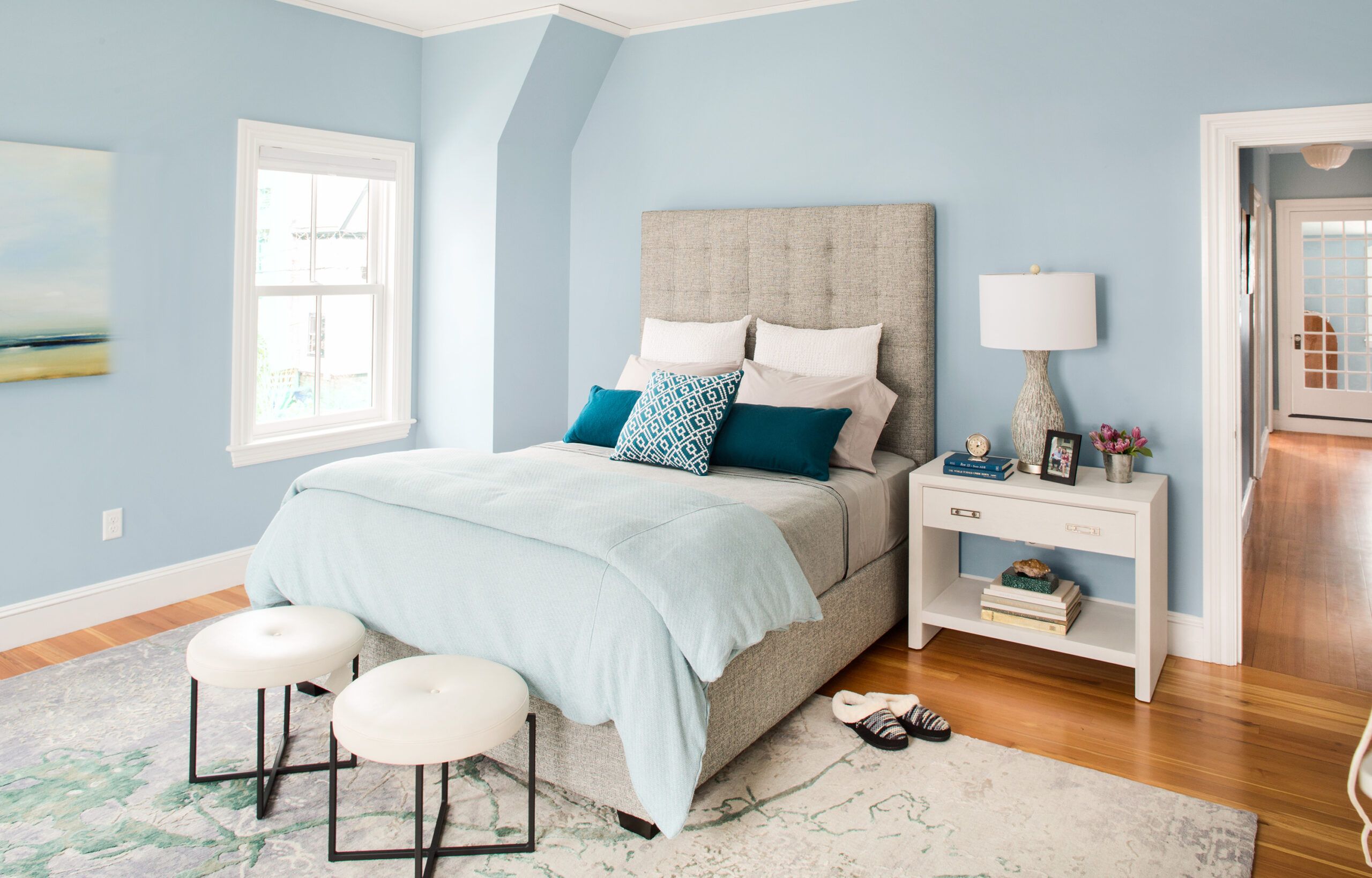
Shown: Pale-blue walls and neutral furnishings bring a sense of calm to the new master bedroom above the family room.
MASTER BEDROOM BED AND NIGHTSTAND: Mitchell Gold + Bob Williams
MASTER BEDROOM AND GUEST SITTING ROOM RUGS: Landry & Arcari
PAINT (WALLS): Benjamin Moore’s Mt. Rainier
Master Bath
Throughout, architectural elements were chosen to honor the house’s Victorian-era beginnings. The new kitchen is ringed with crown molding that replicates the original trim in the adjacent dining space. The half wall dividing the kitchen and family room has a period look, with built-in bookshelves and millwork-wrapped posts.
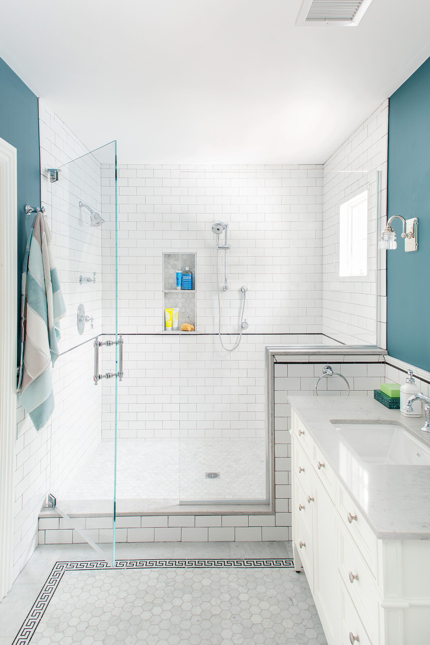
Shown: The spa-like master bath features gray-blue walls with white subway tile, a charcoal pencil trim, hexagonal marble floor tile with a Greek-key border, and a quartz vanity top.
MASTER BATH FIXTURES AND FITTINGS: American Standard
VANITY TOP: Caesarstone
BATH FAN: Panasonic
MASTER BATH ELECTRIC FLOOR WARMING AND WATERPROOF BACKER BOARD: Schluter
MASTER BATH TILE: Tile By Design
PAINT (WALLS): Benjamin Moore’s West Coast
Passed Down Bedroom
The kitchen also reflects the couple’s desire to inject the interior with color and pattern. Working with interior designer Chloë Rideout, they chose a deep blue for the island cabinetry, pantry walls, and kitchen-window trim, inspired by the color on a favorite blue-and-white transferware plate that belonged to Liz’s grandmother. A few steps away, in the new powder room, they incorporated that blue with other colors in a bold, Mediterranean-inspired cement tile floor.
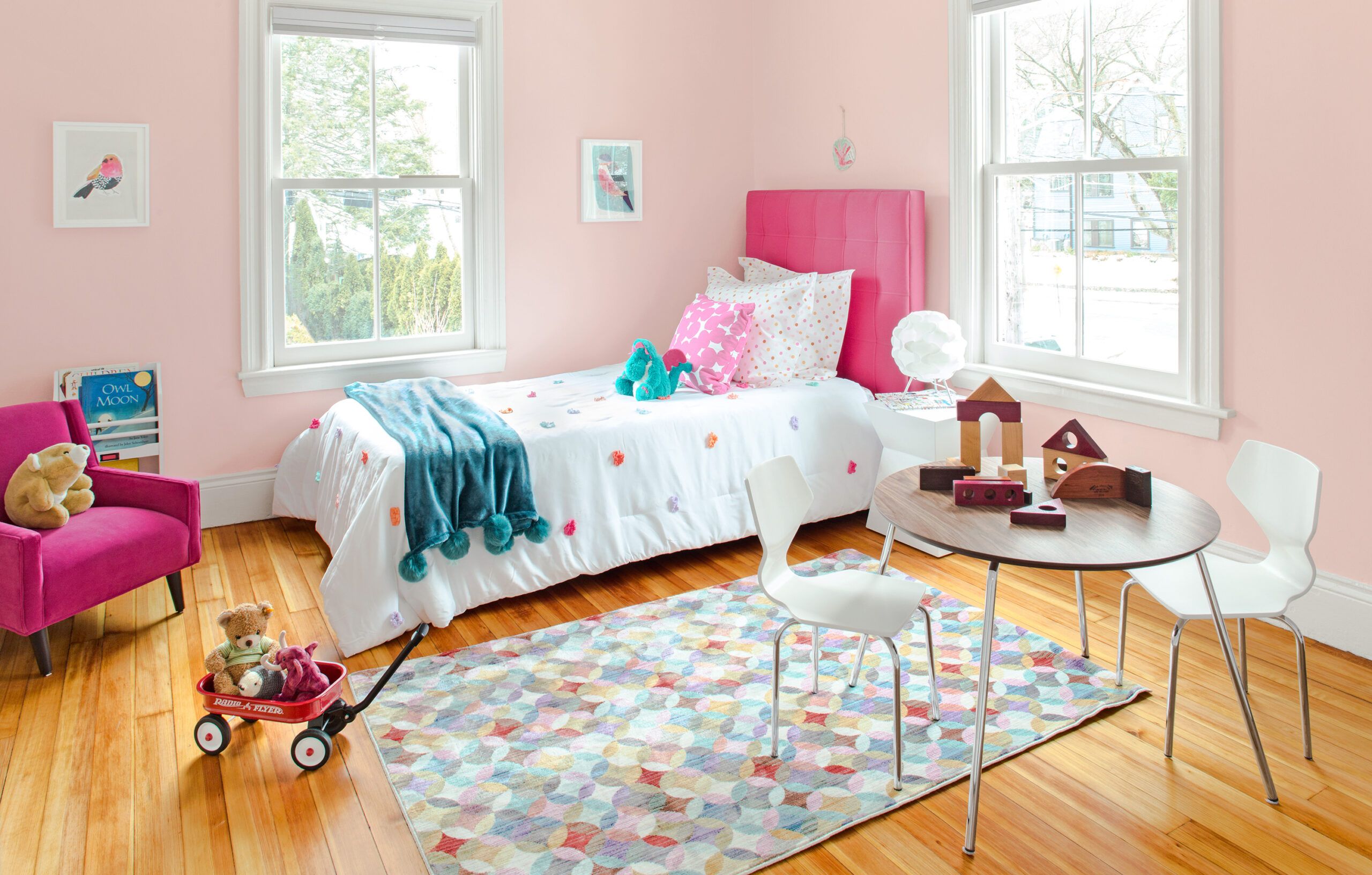
Shown: Liz’s girlhood bedroom now belongs to her 3-year-old, its original heart-pine floor refinished and its closet enlarged.
PINK BEDROOM BED, TABLE, AND CHAIRS: Room & Board
PAINT (WALLS): Benjamin Moore’s Morristown Cream
Garage Addition
Salvaging where they could also helped the couple preserve the soul of the old house. Liz worked with an antique-hardware expert to have all the doorknobs and hinges on the paneled-wood interior doors cleaned and reinstalled, making a connection with the past every time they turn a doorknob. While new white oak was laid for the kitchen–dining area, family room, and guest suite floors, the heart-pine boards lining the existing bedrooms and upstairs hallway were refinished, and more reclaimed heart pine was found for the new master suite. “I am fond of things that are imperfect and old,” says Liz. “I think they’re charming.”
Shown: The garage addition replaced an old freestanding outbuilding that cut up the backyard; it has an upstairs guest suite for visiting in-laws, and is joined to the house with a one-story connector. The historical exterior color scheme highlights the house’s details, including a flare added where upper-story shingles meet lower-level clapboards.
REAR DECKING: MoistureShield
WINDOWS: Marvin
ROOF SHINGLES: GAF
GARAGE DOORS: Overhead Door of Boston
PAINT (EXTERIOR TRIM): Benjamin Moore’s White Sand
PAINT (BRACKETS): Benjamin Moore’s Hodley Red
Guest Suite
Acknowledging that the house was a modest one when it was built, Mat Cummings found ways to enhance its period style without straying from its original spirit. On the exterior, he added a row of flared shingles where the upper level meets the lower clapboards; the swooped detail adds a grace note to the old house, as well as the new additions, and helps to unify them.
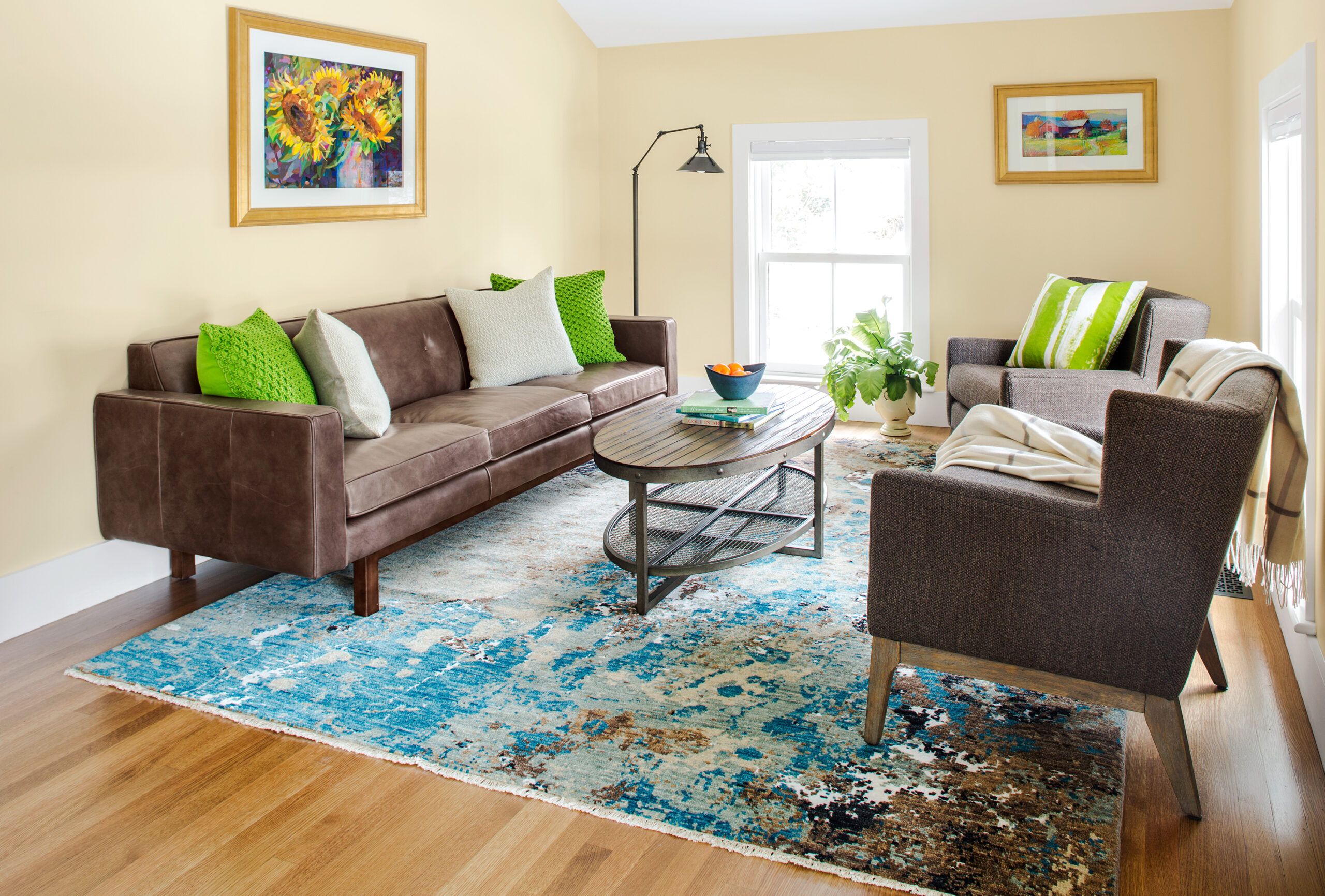
Shown: The guest suite above the garage includes a bedroom, bath, wet bar, and this sitting room. White oak flooring and pale paint colors give the space a light, airy look.
GUEST SITTING ROOM SOFA: Lucía Lighting & Design
PAINT (WALLS): Benjamin Moore’s Fresh Air
Victorian Details
“The configuration of this house now makes sense, the flow is great, and there are no rooms we won’t use,” says Liz of the end result. Call it a perfect blend of honoring the past and building for the future.
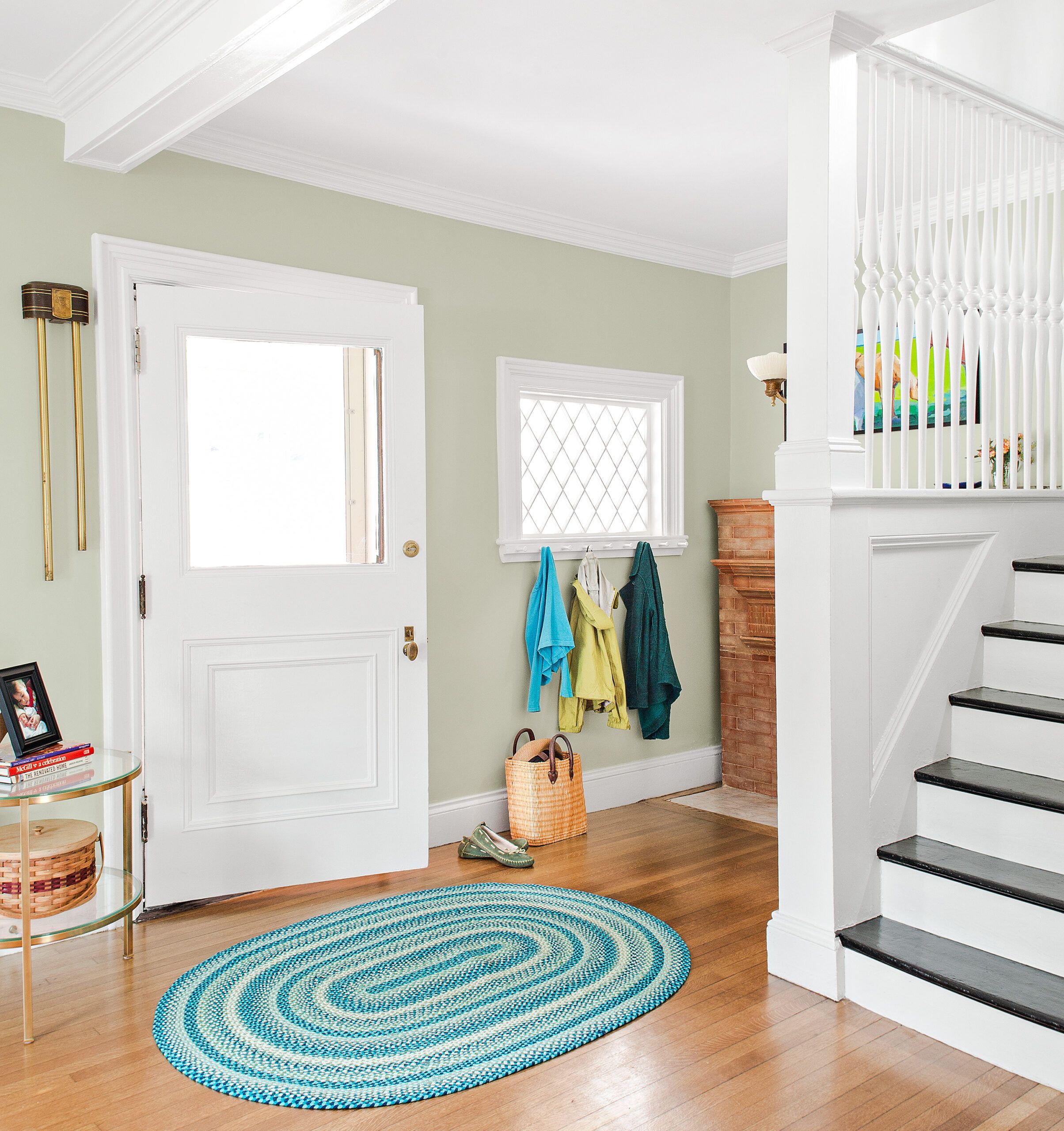
Shown: A diamond-pane window to one side of the front door and the staircase’s delicately turned balusters reflect the house’s Victorian-era roots.
PAINT: Benjamin Moore’s Silver Sage
BRASS TABLE: Lucía Lighting & Design
Front Parlor
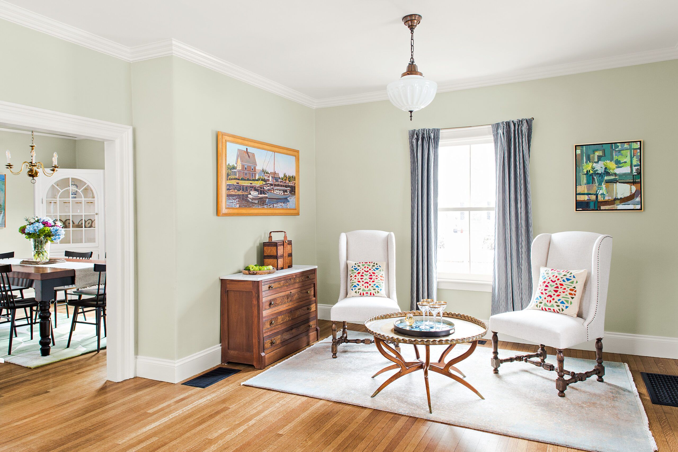
The front parlor features a vintage light fixture and original wood floors; the in-floor heat register was added when the new forced-air HVAC system went in.
PAINT: Benjamin Moore’s Silver Sage
CHAIRS: Lucía Lighting & Design
RUG: Landry & Arcari
No Raised Hearth
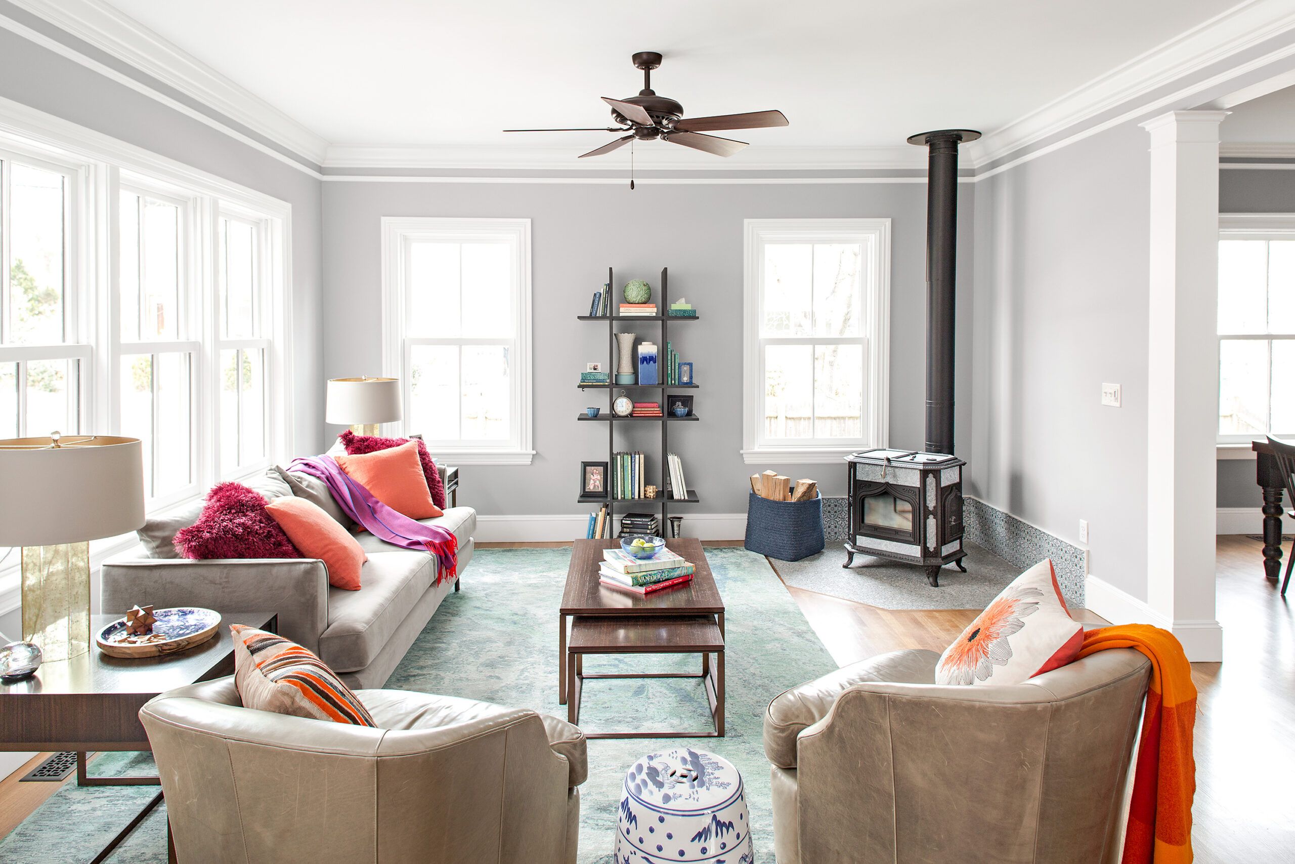
“I like a woodstove, but not a raised hearth,” says Tom Silva. So the family room’s new woodstove rests on a granite hearth neatly inset flush with the surrounding wood floor.
WOODSTOVE: Woodstock Soapstone Company
WALL TILE NEAR STOVE: Tile By Design
A Sentimental Mantel
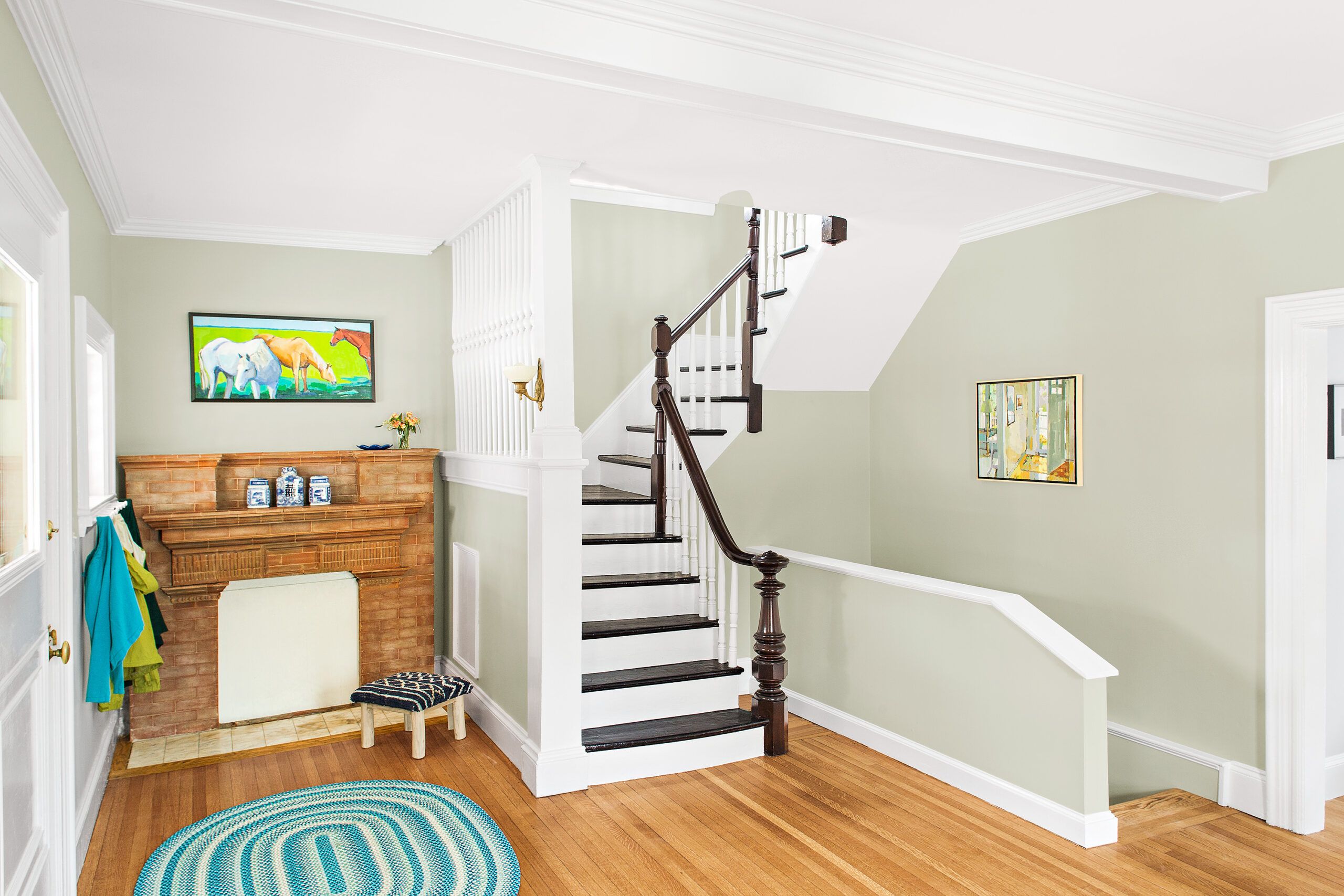
The fireplace just inside the front door no longer works, so the exterior chimney was removed. The mantel was stripped and left in place for sentimental reasons. The original stairway’s treads and railing were refinished.
PAINT: Benjamin Moore’s Silver Sage
ARTWORK: Powers Gallery
Guest Bedroom
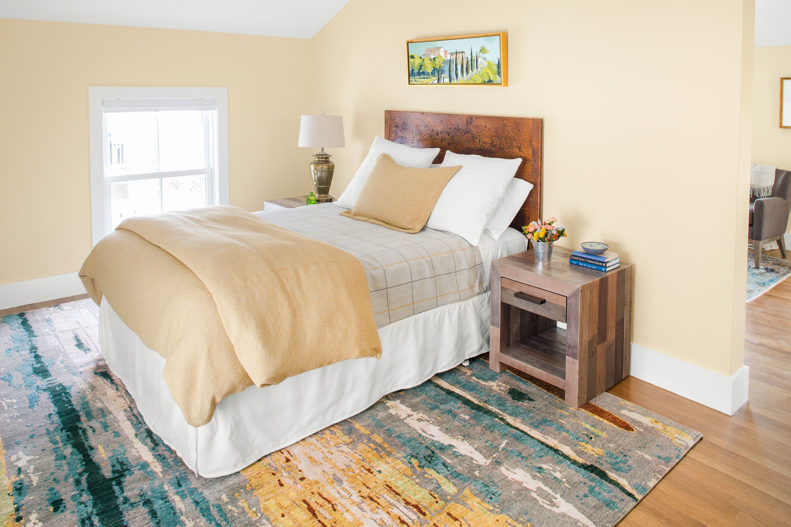
A neutral palette of grays and beiges gives the guest bedroom a warm, inviting look.
RUG: Landry & Arcari
PAINT: Benjamin Moore’s Fresh Air
BEDDING: Room & Board
Guest Retreat
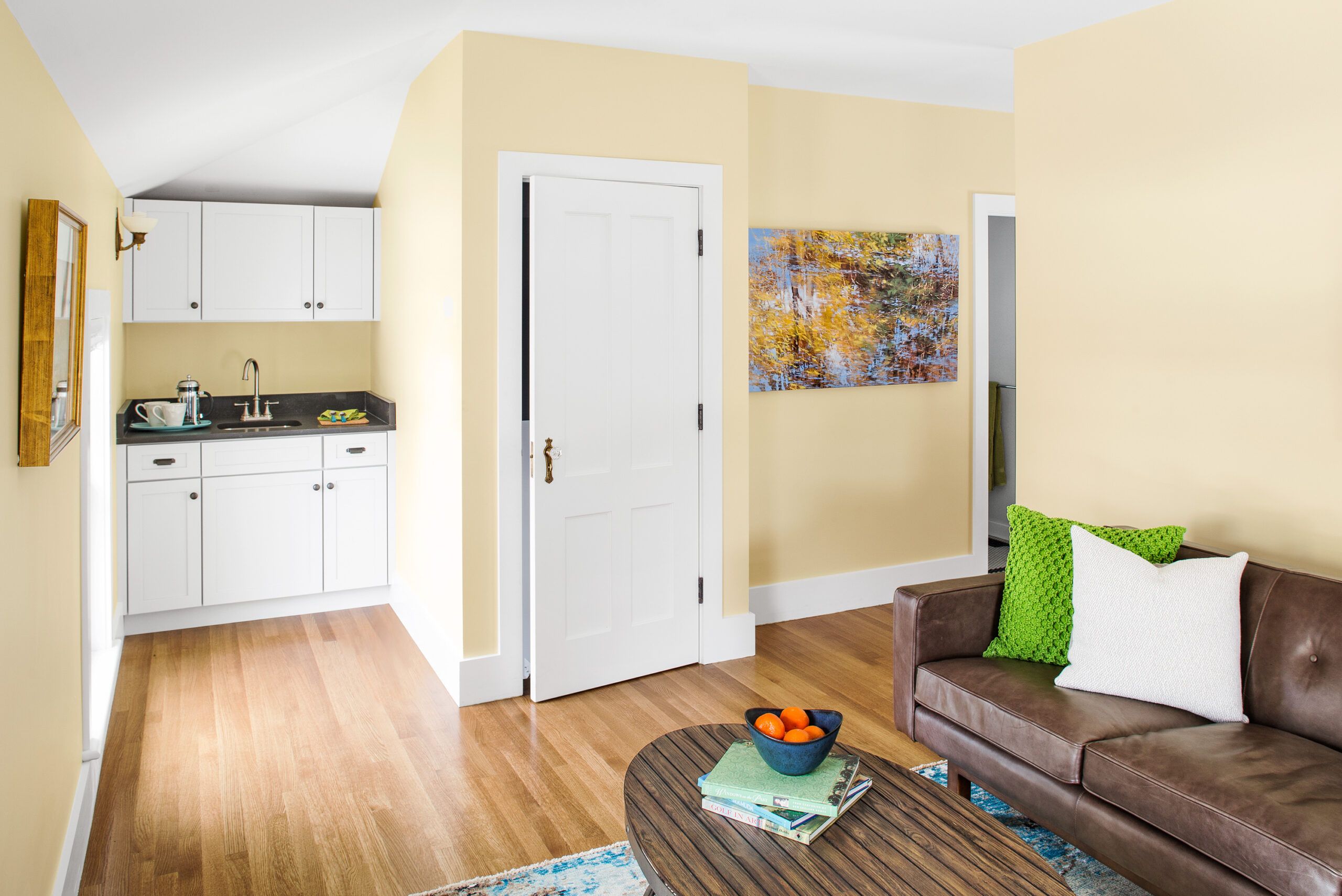
The guest suite includes a wet bar and living area so guests can have their own private retreat.
SINK AND FAUCET: American Standard
CABINETS: Kraftmaid by Carole Kitchen and Bath Design
WHITE OAK FLOOR: Allegheny Mountain Hardwood
DOOR: TruStile
DOOR HARDWARE: Charleston Hardware
Room for Laundry
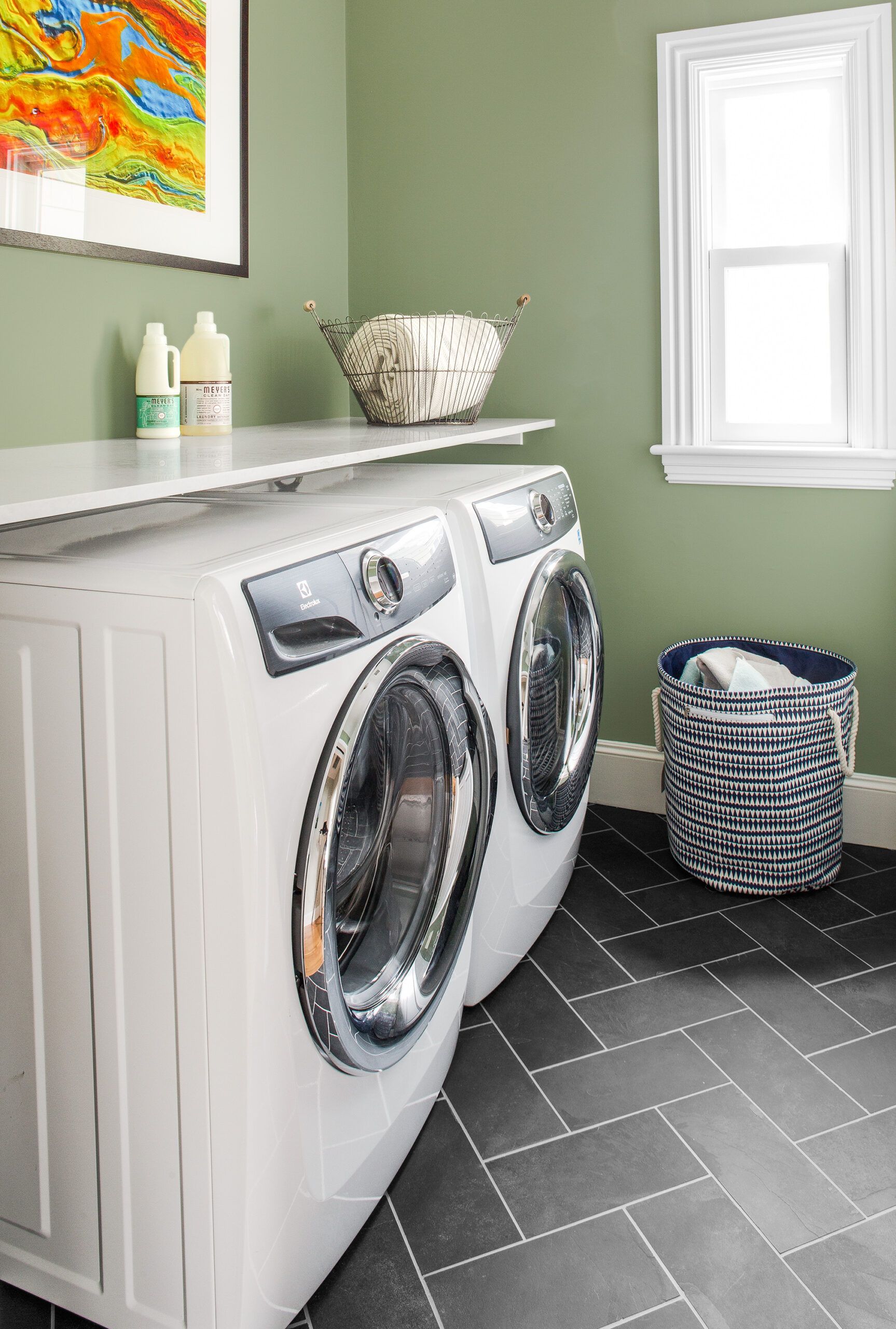
Reconfiguring the second floor near the new master suite created room for a laundry, which the homeowners love for its convenience and style.
COUNTERTOP: Caesarstone
PAINT: Benjamin Moore’s Kennebunkport Green
Vintage Industrial
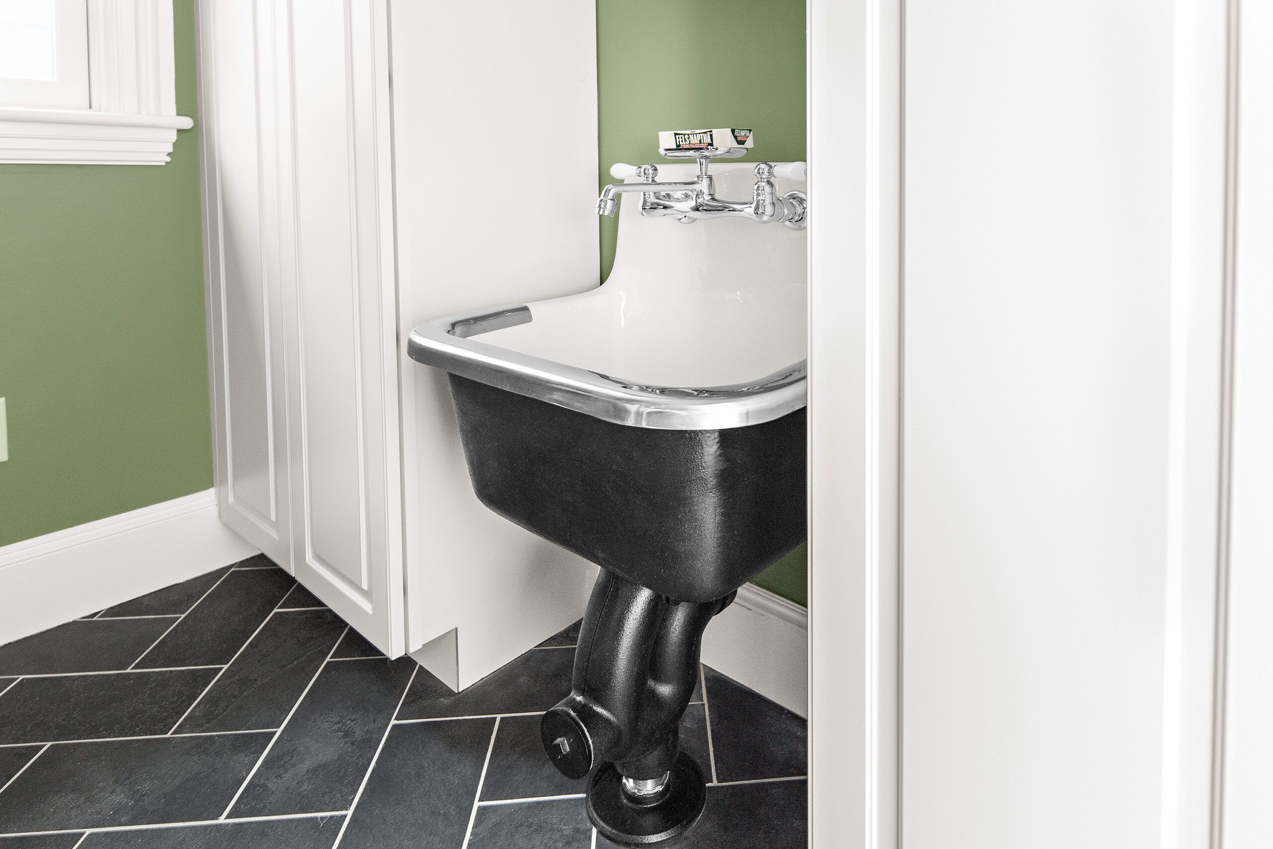
A cast-iron service sink gives the second-floor laundry room a vintage industrial look.
SINK: American Standard’s Lakewell
FLOOR TILE: Tile By Design
CABINETS: Kraftmaid by Carole Kitchen and Bath Design
Stained-Glass Maple
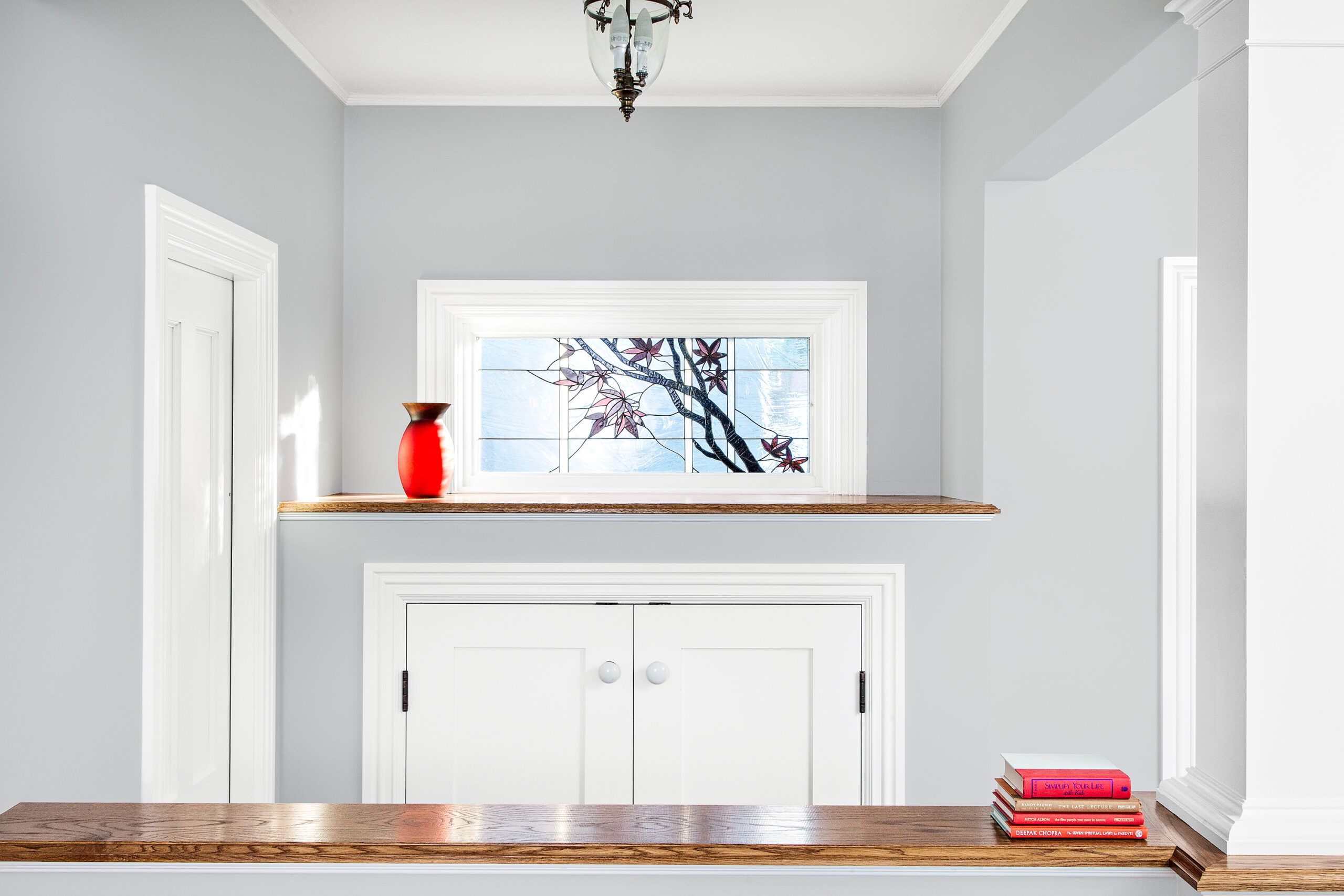
Taking a class with a local artist, Liz Delfino made the stained-glass window for the new mudroom area; a Japanese maple just outside inspired the motif.
PENDANT LIGHT: Lucía Lighting & Design
CABINET DOUBLE DOORS: TruStile
Sliding Barn Door Pantry
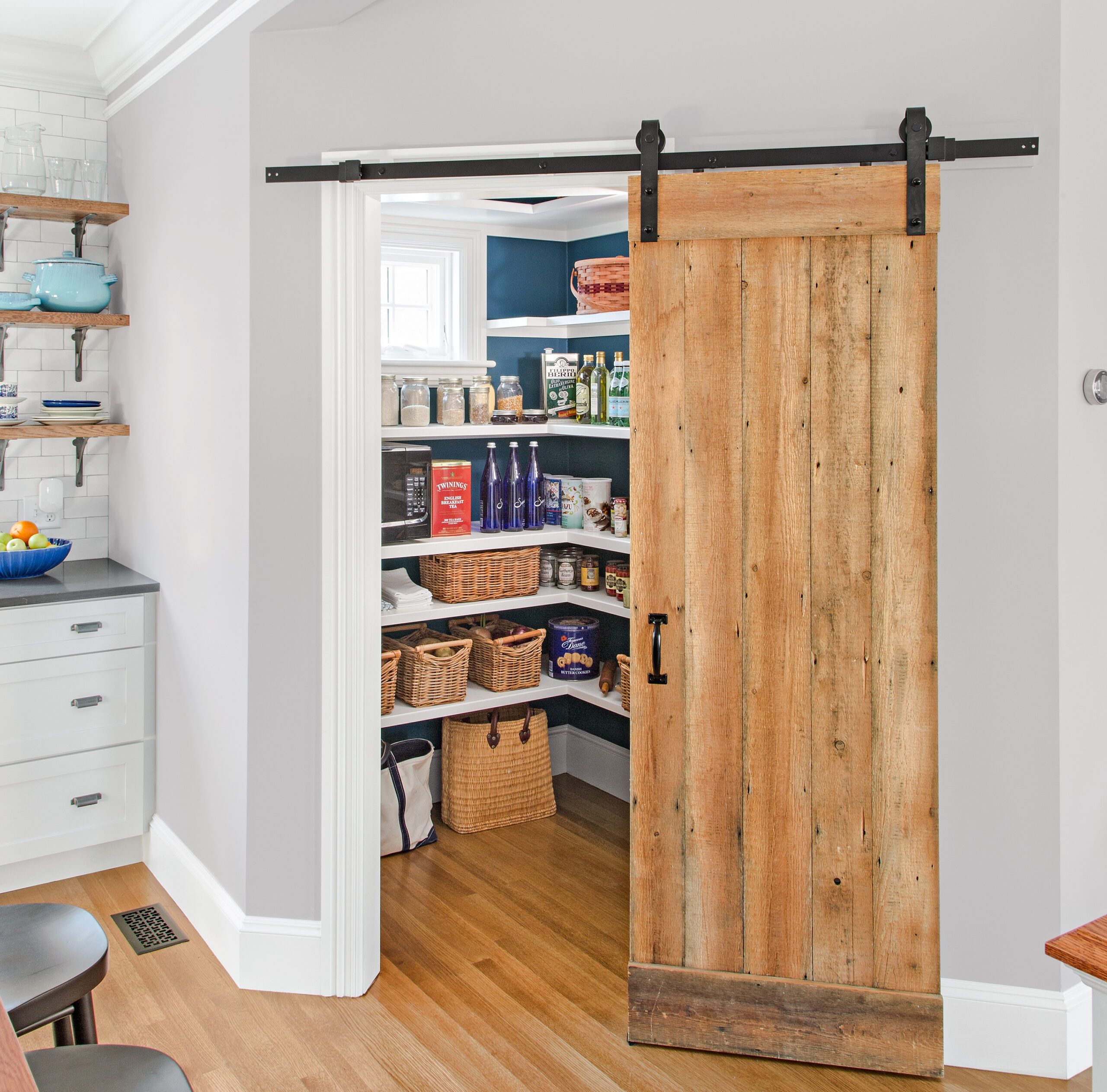
Built-in open shelving on two sides offers easy-access storage in the pantry. Charlie Silva made the sliding barn door from old-growth timber subflooring unearthed in the dining room.
WINDOW: Marvin
PAINT (pantry walls): Benjamin Moore’s Kensington Blue
Distressed Vanity
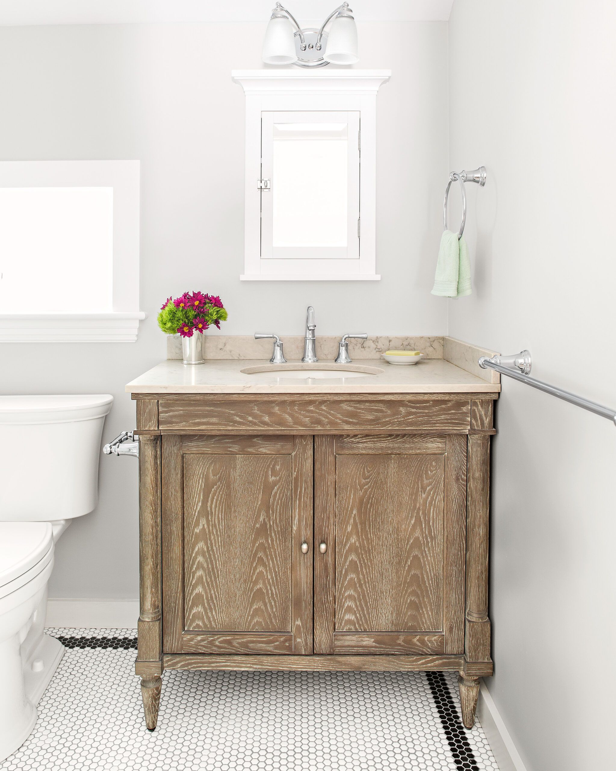
The guest bath in the suite over the garage has pale-gray walls, a white mosaic tile floor framed in black, and a distressed-wood vanity.
FIXTURES AND FITTINGS: American Standard
PAINT: Benjamin Moore’s Graytint
Powder Room Pattern
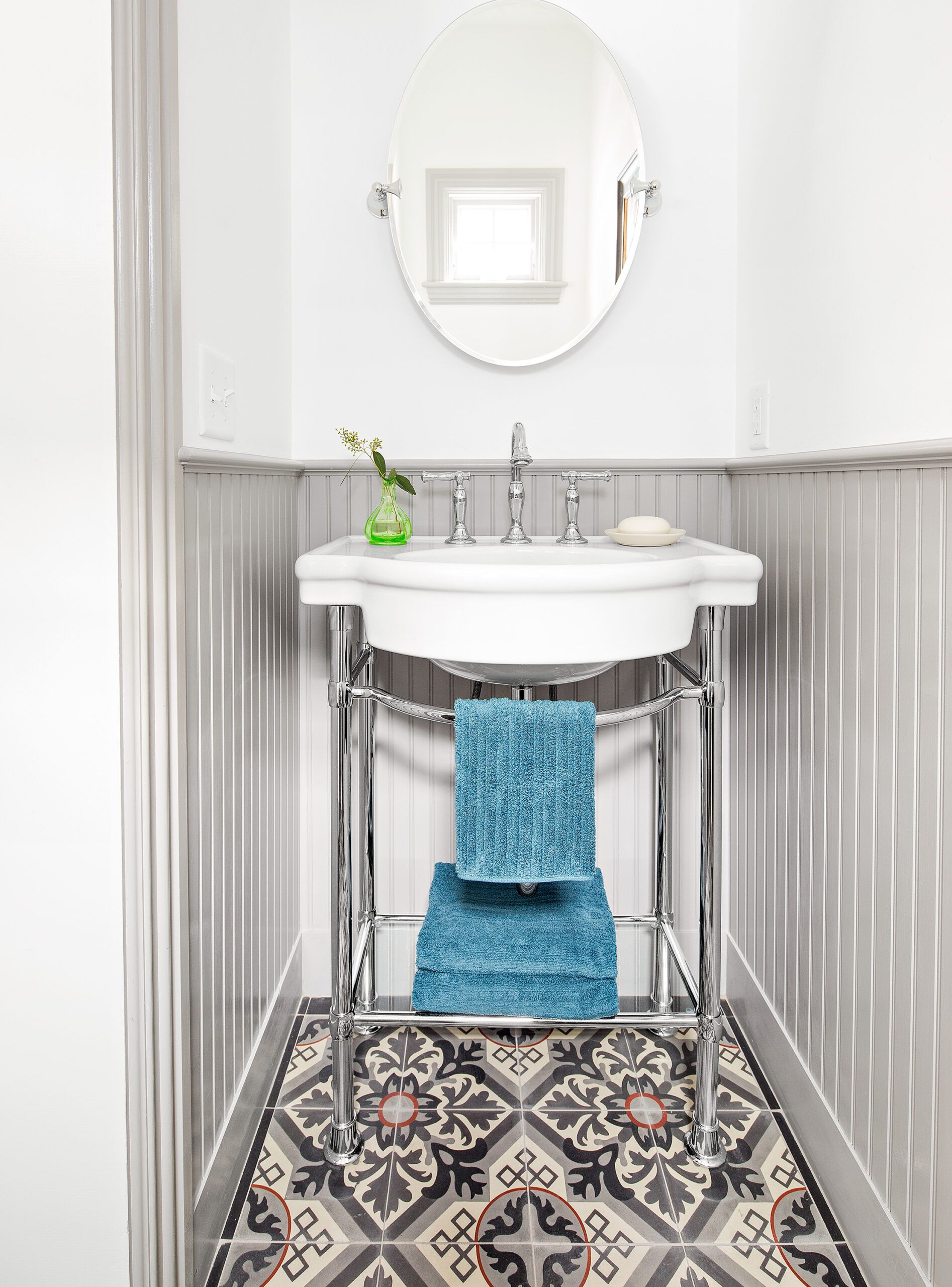
A patterned cement tile floor gives the tiny powder room big style. Beadboard wainscot and a console sink add period-appropriate finishes.
FIXTURES AND FITTINGS: American Standard
TILE: Villa Lagoon
Fireback Backsplash
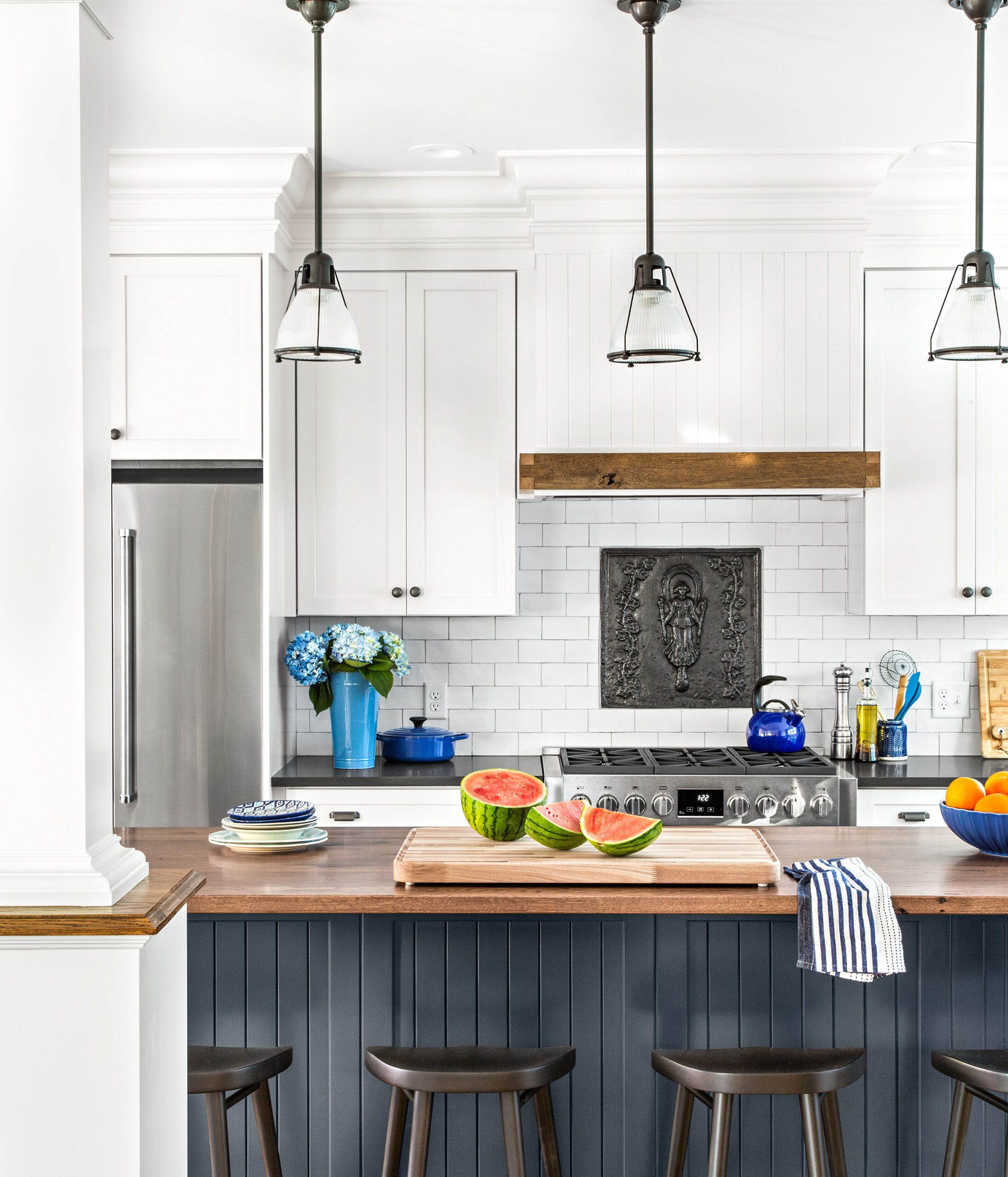
A cast-iron fireback adds a distinctive focal point to the backsplash above the stove. Pendant lights above the island lend a vintage look.
PENDANT LIGHTS: Lucía Lighting & Design
ANTIQUE FIREBACK: antique-fireback
Comfort Underfoot
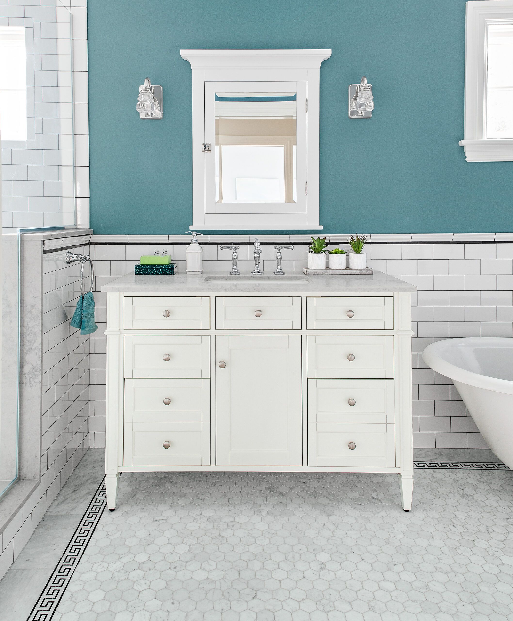
An electric heat mat under the master bath floor tile adds comfort underfoot in the winter months.
FIXTURES, FITTINGS: American Standard
FLOOR WARMING SYSTEM: Schluter
TILE: Tile By Design
Claw-Foot
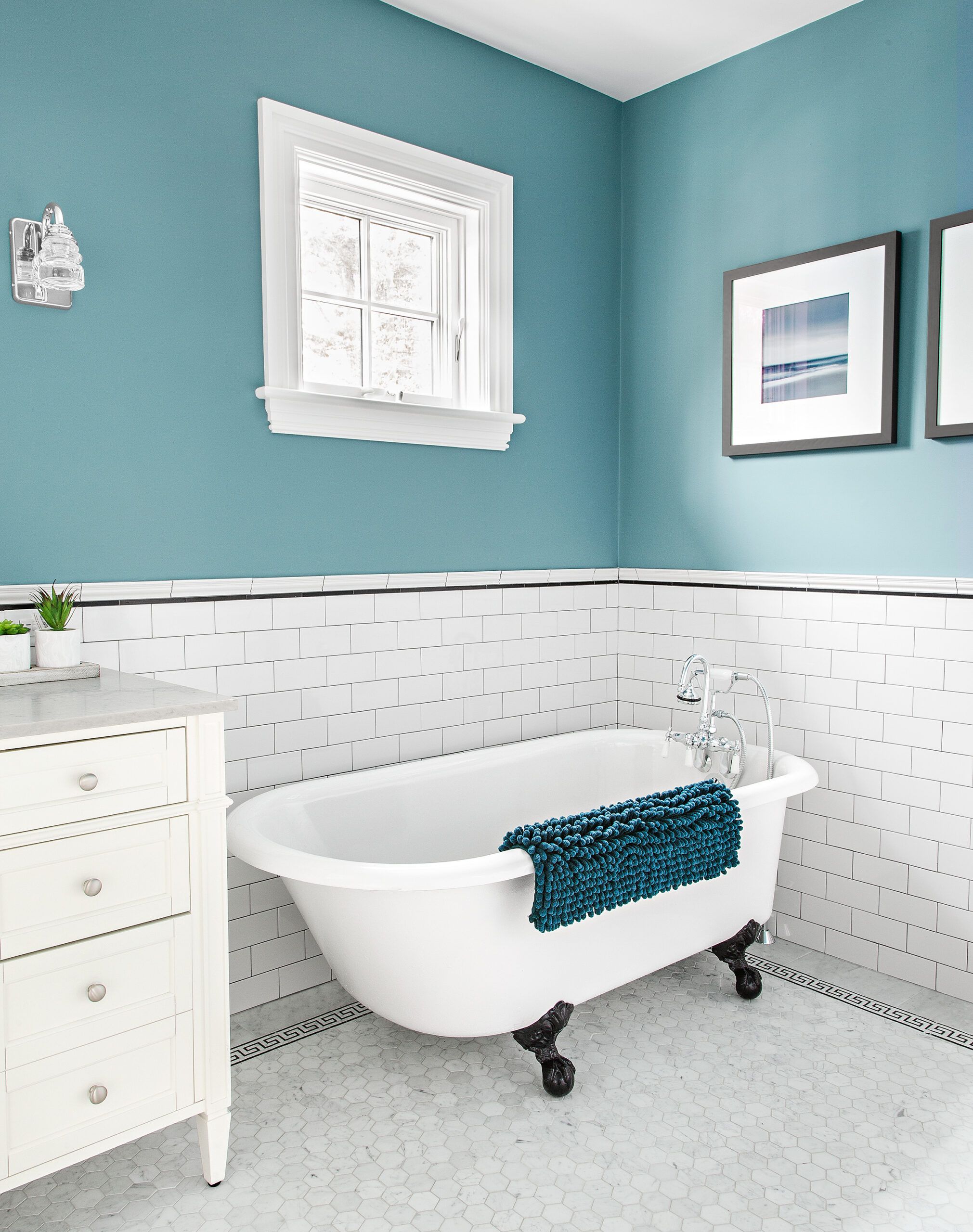
The homeowners found a claw-foot tub in a salvage yard and had it refinished for the master bath.
VENT FAN: Panasonic
TUB: Nor’East Architectural Salvage
PAINT: Benjamin Moore’s West Coast
Mudroom Bench
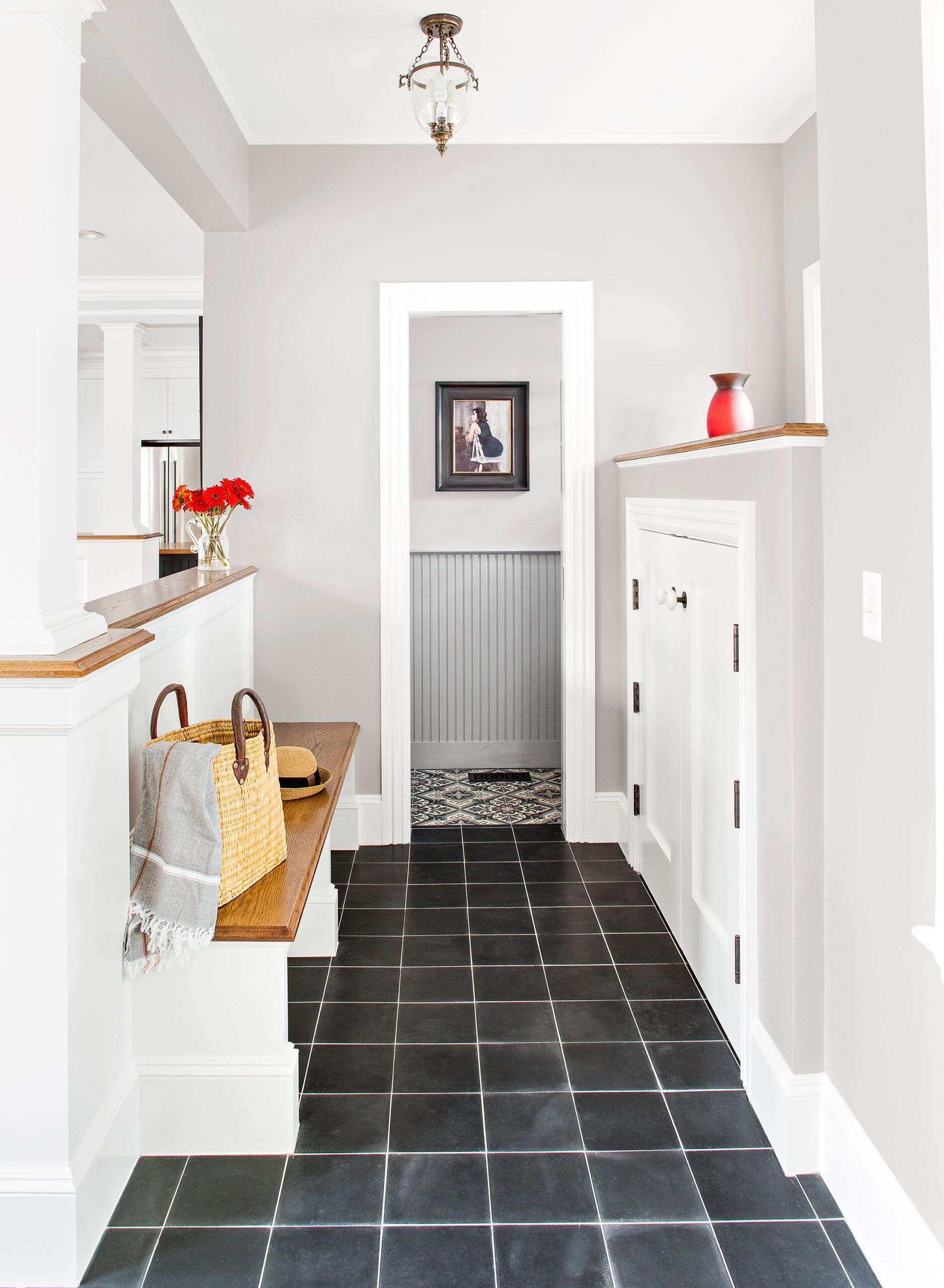
A mudroom bench and storage cabinets line the hallway to the powder room. They are hidden from view on the family room side by a half-wall divider.
LIGHT FIXTURE: Lucía Lighting & Design
FLOOR TILE: Villa Lagoon
Floor Plans
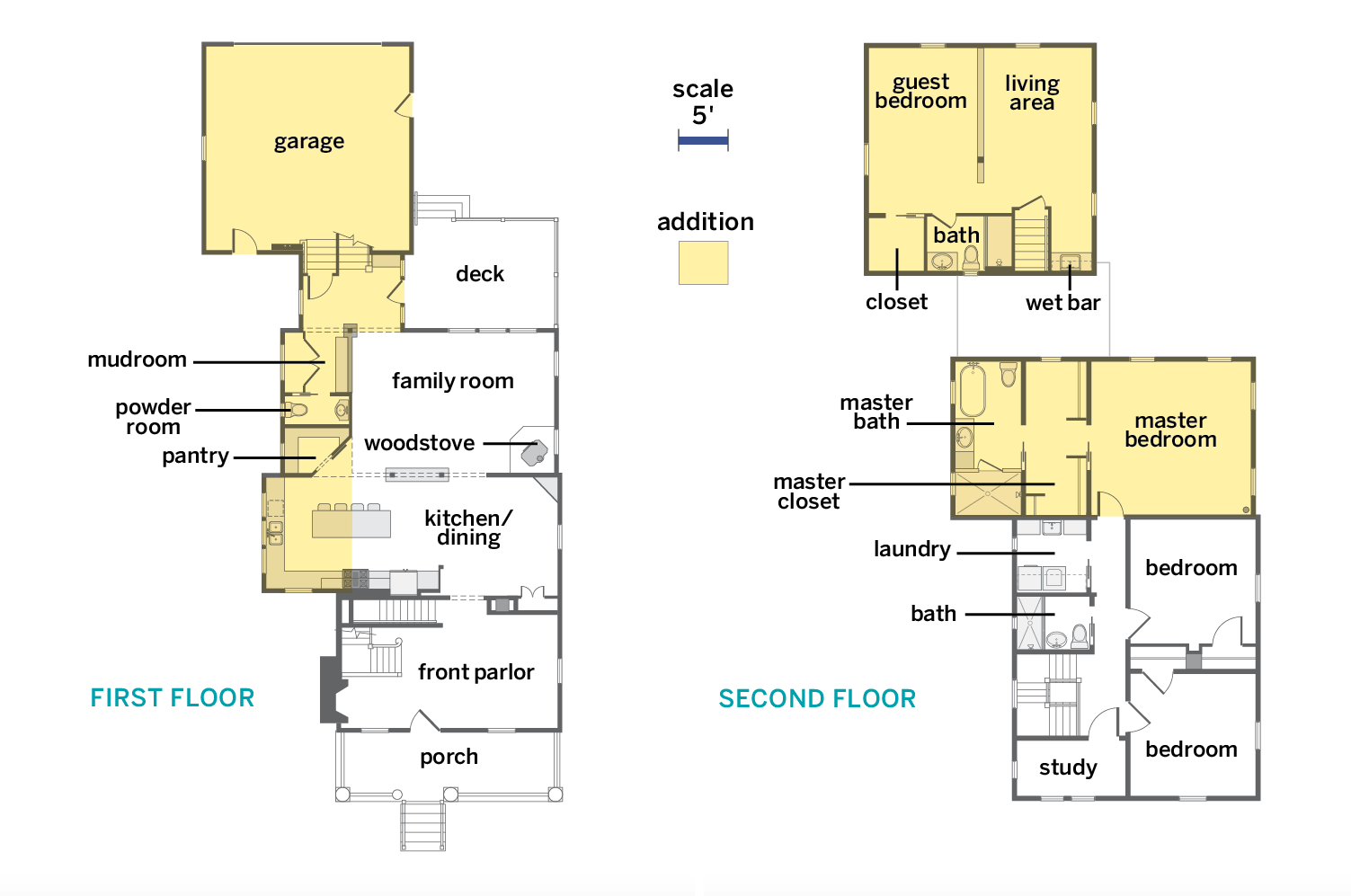
A bumpout enlarged the kitchen, a master suite went in over the family room, and the half bath was relocated between a new pantry and a mudroom. A garage addition with guest quarters upstairs connects to the house on the first floor.
