Get Started
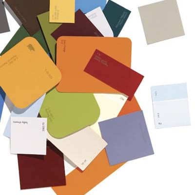
Choosing a color scheme for a small room is a perfect opportunity to be fearless. Unlike large rooms requiring an equally large investment—in terms of gallons of paint and the labor required to roll it on—your outlay for, say, an entry foyer or hall bath is minimal. So go ahead: Pick a color that you really like, and go for it.
Just step back and consider what feeling and effect you want to create.
If your goal is to make the room appear larger, go with lighter shades. But if you want to accentuate its coziness, opt for rich, saturated hues. Then think about the room’s function. Sunny colors often work well in the breakfast nook where you enjoy your morning coffee, while calming shades in a bathroom can
encourage you to de-stress in the tub after a demanding day.
But if even making those decisions is too much, simply pick one of these This Old House—approved color combinations. Thanks to some Photoshop wizardry, you’ll see how three small rooms get completely new looks using three different—and daring—paint schemes.
Entry Foyer: Add a Single Accent
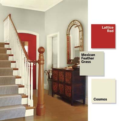
Lively bursts of color in
a front hall create a welcoming atmosphere. “It’s a pass-through space where people don’t linger for long, so take some liberties and be playful,” says Ann McGuire, founder of Beehive Studios, a color consulting firm in Buck Hill Falls, Pennsylvania.
A fire-engine red door provides an unexpected
pop of color against taupe walls. The ceiling,
trim, and stair risers are painted a lighter shade
than the walls to subtly emphasize the woodwork.
Paint: Ralph Lauren
Entry Foyer: Mix Warm and Cool Hues
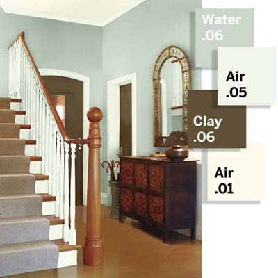
Paints from the
warm side of the color spectrum, such as
the earthy clay used on the doors and the cream on the ceiling, get a lift from the cooler and airier blue-green and celadon hues shown on the walls and trim.
Paint: Yolo Colorhouse
Entry Foyer: Update and Enlarge
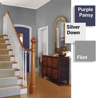
Many colors popular today are new twists on 1980s favorites, says McGuire. Here,
a deep-purple entry door enters neutral territory when paired with gray walls. A light, silvery gray on the ceiling and trim makes the small space feel larger.
Paint: Ace
Breakfast Nook: Let the Sun Shine In
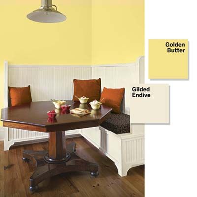
Like a dose of caffeine,
cheery colors in a kitchen
area get you going in the morning, says McGuire.
And by painting architectural details, such as this kitchen’s built-in bench, you can
play with contrasts between dark and light hues.
Let the sun shine in
Yellow gives an eating area a fresh, clean look.
Next to its more golden counterpart, the creamy paint on the seating accentuates the details of the built-in bench.
Paint: Valspar
Breakfast Nook: Rev Up Red
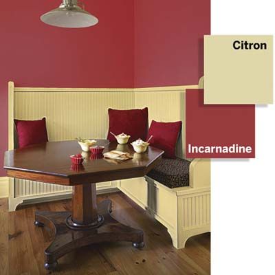
A traditional choice in a formal dining room, the crimson walls, shown with a custard hue on the bench, lend warmth to even a casual eating area. Deep colors work well where there’s little natural light because incandescent lamps make them appear richer.
Paint: Farrow & Ball
Breakfast Nook: Provide an Anchor
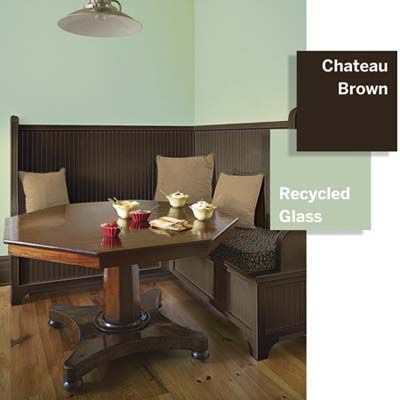
Using a chocolate brown on the bench has a grounding
effect on the minty-green walls, making them seem taller.
The dark color also emphasizes the coziness of the corner built-in. Paint: Sherwin-Williams
Bathroom: Emphasize Good Bones
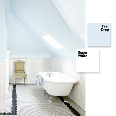
Pale blues and greens
in a bath are common picks because they are soothing, says Chicago-based interior designer Kara Mann.
“But that doesn’t mean you should be afraid of using an unexpected color,” she says.
“In a small space, it packs a lot of punch.”
The contrast between the crisp white and watery
blue helps focus the eye on the wainscot paneling,
one of the bathroom’s nicest architectural features.
Paint: Benjamin Moore
Bathroom: Choose Color Complements
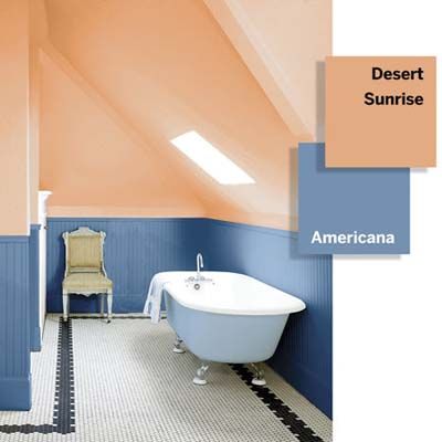
Successful bold pairings can be found across from each other on the color wheel. Putting this pale orange together with its dusky blue opposite makes both colors look cleaner and brighter. Paint: Behr
Bathroom: Stick to the Strip
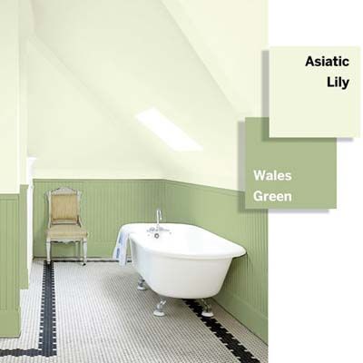
A sure-fire recipe
for a winning combo
is to pick shades from the same color strip. Here, the top and bottom hues are represented with a light celery on the walls and a saturated mossy green on the wainscot. Paint: Glidden
