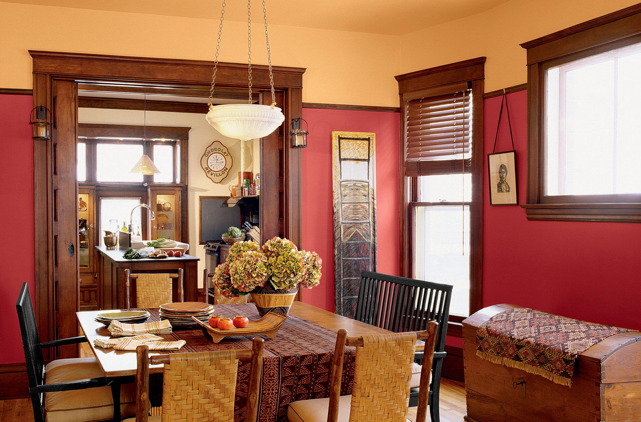
Color trends may come and go, but some paint palettes just seem to have staying power—perhaps because they’re rooted in the past. Interior paint schemes grounded in period architecture can look as fresh now as they did in their heyday, especially when given a bit of a twist. Consider the 10 historical color combinations showcased here.
Historic Interior Paint Colors
Victorian: Layered Brights
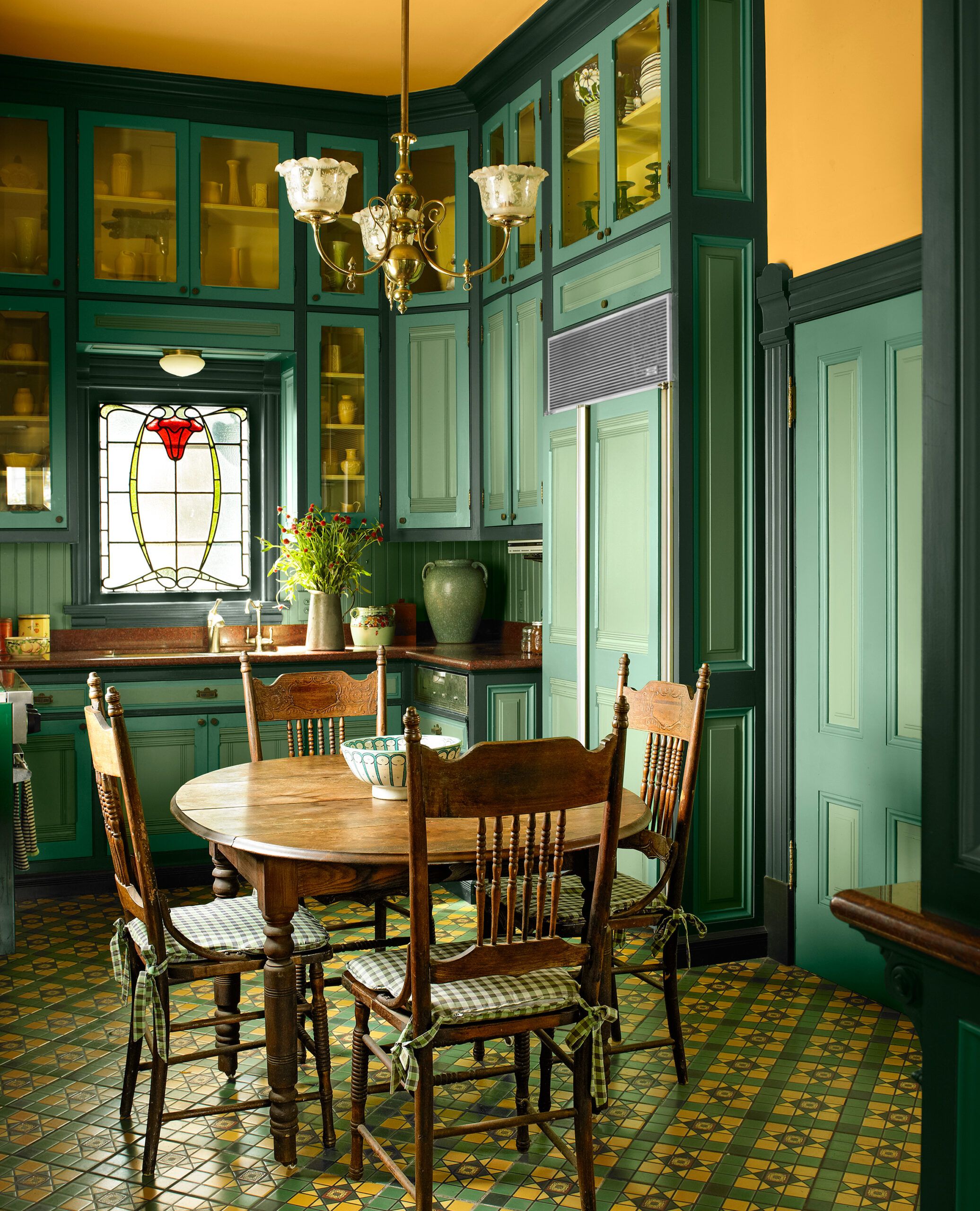
Amp up the color without veering into kitsch by sticking to one part of the spectrum. This kitchen, in an 1889 Stick Victorian, showcases three shades of green: a dark trim color taken from the original floor tile, plus two shades that echo hues used in other rooms.
A strong yellow runs up the walls and onto the ceiling to help draw the eye up and brighten the small space; it’s a visual trick that also would work where ceilings are low. A Victorian-era kitchen might have included more stained wood, says colorist Sara McLean of Dunn-Edwards Paints. “But the layers of over-the-top color here are true to the home’s original character.”
Victorian Palette
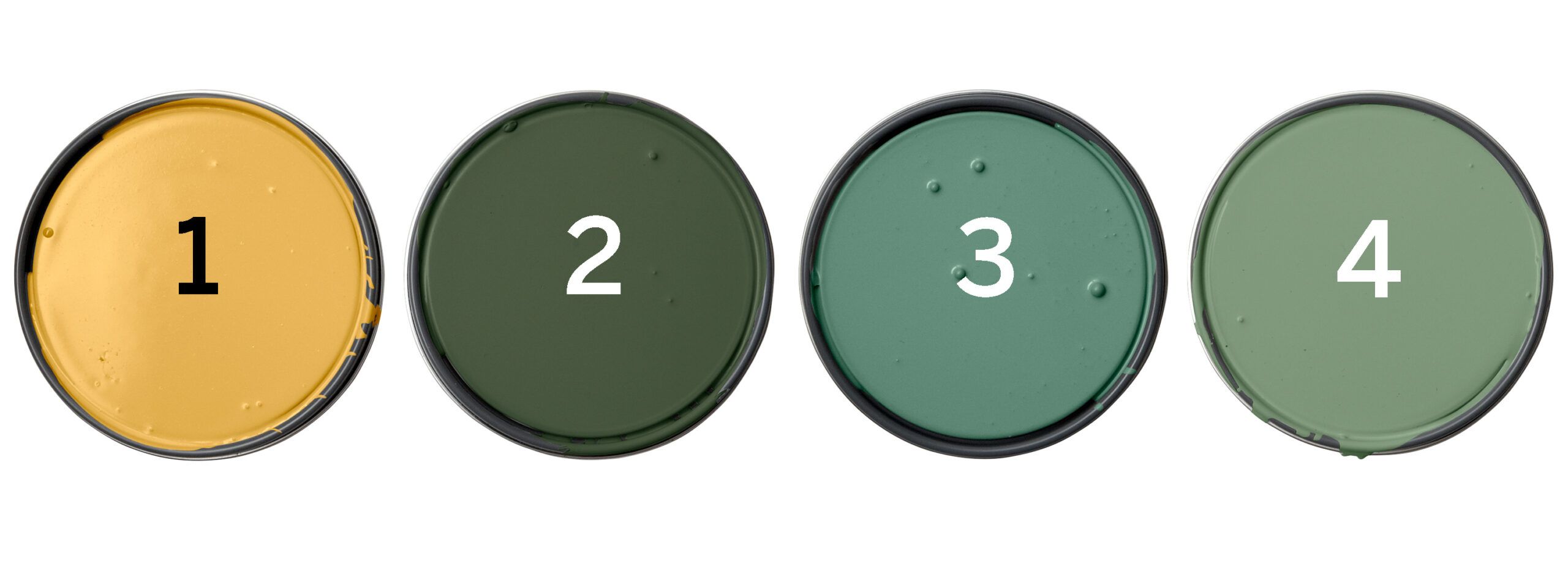
Dunn-Edwards 1. Golden Retriever (walls and ceiling); 2. Greener Pastures (trim, cabinet boxes); 3. Stanford Green (cabinet doors); 4. Eat Your Peas (door panels)
Victorian Palette Tried Another Way
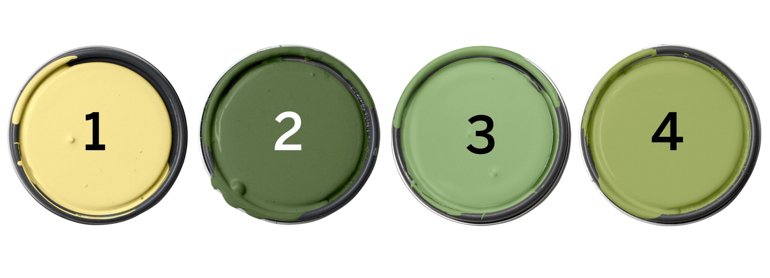
To get a similar effect that’s a tad subtler, swap in colors that share the same undertone (here, yellow).
Olympic 1. Pineapple Delight; 2. Globe Artichoke; 3. Harmonious; 4. Always Apple
Craftsman: Warm Tones
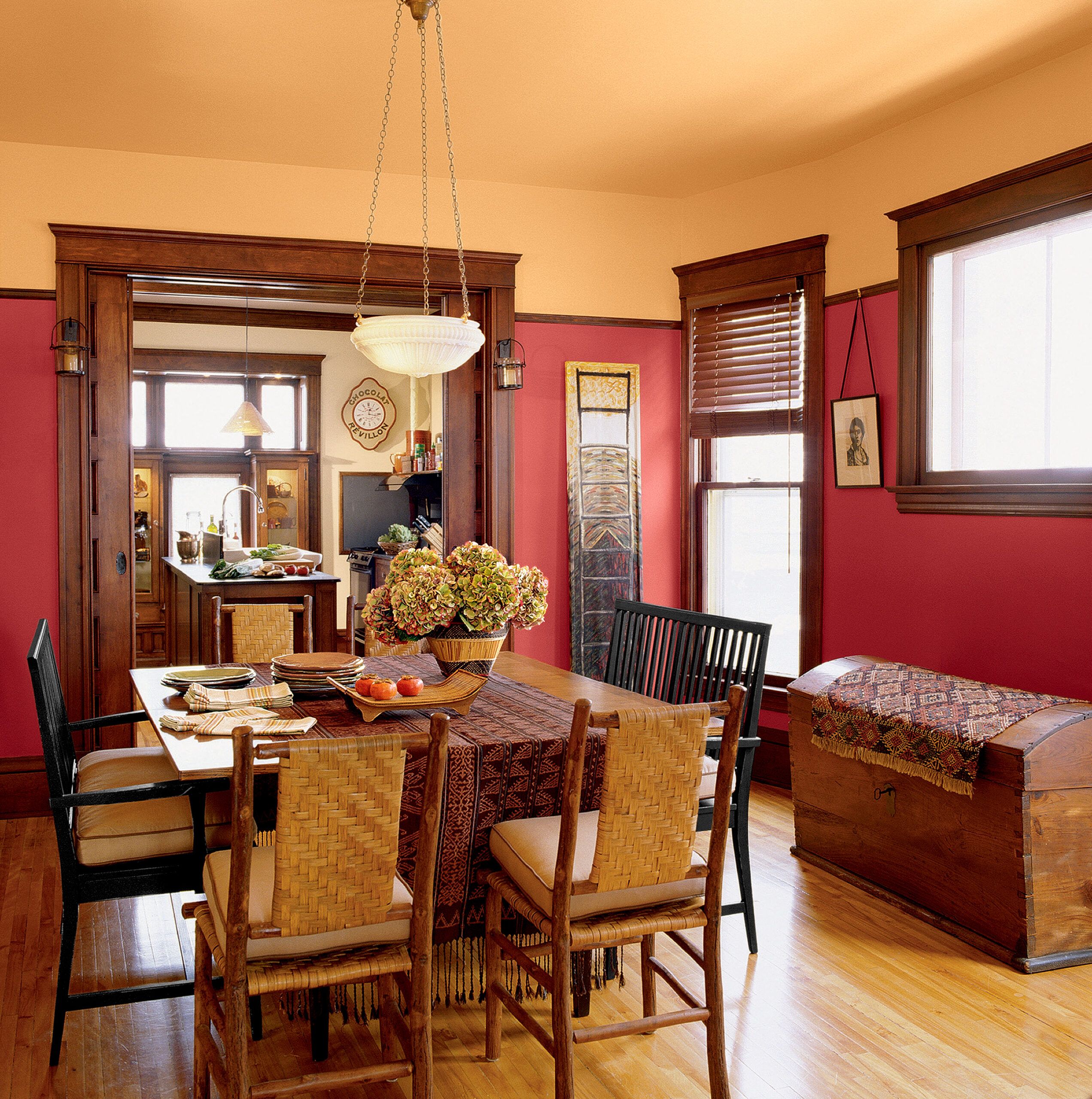
In a room where orange-tinged woods are the standout detail—in furniture, flooring, or casings—choose colors that enhance those existing hues. “One option is to balance warm wood tones with cool colors like blue or slate gray,” says Sue Wadden, director of color marketing at Sherwin-Williams.
The other way to go, as seen in this dining room, “is to create a look that’s all about warmth,” says Wadden. That means using related colors, like yellow and red. The scarlet and honey shades here turn up the volume on the usually subdued earth tones in a Craftsman color scheme.
Craftsman Palette
Sherwin-Williams 1. Show Stopper (walls); 2. Torchlight (ceiling); 3. Concord Buff (kitchen walls)
Craftsman Palette Tried Another Way
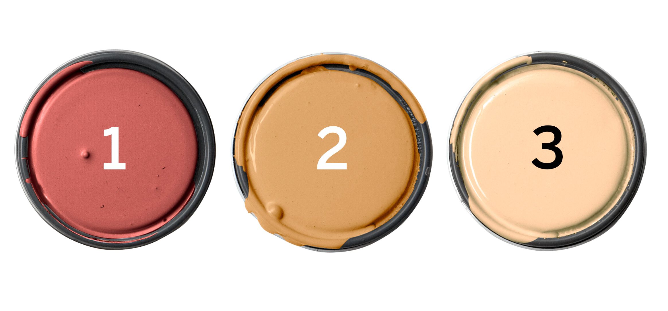
Colors borrowed from nature make sense for showing off unpainted wood. For a more traditional take on this look, dial down the wall color with an earthier shade of red.
Valspar 1. Red Ochre; 2. Ambitious; 3. Palamino Pony
Spanish Revival: Deep and Rich
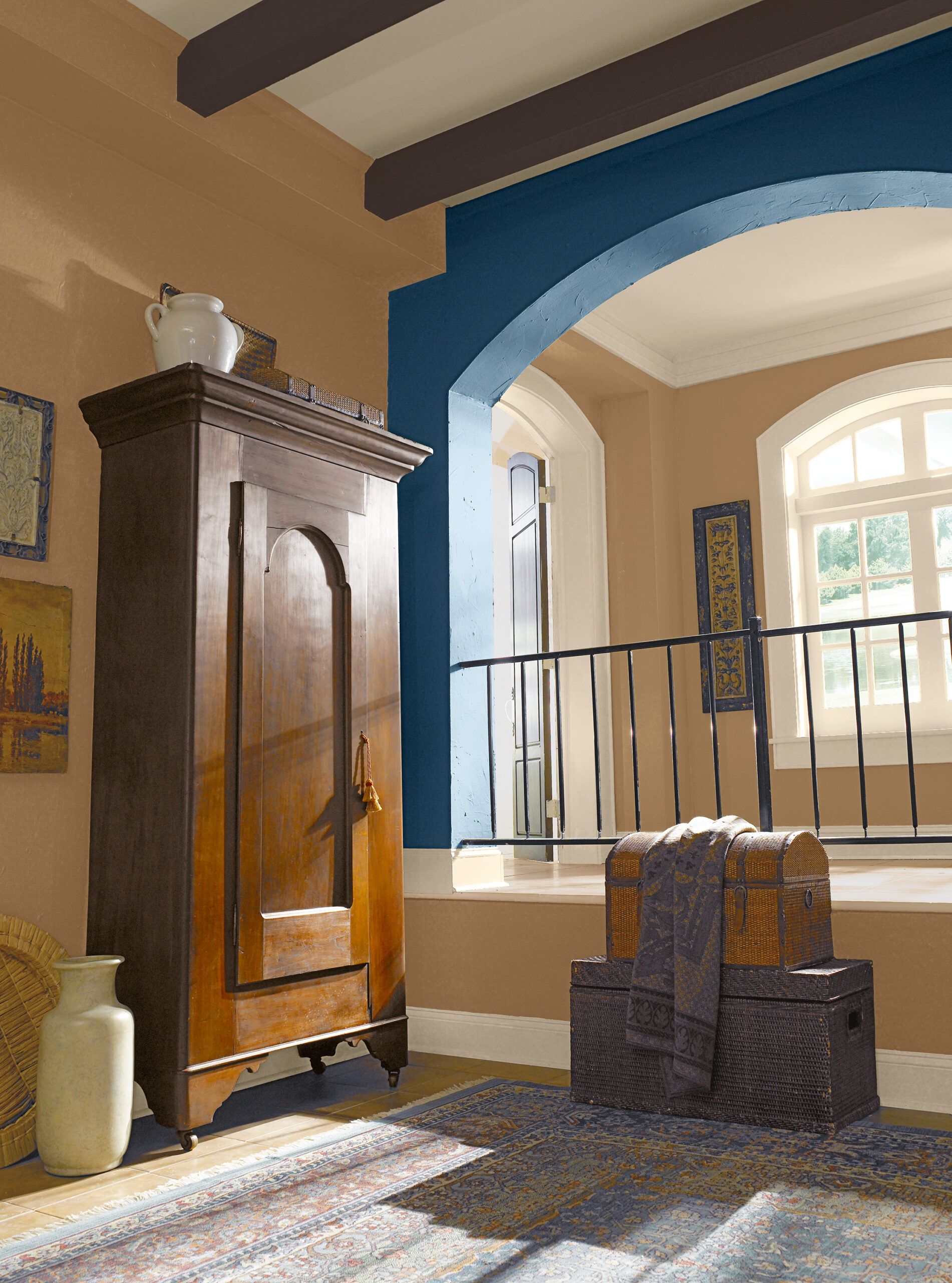
The dark beams, iron railings, and arch details in this Spanish Revival–influenced interior inspired a lush, neutral palette with classic browns and golds. “The less traditional blue accent calls attention to the style’s signature graceful curves,” says Behr color expert Erika Woelfel. Warm white overhead hints at typically stuccoed walls and makes the painted wood beams really pop.
Spanish Revival Palette
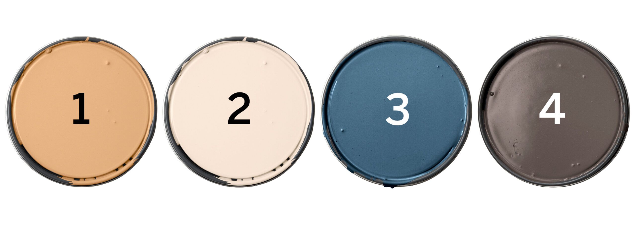
Behr 1. Classic Gold (walls); 2. Polished Pearl (ceiling and trim); 3. English Channel (arch); 4. Sweet Molasses (beams)
Spanish Revival Palette Tried Another Way
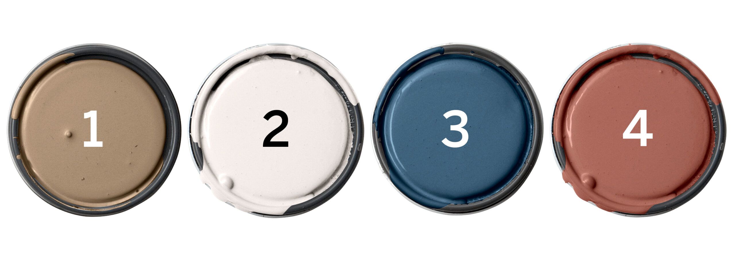
Vary the intensity, pairing saturated accents with more modest wall and ceiling hues.
Glidden 1. Khaki Bronze; 2. Natural White; 3. Deep Arctic Night Blue; 4. Sweet Tea
Mid-Century: Bold Strokes
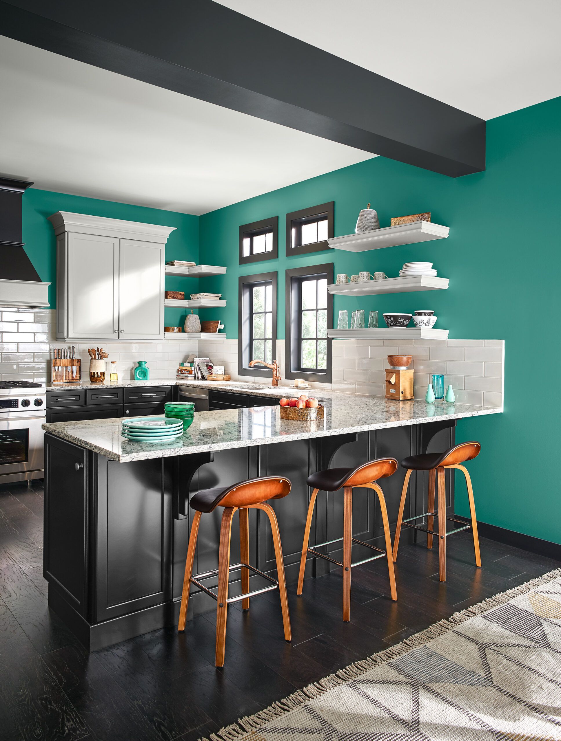
Ready to take a risk? If you’re itching to try a strong color on your walls, “the secret is finding a balance between color and neutrals,” says Behr’s Erika Woelfel. “Using color strategically keeps the look clean and uncluttered.” In this kitchen, pairing silvery gray on the ceiling and upper cabinets with charcoal on lower cabinets and trim “anchors the intense blue-green wall color,” Woelfel says. The palette evokes the classic mid-century combination of turquoise, black, and white, but the less dramatic contrast keeps the room from looking too retro.
Mid-Century Palette
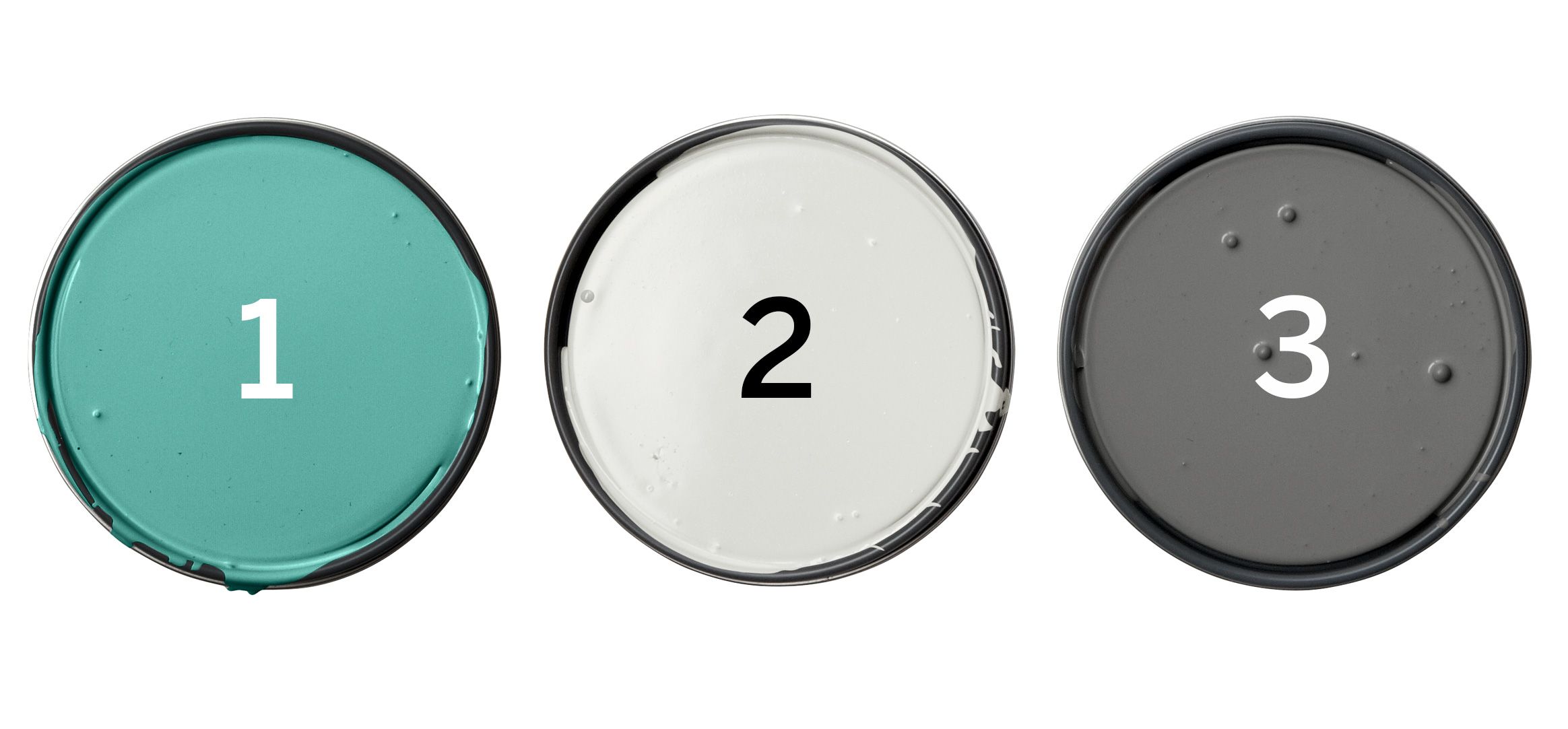
Behr 1. Jade Dragon (walls); 2. Close Knit (ceiling, upper cabinets); 3. Shades On (trim, lower cabinets)
Mid-Century Palette Tried Another Way
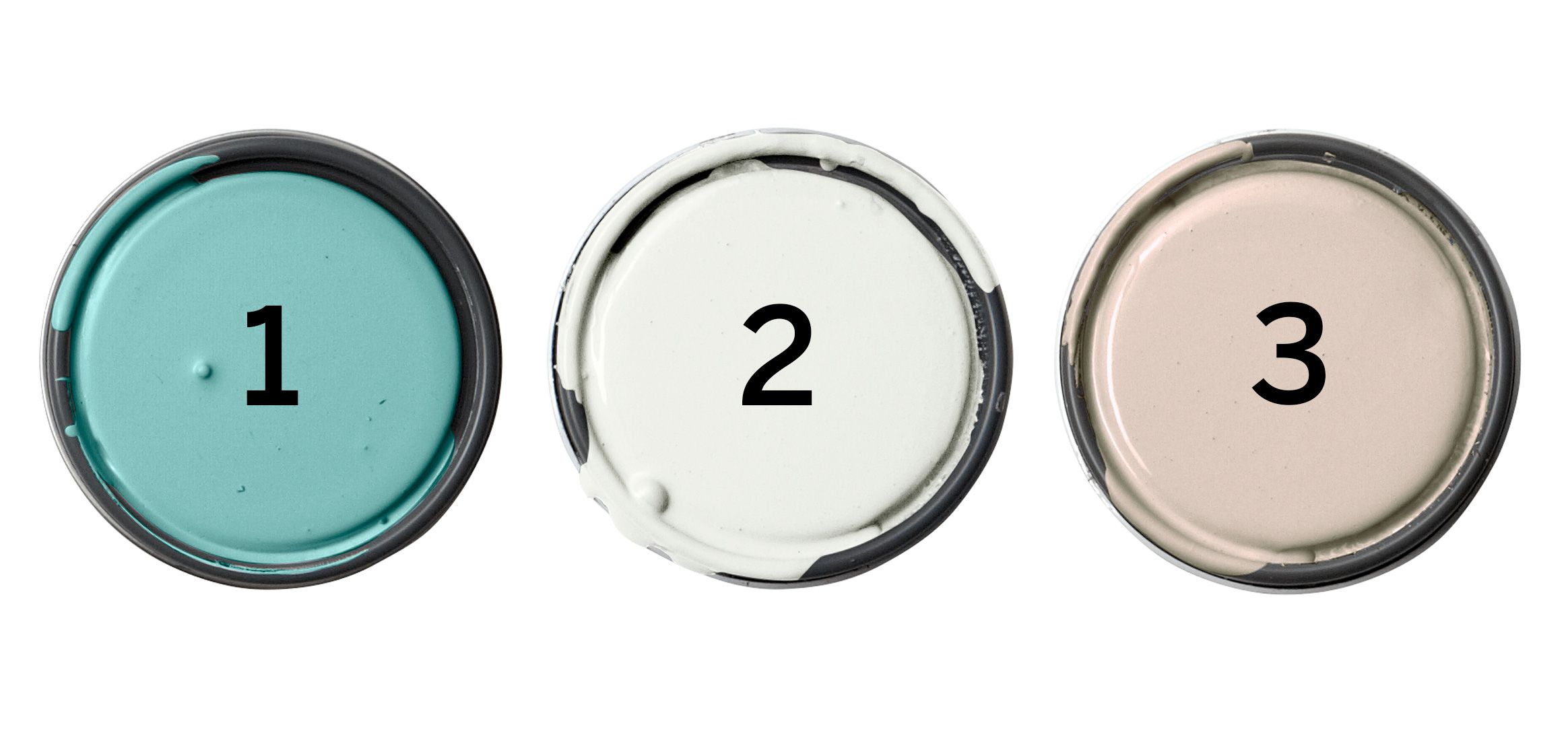
This kitchen’s cool grays recall mid-century chrome, but warmer shades work too. These neutral off-white and greige tones bring welcome balance to a daring wall color.
Clark + Kensington 1. Laugh Out Loud; 2. Silent White; 3. Running Bases
Colonial: Muted Hues
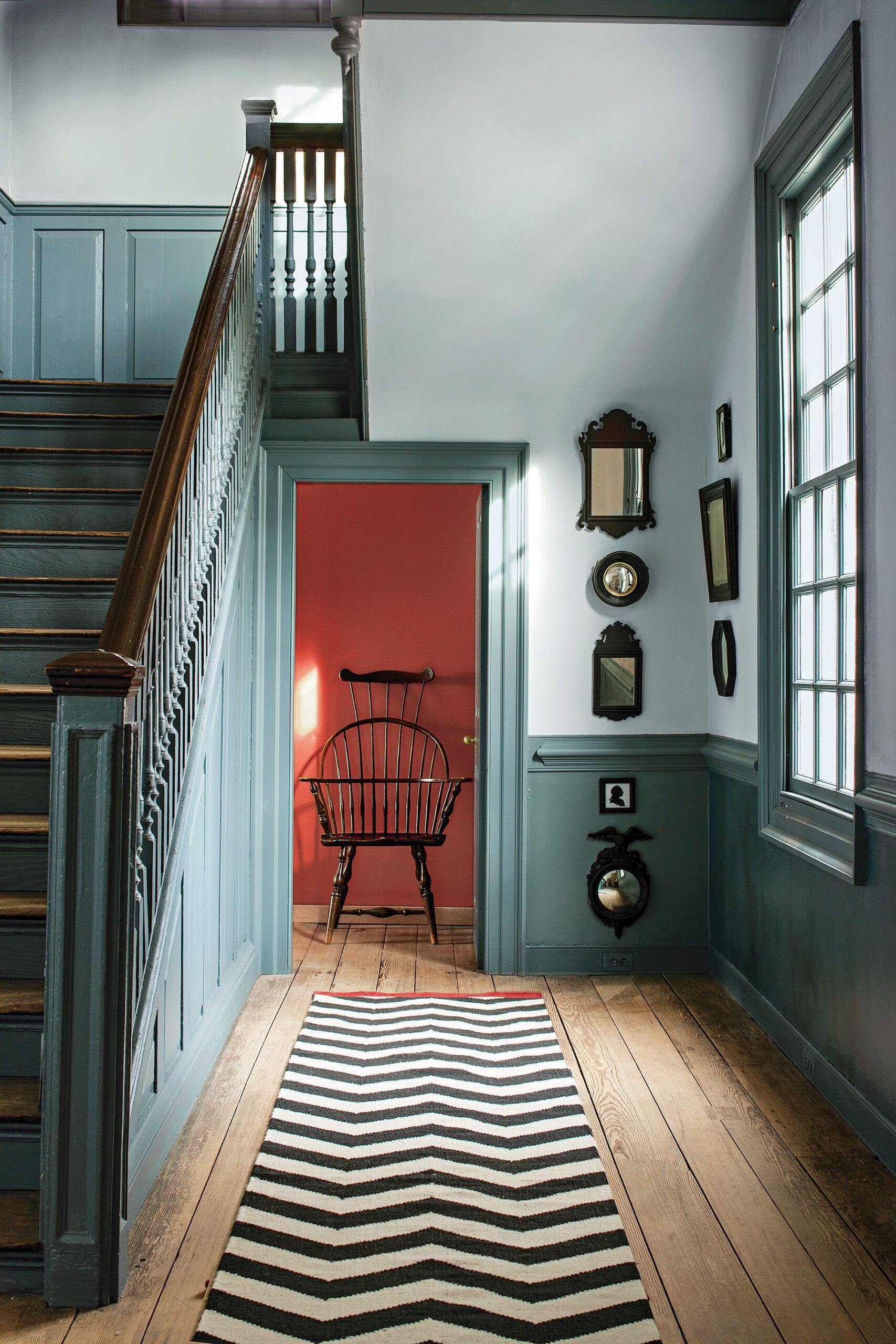
If your walls have never been anything but white, expand your comfort zone with a subtle tint like the barely-there blue in this space. “With darker trim in the same color, it’s a monochromatic scheme that’s easy to live with,” says Benjamin Moore color and design expert Andrea Magno.
The dynamic hint of red peeking in from the next room shows off the grayed-out quality typical of Colonial colors—a result of the natural, and often costly, pigments used. Back then, the brighter the walls, the bigger the budget. Today, of course, color isn’t a luxury. So why not try a new hue?
Colonial Palette
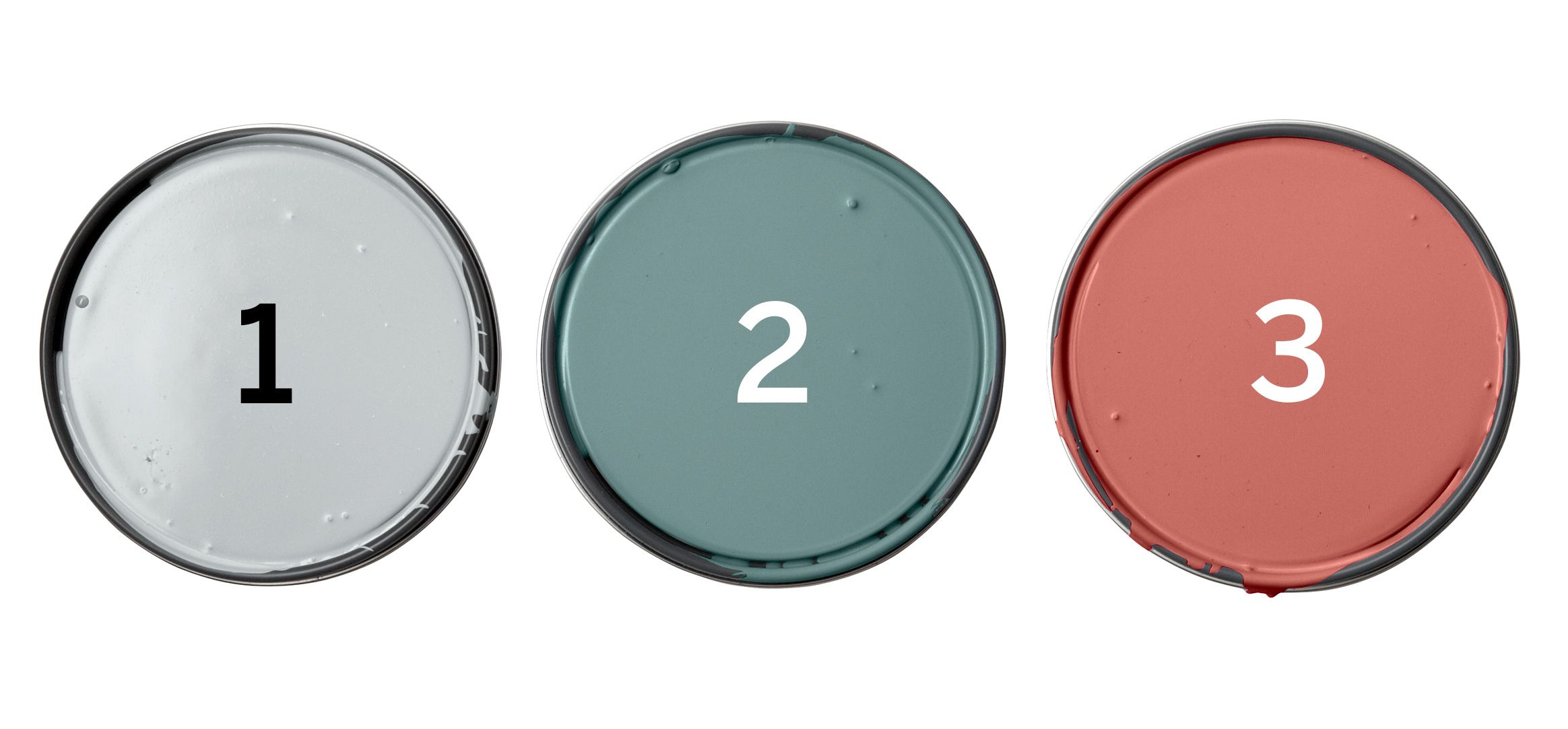
Benjamin Moore 1. Palace Pearl (walls); 2. Williamsburg Wythe Blue (trim); 3. Claret (back wall)
Colonial Palette Tried Another Way
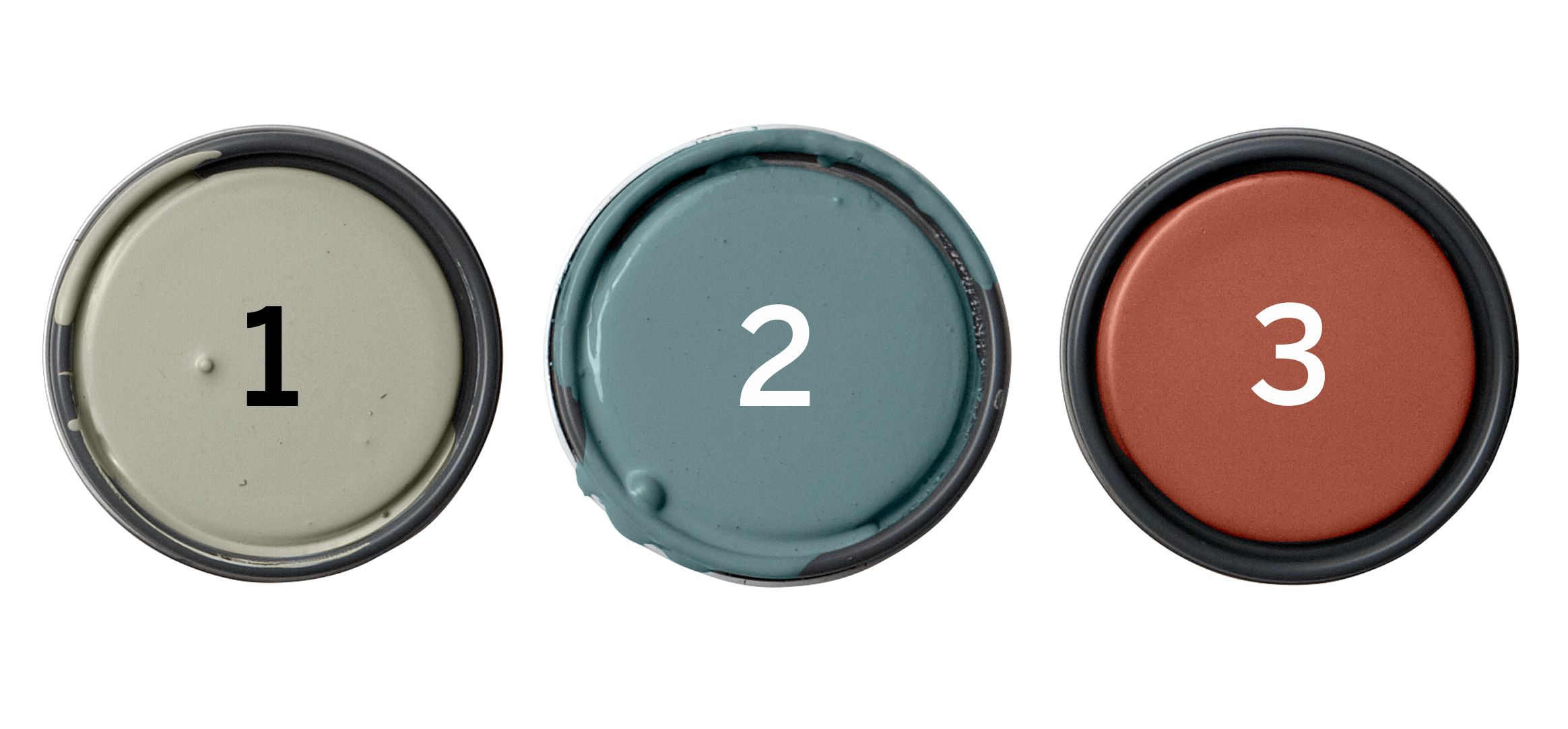
Though many Colonial colors are low-key, saturated shades are also part of the palette. A trim color that’s darker than the walls is visually interesting and historically accurate.
Farrow & Ball 1. Lamp Room Gray; 2. Stone Blue; 3. Picture Gallery Red
Thanks to Sara McLean, color specialist, Dunn-Edwards Paints; Sue Wadden, director of color marketing, Sherwin-Williams; Peggy Van Allen, Valspar color consultant; Erika Woelfel, vice president of color and creative services, Behr; Andrea Magno, color and design expert, Benjamin Moore.
