You are…EASYGOING
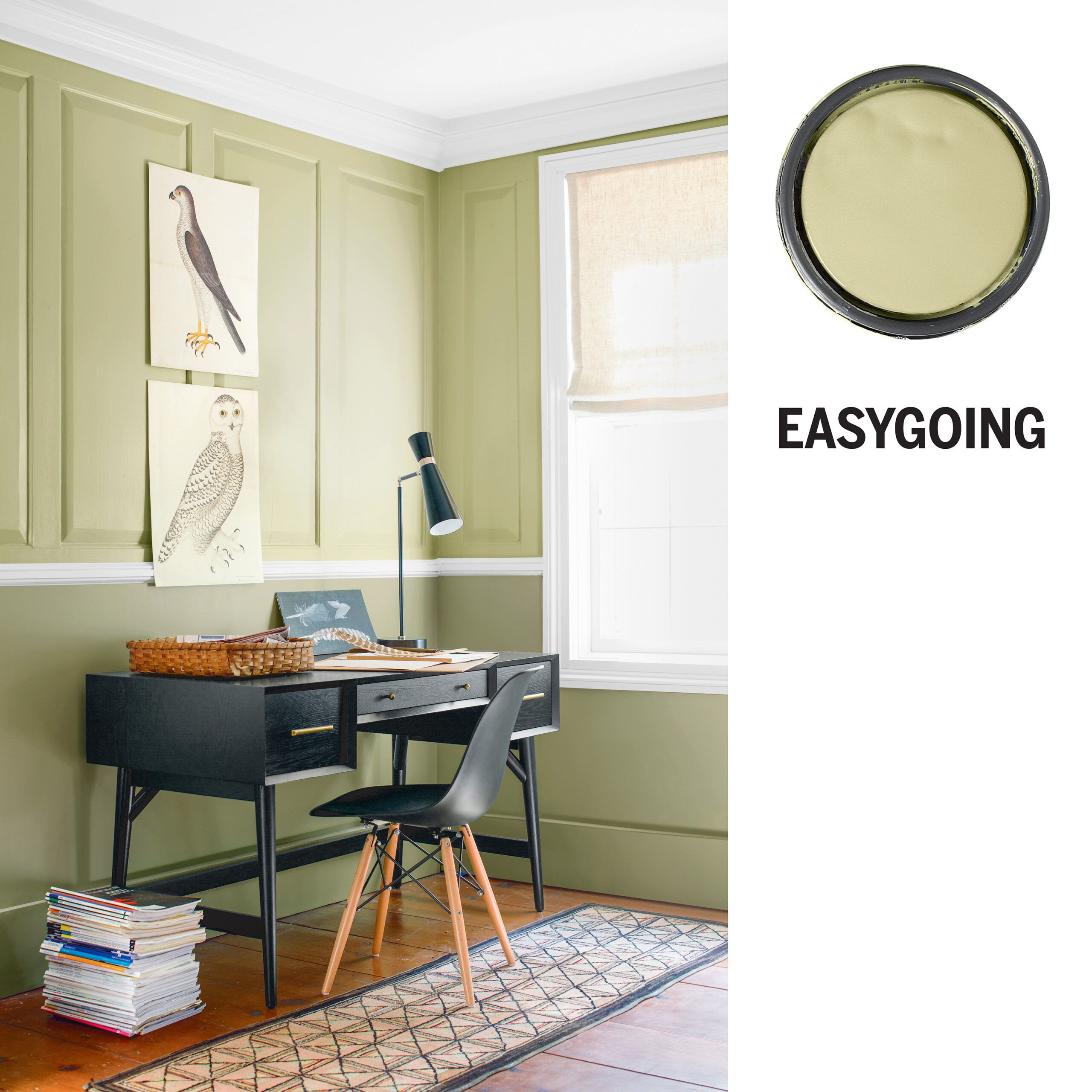
Cool as a cucumber? That notably chill vegetable evokes the color of these paneled walls. “If you gravitate to shades like this, you’re someone who likes to keep your cool,” says Bonnie Krims, a color consultant based in Concord, Massachusetts. “The color feels like a breath of fresh air.” Pairing this lighter yellow-green above the chair rail with a deeper, blue-tinged one below creates a laid-back look, which gets a welcome dose of sophistication from the sharp silhouettes of the black mid-century-style furnishings.
Shown: Benjamin Moore Fernwood Green
Urban Nature (below chair rail)
EASYGOING Alternatives

Colors inspired by the natural world, like these shades of green, match your serene outlook.
1. Valspar Kiss of Mint
2. Behr Marquee Desert Springs
3. Glidden Softest Juniper
4. Farrow & Ball Teresa’s Green
You are…UPBEAT
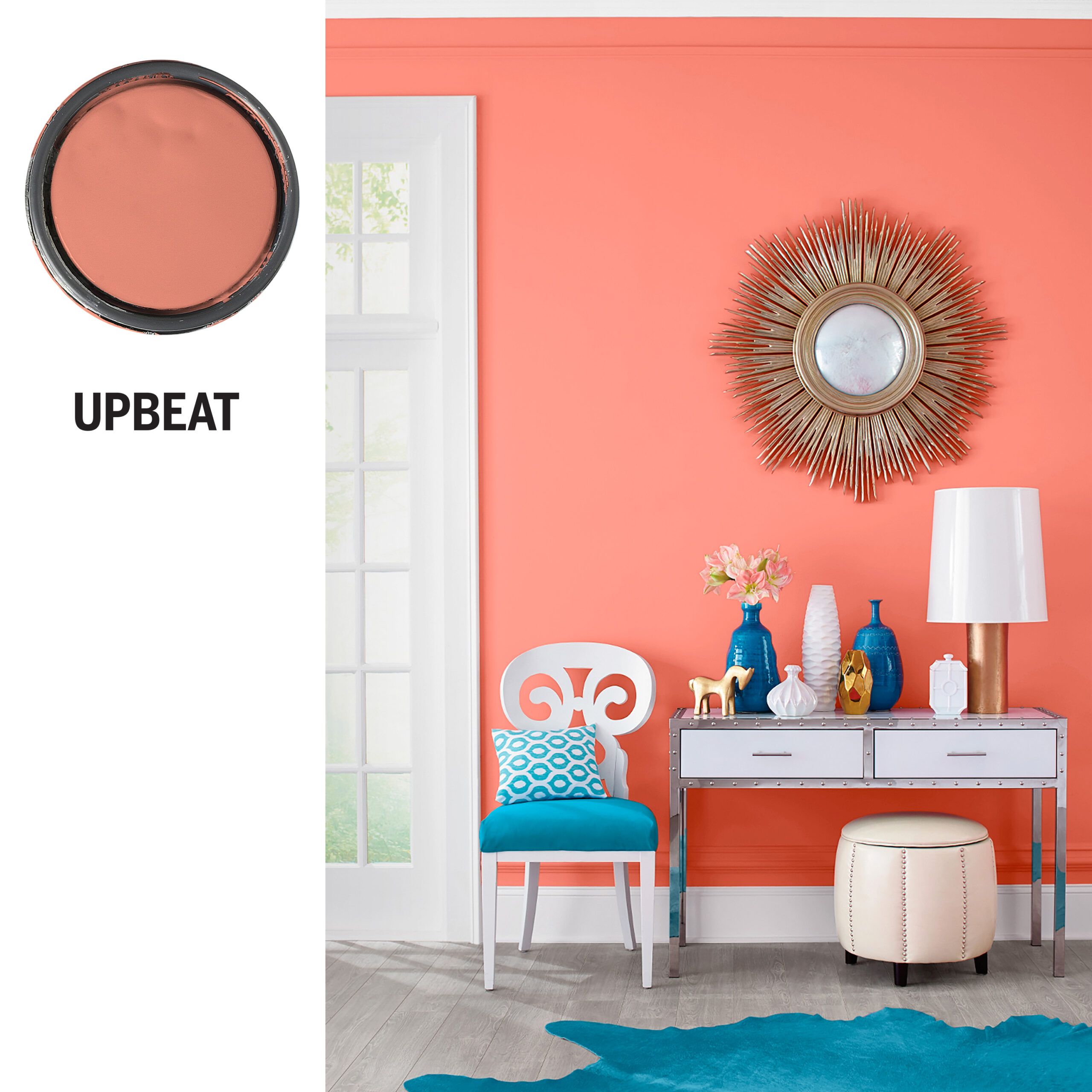
Drawn to this vibrant color? You’re a glass-half-full type of person who isn’t put off by trying something new. “If you love this shade, you’re not afraid of taking risks,” Krims says. “You’ll easily take the plunge with walls painted in this kind of fun, energizing orange.” The bold, bright color fills this space with warmth; adding neutrals and cool, saturated hues in the decor balances the wall color while maintaining the mood. Even on a drab, rainy day, this room gives off a cheerful, sunny vibe—just like you.
Shown: Pratt & Lambert Salmon Souffle
UPBEAT Alternatives

These punchy oranges and reds pop as accents, but with your joyful self-assurance, you’ll likely paint the whole room!
1.Benjamin Moore Fresno
2. Dunn-Edwards Citrus Notes
3. Sherwin-Williams Daring
4. Behr Dragon Fire
You are…CALM
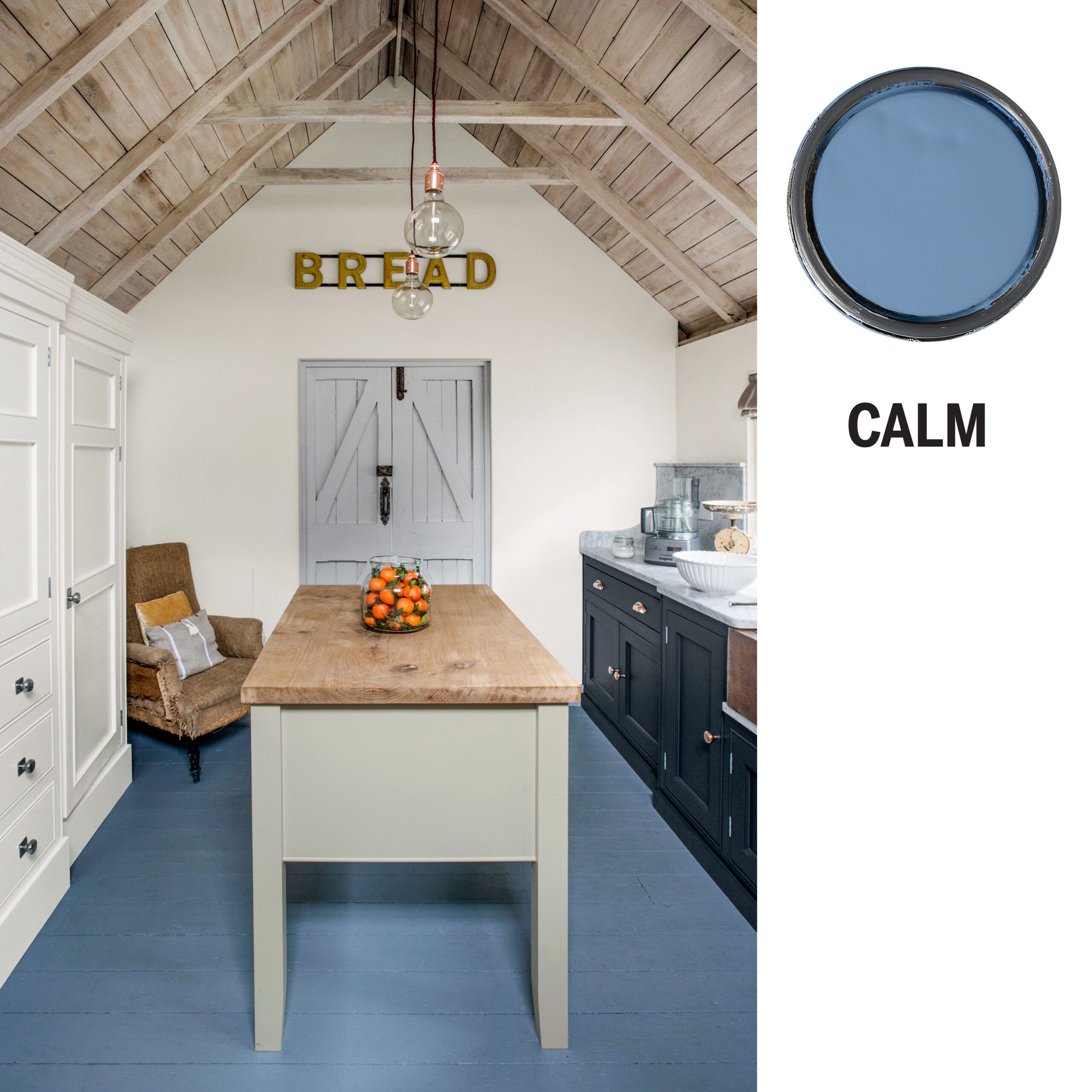
You believe patience is a virtue, have a knack for resolving conflicts, and, of course, you’re smitten with the serene blue found on this kitchen floor. “This color’s for those who prefer a restful pace to a rushed one, and who prioritize harmony and peace,” says Krims. Similarly, this kitchen’s mix of cool blues and grays feels soothing rather than standoffish. Juxtaposed with the natural wood of the ceiling and island top and the sparingly-used warm metallic finishes, the result is perfect harmony.
Shown: Mylands Boathouse
Charterhouse (built-ins and walls)
Islington (door)
Alderman (island)
Bond Street (base cabinets)
CALM Alternatives

From pastel periwinkle to mid-toned slate, these cool blues strike the right notes for you.
1. PPG French Country Blue
2. Pratt & Lambert Colonel’s Lady
3. Valspar Wellspring
4. Glidden Antwerp Blue
You are…DARING
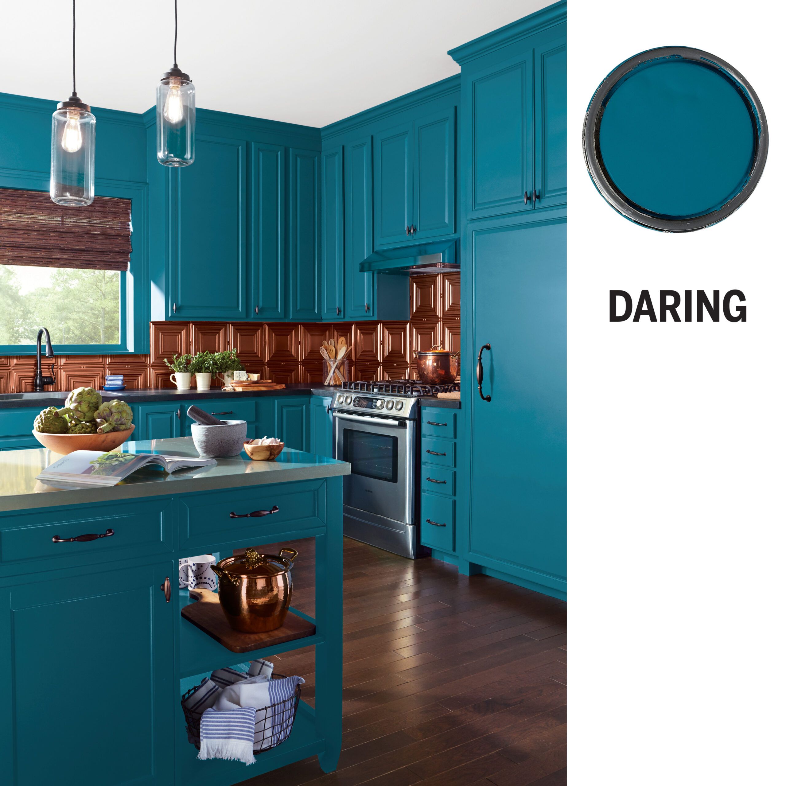
An envelope-pusher like you isn’t going to choose a paint color you’d see in every house on the block. “If you’re enchanted by this deep teal, you’re not interested in the ordinary,” Krims says. “And painting an area this large with such a striking color suggests confidence.” This cabinetry’s paint job looks especially jewel-like set against the copper-colored tile backsplash and gleaming countertops. It’s an effect that bespeaks a fearless attitude with a healthy dose of swagger.
Shown: Sherwin-Williams Oceanside
DARING Alternatives

From near-green to true turquoise, these bold shades of blue mesh with your maverick sensibility.
1. BEHR Beach Towel
2. Benjamin Moore Varsity Blues
3. Glidden Marine Blue
4. Pratt & Lambert Iroquois
You are…THOUGHTFUL
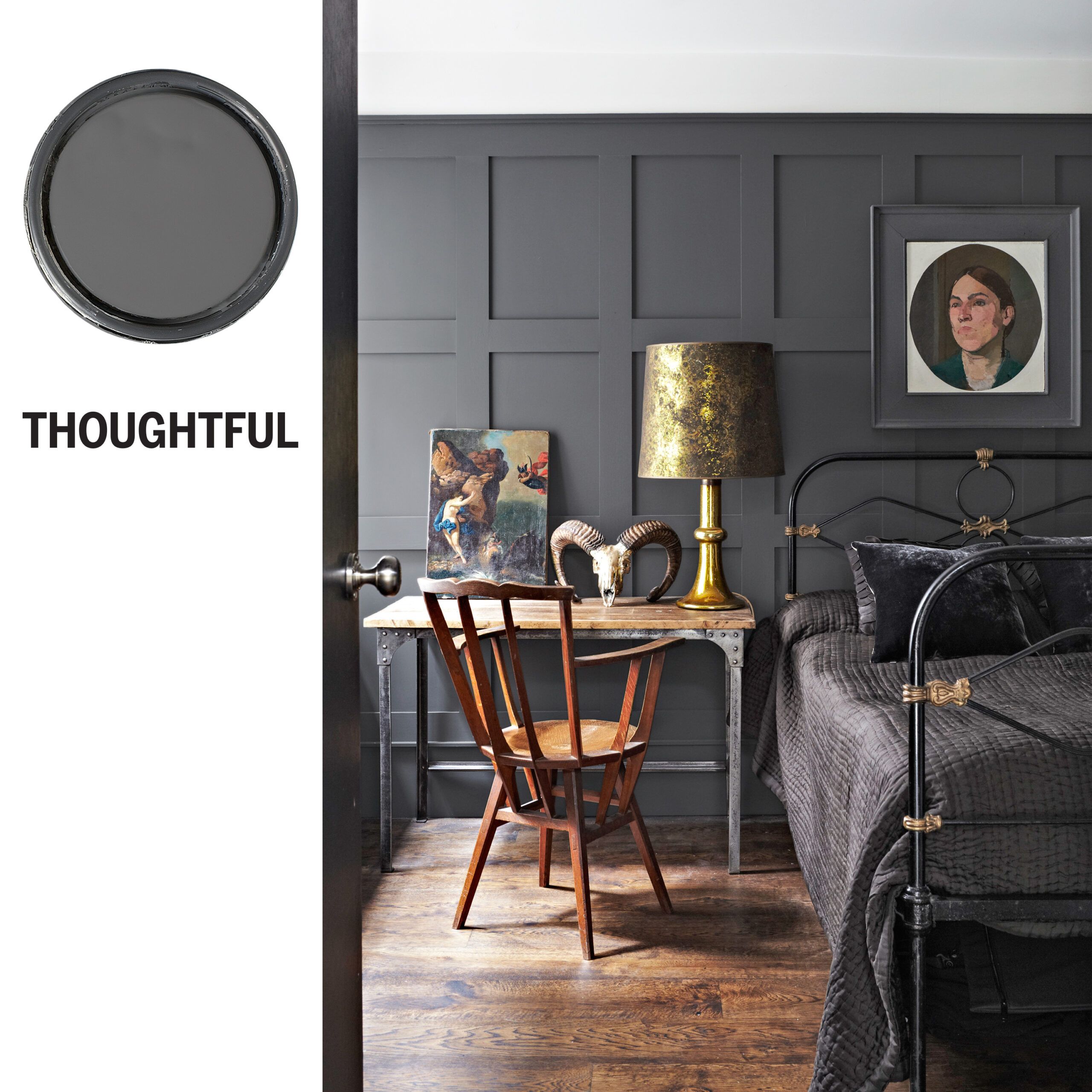
Prefer page to screen? It’s no wonder you chose this dark gray. “Gray is the color of intellect,” says Krims. “If you’re drawn to darker grays, you’re composed and contemplative.” On this bedroom’s paneled walls, dark gray adds depth: The paint color blends with the metal of the bed and table, and creates the effect of a spotlight on decorative pieces like the table lamp. That kind of planning is no accident, but for you, it comes naturally.
Shown: Farrow & Ball Down Pipe
THOUGHTFUL Alternatives

A warmer or cooler gray—or even one with a hint of blue or green—could be your ideal room color.
1. Sherwin-Williams Cyberspace
2. PPG Grey Metal
3. Valspar Iron Frost
4. Dunn-Edwards Blue Steel
You are…QUIET
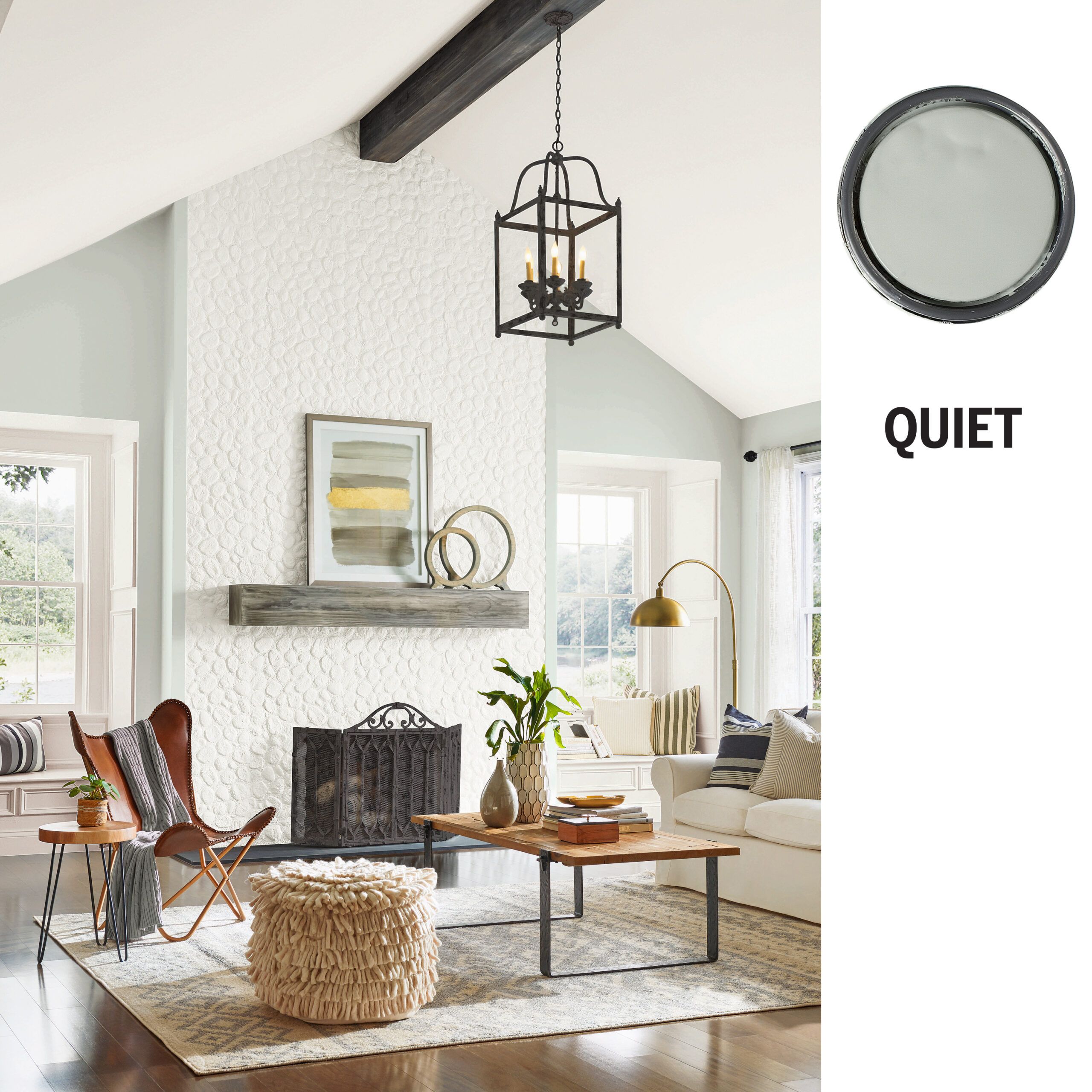
You’re living proof that still waters run deep. So, sure, you want white walls, but you’re not going to choose a basic neutral. This gray-tinged white, with a subtle purple-blue undertone, adds even more depth to this room’s icy-white fireplace wall and ceiling. Even though it’s a large space, the muted colors, natural materials, and judicious mix of textures create a soulful ambience. “This room feels like a refuge from the outside world,” says Krims.
Shown: Sherwin-Williams Silverpoint
QUIET Alternatives

Cool whites (or even warmer ones) with a different undertone can vary the vibe.
1. BEHR Sterling
2. Glidden White Lagoon
3. Valspar White Sash
4. PPG Skater’s Pond
You are…DEPENDABLE
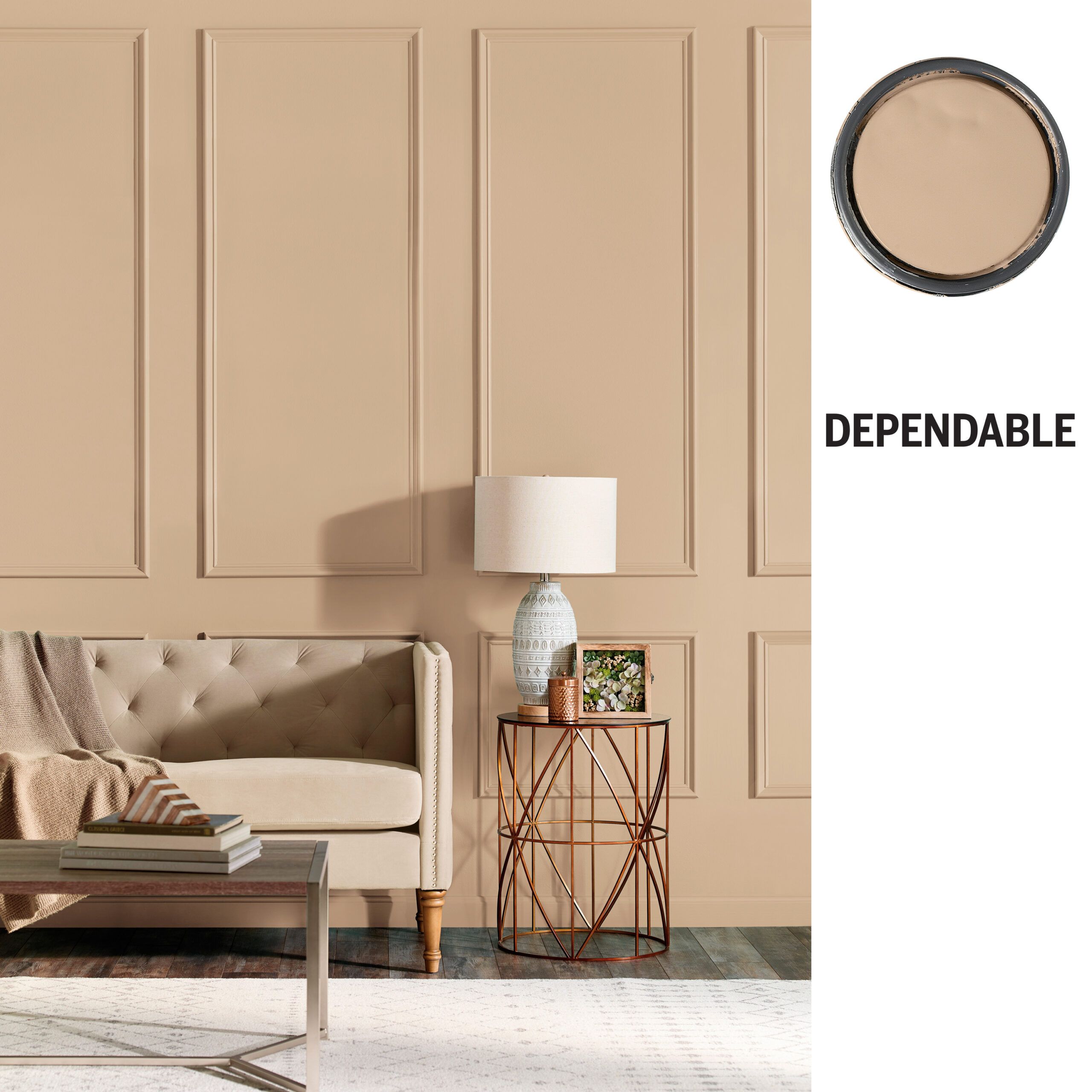
You’re the one everyone turns to—and you’re glad to help. “This warm golden-beige feels welcoming, so it fits people who are friendly, receptive, and good-natured,” says Krims. The not-quite-neutral creates a candlelight-like glow, giving this open space an unexpected aura of coziness. And why not? “It’s a feel-good color,” Krims says, which makes it a reliable go-to. Hey, that sounds just like you!
Shown: BEHR Kombucha
DEPENDABLE Alternatives

These slightly nutty or buttery neutrals also sit squarely in your comfort zone.
1. Benjamin Moore Pumpkin Seeds
2. Glidden Dapper Tan
3. Valspar Crème Brûlée
4. Sherwin-Williams White Hyacinth
Thanks to: Bonnie Krims, color consultant

