We may be compensated if you purchase through links on our website. Our team is committed to delivering honest, objective, and independent reviews on home products and services.
An earlier version of this article appeared in the Fall 2022 issue of This Old House Magazine. It has been edited and expanded.
Color is one of the most transformative tools in your design arsenal. It can completely change the feeling of a space. Here, Nicole Gibbons, founder and CEO of Clare Paint, shares her knowledge of color and its use in interior design to help you give your home the look you want.
What Role Does Sunlight Play in Color Choice?
When it comes to paint, keep in mind that the amount of natural light a room receives, the direction it comes from, and even how it plays off your furnishings all affect how wall colors appear. For example, south-facing rooms tend to get warm, sun-drenched light, so you may want a cooler tone to balance out the warmth.
Those that face north receive indirect light that often has a cool, almost blue cast, so a warm wall color can balance that out. The light can also change drastically throughout the day, especially in east- and west-facing rooms that align with sunrise and sunset. So make sure you love any wall color you’re considering at all times of day.
How Can I Creatively Use Color in My House?

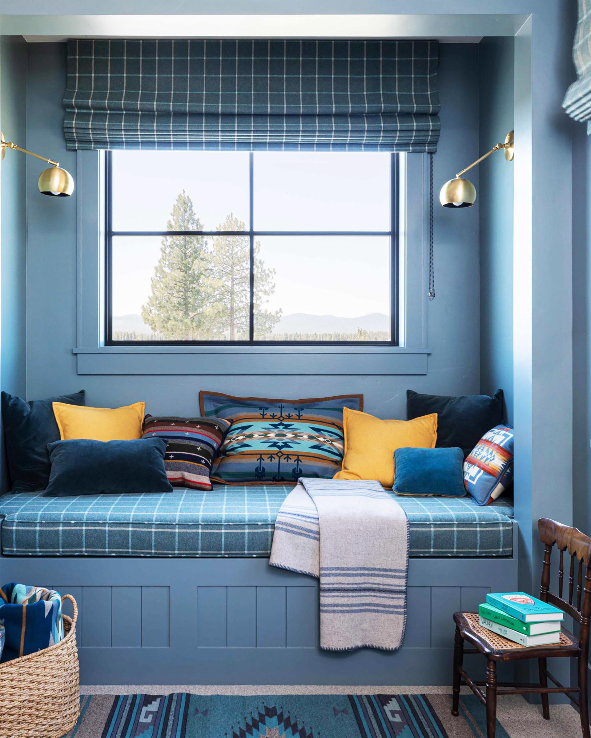
One stress-free approach for those who are adventurous with color is to try a monochromatic scheme. This involves layering various shades of the same color. For example, you could use a mid-tone blue on your walls, then add a deep-blue sofa and a mix of softer blue accents, like pillows and window treatments. A monochromatic scheme feels sophisticated and modern. Plus, mastering this look is pretty foolproof, helping to take the guesswork out of choosing the right colors.
If you’re unsure about committing to one color, start with a neutral palette and gradually introduce hints of your chosen hue. This can help you ease into bolder design choices without feeling overwhelmed. Additionally, consider testing your color scheme in a smaller space, such as a bathroom or a home office, before applying it to larger areas.
Paint Color That Looks Good Everywhere

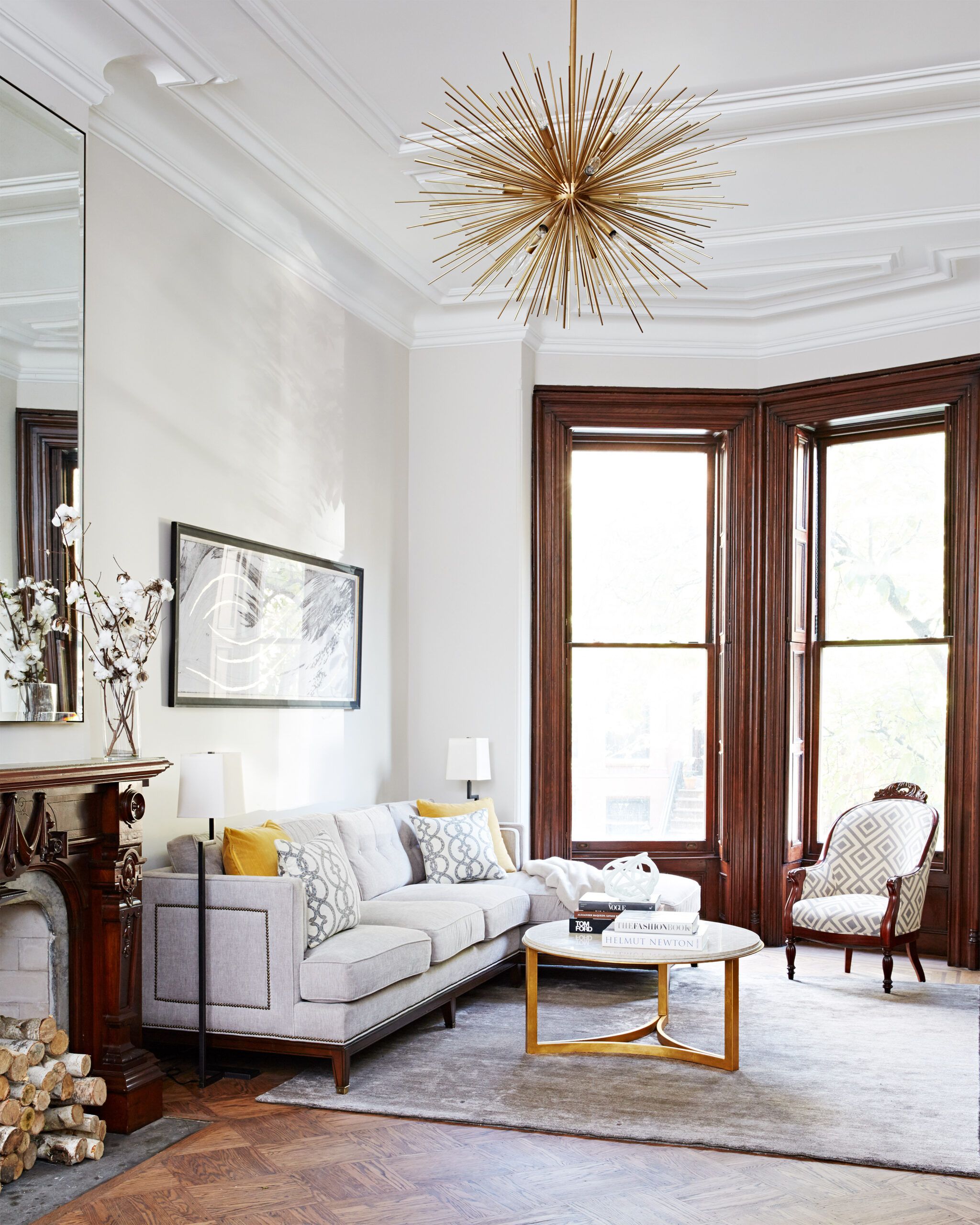
A sophisticated paint color that’s extremely versatile is a soft shade of “greige.” It’s the perfect mix between gray and beige. This can’t-fail neutral offers a hint of color and warmth to make your space feel inviting while still serving as a blank slate for whatever you put with it. It goes with any decor style and can coordinate with various accent colors.
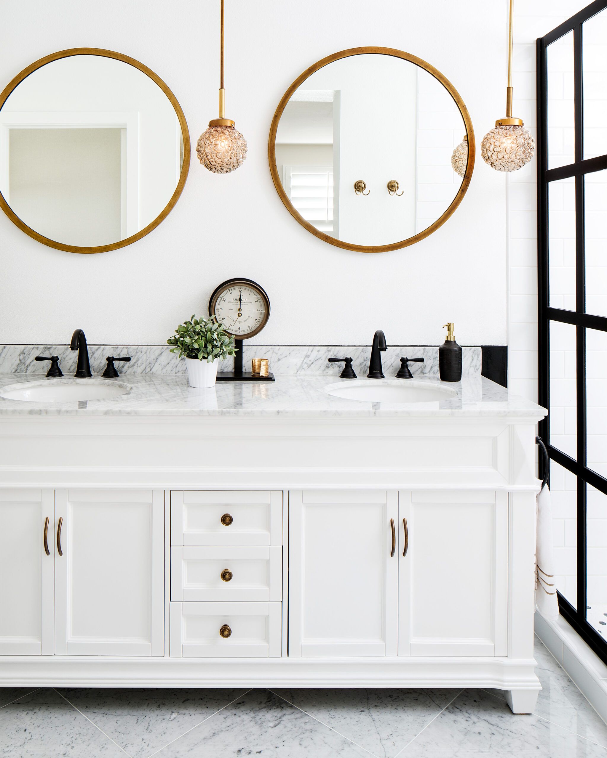
For a fresh, modern look, add clean, breezy blue accents such as artwork, rugs, or decorative items like ceramic table lamps or vases. In kitchens and baths, give this color a modern edge by using matte-black hardware or plumbing fixtures.
Additionally, greige is an adaptable choice for both contemporary and traditional interiors. Consider layering different textures within the same color family to add visual interest without straying from the cohesive look. From sleek, modern spaces to cozy, rustic homes, greige is a timeless option that can unite various design elements seamlessly.
Stylishly Mix Metal Finishes in a Room

According to Gibbons, mixing is a better design choice than matching. With metal knobs, pulls, and plumbing fixtures, a good rule of thumb is to combine no more than two finishes in a room, one as the dominant finish and another as an accent.
For example, if you’re going with matte black as your primary finish in a kitchen, incorporate it on cabinet hardware, light fixtures, and door hardware, but try mixing in a brass faucet for a bright pop that contrasts nicely. Apply this approach with any combination of finishes. In a living space, mix metallic finishes on lighting and furniture. Or mix different variations of the same finish—for example, varying tones and sheens of gold and brass in your living room. Have fun with it!
At the same time, do your best to maintain a sense of balance and proportion. Too many different finishes can create visual clutter rather than cohesion. Pay attention to the undertones of different metals to ensure they blend well together. Subtle detailing, like complementing finishes in picture frames or light switches, can unify the look without overwhelming the room.
Which Paint Finish Should I Choose?
In addition to color, the finish of your paint can significantly impact the overall look and feel of a room. Different finishes offer varying levels of sheen and durability, making them suitable for different areas of your home.
- Flat or matte: Ideal for low-traffic areas and ceilings, as it hides imperfections well but is less durable
- Eggshell: A popular choice for living rooms and bedrooms, offering a subtle sheen and moderate durability
- Satin: Works well in high-traffic areas and kitchens, providing a soft luster and easy-to-clean surface
- Semi-gloss and gloss: Best for trim, doors, and cabinets, offering high durability and a shiny finish
Consider the function of each room and the amount of wear and tear it’s likely to experience when selecting paint finishes. For example, a semi-gloss finish is excellent for rooms where frequent cleaning is necessary, as it resists moisture and stains. Meanwhile, a matte finish can be perfect for creating a calm, muted look in a bedroom or study.
Incorporating Accent Colors
While a monochromatic or neutral color scheme can provide a solid foundation for your home’s decor, incorporating accent colors can add personality. Here are some tips for effectively using accent colors.
- Follow the 60-30-10 rule—use your dominant color for 60% of the room, a secondary color for 30%, and an accent color for the remaining 10%.
- Choose accent colors that complement your base palette and reflect your personal style.
- Use accent colors in easily changeable elements like throw pillows, artwork, or small furniture pieces.
- Consider using a bold accent wall to create a focal point in a room.
Remember that accent colors can be adjusted seasonally or as your tastes change, allowing you to refresh your space without a complete overhaul. Accent colors in unexpected places, like the back of a bookshelf or the inside of a closet, can also create delightful surprises.
Incorporating accent colors effectively requires balance—too few, and the room may feel bland; too many, and it may feel chaotic. Choose your accents thoughtfully, and you can craft a space that feels both dynamic and harmonious.
Our Conclusion
Choosing colorful finishes for your home is an exciting opportunity to express your personal style and create inviting spaces. By considering lighting conditions, thoughtfully mixing finishes and textures, and choosing an appropriate finish, you can achieve a cohesive and visually appealing interior design. Whether you opt for a sophisticated monochromatic scheme or experiment with bold accent colors, the key is to create a space that feels uniquely yours.

