What is Color-Blocking?
There’s no doubt that paint is transformative—and color blocking is one of the simplest and most creative ways to use it. Instead of one uniform shade, color-blocking painting techniques involve painting sections in completely different colors. Think of it as big, bold modern art applied directly to your wall. Depending on the hues and design you choose, the effect can be subtle, dramatic, or just plain fun.
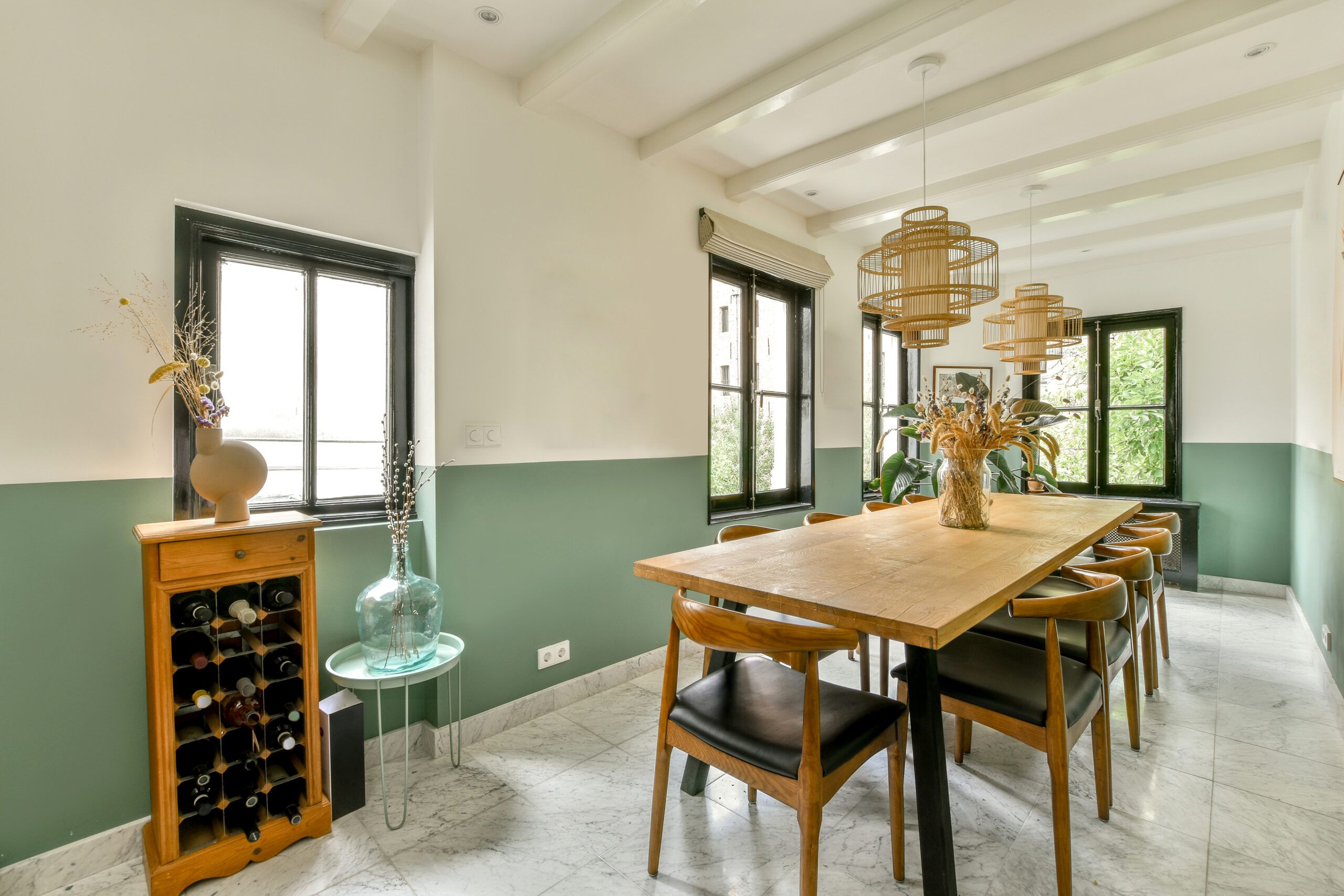
You could try anything from a pink arch to frame your bed, a blue rectangle to zone off a work desk, or a bunch of funky shapes for a playroom mural—or you could even color-block the entire room with the upper half one shade and the bottom another. Your options are limitless, but all you’ll really need is a measuring tape, some painter’s tape, and a little imagination. Read on for even more color-block wall paint ideas, with plenty of guidance for pulling off an impressive design in your home, as well as an easy tutorial on how to color-block a wall.
Tips for Color-Blocking with Paint
Find a good spot
Before the fun of picking out paint, decide on the surfaces for your project. There are several ways to go, depending on the type of design you’d like to do. For one, color-blocking can be a new way to think about doing an accent wall. Another color-block painting technique to consider is a two-tone room with the top half in one shade, and the bottom half in another for a look that mimics wainscoting. Or you can focus the color-blocking on only a section of a wall, so the color-block design itself acts as the artwork.
Choose color combos wisely
No matter what type of color-blocking design you decide on, the colors you select will impact the mood of the space. It’s a good idea to experiment first with paint swatches or on paper, with watercolors, markers, or even crayons, to find the pairings you prefer. Neutrals are gentle on the eye, while bright, dark, and jewel tones can all be bold and command attention.

- Neutral tones, such as white, cream, gray, beige, and brown, have a soothing, non-invasive vibe when teamed up.
- Monochrome colors are variations of a single hue. When paired together, they can be quite attractive, particularly in a traditional room. For a sophisticated duo, consider charcoal with pearl gray. For something slightly more playful, try mint with forest green, or muted rose with pale pink.
- A neutral with a bold hue: will step things up a notch —often nice in a transitional or eclectic setting. Taupe with royal blue, say, can look great together. Ditto for green against tan, or just about any bright with white.
- Bold color combos can bring a lively vibe to a modern or casual setting but may feel out of place in a more traditional room. Keep in mind that black is both neutral and bold, so consider how it works with a primary hue or perhaps a metallic.
Rock the block
Take inspiration from abstract artist Mark Rothko and paint a sequence of three different-sized blocks on one wall in various colors. It’s graphic, modern, and fairly easy to do. The design need not take up the entire wall—in fact, it can be a less expensive alternative to oversize artwork. Not sure what the proportions of the blocks should be? Follow the designers’ 60-30-10 formula: Make one block 60 percent of the design in one shade, the second block 30 percent in another color, and a 10 percent shot of unexpected color. This can look super in a space where other décor items are sparse, but it might be too busy for a room with a lot of throws, pillows, and other objects.
You can even indulge the whole rainbow and add more blocks of color, which would be especially fun in a child’s bedroom or playroom. Still, stick to a single accent wall. Doing the whole room in multiple shades would probably be overkill.
Stripe it up
Stripes can be color-blocking, too. Figure out which direction you want the lines to go—side to side or up and down—since this will influence the perception of the room’s size. Horizontal stripes can make a space feel more expansive (wider or longer), especially in light shades. Meanwhile, vertical lines draw the eye up, which can make the ceiling seem higher and lend airiness. But there’s no need to hem yourself in: You can add stripes to a wall with both horizontal and vertical lines, or even paint them on the diagonal or in a chevron pattern. Just keep in mind that the more stripes you add, the more measuring that’s involved, which can get tedious.
Go top to bottom

Another approach to color-blocking would be to paint the walls one color, the door a second color, and the window trim and molding a third color. You could stick to various shades of muted blues to create a cozy and moody bedroom or go all out with a mix of brights or pastels for a playful kid’s room.
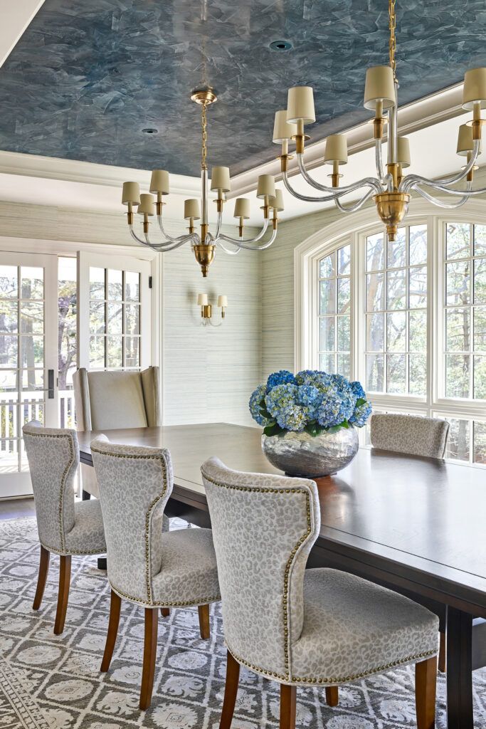
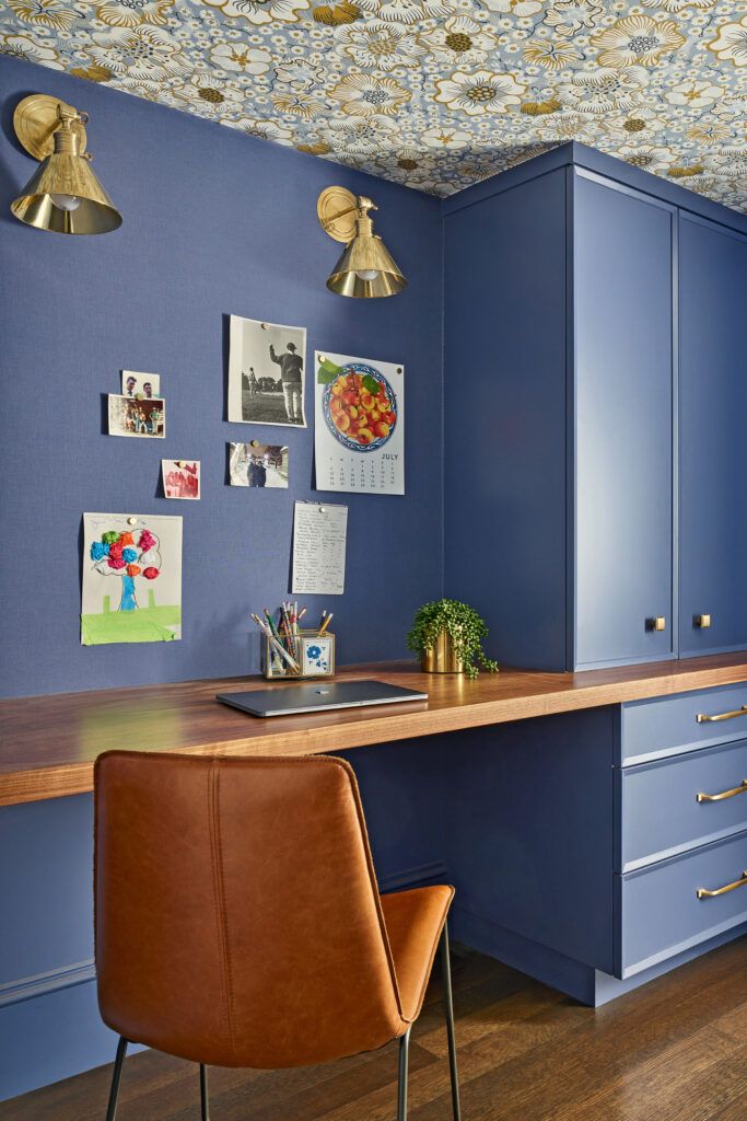
A room is more than just walls, and even the ceiling can be part of your color-block project. For instance, you could paint a contrasting rectangle that goes up along a portion of the wall, extending onto part of the ceiling. If you live in a small space or have an open floor plan, this technique works well to visually zone off a work desk or a reading nook from the rest of the room.
Think outside the box
Basic squares, rectangles, and triangles with right angles are graphic go-to’s, but there are other cool shapes to consider. All kinds of curves can also come into play from circles and ovals to arches and free-form rounded shapes. Painted arches have been particularly popular lately as a headboard alternative in a bedroom. They’re also great for highlighting a certain area, like an entryway or decorative shelves. You can try a single circle or overlap a few curvy designs—either of which would add a nice pop of color to a wall and make a stunning backdrop for small pieces of artwork.
How to Color-Block a Wall
Inspired to try color-blocking in your home but unsure of how to do it? A simple two-tone horizontal accent wall—with the bottom half of the room in one color, and the top half in a contrasting shade—works for almost any space and style and is relatively easy to pull off for even a novice painter. The trickiest part is ensuring that you’ve got a straight line.
Step 1: Plan which paint color will go where.
For practical purposes, the darker tone is best on the bottom, as it will be less likely to show dirt from everyday traffic. Plus, a lighter tone on top will make the ceiling seem higher.
Step 2: Decide where to put the dividing line.
You can halve the wall evenly in the middle or play with proportion and dedicate the bottom two-thirds to one color. Perhaps you’ll want the dividing line to meet up with the top edge of a piece of furniture or cabinetry; for example, in a bedroom, one color can extend from the baseboard to as high as the headboard. Carefully measure up from the floor and mark the dividing line with pencil points at six-inch regular intervals.
Step 3: Paint the lighter shade portion of the wall first.
Paint as you normally would use a brush and/or a roller, but you’ll want to extend the paint slightly beyond the dividing line. Let dry and apply a second coat.
Step 4: Define with a chalk line.
When the lighter color has dried thoroughly, measure and mark the dividing line again with faint pencil points, then define it with a chalk line. If you don’t have a chalk box, try coating a long length of string with chalk in a contrasting shade to the paint color. Then tape the string securely and tautly at each end of the wall, matching it up with the pencil marks that denote the dividing line. Snap the string to mark the wall with chalk. Remove the string from the wall, being careful not to smudge the chalk line.
Step 5: Place the painter’s tape.
Adhere painter’s tape along the chalk dividing line on the lighter portion of the wall—tape just outside the line so that the paint will cover any marks made on the wall. You can use a laser level to double-check that the painter’s tape is straight before you start painting the second color.
Step 6: Paint the darker portion of the wall.
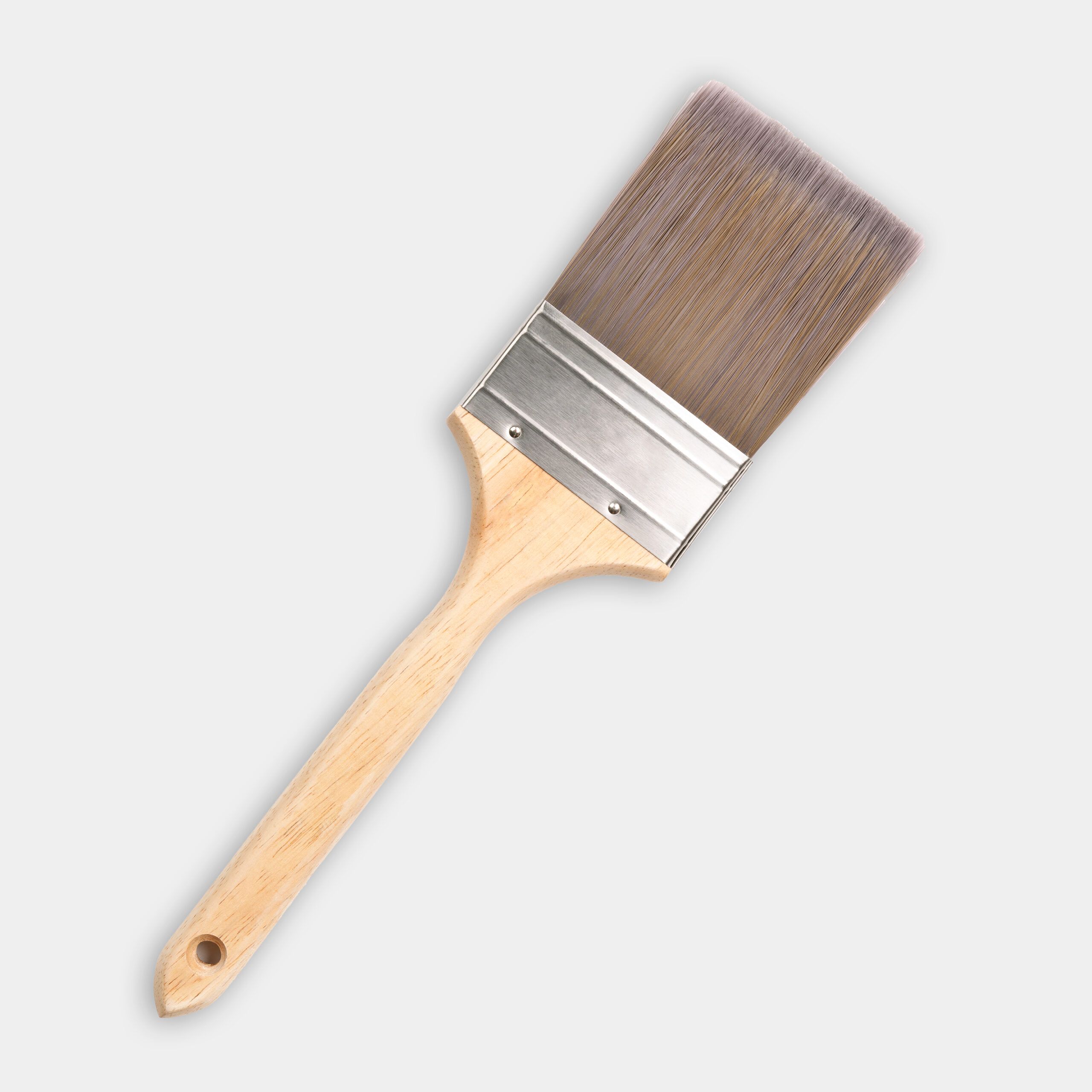
Work slowly and precisely as you near the tape line, opting for a brush to avoid accidentally going beyond the tape line. Apply a second coat.
Step 7: Remove the tape.
For the crispest line, carefully remove the tape while the darker paint is still wet.
Materials
- Two small cans of paint
- Painter’s tape


