We may be compensated if you purchase through links on our website. Our team is committed to delivering honest, objective, and independent reviews on home products and services.
A small bathroom doesn’t have to mean sacrificing style or function. With a clever, creative design and effective planning, you can create a comfortable space that meets your needs. This guide offers practical suggestions on maximizing your small bathroom layout to make every square foot count.
Small Bathroom Layouts
“100 square feet can be a nice sweet spot,” says San Diego designer Corine Maggio. “It allows for the classic four pieces—a double-sink vanity, a tub, a separate shower, and a toilet—while meeting the minimum standards for comfort and usability. That means allowing for a 3-foot-square shower, 30 inches of clearance alongside a tub and in front of a commode, and a 60-inch-long vanity.”
However, not everyone wants the classic four-piece configuration, even if they have the space. You may have more pressing needs, such as a bigger shower, extra storage, or a linen closet. By clearly outlining your priorities and finding ways to blend functionality with design, you can accomplish a lot within 100 square feet.
To illustrate the possibilities, we’ll explore how designers and homeowners have gotten the most out of their roughly 100-square-foot bathroom spaces with innovative approaches. Each example highlights unique solutions and breakthroughs that can inspire your own renovation project.
Clean, Crisp Four-Piece Bathroom
Case Study 1: 94 Square Feet
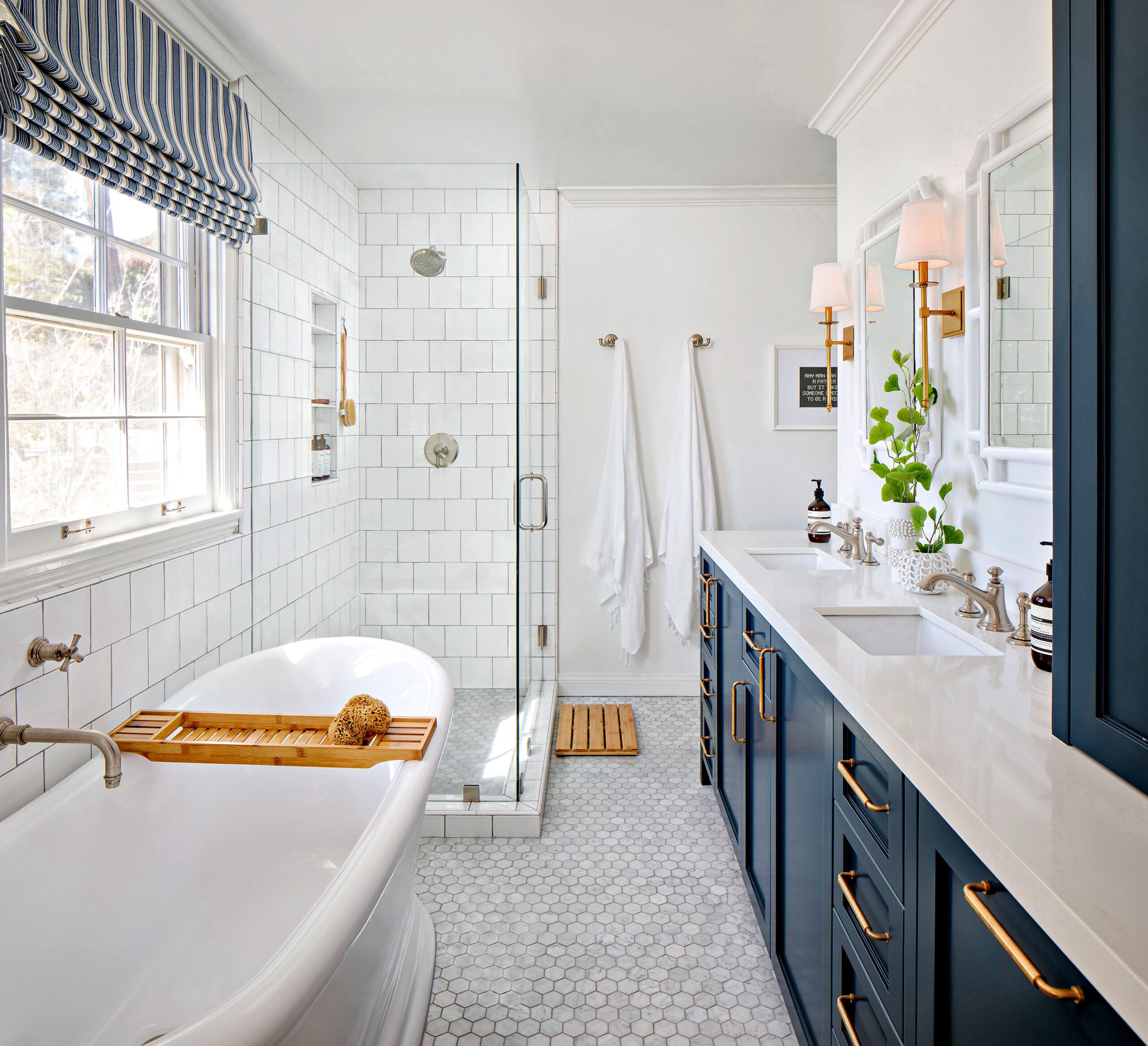
The long, narrow primary bath in Maggio’s clients’ 1951 house in La Jolla, California was “closed-in and compartmentalized,” she says. A large linen closet to the left of the entrance took up valuable square footage. By removing it and replacing dated fixtures in the same locations, they opened up the space by a great deal. Although they couldn’t move the door and window, “we were able to tweak things enough to make a big impact in the same general layout,” Maggio says. Her approach shows that sometimes, even small adjustments can drastically change the feel of a space.
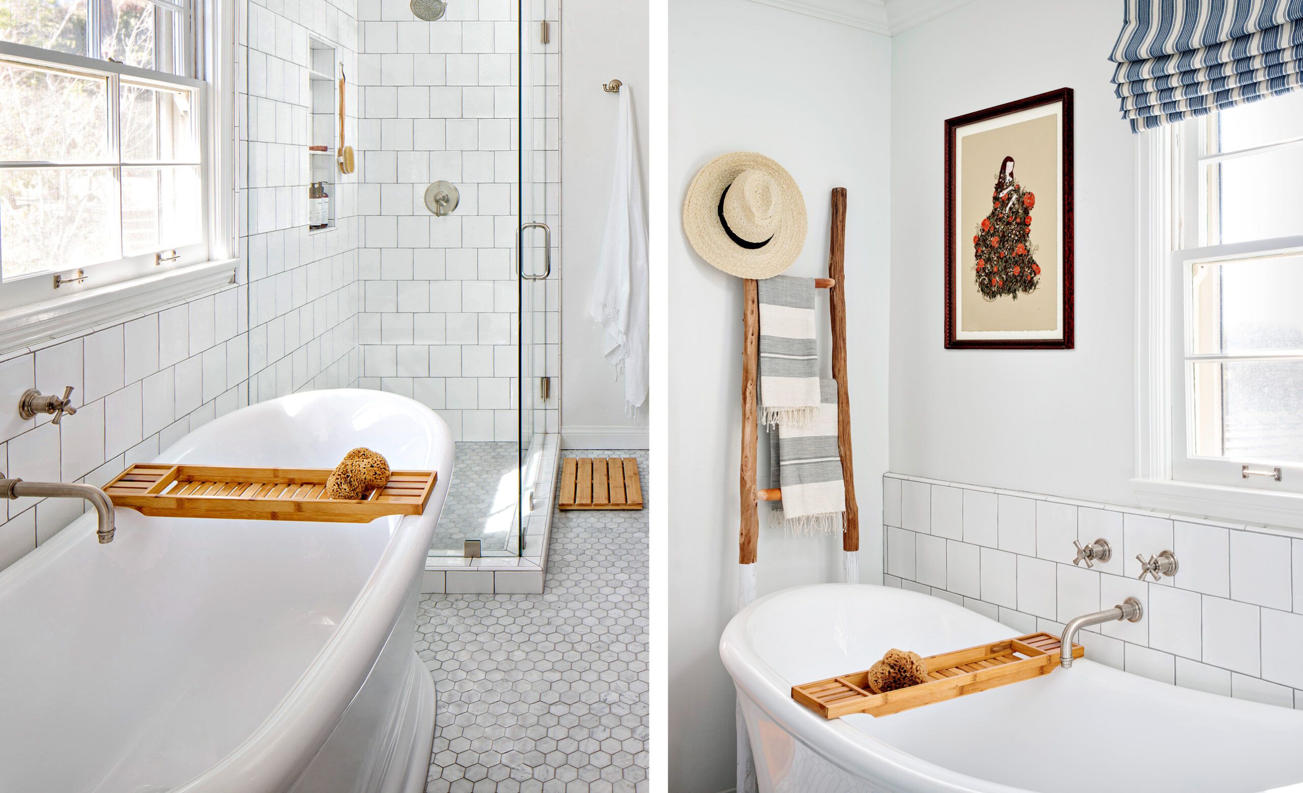
With a curvy soaking tub, square tiles instead of subway tiles, and a mix of brushed nickel and antique brass hardware, “the bath hits just the right note between playful and sophisticated,” says Maggio. She transformed a cramped bathroom into an open, usable space that feels much larger than its actual square footage. This thoughtful design uses every single inch of the bathroom.
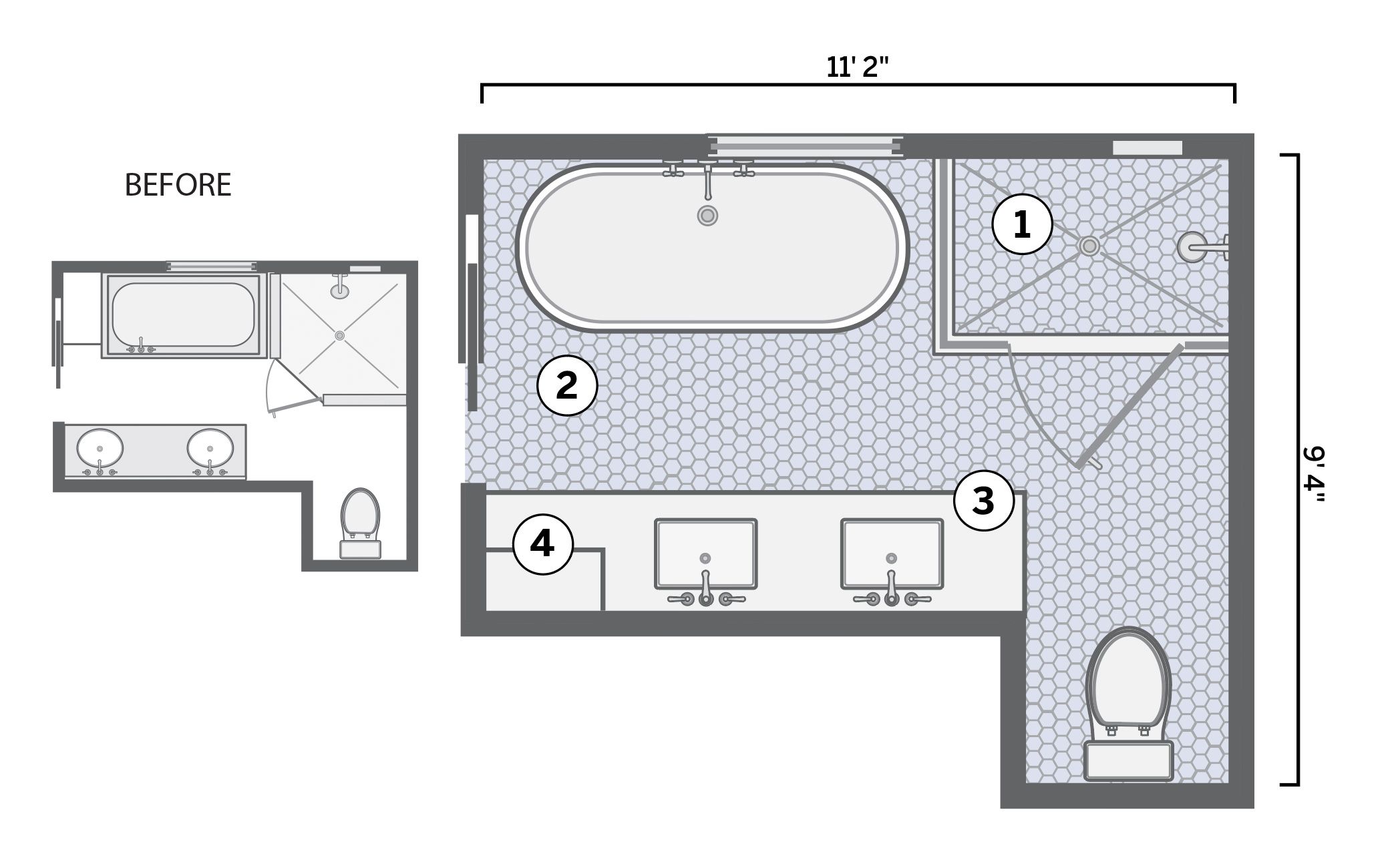
You can see the before and after of Maggio’s bathroom transformation in the above floor plan. These are the four key changes she made as indicated by the numbers in the image above:
- Reshaped shower: Squaring off an angled shower narrowed it slightly but added length, enlarging it by 4 square feet overall. This adjustment allowed for full utilization of the vanity wall length. The reshaped shower provided a more ergonomic and pleasant showering experience while enhancing the room’s flow.
- More open space: Removing the bulky linen closet and sunken tub created breathing room between the shower and the new freestanding tub. “The more floor you see, the bigger the space will feel,” Maggio points out.
- Vanity revamp: A larger custom sink cabinet, 6 feet long, now lines the wall opposite the tub. The toilet remained in its recessed area, providing more counter space and storage while keeping the room open.
- Sleek storage: A ceiling-height cabinet above the vanity, just inside the door, increases storage capacity. A built-in hamper below collects laundry that might otherwise clutter the floor.
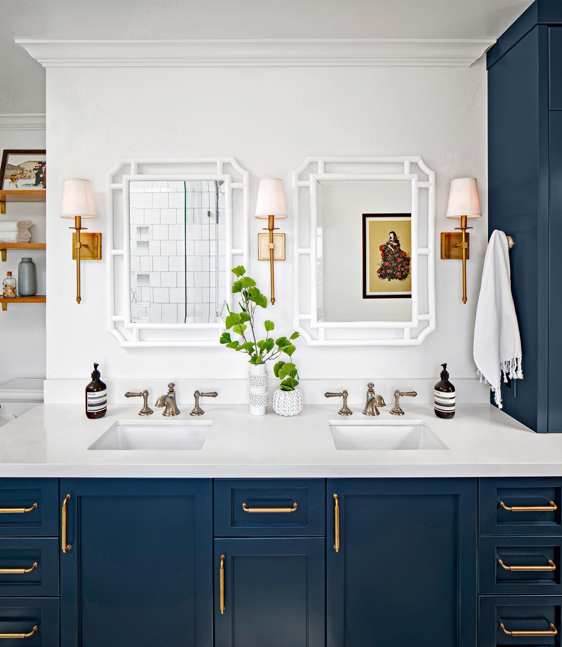
- Carpenter: Alex Singer, San Diego, California
- Countertop: Silestone
- Designer: Corine Maggio, CM Natural Designs
- Floor tile: Arizona Tile
- Mirrors: Serena & Lily
- Paint: Pure White (walls) and Gale Force (vanity), Sherwin-Williams
- Sconces: Savoy House Lights
- Tub: Memoirs freestanding bath, Kohler
- Vanity hardware: Baldwin Hardware
His, Hers, and Theirs
Case Study 2: 104 Square Feet
When Jacque and Jeff Flaherty’s twin sons outgrew bath time in their parents’ enormous oval soaker, the couple decided to reclaim their primary bath in their 1996 Colonial-style home in Gaithersburg, Maryland.
“The bathroom was a decent size, but with the fixtures lined up against the walls and wasted space in the center, I thought there must be a better way to use the space,” says Jeff, an avid DIYer. This realization led to a unique and innovative bathroom layout that seamlessly blends functionality and personal space for the couple.
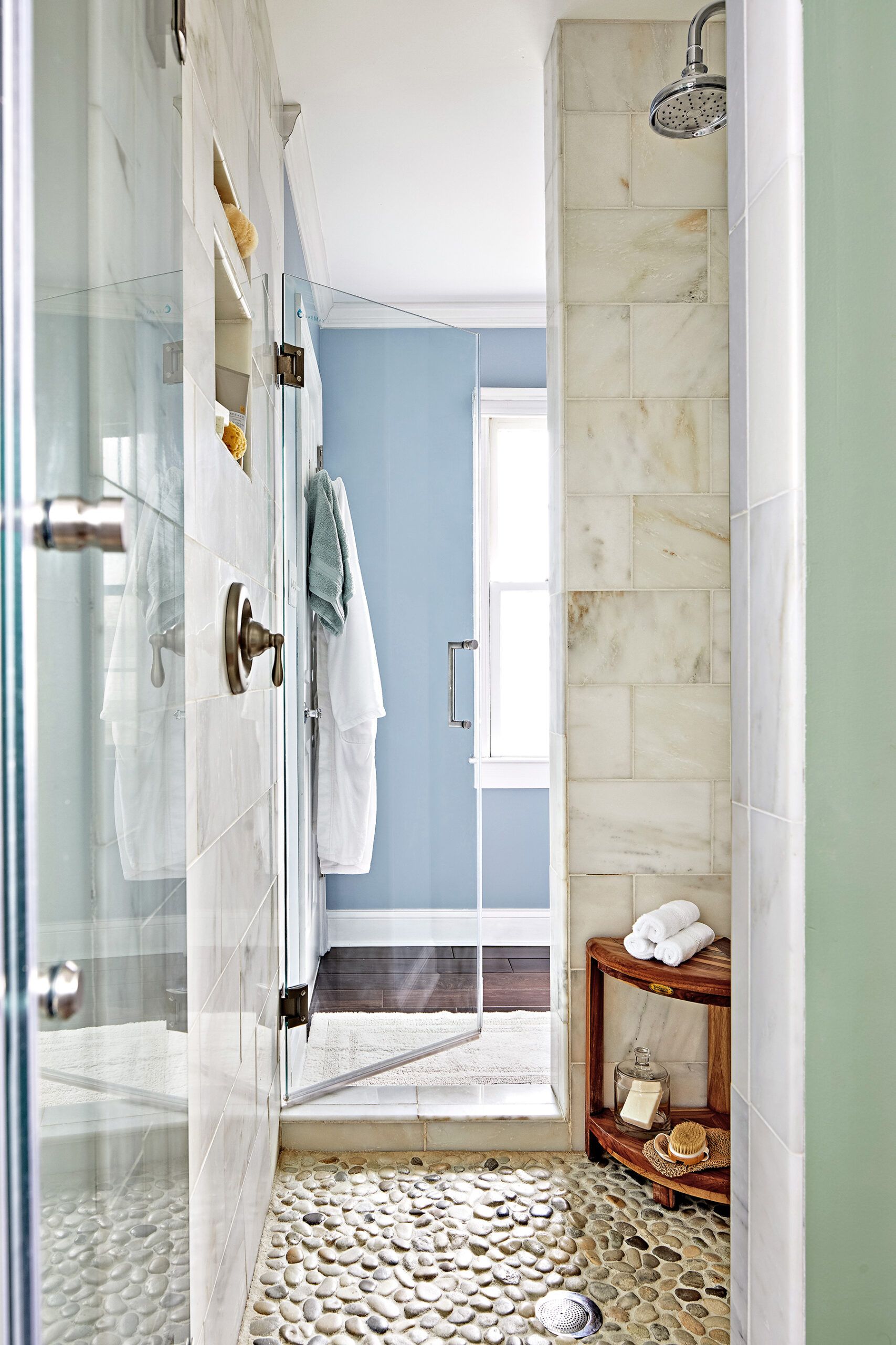
The Flaherty bath is on a corner with windows on both sides. The shower’s pebble-tile floor is one of the couple’s favorite features. “Every time we step inside, it’s like a foot massage,” Jeff says, highlighting how simple design choices can improve your daily bathroom routine.
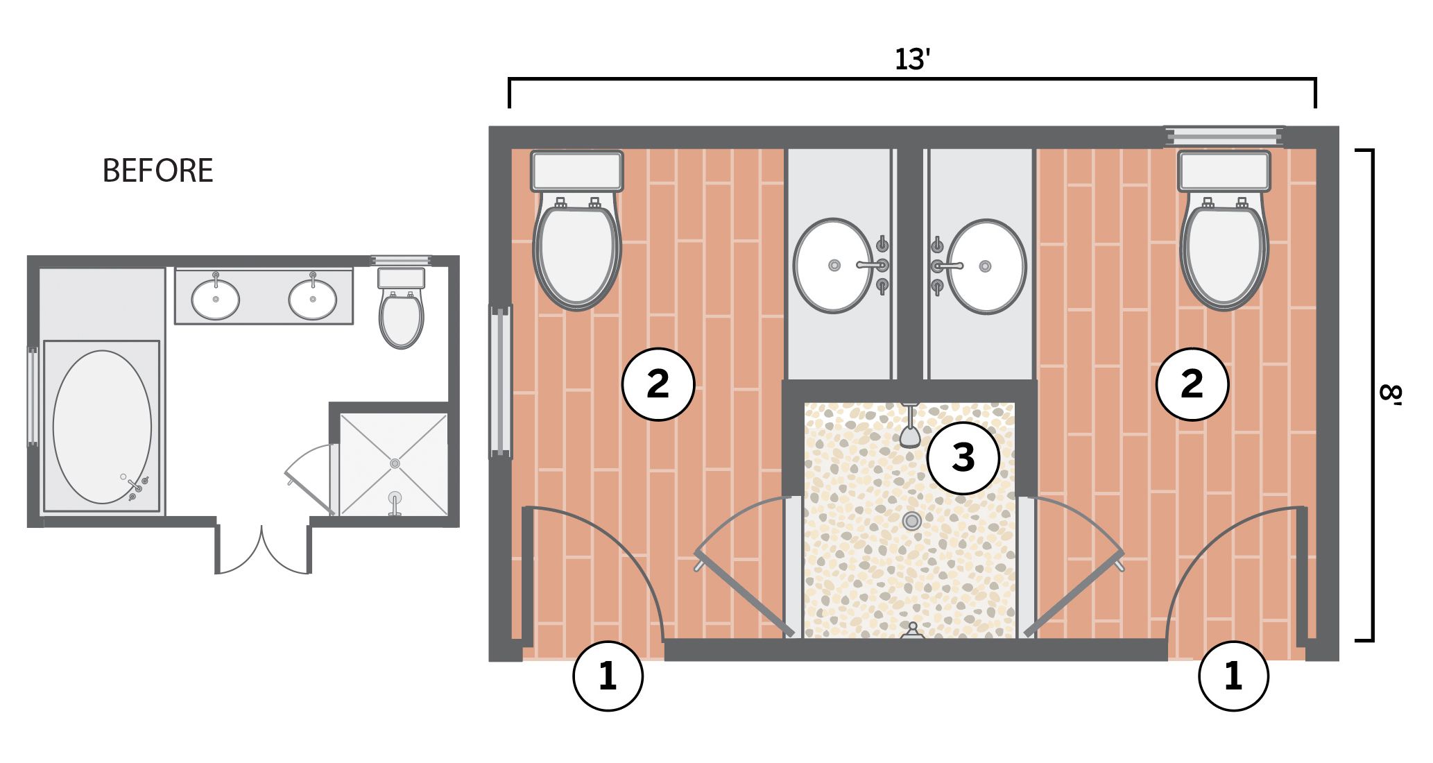
You can see the before and after of the Flahertys’ bathroom renovation in the above floor plan. These are the three main updates Jeff made as indicated by the numbers in the image above:
- Dual entrance: The couple wanted private spaces, so Jeff designed a unique Jack-and-Jill bath with two entrances from the primary bedroom. This dual entrance allows private access and splits the space into two distinct zones.
- Two halves: After gutting the space, Jeff divided it in half, framing a partition wall with a one-sink vanity on either side and toilets on the adjoining walls. Both sides kept their existing windows. This division gave both parties designated areas for privacy and convenience.
- Shared stall: Forgoing a tub made room for a 32-by-42-inch shower that opens into both half baths. This clever design promotes harmony in the couple’s daily routine. “We haven’t had a single argument over toothpaste in the sink, towels on the floor, toilet seat position, or any of the usual issues couples have,” Jeff says.
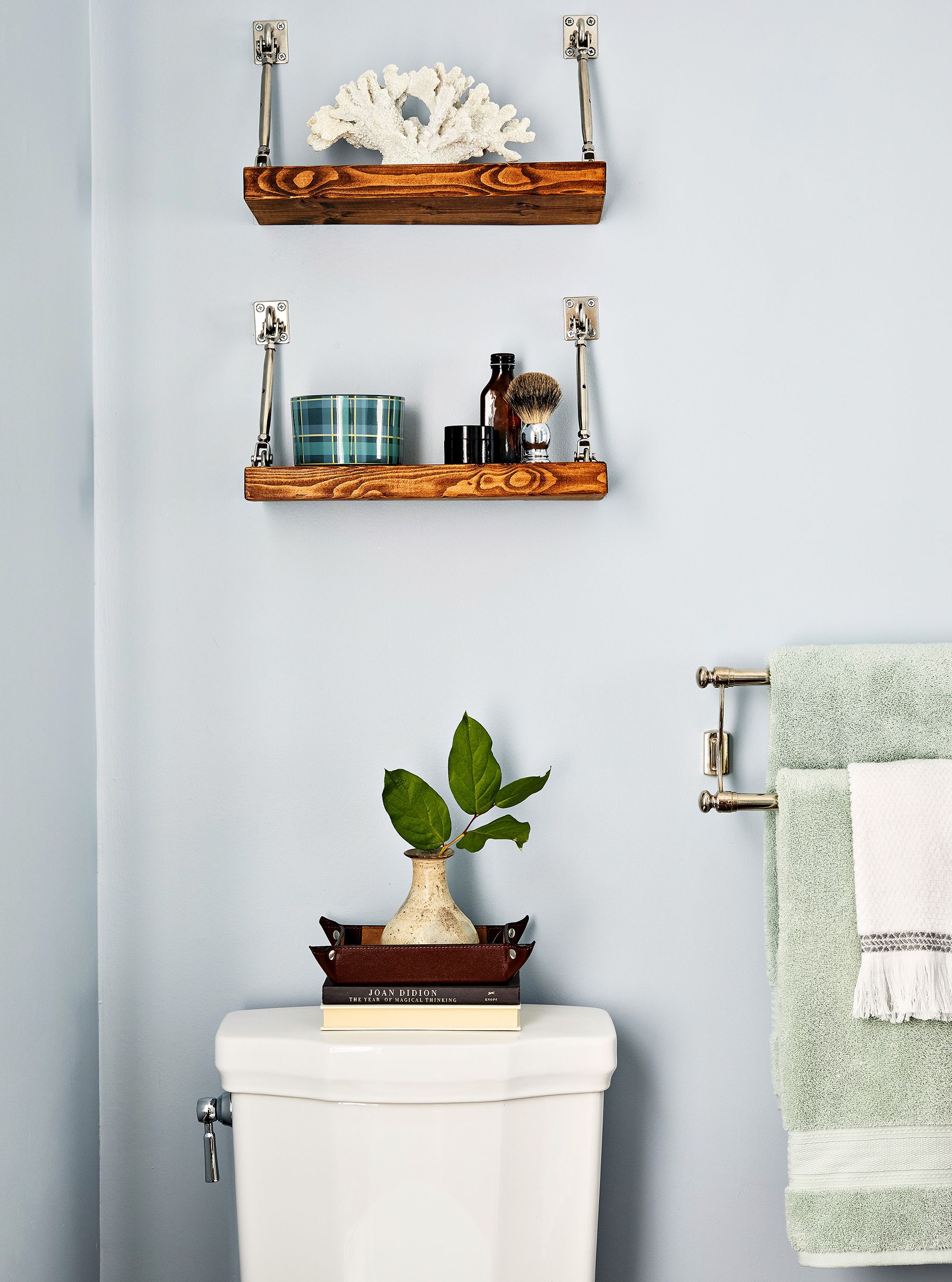
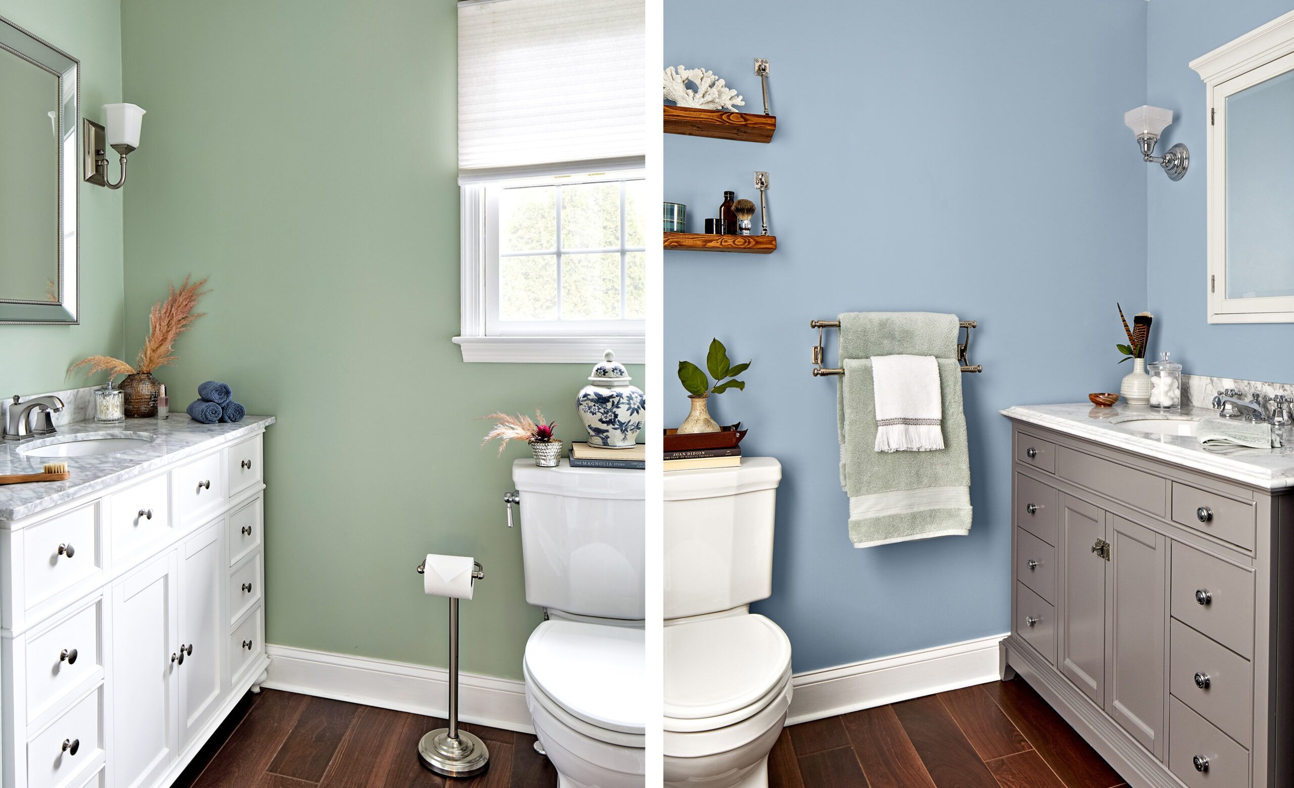
Both Flahertys now have their own private spaces, which they’ve personalized with slightly different paint colors—blue for his side, green for hers. Open shelves over the toilet add storage and display space in Jeff’s area, a hidden gem in this compact space.
- Faucets: Kohler (her side), Kingston Brass (his side)
- Lighting: Quoizel Lighting
- Paint: Silver Sage (her side), Restoration Hardware; Flowing Breeze (his side) and White (molding), BEHR
- Tile: Lumber Liquidators (floors), Floor & Decor (shower walls), The Tile Store Inc. (shower floor)
- Toilets: Toto
- Vanities: Wayfair
Split Decision
Case Study 3: 126 Square Feet
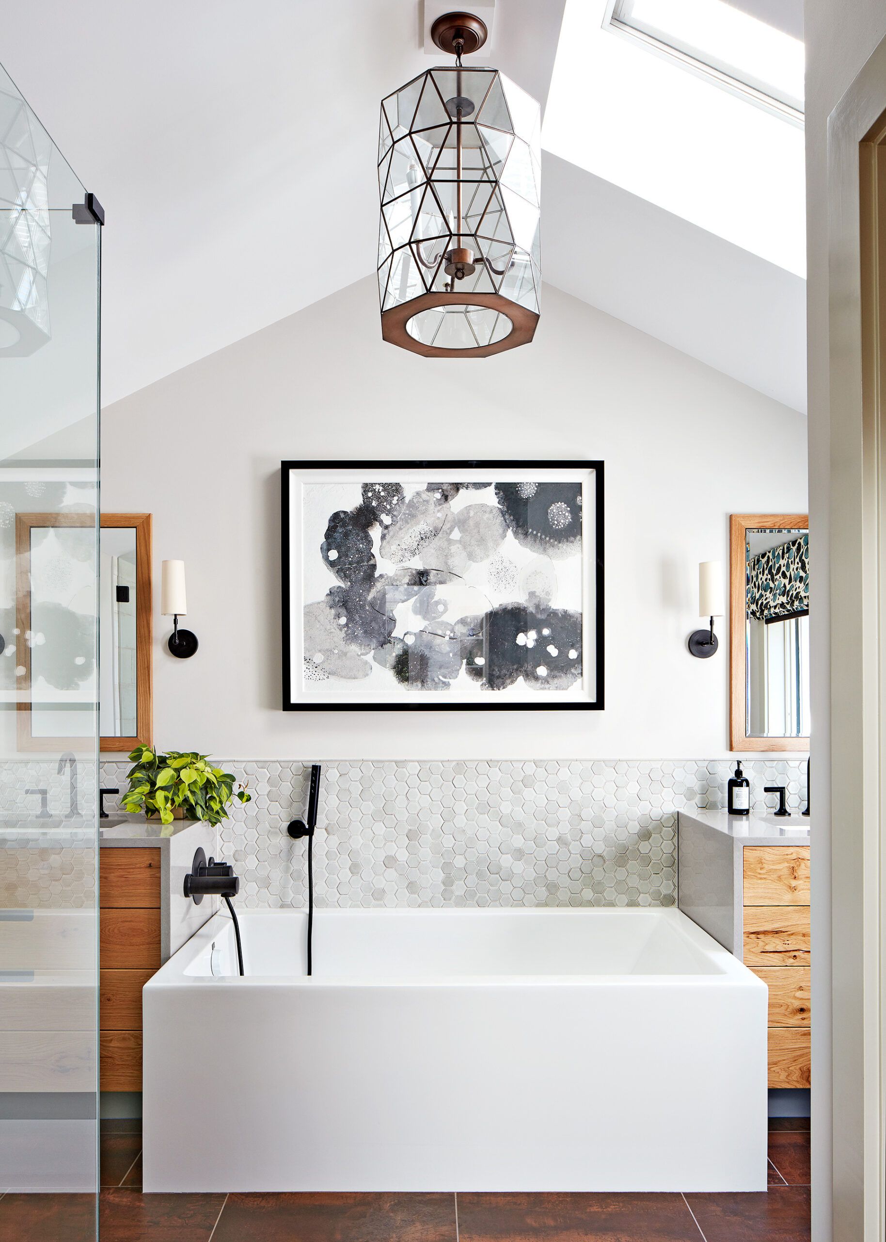
While removing the tub has become popular in primary bath renovations, some homeowners still enjoy a good soak. This was the case for a couple in a 1956 contemporary home in Manchester, Massachusetts. “But no one wants a tub jammed in the corner,” says Kristina Crestin, their designer. “It’s not pleasing to the eye or very functional.” With that in mind, the built-in tub wedged between the vanity and the toilet room had to go.
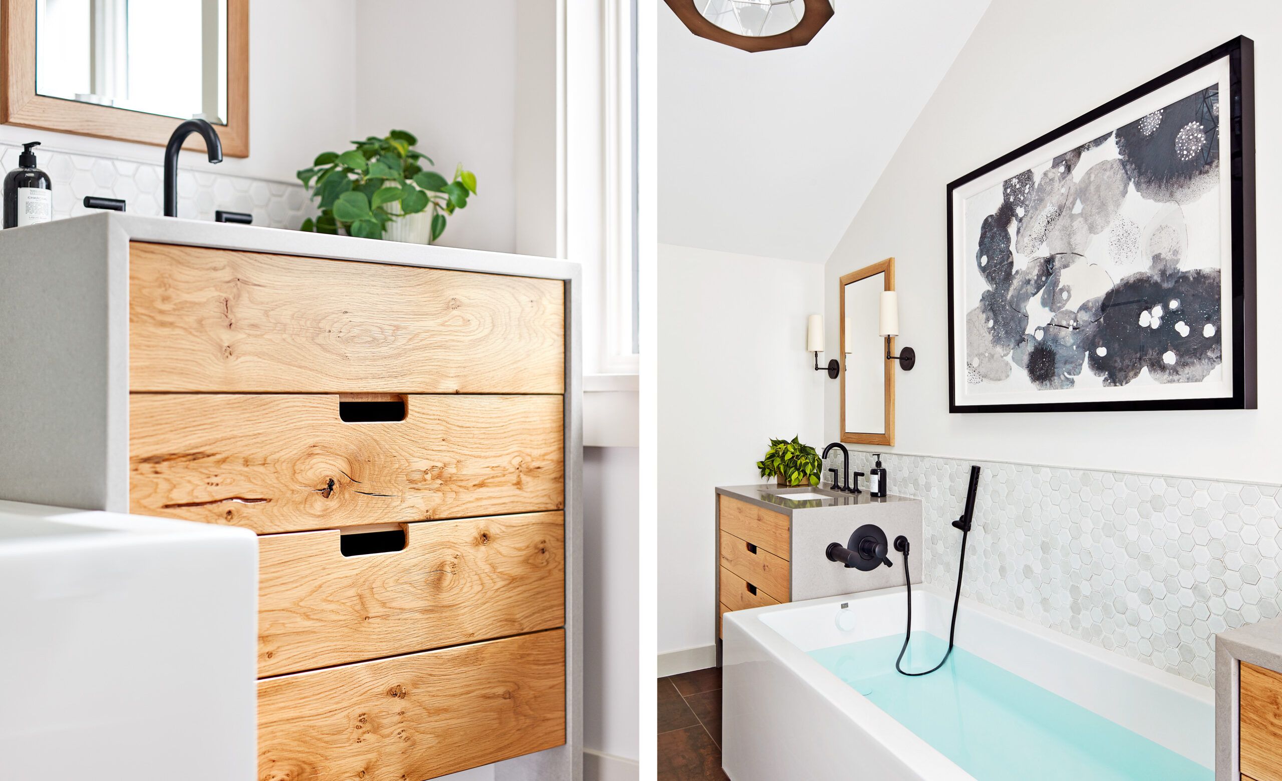
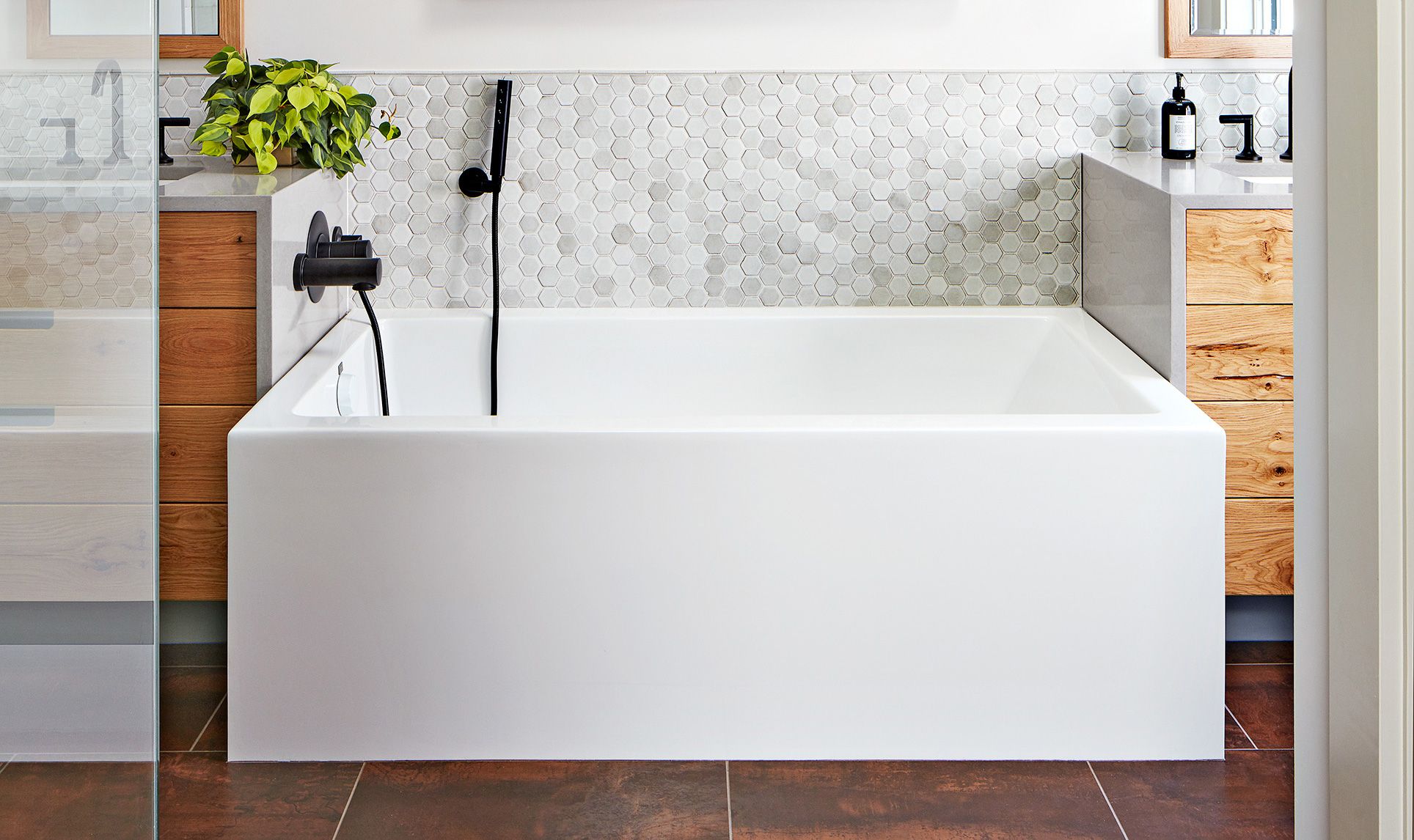
Organic elements—such as salvaged wood on the vanities, porcelain floor tile resembling leather, and handmade hex tiles behind the tub—help soften the room’s modern geometry. These thoughtful design choices blend contemporary and natural looks, and the natural textures and materials add warmth and character to an otherwise sleek and modern space.
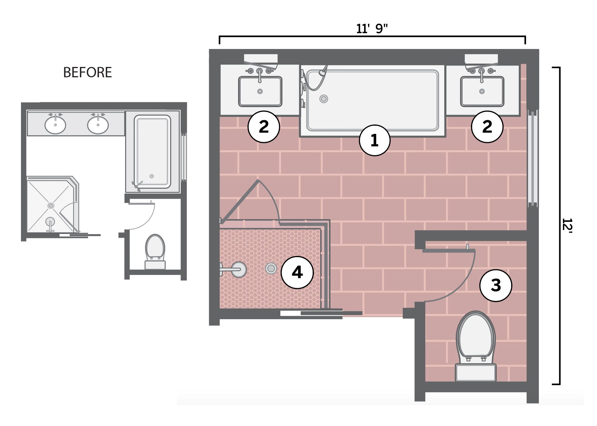
You can see the before and after of Crestin’s bathroom updates in the above floor plan. These are the four main changes Crestin made as indicated by the numbers in the image above:
- Soaker spotlight: Crestin placed a sleek, squared-off tub opposite the entrance—where the dated double vanity had been—to create a fresh focal point. A large-scale pendant light crowns the ceiling vault, drawing attention to this new centerpiece and making the room a welcoming retreat.
- Vanity flair: The tub’s square ends allowed custom 36-inch-wide vanities to fit snugly along either side, creating a pleasing symmetry separating the couple’s grooming stations. Long, deep drawers offer convenient storage, maximizing the available space.
- Cleaned-up WC: New finishes refreshed the existing 5-by-4-foot space, maintaining its utility while updating its appearance. Simple yet stylish upgrades can rejuvenate a space without major structural changes.
- See-through shower: The shower remained in its original location, but Crestin installed frameless glass to enable natural light to flow through the room and create a sense of spaciousness.
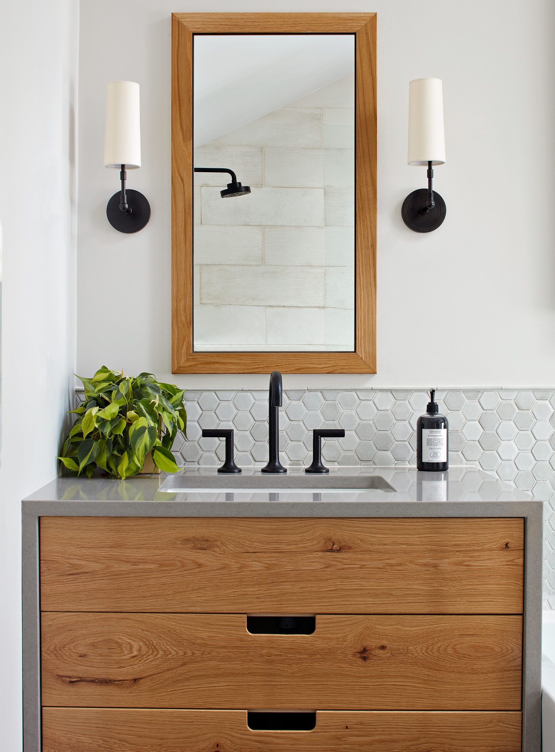
Custom vanities with reclaimed wood drawer fronts and simple cutouts add more character than hardware. Recessed medicine cabinets with framed mirrors provide eye-level storage and serve as practical home decor.
- Designer: Kristina Crestin Design, Manchester-by-the-Sea, Massachusetts
- Faucets: Brizo
- General contractor and custom cabinetry: Curran & Sons Construction, Inc.
- Handmade hex tile: DiscoverTile
- Pendant light and sconces: Worlds Away
- Tub: MTI, Designer Bath
Wash-Up-and-Dry Zone
Case Study 4: 93 Square Feet
Primary baths weren’t standard in 1905 when Adam and Jill Sharkey’s Craftsman home was built in Santa Barbara, California. Instead, a sitting area adjoined their bedroom—which architect Adam knew they could utilize more effectively. “We didn’t want to continue sharing the hall bath with our kids, and we wanted an upstairs laundry,” he explains. These goals sparked a creative redesign that added modern conveniences while retaining the home’s historic charm.
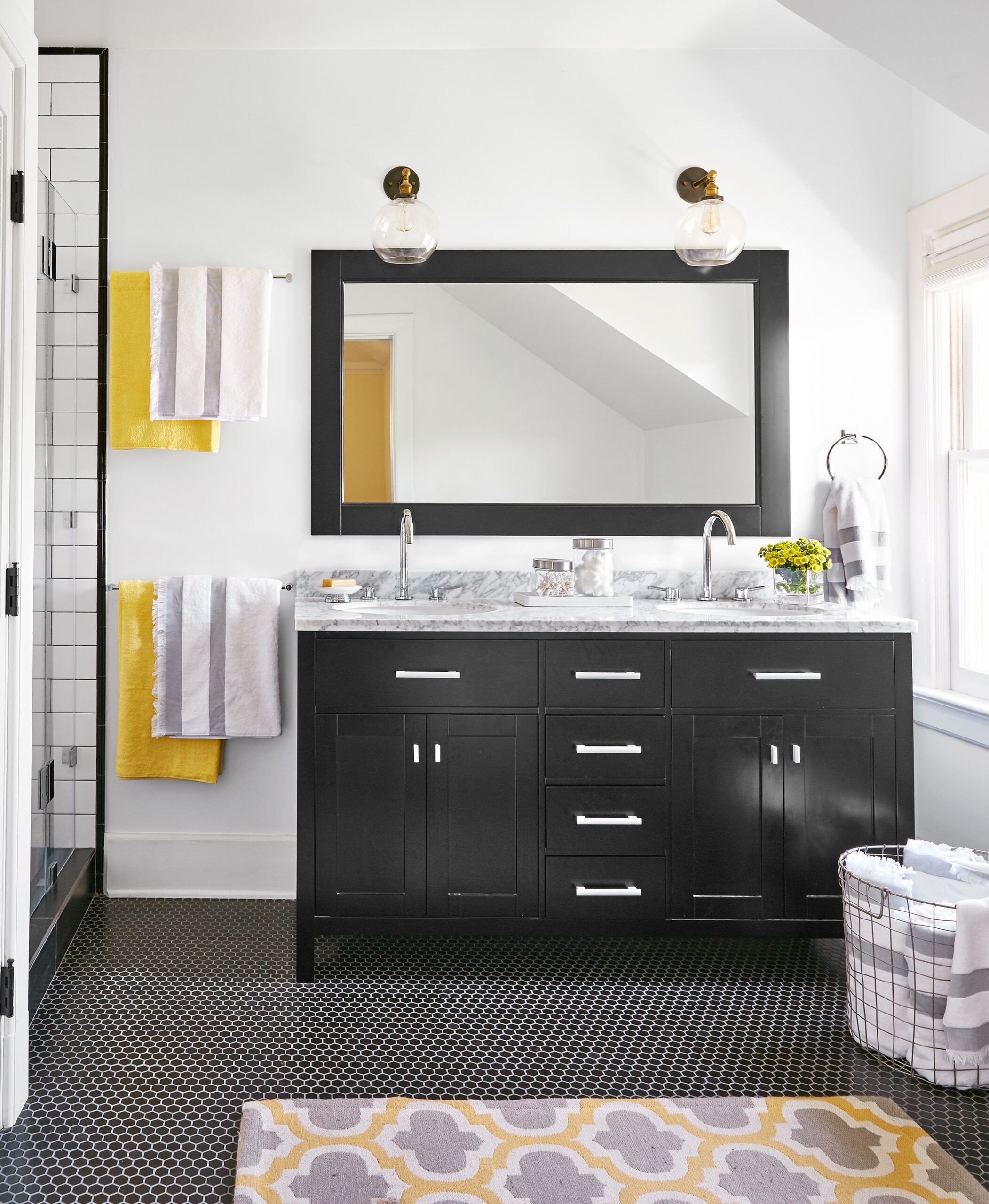
The bath’s classic black-and-white scheme is elegant and modern but still in keeping with the house’s Craftsman style, which is exactly what the Sharkeys wanted.
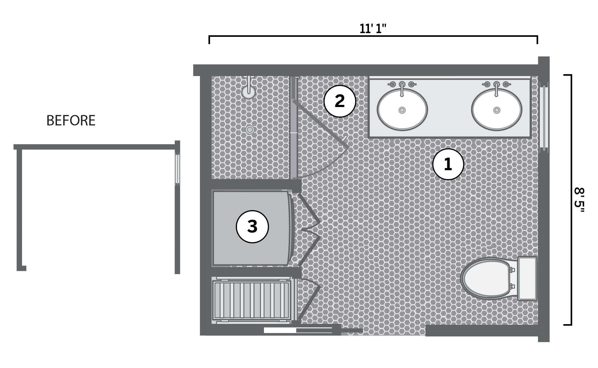
You can see the before and after of the Sharkeys’ new bathroom installation in the above floor plan. These were the three main components of Adam’s vision for the former sitting room, as indicated by the numbers in the image above:
- A simple plan: Adam laid out a 60-inch double vanity perpendicular to the window to take advantage of natural light. He placed the toilet across the room, where the ceiling slopes down slightly, offering a subtle sense of enclosure.
- Room to move: Strategic layout choices can even improve daily routines. In addition to agreeing on a 36-by-40-inch shower, the couple wanted “landing space” for exiting and entering it, so they placed the end of the vanity almost 3 feet from the shower.
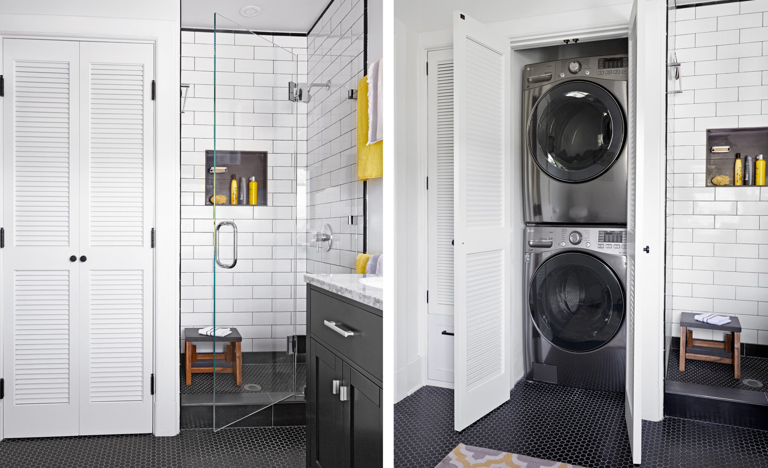
- Secret stack: “It makes sense to have the washer and dryer upstairs, where our dirty clothes and bedsheets are removed,” says Adam. A 3-foot-square closet holds stackable units, while a skinnier one has drying rack pullouts and a deep drawer to carry supplies. This clever integration of laundry saves time and steps, making household chores more efficient.
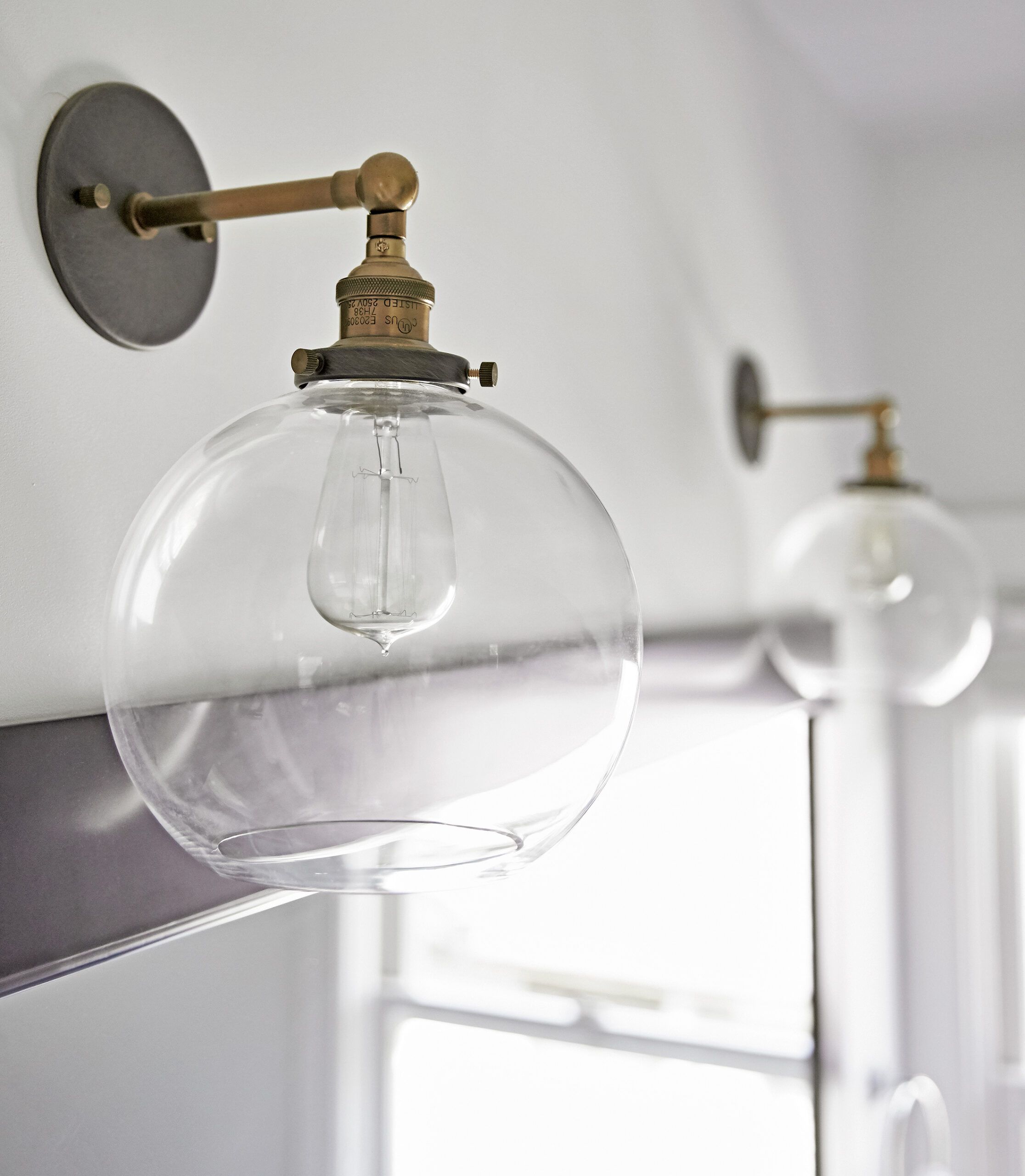
The clear glass globe sconces with brass fittings that Adam installed are similar to the original fixtures in other rooms in the Sharkeys’ 1905 house, keeping a cohesive design throughout the home while providing adequate lighting in the compact bathroom.
- Architect: Adam Sharkey, Santa Barbara, California
- Cabinetmaker: Lotus Cabinetry, Santa Maria, California
- Closet doors: T.M. Cobb
- Contractor: Jose Manuel Mora, Mora’s Construction, Oxnard, California
- Faucets and shower fittings: GROHE
- Mirror, and vanity with double sinks and marble top: Design Element
- Paint: Frazee Dear Feather, Sherwin-Williams
- Sconces: Restoration Hardware
- Shower door: Bortolazzo Glass, Santa Barbara, CA
- Tile: Tileco
- Washer/dryer: LG
Maximize Small Bathroom: Our Conclusion
With some planning, creativity, and a clear vision, you can turn your small bathroom into a beautiful, functional space. Whether you decide to update your vanity, install laundry facilities, or highlight your soaking tub, you can find a way to make your bathroom work for your family’s needs and routines.
