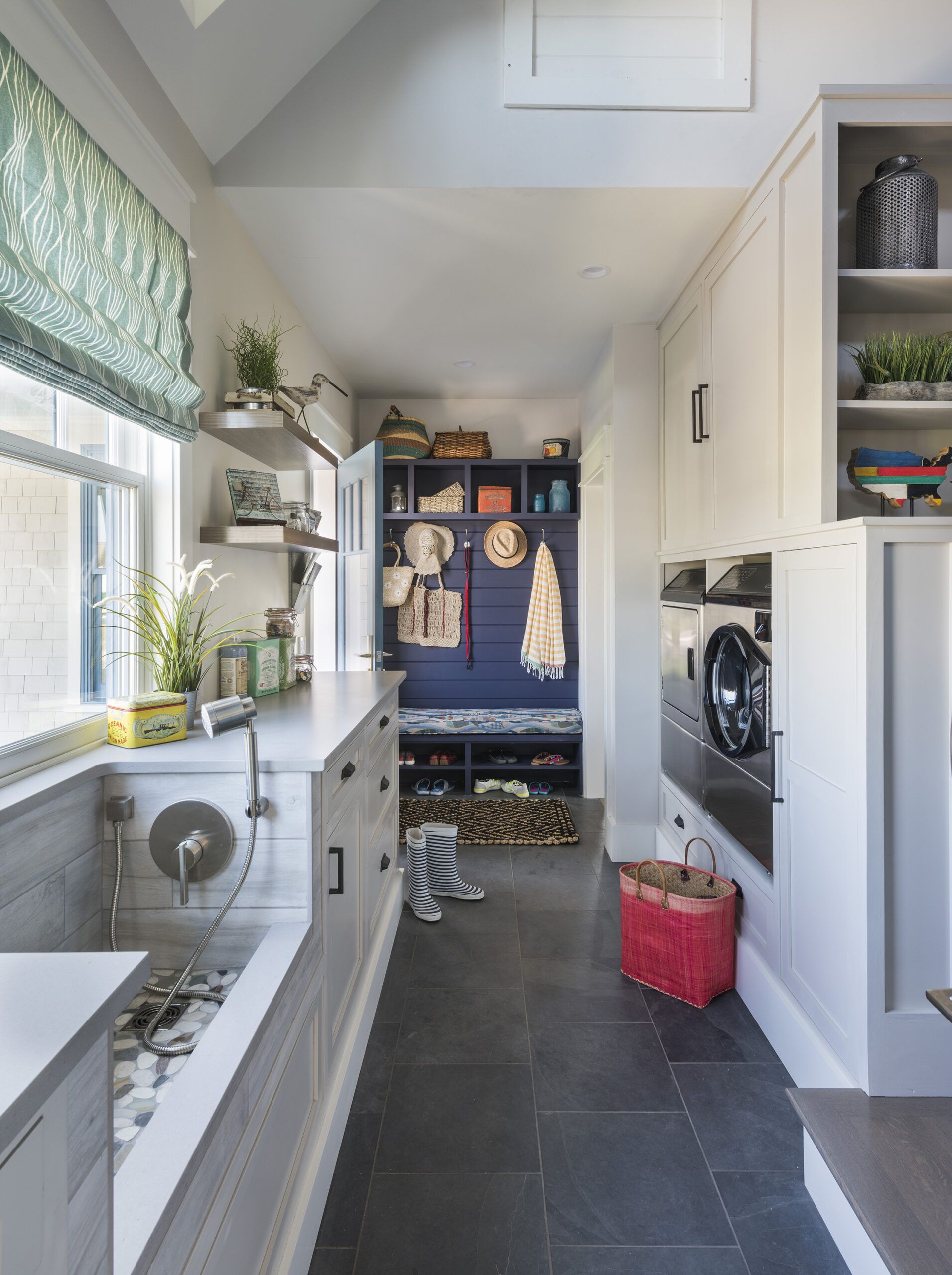
As a young visitor sprinted through the mudroom of This Old House’s 2017 Idea House in East Matunuck, Rhode Island, recently, she stopped and pivoted in front of the mudroom’s dog-washing sink (expand image at left in desktop/ at bottom in mobile), with a twinkle in her eye. “Cool!” she exclaimed, reaching for the hand sprayer. “Where’s the puppy?”
Builder Jeff Sweenor, a dog owner himself, appreciates the impulse. “This house has so many special details, and they are all about making the house extremely functional, livable, and even fun. Every room has something extra.”
A collaboration between Sweenor Builders, Union Studio Architecture & Community Design, and numerous This Old House sponsors and contributors, the house delivers a medley of features that are at the top of homeowners’ wish lists today. Its open-plan living areas promote easy circulation; the first-floor master suite supports aging in place; and multiple levels accommodate adult children and grandchildren. Weather-resistant and energy-efficient materials and systems minimize maintenance, while smart-home features maximize convenience and comfort. Add in generous outdoor-living spaces to make entertaining easier, and custom touches that supply function and personality throughout, and you’ve got all the makings of a dream beach house.
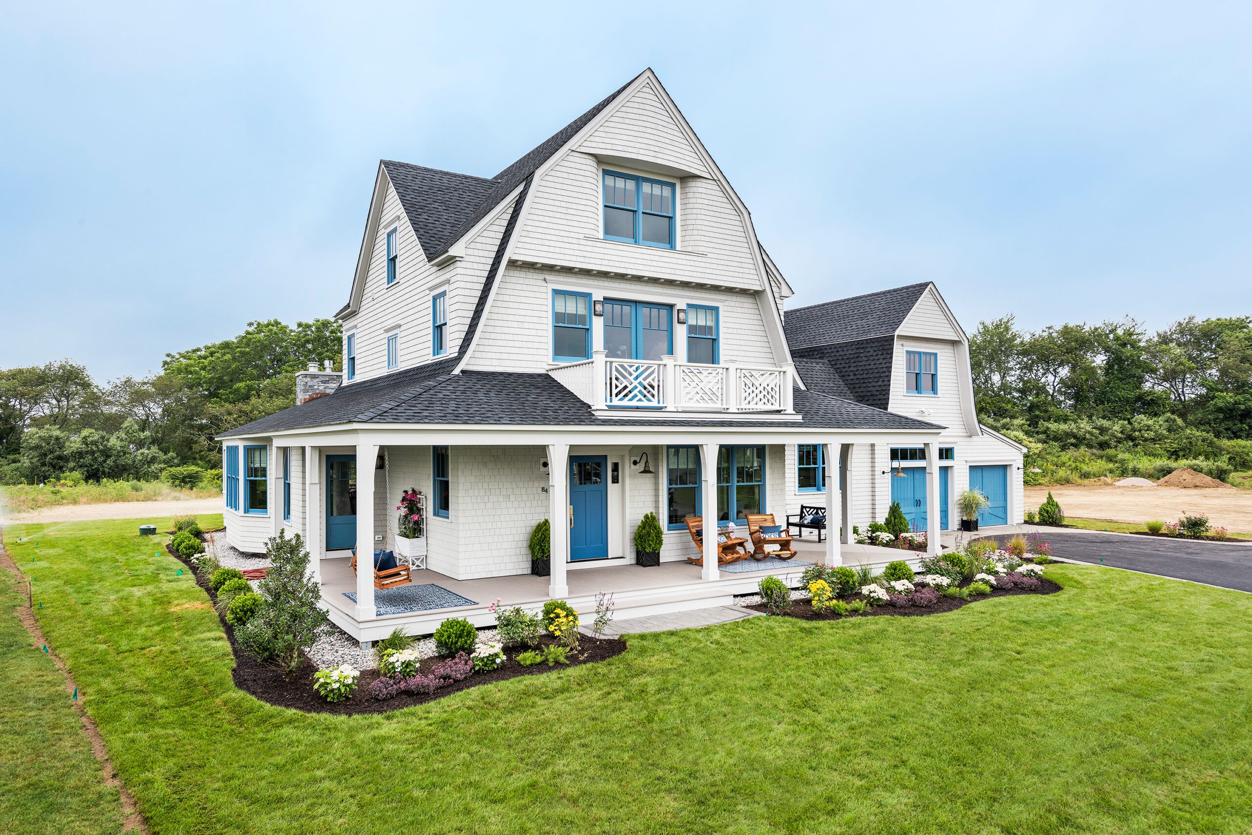
Perhaps best of all, these features take shape within a 3,200-square-foot house whose outward face finds design inspiration in one of New England’s most iconic architectural styles: Shingle style. “The details and forms draw on Rhode Island’s 19th-century tradition of Shingle-style architecture, with gambrel roofs, flared gables, and curving shingled walls at balconies and windows,” says principal architect Don Powers of Union Studio Architecture, who teamed up with project architect Christina Carlson on the design of the house. “But we adapted those historical elements to the way people like to live right now,” he says.
RELATED: Idea House 2017 | Ground Floor Reveal
A prime example of this updated approach is the open-plan kitchen-dining-living area that is the heart of the home. “We wanted to create the easy flow and communication from one space to the next that is so desirable today,” Powers says. But the team ensured that the open-plan space still had a traditional sense of defined rooms—something often missing in contemporary open spaces—by varying the ceiling design. A vaulted ceiling with white-painted V-groove boards distinguishes the living area; a coffered ceiling with V-groove insets marks the dining area; and a smooth plastered ceiling caps the kitchen. Structural columns flanking a built-in cabinet further delineate the living and dining spaces, while providing useful storage and maintaining open sight lines.
“We also created a layout so that all the living could happen on the first floor if that’s what is desired,” says Carlson, who felt strongly that the house should support one-level living for aging in place. “Many of our clients today insist on a first-floor bedroom,” she says. In addition to the first-floor master suite, thoughtful aging-in-place design features include minimal stairs from garage to main house to outdoor-living areas; maximum daylighting with walls of windows, as well as variable lighting control; lever-style handles and a curbless walk-in shower with a seat in the master bath; a first-floor laundry; and 40-inch-wide hallways.
Flexible upstairs spaces are designed to accommodate different scenarios, including multigenerational living. For example, visiting guests or grown children can occupy the second floor of the main house, which holds two bedrooms and a bath with a secondary laundry. The youngest members of the household—or grandchildren—can take over the third-floor bunk room, and 20-somethings can gather in the bonus space above the garage, designed as a game room with a freestanding bar.
To play up the house’s personality, the design team pushed for some distinctive custom features. Chippendale-style railings with bold diagonal lines call attention to the stairways in the main house—and are even repeated on the outdoor balcony. The mudroom holds a dog-washing station with a wood-look tile enclosure, a pebble mosaic floor, and a hand sprayer. No dog in the house? No problem—the area doubles as a utility sink for sandy sneakers and swimsuits, right across from the washer and dryer, which are elevated on back-saving pedestals and incorporated into a wall of custom cabinetry. Built-ins throughout add function and storage —as well as architectural flair—from bookcases in the study with X-detailing on the doors to a front-entry bench with drawers to a mudroom drop zone with cubbies and coat hooks.
All these details, coupled with a color palette inspired by sea, sand, and sky, contribute to the refined beach-house look. “We used blues, creams, taupes, grays, and washed finishes to evoke the beach, but we also brought in a level of sophistication with rich fabrics, metal finishes, and classic, yet comfortable, furniture,” says interior designer Denise Enright. The color of the exterior window cladding became a jumping-off point for Enright, who used various shades of blue throughout, spiked with accents of green, dusty purple, and pink.
“This is definitely a very detail-rich house, whether it’s the built-ins that add so much function inside or the sweeps in the roofline that give it a traditional look outside,” says Jeff Sweenor, who relied on the craftsmanship of his 50-man crew, including son and apprentice Ryan, to get the exacting work done.
The gambrel roof, which has become one of this Idea House’s trademarks, is a more challenging way of framing a roof because of the change in pitch on the rafters as well as the bottom flares. The eyebrow dormer accenting the one-story mudroom connector is another iconic architectural detail that requires finesse, as does curving the traditional eastern white cedar shingles in a few key places, such as the windows at the gambrel peaks. “All these special moments add interest, and complexity, but in Jeff Sweenor, we knew we had a builder who could do it all,” says Don Powers.
As a practical plus, the weather-resistant materials used on the house add durability to the exterior and mean less maintenance down the road. Preprimed radiata pine exterior trim conveys a traditional look but also offers the moisture resistance that comes from a modern pressure-treating process. The capped-polymer decking and porch flooring for the house’s multiple outdoor-living spaces provides a wood-like appearance that’s splinter-free underfoot and also rot- and mildew-resistant. On the roof, thick fiberglass asphalt shingles stand up to sun, salt air, and wind, and are also algae-resistant.
Innovative materials and high-tech systems increase the home’s energy efficiency as well. Closed-cell spray foam insulation fills the cavities between the framing timbers, with side and roof house wrap creating a layered barrier against cold and moisture. The hurricane-rated wood windows feature insulated laminated glass and aluminum-clad exteriors. For room-by-room comfort, the team chose single-phase variable refrigerant flow (VRF) for the HVAC system, enabling each room to have its own thermostatic control. It should improve the house’s energy efficiency by as much as 40 percent over a conventional system.
The family who eventually lives in the house can feel secure in the knowledge that the easy-to-use smart-home security system will ensure reliable monitoring and alerts. Wireless lighting controls can be set for different scenarios—such as “coming home,” with bright entry lighting, or “relaxed evening,” with soft ambient illumination—as well as occupancy sensors. The security system includes not only smoke, carbon monoxide, and intruder detection but also remote access to live video feeds with an e-mail or text-message alert system.
Multiple spaces for outdoor living, each with its own distinct look and all easily accessed from inside, provide the indoor-outdoor-living ideal popular today. The wraparound front porch evokes the traditional porches of Shingle-style houses but is designed a roomy 8 feet wide to allow for easy circulation and furniture placement. A backyard deck off the kitchen provides space for dining outdoors, with a durable paver patio and built-in fire pit just two steps down from the deck. With the house’s proximity to the ocean, an outdoor shower built off a rear corner of the oversize two-car garage should help keep sandy feet away from the house’s wood floors.
RELATED: Idea House 2017 | Outdoor Living Reveal
But the screened porch off the living area may be the real open-air showpiece, according to Don Powers, who predicts that it will be one of the most-frequented spaces in the house. “With its fireplace, you can use that room well into fall and even winter,” says Powers. “We intentionally didn’t make the screens go all the way down to the floor. Instead, we added a solid board-and-batten wall for the lower 30 inches, which creates more of an enclosure.”
The end result of the collaborative spirit—and skill—of the design and building team is clear from the first sight of the Idea House, with its mix of modern materials and amenities and classic architectural details. “There’s a nice balance here,” says Powers. “One of the interesting things about this house is that it shows that a traditionally designed house can meet every modern need, from energy efficiency to comfortable, stylish living.” Explore the entire build, start to finish, here.

