Wise Ways to Preserve an Old House

“I wasn’t sure I could ever afford a house in Boston. I got really lucky,” says Lanita Tolentino, the new owner of the left unit of this restored duplex in Roxbury. She grew up just a few blocks away. The 1870s Second Empire, like many older homes in the area, had sat vacant and in foreclosure until it was acquired by local nonprofit Nuestra Comunidad last year. That’s when TOH TV stepped in to help. The show’s pros spent last season gutting and transforming both spaces—making needed structural fixes as well—to enable Nuestra to put them on the market as affordable housing. Combining period elegance with an updated layout and modern, well-priced materials, Lanita’s first home is a study in smart renovation tactics for anybody who’s fixing up an old place.
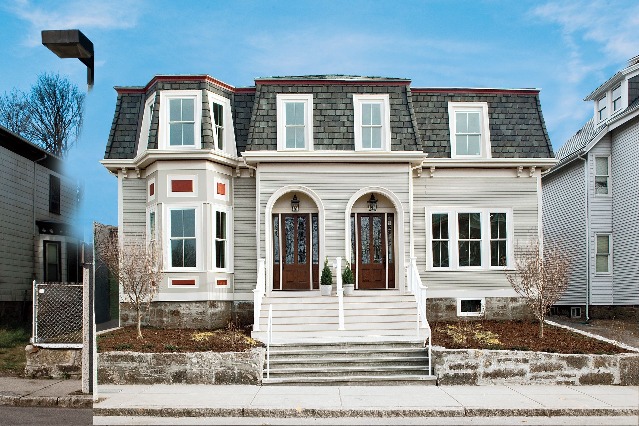
Shown: Long-wearing exterior materials enhance its look and will minimize upkeep.
Before: Second Empire in a Shambles
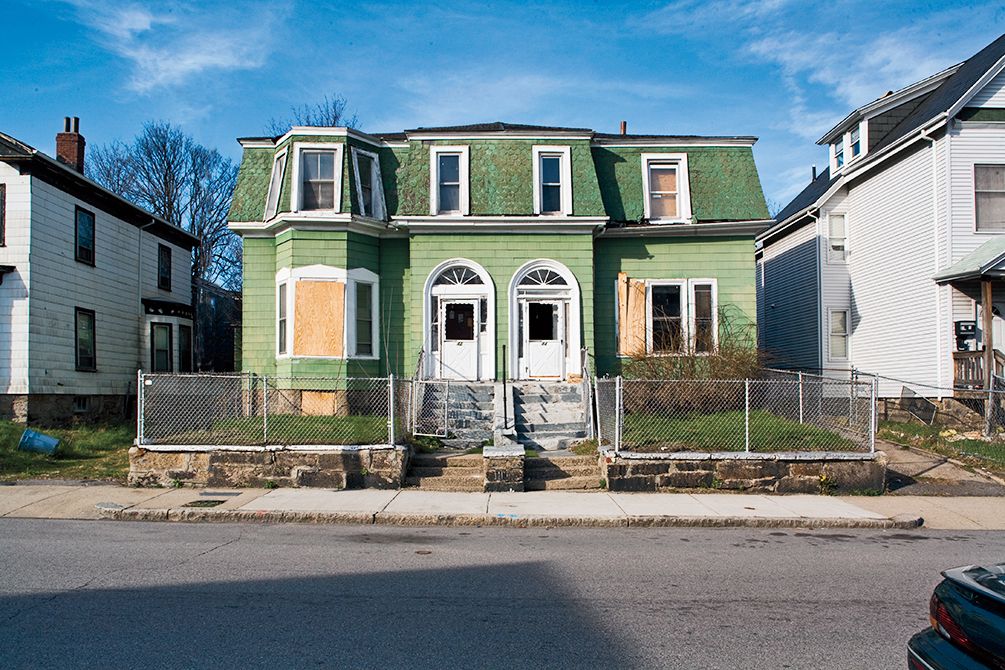
Though architecturally intact, missing windows and shabby siding and shingles made the house an eyesore.
A Facade That Will Stand the Test of Time

The mansard roof is topped with slate-look laminated shingles that have a lifetime warranty.
Grand Manor roof shingles and CertiSpray insulation: CertainTeed
Protection Up Front

Rot-proof trim frames the arched doorways and windows. “We also recessed the front door to further protect it from the elements,” says TOH master carpenter Norm Abram.
Exterior trim, decking, and railings: AZEK
Insulated Alternatives
Wood windows were swapped for durable vinyl models that offer good insulation.
Windows: Simonton
Detailed Palette

A muted color palette of taupe weatherproof fiber-cement siding and white trim helps the house fit into the neighborhood, while red paint livens up the paneling around the bumped-out bay.
Exterior paint: California paintsPlank siding: James Hardie ColorPlus in Monterey Taupe
A Front Parlor with Restored Glory

Period touches, such as crown molding, make the front parlor the home’s centerpiece once again. The new crown is made from lightweight, DIY-friendly polystyrene foam coated in plaster.
Crown molding: Trimroc, Canamould Extrusions Inc.
Front Parlor Before
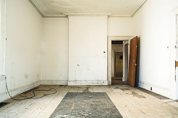
This room, typically used to receive and entertain guests, was scarred by years of ad hoc renovations and outright neglect.
Marble Mantel
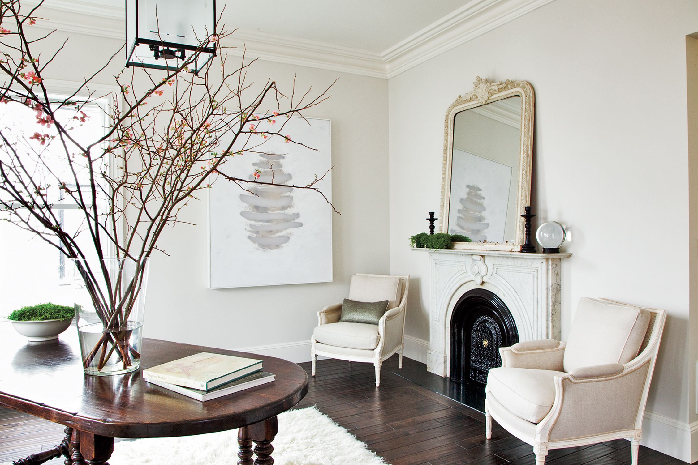
The graceful marble mantel, similar to an original one next door, was found at a salvage yard. Placed where the fireplace once stood, it serves as a handsome focal point that anchors a sitting area.
Walls and trim in shades of white, with different finishes, help tie the room together visually. “Lighter colors are often better than dark ones at highlighting the details and architecture of a space,” says Tricia McDonagh, the project’s interior designer.
Antique marble mantel: Restoration Resources
Interior paint: Benjamin Moore
Casework by Casework
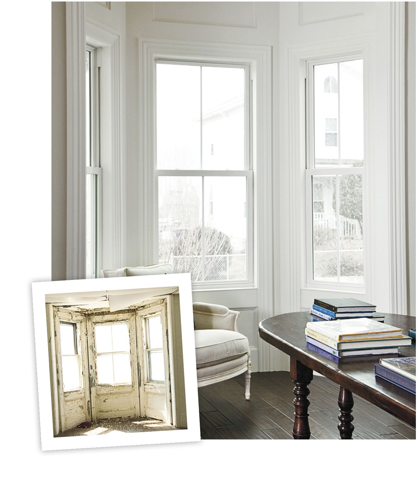
The bumped-out bay gets a boost from new paneling and casework around the windows.
TOH Pro Tip: “Keep costs down by making casework from stock materials. We used MDO plywood overlaid with rails and stiles made with lumber and panel moldings.” —Norm Abram, TOH master carpenter
A Tiny Kitchen and Dining Area that Act Big
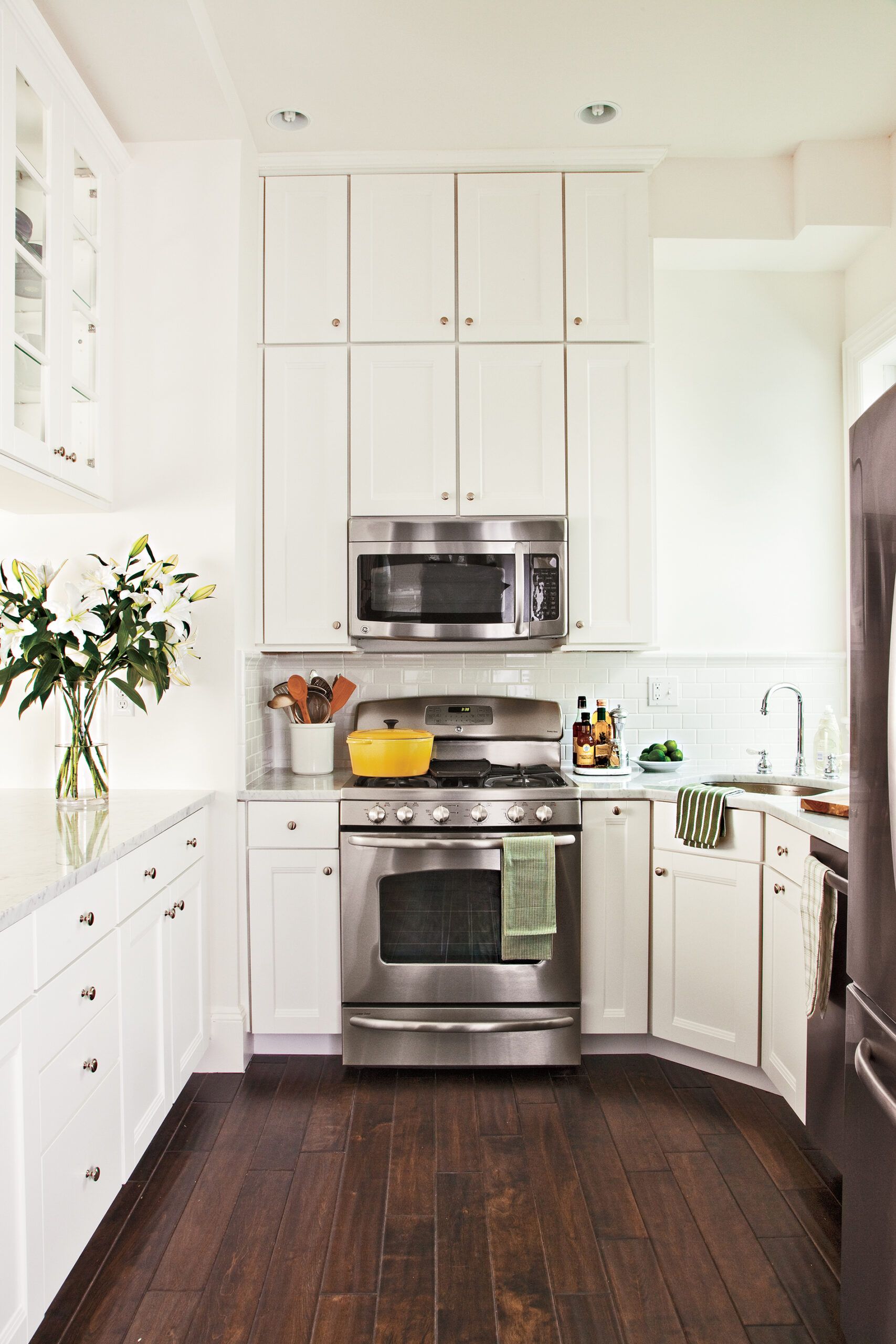
Smart design decisions make a 10-by-10-foot kitchen and adjacent dining nook highly functional.
Cabinets extend all the way to the 10-foot ceiling. “This draws the eye upward and gives the kitchen a butler’s-pantry feel, which suits its tall, narrow shape,” says McDonagh. Added bonus: The uppermost cabinets give Lanita room to stow away little-used items.
Kitchen cabinets: American Woodmark
Kitchen fixtures: American Standard
Kitchen appliances, washer and dryer, garbage disposals, and water heaters: GE
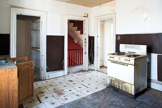
Kitchen and Dining Area Before
See more lessons learned from TOH TV project houses:
• How to Keep a Small House Small
• Little Ways to Save Big on a Remodel
Reflected Light
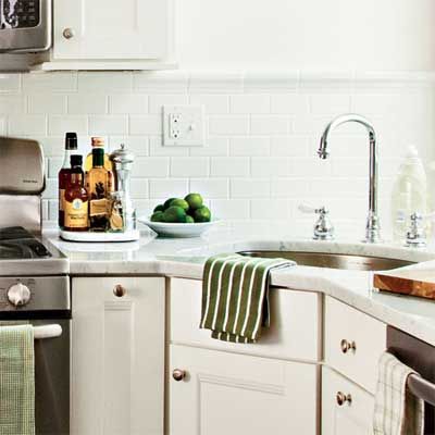
Budget-friendly white cabinets and backsplash tile team up with white walls to reflect light from the west window and help the room feel airy and bright.
Backsplash tile: Daltile, Dal-Tile Corp.
Glass Housing
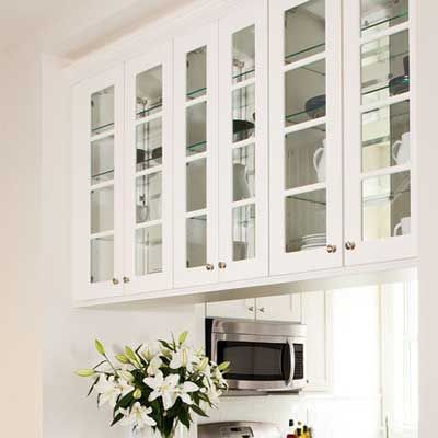
Dual-sided cabinets with glass doors offer easy access and channel light into the kitchen from the adjacent hall.
Half a Wall is Better
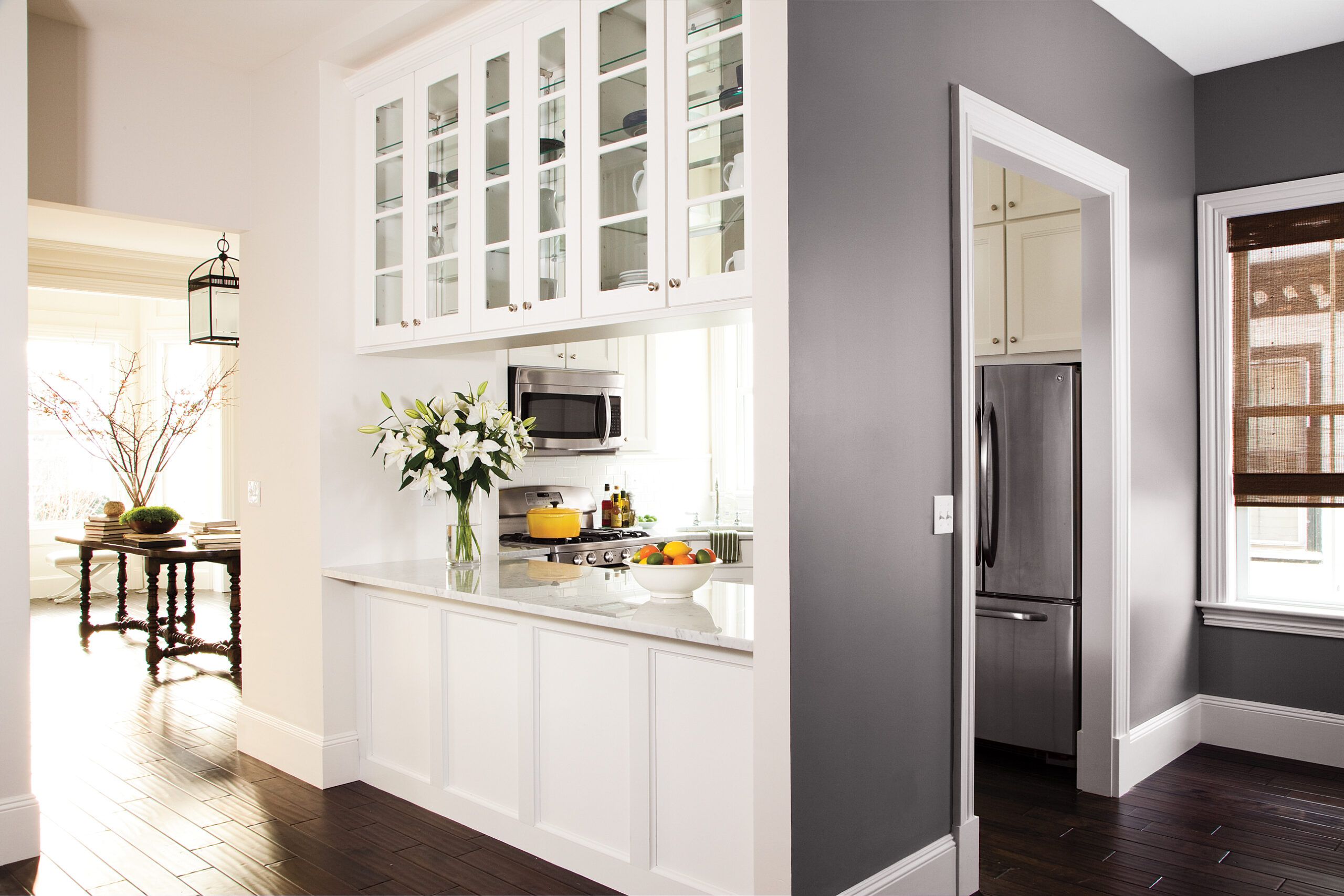
A half-wall allows cook and guests to interact easily; Lanita could add stools here, too, to turn it into a breakfast bar.
Distinctive Nook-ing
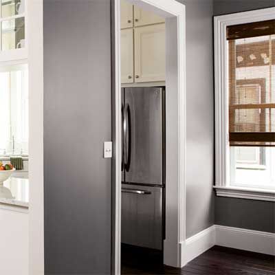
Using strong color in an open floor plan can be tricky, but the dining nook’s charcoal-gray walls give it distinction and set it off visually from the surrounding spaces.
A Family Room for Kicking Back
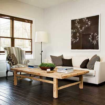
In a new addition is the perfect spot for reading and relaxing.
Family Room Before
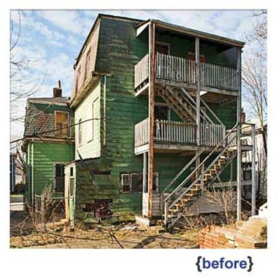
This rickety addition had to come down.
Wide Open Views
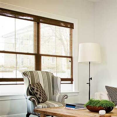
The low sill of the double window permits views out to the backyard even while seated.
Window shades: Bali window treatments from The Home Depot
Ventilation fans: Broan-NuTone LLC
In Contrast
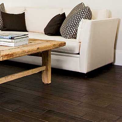
Dark floors paired with light walls make even smaller spaces like this one feel bigger. Lanita, an avid photographer, also likes the neutral backdrop for the black-and-white prints she plans to hang.
Flooring: Lumber Liquidators
Bright Ideas
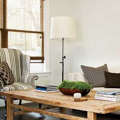
An oversize floor lamp is a good fit here, thanks to the room’s tall ceilings.
Lighting: Hudson Valley Lighting from Yale Appliance and Lighting
A Foyer That’s Filled with Light
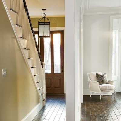
A style-appropriate paneled wood door has long, vertical lights to brighten the foyer. Ample natural light now makes the entry much more gracious.
The Foyer Before
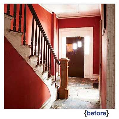
The front door was warped and badly outdated, as were garish red-orange walls.
Foyer Each Their Own
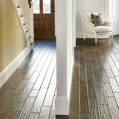
The opening between the foyer and parlor was enlarged for better flow, but the wall was kept in place to help define the parlor as a special spot. It also guides foot traffic coming from the entry or upstairs back to the kitchen and family room.
Walking the Planks
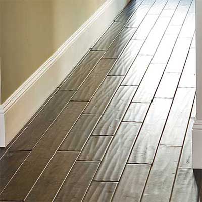
Solid-wood plank floors with a hand-scraped finish look warmly worn-in and add texture and visual interest to the hallway. The same effect could be replicated with a less pricey, more DIY-friendly laminate or engineered-wood floating floor.
First Floor Plan
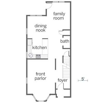
At just 1,000 square feet, the first floor packs lots of function into a relatively compact footprint. Upstairs (not shown) are three modest-size bedrooms and a master bath.
Interior designer: Patricia McDonagh Interiors
