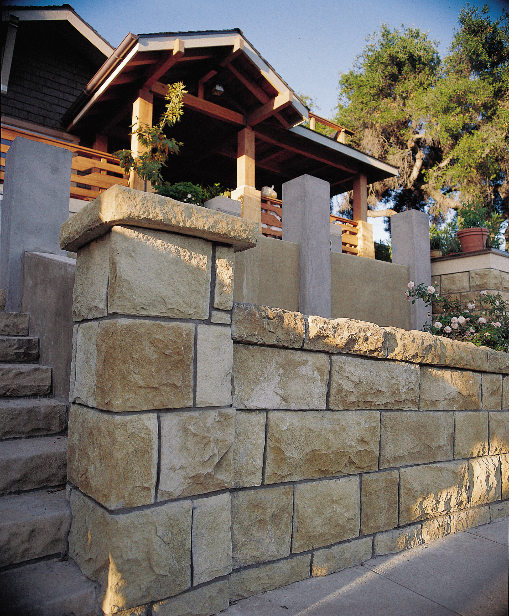
A second-floor addition, a radically revamped front facade, a new garage, new kitchen, three full bathrooms, new roof, new windows, new landscaping. These were just the main items on general contractor Steve Crawford’s to-do list for the renovation of Jan Winford’s 1907 Craftsman style bungalow in Santa Barbara, California. He and his crew had but three and a half months to do it all, working on a steep and narrow building site, with a national TV audience looking over their shoulders. His response: “No problem.”
Our winter 2000 project needed every bit of the esprit de corps that Steve’s attitude engendered, because it was not long after starting that Steve discovered the entire house was perched on a substandard foundation that in most places went only five or six inches into the soil, with no footings. Most of it would have to be replaced and upgraded to conform to the strict building code of a Zone 4 (highest risk) earthquake area. Not long after that little surprise, right when much of the roof was off the house, the winter rains set in. His response as each new obstacle came up: “No problem.”
All involved knew from the start that Jan’s budget would not allow for the completion of the whole project as envisioned. The job would either have to be broken into phases, or she would have to revisit how much she was willing to spend. In the end she opted for both courses, as the unforeseen expense of the foundation and her desire to tackle more rather than less combined to push her costs past $400,000.
The transformation she purchased was remarkable. In addition to adding some 790 feet to Jan’s original 1,500 square feet, architect Jerry Zimmer’s plan also called for enriching the house’s Arts-and-Crafts character with a variety of period-appropriate finishes. Some—the wall stenciling, the art glass, the wallpaper, the hand-glazed tile—were done much the same way they would have been back in 1907. Others—the fireproof wall shingles, the synthetic veneer stone used on the retaining walls, the zinc leading applied to the windows—were modern products chosen for their performance, cost, and close approximation of the period look. In concert, they and other products gave Jan’s home the feeling that it was a grand old place lovingly maintained over the years, rather than a modest structure radically renovated during several intense months at the dawn of the new millennium.
Some of the project’s most notable ingredients:
- Synthetic veneer stone—Lightweight concrete cast in molds made from the real thing, these eye-fooling, easy-to-work “blocks” made the house’s streetfront retaining walls and exterior columns look authentic at a fraction of the cost of using real stone.
- Colored concrete—The front walkway and its retaining walls were made from concrete colored through with a tan dye, giving a softer and more natural look.
- Landscaping—To a front yard full of California native plants, landscape architect Susan Van Atta added a garage-rooftop “bird garden” of potted plants and a birdbath set on a floor of patterned crushed stone and glass.
- Exterior materials—Given that Santa Barbara ordinances require the use of non-flammable materials, traditional wood shingles and trim were off-limits. Instead, we used heavy, Class A architectural roof shingles that gave a highly textured look, color-through fiber-cement wall shingles that never need painting, and manmade fiberboard trim that, when doubled up, gave the required fire rating at far less cost than full-dimension 3-inch lumber.
- Arts-and-Crafts style front door and entry hardware—The combination of a heavy, cherry door replete with period details and a massive hammered bronze lockset set the stylistic tone for entire house.
- Reproduction lighting fixtures—Throughout the house, understated, historically accurate (and reasonably priced) lighting fixtures gave a warm glow to inside and outside spaces.
- A transformed fireplace—Formerly a forlorn set of pink-painted bricks, the living room’s fireplace was redone in hand-glazed tile and quartersawn oak (in a design by interior design consultant Paul Duchscherer), making it the focal point of the house.
- Leaded glass, both real and simulated—Glass artist Brian McNally crafted an exquisite, period-perfect set of wisteria vine panels for the front entry, while the studio of Steve Handelman applied zinc strips to our factory windows to give them the appearance of handmade leaded glass.
- Wall treatments—The team of Bob Burchman and Ed Pinson practiced the art of hand-applied stencils on the walls of the master bedroom and painted a mural of a pond in the guest bath; the guest bedroom walls and ceiling were transformed with period wallpaper.

