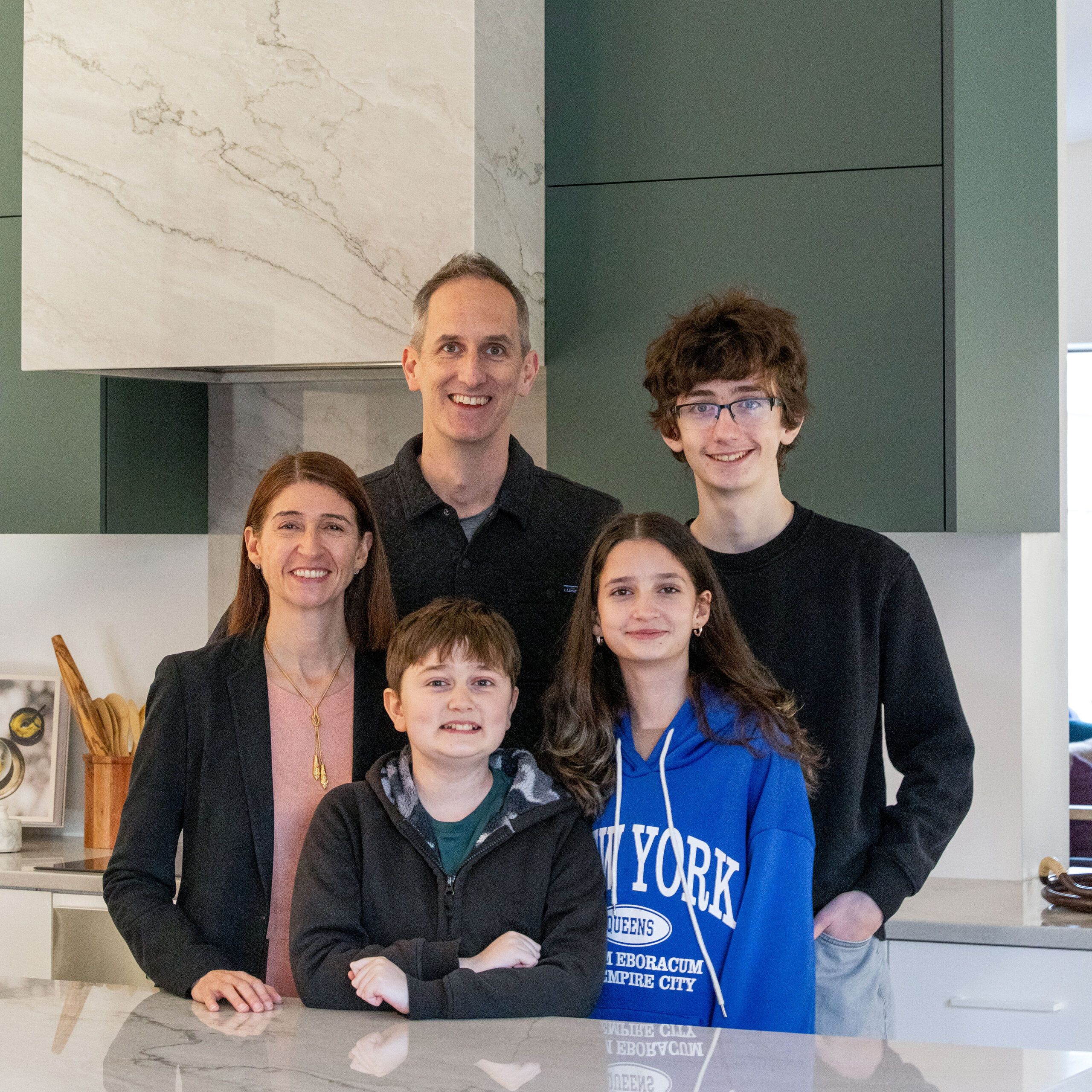
Over the years, the This Old House team has faced many challenging renovations, but none with a mission like this project’s: creating a home for a family to gather comfortably with accessibility built in—to address the mobility issues of a child with a rare disease.
The family of five—Michelle Werner and Billy Lester and their children, Wix, 16, Caffrey, 13, and Marlowe, 12—all know the importance of creating a house that can handle whatever comes. The day is fast approaching when Caffrey, who has Duchenne muscular dystrophy, will need a wheelchair. “Our son’s disease is progressing every day,” says Michelle. “The toughest thing for families living with progressive disease is to figure out what is needed today and also tomorrow,” says Billy.
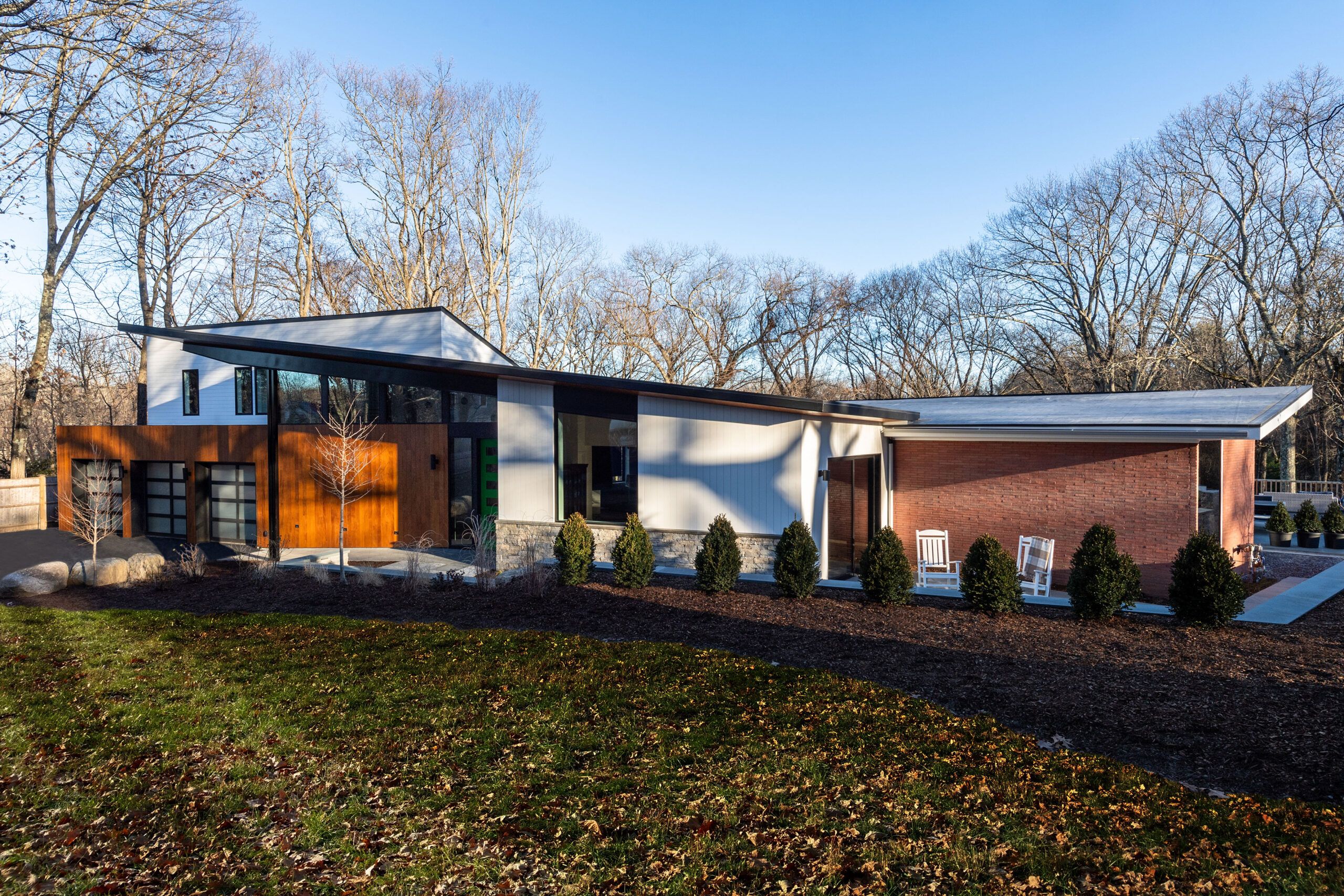
The extensive renovation that turned Michelle and Billy’s awkwardly remodeled 1960 mid-century modern house into an energy-efficient, fully accessible one, was documented as part of TOH TV’s 45th television season. By all rights, it should have been a 15-month renovation, but TOH home builder Charlie Silva led the team to get it done in10 months, so the family would have the house they needed as soon as possible. “The time crunch was definitely the biggest challenge,” says Charlie, who advised everyone to buckle up. “And we got it done.”
Seeing the Potential
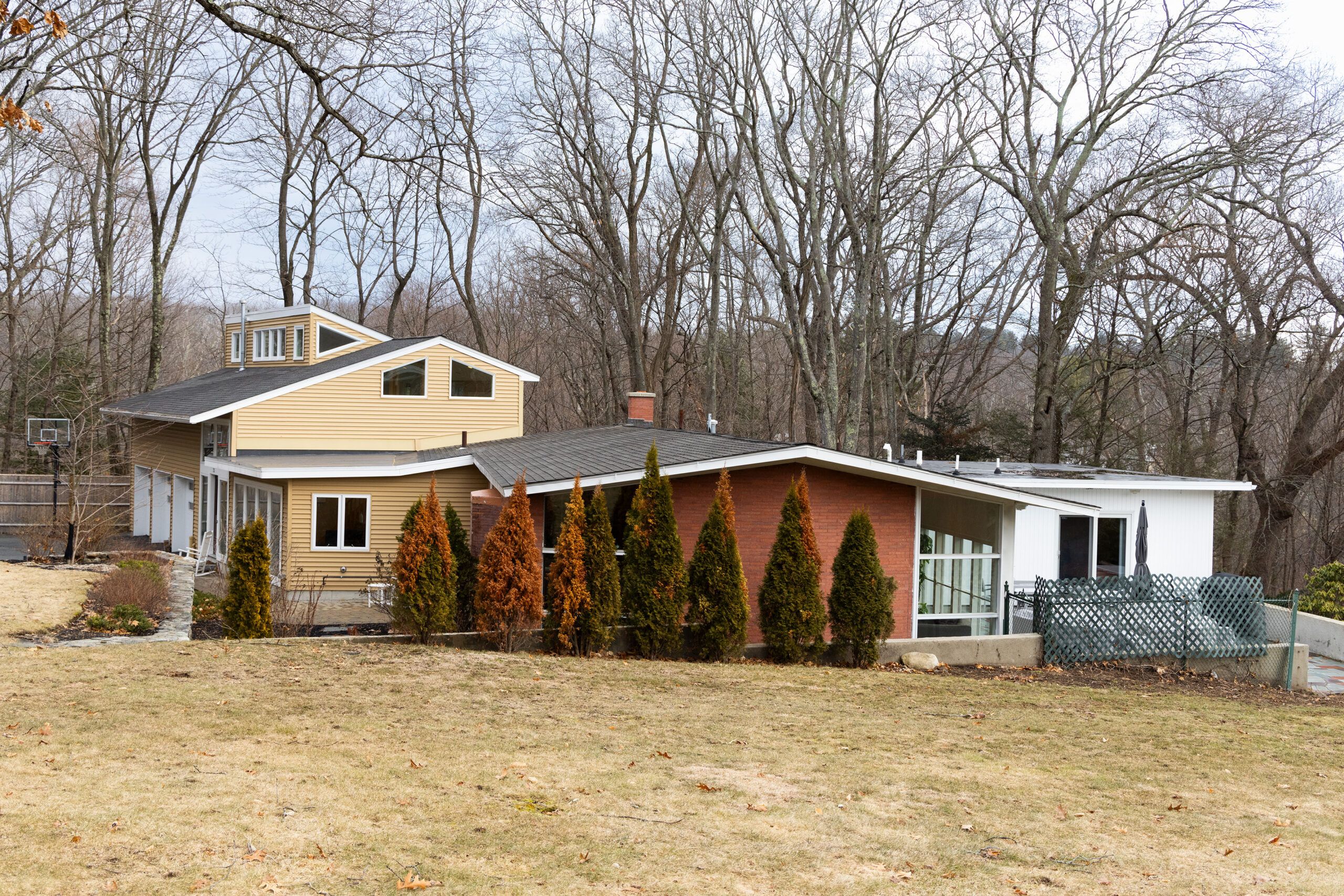
Michelle and Billy bought the Lexington house in 2022, just two years after Caffrey’s diagnosis, for its potential: It had been designed by a Boston architect in the mid-century modern style they admire, and still featured original brick walls, expanses of glass, and a floor plan with bedrooms and living spaces on one level. The primary bedroom, however, was on top of the garage, far from the main-level bedroom where Caffrey would sleep. The galley kitchen was cramped, and most interior doorways were a standard 32 inches wide, while wheelchair use requires at least 36 inches.
Another issue to contend with was the house’s awkward look: A vinyl-clad, dormered two-story garage and foyer from previous remodeling overwhelmed the original brick structure.
Creating a Modern Sanctuary
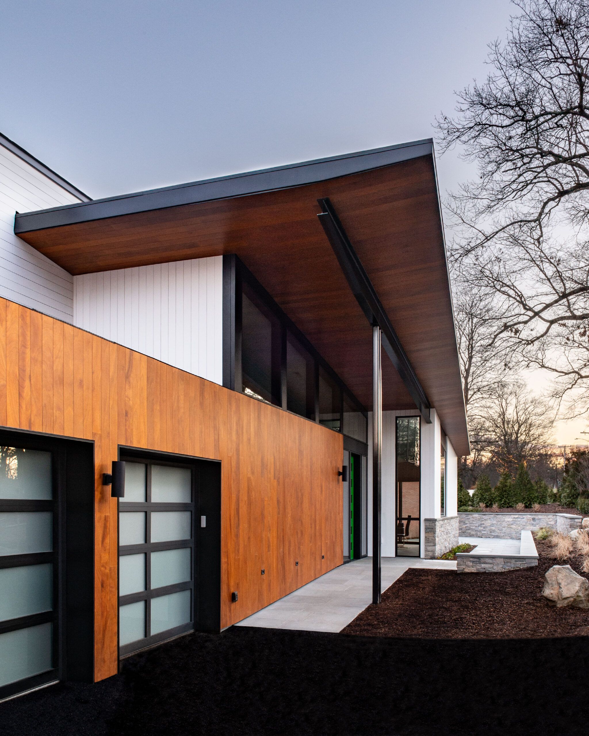
Today, the newly invigorated mid-century aesthetic is most apparent on the front façade, where architect Sandra Jahnes designed an angled overhang supported by steel columns to connect the garage with a new entry. Frosted glass garage doors and natural wood veneer siding installed vertically reinforce the modern look.
Equally important is the functional advantage of the new entry design: The overhang provides weather protection for a bluestone ramp that leads from the driveway to the new front door. Integrated into the house’s landscaping, the ramp’s gentle rise surpasses the ADA guideline of 1 inch of rise for every 12 feet of ramp length. “It will really ease Caffrey’s entry into the house at the front door,” says Charlie.
Making Living Better on the Inside
Inside, the focus is on open-plan living spaces and easy navigation along wide hallways and through doorways without thresholds. The heart of the house is the family-kitchen-living area, occupying most of the footprint of the original brick 1960 house; a beefy new LVL ridge beam provided the structural support needed to achieve the new spaciousness, and a two-story, 26-by-50-foot rear addition created space for bedrooms.
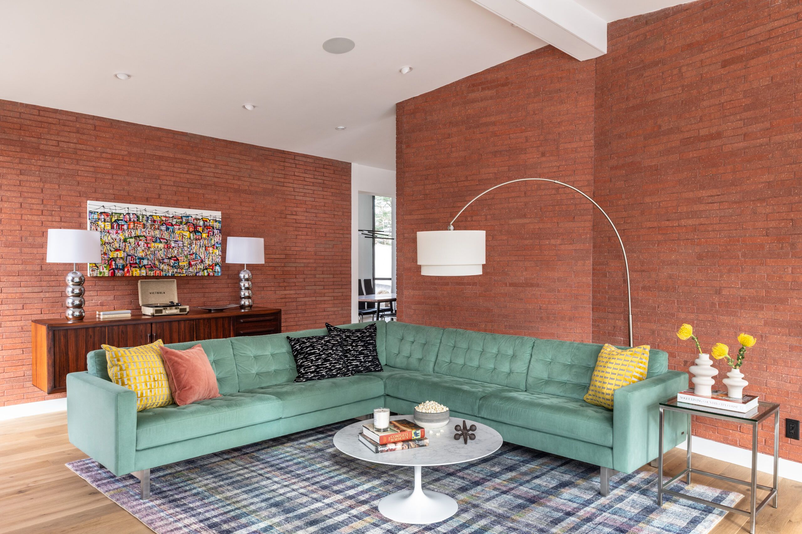
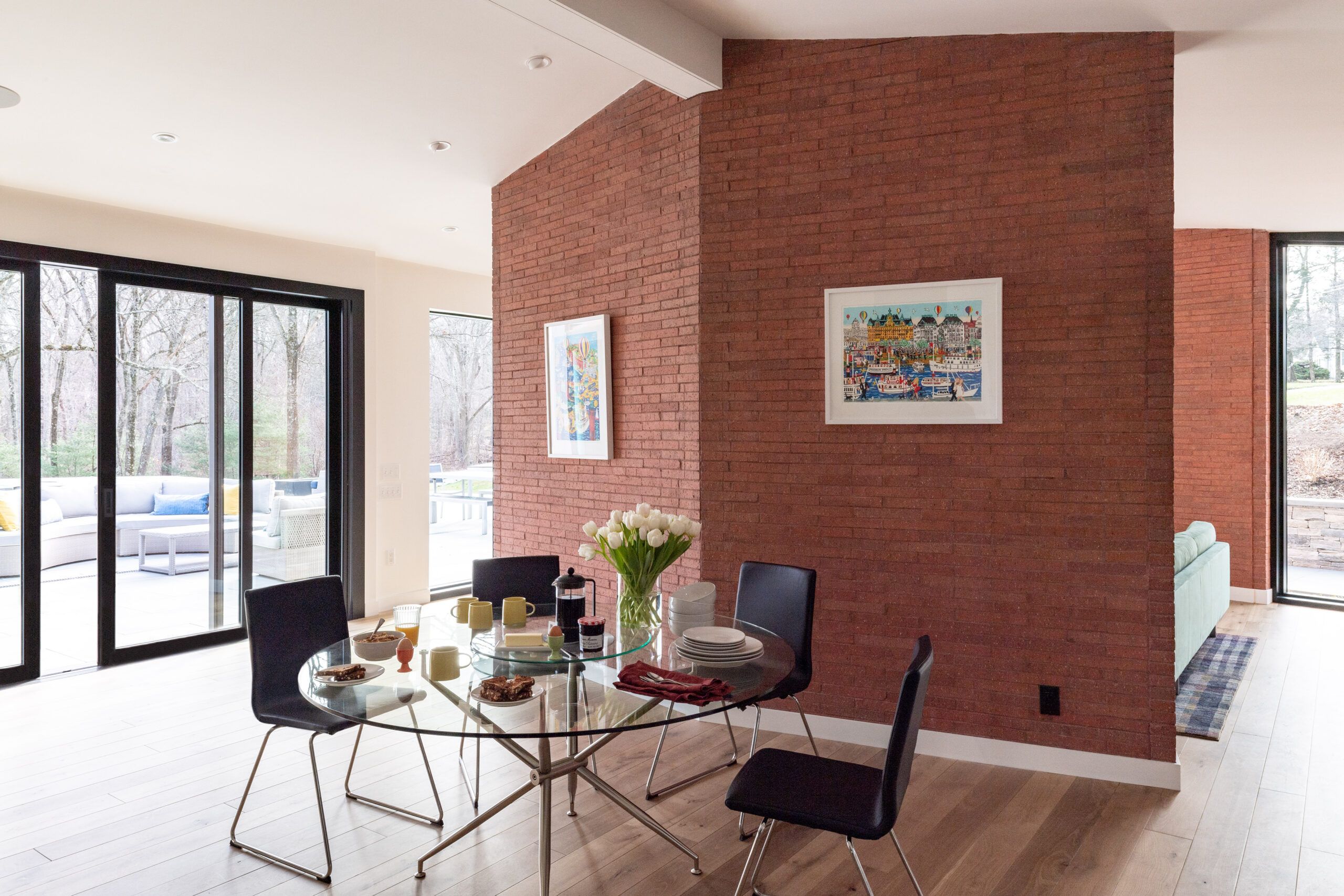
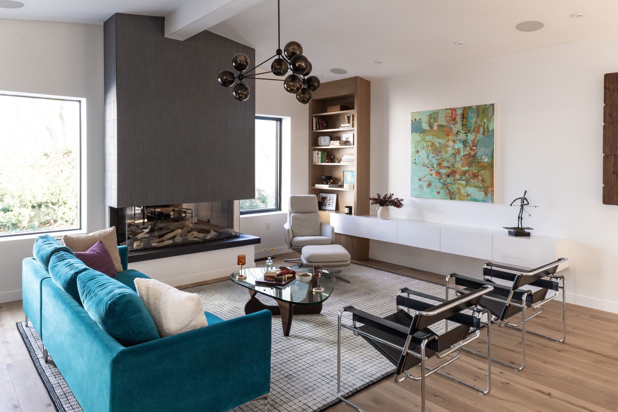
The family room, one of Michelle’s favorite spaces from the start, retains its original look with brick walls and plenty of glass, although all windows here and throughout the house are new—in modern metal black frames. “The large windows bring the outdoors in and create the modern feel,” says TOH general contractor Tom Silva, who admires mid-century modern style. “I love its simplicity.”
Building Functionality into the Kitchen and Living Spaces


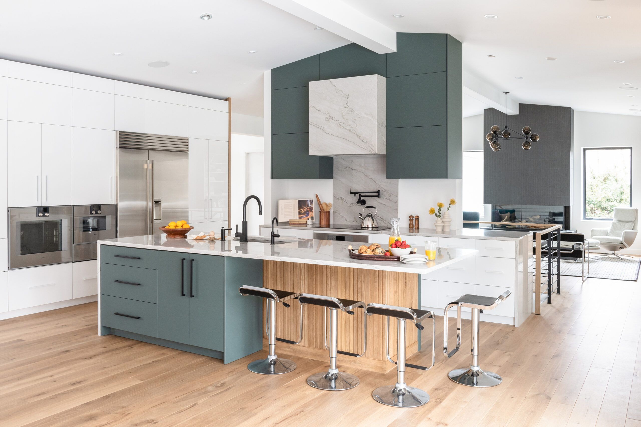
Both open and accessible, the kitchen now serves as hangout central: Traffic corridors range from 4 feet to nearly 5 feet wide (3 to 3½ feet is typical), providing a generous turning radius for a wheelchair. Billy and Michelle chose appliances and cabinetry with touch-to-open functionality. The cabinetry—in glossy white and matte green melamine over an MDF core—offers fingerprint-smudge resistance and easy scratch repair, important given the touch-to-open feature.
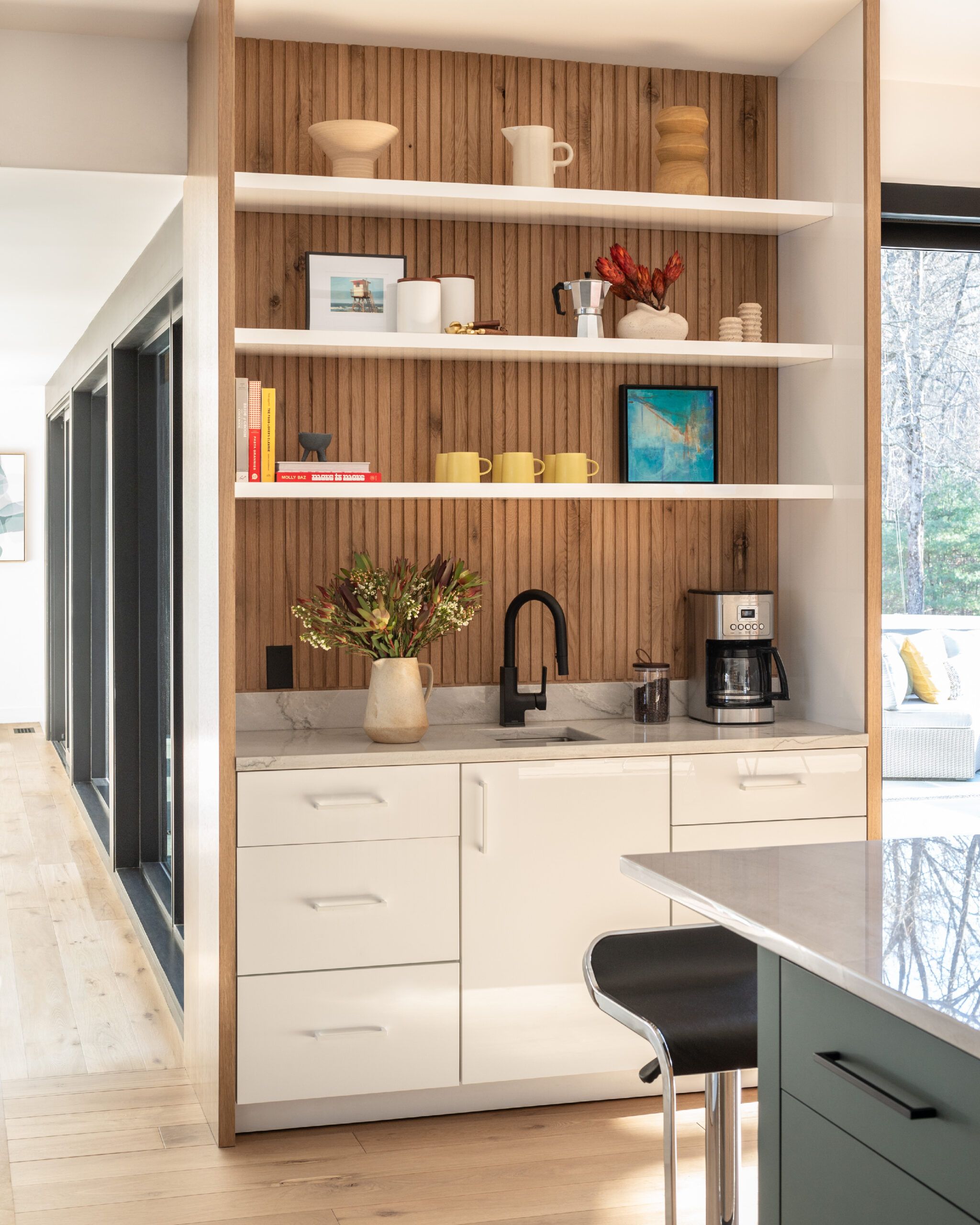
The central island’s sleek white quartzite countertop complements an island base featuring custom-made fluted-wood paneling; Tom created the fluted detail by using a router to run grooves in pieces of leftover white oak flooring. As an example of planning for tomorrow, a matte green drawer section under the island—next to the barstools—was installed on wheels so it can be removed to make way for wheelchair seating one day; the island base behind the movable section has already been finished with the same fluted wood treatment. “We wanted a kitchen where everyone can cook together and congregate,” says Michelle.
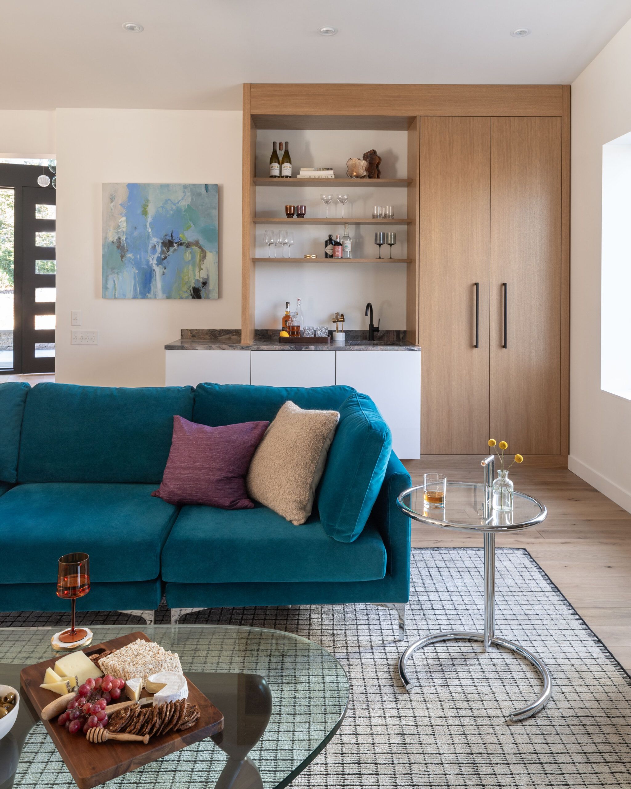
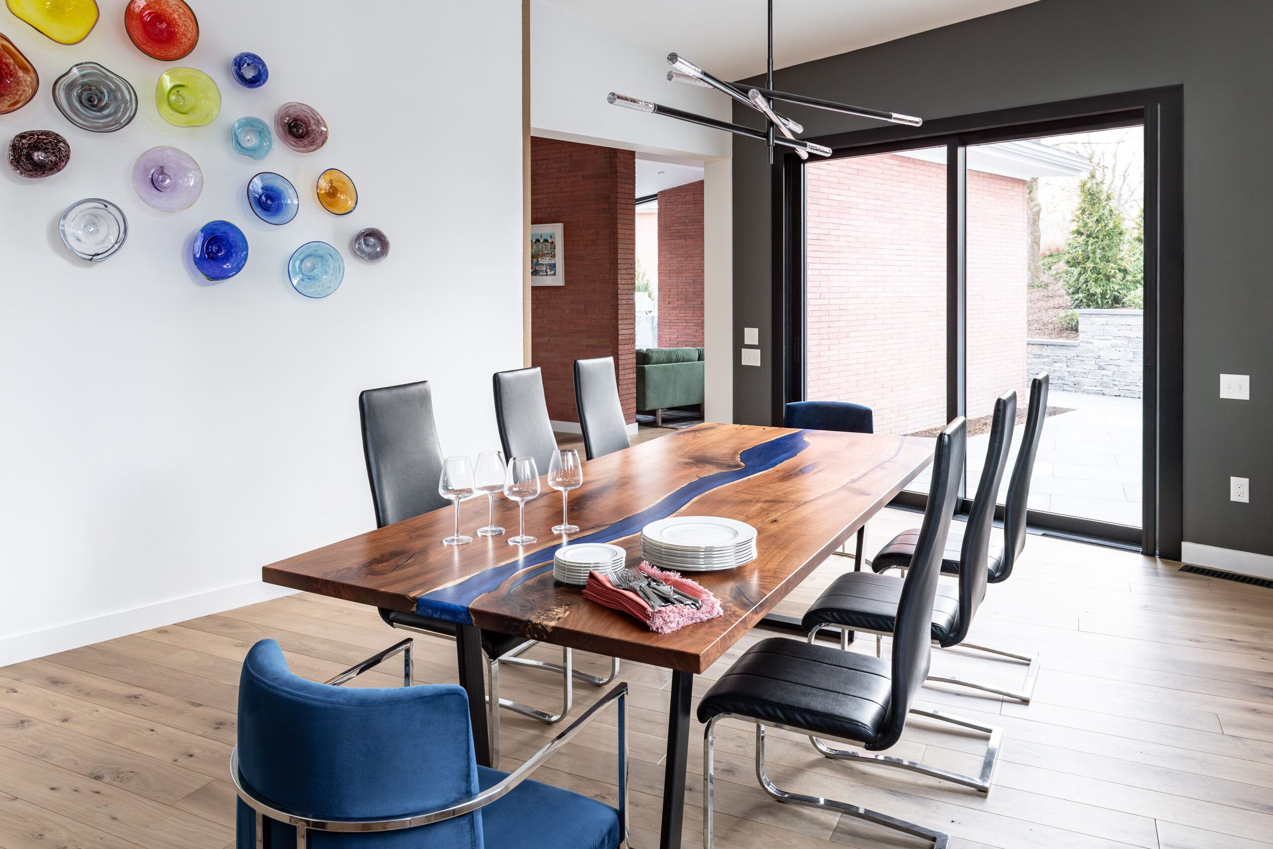
The formal living area and a new dining room, the latter in a bump-out at the front of the house, are adjacent to the centrally located kitchen; the use of modern finishes, from contemporary light fixtures to floating stairways and matte black accents, gives the spaces a cohesive look. The homeowners chose white oak flooring for its clean look and used the wood as treads for the floating staircase to the second floor, as open shelving and built-in storage in the living room, and for the fluted wood details in the kitchen.
Finding Optimal Ways to Stay Efficient

The natural-finish white oak floors throughout the main level conceal a huge renovation effort underneath—one that was all about energy efficiency. Early on in the project, Charlie and the homeowners had to contend with a state mandate that the finished renovation meet a Home Energy Rating System (HERS) requirement. The HERS number they needed to achieve was 52, a calculation that takes into account the performance of HVAC systems and appliances, and the R-values of windows, doors, roofs, and insulation.
With so much of the original structure consisting of low-R-value brick walls and zero-R-value concrete slab floors, Charlie had to expand the initial scope of work and bulldoze the main level’s concrete slab to start over. “It was the only way we could get new mechanicals, ductwork, and insulation for the main level to meet the new requirement,” says Charlie, who incorporated multiple layers of insulation into the floor system.
In pursuit of energy-efficiency, the homeowners chose a geothermal heat pump system for heating and cooling and rooftop solar panels to generate the electricity the system demanded. Four 500-foot-deep holes drilled in the yard created the core of the geothermal system, with four sets of geothermal piping leading into the house to feed super-efficient circulator pumps and heat pumps that provide heating and cooling. “There’s certainly costs up front, but a system like this is extremely efficient and a great investment for the future,” says TOH plumbing and heating expert Richard Trethewey. With these improvements, the house was awarded a HERS rating of 39 upon completion, surpassing the originally, mandated requirement.
Re-thinking the Primary Suite and Bedrooms
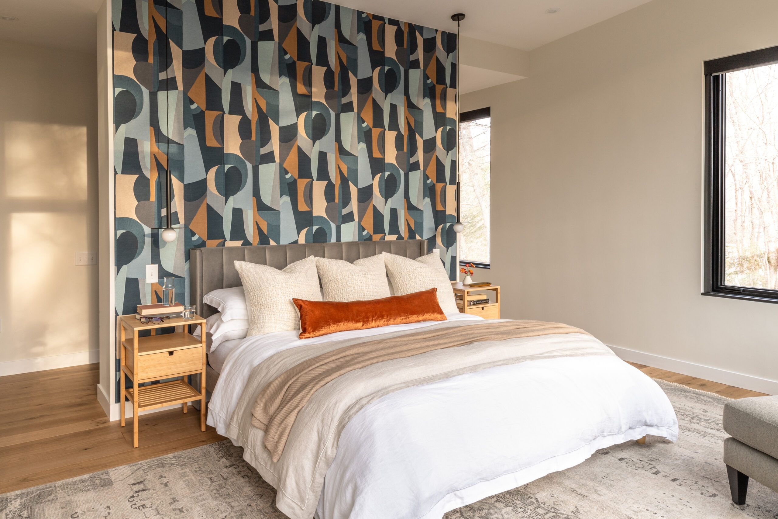
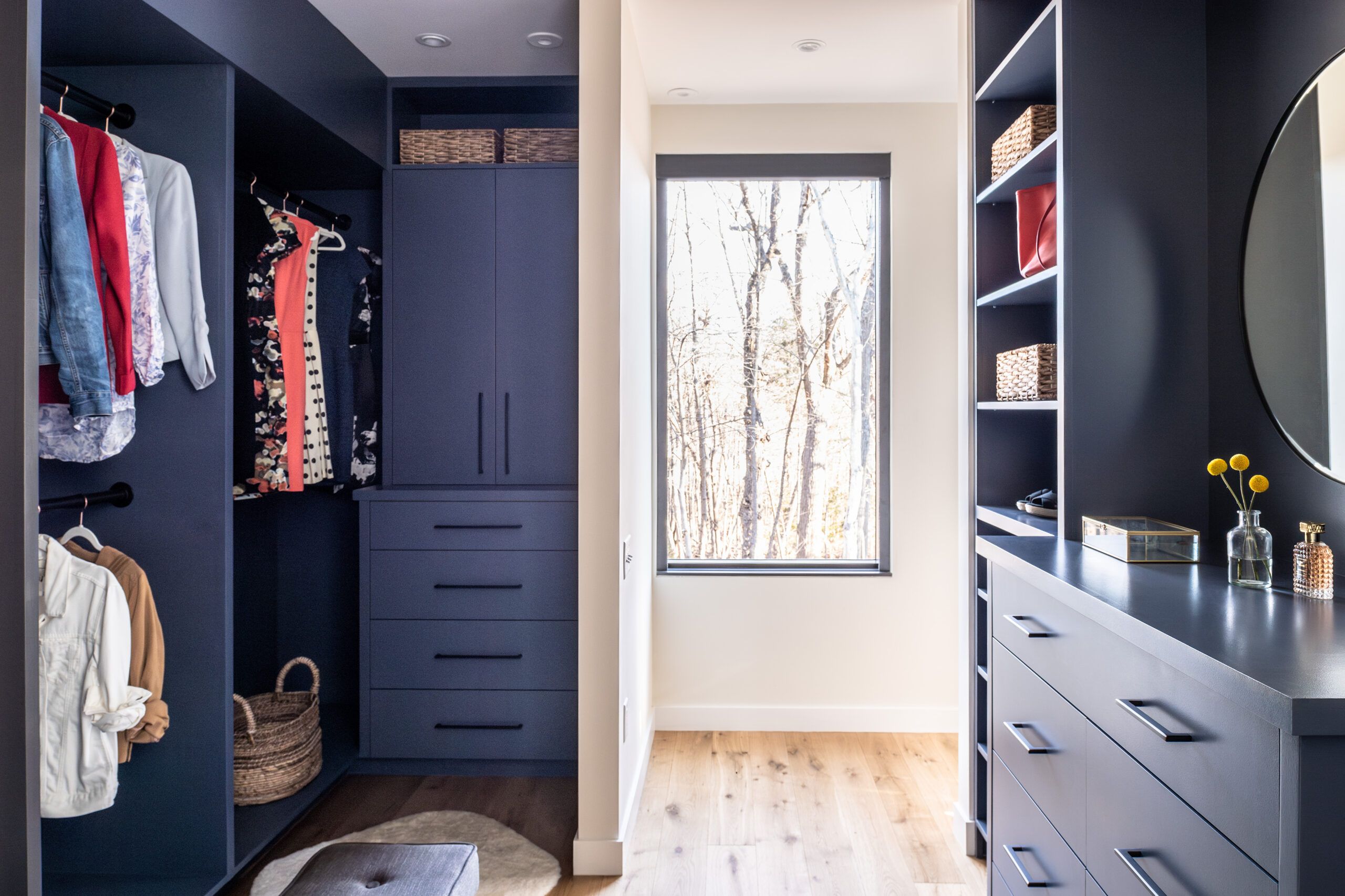
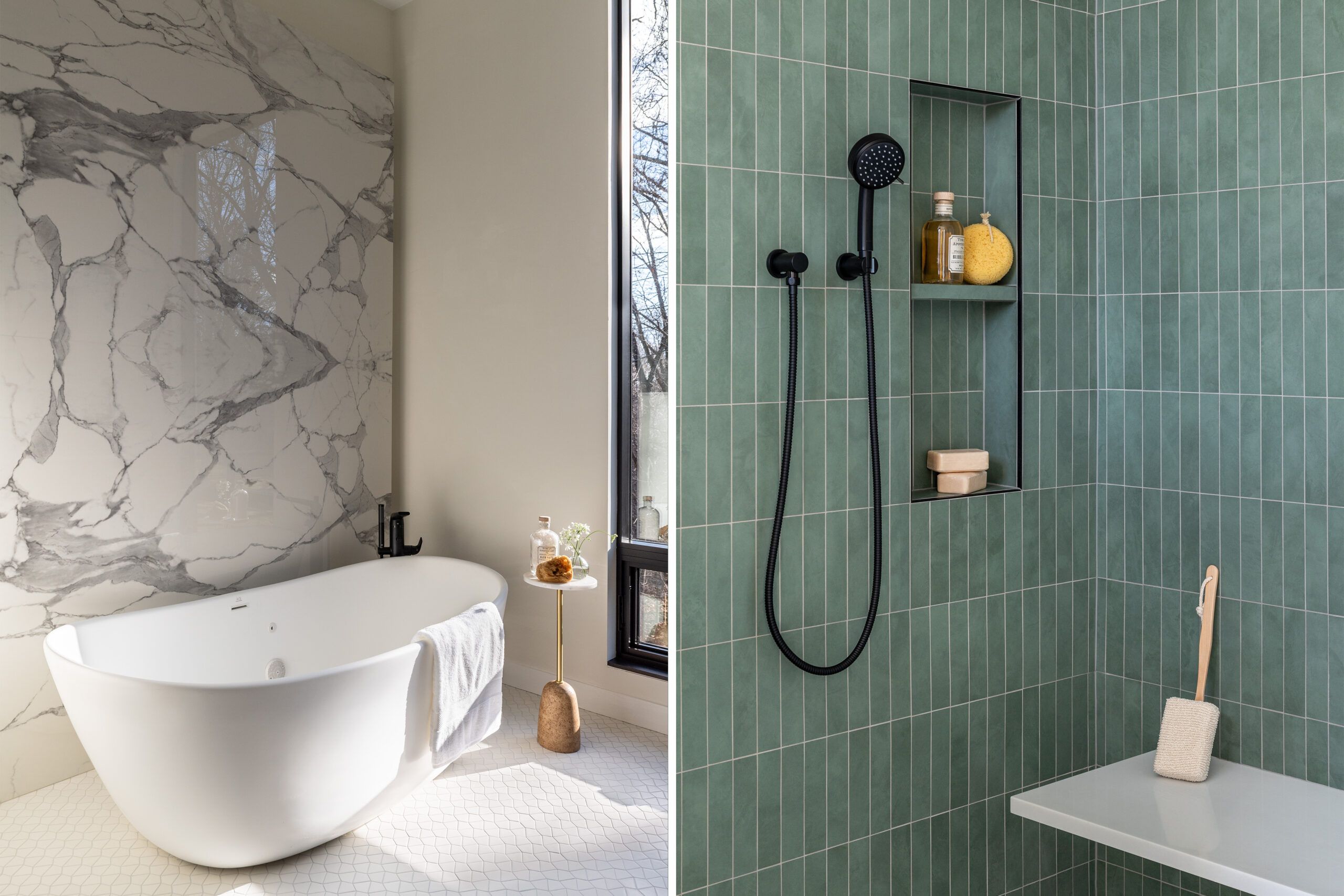


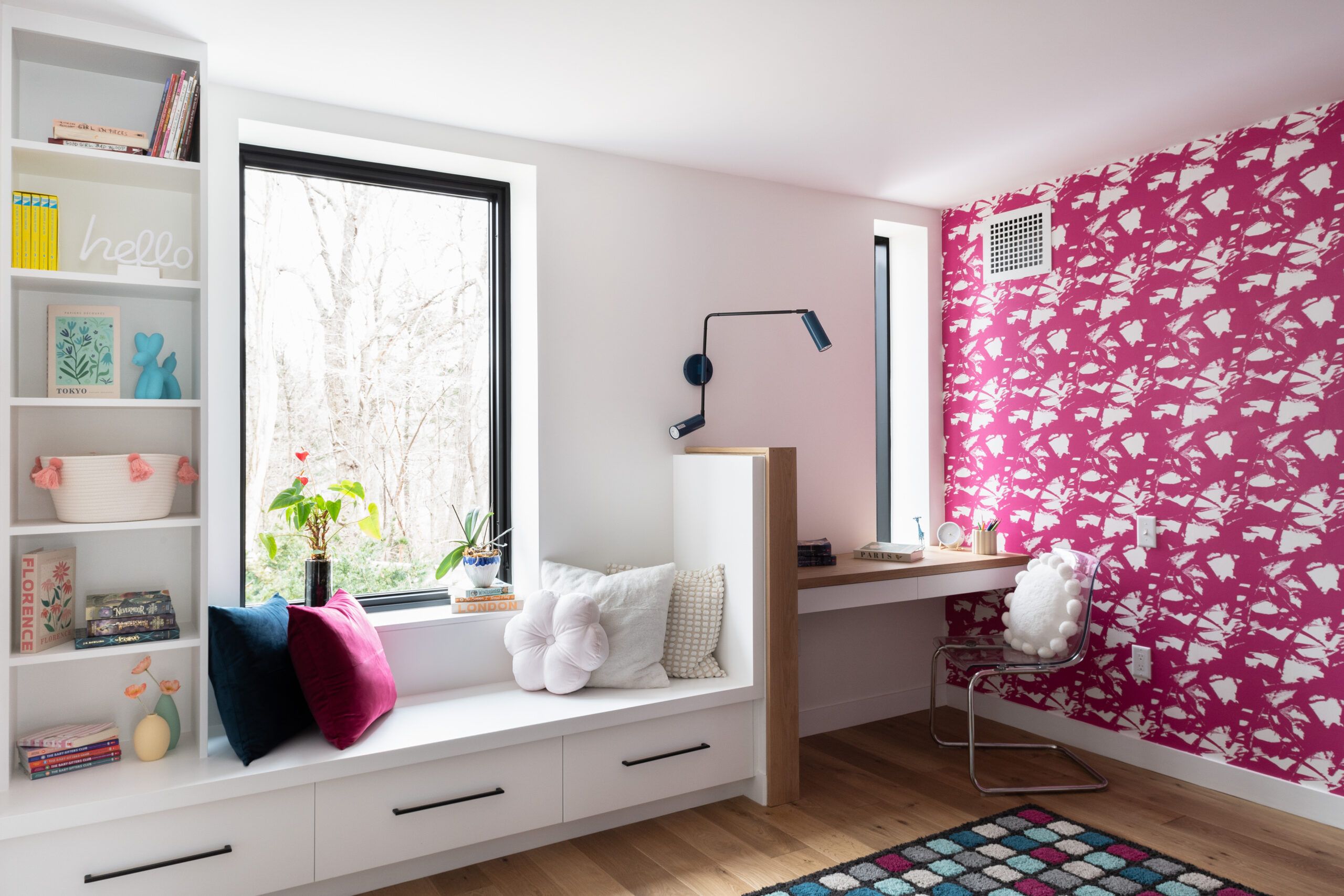
Another key renovation goal was to have the primary suite adjacent to Caffrey’s suite. “We needed the peace of mind to know we were right there when he needed us,” says Billy; both suites are in the rear addition, with Marlowe’s bedroom also nearby, and feature wide hallways and zero-clearance doorways.
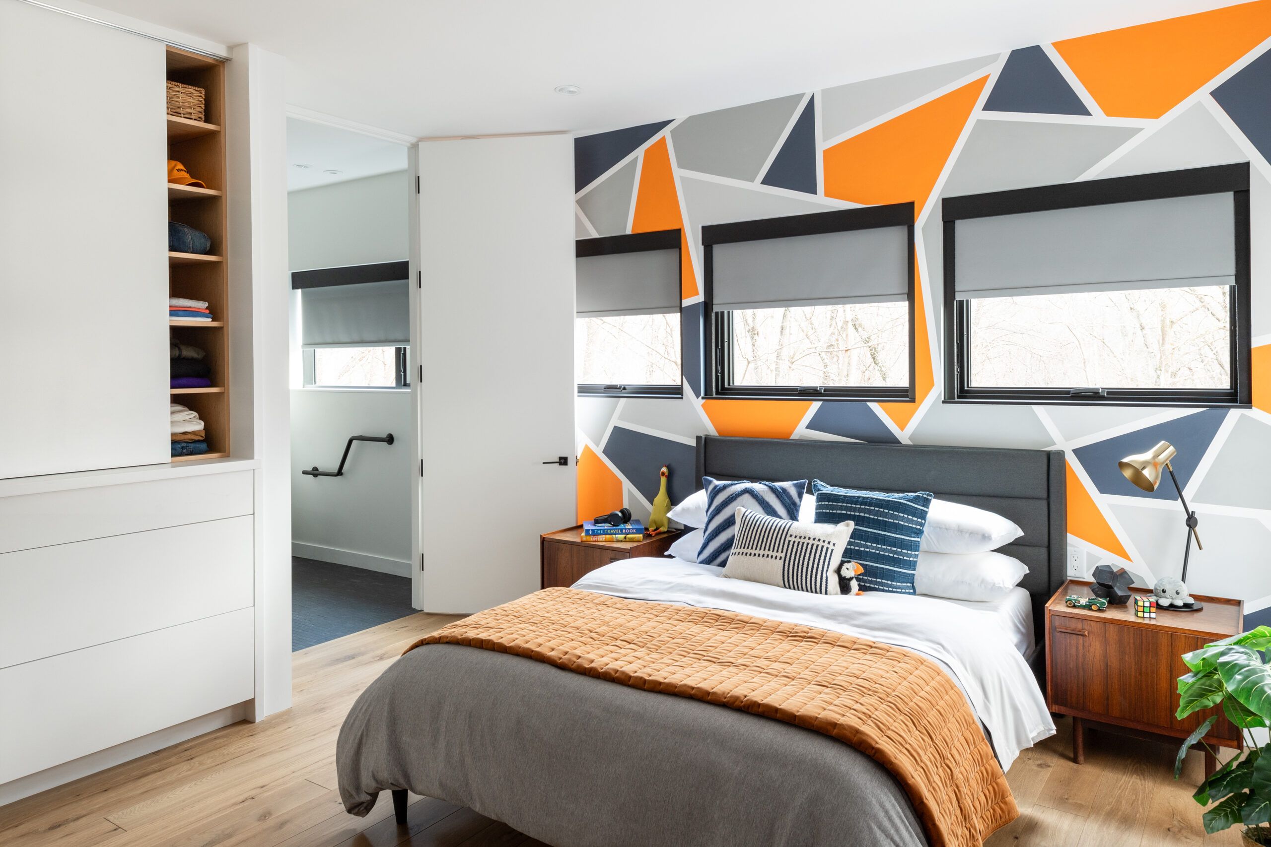
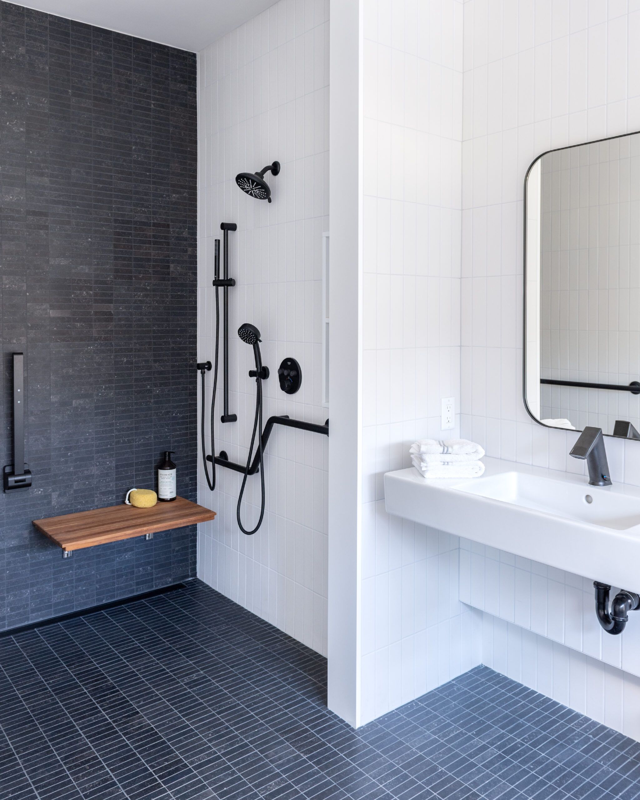


For Caffrey’s bathroom, the team built accessibility into the space in numerous ways—starting with extra blocking in the walls done during the framing stage to support the grab bars now installed on all four walls. The position and height of the sink address future wheelchair navigation, and the curbless shower includes a built-in seat and an extra handset for a person providing assistance. Just outside Caffrey’s bedroom door is an elevator, installed to enable access to the lower level of the rear addition, where Wix’s bedroom is located.
Creating Outdoor Space for Family Gatherings
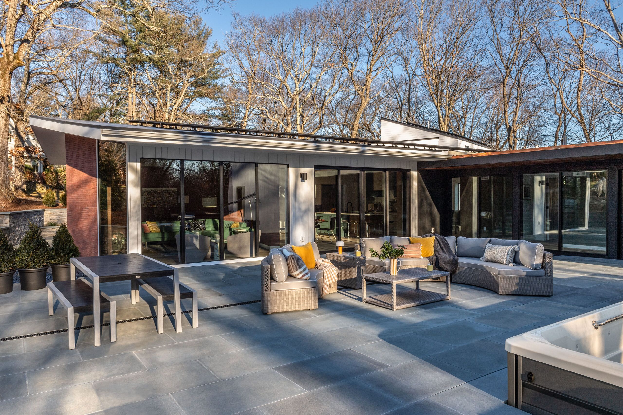
In addition to making the indoor spaces accessible, the outdoor design focused on providing places for the entire family to gather. “Accessibility was the most crucial part of my landscape design—with the inside and outside all on the same level, no steps anywhere,” says TOH landscape contractor Jenn Nawada. The main attraction is the 24-by-38-foot rear patio, which is accessible from three areas of the house (kitchen, hallway, and Caffrey’s bedroom) via zero-clearance thresholds.
The 12-foot-wide glass sliding doors from the kitchen also feature a motorized system, making it as easy as possible to move from inside to out. For the bluestone patio, Jenn designed gathering zones, including a firepit and a sofa area. Installed at one corner of the patio is a pool that can be used by the entire family; its warm water and massaging jets provide therapeutic benefits for Caffrey’s muscles as well.
Making Life Better for the Family
“There are so many ideas here that can help anyone facing mobility issues. We ended up with an efficient house, an accessible house, and a beautiful house,” TOH host Kevin O’Connor reflects on the renovation.
Most importantly, for the family, it is proving to be the gathering place they hoped for with all the functionality they required. After just a month in the house, they were already seeing the benefits every day—from wide corridors that make it easy to move through their home to the comfort of knowing that the bathrooms already have accessible features in place.
“Not only is the house spectacular, it is working wonders for our family,” says Michelle, who also appreciates the mid-century modern characteristics—from the original feel of the family room, where she has coffee every morning, to the new built-ins in the living room, where the family often gathers in the evenings. Looking ahead, Billy adds: “For Caffrey to be able to have independence no matter what—that’s why we did this. It’s very noticeable already that the design has made things very comfortable for the entire family.”
Directory and Resources
General contractor: silvabrothers.com. Architect: ruhljahnes.com. Interior designer: racheldunhamdesign.com. Accessibility consultant: solutionsforaccessibility.com. Plumbing: biloplumbingandheating.com. HVAC: backbaymechanical.com. Geothermal design: te2engineering.com. Electrical: eatonandeastmanelectric.com. Landscape design: nawadalandscapedesign.com. Landscape: kandrlandscape.com. Masonry: mjmmasonry.com. Painting: maurospainting.com. Carpentry: berkybuilders.com; conorscarpentry.com; kenyonwoodworking.com.
Roof sheathing, wall panels, subfloor: huberwood.com. Roof shingles, underlayment: gaf.com. Hardware: baldwinhardware.com. Tile waterproofing: schluter.com. Plumbing fixtures: americanstandard-us.com, duravit.us, dxv.com, franke.com, grohe.us, moen.com, robern.com, totousa.com, wetstyle.com; all from fwwebb.com. Kitchen cabinets: bespokeofwinchester.com. Kitchen countertops: cbsstones.com. Elevator: inclinator.com; from aboveandbeyondelevator.com. Appliances: yaleappliance.com. Carbonated water maker: zipwater.com. Flooring: huntcustomwood.com. Garage doors: middlesexohd.com. Therapy pool: mainelytubs.com. Pool lift: liftandcaresystems.com. Furnishings: dwr.com. Rugs: landryandarcari.com.
